The Carousel element in the course builder
Use the Gallery element of the Carousel type in the course builder to add a set of images as slides within a lesson element.
For example, you can present your content step by step and use one slide per concept or before/after image. This helps reduce overload, improve navigation, and increase engagement.
Let’s talk about how to add a carousel and customize your slides.
Add the element
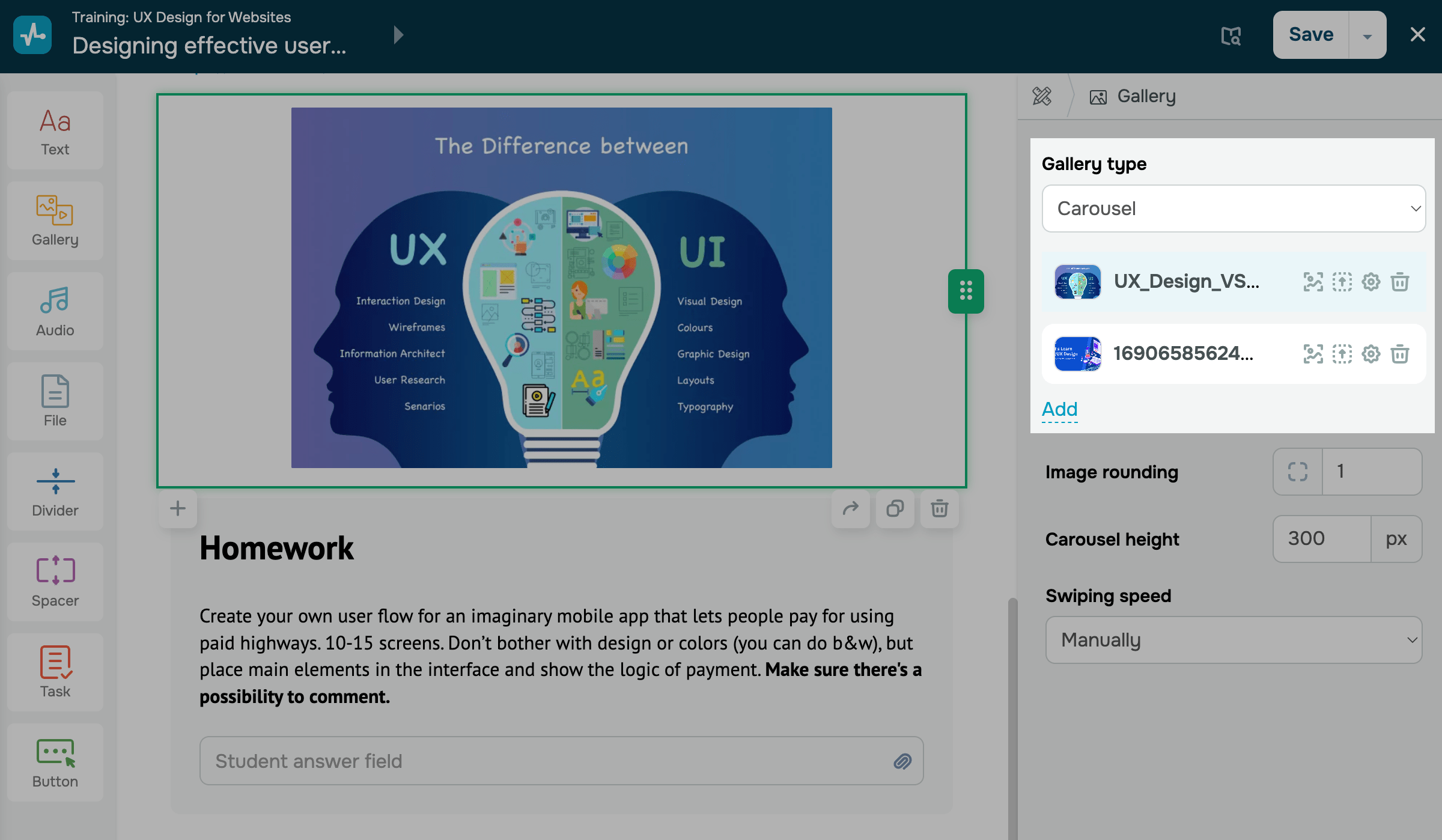
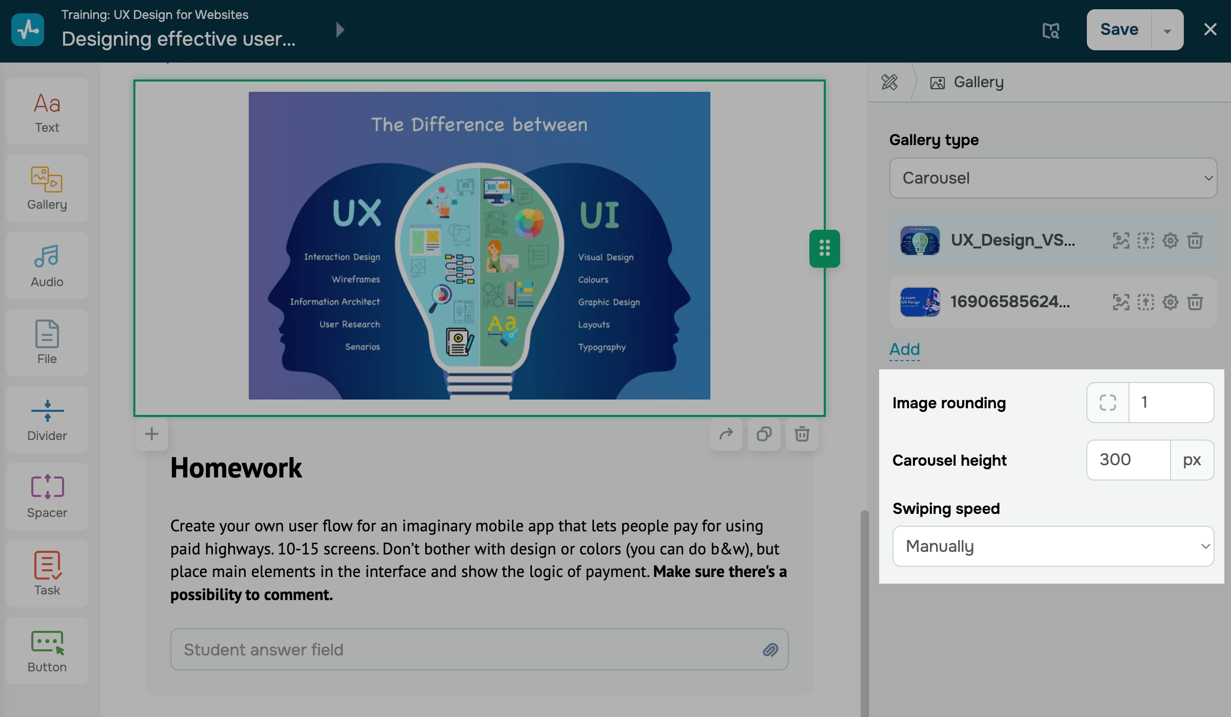
In the lesson builder, drag the Gallery element from the left sidebar to your workspace, or click the Plus icon under any element. On the right, select the Carousel type.
Upload images
On the right, click Choose file. Select an image from SendPulse’s file manager or upload a new one, and then click Choose. You can select one or multiple images.
Manage image files
After you add your images, rows with their names and available actions will appear next to each image. You can take the following actions:
| Image Editing | Edit the uploaded image in the image editor.
To save your changes, click Save. |
| Choose an image | Open the file selection window to add another image. |
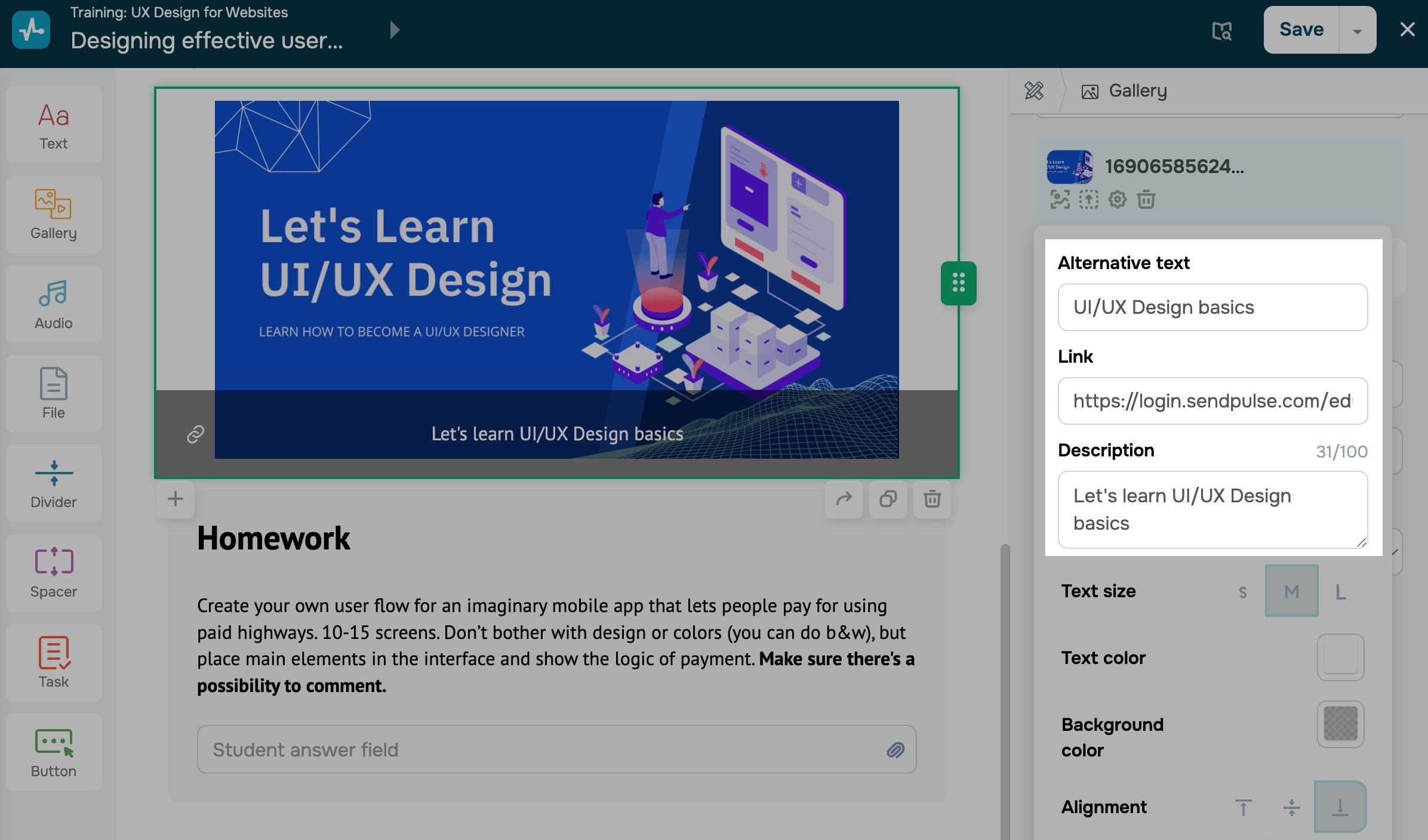
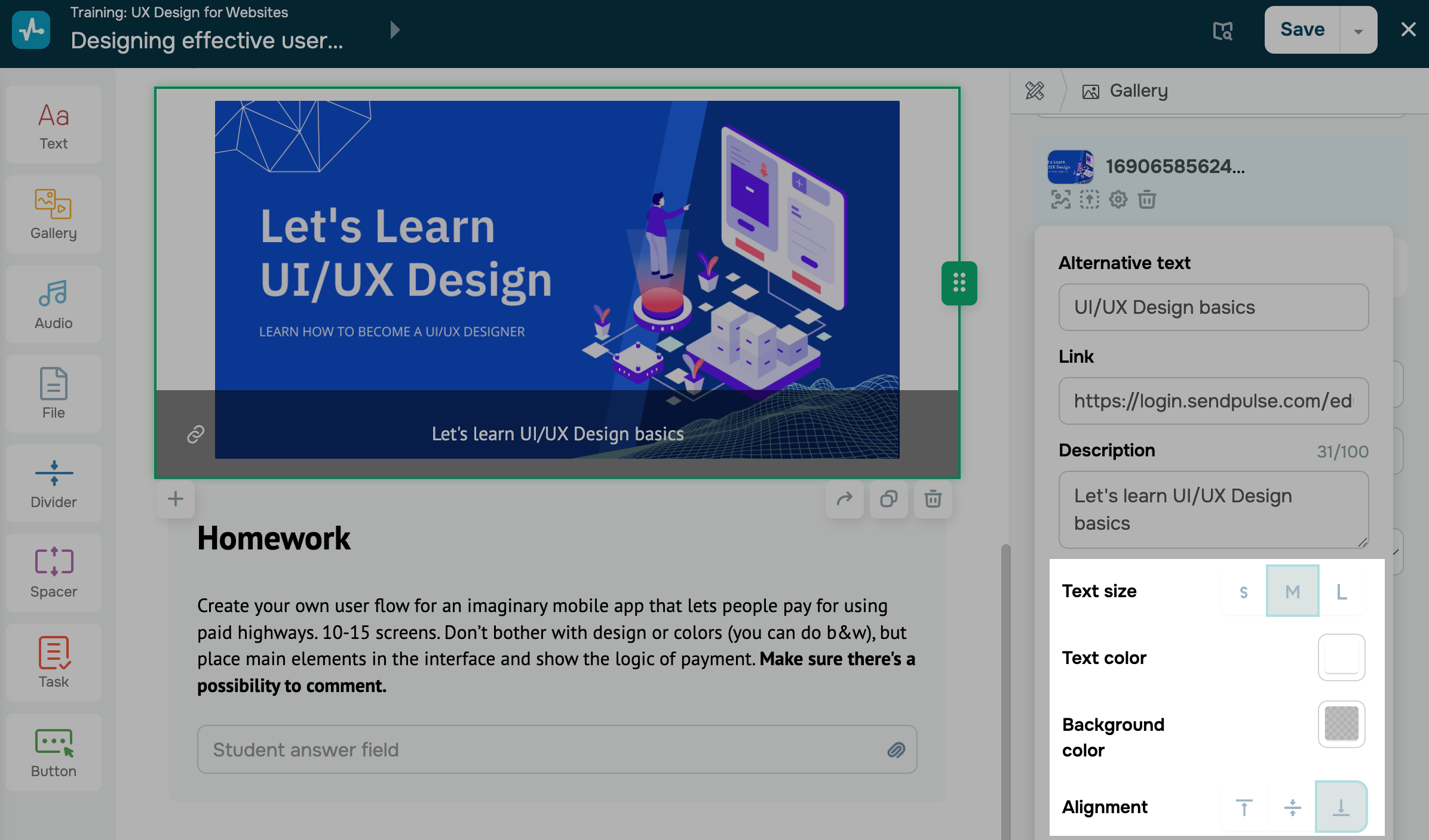
| Settings | Open the settings of a specific slide, including alternative text, link, and description. |
| Delete | Remove the image from the Gallery element to upload a different image.
Note that deleting an image does not delete the element. To delete the element itself, click the trash can icon in your workspace. |
To rearrange your slides, drag an image up or down in the list. To add a new image, click Add.
Set up image settings
To customize an image, click the settings icon and fill in the fields:
| Alternative text | Adds information about your image if the image display is disabled in the browser or the image fails to load.
Enter a short description of the image that will appear when it is unavailable. |
| Link | Adds a link to the page a user opens when they click your image.
Paste the link that students will go to when they click your image. |
| Description | Adds text over the image. You can enter up to 100 characters.
Enter a description that will appear over the image. |
Set up carousel style
Choose slide display options:
| Image rounding | Rounds the image in the carousel.
Enter a rounding value. |
| Carousel height | Sets a carousel height. Images adjust to your selected height.
Enter a carousel height in pixels. |
| Swiping speed | Sets a slide swiping speed or disables auto-scrolling.
Manual disables auto-scrolling; Low auto-scrolls every 3 seconds; Medium auto-scrolls every 2 seconds; High auto-scrolls every second. |
Set up image style
Choose image display options:
| Text size | Sets a description font size.
Small; Medium; Large. |
| Text color | Select a description text color. |
| Background color | Select a background color for your description text. |
| Alignment | Defines the position of your description within its slide.
Top places the description at the top of its slide; Center centers the description on its slide; Bottom places the description at the bottom of its slide. |
After you finish setting up the element, click Save in the upper-right corner of the builder.
Last Updated: 22.12.2025
or