The Button element in the course builder
Use the Button element in the course builder to add a clickable button that links to an internal course page or an external resource. You can also use it to prompt students to upgrade their pricing plan.
For example, you can direct students to extra course content, a registration form, another course, or a page.
Let’s talk about how to add a button to a lesson and customize its text, link, and appearance.
Add the element
In the lesson builder, drag the Button element from the left sidebar to your workspace, or click the Plus icon under any element.
Set up the element
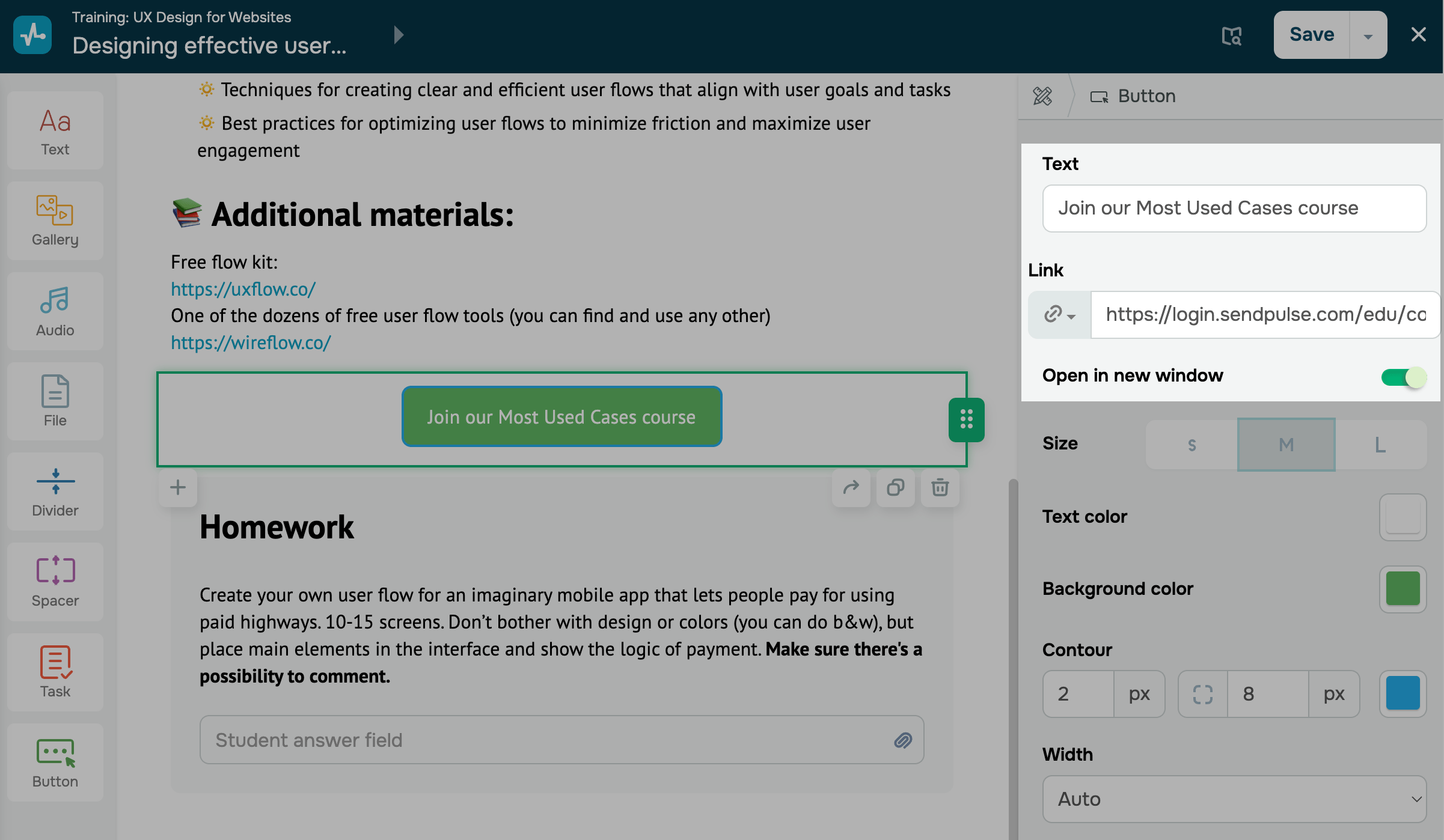
On the right, configure the button settings:
| Text | Sets a button label.
Enter the text that will appear on your button. |
| Link | Defines the button type and its settings.
Select a button type and configure it: Link — paste the link that students will go to when they click your button. Pricing plan — select a course pricing plan so that students can pay for more course content. |
| Open in new window | Enable this option to open the link in a new browser window. |
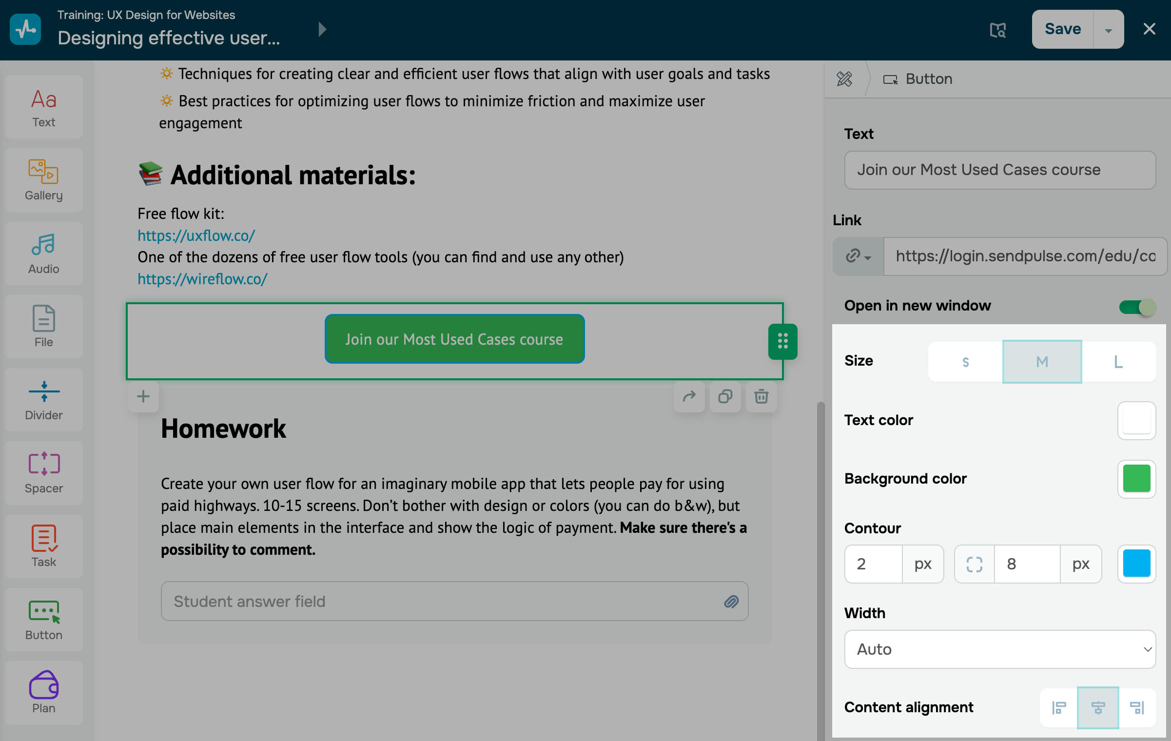
Customize the button
Set a button style:
| Size | Sets a button size.
You can choose one of the following button size options:
|
| Text color | Sets a button text color.
Click the icon and select a text color. |
| Background color | Sets a button background color.
Click the icon and select a background color. |
| Contour | Adds a contour to the button.
Set a line thickness and rounding in pixels, then choose a contour color. |
| Width | Sets a button width.
Choose one of the following options: Auto adjusts the button to the text length. Full container width stretches the button across the entire element width. Fixed lets you enter a specific button width. |
| Content alignment | Sets a button alignment.
Decide how to align your button in the element: Left aligns the button to the left side of the element; Center centers the button in the element; Right aligns the button to the right side of the element. |
After you finish setting up the element, click Save in the upper-right corner of the builder.
Last Updated: 22.12.2025
or