The Layout element in the website builder
The Layout element allows you to divide content into well-defined segments within blocks, sections, or columns.
Let's talk about how to add a layout and set up tabs within it.
Add a layout
To add a layout, click + Add widget in a block, column, or section, and then click Layout.
Select a placement from the available options.
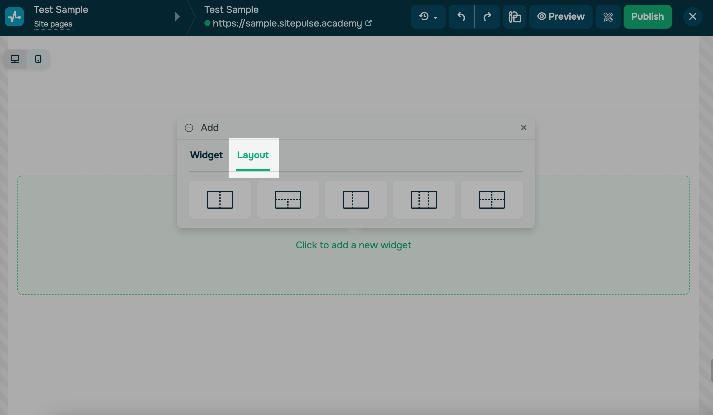
Afterward, you can add widgets to every segment vertically. Click + and select a widget.
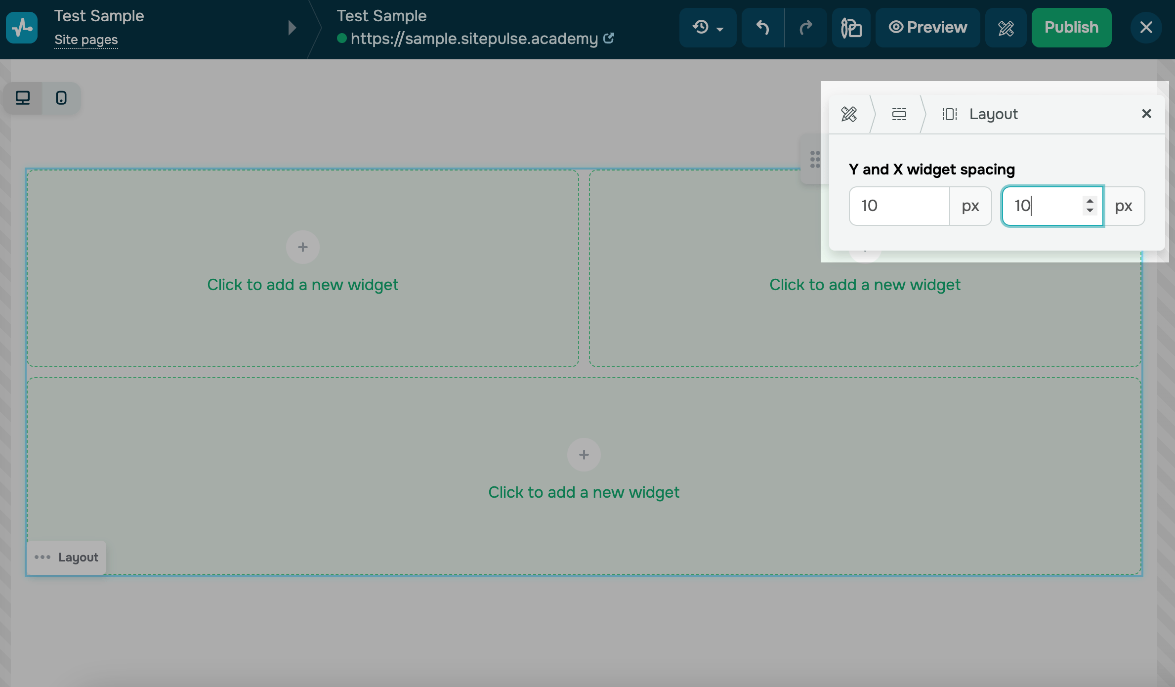
To space out segments, hover over your layout, click the three dots at the bottom, and select Edit. On the right, enter pixel values of the X-axis and Y-axis widget spacing.
Add a tabbed layout
A tabbed layout organizes content into multiple tabs within one section. This keeps long content compact and helps it fit on a single screen.
For example, an online store can split a product description into Specifications, Delivery, and Reviews tabs.
To add a tabbed layout, click + Add widget in a block, column, or section. Go to the Layout tab. Choose a tabbed layout option.
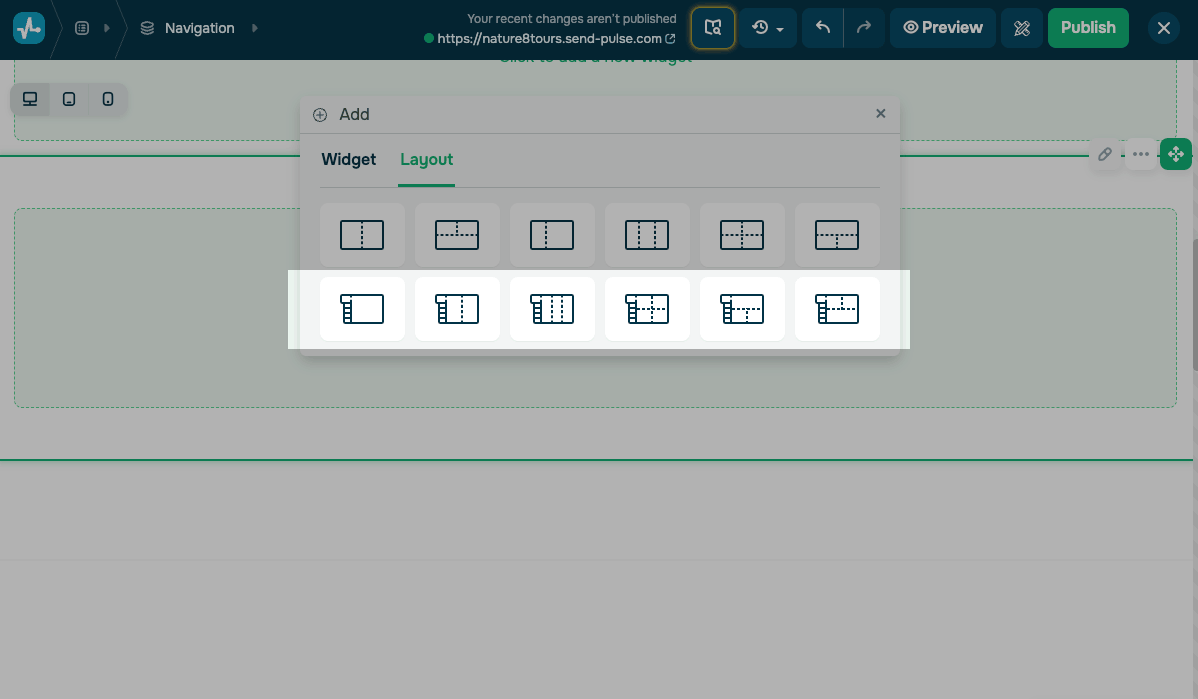
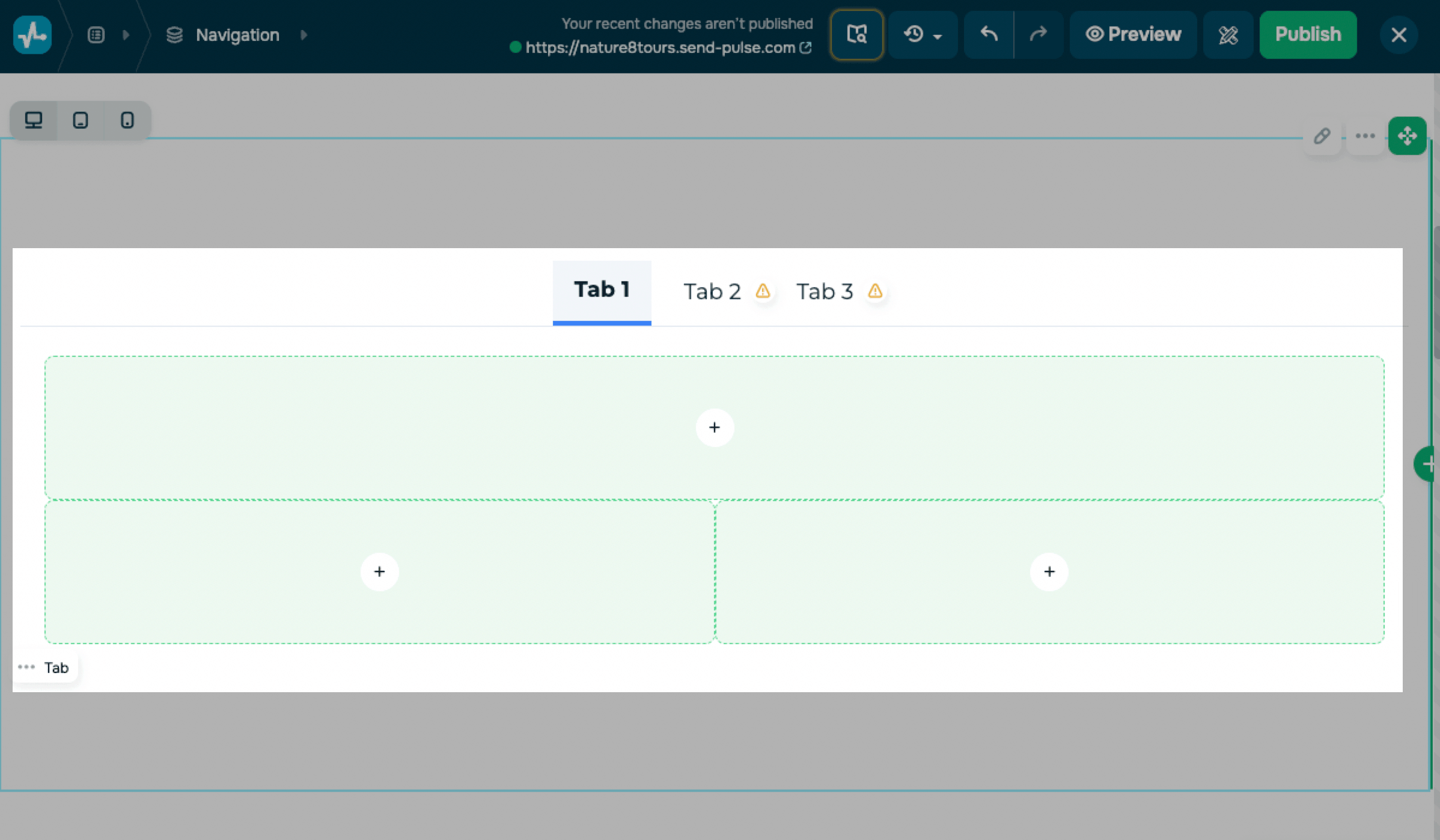
Tabs belong to the same page rather than separate pages. When a visitor clicks a tab name, the page shows the content of that tab and hides the others.
Each tab has its own content. The number of tabs and the segment layout depend on the option you selected.
To fill a tab, click its name, click + in a segment, and select a widget.
A warning icon marks tabs that have no content yet.
To customize your layout, hover over it and click the three dots. Select Edit.
Choose a tab placement
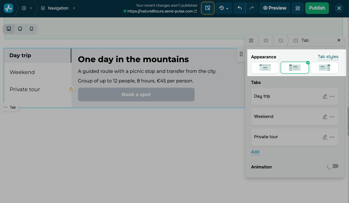
Tab names can sit above your content or beside it, depending on how much space your page has. By default, they sit above the content.
In the Appearance section, choose one of the following positions: above the content, to the left, or to the right.
Customize tab styles
To match the tabs to your website design, click Tab styles.
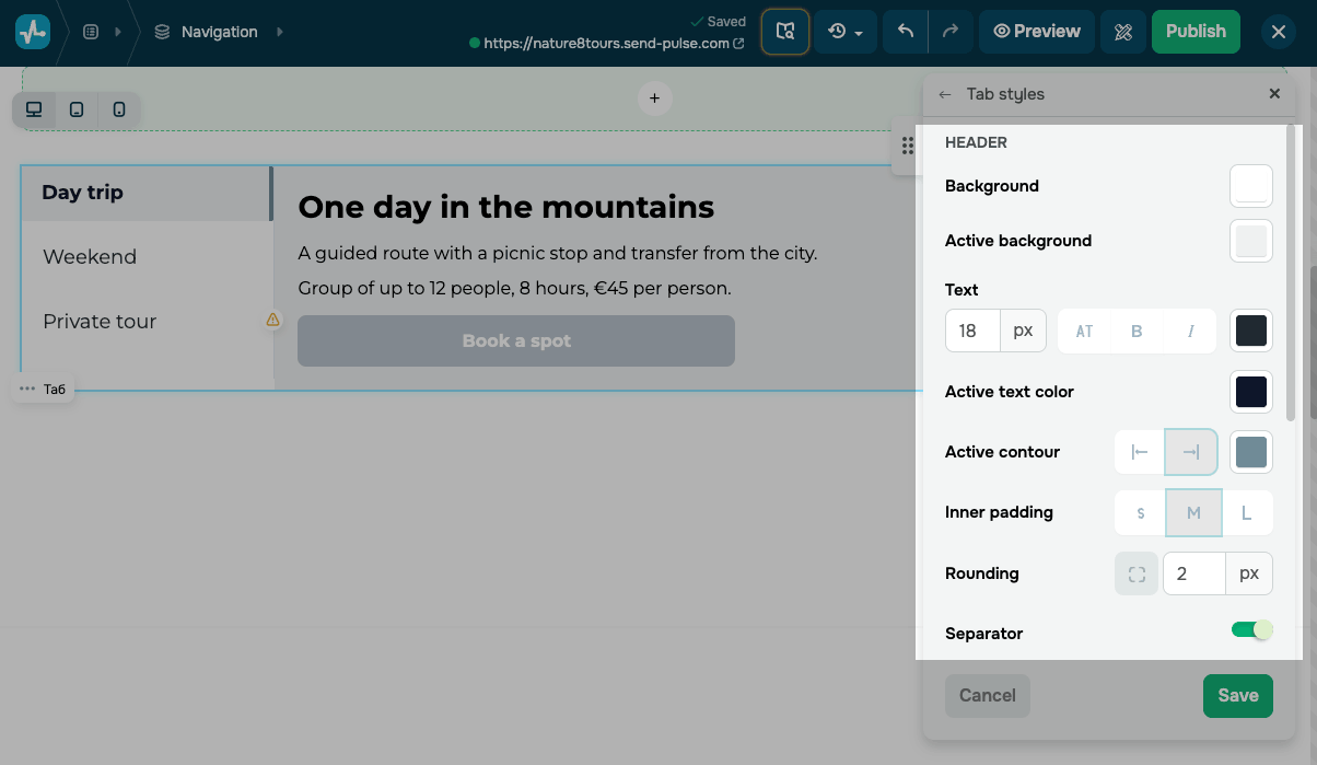
In the Header section, customize the appearance of your tab names.
The active tab is the one a visitor has opened. You can also highlight it and separate the header from the content:
| Active background | Sets the active tab’s background color. |
| Active text color | Sets the color of the active tab's name. |
| Active contour | Adds a line that highlights the active tab. Select its position and color. |
| Separator | Adds a dividing line. |
| Separator color | Sets a dividing line color. |
In the Content section, set the general appearance settings of the area that holds the widgets. In Gap between widgets, set the space between widgets inside that area, in pixels.
To apply your changes, click Save.
Manage tabs
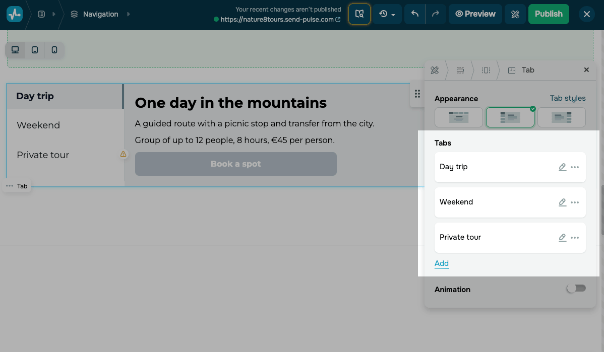
The Tabs section lists every tab you have added to the layout.
To rename a tab, click the pencil icon next to it. Enter a new name in the Text field, then click Save.
To copy or delete a tab, click the three dots next to it. Select Duplicate to add a copy with all the widgets of the original tab. Select Delete to remove the tab.
To rearrange tabs, drag a tab up or down by its handle on the left.
To add a new tab, click Add.
To add a smooth transition when a visitor switches tabs, turn on the Animation toggle. Then, choose an animation type, position, and speed.
To make the tabs available to visitors, click Publish. Visitors see one tab at a time and can open another by selecting its name.
 Last Updated: 18.07.2025


or