Website design guidelines
Website design is a powerful tool that helps achieve business goals, ensure a good user experience, and meet user needs. Every detail — from navigation ease to color combinations — affects how visitors perceive your website and whether it encourages them to take action: read, sign up, or place an order.
Let’s talk about how to create a design that balances aesthetics, functionality, and simplicity.
Common page elements
Here are the key elements typically found on website pages:
| Navigation/Menu | This is the first element visitors see. It affects how easily they can navigate your website. The menu should be visible and easy to use on both mobile and desktop devices. |
| First screen (call to action) | This element presents essential information to visitors at the top of the page. It motivates users to stay on the page and interact with your website. Usually, it includes an attention-grabbing image, a large headline that highlights a product and its benefits, and a clear CTA. |
| About us/Features/Solutions | This section introduces your company and its activities. It helps users understand what solutions you offer and why they should choose your products. Typically, it includes brief product descriptions, lists their benefits, and features visual content, such as images or videos, to make the information clearer and easier to grasp. |
| Pricing plans/Product catalog | This element shows pricing details, including available plans and packages. It's best to organize this information into cards or columns so that users can compare options with ease.
If you offer a free pricing plan, make sure to highlight it to grab attention. All pricing plans should feature descriptions of their benefits to help users understand how they differ from one another. |
| Testimonials | This element helps build trust using existing customers’ feedback. Whenever possible, include the reviewer’s name, photo, and social media links to ensure testimonial credibility. |
| FAQ | This element answers the most common questions about your product or company. It is usually designed as a dropdown list with questions and concise answers. |
| Footer | This element includes contact details, social media links, legal documents, and feedback forms. Footers often use contrasting backgrounds, distinct colors, or horizontal dividers to stand out from the primary content. |
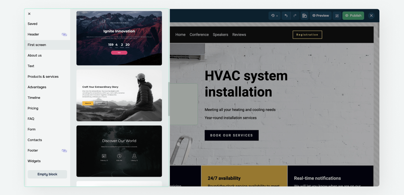
To create pages faster, use pre-made blocks. The gallery offers blocks categorized by type.
You can also select a pre-designed page template. Using the builder, you can replace images or text, remove elements, and adjust the overall style, including colors and fonts, to customize your template.
Layout design principles
Content blocks
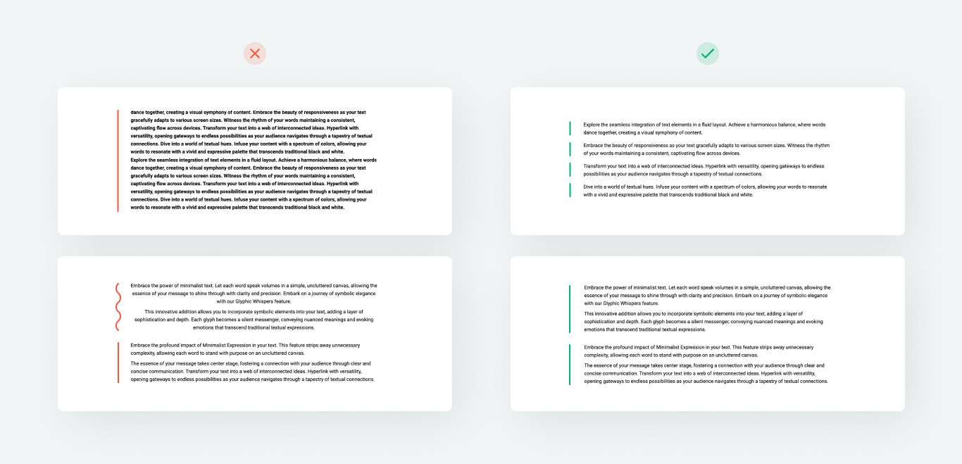
Organizing information into blocks makes it easier to understand. Use padding (120px–200px) and background colors to space out different sections.
Keep the spacing between content blocks consistent to maintain information hierarchy and a smooth flow. This will make your page text easier to scan and give it a more polished look.
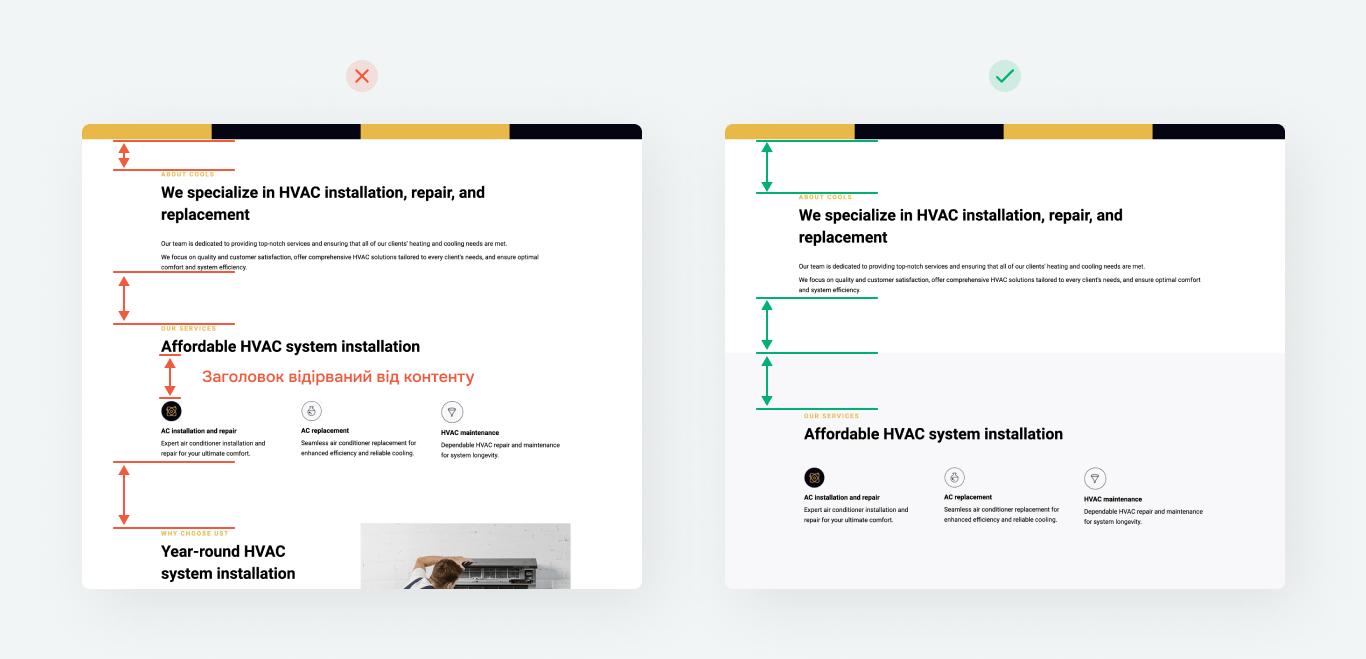
Add spacing to every element to enhance visual balance and readability. Well-placed spacing highlights major content blocks, reduces visual clutter, and creates a more harmonious design.
Follow the principle of proximity: related elements, such as headings, text, and buttons, should be grouped together. Apply larger spacing to separate unrelated element groups.
Grid-based layout
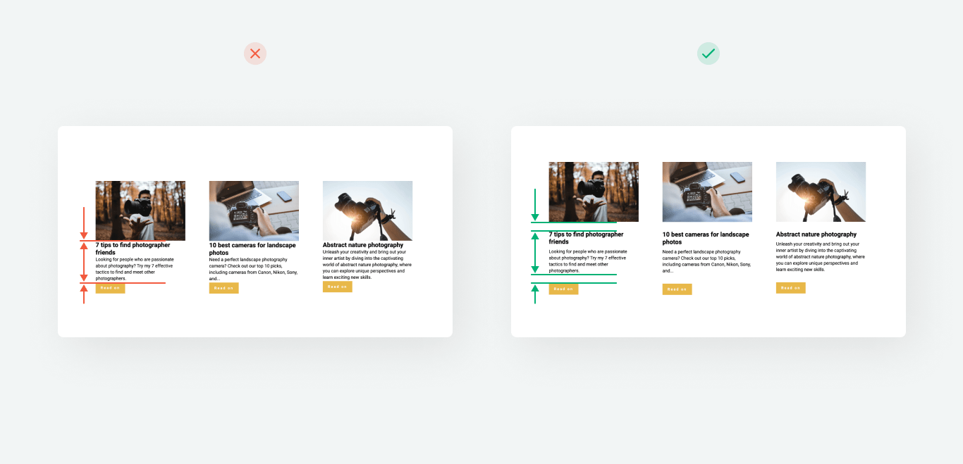
Aligning elements within a visual grid ensures a clear structure and creates a consistent flow of information. This makes your page design cleaner and helps users find what they need effortlessly.
Beyond that, grids also facilitate responsive design, ensure consistent element placement across all screen sizes, and deliver a seamless user experience.
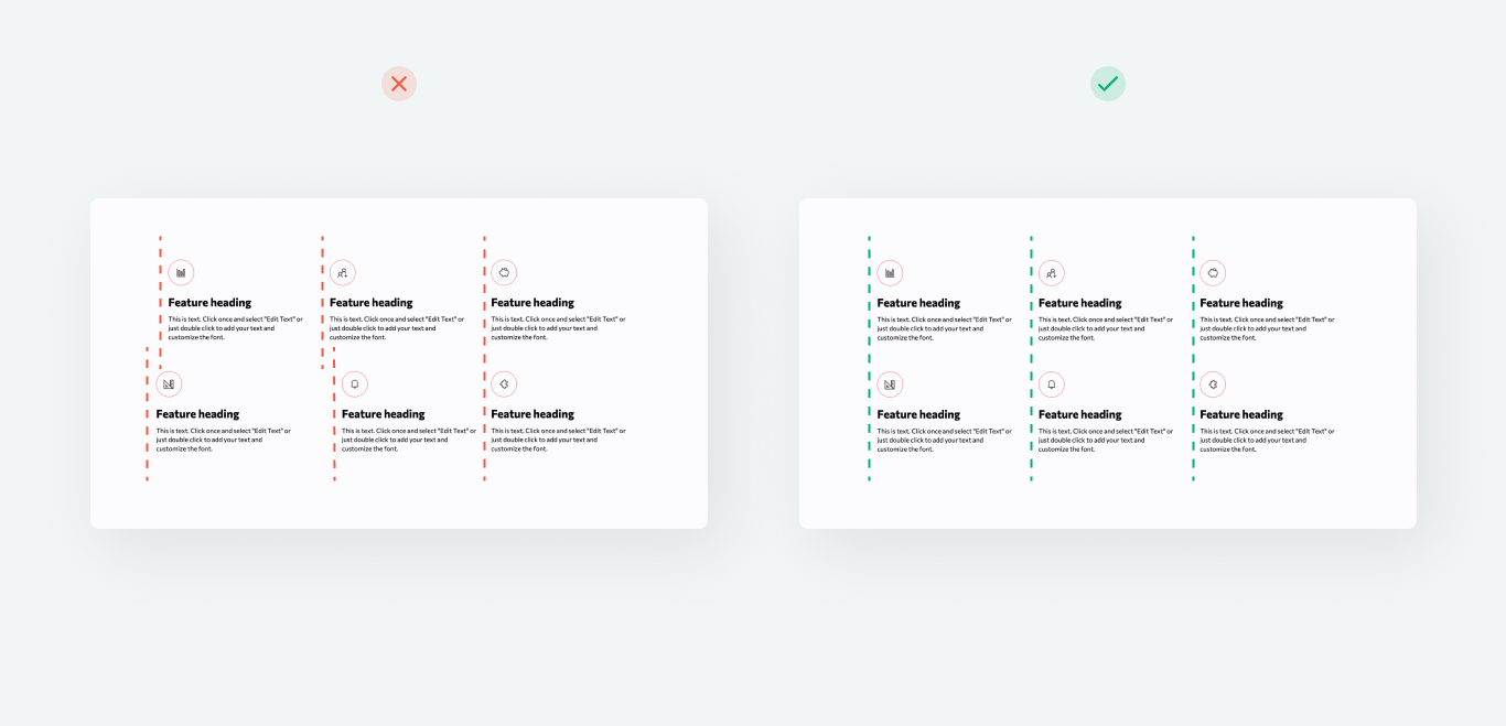
A grid-based layout ensures that similar elements are precisely aligned both horizontally and vertically. Neighboring blocks should have the same width and height, and buttons should be placed on the same line and maintain equal sizes.
To ensure balanced content distribution, factor in the length of text in headings and other blocks, image sizes, and element spacing.
Style consistency
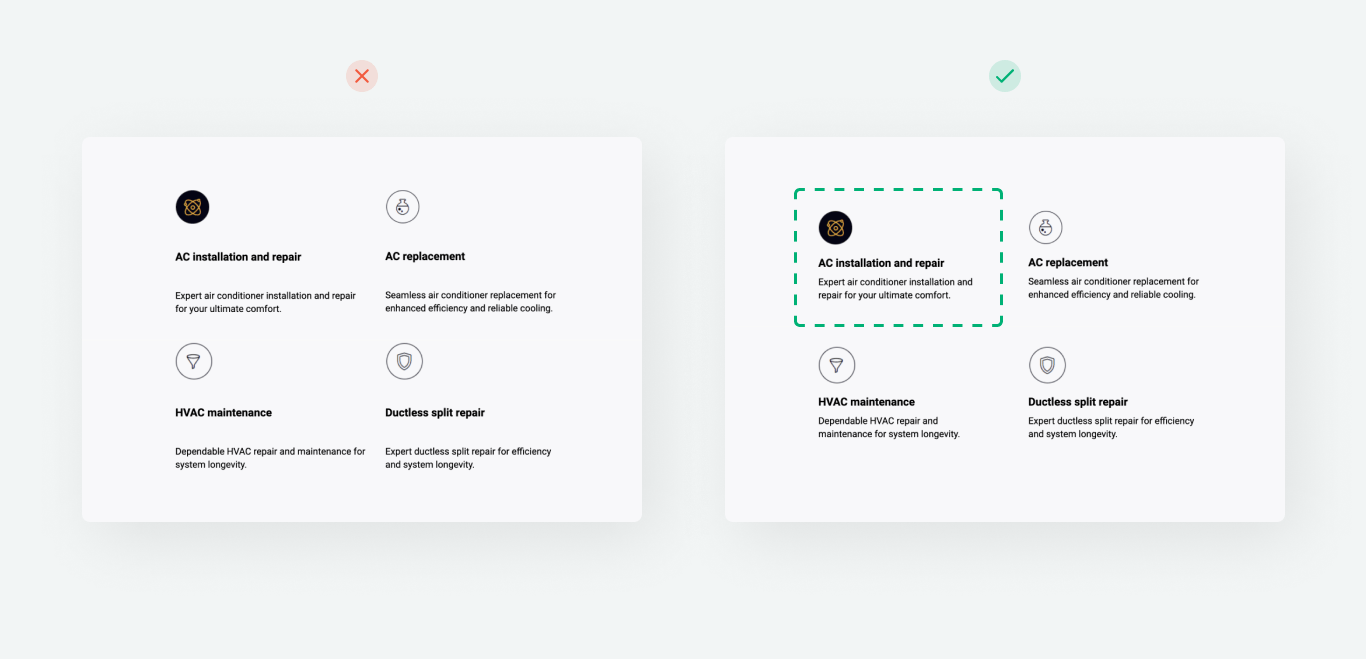
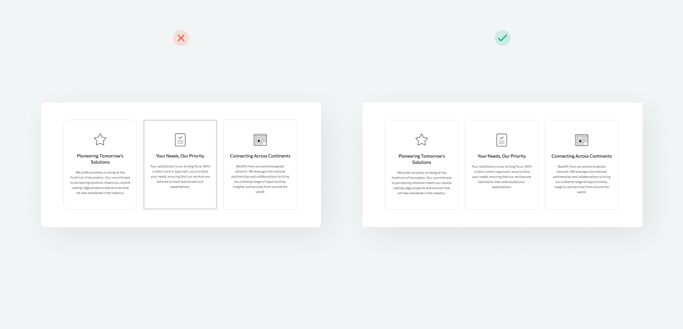
All adjacent elements (buttons, images, or blocks with outlines or shadows) should have a consistent style, including color, size, shape, and alignment. This rule applies only to elements with equal content value. For instance, on the pricing page, you can highlight one pricing plan using a more prominent outline or shadow.
Single out the purposes of your content blocks, categorize them, and create a consistent design for every category. To give you an idea, you can make all buttons 240 px wide and left-aligned, add a 5 px rounding, and apply no shadow or outline.
Content clarity and cohesion
Content cohesion is essential for effective design. Every page element should serve a clear purpose — whether to inform, persuade, evoke emotion, or prompt action. Present the information clearly so that visitors can quickly grasp your page's purpose and understand what to do next.
Clarity and a smooth page flow help shape a positive user experience. All parts of the page should work together to craft a cohesive story or guide users along a clear path. If an element doesn’t match the overall concept or goal, it’s better to revise or remove it.
Your page should answer major user questions within seconds: What is this company? What does it offer? What unique value does it provide? Steer clear of complex wording and unnecessary elements that may distract users. The easier it is to comprehend your page copy, the more likely users are to take action.
Element styling
Typography
Pick simple, minimalist fonts. Try to add no more than two or three fonts or select different styles from the same typeface for consistency. Prioritize fonts with high readability on screens of various sizes.
In website style settings, under the Text styles section, you can select and adjust fonts on your entire website, including font style, size, and line spacing. Use formatting thoughtfully and apply it only to highlight core elements. Overusing it can create visual clutter.
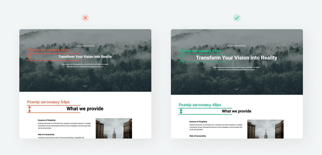
Follow the hierarchy principle when selecting font sizes. The more important the information, the larger its font size should be. Headings, for example, should be more noticeable than subheadings because they need to grab users’ attention. This helps website visitors quickly identify primary and secondary content.
Here’s an example of a clear text hierarchy:
H1: The main heading that grabs attention. It should be the largest, typically around 36 px.
H2: Headings that introduce their sections’ key messages. Recommended size: 34 px.
Lead text: Supplementary text that provides more context for H2. Recommended size: 22 px.
H3: Subheadings highlighting products and their benefits. Recommended size: 20 px.
Paragraph: Body text featuring more in-depth descriptions under H3 headings. Recommended size: 18 px.
Color
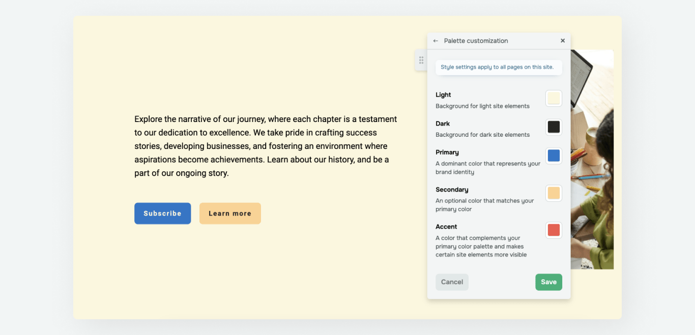
Settle on no more than 2 or 3 primary colors to maintain design coherence. This is enough to highlight your core elements. Pick colors that reflect your brand identity and work well together. Maintain a clear contrast between text and background to make your content accessible to users with low vision or color blindness.
For example, one color and its shades can be your primary color, while the second or third can be used as accents. Use accent colors to highlight major elements, such as call-to-action buttons or key phrases. Apply accent colors sparingly to maintain a clean and visually balanced design.
To make your design cohesive and consistent, use the same color scheme for all icons, menus, arrows, and other website elements.
Here are some color schemes that can help you achieve a well-balanced design:
| Monochromatic | Uses different shades, tones, and saturation of a single color. |
| Complementary | Uses opposite colors on the color wheel to create a strong contrast. |
| Analogous | Uses one primary color and two neighboring colors on the color wheel. |
| Triadic | Uses three equally spaced colors on the color wheel for balanced contrast. |
| Split complementary | Uses the primary color with two neighboring colors for a softer contrast. |
| Tetradic | Uses four colors that form a square or rectangle on the color wheel. |
In website style settings, under the Color palette section, you can select primary, secondary, and accent colors for your entire website.
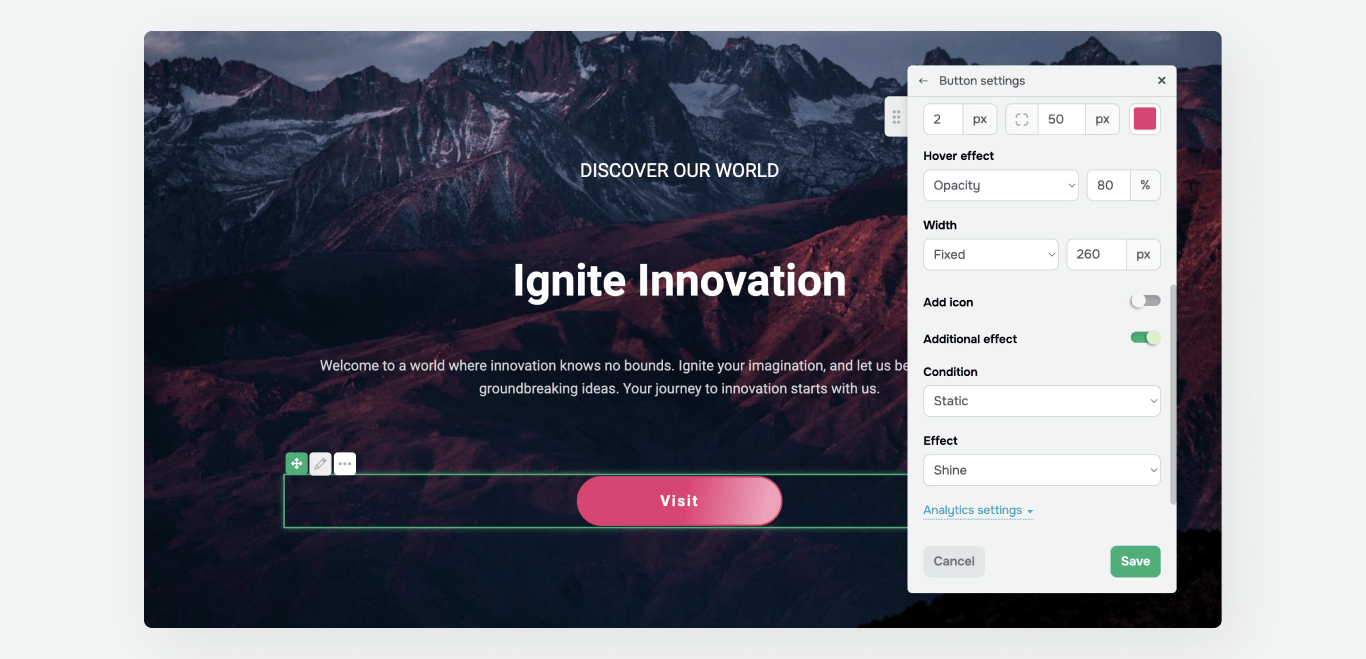
Buttons
Buttons can be used in Button, Course registration, Subscription form, Product, and Checkout elements.
Come up with different styles for primary and secondary buttons. The primary button should be bold and noticeable, while the secondary button should look more neutral. Ensure all buttons on your website follow a consistent style to align with the overall design.

In website style settings, under the Button styles section, you can customize the overall appearance of your buttons and add hover effects. If you want to make a specific button stand out, you can customize it individually and apply unique animation effects.
Button text should be short (2 or 3 words), meaningful, and clear. It should guide users on what action to take, like "Buy now," "Learn more," or "Download for free."
Text
Read about text style settings in the Typography section.
When you select a text type in a block, the corresponding font from your style settings will apply automatically. Use no more than three fonts and maintain consistency when applying them.
Break long texts into paragraphs. Add bullet points or numbering to format lists and make the text easier to read. Highlight essential elements with bold text and try not to overuse it.
Try not to mix multiple text alignments within the same block, as it may create visual clutter and confuse visitors. Align text either to the center or to the left.
If text is placed over an image, make sure it doesn't cover essential parts of the picture and maintains enough contrast. Add light text to dark backgrounds and dark text to light backgrounds. If needed, apply filters to images to increase text readability.

When adding text, be mindful of its length and the space it occupies. Suppose a single word spills onto a new line, or the text in one block takes up two lines while the adjacent block only takes one. It's already enough to create a design imbalance, which will make the layout appear messy and reduce your page's visual appeal.
You should also be mindful of the proportions between text and surrounding elements. If a button is too small or the text is too large and doesn't fit, it disrupts consistency. To avoid this, plan your text size and length beforehand, test different options, and ensure the design is responsive.
Follow these copywriting tips to craft an effective landing page:
Be concise. Use short sentences to avoid overwhelming users with unnecessary information.
Be specific. Write text that immediately answers the primary user question: "What will I get?"
Focus on needs and desires. Don’t just solve a problem — show how your product helps achieve a desired outcome: "Become an expert in 15 minutes a day."
Use social proof. Share concise success stories or facts that highlight your product's popularity or effectiveness: "Join 10,000 happy customers."
Spark curiosity. Instead of straightforward text, use questions or promises that encourage users to learn more: "Discover the secret to a perfect day."
Keep lists consistent. Ensure that all list items start with the same types of words (verbs, nouns, etc.) and elaborate on their headings’ ideas.
Avoid biased language. Focus on inclusivity in your writing. To give you an idea, instead of "For people over 30," use "For anyone who wants to create the perfect schedule."
Proofread and fact-check. Check for spelling, punctuation, and stylistic errors and verify all facts, data, and claims to create an impeccable first impression and build user trust.
Images
Images can be used in the Image, Menu, Gallery, and Product elements.
Use high-quality images that look sharp on high-resolution screens (Retina displays). This will make your website appear more sleek and appealing. All SendPulse-powered websites have an automated image optimization system to ensure your pictures always look their best.

Add only licensed or original images. This is not only ethical but also helps you avoid potential legal issues. On top of that, take the time to optimize your images — this will help them load quickly without sacrificing quality, benefit users with slower internet speeds, and boost your SEO performance.
When planning your design, keep the page concept in mind and choose image sizes and proportions based on their purposes. Let's say an image takes up an entire block. In this case, it should be large enough to enhance the text and act as its visual extension. These types of images typically work best as background elements.
Follow this checklist to get the most out of your images:
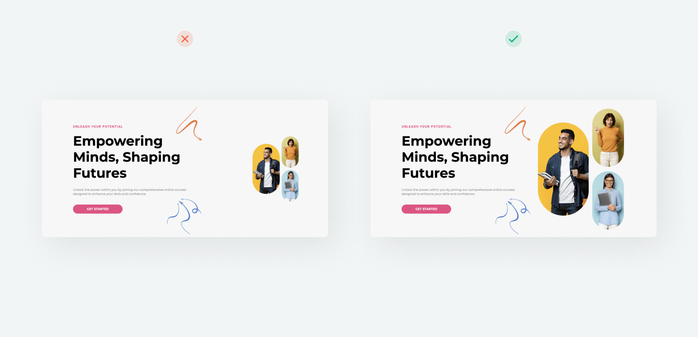
Match content. Images should be relevant to your page content and complement the text, not distract you from it.
Be consistent. Ensure all images on your website have a single style (color palette, filters, composition) to create a cohesive look.
Keep it simple. Avoid clutter and embrace minimalism to help articulate your messages more effectively.
Highlight the product. If your website sells products or services, make sure your images clearly showcase them from different angles.
Add hero images. Add large, impactful images to the main screen or key sections to create a strong first impression and set your page’s tone.
Focus on accessibility. Add text descriptions (alt attributes) to images to make them accessible for users with low vision and drive SEO performance.
Avoid stock clichés. Skip overly generic stock photos that look unoriginal. Instead, use unique content or custom illustrations.
Test for responsiveness. Ensure images appear correctly on different screens and devices without distortion or cropping.
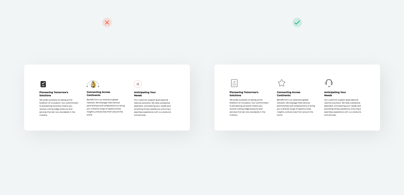
Icons
Ensure that all icons on your website follow a consistent style. They should align with the chosen design (such as linear, flat, or 3D) and use colors that complement your brand palette or your website’s accent color.
Standardize icon sizes so that they are large enough to remain visible but not too large to clutter your page. Common sizes for web design are 24×24 px or 48×48 px, depending on the style and purpose.
It’s best to use SVG files as icons and logos. They maintain high image clarity across all devices and screens while keeping file sizes small to reduce load times. SVG files can also be scaled without losing quality, making them perfect for web design.
As for 3D images, GIF animations, and emoji, avoiding them is a good idea most of the time since they tend to overload the design and distract users from the main content. Needless to say, these elements often clash with contemporary design principles, which may reduce the perceived quality of your website.
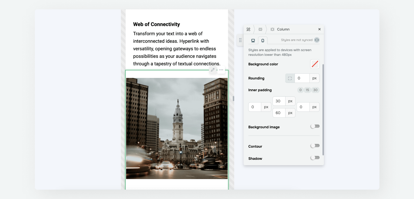
Mobile display
Keep in mind how your website appears on mobile and tablet devices. Most users visit websites from mobile devices, so responsive design is now a standard. All SendPulse-powered websites are responsive and customizable, meaning that you can adjust text sizes, spacing, and colors to suit your needs.
Hide secondary blocks to minimize information overload and boost loading speed on mobile devices.

Make sure that elements don’t overlap in your mobile website version for a clean, user-friendly layout.
Last Updated: 10.01.2025
or