Email Template Size
You must take the email template size into account when creating a campaign. We create campaigns for our subscribers, that's why they should meet their needs. People use different email clients; they have different devices, not to speak of internet speed. So, we should follow the most optimal and already tested practices.

Email Template Width
The most optimal email template width is considered to be 600 pixels. You may know that screen resolutions today allow more, but your emails will never be displayed on the entire screen. The display box in different email service providers varies. Besides, have you ever used horizontal scroll bars to read the email? It doesn't matter how much your subscribers look forward to reading from you. They won't spend even a couple of minutes on scrolling your email. So, the optimal width is 600 pixels.
Email Template Height
There are no standards regarding the email template height, just a few tips:
- The shorter your email is — the more chances that subscribers will read it up to the end.
- Place essential information and offers above the fold. Otherwise, a recipient won't scroll down, looking for something more interesting.
Image Size and Format
The quality of your images influences the email significantly, as recipients pay attention to them first. To have more chances for an image to be displayed, keep its size less than 1 Mb. Otherwise, they will load too slowly. Use PNG format for images, because JPG and JPEG formats usually harm the image quality.
Mobile-Friendly Email
We have already mentioned that the most optimal email template width is 600 px. Why? About ten years ago, it was 800 px, but a lot of things have changed. Marketers often use two columns while designing an email, as they give better chances to deliver more information. So, if your email has two columns — 400 px each and the recipients will open the email on mobile phones, they will have to use horizontal scroll bars, which are incredibly uncomfortable. That's why a 600 px width is a good practice since there will be no need to scroll left and right.
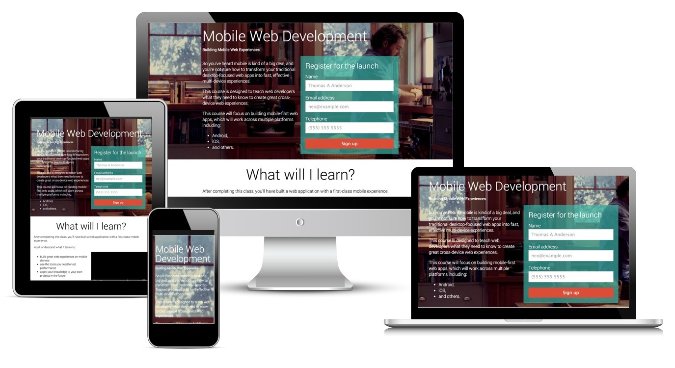
Mobile-friendly design is usually called responsive design. If you send emails from a marketing service, you don't have to worry about email template size since these platforms use the standard format by default.
Let's create responsive emails!
Create responsive emails with SendPulse drag and drop editor. You don't even have to code. All the templates are mobile-friendly by default.
How to Create Emails that Fit Perfectly on Desktops and Mobile Devices
All the email templates created in SendPulse are responsive. It means that every email designed in our drag-and-drop editor and existing email templates look perfect both on desktops and on mobile devices with the smallest screen resolution. Their design is adaptive, and you don't have to worry about email template size.
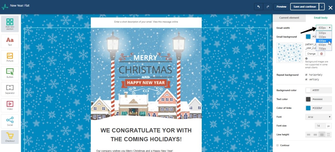
Despite this fact, you can change the email's width.
How to Create a Responsive Email Template
Use a free email editor!
Creating an email campaign in SendPulse is easy and takes 3 automates steps.
At the 2nd stage, choose an existing email template or create your own with a layout template editor. Then, you will see the option «Email width» on the right of your working field. You have five variants. The default email width is 600 pixels.

This is the way to create a responsive email for free.
Register in SendPulse and create a responsive email right now!
Last Updated: 22.02.2023
or