A responsive email is an email that looks good on any deviсe, whether it’s a desktop, tablet, or mobile phone. The email automatically adapts to all screen resolutions, allowing subscribers to read emails on the go with convenience and meeting a modern demand in mobile presence.
In this video, Ana Hoffman offers simple tips to create traffic-driving mobile-friendly emails.
Why is responsive email important?
40.22% of all emails are read on mobile devices. Moreover, 75% of users claim they will delete an email if they can’t read it from their smartphones. A lack of usability caused by the absence of responsive design is a crucial factor for unsubscribing and marking emails as spam. In its turn, it damages sender reputation and email deliverability.
Without a responsive design, your emails are difficult to read on a mobile device, making the user scroll, zoom in and out — which is simply annoying.
Choosing a professional marketing service shouldn't be an afterthought. It makes creating emails less of a headache.
Go responsive with SendPulse!
Use our pre-designed email templates that look perfect across all devices or create your own with our functional editor. They're all responsive and free.
How to create a responsive email?
With SendPulse's drag-and-drop editor, it’s easy. You don’t need to worry about the responsive design of your emails since all templates created with SendPulse are responsive by default.
Before you launch your email campaign, preview how your email template will look on a desktop and mobile phone.
If you are keen on coding, you can create emails with SendPulse's HTML-editor. Before you read an instruction on how to create responsive emails, check out some examples and best practices first.
Responsive Email Examples
Billabong. This is an excellent example of a responsive email that promotes clothing, because, viewed on mobile, the text and CTA are distinct, and images get smaller to fit a smaller screen.
Desktop view
Mobile view
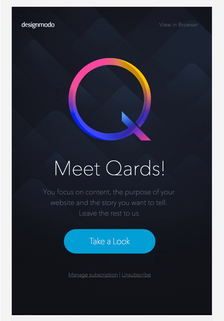
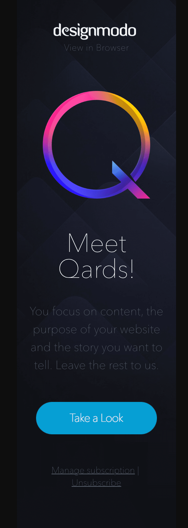
Designmodo. In this responsive email, the fonts and alignments change on a mobile phone, so the recipients can smoothly travel down to the CTA at the bottom of the email.
Desktop view
Mobile view
AdiInvite. In the mobile version of this email, the combination of pieces of text, images, and CTAs moves to a single column system to ensure convenient visual perception for the reader.
Desktop view
Mobile view
Responsive Email Tips and Best Practices
- Stick to a single-column layout. This simplifies your responsive email design, making it easier to digest the information on the smaller screens of tablets and smartphones.
- Build a logical content hierarchy. Place essential information first, because a single-column design makes the template longer, narrowing the view for the recipients. When you place the most important details at the bottom, getting your message across to the audience is at risk.
- Choose the appropriate font size. Keep the regular body text around 14-16px, and the headlines from 22-24px, making the email copy clear across all devices.
- Make a CTA easy to tap. Create a CTA that contrasts with the background, and ensure its size is at least 44*44px. While creating your email template, select “the full width” to leave more space for tapping a CTA button on mobile devices.
- Use responsive images. If you work in an HTML-editor, add class=“img-fluid” attribute to an <image> tag. In the drag-and-drop editor, all images are responsive by default.
Read our blog article here to get a bigger picture of email optimization for mobile devices.
FAQ
? Can I send responsive emails via SendPulse?
Yes. All emails sent with SendPulse are responsive by default, so register and take advantage of 15,000 emails to 500 subscribers monthly at no charge.
? Why should I optimize emails for mobile devices?
Because over half of all emails are checked from smartphones and tablets. If your emails are not mobile-optimized, users will unsubscribe from your campaigns or even mark them as spam.
? How much does it cost to create a responsive email?
Whether you create templates with SendPulse’s drag and drop editor, use pre-designed templates, or get other companies’ emails as templates with our Chrome extension — they’ll be responsive and free. Register with SendPulse and give it a try.

or