Back in 2010, Google CEO Eric Schmidt claimed that their goal from that time on was to “…make mobile the answer to pretty much everything.” This statement has become more than prophecy. Today, to be closer to your audience and provide the best experience possible, you should focus on mobile first. In this article, we’ve prepared plenty of useful hacks for you to understand how to optimize your emails for mobile, so read on.
Why you should focus on mobile
In 2017, the number of mobile digital minutes reached 61.9%, which is impressive compared to 29.3% for desktop and just 8.8% for tablet. In 2018, mobile consumption numbers are still the highest, as you can see in the graph below:
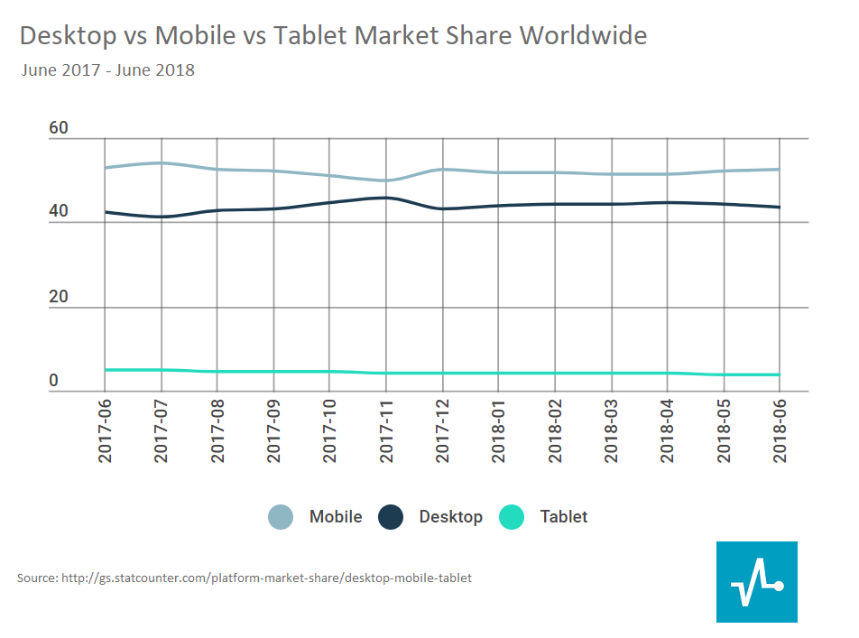
Moreover, mobile users tend to spend more time online, in particular, two times longer than desktop users. For over half of them, every morning starts with a smartphone in their hands, and, according to Express Pigeon, 91% of these users check email at least once a day. To reach the wider audience, look at some tips how to optimize your emails for mobile devices.
Email marketing starts with people who visit your website. At this stage, your goal is to shift visitors’ focus right to the opt-in form, drive interest and motivate them to subscribe.
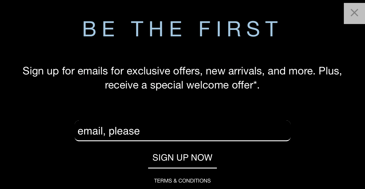
The best way to create a mobile-friendly subscription form is to decrease the number of fields in it, use large enough fonts, and locate the form itself in a visible place. You can also use input type=”email”, making a special keyboard with characters like “@” or “.” or user’s email address automatically pop up on a mobile device.
Check out the mobile view of the GAP’s subscription form. It is short, visible, and in line with the brand’s overall design. What is more, it brings value as the brand promises a special welcome offer for new subscribers.
Shorten your subject line
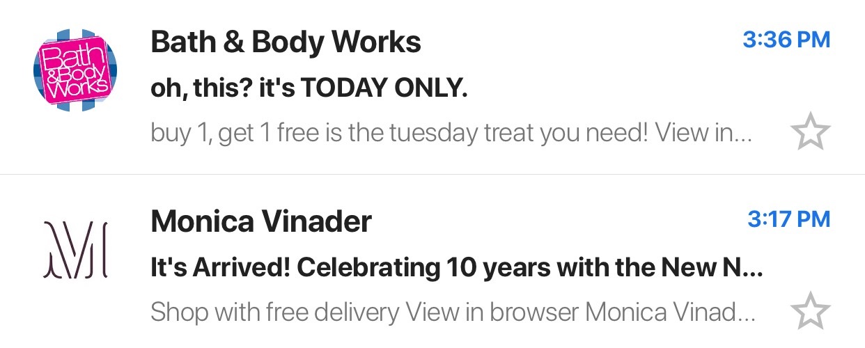
The number of characters displayed in subject lines by different email clients varies, but the rule of thumb is to keep it to around 25-30 characters.
Below you can see some good examples of emails, where the subject lines summarize email content and are fully viewable on mobile screen.

24% of people look at the preview text while deciding whether to open an email or not; that’s why you should put some efforts into writing your preheaders. Just like subject lines, preview texts are limited in the number of characters displayed depending on the email client.
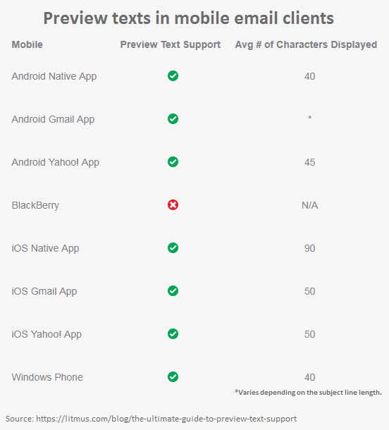
Always focus more on the first words of your preheader as this is the part that will be displayed on every device by every email client.
Use preview text to provide more details about the email content. For example, in promotional emails, you can elaborate on delivery or specify the conditions of the promo.
Make fonts big enough
Your text should be readable on any device. For that purpose, strike a balance between the font size of the title and the text. Say, choose 22-24pt for the title and 14-16pt for the text, but don’t go lower than 14pt. As to the font types, it is better to use web safe fonts — Arial, Tahoma, Times New Roman, Courier New — as all email clients support them.
Think of using contrasting colors in your email to make it visible in the sunlight or on the screen with lowered brightness.
Look at the example from Tentree: you can see contrast between white font and green background and a combination of analogous shades of green. An exclusive offer of free shipping is highlighted in blue.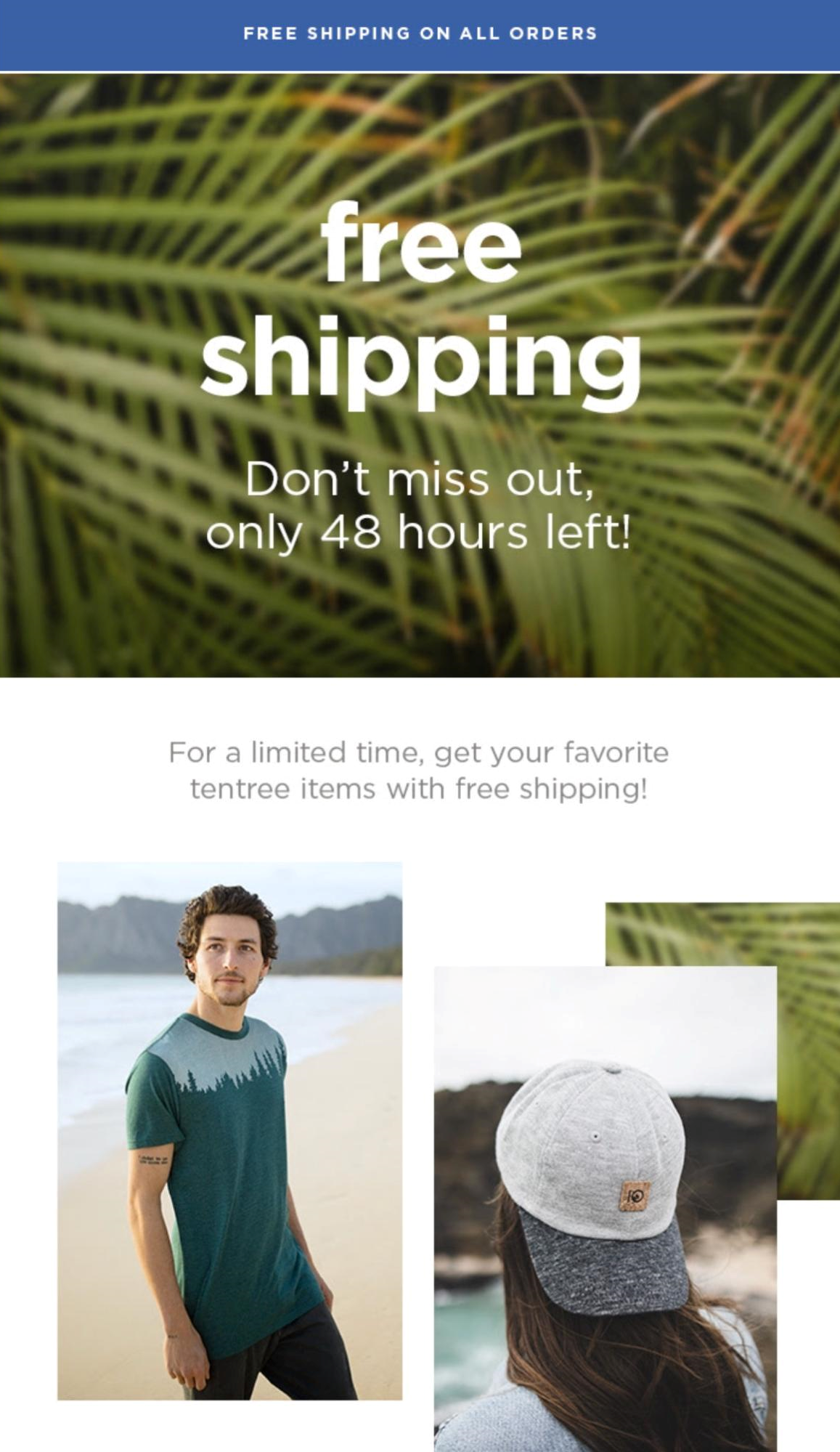
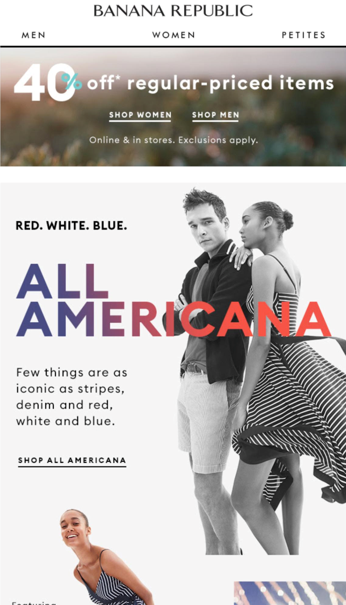
Another idea is a mix of bright colors with black and white as in the email from the Banana Republic.
Work on your call to action
75% of people use only their thumb to touch the screen; less than 50% hold their phone with one hand, 36% of users cradle their phone, and 10% of people hold their phone in one hand and tap with a finger of the other hand. Consider this data while choosing a place for your call to action (CTA) button.
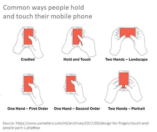
If there are several CTAs, define their priority and place them according to the principle “the main CTA is bigger and higher.” The size of the button should be at least 44×44px with enough free space around it — this ensures that the reader clicks it easily with just one thumb. Try to avoid too many hypertext links in the copy as they can appear not comfortable to click on.
The above-mentioned email from Tentree has a visible easy-to-click CTA button with enough white space around.

Mind the size of visual elements
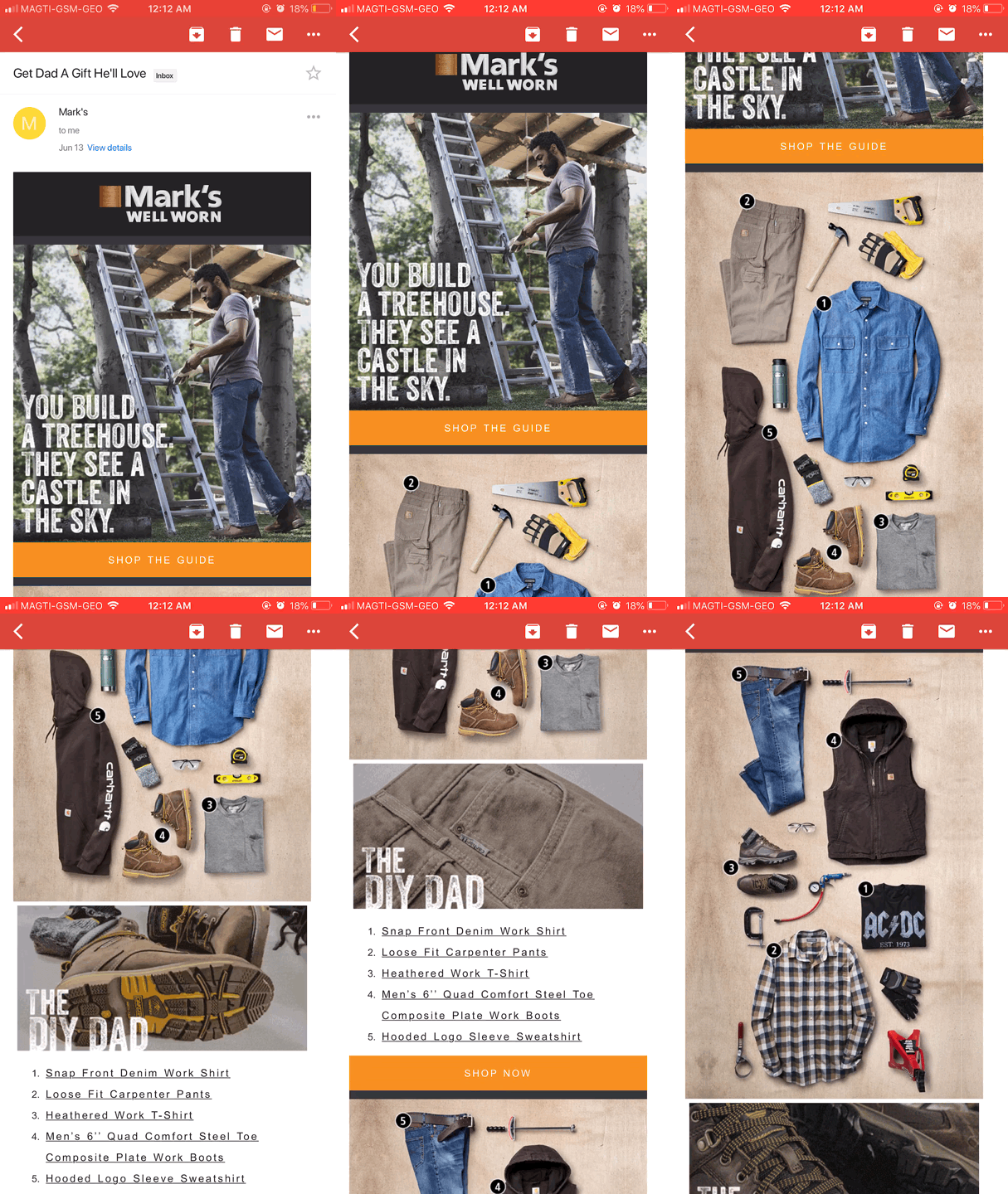
Mobile devices load images and photos much slower than desktop. Visuals always make an email harder to load, so their size should not be more than 599px. Remember about quality — the readers will hardly favor blurry and pixelated images. Test emails with GIFs in all possible email clients to make sure they are displayed correctly and your email doesn’t end up in the spam folder.
Below you can see an example from Mark’s: their emails are rich with GIFs and images, but they don’t take long to load.
Besides don’t forget to add ALT-text to all the visuals because some email clients may automatically block pictures.
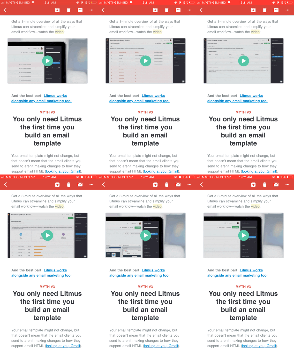
As for video content, you can use GIFs or simple images with a play button as a thumbnail and lead users to a web page where they can watch this video. See an example from Litmus: they use a GIF resuming the video overview with a play button on it.
Make the most out of responsive design
As an email marketer, you should jump in feet first into creating responsive email design to build flawless emails. Responsive means that your email will be displayed correctly on mobile devices, tablets, and desktops as its layout width and structure change in real time depending on the device screen size and browser.
SendPulse ready-made templates simplify navigation for users and make it easy for the marketers to create an optimized email. Just choose a template, change it any way you want, and send it out to your mailing list. It will be automatically adjusted to desktop, mobile and tablet screens. Comfy, isn’t it?
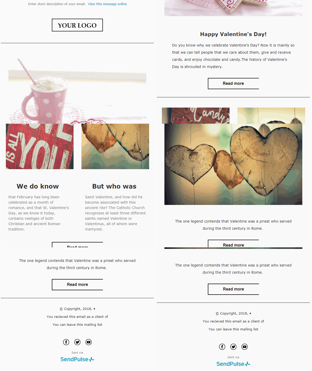
See how one of the SendPulse templates looks on the desktop: images are large, every button is easy-to find and click, the fonts are readable.
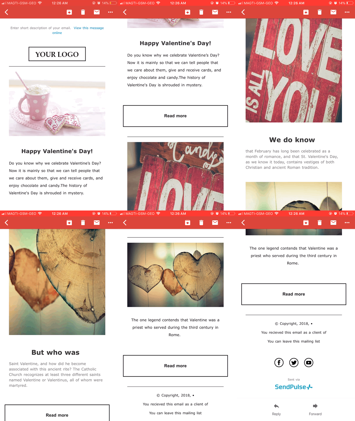
Each element is optimized for mobile: in mobile version, the main text is large enough and the buttons are of the right size to be clicked on with a thumb.
Summing it up
Let’s resume the tips you can use to optimize your emails for mobile users:
- Start with mobile-friendly sign-up forms;
- Go for short and informative subject lines and previews;
- Use readable safe web fonts;
- Keep your CTA buttons big and clear;
- Check if all visual elements look great on mobile;
- Use responsive layouts.