Create responsive emails in the SendPulse template builder
A responsive layout allows an email to adjust to smartphone screens in the mobile email applications automatically. This makes it much more convenient to reach buttons and read text. This gives mobile users a seamless experience and attracts them to your campaigns from both desktop and mobile.
Our service automatically adapts emails for display in mobile applications — no additional settings need to be specified.
The drag and drop editor uses adaptive layout elements — using media requests, styles are set for certain screen sizes and using fluid layout elements, the width of the blocks is proportionally stretched to the width of the screen.
Let's look at what you need to consider when creating an email template to help you avoid some common mistakes.
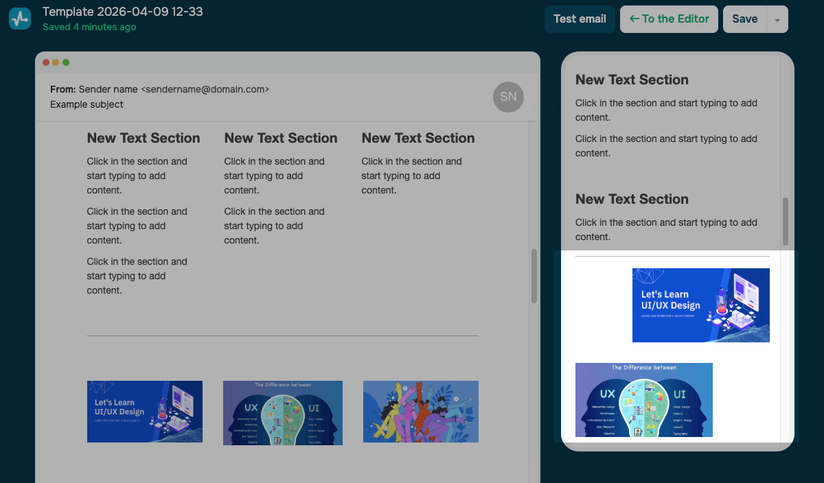
Structures
Table rows and cells are formed from the designer elements in the template, and it is important to choose the correct structure of blocks so that they line up correctly for mobile users.
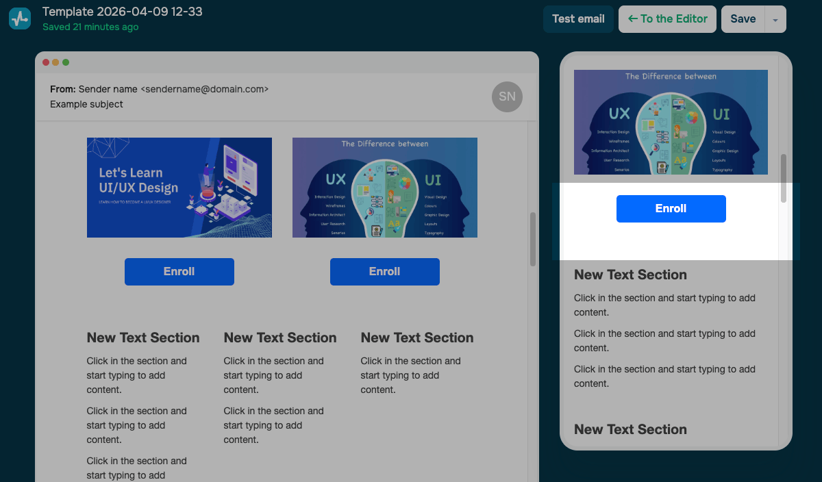
If you have a template with several columns, for example, a product card, these columns will be displayed in turn.
To avoid display issues, you need to consider the structure and add all the elements of the product card to one cell.
Select the required number of columns in the Add new section element.
Then, in the selected cell, drag the elements Picture, Text, and Button in the order you need.
Then the elements in the mobile layout will have the same format.
Fixed block width
Fixed element width is not used on mobile devices, it is replaced with a relative value — 100% of the screen width. Therefore, pictures, text, and other blocks will be stretched to the full width of the screen, taking into account the padding.
Fixed block height
Block height is often used to align the size of two adjacent elements. In a mobile layout, the height of the blocks remains fixed. And the chosen height of the blocks can turn into a large empty space.
We recommend you make sure that parallel blocks of information are the same size in both versions. Use pictures of the same size and insert text that is the same length as the block's message.
Alignment
Use a combination of alignment and padding to improve the display of your emails on mobile devices.
If you forget to set the element's alignment to the center, the picture will be left justified by default.
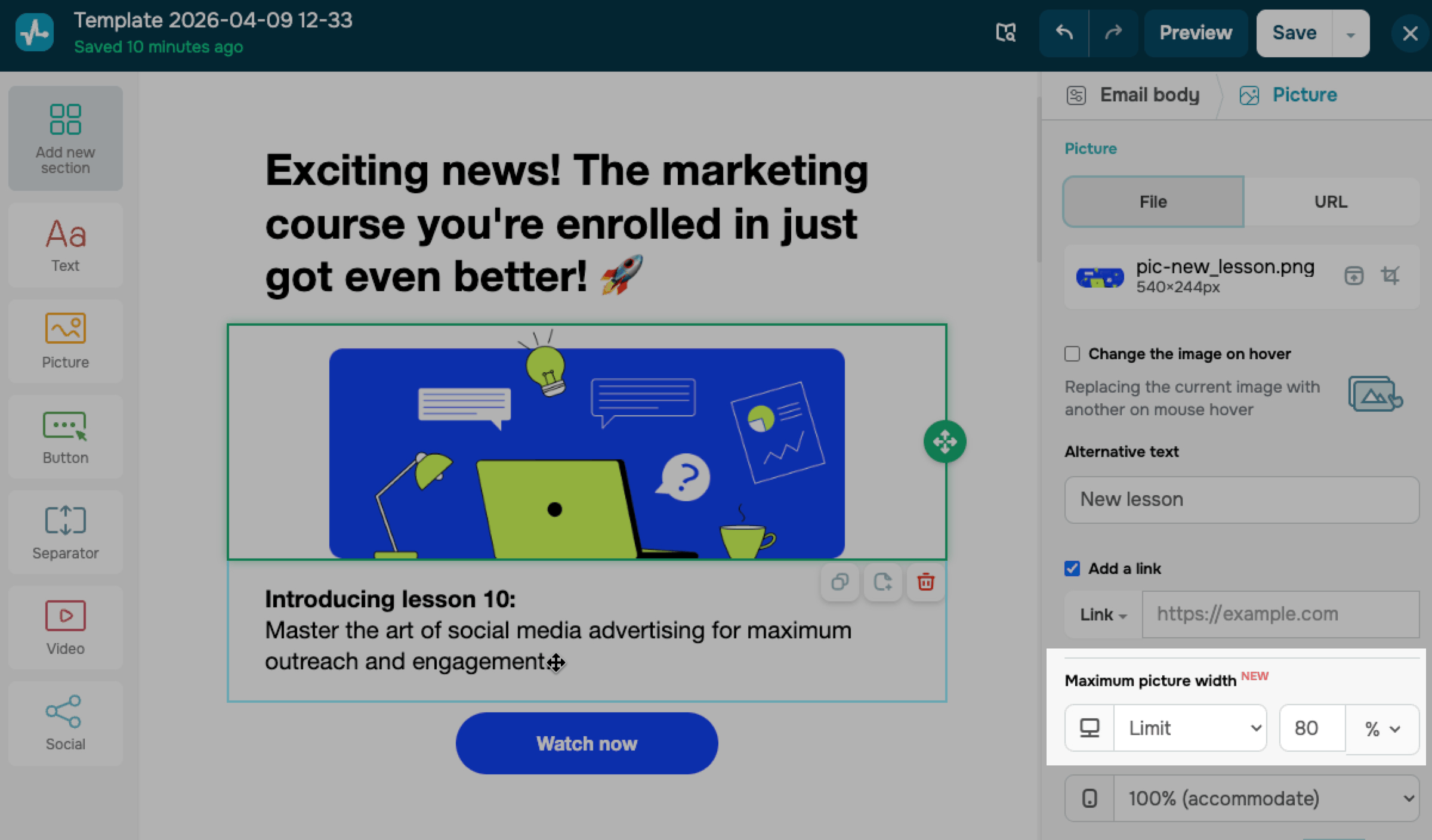
Pictures
We recommend you upload images of the required size.
The recommended width of the entire email for the desktop version is 600px; it is recommended to use 300px for mobile devices. The value may vary depending on the screen size.
Images that were less than 100% will not stretch and will stay within their actual dimensions. An icon with a real image size of 20px will stay 20px on a mobile phone.
The parameters for changing the width in the block editing field will stop working for the mobile layout — the picture will be displayed at 100% of the screen width. In this case, the height will increase proportionally.
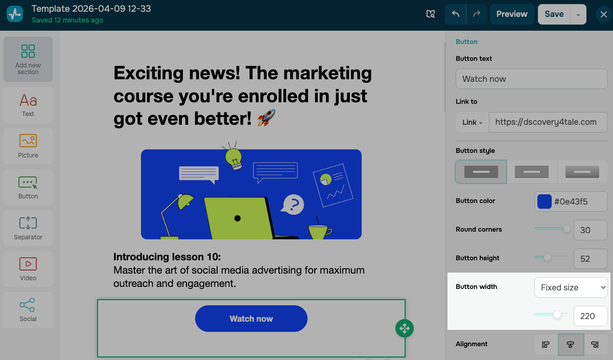
Buttons
The constructor has the following parameters for setting the button size:
| The full width | Will stretch automatically proportionally to the full width of the block, taking into account padding |
| Fixed size | Used mainly for small-width buttons. You can set your size up to 300px. For correct display on mobile, it is recommended to do no more than 270px, taking into account the padding on the left and right. |
Padding
For mobile displays, all padding is automatically changed to 15px.
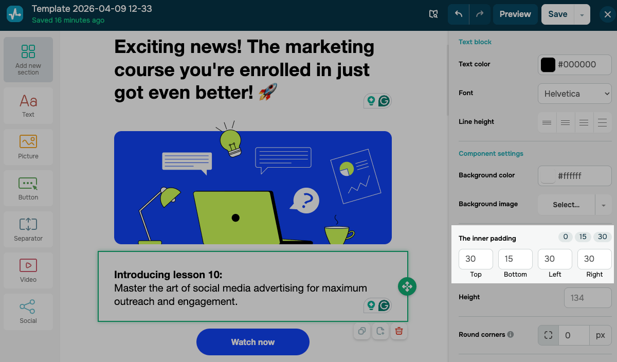
If you need to add top padding of more than 15px between blocks on a mobile layout, use the Separator element.
Zero-value padding will remain unchanged. For example, a picture adjacent to the edges of the block and on a mobile phone will be adjacent without padding.
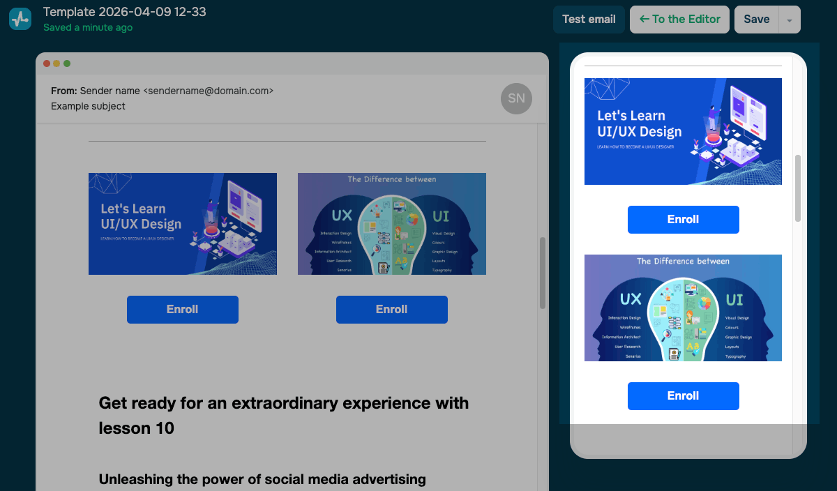
See the example below. It may seem that there is padding after the Button element, but in fact, it is determined by the height of the right block with the picture.
Therefore, we recommend using padding and the Preview function before sending an email.
This way, you can always check how your email will look in mobile applications that support responsive layouts.
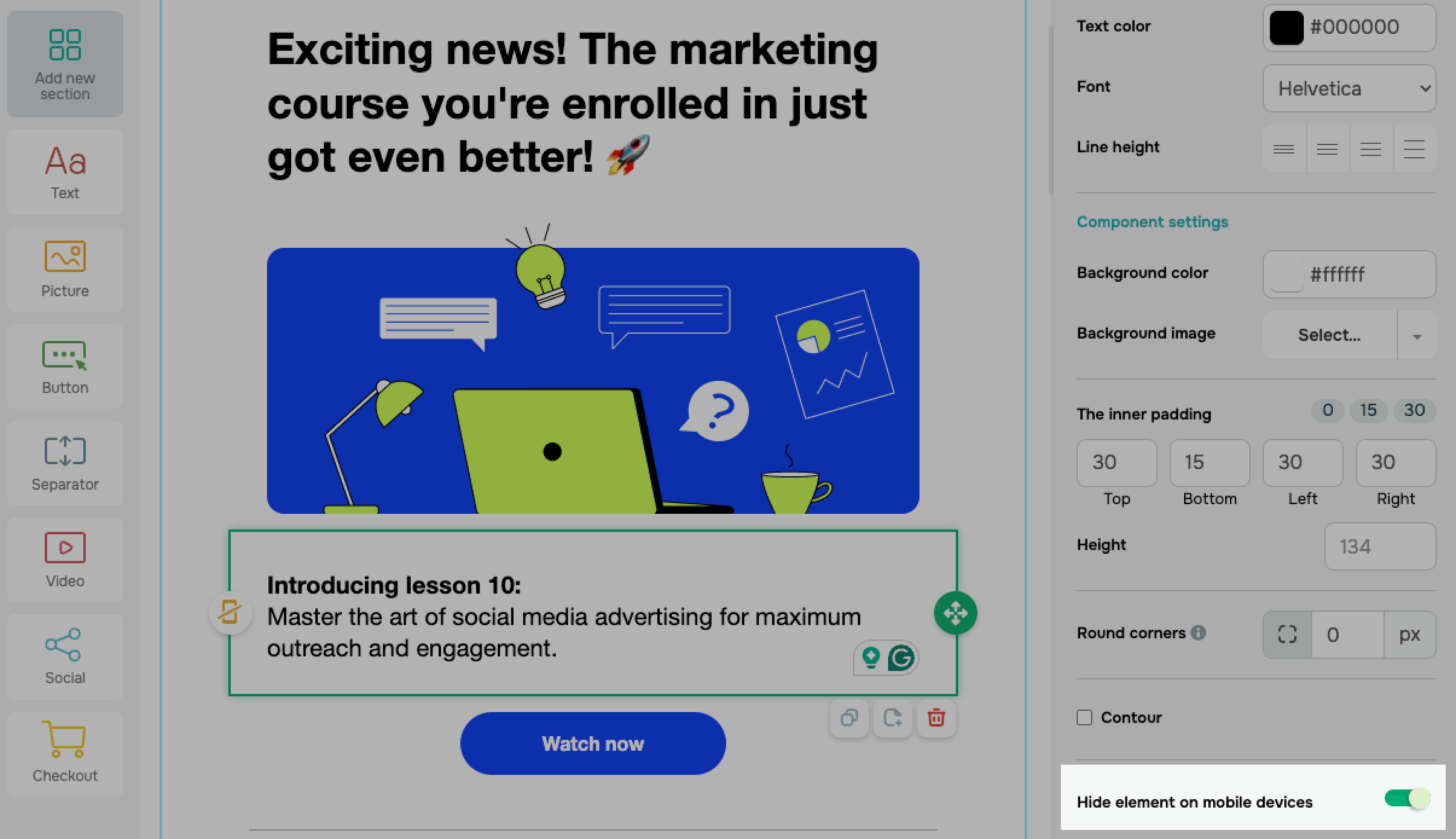
Hide elements on mobile devices
You can also hide elements for users on mobile devices.
To do this, select an element and activate the Hide element on mobile devices option in the settings on the right.
This option does not work for all email services. For example, it works for gmail.com but may not work on other services.
Last Updated: 05.12.2023
or