How to create a website
You can create a single-page or multi-page website with a well-thought-out user-friendly design using a visual website builder — no coding skills are required. Choose and customize premade templates that suit your business, or create your own from scratch.
With our website builder, you only need to select an element, drag it to the workspace, and customize its style to fit your business tasks. In addition to text and visual content, you can add payment options, subscription forms, and image galleries and include links to your social media profiles or blog to attract and convert visitors into customers.
To create a website, go to the Websites section, and click Create website. Select Website.
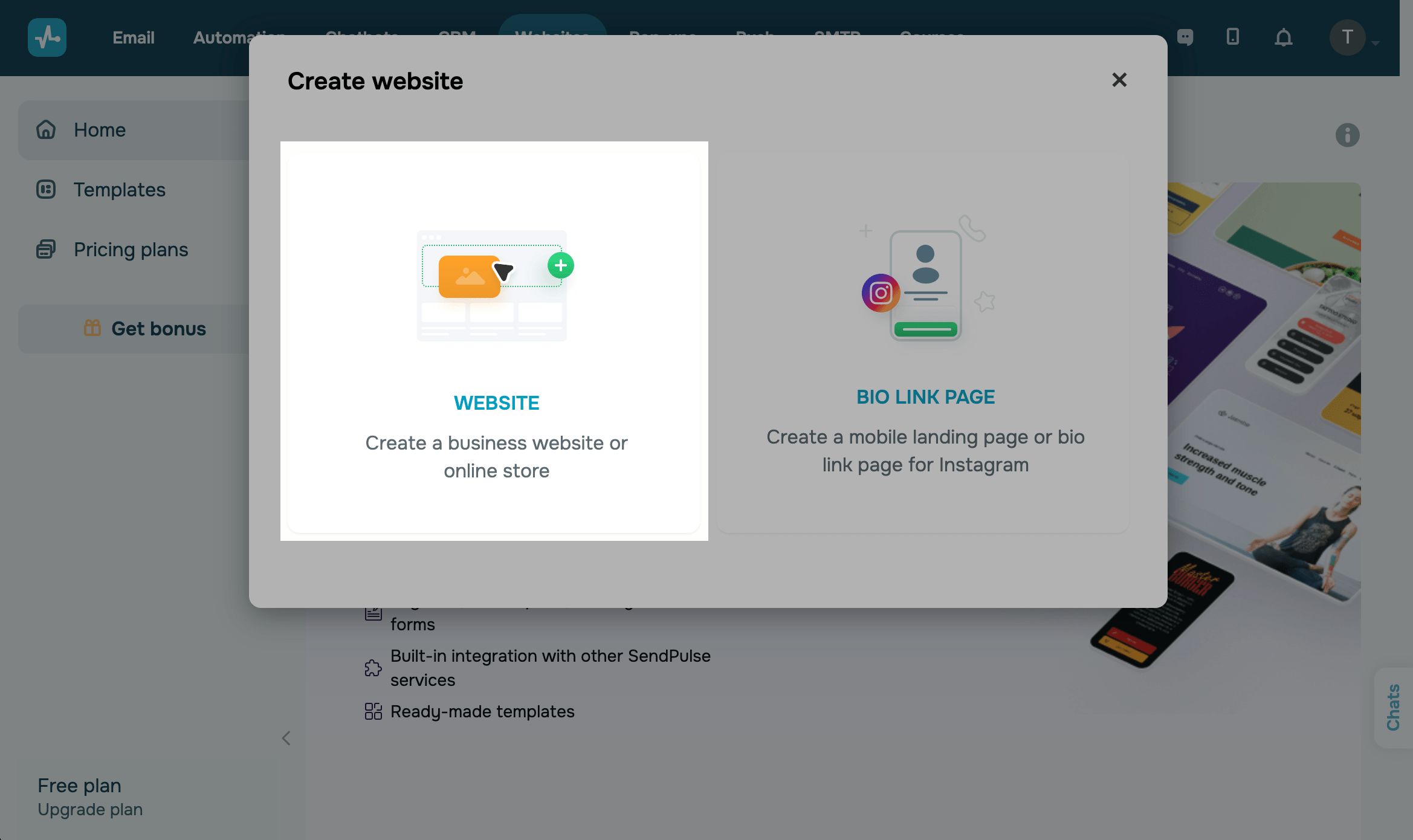
Then click New Site to create a website from a scratch.
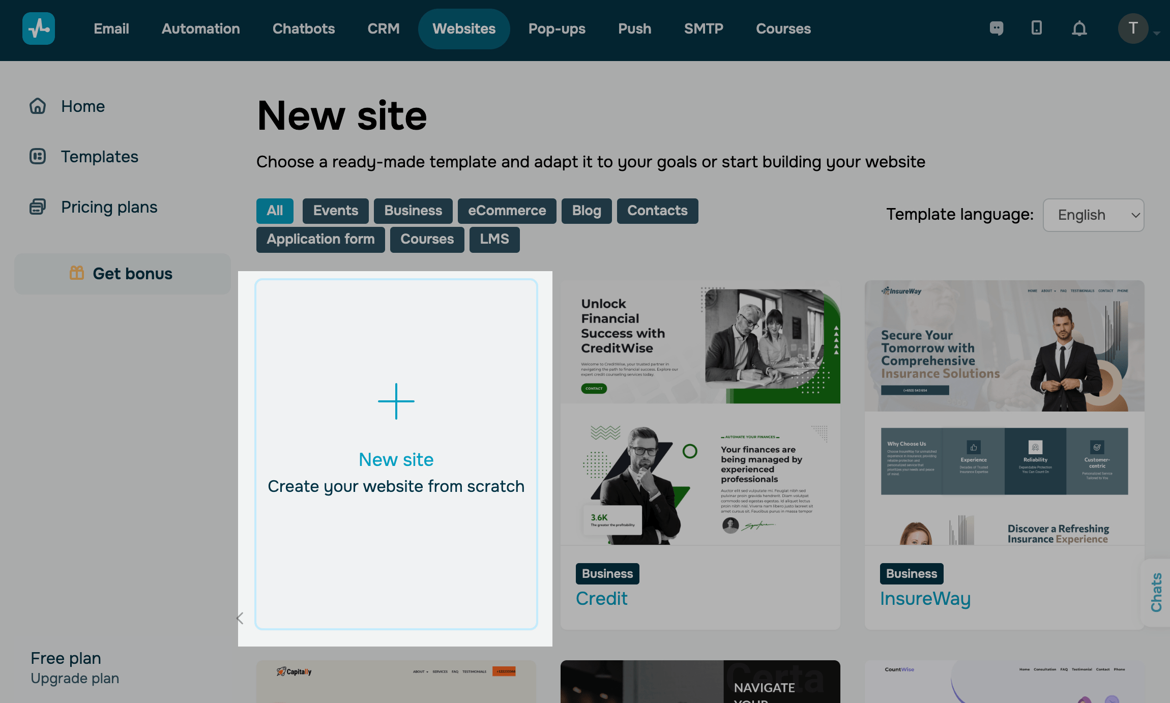
You can filter pre-made templates by category or template language, select a template, and adapt it to your needs. Find a template, view it, and click Edit.
Overall page style
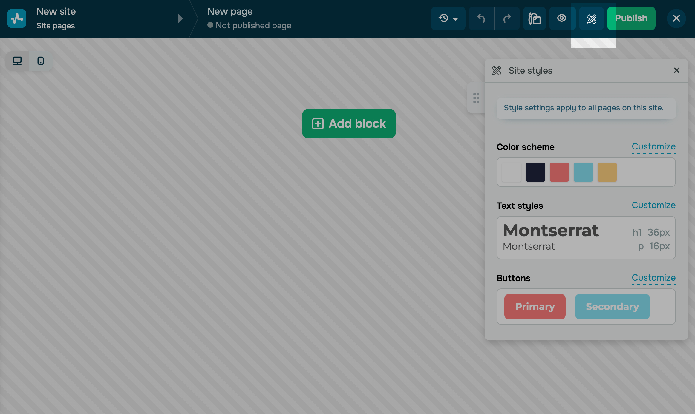
Before you start adding elements, choose your template style. By default, the color scheme and text style you select will be applied to all the elements you use. You can also set or change the overall style of your website after it is created.
Overall website style settings are applied to all its pages. Read more: Overall page style and Customizing your elements.
Set up elements
Create a Structure
Plan your website structure, and start creating it using the Block, Section, and Column elements. You can combine sections into blocks vertically and unite columns into sections horizontally. You can also organize your website content using the Layout element within blocks, sections, and columns.
You can add an unlimited number of blocks and up to 6 columns to one section.
Click Add Block and select a block from the library.
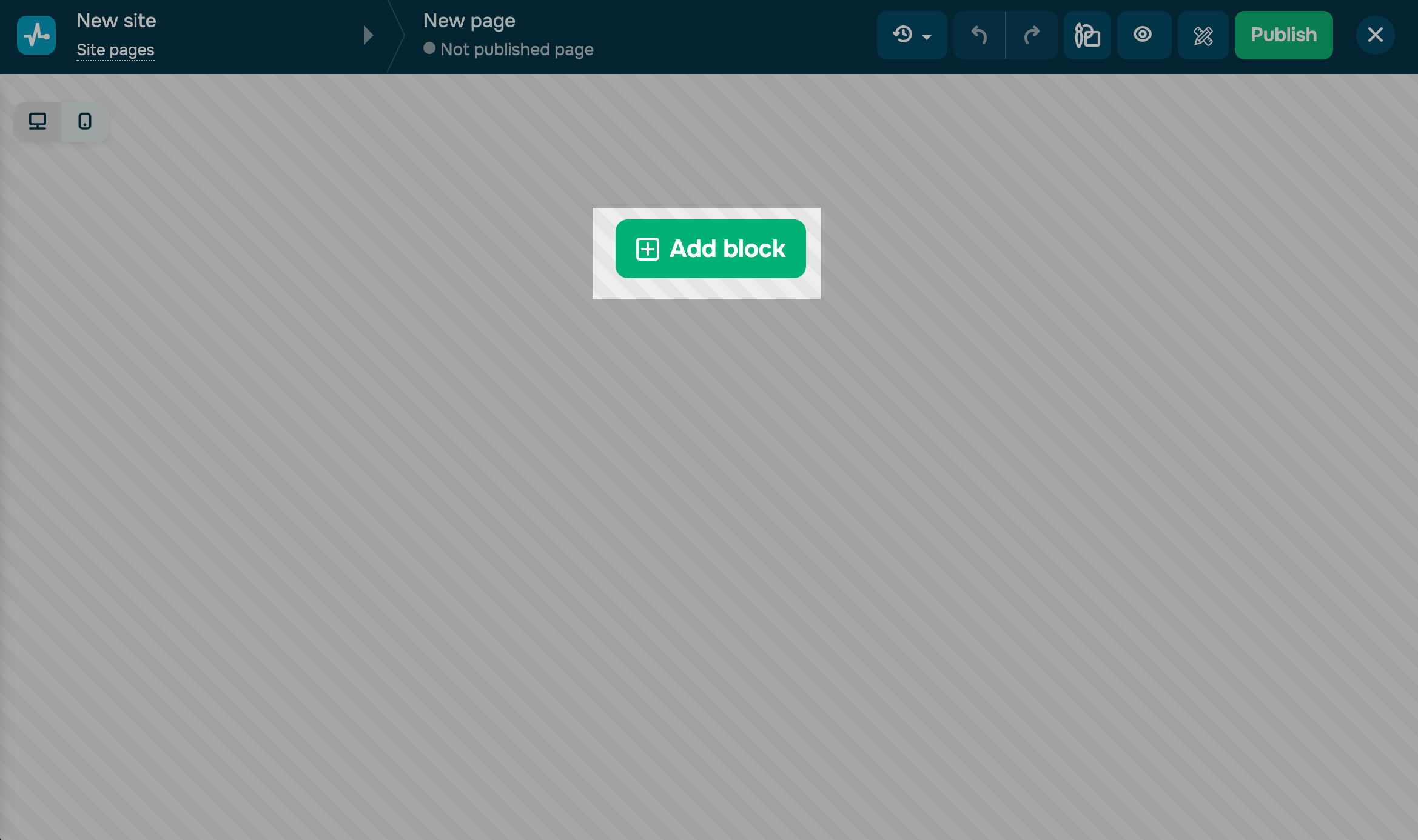
You can add an empty block or select ready-made blocks from our library, including Header, First screen, About us, Advantages, Text, Contacts, FAQ, and Footer.
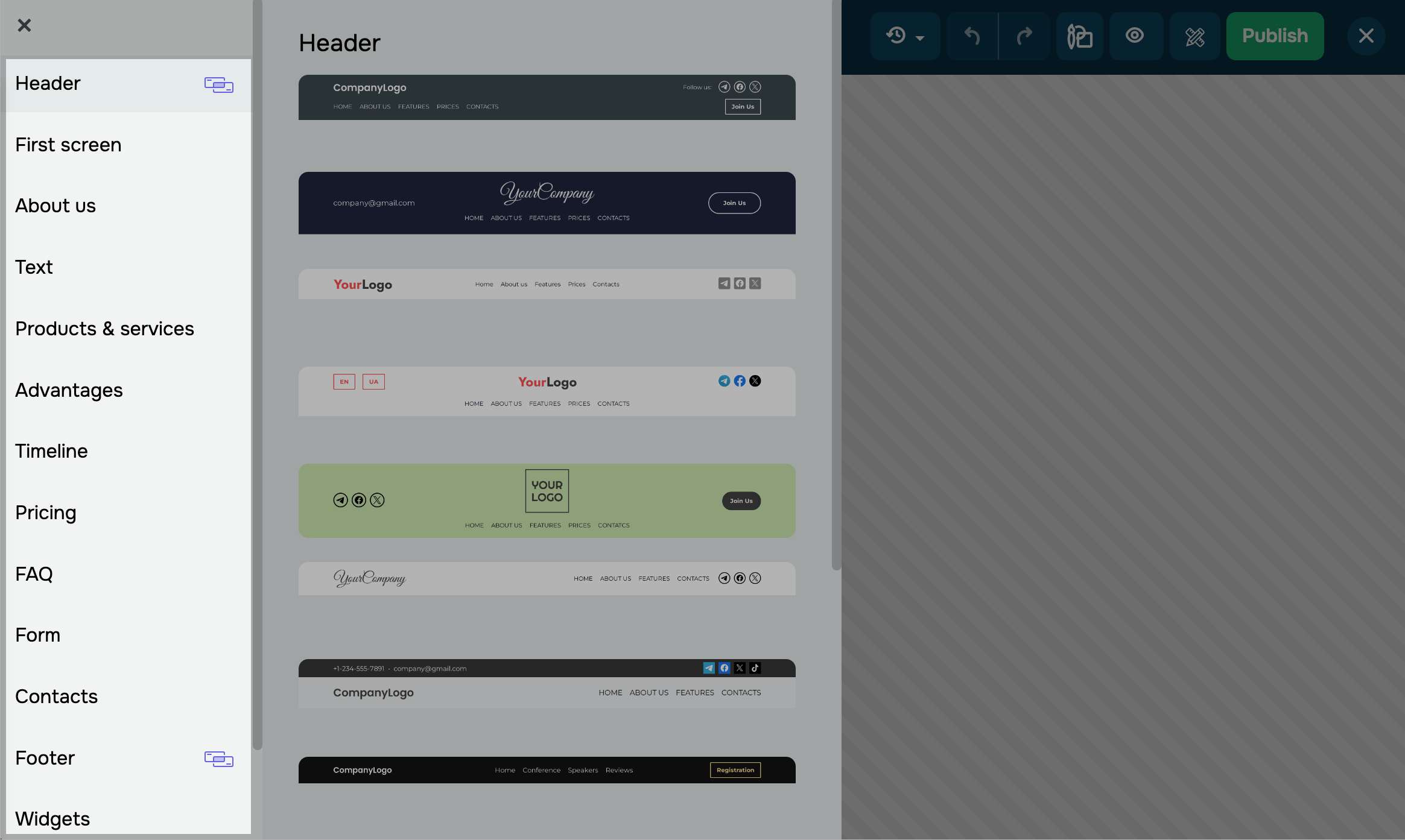
If you have already added an element to your future site and want to move on to the next one, hover over it, and click + Add block.
To customize the style, click on the appropriate icon in the upper right corner of the builder.
Read more: How to work with site elements.
Add widgets
Select a widget — a functional website element designed to add information and interact with visitors. Read more about each element below.
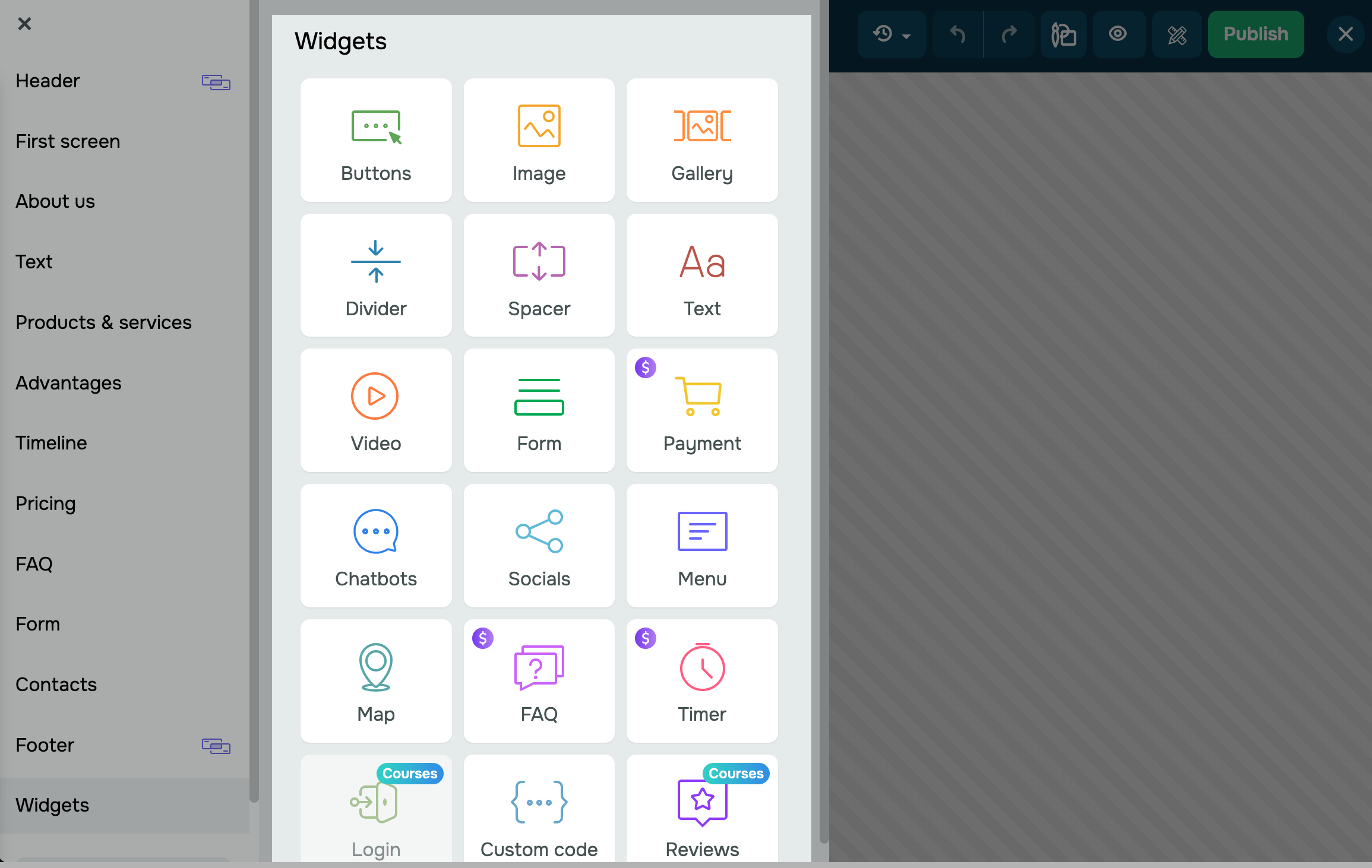
Menu
You can add a menu to help users navigate to the desired website page.
Add the Menu widget to the top of your page. You can see some menu examples and customize them when editing your widget.
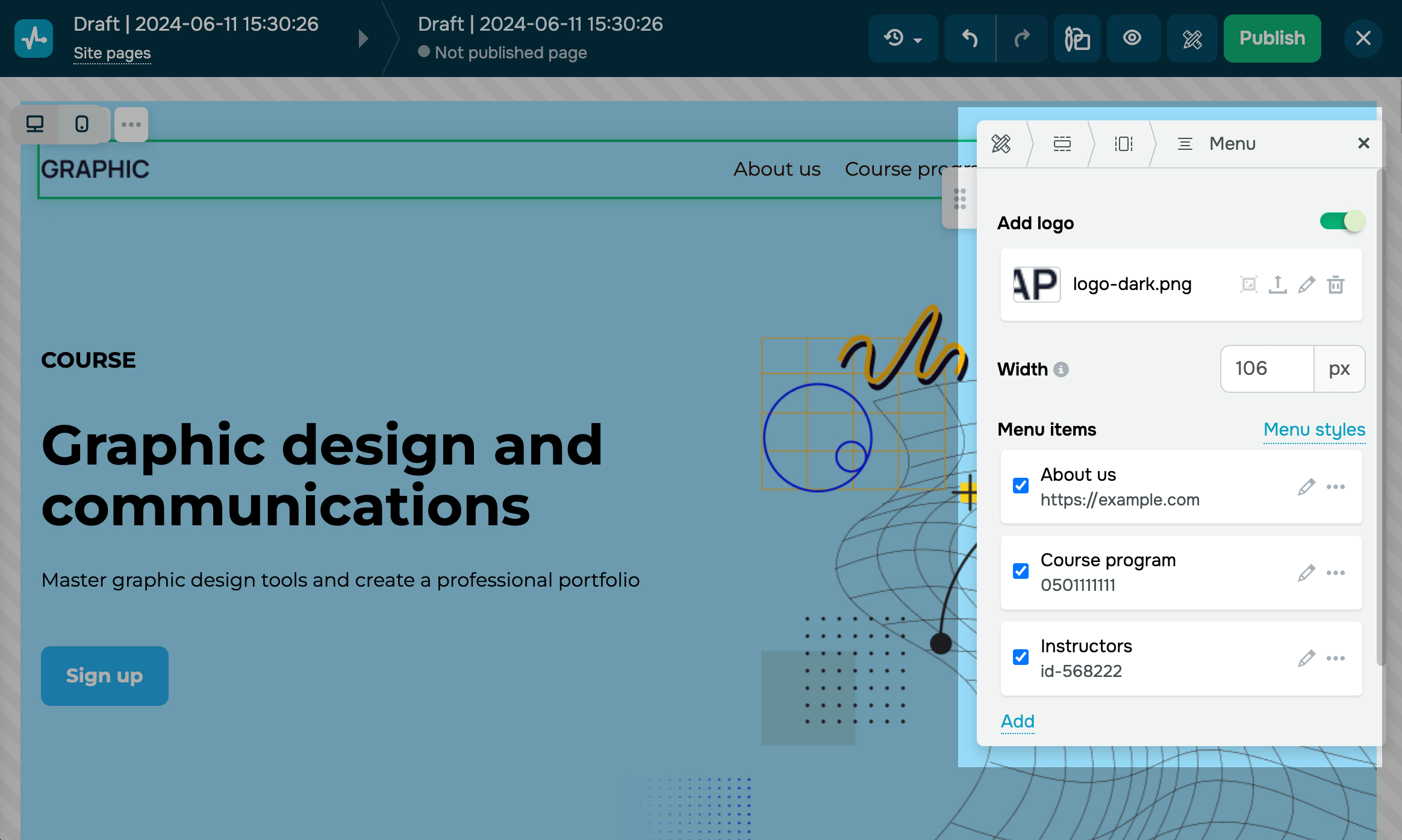
To add a new item to your menu, click Add. Then, click on the pencil icon. Enter a new item name. Select your website page, or enter a link, email address, phone number, or anchor link to another block.
Buttons
It is used to add buttons with links to other websites, pages, and blocks or allow website visitors to call or email you.
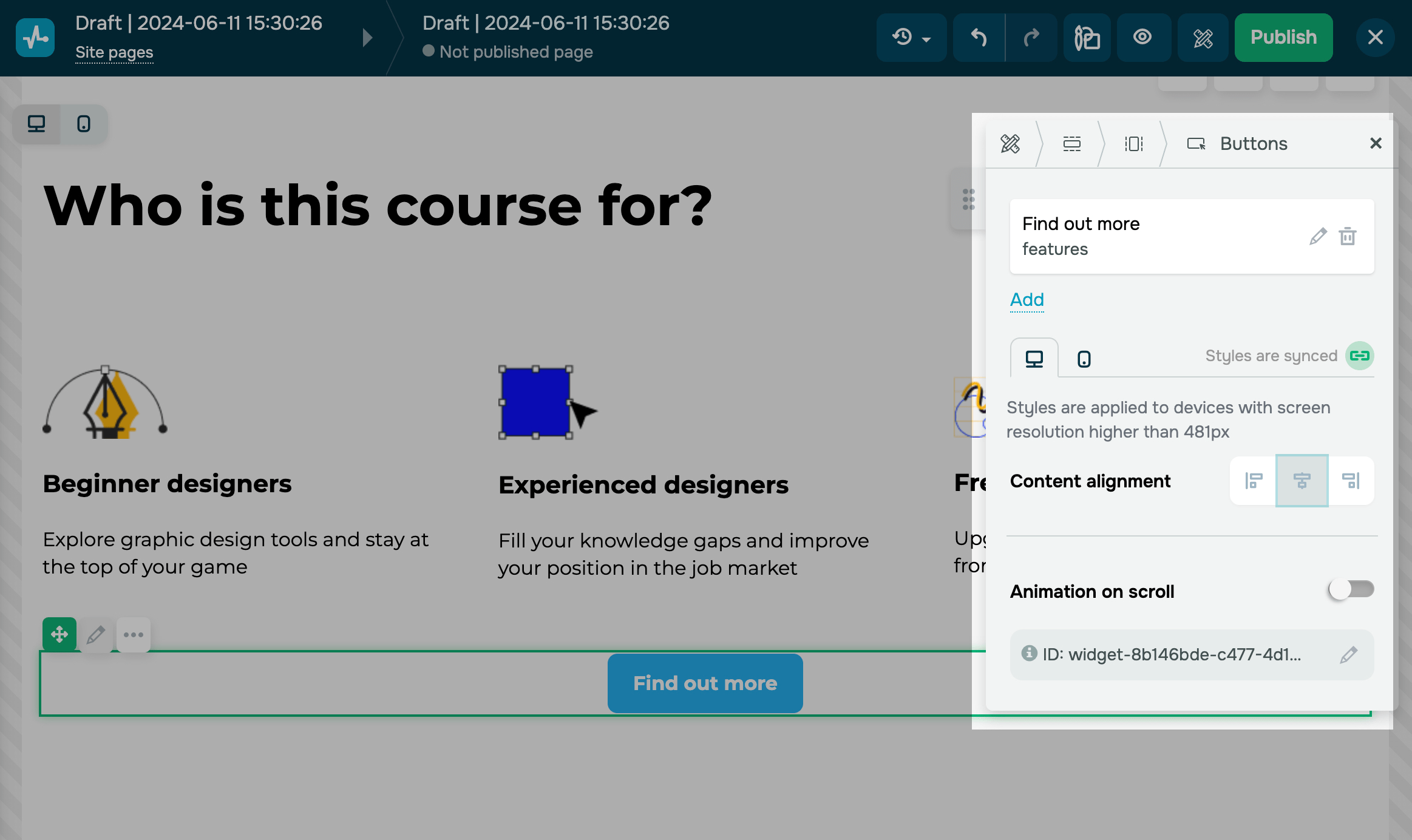
In the Buttons widget editing panel, you can add extra buttons or align the element relative to the column space.
To add an extra button to your column row, click Add. Enter your button name and hint in the description. Select its type (link, phone number, email address, or anchor link), and then insert the required data.
Customize your button style (placement and opening type), and add effects.
Text
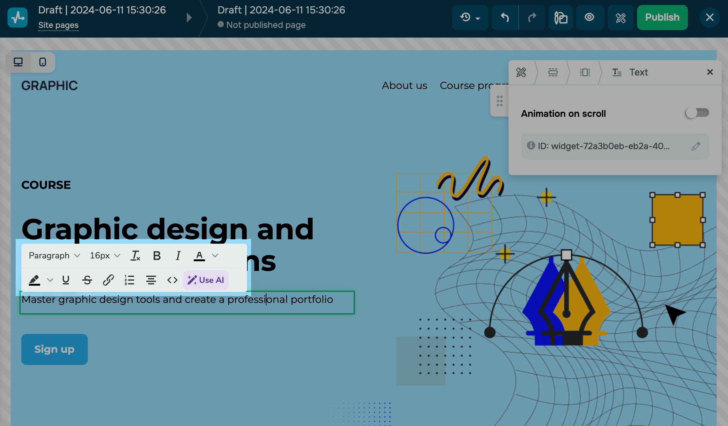
This element is used to add a text element to your page.
To change the formatting, click the text itself. Select the necessary part of the text, and choose its color, size, and font. You can also add lists, hyperlinks, or additional items using source code and add scroll animation.
You can customize the font size and line height of each of your headings in the general site style settings and modify or generate new copy with ChatGPT. See also: How to improve or generate your website copy with AI.
Image
With the Image widget, you can add a multimedia element to your page. Add visual elements that enhance your text.
Once you have added the widget, go to the element editor, select a file, or upload a new one.
You can edit images right in the website builder, for example, add text or use various effects.
Read more: How to edit images using the website builder.
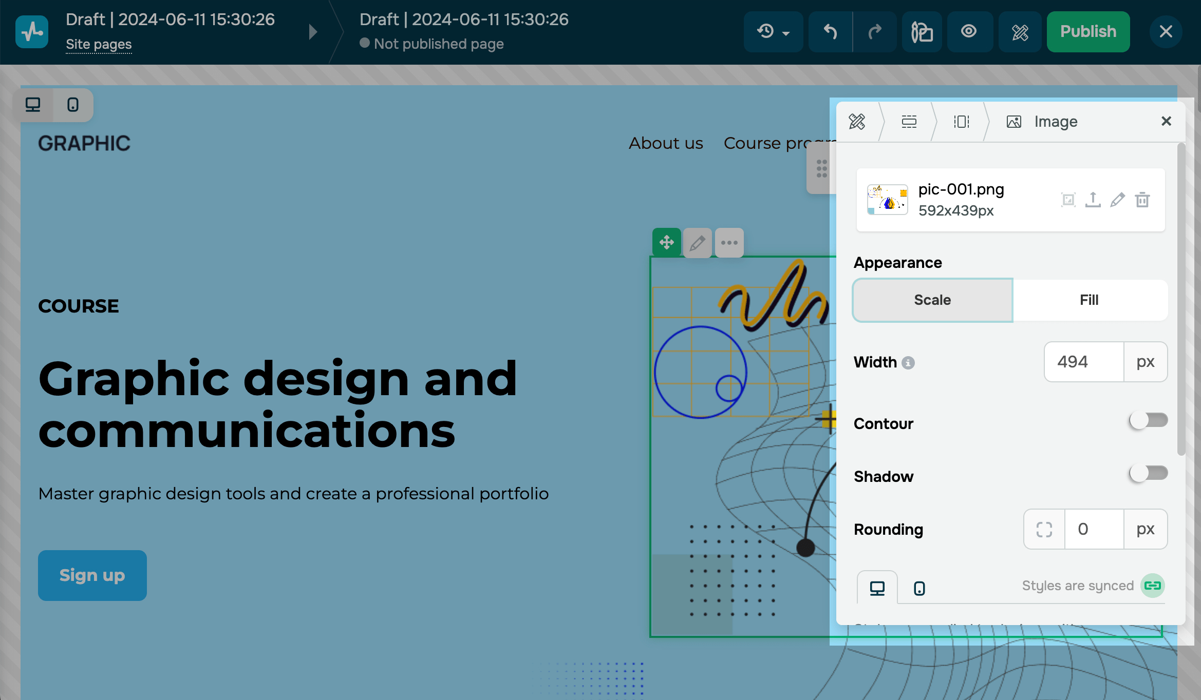
You can enter alternative text and add a description and a link. Customize the text you will use for your image by changing its size, color, and position and adding a background to it.
You can also add scroll animation to your image.
Video
With the Video widget, you can add on-click videos.
Select a platform where your video is hosted (YouTube or Vimeo), and in the next field, paste a link to it.
You can also select a preview file, element width, and alignment to customize this element.

Gallery
Galery widget used to display images as a carousel, grid, or collage. Upload images, select a gallery type, and customize its appearance (how you want to display images and how users should interact with them).
You can also resize your images and select a focal point (an image part you want to draw more attention to). To do this, click the image, and customize its settings using the sizing handle and cursor.
Socials
With Socials widget you can add a link to your social media profile to invite users to follow you.
To add a link to your social media profile, click Add. Then click on the pencil icon, select a social media platform, and enter your profile link.
Customize your element by displaying it as a button or icon or choosing its color and alignment.
Spacer and Divider
Use a spacer and divider to visually separate your content: blocks, sections, columns, or widgets.
Indentation affects the sections' width and the columns' height, so think about your page structure beforehand. You can also set spacing between elements by adding a spacer using the element settings. Read more: Indents.
When adding the Spacer widget, you can set the height size in pixels.
You can select the color, type, thickness, and size of your Divider widget. For example, if you need a line for the entire column, you can set the width to 100%. If you need it for a smaller element, you adjust the width using the slider. Align your content left, right, or center.
Subscription Form
With Subscribtion form widget you can collect your site visitors' data, and offer them to subscribe to your newsletter using a subscription form.
First, choose where you want to save your new subscribers.
By default, every time you get a new lead, your CRM system creates a new deal. Enter a deal name, and select a pipeline where you want to add your new contacts.
You can also save contacts to your mailing list to send them campaigns later. Select a mailing list where your new contacts will be stored.
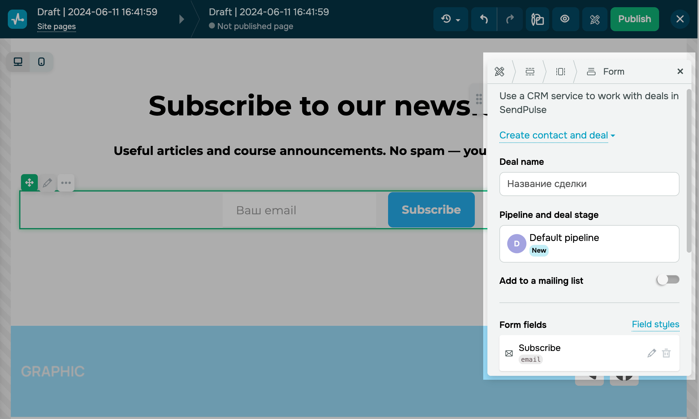
Then customize your form fields and subscription button.
Payments
Use the Payments widget to enable users to buy your products in one click.
Enter the name of your product, its price, and select a pipeline your deal will be saved to. Select a mailing list where your contact will be stored once they successfully pay for your product. You can also customize your form fields.
Chatbots
With Chatbots widget you can add a button to offer users to subscribe to your chatbot and launch the desired flow, for example, a welcome flow or a customized flow.
You can choose your button style and customize it. Then add a new element, or edit an existing one by specifying a social network.
Timer
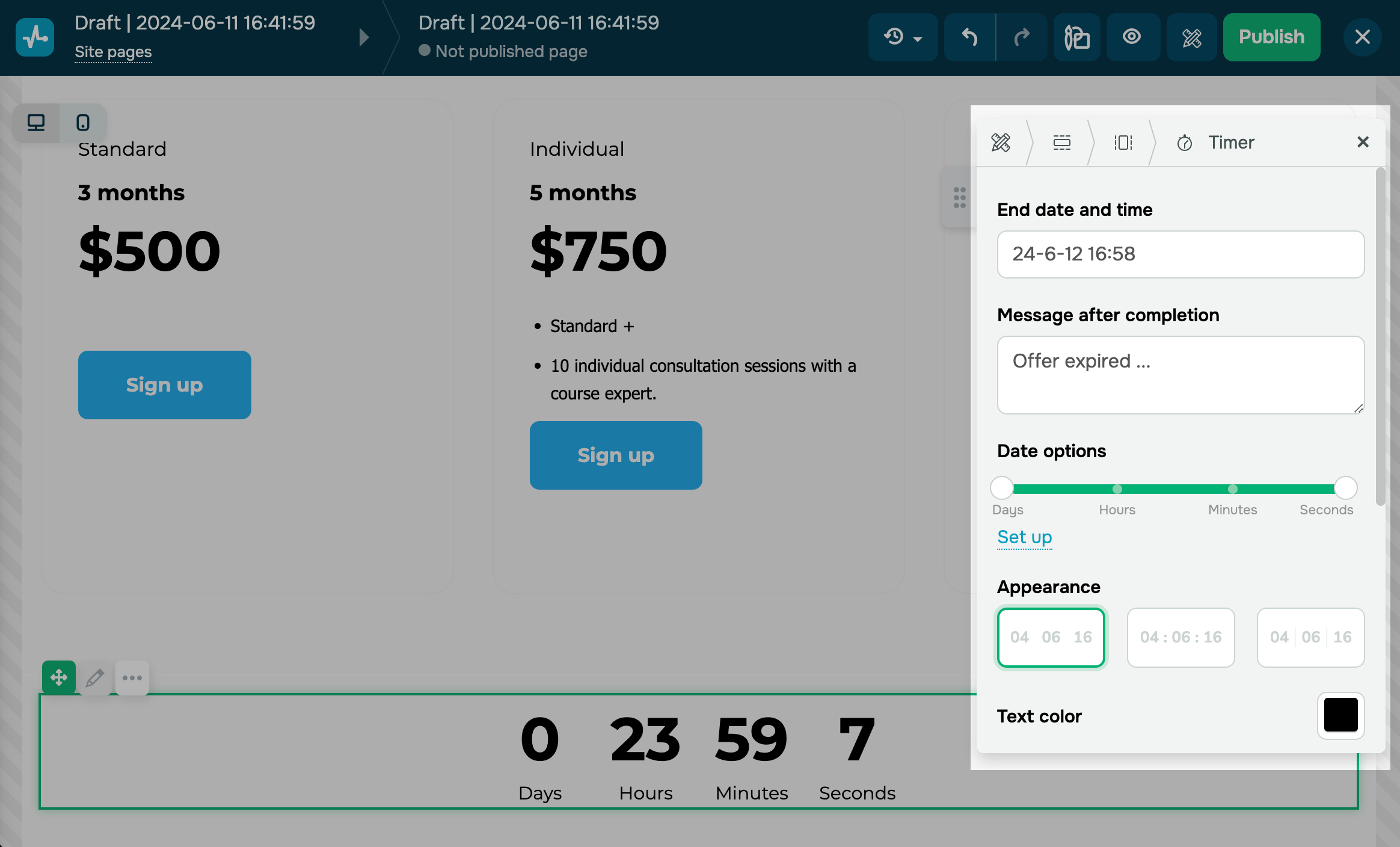
You can add the Timer widget to set a countdown timer until the start of an event or the end of a sale.
Enter your end date and time and message, set the date options, and customize your countdown timer.
FAQ
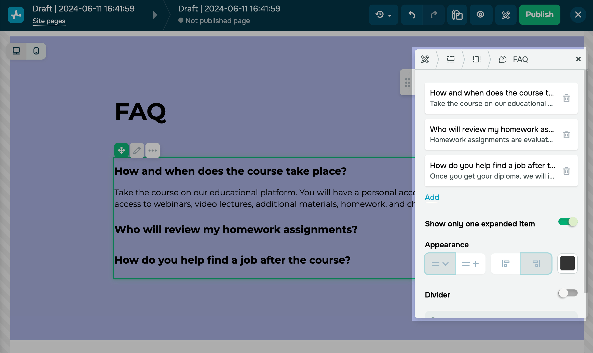
Use the FAQ widget to add detailed answers to frequently asked questions from your users.
To change the text and formatting, click on your text or heading, and you will be able to edit it.
You can add a new question when editing your widget. Change your icon style, add or remove a spacer or divider, and choose its color.
Map
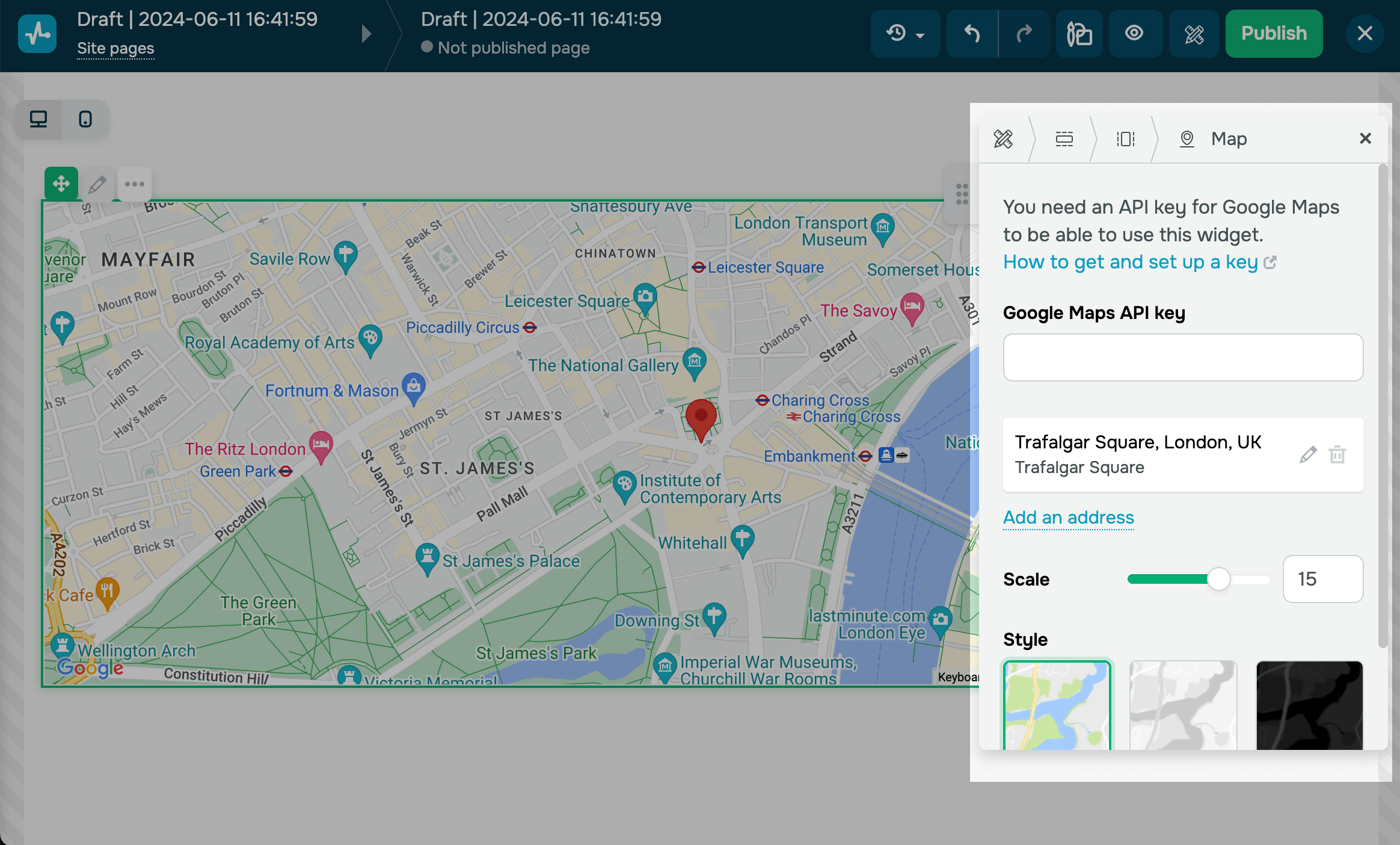
With Map widget you can add your contact information and location to a map to help users find you offline.
Obtain and connect a unique Google Maps API key. Add addresses and descriptions as needed. Customize your maps’ scale and look and feel.
Course login
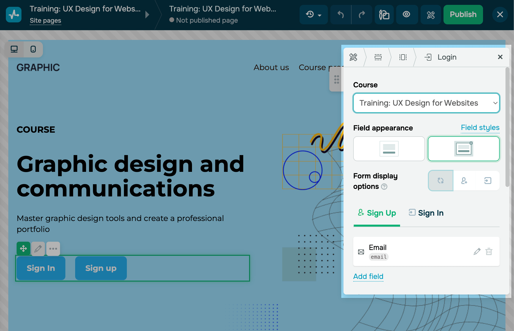
You can add Course login widget to your course website to allow students to register for a course or log in a student account. This enables you to create a page, for example, about a school or an expert, and use it to present different courses.
You can add this widget only to a site with a linked course. To develop a page with your own design, go to the course site, create a new page of your site with a linked course, and add the widget to it.
Select the course for which you want to create a site page. Select and customize your buttons, or add new ones.
Custom code
If you need to add an extra element to your website, such as a calendar widget or a comment system, you can add it using the Custom code widget.
You can add an element with HTML, CSS, or JavaScript code you have written or generated using a relevant tool. To do this, add the widget to your website page, and click it to insert your code.
Reviews
Use Reviews widget to display your course reviews to increase customer trust.
Once you add this widget, go to the Review display option field, and choose if you want to display your reviews as a carousel or a grid.
In the Source field, select the course for which you want to display reviews.
Your course must have the same domain as your website and contain existing reviews. The Student Reviews setting in your course settings must be enabled.
In the Number field, select the number of last reviews to display.

Product
To add the Product widget, connect your online store. Then, you can add a payment method to your shopping cart page.
Use the Product widget to showcase products and services on your online store’s website and enable users to purchase them.
Add the widget, click Add product, and fill in your product information, including a name, description, image, SKU number, and price. After adding a product, select a product card type and card style in the settings panel.
Manage changes
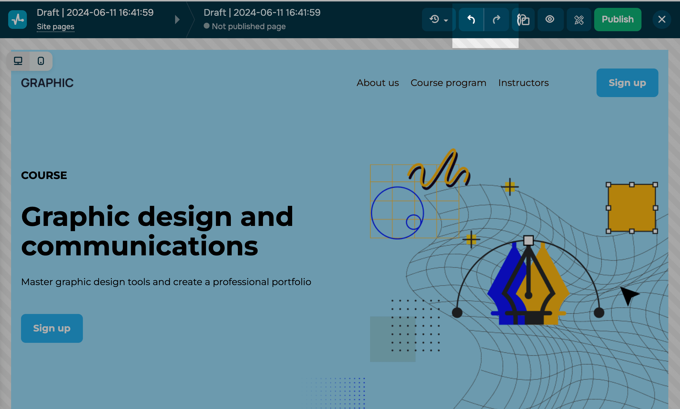
You can undo up to ten actions. To undo the most recent data entry or action, use the control buttons on the top panel. To do this, click the left arrow.
You can also undo entered data or restore a previous version of the site.
Read more: How to manage page versions and How to undo recent changes.
Preview
Once you create your website, you can see what it will look like on different devices. To do this, click Preview at the top of the screen.
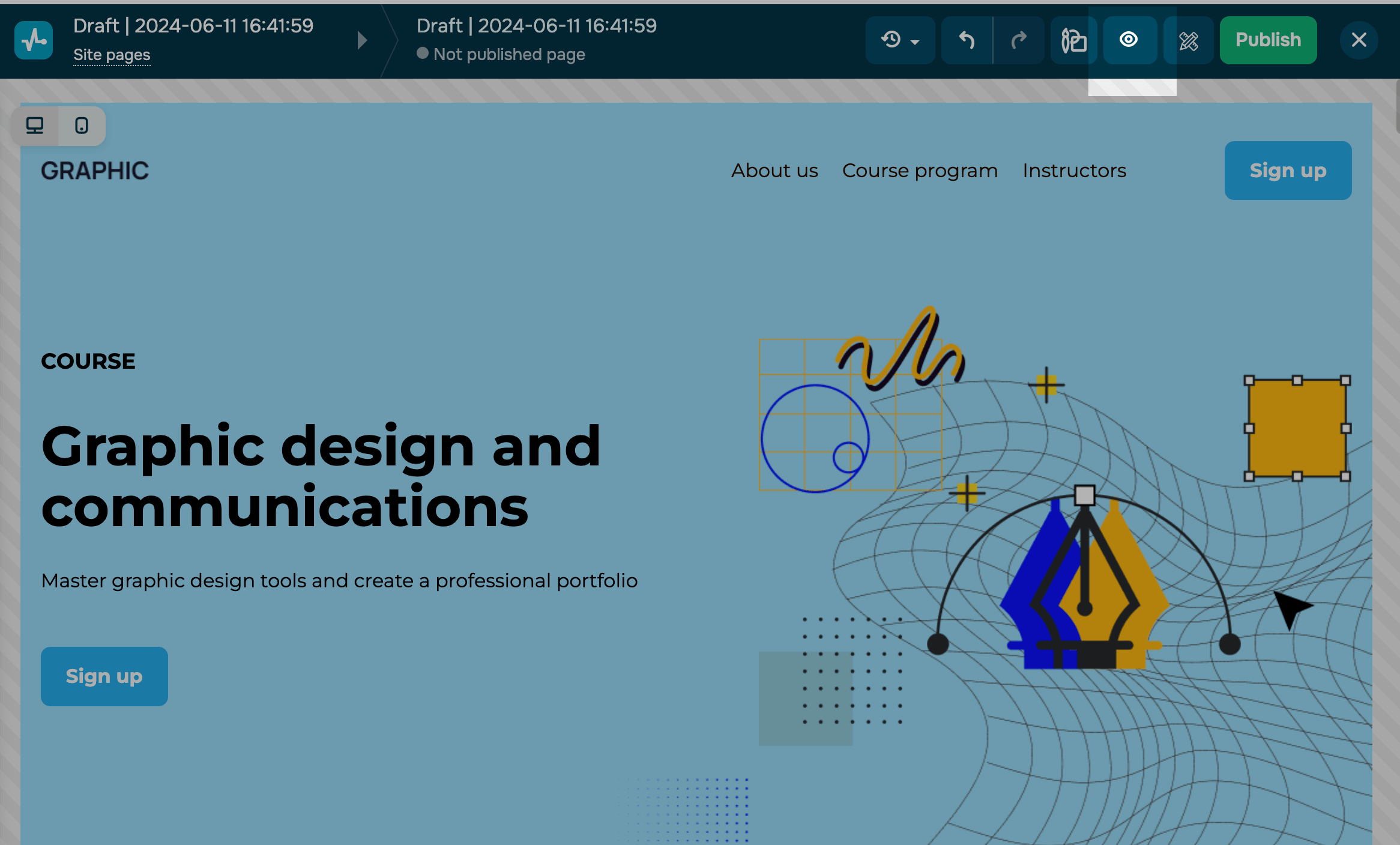
Choose which device you want to see the preview on (desktop or mobile).
You can edit elements, columns, sections, and blocks separately for the mobile version.
Read more: How to edit elements in the mobile version.
Save and publish
Once you've finished creating the page, click Save and Exit. Enter your website name and link. When adding a new page, enter its URL.
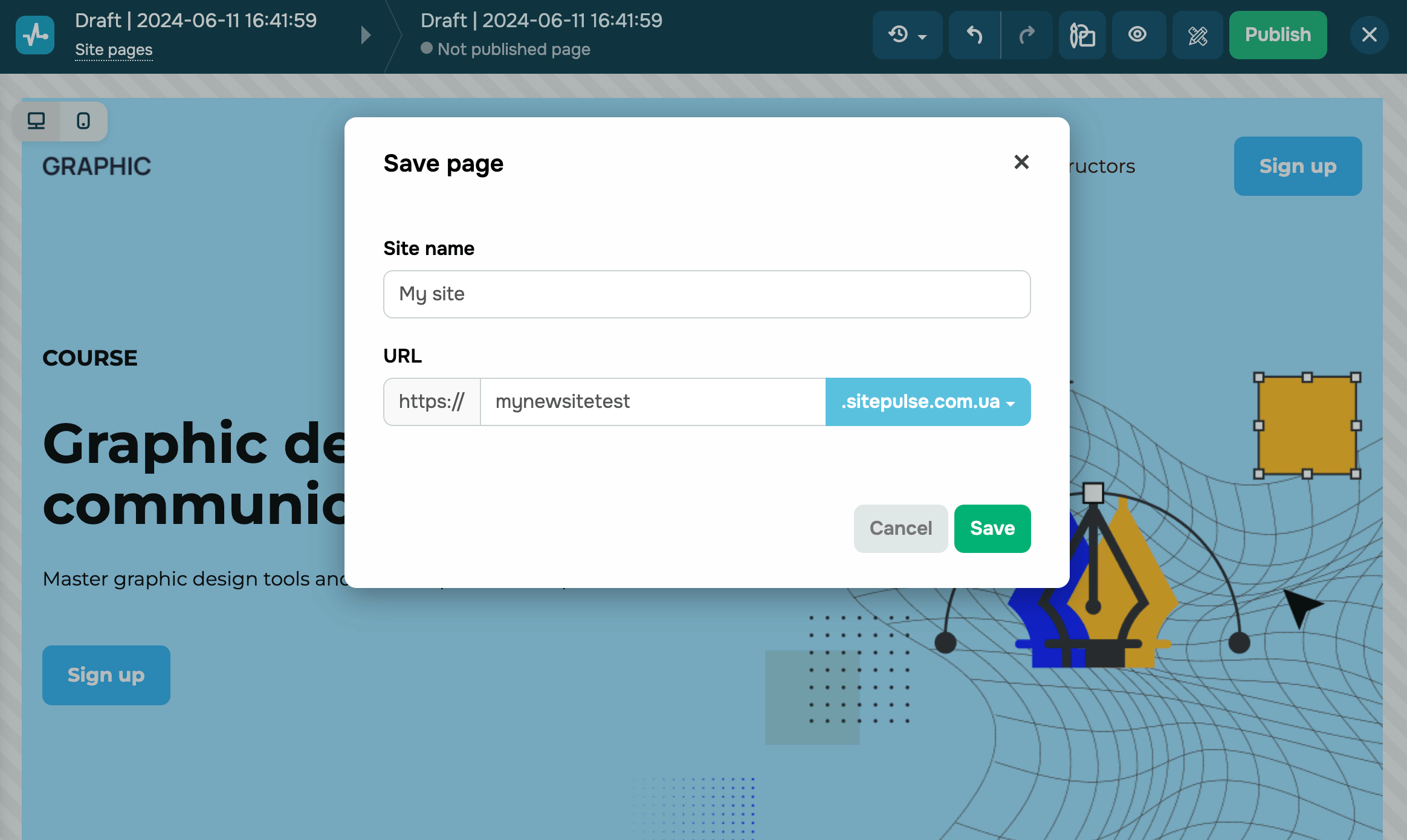
Afterward, you will be able to publish, customize, copy, or delete a new page.
See also: How to manage your website pages and How to customize your site.
You can also monitor your website visit statistics. To do this, go to the Statistics tab, and select a statistics type you want to track.
Last Updated: 09.10.2024
or