It is a well-known fact that people tend to pay attention to the visual elements first which often makes them prefer the form to the content. Email marketing is no exception. It is the structure of an email, illustrations, text formatting, color palette, and mobile optimization that usually determine if users will finish reading your email and complete the desired action.
Email design influences not only the reader’s perception but also a sender reputation. Mailbox providers often mark emails with layout and design mistakes as spam, making it a good reason why you should care about your email template design.
In this article, we’ll provide you with some email design tips on how to make your emails visually appealing and overall effective. We’ll also talk about the most common design mistakes and show examples of well-designed emails from different brands.
Email template design tips
A template is a foundation of every email. It defines the layout and visual appearance of your future emails, influencing the overall results of your campaigns.
In your email template design, you should follow the same visual guidelines which you would use for a company’s website, social media, and other platforms. Let’s go through some common email design mistakes and email design tips you’d better take into consideration while creating your template.
Mistakes to avoid
1. Don’t change email template design too often. If users receive a different email every time, it will become harder for them to remember and recognize you.
2. Don’t use images instead of text, because
- images may not display;
- you will have to change the template manually every time you want to change the text;
- any promo codes placed on the image will be impossible to copy and paste if needed;
- mailbox providers may mark the emails which consist only of images as spam.
3. Don’t use your corporate color as the main color of your email if it’s too bold and bright.
4. Don’t use bright or complex background for the text.
5. Don’t hesitate to rely on the help of a professional email designer if you have such an opportunity. An email designed in a bad way may ruin a company’s reputation or simply be marked as spam by a mailbox provider. Meanwhile, a professional designer will be able to create a long-lasting email template design that will keep your subscribers interested and engaged.
Best practices to follow
1. Always design email templates based on your company’s visual guidelines. Taking a holistic approach to your digital appearance will increase brand recognition and boost customer loyalty.
2. If you decide to hold A/B tests, test separate elements instead of an entire email. This way, you will know for sure which details are more or less effective, the style of your company staying recognizable for the audience.
3. Create separate templates for different types of emails and design them in a similar corporate style. This will help your subscribers not only distinguish your emails from those of any other brand but also differentiate them from each other based on their type.
4. Place the most important information and the CTA at the first scroll and make sure the entire email looks balanced. If your headlines and descriptions are designed neatly, the call to action buttons are eye-catching, and the images are of high quality, the recipients will be smoothly guided throughout the entire email straight to the call to action.
5. Try to make your emails 600px wide so that they will display correctly in any email client.
6. Alternate text blocks and images. It’s important not only for readability but also for better deliverability of your emails, especially if you started sending out emails not so long ago. In general, we advise that you follow the 80:20 or 60:40 text to image ratio.
7. Remember that for a bright background, it’s always better to use a contrasting dull placeholder.
8. Unless you can rely on the help of a designer, you may design email templates by yourself using drag and drop email editors.
Now let’s look at some examples demonstrating these best practices in action.
We have taken the first two examples from Behance. Both templates, one for welcome emails and another for weekly “New inspiration” emails, follow similar design principles, yet looking a bit different. The welcome email has a large and clear title, high-quality pictures, a broken grid layout, and a well-readable font. The text and image blocks are alternated, which makes the email easier to read.
 Behance welcome email template design
As for a weekly email, it is overall shorter and puts more emphasis on images, having a bold CTA button at the very top.
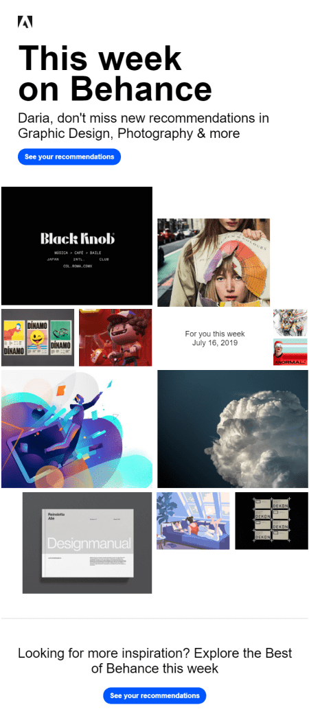 A weekly email from Behance
Here’s another example of a good email template from Downshiftology. The company can boast of sending out minimalistic emails with a well-structured grid. They usually begin with a header and an intro followed by some high-quality food photos and the hyperlinks to the recipes. A justified alignment and light colors make the email pleasant to look through and easy to read.
 A well-designed email by Downshiftology
Responsive email design tips
While thinking about the layout and the template for your email, always keep in mind how they will look on different devices, including mobile. Here are some mistakes to avoid and tips to follow for responsive email design.
Mistakes to avoid
1. Avoid using several hyperlinks together as it may result in their cluttering. A recipient may accidentally tap the wrong link situated too close to the one they wanted to click.
2. Don’t make your CTA buttons too small. Zooming in to click a button can get recipients really frustrated.
3. Don’t use fonts smaller than 14px for the email body, and 20px for email headlines as this will make your email hard-to-read on small screens.
Best practices to follow
1. Follow the rules of the responsive emails. For example, if your email template consists of several columns and you want them to adjust to mobile screens, insert a special code and build your email inside a table.
2. Use ready-made adaptive email templates from SendPulse or create your own in our drag and drop builder if you don’t want to mess with the code. They are already adjusted for both desktop and mobile; besides, you can always preview your email template for both devices.
Take a look at the following email from Uniqlo, which is well displayed on both desktop and mobile. Here’s what a desktop user sees:
 A desktop version of an email from Uniqlo
The layout of its mobile version is a little bit different:
 A mobile version of an email from Uniqlo
Tips on how to use text in your email template design
Even the most engaging copy won’t get attention if it looks unattractive or is difficult to read. By contrast, users will hardly neglect an email with a neat layout, short paragraphs, catchy headlines, and proper highlights of the most important information.
Mistakes to avoid
1. Don’t mix up too many fonts, styles, colors, and font sizes in one email as they can make it look sloppy.
2. Avoid using too small or pale fonts ― in both cases, your email may become hardly readable.
3. Don’t create a text-based email with no paragraphs, headlines, and highlighted key points. It will most likely bore your readers, even if your text is actually interesting.
Best practices to follow
1. Choose one or two main fonts for headlines and the main text, not more.
2. Use basic fonts which will be rendered correctly by most email clients such as Gmail, Yahoo, Outlook, and others. If a service can’t recognize your typeface, it will replace it with some other font, which may affect the overall email template design badly. The safest fonts are considered to be Arial, Lucida Grande, Tahoma, Trebuchet, Verdana, Georgia, Palatino, Times New Roman, Courier New, Courier, and Impact.
3. Feel free to use your own corporate fonts on banners and images. However, make sure that the font on the banner and in the email go well together.
4. Divide your text into sections using headlines and short paragraphs. A well-structured text is always easier to read.
5. Make your font no smaller than 14px.
One of the examples of a good text layout is an email from DesignLab. It has a bold centered headline and consists of three short paragraphs followed by the prominent CTA, highlighted in orange.
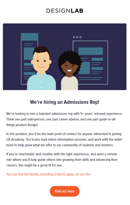 An email from DesignLab
Tips on using color in email template design
Color is a powerful tool which can create the mood of an email and strengthen your message. However, by choosing the wrong colors, you risk making your email too boring, distracting, or chaotic.
Mistakes to avoid
1. Don’t overwhelm your readers with a bunch of colors. Too much red, yellow as a background for the text, or combination of colors that don’t match each other may ruin the impression you are trying to make as they will most probably distract users from the main idea.
2. Refrain from too many gradients. If used unprofessionally, they can make your email look sloppy or decrease visibility of the text.
Best practices to follow
1. Use bold and bright colors only to emphasize separate elements or words, while choosing more calming colors for your background.
2. Consider the preferences of your audience while choosing a color theme. For instance, Kissmetrics reported that men prefer contrasting colors, while women choose softer color palettes. To learn which colors your users like best of all, hold A/B tests and try changing the color of a single or a couple of elements at a time to measure the results accurately.
3. Use such tools as Adobe Color to choose a perfect color palette that will look visually balanced.
B&Q, for instance, use their corporate orange color as a highlighter and stick to more neutral tones for the rest of the elements.
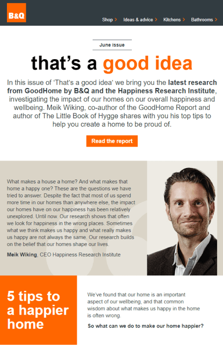 The use of colors in an email from B&Q
Header is the first block of an email placed at the very top of it. It usually contains a logo, links to website sections, contact details, and other general information. Email header, along with a sender name, helps users identify a sender.
Mistakes to avoid
1. Don’t try to put too much information into the header. Yes, you may give links to your website, for instance, but if you also place your social media links, detailed contact information, and other blocks inside your header, the latter will become too large and most probably confusing.
2. Don’t use bad-quality images in your header and anywhere else in your email as this will make an impression of an amateur design.
Best practices to follow
1. Emphasize the main information of your header and let the other elements be a bit smaller or less bright.
2. Use special themed headers during holidays, sale seasons, and other special events to set the mood up. You can also vary headers for different types of emails such as digests or transactional emails.
Take a look at the minimalistic header in the email from TheRealReal:
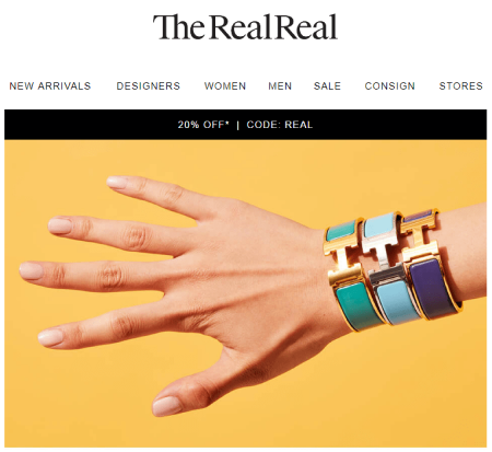 A header of an email from TheRealReal
The very last but not the least block of an email is its footer. It usually contains an email signature, unsubscribe link, company contact details, and social media links. Even though this block seems to be the easiest to design, there are still a few mistakes companies frequently make.
Mistakes to avoid
1. Don’t overwhelm your footer with too much general information, so that it won’t look messy and confusing.
2. Never hide the unsubscribe link, make it too small or hardly visible. If a user finds it difficult to unsubscribe, they will most likely click “Spam,” which is always bad news for your sender reputation.
Best practices to follow
1. Include only those links to your footer that would truly matter for your users; try to group similar blocks of content to improve readability.
2. Be honest with your audience and make your unsubscribe link well visible.
3. Add a creative email signature to your footer to finish your email on a friendly note and let the recipient look forward to hearing from you next time.
The footer of the email from LinkedIn, which you may see below, follows the above mentioned tips perfectly well. It contains an email signature, a clear unsubscribe button, and the company’s contact details, without any unnecessary information being provided.
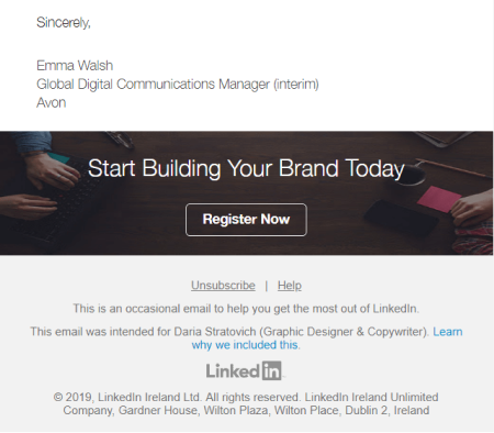 A footer of an email from LinkedIn
Tips on how to use images in email design
Visuals play a significant role in an email design: a smart choice of images may put your subscribers on a better footing at once and ensure their engagement with the email till the endline.
Mistakes to avoid
1. Don’t create emails consisting only of images as 43% of users turn off the images in their email clients; however, mind that the content of your email should remain clear even if the images aren’t visible.
2. Don’t make images larger than recommended. For instance, if it’s advised that you should use pictures 300px wide, don’t use the ones which are 1200px wide.
Best practices to follow
1. Optimize images before adding them up to your email. An email with heavy pictures will take longer to load, especially on mobile phones. Most likely, a user will not wait for images to load and will simply close the email. To optimize pictures, use tools like Squoosh or TinyPNG.
2. Add alt text to your images for users to understand what the pictures are all about in case they don’t load automatically.
3. Make the size of your icons 2X larger, so they look good on iPhone and Macbook devices with Retina screen. For example, if you need to use a 70×20 icon, upload a 140×40 version to the server and then resize the icon in your email using the following attribute: width="70".
Note! When you use this method, you change only the size of an image, and not its weight. That’s why you should optimize your images first and then upload them to the server.
4. Make images clickable. If you take a look at a click map of your emails, you will most often see that people click on images. Use that advantage to lead people to your website or social media.
5. Use high-quality images taken by yourself or found on stock photo websites.
Moving on to the examples, you may see TheSill remember to add alt text clarifying what types of flowers are depicted on the images.
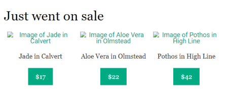 Alt text in an email from TheSill
Meanwhile, The New York Times Magazine use high-quality pictures and unique illustrations to brighten up their emails packed with text.
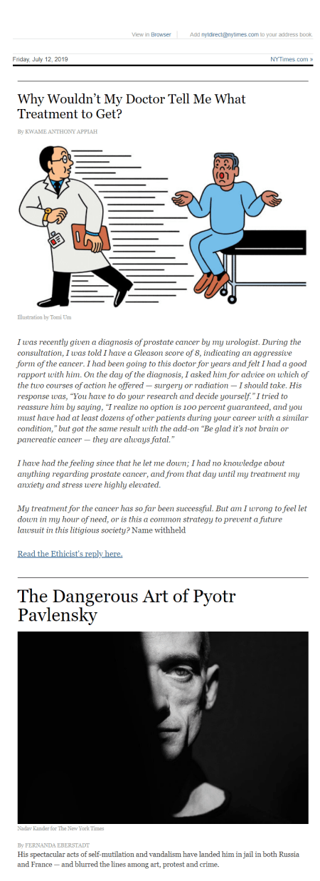 Images in The New York Times Magazine email
CTA design tips
A call to action in an email is a link or a button created to get some kind of a response from a user — registration, purchase, or contact with a manager. A clear call to action and its correct placement will help you increase your CTR, while mistakes in a CTA can complicate your subscriber’s ability to fulfil a desired action, making your email simply useless.
Mistakes to avoid
1. Don’t hide a single call to action button at the end of your email or even behind the first scroll.
2. Don’t make users guess what they need to do ― provide them with a clear call instead.
3. Don’t hide your hyperlinks if you use them instead of CTA buttons. They shouldn’t get lost against other elements of the email. They also shouldn’t be too small or desaturated.
Best practices to follow
1. Place your main CTA at the first scroll. If your email is long, you can repeat CTA a couple of times throughout it.
2. Make sure your subject line and your CTA are dedicated to the same topic.
3. Make your CTA button bright and visible. It should contrast with the background, text, and other elements of an email.
In one of their emails, LinkedIn, for example, not only repeated their CTA two times but also made it bold and contrasting.
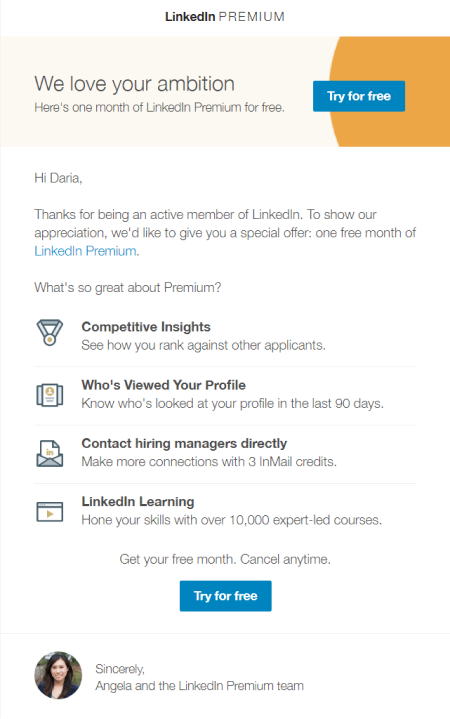 Bright call to actions in LinkedIn email
On another example from Neil Patel, you may see that the subject line of the email correlates with the CTA text:
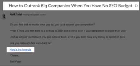 An email from Neil Patel with a correlating subject line and CTA
A checklist of email design tips
To help you easily check your emails before sending, we’ve gathered all the guidelines you should remember and grouped them by categories.
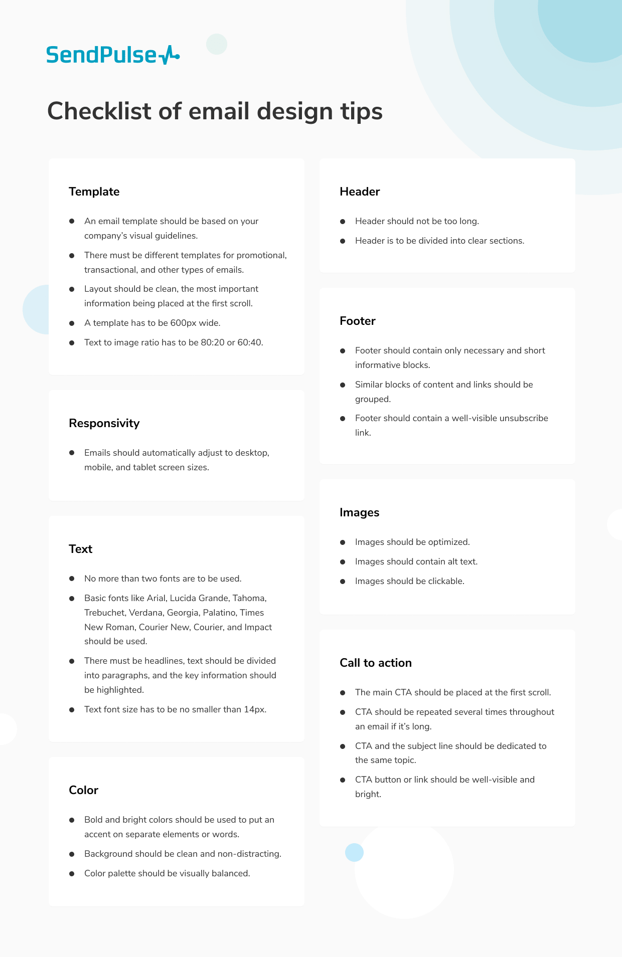
We believe, with all these tips at hand, you will be able to build responsive and well-designed emails, and not without SendPulse. The service will also help you A/B test different elements of your email and choose the best options for your campaign.