When you think of communicating with your customers or prospective customers online — be it through your website, email, or advertisements, you basically have a handful of tools at your service — words, images, colors, and so on that help to put forth your point. But one vital tool that generally doesn’t get the attention it deserves is the font you use or the typography. Fonts carry a visual psychological meaning and have a major impact on how readers perceive your content.
When it comes to email, it is incumbent upon the marketer to choose the right font. That is because it is not just about what your email font is conveying but also about the issue of the availability of the font in operating systems and email clients. It’s about how your font, which you have chosen with great understanding, renders and what your email subscriber ultimately sees or does not see in their email. In this blog post, we’ll learn all about fonts in email marketing — the types, the rendering issues, and the fallback.
Fonts used in email
While there are many fonts that marketers and designers use in emails, on the basis of how each letter is modeled, they can be separated into four families:
- Serif
- Sans Serif
- Cursive
- Monospace
Serif fonts
Considered easier to read, Serif Fonts are commonly used in emails. The well-spaced characters have flourishes on the ends of their strokes, and the axis of the strokes is generally inclined to the left. The most popular serif fonts are Georgia and Times New Roman.
Serif fonts work best for content offering actionable insights to the reader. These fonts can also be used to mention the benefits of the products or services.
This email by Publican Anker has used Times New Roman to give a formal look to their email about confirming a reservation. This email font also ensures great readability.
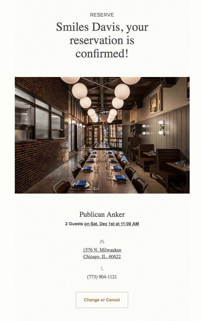 Serif font used in an email by Publican Anker. Source: Really Good Emails
Sans serif fonts
Serif fonts without the flourishes make way for the Sans Serif Fonts.
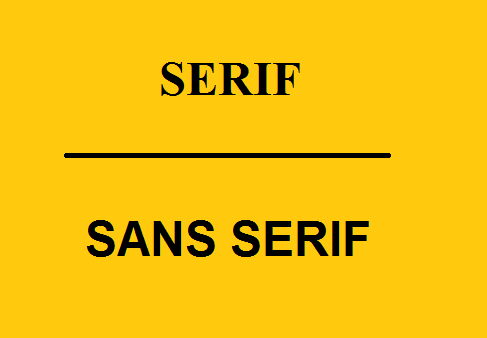 Differences between Serif and Sans serif fonts
With the decorative stroke missing in every character, this font has a very semi-formal look. The most popular fonts in this family are Arial, Trebuchet MS, Verdana, Open Sans, and Helvetica.
Sans serif font is commonly used when the email consists of briefly written content sections.
This email by Facebook creates a great impression with the Arial font they have used.
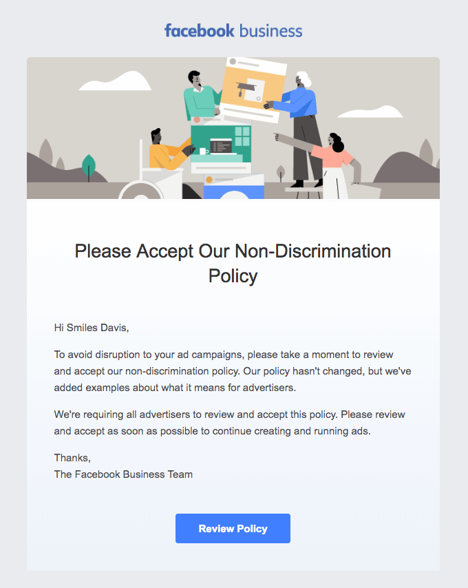 Sans serif font used in an email by Facebook. Source: Really Good Emails
Calligraphy fonts
Using a script style and flowing movement to emulate the look of handwritten words, calligraphy fonts are quite artistic. Calligraphy may be Western, Eastern, or Arabic, each reflecting a language from a different region. However, they are not-so-easy on the eyes when read on digital screens and thus used less often in email copies. You will find them in email headings to grab attention.
As readers take 86% longer time to read fancy fonts, it is important to use these fonts wisely.
In this email, Simple uses calligraphy font to bring the feel of handwritten words, making the email fun to read.
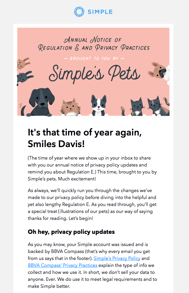 Calligraphy font used in an email by Simple. Source: Really Good Emails
See how MAC has combined simple as well as artistic fonts to draw the reader’s attention in their welcome email.
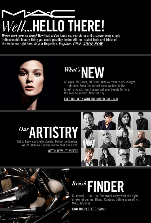 Welcome email from MAC Cosmetics
Monospace font
Resembling a typewriter font, the characters in the Monospace Font have a block at the end. This font can be a perfect choice when it comes to giving the email a sparse, minimal feel. Courier, Lucida Console, and Monaco are some of the fonts that belong to this family.
Check out this email by Misfit. They have used a mix of various monospace fonts in this email including Andale Mono, Lucida console, Courier, and others in the email body.
 Various monospace fonts used in email by Misfit. Source: Really Good Emails
Web-safe fonts or web fonts — how does it matter?
Web-safe fonts are fonts that render correctly on nearly all operating systems. They include fonts like Arial, Comic Sans, Courier New, Georgia, Impact, Palatino, Tahoma, Trebuchet MS, Times New Roman, and Verdana.
Web fonts on the other hand are not found in multiple operating systems and devices. Moreover, not all email clients will display them. Email clients that support web fonts are:
- Native Android Email client;
- Outlook 2000;
- Outlook.com app;
- AOL Mail;
- Apple Mail;
- iOS Mail;
- Safari browser.
It thus becomes essential to use fallback for these fonts. Web fonts can also be hosted on a server from where your email client downloads them and renders them in the subscriber’s email.
Some designers have a thing for custom fonts. These too need fallback to render in all systems and email clients. Always test your emails to check for proper rendering of the fonts as well as the fallback.
Selecting a fallback
So, how do you select a fallback for your email font? These factors will help you:
Font size
Different fonts have different height. So, while selecting a fallback for a particular font, make sure that the one you pick isn’t shorter or taller than the original.
Spacing
Make sure the spacing between letters of the fallback font is similar to that in the font you are using in your email. If not, it can decrease or increase the length of each word.
Suppose you have chosen to use Helvetica in your email and your email subscriber has an Apple device. They will be seeing your email just as you created it — in Helvetica. However, when a Windows user opens the email on their device, they will see the first fallback you have added to the code, say Verdana. If that too is not available, the user will see the font in the your third option you have mentioned, or whichever Sans Serif font is available. So, here’s how it goes — Custom font -> Web-safe font-> System font.
Best font colors for email marketing
Font color helps to make your message stand out. However, limiting your use of colors is the best option. Three is the limit — one for the header, one for rest of the text, and one to highlight the links.
Also, the color you choose must have a high enough contrast with the background color, boosting readability.
Wrapping up
Here are a few ‘typography in email’ tips that will come handy when you are all set to select the best font for your next email marketing campaign:
- choose a font that is appropriate for your email — a business email in Comic Sans will work against you;
- use a font type and font colors in tandem with your brand colors to build a brand image;
- maintain a standard line spacing — 1 ½ size of the font size — in the emails;
- make your email font readable — neither too small nor too big;
- limit yourself to use two font types and colors in an email;
- don’t forget to add fallback fonts for your custom fonts;
- choose the fallback wisely; the height and spacing between letters matter.