People always remember the last thing you say. In conversations, negotiations, or presentations, the closing words often carry the most weight — they linger, shape perceptions, and influence how others remember the entire exchange. The same principle applies to digital communication. In a sense, your email signature is your “last word.”
Your email may be full of high-value content, thoughtful responses, or persuasive offers, but what appears at the end can either make or break that professional impression. Think of a well-crafted email signature as the digital equivalent of a firm handshake or a polished business card — it wraps up the interaction on a confident note. On the other hand, a cluttered, inconsistent, or incomplete signature can distract from your message, diminish trust, and make an otherwise strong communication feel unfinished.
With that in mind, let’s explore the essential elements, design ideas, and best practices for creating a complete and professional email signature that not only looks great but also strengthens your brand, one message at a time.
The key elements of a professional email signature
Whether you’re a small business owner, a company representative, or a self-employed professional, your email signature serves as a strategic branding tool. Every element you include, or overlook, says something about who you are — and how seriously you take your work.
Below are the core elements that typically belong in every professional email signature, especially if your end goal is to build a lasting, mutually beneficial relationship with your recipients.
Full name
Your name is the foundation of your professional identity. Firstly, it personalizes your email and reminds the recipient who they’re communicating with, especially in organizations where multiple people may share similar roles. Secondly, it prevents confusion and improves traceability — your client can always identify and reference you easily.
For brands, this aspect is less critical but still plays a big role. Small businesses and teams can sign off with phrases like “—The [Company Name] Team” or “Warm regards from all of us at [Company Name]” to make the message sound more human.
| When to include |
Exceptions |
| Always. Even internal communications benefit from clarity — especially in large teams. |
In quick internal replies or email threads where your name already appears in the header, you might omit a full signature entirely. |
Job title and department
Your title establishes authority and context, helping the recipient understand your decision-making power and area of expertise. For instance, if you’re a Marketing Director, it signals that you’re the go-to person when it comes to campaigns and brand direction. In contrast, a Marketing Coordinator might be the right person for scheduling or operational inquiries.
For small businesses or teams sending emails from a shared account, individual job titles may not always make sense. In these cases, it’s better to reference the department or team function instead.
| When to include |
Exceptions |
| Always include in external communications or when writing to someone new. |
If you’re a freelancer or consultant, you might use a more descriptive title (e.g., Event & Branding Specialist) instead of a corporate one, which tends to be quite vague. This will help highlight your expertise rather than your hierarchical position. |
Company name and logo
The company name is a must if you want your audience to connect you to your brand. A logo adds a visual cue that strengthens recognition and credibility.
| When to include |
Exceptions |
| Always for client-facing, partner, or external emails. If your company has multiple branches or operational regions, it’s a good idea to also specify which office or location you represent. |
In personal correspondence or internal emails, you can omit the logo to avoid visual clutter. |
Contact information
This email signature element provides quick and trusted ways to reach you beyond email. The contact details also make your communication more transparent and accessible.
| When to include |
Exceptions |
| A phone number is often appreciated by clients or stakeholders who might need urgent contact. A website address is essential for businesses, freelancers, and anyone wanting to drive traffic. Including an office address is a standard practice for brick-and-mortar businesses or formal organizations. |
It makes sense to skip your phone number or address if privacy or convenience is a concern. |
Professional photo (optional)
A headshot can humanize your email and build trust, which plays a big role in sales, customer service, or client-facing roles. It puts a face to the name and makes you more memorable, positively setting you apart from the competition.
| When to include |
Exceptions |
| Use for personal branding, networking, or outreach where relationship-building matters. |
In large organizations or industries that prefer formal, minimal communication, for instance, finance, law, and government, photos are often omitted to maintain uniformity and professionalism. |
People want to connect with real people. Even something as simple as a still image can help users recognize and relate to your brand.
SourceKati Noakes
Founder KN Comms Social Media
Social media links
Including social media buttons extends your professional presence and makes it easy for people to connect or verify your legitimacy without having to manually dig through namesakes on LinkedIn.
| When to include |
Exceptions |
| If your social profiles are active, professional, and relevant to your work, for example, a LinkedIn profile, a company X account, an AI bot on WhatsApp, or an up-to-date Instagram portfolio. |
Skip personal social media unless they’re part of your brand or business presence. |
Call to action
A subtle CTA can guide recipients toward desired actions, like booking a meeting, reading a case study, watching a new webinar, or signing up for a newsletter. It turns your email signature into a marketing opportunity.
| When to include |
Exceptions |
| Ideal for marketers, consultants, or anyone with ongoing campaigns or content to promote. |
Avoid overly promotional CTAs in formal or first-contact emails — they can feel intrusive or spammy. |
Legal disclaimer (if applicable)
Disclaimers protect confidentiality and comply with legal or industry requirements, especially in regulated sectors like healthcare, finance, or law. They let your audience know how you will store and process the data they’re about to share — and whether the exchange is legally binding or secure.
| When to include |
Exceptions |
| When your company policy requires it or when handling sensitive information. |
Skip for informal communication or when sending non-confidential, personal emails. |
On-brand design elements
Consistent email signature fonts, colors, and spacing reflect your brand’s dedication to its visual identity. By tidying the look of your email footer, you also improve readability and draw attention to key details.
| When to include |
Exceptions |
| Always. Design cohesion ensures a professional appearance. |
Minimalism works best for plain-text or tech-oriented industries. It’s better to avoid heavy graphics or complex HTML that may break in some email clients. |
Pronouns (optional but increasingly common)
Including pronouns (e.g., she/her, they/them) signals inclusivity and respect in professional spaces. This is especially useful when communicating across cultures, languages, or organizations where assumptions about gender may lead to awkward misunderstandings.
| When to include |
Exceptions |
| When company culture or personal values support open, inclusive communication. |
If your industry or region isn’t familiar with this convention, it’s fine to omit. |
Email signature best practices and mistakes to avoid
Before you go ahead and design your next email signature, it helps to consider the essential practices that make your email footer law-compliant, informative, and visually inviting. We’ll also demonstrate what can happen if you ignore those rules.
Follow your local legal requirements
Some jurisdictions impose certain requirements regarding commercial emails and their signatures. For example, in the European Union, every business email is treated like a formal letter and must include the same mandatory company details as physical letters. Even in email footers, this information must be complete and easily visible.
In the United States, there are no strict formal signature requirements like in Europe, but under the CAN-SPAM Act, business emails must include:
- a valid physical postal address;
- a clear identification that the message is an advertisement (if applicable);
- an unsubscribe link.
This is relevant even if your newsletters are personal (e.g., founder-led content or written from the perspective of a manager), because in such cases, the sender’s identity becomes part of the brand’s public image.
Keep it short and structured
A plain wall of text as an email signature evokes little desire to read it — and may even pull attention away from your email’s key points. Aim for three to six lines of text, unless you need to include a mandatory disclaimer. It helps to think of it as a digital business card, not a resume.
Be intentional and cautious with color
If you do decide to use your brand colors, reserve them for your name and links, or dividers. One or two accent colors are usually enough to maintain a clean, cohesive appearance. Too many colors in an email signature are likely to create a cheap feel and add visual distractions.
Red and orange colors, in particular, have become deeply associated with call-to-action buttons such as “Buy Now,” “Sign Up,” or “Learn More.” These alerting colors naturally draw the eye and signal urgency or interactivity. When those same colors are used simply to decorate a block that isn’t clickable, like in this email signature example, it can confuse recipients.
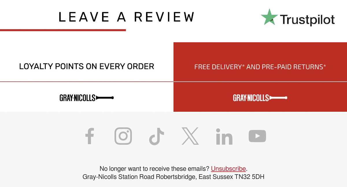 Misleading color use in an email signature
People may instinctively try to click on something that doesn’t lead anywhere, which creates frustration and weakens trust in your email design. Overusing or misusing these colors blurs the line between actionable and decorative elements, breaking the visual logic and hierarchy.
Use a clean, minimalist font
Sticking to web-safe fonts like Arial, Helvetica, Calibri, or Verdana will guarantee your email a professional look across diverse email clients. Keep in mind that aesthetic script or serif fonts can be hard to read on mobile devices.
Optimize for smartphones
The more elements you add to your email layout, the more chances there are for something to break — especially on mobile devices. More than half of emails are opened on mobile devices, which means that your design has to be mobile-responsive — simple, single-column, swipe-friendly, and with tappable links and buttons.
A common mistake when it comes to company email signatures is to force the user to enter the contact details manually, which can be especially jarring on mobile. Adding a chat widget button would be a more elegant solution.
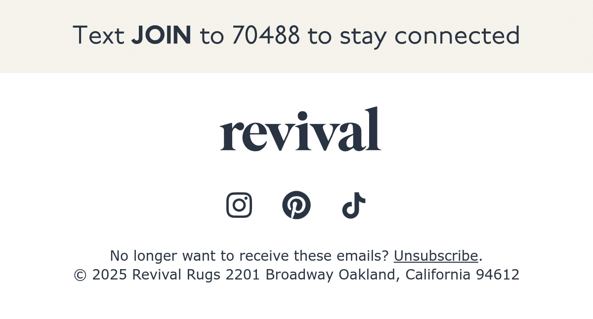 A less mobile-friendly email signature example
Most email automation platforms like SendPulse allow you to test your signature on different screen sizes before finalizing. Our builder comes with a collection of 130+ customizable templates, all of which are responsive by default, so that you can be confident that your design scales up or down equally well.
Include clickable, trackable links
There’s little point in making your email signature interactive if you can’t register those actions. Besides adding hyperlinks for your email address, website, or social media accounts, introduce trackable links (via UTM codes or CRM tools) to measure how often people interact with your signature content. SendPulse, for instance, features built-in analytics tools, which allow you to view the detailed click map of your email.
Keep images lightweight and externally hosted
The email signature isn’t the place to impress your audience with 4K imagery — that’s what the hero section or image gallery in the email body is for. Large or high-resolution graphics can slow down loading times, trigger spam filters, or even fail to display properly across different email clients. Instead, opt for small, web-optimized images such as a company logo or a discreet headshot.
Never attach a logo or banner as a file — it bloats your email size and can trigger spam filters. Most email automation services allow you to upload compressed, web-optimized images hosted on a reliable server instead of embedding them directly into the email.
Use dividers or spacing for clarity
A professional email signature should not mix with the main part of the email — it needs its own visual boundary that signals the end of the message. A simple line, subtle color change, or even a bit of extra white space can help separate your core message from your contact details, keeping the layout nice and clean. The goal is to create a clear, natural pause before your signature, just like with a handwritten sign-off.
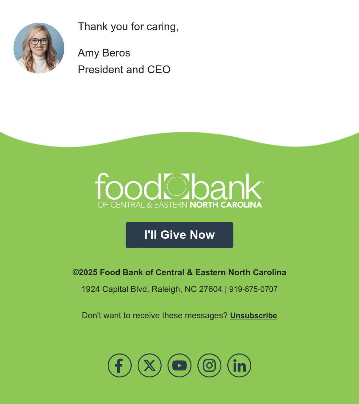 Visual dividers in an email signature
This non-profit email signature example proves how much of a difference proper spacing and use of color make. When nothing is crammed, it’s easier for the reader to follow the flow of the message.
Stay consistent with branding
Lots of email builders offer pre-designed email signature blocks, but, tempting as they are, they may clash with your existing branding. The solution is to thoroughly customize such blocks to avoid a generic feel. Match your email signature’s colors, fonts, and tone to your brand identity and, if you’re part of a team, standardize signatures company-wide for consistency.
Avoid overloading with banners or quotes
While inspirational quotes, content highlights, or social media icons can add personality, too many make the signature feel spammy and even tacky. Limit yourself to two to three icons (LinkedIn, website, and portfolio) and skip quotes unless they directly support your main CTA.
 A clickable email signature idea
If you do include a colorful banner, keep the rest of your signature plain and simple to avoid a visual cacophony. If the banner is clickable, it should be obvious from its design, like in this email signature example.
Ensure accessibility
Even now, many otherwise well-designed or “cool” email signatures still suffer from accessibility issues. Things like flashing banners or hidden unsubscribe links are incredibly common — and may spoil an otherwise positive impression.
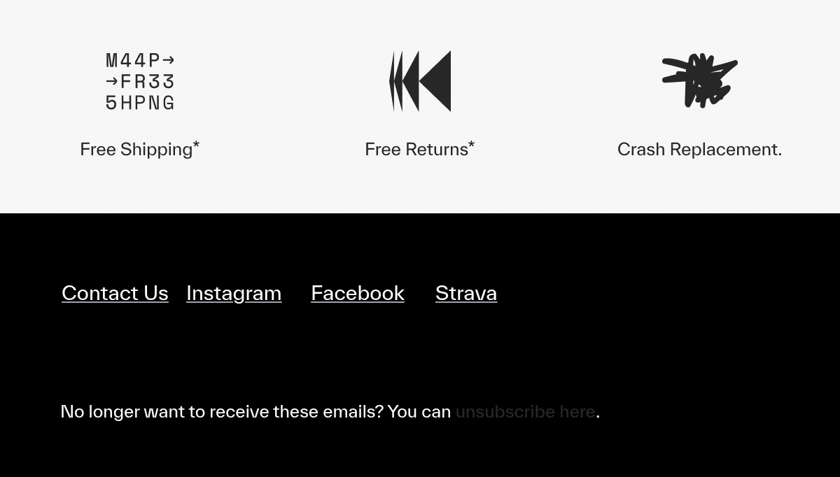 Poor accessibility in an email signature
True professionalism lies not just in how polished your signature appears, but in how universally it functions. Here are some steps you can take toward more inclusive email signature formatting and design:
- Use alt text for logos and icons so screen readers can interpret them.
- If the image is just decorative, use an empty alt attribute.
- Choose readable sans-serif fonts at 12–14 pt size and ensure strong color contrast in both light and dark modes.
- Avoid embedding your signature entirely as a large image.
- If using animated GIFs, make sure they don’t flash more than three times per second. Provide a way to stop or pause if needed.
- Stick to single-column layouts wherever possible, especially for mobile.
- Use descriptive link text — “Visit our website” instead of “Click here.”
- Make phone numbers and links easily recognizable and tappable.
- Include a plain-text fallback so your contact details remain readable even when formatting or images don’t load.
Accessibility isn’t a constraint, and it doesn’t require sacrifices — it’s more of a mark of thoughtful design and respect for your recipients.
Keep it fresh and relevant
Over time, details like job titles, contact information, company logos, or links to promotions and social media can change. If your signature becomes outdated, it will act as a red flag to your potential clients or peers, signaling your lack of attention to detail.
Avoid sending the wrong message by regularly reviewing your email footer and adjusting it according to the circumstances. For example, during an emergency, you might want to temporarily remove promotional banners or upcoming event links and instead include urgent contact information, support channels, or safety notices.
10 best email signature examples from people and brands
There’s still this misconception that the email footer is where all the boring stuff gets crammed together, so there’s no point in trying to make it look good — but that couldn’t be further from the truth. To illustrate how subtle design and formatting choices can elevate an email’s final look, let’s explore some of the best email signature examples from thriving companies and individuals.
Making use of a quirky headshot
For many people, headshots are associated with an uptight and rigid corporate aesthetic — but they don’t necessarily have to be formal. This cool email signature example demonstrates what happens when you introduce a contagiously fun portrait shot at the footer to brighten up the mood.
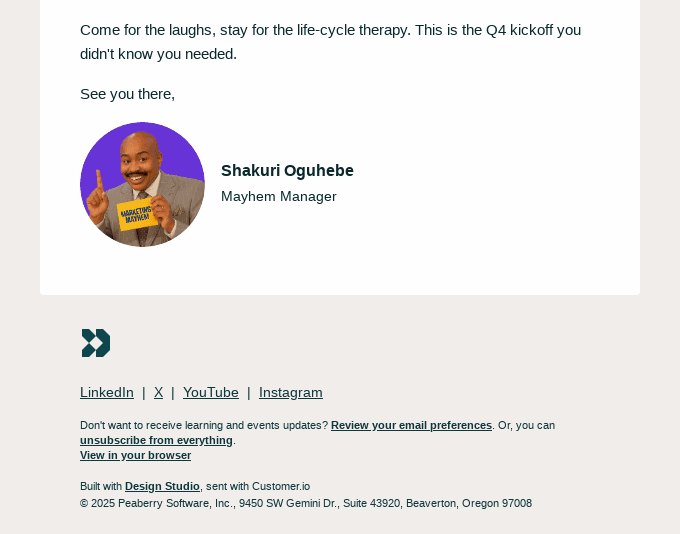 A company email signature example
If your entire team is camera-shy, it’s not a problem, either. Using a headshot of a fictional character is another way to spice up a good email signature and make it a bit more playful — as long as your brand guidelines allow for it. Alternatively, you can even use personalized AI avatars or cartoon versions for each of your team members.
Utilizing a two-column design
Using two-column layouts is not always a crime — in some cases, it’s more than justified, as shown in this example. Email signature formatting best practices are all about presenting content in the most digestible way, and sometimes that means splitting it into multiple columns.
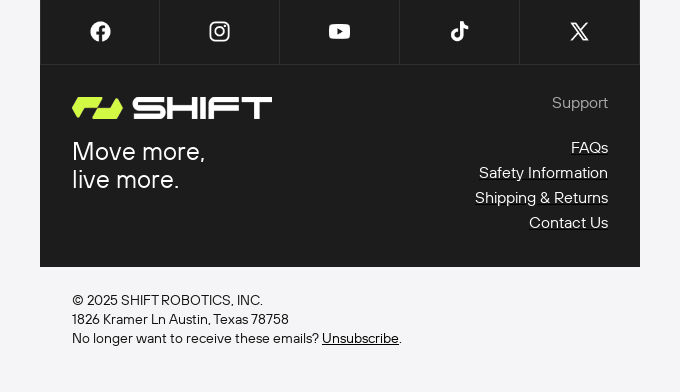 A company email signature used by Shift Robotics
For example, placing your logo and tagline on one side and linking to your key website pages on the other can create a visually balanced, easy-to-scan layout that feels clean and modern.
Injecting personality through emojis
If your email signature feels too dry and impersonal, emojis can save the day, adding a touch of personality without interfering with the main content. This is a good way to remind your recipients that you are a digitally savvy person who isn’t afraid to show a bit of warmth in professional communication.
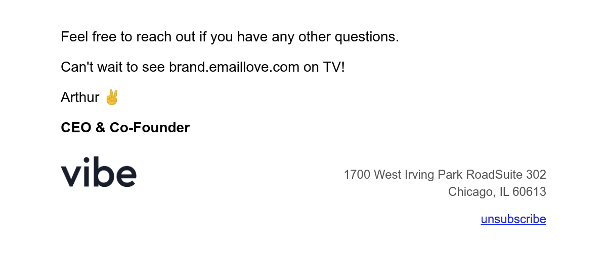 A professional email signature used by Vibe
Stick to one or two subtle, meaningful icons that align with your tone and brand personality. However, when using gesture emojis, like in this email signature example, be aware of their cultural context and potential double meanings.
Respecting potential opt-outs
This sales rep email signature example takes the crown when it comes to transparency and respecting its audience’s time and attention. Instead of hiding the opt-out link somewhere in the fine print, Naomi makes it part of their signature.
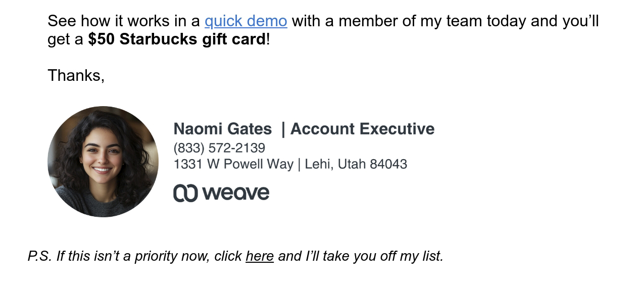 A personal email signature used by Weave’s team member
Due to its informal, down-to-earth language and clean design, this signature feels refreshing yet trustworthy. The included headshot is professional but also bright and memorable, which solidifies the overall positive impression.
Sharing a motivational quote to spark action
Here’s another lesson on how to design an email signature that feels like a meaningful part of a message rather than a formality. Including a fun or motivating quote in a SaaS email, especially for something like a math app, can be a great way to express your brand’s personality and inspire users.
 An email signature example from Brilliant
It works particularly well in onboarding, update, or milestone emails, where you want to encourage engagement or celebrate progress. Having a profound, relevant quote instead of a boring “Until next time!” can elevate your message and make it stick.
Asking for honest feedback
When it comes to corporate email signatures, designing and formatting them is particularly tricky because of the sheer amount of disclaimers and legal documents you need to include. To ease this visual and informational overload, it’s smart to balance the formal necessities with a few interactive, human-centered elements.
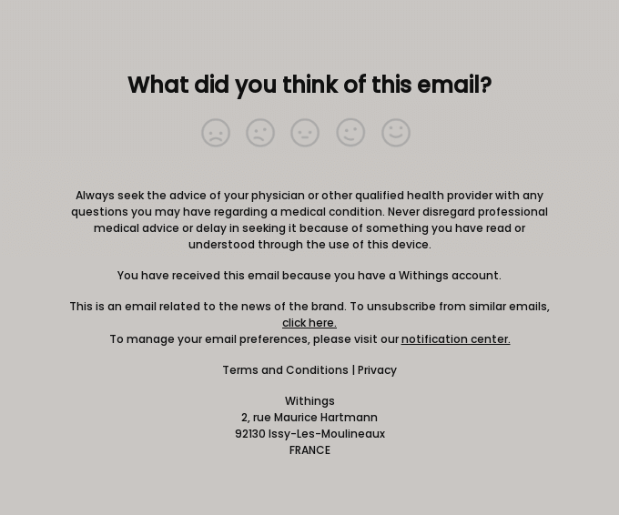 An email signature example from Withings
Adding small touches like this one-click feedback survey, a “Rate your experience” button, or even a simple emoji-based satisfaction poll can make your signature more dynamic and captivating.
Revealing the real human behind the job title
While large corporations rely on scale and reputation, small businesses thrive on personal connection and trust. Adding a touch of personality to your signature, like in this small business owner email signature example, reminds recipients that there’s a genuine person behind the message.
 A small business email signature example
Moreover, for a small business owner, it’s often unnecessary and even counterproductive to use a hyper-professional headshot in their email signature. While a polished photo can convey credibility, it can also feel overly corporate or distant, which goes against what makes small businesses so appealing in the first place.
Including badges and certifications instead of empty accolades
Here’s another clever email signature idea — show your strengths, don’t just tell them. For corporate email signatures, especially for roles like legal advisors or security specialists, it’s often far more impactful to include badges and certifications than vague self-promotions.
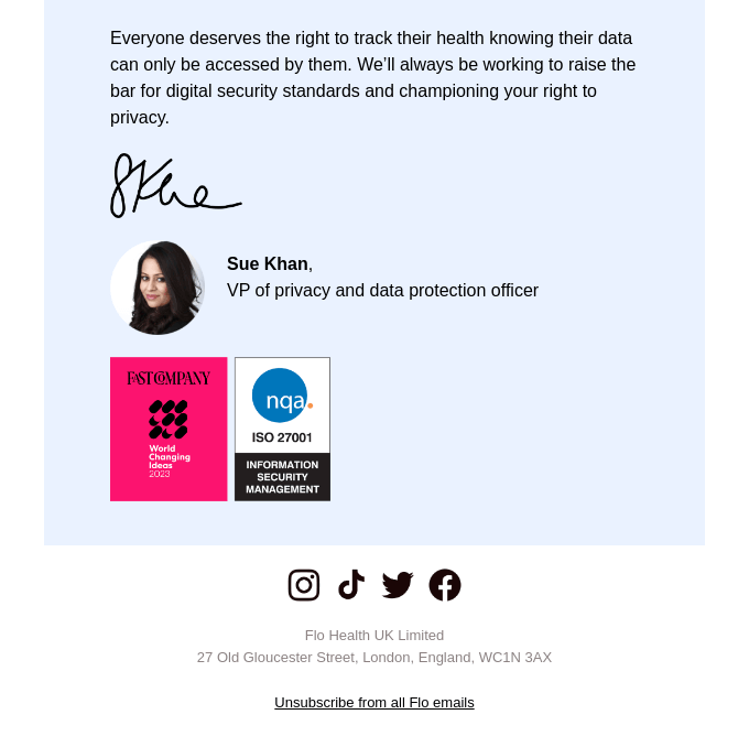 An email signature example from Flo
Compact, verifiable badges carry far more weight than a long line of text claiming expertise — and do not clutter the email design. They are instantly scannable, especially by professionals familiar with industry standards.
Hinting at exciting news around the corner
Including a subtle hint about upcoming news or developments in your email signature can be a clever way to build anticipation. A touch of intrigue is what makes recipients more likely to pay attention to future announcements from you or your company.
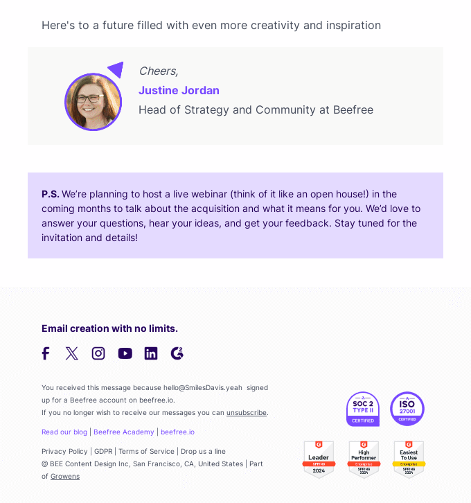 A professional email signature used by BeeFree
One effective way to include subtle hints or spoilers is by placing them in the postscript section of your email signature. The postscript naturally draws the reader’s eye, making it a perfect opportunity for a small teaser without distracting from the primary content.
Masterfully including two CTAs to cover diverse user needs
The postscript section of an email signature can also serve as a strategic space for a secondary CTA, targeting different segments of your audience without interfering with the main message. For example, if a recipient is already familiar with your product or service, the P.S. can gently nudge them toward a more advanced plan or package.
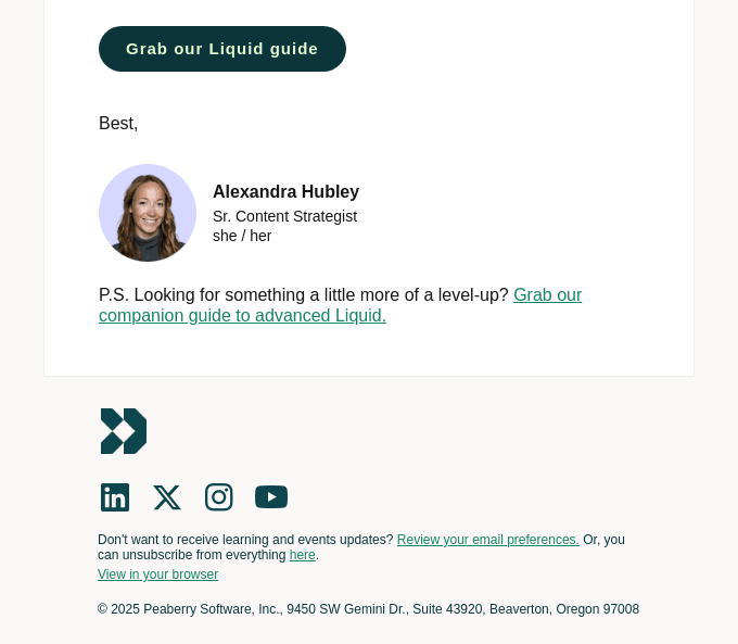 A good email signature example from Liquid
This approach works because the postscript naturally draws attention as a final note, making it a perfect spot for a subtle upsell or cross-sell. It doesn’t compete with the main CTA in the body of the email, yet it provides an additional path for engagement.
3 ways to create an email signature using native or third-party solutions
Now that you know what goes into creating an effective sign-off, let’s take a look at some of the best email signature generators.
Using built-in email clients — for personal email signatures
Most email clients come with built-in signature editors that are both beginner-friendly and completely free. Gmail, for example, even supports externally hosted images, allowing you to insert logos or icons without attaching files — this reduces the risk of triggering spam filters.
 Creating a personal email signature in Gmail
Here’s how to set up your email signature in Gmail using the desktop version:
- Open Gmail and click the gear icon in the top-right corner.
- Select “See all settings.”
- Scroll down to the “Signature” section under the “General” tab.
- Click “Create new,” name your signature, and start editing in the text box.
- Add your name, job title, company, contact info, and any links.
- Adjust your email signature fonts, colors, and alignment if needed.
- Insert images or logos using the “Insert Image” button.
- Set when the signature should appear — for new emails, replies, or both.
- Scroll down and click “Save changes.”
These steps may slightly differ, depending on your device. On mobile, you can add a mobile signature to substitute your web signature when on the go. This method keeps everything within Gmail, but it’s limited when it comes to design options, not to mention link tracking. Nevertheless, with it, you can set up multiple signatures for different occasions.
Using dedicated email signature generators — for corporate messaging
For more advanced options, you will need email signature generators — they offer pre-made templates, branding options, and easy export for multiple platforms. Most of the time, it’s as simple as copying and pasting the finished design to your email client settings.
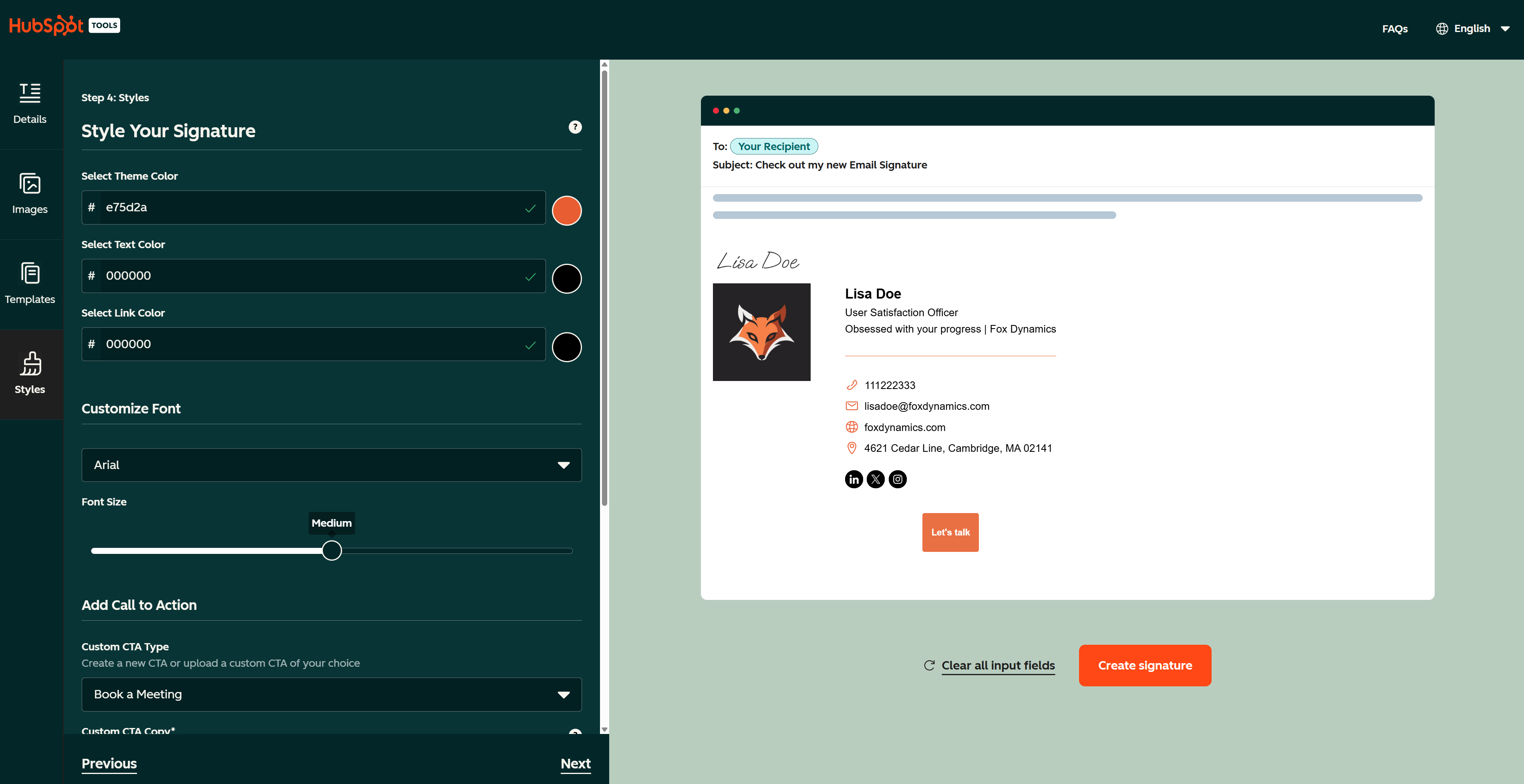 Creating an email signature in the HubSpot Email Signature Generator
There are countless free and paid tools out there — let’s take HubSpot’s free email signature generator as an example:
- Choose a layout that fits your style.
- Fill in your personal information like name, title, company, phone, website, and social media links.
- Add a logo, headshot, or optional banner, and adjust layout and colors to match your brand.
- Preview your signature on desktop and mobile.
- Copy the HTML code or copy the signature directly.
- Paste it into your email client’s signature editor and save changes.
Make sure to use one of the recommended browsers (Chrome or Mozilla) when exporting your email signature design and paste it as is, without matching the style.
Using email automation platforms — for commercial messaging at scale
Email automation platforms and CRM systems let you create professional email signatures that integrate with campaigns and automated messages. This is the optimal solution if you want to go beyond default options and make your signature both interactive and conversion-oriented.
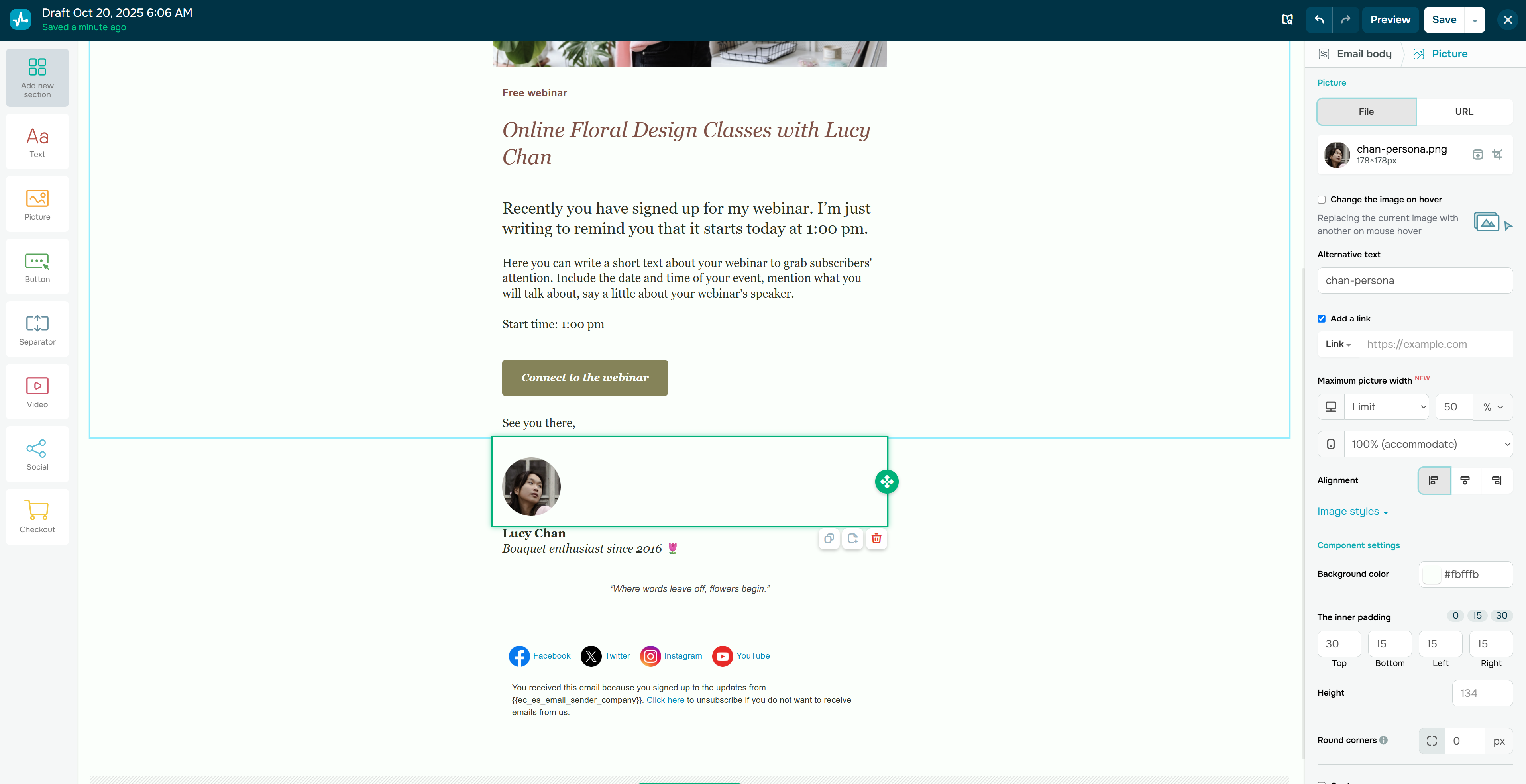 Creating a professional email signature in SendPulse
In SendPulse, you can enjoy the complete flexibility of our drag-and-drop builder to design and customize your dream signature without restrictions. All the ready-made email templates already include an email footer, on top of which you can easily add your own elements:
- Log in to your SendPulse account and navigate to “Email.”
- Create a new campaign and select one of the templates from the library.
- Add your own content and adjust formatting to match your vision.
- Use the built-in AI assistant to generate, improve, or translate email copy.
- Include relevant links and add a logo or profile picture.
- Use the drag-and-drop functionality to arrange, introduce, or remove elements.
- Once satisfied, select your signature and click “Save this block.”
- You can always access it by clicking “Add new section” → “Saved elements.”
This way, you’ll have a consistent on-brand email signature that can be included in any of your SendPulse campaigns in one click. This method is ideal for businesses that send frequent newsletters or automated emails, ensuring consistent branding and compliance across all messages.
Before you go
You’ve gathered some new email signature ideas — put them into practice with SendPulse by creating sleek, engaging emails that are also trackable and give you insights into how your audience interacts with your content. Our omnichannel sales and automation toolkit gives you everything you need to build and nurture customer relationships at scale.
Create your free account today and start exploring our email builder, 360 automations, pop-ups, live chat widget, chatbot builder, LMS, and more!