Psychologists state there is a strong connection between colors and feelings. Email marketers, in turn, see color triggers as a hard-hitting branding and decision-making tool. There’s a reason for that — 85% of users are strongly influenced by the color of the product when shopping. Read on to find out how colors can turn your emails into a literal eye-candy and check out our tips on how to apply them properly.
Color psychology in email marketing
Color psychology is a science that studies how color influences human behavior. When our eyes see a color, they contact specific brain parts responsible for our mood, feelings, and, eventually, behavior.
For email marketers, the right choice of color improves brand recognition by up to 80%, which makes it a promising sales booster. On top of that, 93% of consumers put the visual appearance of the product above smell and texture. So color is another ace up email marketers’ sleeve to increase the customer’s shopping appetite.
But, which colors should you choose? Let’s hit some examples from our inbox and find out what colors you can use to press the right button in your customers’ minds.
Blue — guarantee stability
Blue is recognized as the safest and most positive color worldwide, which is believed to have a soothing effect. Apart from that, it inspires trust, so many businesses often use it to win credibility. Choose light shades of blue to make your email look more relaxing and calm, and try dark blue to breathe strength and reliability into your emails.
Have a look at an email from Warby Parker. It reports on the most popular styles of the glasses. With various shades of blue, the email brightens up, whereas the stats look trustworthy.
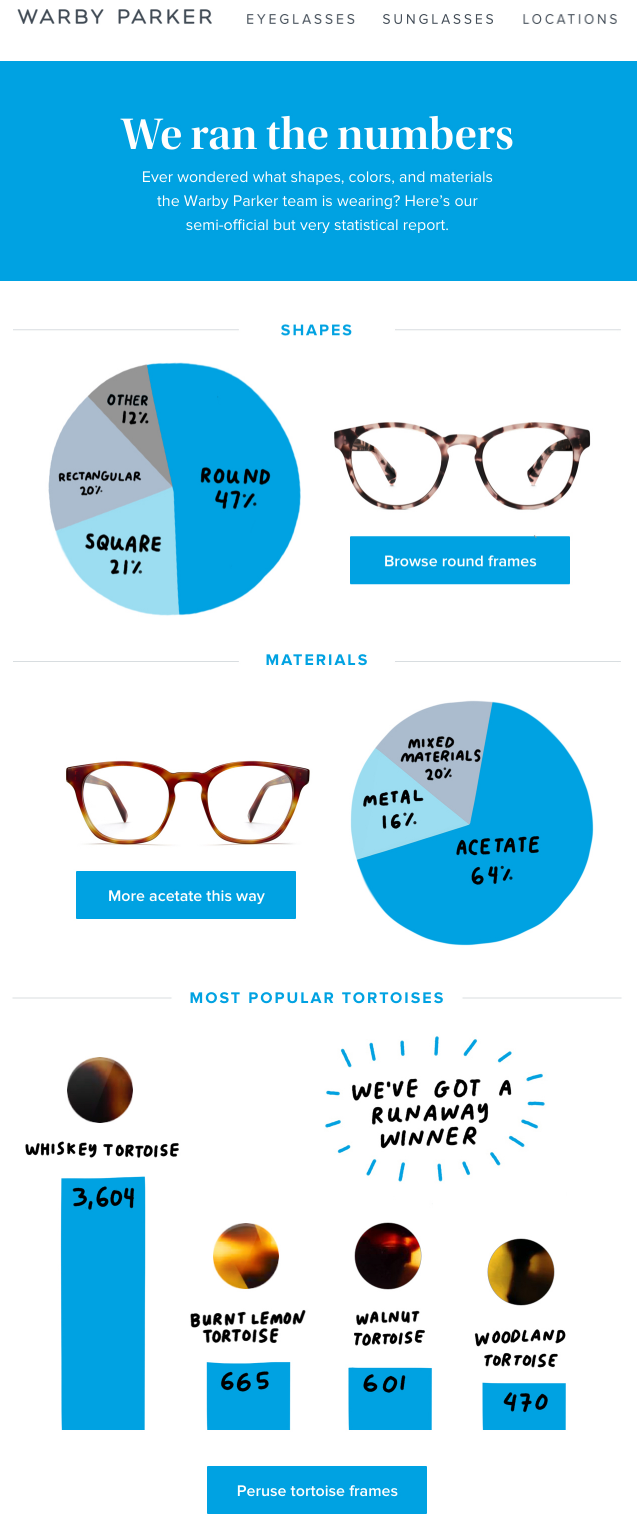 Blue in email an template from Warby Parker
Red — capture attention
Red can indicate importance, passion and even danger. If used as the dominant color, it can make an email look like an eyesore, so it’s better to apply this color for CTA buttons or as an accent in your message.
Look at this email from MAC. The company joined the promoted items and the call-to-action button with the color red. This way they glued the audience’s attention to their offer and CTA, highlighting the key points of the message.
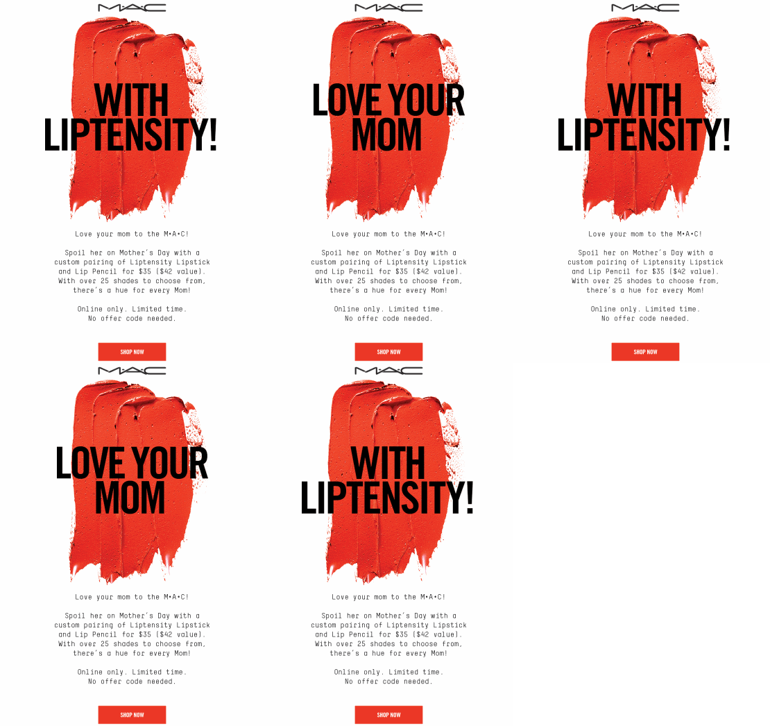 Red in email template from MAC
Orange — encourage action
Orange is fun and creates the feeling of warmth and creates a sense of impulse. It isn’t as overwhelming in design as red but also suggests urgency. This is why companies often use this color to encourage users to subscribe or make a purchase.
Check out how Mud Pie used orange in their Halloween-themed email. The brand elaborated a well-balanced color pallete, so the email doesn’t look garish, stimulating activity instead.
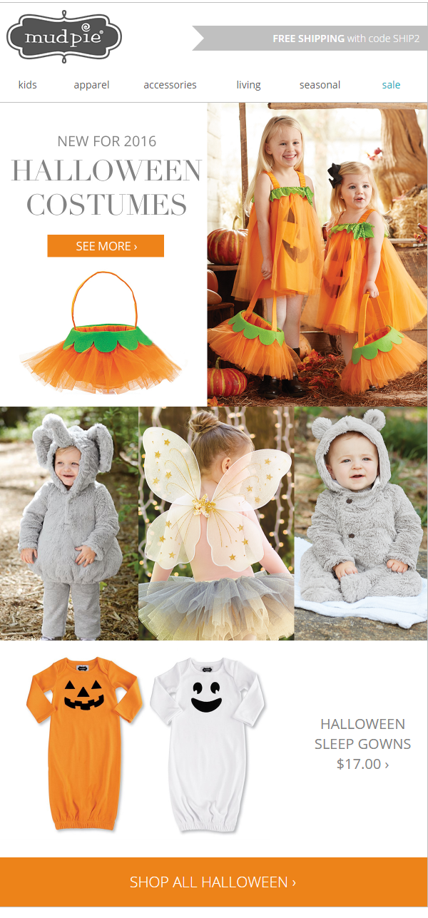 Orange in an email template from Mud Pie
Green — inspire to care for nature
This color is traditionally associated with renewal, health, and life. Bright green is dynamic and lively, while its darker shades link with stability and growth. Being considered the most environmentally-friendly color, green is associated with nature and new beginnings. This is why pharmacological, organic food and eco-friendly companies widely use it.
Patagonia, a clothing retailer and an environmentally-friendly company, encouraged their subscribers to buy themed T-shirts made from organic and recycled materials. The company topped their environmental message with greenery, calling customers to support the brand’s ongoing eco-campaign and purchase the promoted items.
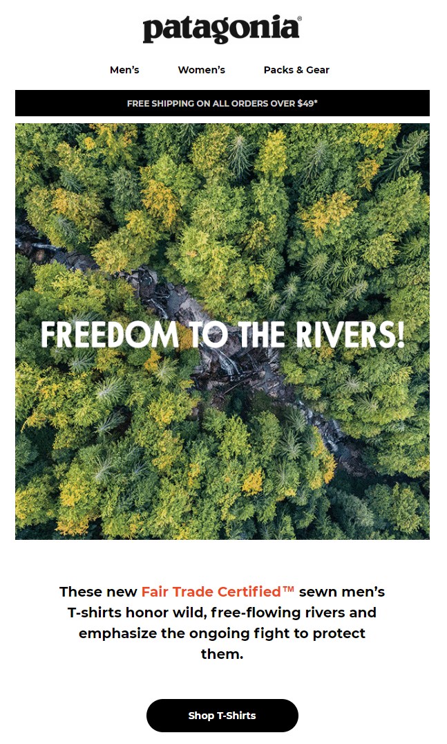 Green in an email template from Patagonia
Yellow — energize your email
When you think of yellow, what usually pops in mind is optimism, joy, and creativity. This color is also associated with strong positive emotions. Companies use it to grab audiences’ attention and stimulate compulsive buyers. However, yellow may also showcase warnings and even cause anxiety, so you’d better not overdo it.
Calzedonia, for instance, sent a yellow-charged email to promote their new swimsuit collection. A smart combination of color that doesn’t tire the eye, but instead cheers the reader up and brings positive holiday vibes.
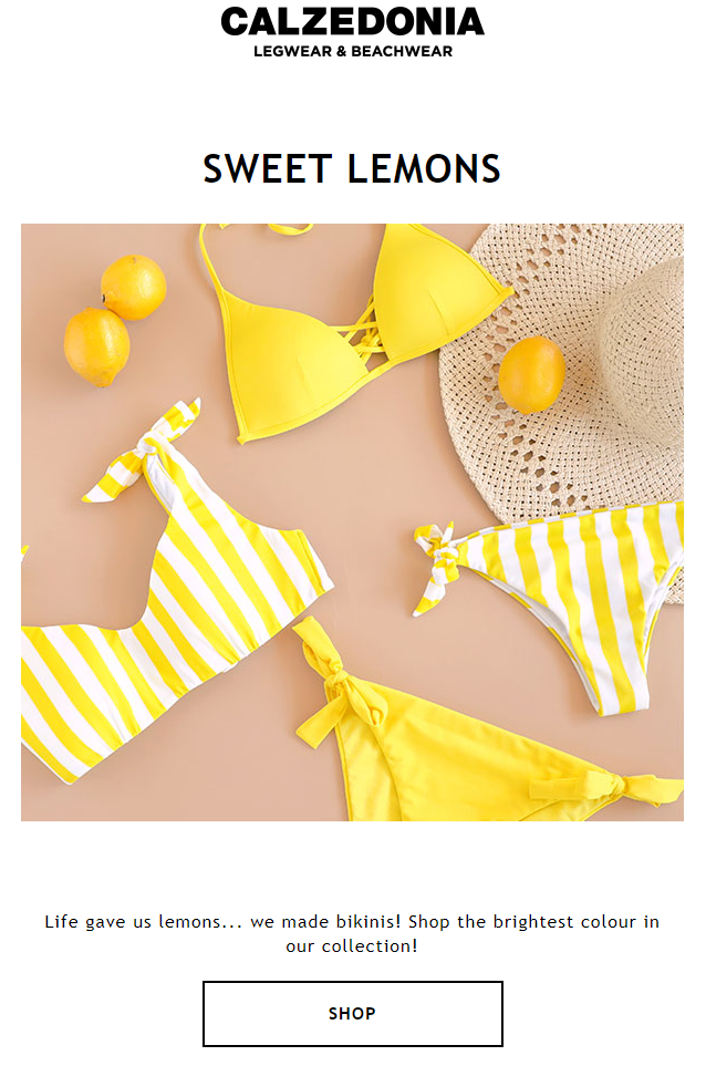 Yellow in an email template from Calzedonia
Purple — add sophistication
In color psychology, purple means wisdom, independence, mystery, and magic. Its darker shades remind people of royalty and nobility, while lighter shades indicate feminine energy and delicacy. Adding hints of purple to your email fills it with uplifting and encouraging accents. But be careful as using too much purple can cause feelings of frustration.
Brands are often inclined to purple when marketing beauty and anti-aging products. Dermalogica, for example, put purple on top of one of their email campaigns to highlight the exclusivity of their special offer.
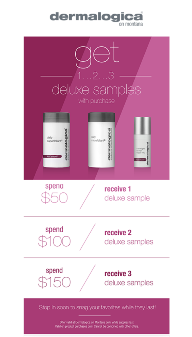 Purple in an email template from Dermalogica
Black — add a touch of elegance
Black is often linked with mystery and sadness. Yet in email marketing, the black color is associated with luxury and exclusivity. In fact, the darker the shade is, the more sophisticated it looks, it is no surprise that this color is widely used to market expensive and high-class products.
Have a look at the email Chanel sent to inform their subscribers about their new collection. The fashion brand blended the lights and darks with a touch of bright color, so black in this email doesn’t look depressing, but rather sleek and sophisticated.
 Black in an email template from Chanel
White — keep it simple
White represents purity, simplicity, and innocence. This color is associated with freedom and spaciousness; that’s why companies commonly use it to get a modern and minimalistic design. However, white is hardly a dominant color to highlight the call to action or a special offer, so it’s better to combine it with other colors to brighten up the email.
Alice and Olivia, for example, used white to highlight the key points of their email campaign — brand’s wedding collection. Since the company put white as a center color, they paired it with a contrasting background, so the promoted items stand out and catch attention.
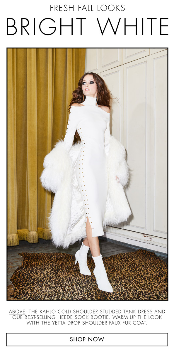 White in an email template from Alice and Olivia
Anyway, it’s one thing to be aware of the psychological effects of different colors, it’s another thing to apply this knowledge wisely as there may be some pitfalls on the way to implement colors to emails.
Five tips on how to apply colors in emails
- Code the colors correctly. When coding the email, choose a HEX triplet or its shortened three-digit form over an RGB one as some email clients fail to display the latter properly. Say you’re planning to add a red CTA to your email. In this case, write #FF0000 instead of rgb(255,0,0).
- Choose the color scheme. Applying random colors to your email’s design isn’t the best idea. Choose a base and a secondary color and make sure they go well with your brand.
- Count the colors. Overloading your emails with too many colors can distract the reader and clutter your email’s design. So, try to use no more than two main colors in your email.
- Apply a proper background color. If used correctly, this hack will help you organize content and create a visual hierarchy, making it easy for the reader to skim through your email. What’s more, background colors don’t increase email weight and load faster, unlike images.
- Hush the color palette. The spam filters of the majority of ESPs perceive flashy emails as spam. Stay away from spam folders by muting the shades of your emails.
Parting thoughts
A smart use of colors should be another core element of your email marketing strategy. Figure out the key idea of your message to choose the right color and feel free to follow the above-listed tips to create an email that converts. Run A/B tests to work out the most suitable email design, and your campaigns will become a real piece of art.