Conversion rate optimization (CRO) is the systematic process of increasing your conversions. CRO boils down to obtaining more sales from the same amount of traffic and entails studying your target audience, their behavior, and how they interact with your content.
In this video, Anya, a marketer at SendPulse, explains how to turn your site visitors into loyal customers.
Why is conversion rate optimization important?
Digital marketing is a rapidly changing field. Your customers’ buying habits, behavior, and journey through the sales funnel change now and again. As a result, marketing strategies that worked well six months ago may not be effective these days. The only way to keep your business afloat in this constantly evolving environment is by working on conversion rate optimization.
Conversion rate optimization can bring numerous benefits, among them improving marketing investment. Marketers can be sure that website traffic that comes after the implementation of marketing campaigns is used to its full potential. Companies successfully convert more users into customers and get more value from the costs they spend on generating leads, consequently bringing higher revenue.
CRO enables businesses to have a better understanding of their target audiences, their needs, requirements, and preferences. After receiving customer insights, marketers can adjust their marketing strategies and make well-thought-out decisions regarding the website and its elements, content, social media efforts, customer support, and more. The analysis of user behavior enables companies to craft their website, blog posts, social media posts, advertising campaigns, and email campaigns to meet their needs, improve satisfaction, and bring conversion.
Better yet, conversion rate optimization allows you to get a lot of value from your current audience without investing a ton of money into attracting new leads. Read on to learn conversion rate optimization statistics to prove that it truly matters for your business’s profitability and growth.
Conversion Rate Optimization Statistics
Conversion rate optimization statistics provide you with real proof of the necessity to improve your website, email campaigns, social media, and other channels for better sales. We’ll give some of the most crucial statistics to consider when deciding whether it’s important to optimize customers’ experience with your brand.
- 80% of new prospects don’t convert into customers;
- 96% of site visitors aren’t ready to purchase;
- 74% of marketers focus on lead conversion as one of the key priorities;
- personalized CTAs bring 202% better conversions;
- average landing page conversion rates amount to 26%;
- landing page conversions increase by 10% after reducing distractions.
While statistics focuses on the importance of conversion rate optimization for your business, you still need to understand the benefits it carries. They will help you decide whether it's appropriate for your team to review your site, social media, and email marketing and find space for optimization.
Benefits of Conversion Rate Optimization
Conversion rate optimization has other advantages besides getting more revenue from the same amount of traffic. Let’s take a closer look at some of them.
- Advanced knowledge about your customers. There’s no CRO without collecting customer information, and the more you know, the faster you can drive your audience through the sales funnel.
- Prolonged customer lifetime value. A well-produced conversion rate strategy allows you to gain more leads and retain your current buyers.
- Higher search engine rank. CRO implies that your website visitors get what they want from your site, and search engines love it. Thus, your web page appears higher on SERPs, and you get more traffic.
- More profitable paid advertising. You probably invest a lot in PPC – an advertising model where you pay for each click on your ads. When your landing page converts more leads obtained from this channel, you get more revenue on each cent invested.
- Increased brand credibility. Thanks to CRO, you get more dedicated customers and higher ranks on search engines. These things combined raise trust in your brand.
- Effective lead generation. A well-thought-out lead generation strategy contributes to the quality of your prospects. An optimized user-centric website allows you to boost the number of qualified potential customers.
- Lower bounce rates. Since conversion rate optimization aims to identify and eliminate your website's issues, you can reduce the number of bounces your site causes. An optimized website will improve customer satisfaction and lead to more potential clients staying with your brand and buying your products.
- Better user experience. CRO allows you to understand how site visitors interact with your website and identify the issues that make them leave without purchasing. When you improve your website based on the user's needs and requirements, you can boost customer satisfaction and loyalty. The number of conversions will improve.
- Higher ROI. Website optimization contributes to the ROI of site visitors and your customers. When done right, conversion rate optimization will help you obtain more revenue than you spend on lead generation.
- Competitive advantage. Having a website that has all the necessary elements to engage customers, provides smooth support, a fast checkout process, and quick loading time helps you outperform your competitors. Customers prefer a proper website rather than those with low loading time, complicated payment options, incomplete information on products, or unclear call-to-action buttons.
- Higher profits. By improving the number of conversions with your company, you automatically increase your revenue. When site users are satisfied with their shopping experience, customer support, and brand values, they are more likely to buy your products. This results in better conversion rates and, consequently, higher profits.
We’ve unpacked a few benefits your business gets from conversion rate optimization. Now it’s time to take action. Let’s start with seven hacks to skyrocket your landing page conversions.
E-commerce Conversion Rate Optimization: Tips and Examples
- Design landing pages with one goal
- Apply simple UX design
- Include elements establishing trust
- Make it responsive
- Ensure seamless checkout
- Be short, sweet, and concise when messaging
- Provide targeted recommendations
Improving your e-commerce conversion rates requires a strategic approach, as there is no one-size-fits-all solution. You need to carefully review your conversion rates and website and consider taking the following steps.
Design landing pages with a single goal
Each landing page should be designed to achieve one specific objective among your site visitors. This focus allows potential customers to concentrate on a single action, reducing distractions and increasing the likelihood of conversion. When you focus on selling a particular product with the help of your landing page and add a specific CTA to do it, you increase conversion opportunities. Optimized landing pages are more likely to convert users rather than overwhelm them with unnecessary information.
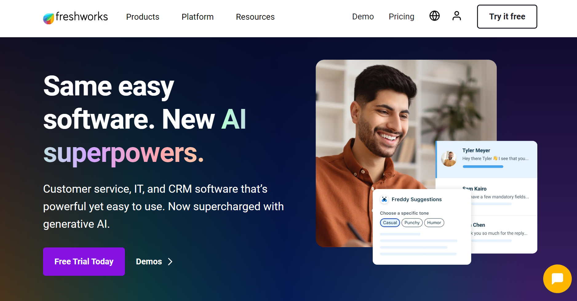
Below, you can find how Freshworks places its call-to-action buttons. They are visible, clear, and concise, allowing users to instantly proceed to the desired action.
Apply simple UX design
Due to users’ short attention spans, it’s essential to stick to a clear, simple, and uncluttered UX design. Your layout and navigation bar should make it easy for shoppers to find everything they need fast and effortlessly. Check your landing page for good information architecture, clear terminology, the absence of distractions, and other elements that might negatively affect purchasing decisions.
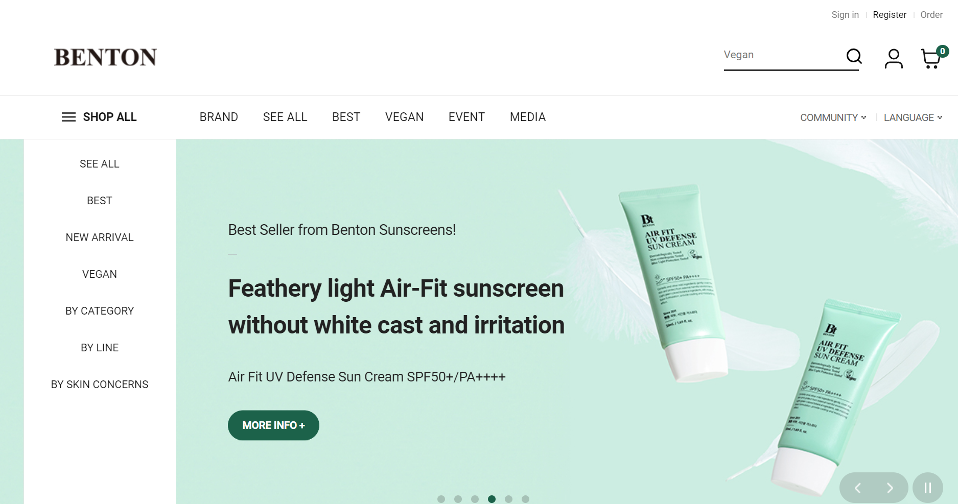
Below, you can see how simple Benton’s landing page is. The navigation bar allows users to quickly find all the necessary products.
Include elements establishing trust
You need to take care of these since prospects often pay attention to the comments, reviews, ratings, customer success stories, and case studies from previous customers. These elements are crucial for building trust and credibility. By adding customer ratings or success stories to your landing page, you can encourage trust and engagement, resulting in conversions.
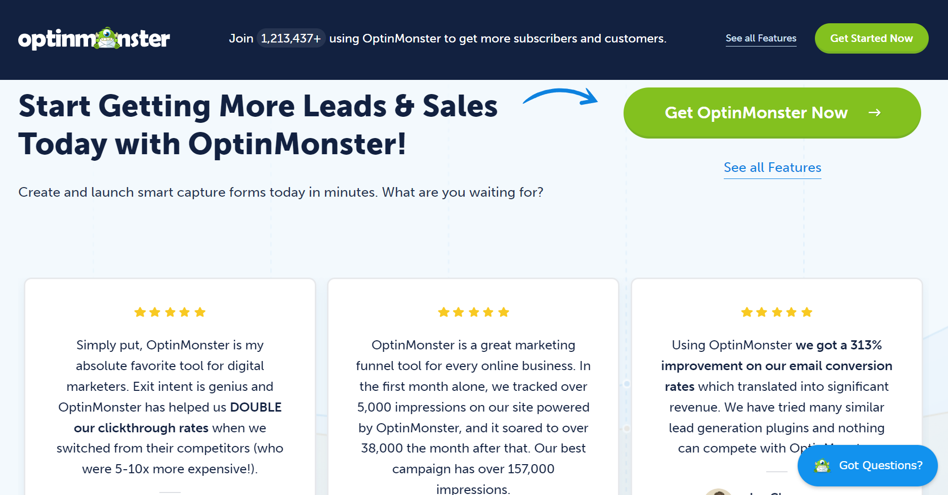
Below, you can see that OptinMonster adds customer testimonials to its website. These testimonials discuss the benefits of using the service and how it helps solve specific problems.
Make it mobile-friendly
More and more people are accessing websites and making purchases from their smartphones. However, not all e-commerce companies offer a mobile-friendly experience because their sites aren't optimized for mobile use. If you haven't optimized your site for mobile yet, it's time to prioritize it to avoid losing potential conversions. Ensure your website looks good on all screen sizes and allows users to explore products, complete checkouts, and view demos effortlessly.
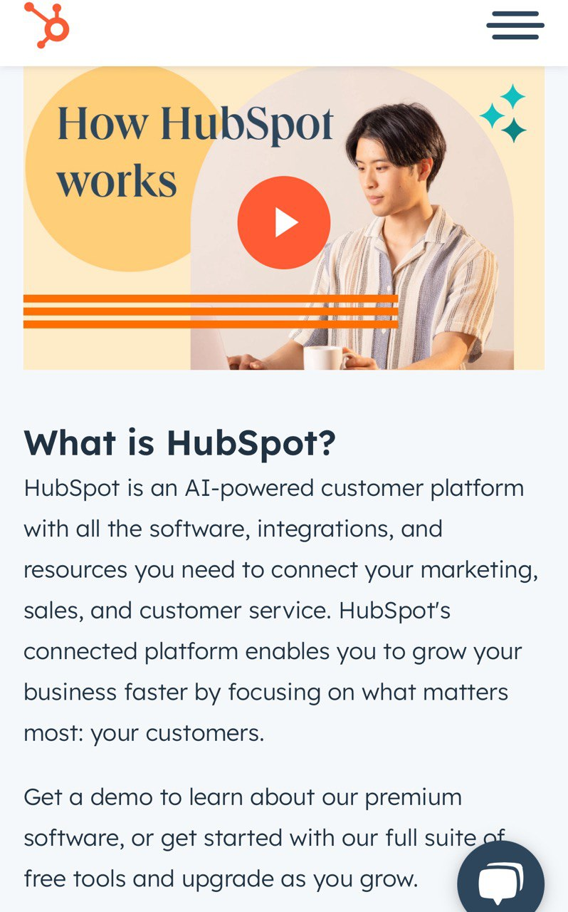
For example, HubSpot’s mobile website is easy to navigate, featuring a simple layout, ample white space, intuitive CTAs, and other user-friendly elements.
Ensure seamless checkout
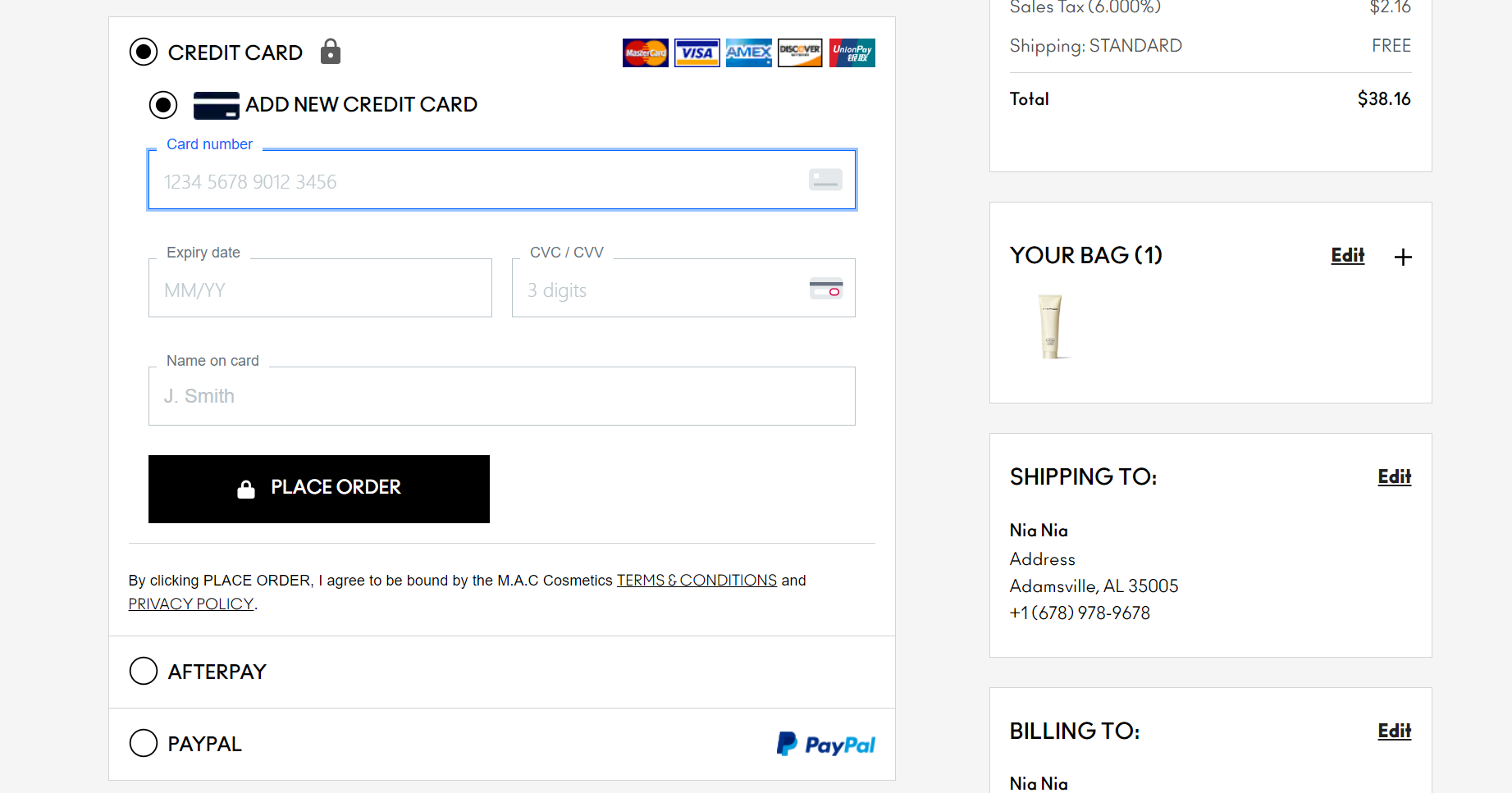
A complicated checkout process can make users abandon their carts and leave your site. To prevent this, ensure your checkout process is as simple and fast as possible. Reduce the number of steps, offer multiple payment methods, and allow new customers to checkout without creating an account or logging in.
For example, shopping on MAC Cosmetics' website is straightforward and user-friendly. Users can shop as guests without logging in, choose their preferred payment method, and quickly proceed to checkout. The process is streamlined, requiring minimal time and effort to complete.
Be short, sweet, and concise
You need to stay simple and concise across communication platforms. Consider using clear language and avoid creativity and wordiness. Your customers should be able to understand and find everything fast.
Below, you can see how Birkenstock describes its products. Every item has a clear description that provides details about the product. Customers can instantly see the available sizes, prices, materials, etc.

Provide targeted recommendations
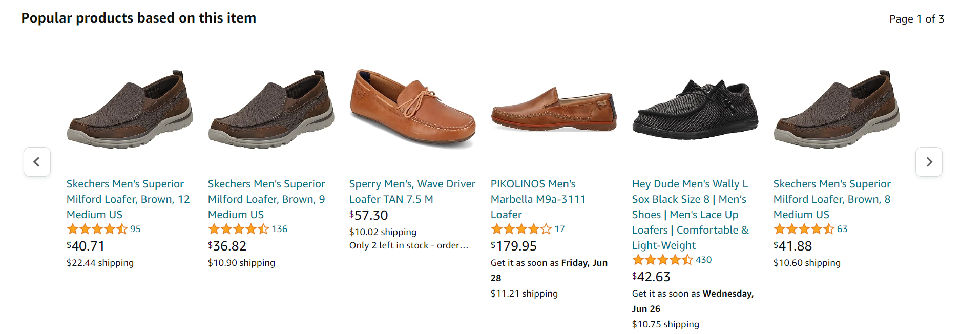
Crafting personalized offers for your customers leads to higher engagement and increased actions. Tailoring the shopping experience to individual preferences enhances sales opportunities and customer satisfaction.
For instance, Amazon excels at providing a personalized shopping experience. After a user explores a specific product, Amazon displays a list of similar products based on the user's browsing history, increasing the chances of additional purchases.
When you are involved in e-commerce, it's essential to improve conversion rates across all communication channels. Since landing pages are a primary source of leads, optimizing their conversion rates is crucial. We will show you how to do this effectively.
13 Tips for Increasing Your Landing Page Conversion Rate
- Rethink your landing page design
- Create attention-grabbing headlines
- Let users set preferences
- Provide a strong, unique value proposition
- Add engaging CTAs
- Encourage trust
- Include optimized visuals
- Revise your website copy
- A/B test your landing pages
- Add exit-intent popups
- Optimize for mobile
- Improve your page forms
- Remove distractions
Boosting your landing page conversion rate requires careful planning and execution. Consider the following tips to enhance your results.
Rethink your landing page design
Visitors spend roughly 50 milliseconds deciding whether your website is worth viewing. Hence, make your landing page design a show-stopper.
Firstly, revise your structure and ensure it is clear-cut and easy to skim. Check if your page has the following essential elements:
- a prominent headline;
- relevant, high-quality, and eye-catchy images;
- a compelling and distinctive call to action;
- a simple subscription form.
Use custom visuals like infographics or videos to boost your web page conversions even more.
Webflow provides an A+ example of a well-designed landing page. Various colors for each block make the page structure sharp and keep viewers engaged. The company uses custom visuals, such as collages, videos, animations, and infographics, to showcase its product and illustrate its benefits.
The CTA button is located on the first screen and immediately grabs visitors’ attention. Moreover, Webflow reinforces its call to action with social proof — clients’ logos — boosting the conversion rate.
Create attention-grabbing headlines
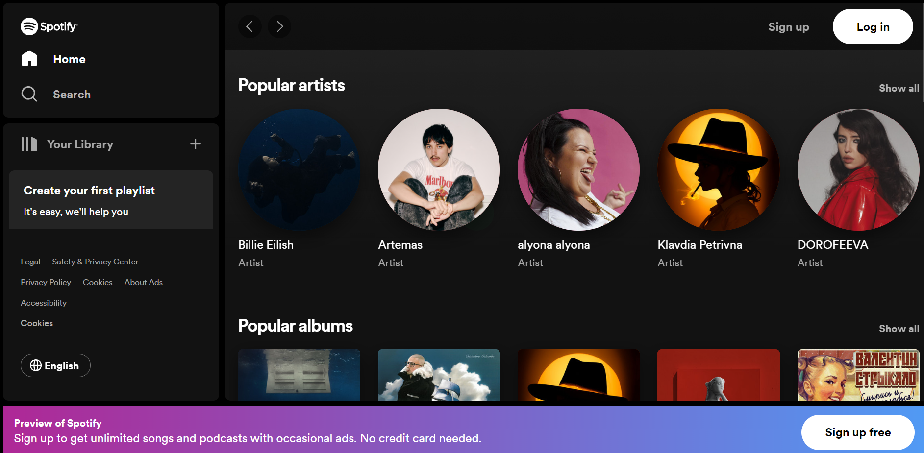
Your headlines should be brief but contain the main value and resonate with your target audience’s concerns. A compelling, engaging, and eye-catching headline, including a value proposition, is a must for better conversions.
Below, you can see clear, visible, and concise headlines Spotify uses to let users navigate its website seamlessly.
Let users set preferences
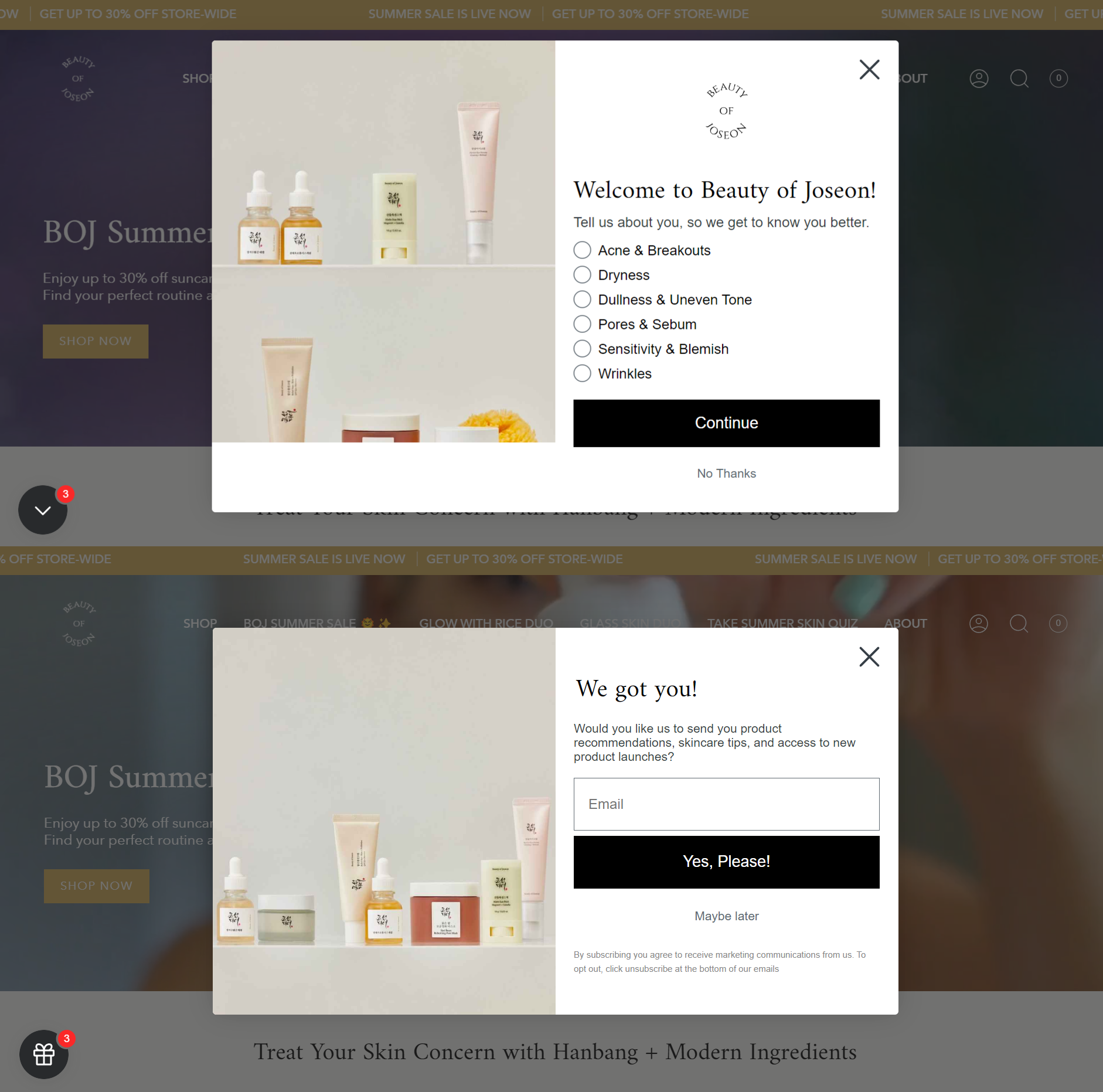
Add special forms to your website to let users set their preferences and get to know them better. By understanding prospects’ needs, you can provide more personalized offers and products they seek.
Below, you can see how Beauty of Joseon uses this strategy to its advantage. After landing on the brand’s site, users encounter a pop-up form inviting them to share information about their skin concerns. Next, they are prompted to enter their email addresses to receive personalized product recommendations. This approach allows the company to collect contact information and send targeted offers, contributing to higher conversion rates.
Provide a strong, unique value proposition
To successfully convert site visitors into customers, you need to communicate the benefits of your product. Your prospects should understand why choose your product or service over others. A brand that stands out from the competition has more opportunities for conversions.
When landing on HubSpot’s website, you can instantly see what the company offers and the benefits customers can reap. The value proposition is clear, concise, and visible to everyone visiting the page.

Add engaging CTAs
When designing call-to-action buttons, it's crucial to ensure they are well-placed, feature compelling text that encourages action, and have an appropriate design. Your CTAs should be strategically positioned throughout your landing page to allow users to take action seamlessly.
In addition to placement, pay close attention to the wording of your CTAs. Use strong, concise, and action-oriented language such as “Shop Now,” “Grab the Offer,” “Learn More,” “Start Now,” and similar phrases to prompt immediate engagement.
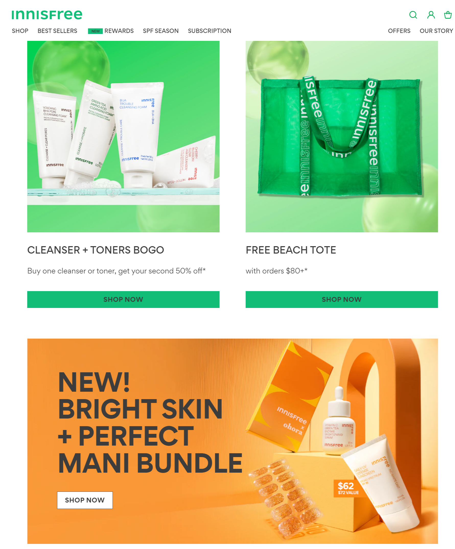
Below, you can observe how Innisfree, a well-known Korean skincare brand, effectively utilizes visible, concise, and encouraging CTAs. These buttons guide site visitors to navigate to essential sections and complete desired actions. The design is simple, with appropriately chosen colors that enhance usability.
Encourage trust
If you want to gain prospects’ trust and credibility, you should provide social proof in various forms. This can include reviews, ratings, case studies, success stories, testimonials, etc. Consider adding certifications and security seals to your landing page so that users mark your brand as trustworthy.
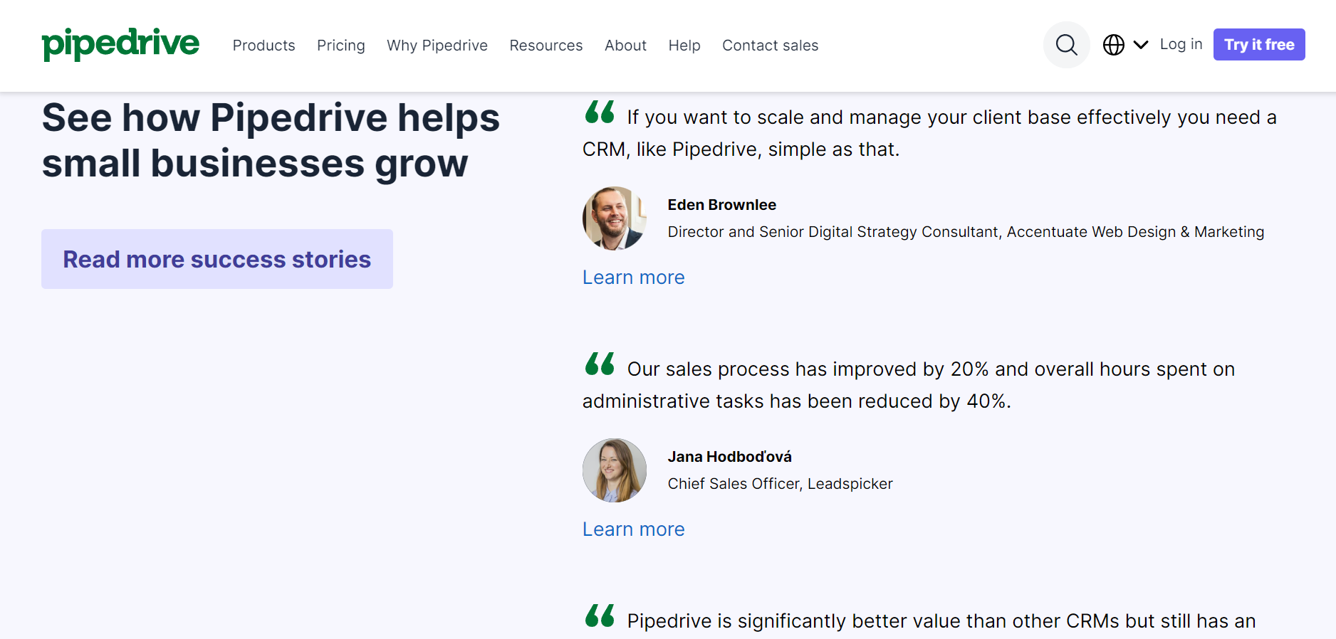
Below, you can see how Pipedrive uses small business owners' customer success stories to establish trust and credibility. Positive reviews help the company increase its customer base and gain more conversions.
Include optimized visuals
Besides adding relevant, high-quality, and informative images and videos, you should also ensure that they align with your audience’s pain points, needs, and preferences. The size of your visuals also matters because it influences your landing page speed. That’s why you should optimize all the visual elements you decide to include.
Revise your website copy
Writing is crucial for improving your landing page conversion rate. While your design attracts potential customers, the copy persuades them to take the desired action. Check if your page text matches your target audience to make it more persuasive. If your knowledge about your customer persona is vague, you’ll fail to address their pain and interests and persuade them. Then, ensure your landing page contains only one clear call to action. The fewer links you have, the higher your conversion rate is.
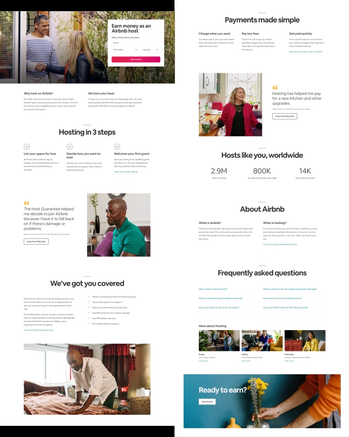
Airbnb knows a little something about creating an effective landing page copy. The text is intertwined with social proof, such as statistics and customer testimonials. Airbnb uses minimum words to enlighten its viewers and persuade them to become partners. The razor-sharp structure makes the copy easy to skim.
A/B test your landing pages
When it comes to CRO, A/B testing is nothing to sneeze at. Changing a minor detail, such as your CTA button’s color or image position, can often increase a conversion rate.
If you want to conduct split testing, start with a hypothesis. For example, which landing page element can change the game for your conversion rate? Or you may need a whole new web page design. If you are stuck on this step, try experimenting with the key elements of your page, including your unique selling proposition, main image, features, benefits, and call to action.
When running an A/B test, stick to the following rules to get reliable results.
- Test only one variable at a time. It might be a single page element or a whole different page design.
- Define your primary metric. It can be the number of web page visitors or the number of leads converted — choose whatever serves the purpose of your split testing.
- Outline your test duration. You should run your test long enough to get a substantial number of views.
- Ask users for feedback. This move will give you valuable insights into why your audience prefers one variant over another. Besides, you can get some hints for future tests.
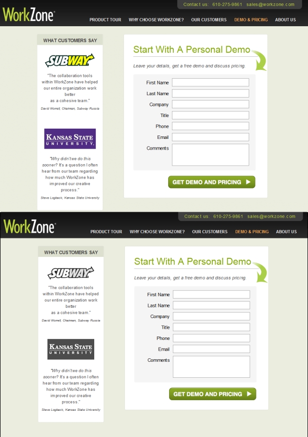
In the example from a WorkZone case study below, the company replaced colored logos with black-and-white logos. After 22 days of split-testing, the second variant showed a 34% increase in form submissions.
Add exit-intent popups
Many marketers avoid exit-intent popups because they are believed to be annoying for viewers. However, this tool is essential for conversion rate optimization.
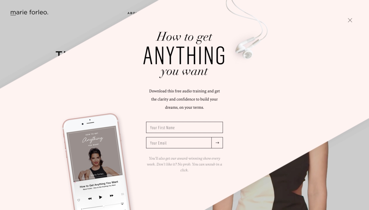
Apart from design hacks, you should pay attention to your copywriting and hook a viewer with an outstanding headline and a strong call to action. You can also implement some psychological tricks, as entrepreneur Marie Forleo did in the example below.
The popup explains the benefits of her audio training for subscribers and promises some additional value. Moreover, it accentuates the safety of this offer since a viewer can unsubscribe anytime.
Optimize for mobile
Mobile users spend twice as much time browsing the Internet compared to desktop users. Roughly 70% of smartphone users confessed they would rather buy from companies with informative and convenient mobile websites. Meeting this audience’s interests is a great chance to boost your website's conversion rate.
To get the ball rolling, improve your mobile landing page loading time — it should take less than five seconds. Then, make sure your website is convenient for mobile users. Is your content easy to read on a small screen? Are CTA buttons accessible?
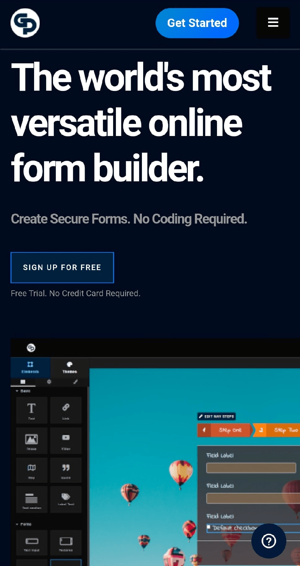
Look at the mobile version of the Global Patron website. The page loads in seconds, contains all the features available for the web version and provides easy access to buttons, including a clear call to action and a live chat button.
Improve your page forms
Subscription forms on your website can make or break your conversion rate. Long forms are often intimidating and irritating since visitors hate to fill them in and usually drop them off before finishing the process. Consider getting rid of excessive fields to acquire more leads. The best option is to go with an email address only.
If you need more fields to segment your subscribers immediately, consider multi-step forms. Simply put, split your long forms into several parts.
The form in the example below entices a website visitor with its simplicity. It looks like you only need to press the “I’m ready to talk” button. Once clicking it, a user sees a form with nine fields, but in this step, they are more inclined to put some effort into filling in the form.
Remove distractions
Your landing page visitors have a limited attention span. Hence, it’s crucial to remove everything that distracts them from taking action. To enhance your conversion rates, consider removing navigation bars, external links, banners, and other non-issues.
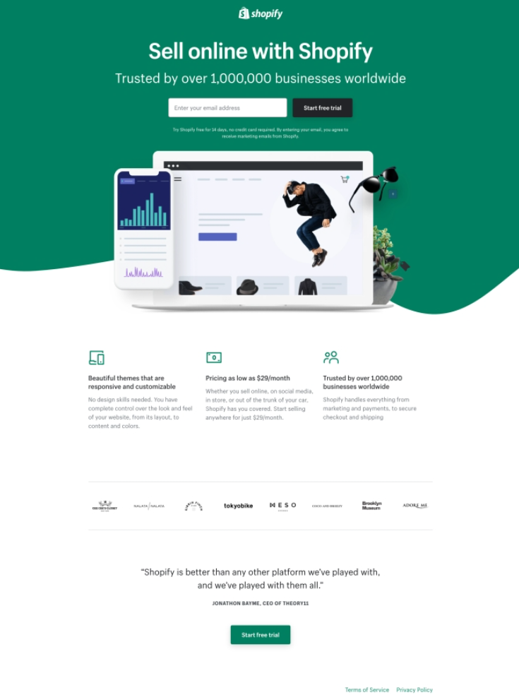
Even sticking to minimum page elements, you can still build a well-designed and persuasive landing page, as Shopify did in the example below. The company left only two CTA buttons on its web page.
Shopify added subtle social proof to boost the conversion rate – the number of customers at the top of the page, clients’ logos, and a testimonial at the bottom. All of them are located right before the CTA buttons to reinforce their message.
Besides improving conversions for your landing page, you should also consider customers who come from email marketing. There are 10 effective strategies to consider when you strive to improve conversions from your email campaigns.
11 Tips for Increasing Email Conversion Rate
- Segment your audience
- Make your communication personal
- Use animations
- Create a sales funnel with your emails
- Make sure your emails display well
- Write an effective subject line
- Make a killer offer
- Add clear and visible CTAs
- Ensure value
- Drive a sense of urgency
- Remove inactive subscribers
Email marketing is alive and thriving when it comes to promotional activities. The majority of internet users prefer to receive offers from brands via email. Moreover, the average email conversion rate is roughly 4% higher than for social media. If you struggle to raise your email conversions, try following the tips below.
Segment your audience
Segmented email campaigns get 100.95% higher click-through rates compared to non-segmented campaigns. If you still do not segment your email recipients, it’s time to give it a try.
To start email segmentation, clearly define your criteria. They might be gender, location, the amount of time your subscribers have spent with you, the frequency of their interaction with your email campaigns, and more. After segmenting your subscribers, create different email strategies and campaigns for each group. Your emails should reflect the interests of each category of your receivers.
Zara, a clothing brand, shows a great example of such an email campaign. The message below promotes a new collection and shows some womenswear curated for a female recipient.
Make your communication personal
Emails with the “To whom it may concern” salutation are frequently in the trash folder without being read. Such impersonal messages annoy your audience, while personalization appeals to 90% of customers.
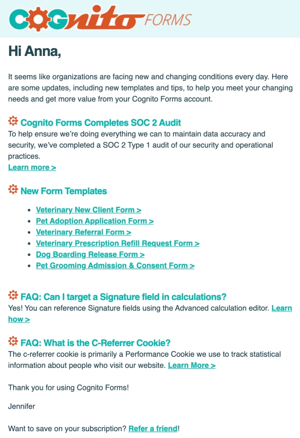
Thus, starting your communication by calling a recipient by their name is good, as Cognito Forms does in the example below. Moreover, the company uses a person’s name in the sender line because these kinds of email campaigns have a 15-35% higher open rate than non-personalized messages from companies.
Use animations
According to Outgrow, 77% of marketers say interactive content brings repeat visitors and multiple exposures. It also generates more conversions than traditional, text-based, or static media. The autoplay of in-message videos is unavailable in most email clients and may not yield the conversion rate boost you need. Try to add GIFs and animations to your email campaigns instead.
To improve your email conversion rate with animations, follow two simple rules. Firstly, use images relevant to your content. Secondly, stick to moderation because GIFs incorporated between every two lines of your email will drive readers up the wall. You’d better limit yourself to one or two animated images.
Let’s learn from the Barkbox email campaign below. The company added only one moving image at the very beginning of its message. The GIF with cute doggies is custom, relevant, and perfectly matches the email’s design and Barkbox’s visual style in general. But most importantly, it’s funny, eye-catching, and adorable.
Create a sales funnel with your emails
If your email is a standalone piece of content, it will probably fail. To prevent this, consider each of your campaigns as part of a single email marketing strategy.
Create email flows to keep customers engaged with your brand. We’ve collected 14 types of emails you need to provoke interest in your product, create an exceptional user experience, nurture leads, and more. Follow the principles of a marketing funnel to learn how to apply them to your marketing strategy. At first, provoke your readers’ interest, drive them towards purchasing, and push them to take action.
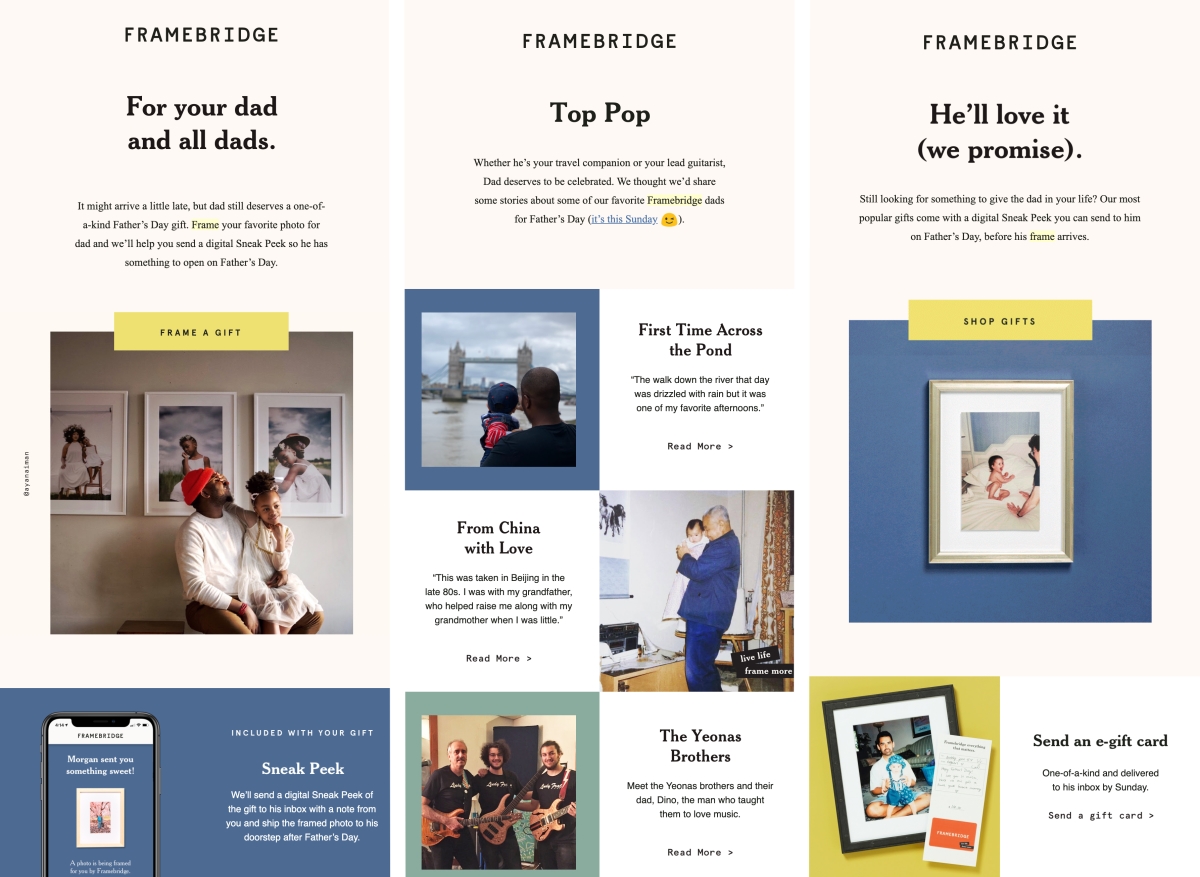
Look at Framebridge’s Father’s Day email flow to get some inspiration. In the first email, the company gives a hint about a perfect holiday present and provokes readers’ interest. In the second message, Framebridge shares several moving stories about dads, intensifying readers’ desire to make their fathers happy. In the final email, the company urges readers to shop for last-minute gifts for their dads.
Make sure your emails display well
65% of emails worldwide are opened on mobile devices, so emails that look great on any screen type are a must-have. A poorly-displayed message is unlikely to have a good conversion rate.
Before sending your email, ensure it displays well on different screen types. Enabling users to open their email in a browser will help with any screen resolution or email client problems.
Look how TheSkimm embodied this option in its email campaign. After a click, readers come to the archive of all of TheSkimm’s email campaigns, where they can read anything they like.
Write an effective subject line
Roughly half of the users decide whether to open your email based on the subject line. Three-quarters of recipients report emails as spam without opening them if they don’t like their subject lines. You cannot downplay the importance of this element when it comes to conversion rate optimization.
There are tons of techniques and tricks to compose effective subject lines. To dive into this topic, review the list of hacks we’ve picked for you.
However, the bottom line of each excellent subject line is its relevance and clarity. Readers should be able to grasp the subject of your email after a short glance. If the subject line is ambiguous or misleading, you may lose your audience's trust forever.
Wordstream provides several excellent subject line examples. They are short, sweet, clear-cut, and comprehensible at first glance.

Make a killer offer
Talking about email conversion rate optimization without mentioning the offer is meaningless. Create a killer offer to drive more conversions, and reinforce it with psychological tricks. Our compilation of hacks based on human psychology peculiarities will help your email conversion rate grow like crazy.
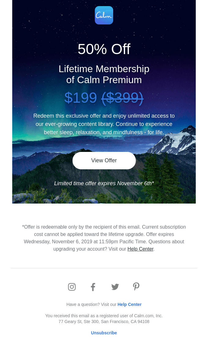
Let’s learn from Calm, a mobile app for sleep and meditation. The company offered its customers a tempting offer to buy a lifetime membership for half its average price. To make it even more irresistible, Calm added two psychological tricks. The service highlighted the exclusivity of this proposal right before the CTA button, accentuating the offer’s scarcity right after it.
Add clear and visible CTAs
When adding call-to-action buttons, ensure using action-oriented language, encouraging subscribers to take the desired action. For example, you can use phrases like “Shop Now,” “Redeem Offer,” “Learn More,” etc.
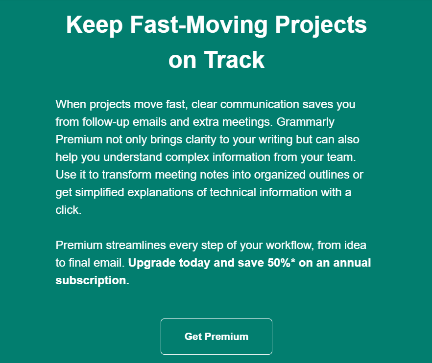
Below, you can see how Grammarly uses email campaigns to convert subscribers into paying customers and encourage them to buy a premium subscription. The service uncovers all the benefits it can bring and provides a clear call to action button so that users can purchase the product.
Ensure value
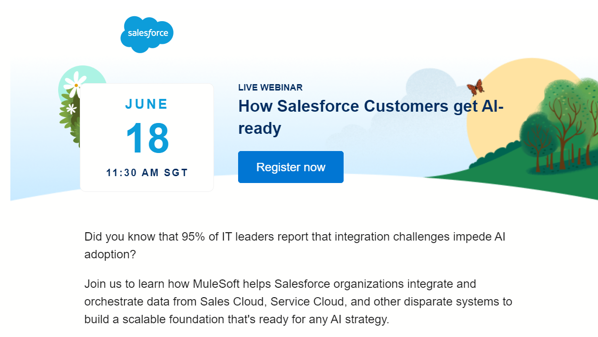
Your email content should be informative and relevant. Discounts, educational materials, and essential insights will add value to your emails and encourage subscribers to interact with your company. When using this strategy, you’ll be able to receive more open, click-through, and conversion rates.
Salesforce sends its subscribers an invitation to join its live event unveiling how to use AI and its service.
Drive a sense of urgency
Encourage more purchases by establishing time-sensitive offers and using countdown timers. With limited-time offers, you can make your subscribers act quickly after they receive your email campaigns.
Below, you can see how MAC Cosmetics drives action by adding a subject line with information that the offer ends soon. Its email also mentions the end date of the deal and offers an enticing discount that encourages purchase.

Remove inactive subscribers
Periodically, check your mailing list for inactive subscribers and remove them from the list. It will help you improve deliverability and engagements, the two metrics impacting conversion rates.
Since conversion rate optimization is equally important for B2C and B2B companies, it’s essential to understand how it works with different customers. That’s why we’ll talk about it in detail below.
B2B Conversion Rate Optimization
Conversion rate optimization is crucial for all businesses and the audience they target. It helps them reach decision-makers more effectively and encourages them to take action. This section covers this and more.
B2B conversion rate optimization is the process of improving your website or landing pages to encourage more actions among decision-makers. This can be more filled contact forms, signups for your email newsletters, or an actual conversion during the first purchase. To successfully drive conversions for your B2B company, you need to perform specific steps, which you can find below.
- Understand your target audience. Consider creating buyer personas that describe your ideal business customers, their challenges, needs, decision-making process, and other crucial factors. It will help you find touchpoints with decision-makers and resonate with their needs.
- Optimize your site usability. When improving your site, you need to consider the three main elements: user-friendly design, mobile optimization, and load speed. If you want business clients to stay on your site and convert, you should ensure that your site is easy to use, comfortable for smartphone users, and loads fast.
- Improve your content. Your content should have a clear value proposition so that decision-makers can understand what your offer is about. Articles and blog posts you create need to be informative, providing value to prospects and addressing their challenges and needs.
- Optimize your lead capture forms. Review your subscription forms for clarity and simplicity. You should ensure that forms contain only the minimum fields to fill in. It will help you prevent potential customers from leaving.
- Use retargeting and follow-ups. If you have decision-makers who haven’t converted into clients yet, consider using re-engaging campaigns. These can be email campaigns about abandoned carts, enticing offers with discounts, season sales, etc.
Besides reaching decision-makers for your B2B company, you might face challenges while converting smartphone users into customers. We’ll unveil what mobile conversion rate optimization is and how to do it effectively.
Mobile Conversion Rate Optimization
Since more and more prospects use their smartphones to access your website, social media, or landing page, it’s a must to pay attention to mobile conversion rate optimization. Let’s start with a definition of this term.
Mobile conversion rate optimization is the process of improving your site or landing page based on the requirements of smartphone or tablet users. Business owners aim to optimize their websites for mobile users, including website design, CTAs, loading time, and user experience, to increase satisfaction and boost conversion.
There are several main strategies you should keep in mind when working on mobile conversion rate optimization.
- ensure that your site automatically adjusts to the small smartphone screens once users open your website;
- create a mobile-friendly layout, providing seamless navigation and experience for prospects;
- ensure that site loading time is around 2 seconds and around 8.6 seconds for mobile devices;
- provide a simplified navigation menu to find the necessary information on your site;
- use a visible search bar so that users can find the necessary products more easily.
Implementing your mobile conversion rate optimization strategy can be a time-consuming process when you do everything manually. Yet it can be easier with special platforms that will take the majority of your team’s responsibilities. So, let’s jump into our list of the best tools for conversion rate optimization.
5 Conversion Rate Optimization Tools
- SendPulse
- UserTesting
- Optimizely
- Hotjar
- Userpeek
There are plenty of platforms you can use to optimize your conversion rates. In this section, we’ll list the best of them for you to consider. So, let’s dive in.
1. SendPulse
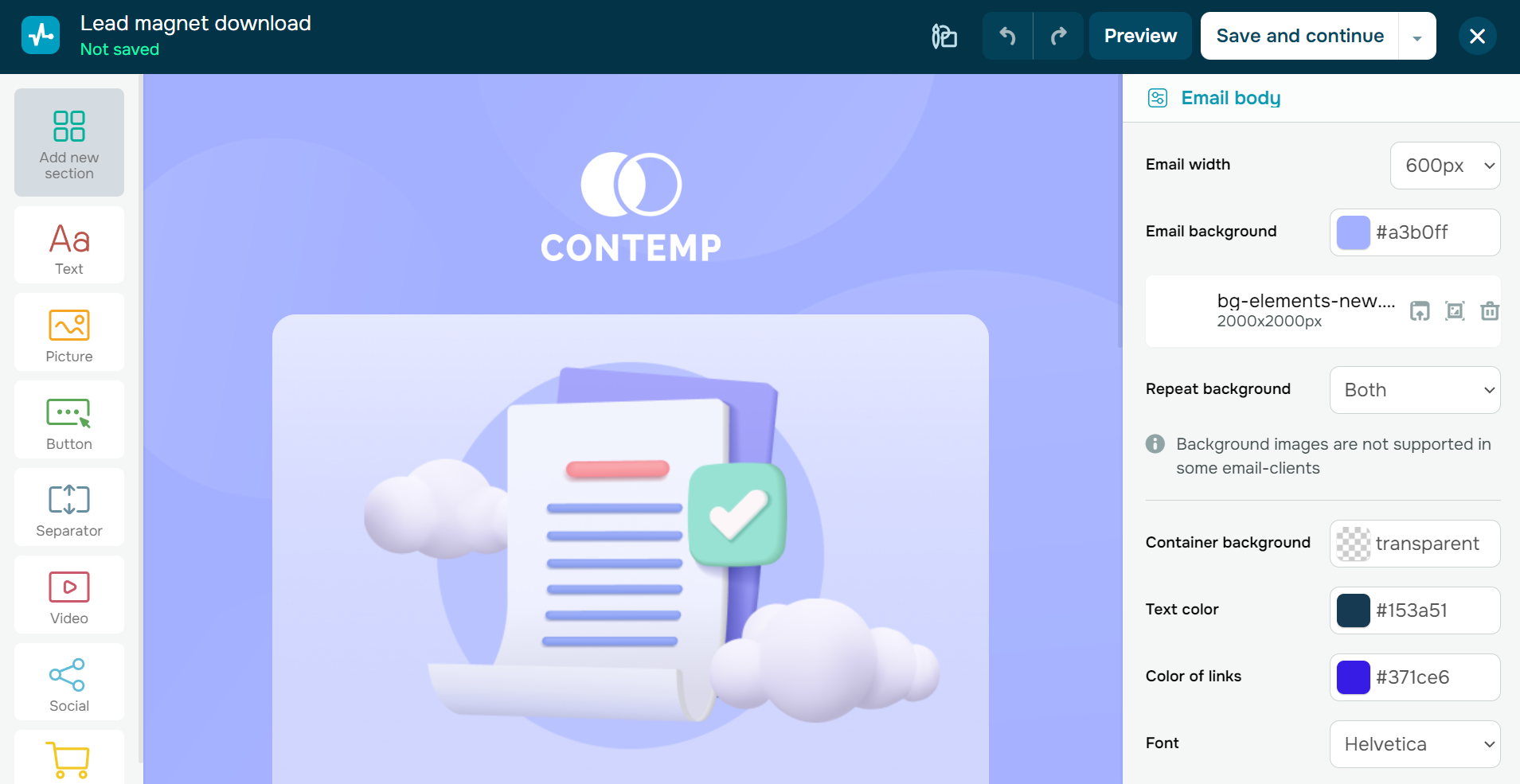
SendPulse is a multichannel marketing platform that combines multiple valuable products used for conversion rate optimization. Email marketing software is one of them. If you decide to incorporate the service for sending email campaigns, you’ll enjoy the benefits of personalization, segmentation, a built-in spam checker, a drag-and-drop editor, a library of pre-built templates, an email verifier, A/B testing, follow-up emails, and many more.
You can also use Automation 360 to send trigger and transactional emails. These will help you follow up with potential customers once they perform specific actions, improve their shopping experience, and boost engagement, which contributes to higher conversion rates.
Besides email campaigns, SendPulse allows you to create web push notifications, chatbots, and subscription forms to collect prospects' personal data, engage with them, and provide personalized offers. With these tools, you can craft targeted messages encouraging leads to convert.
Below, you can see how easy it is to create a professional email campaign using the service.
Pricing: When leveraging email marketing for conversion rate optimization, you can start with a free plan that includes 15,000 emails, 500 subscribers, 3 sender email addresses, 1 domain, 1 website or bio link page, and 100 verifications. If you need to send more email campaigns to your subscribers, upgrading to a paid plan starting at $8 per month, billed annually, could be a worthwhile investment.
2. UserTesting
UserTesting is a perfect solution for startups, enterprises, small businesses, and mid-markets. It provides valuable products for UX design teams, UX research teams, digital product teams, and marketing teams.
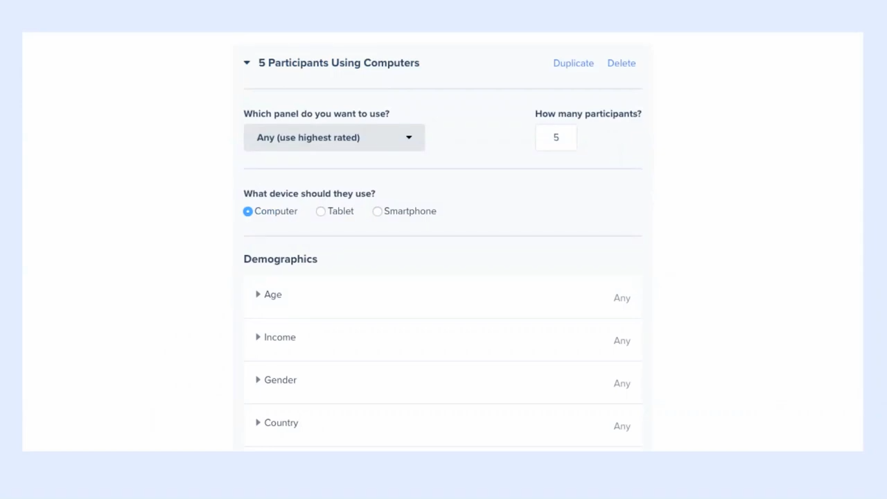
With UserTesting, you can collect user feedback on any experience with your company. You can identify opportunities for better user experience, evaluate the quality of your website, including trust, ease of use, and layout, analyze site visitors using a pre-production experience, and assess new ideas.
Below, you can see how to use UserTesting to create surveys and collect feedback on your new ideas, prototypes, applications, concepts, new designs, and more.
Pricing: You can contact the sales team to find out about the company’s pricing.
3. Optimizely
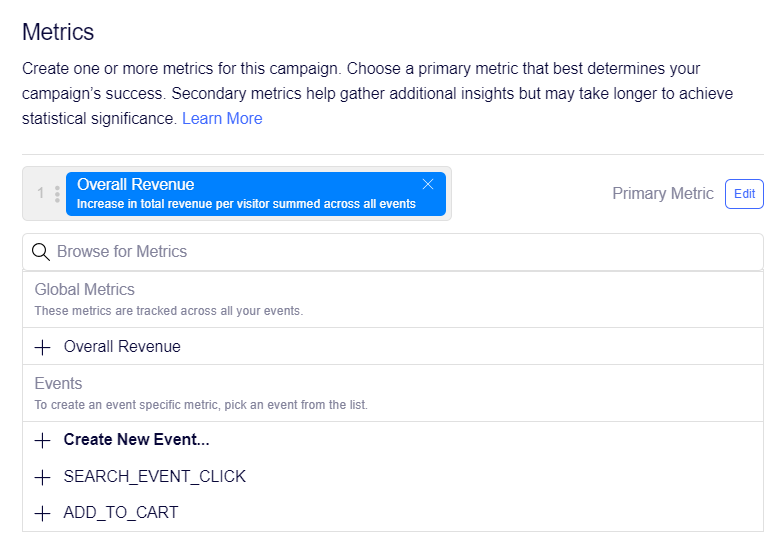
Optimizely helps you convert more users into clients by using A/B testing. The service helps you obtain valuable user insights and ensure seamless experiences, enabling you to convert more site visitors into customers. The platform allows you to experiment using an easily implemented, no-flicker snippet without any negative influence on your site performance.
Optimizely is open for collaboration between team members. They can easily craft hypotheses and variations. It has idea submission forms and backlog, workflows, variation design tools, and approval checklists. All this activity is easily shareable and trackable due to the service's calendars.
Below, you can see how to set up and run A/B tests using Optimizely.
Pricing: You can contact the company’s support team for details on its pricing based on the features and products you need.
4. Hotjar
Hotjar is a useful service for product and marketing teams, product managers, UX designers, and researchers. The platform offers various products enabling you to identify areas for improvement using visual user insights, find out what customers want directly, unveil bugs and broken flows, and focus on the right issues.
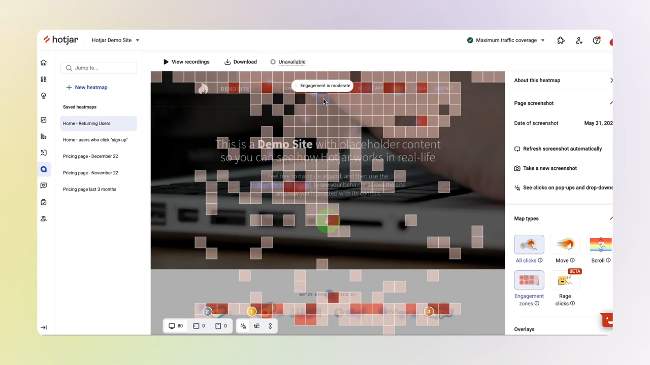
With the platform, you can create heat maps visualizing user behavior. They will show you how users move, click, and scroll so you can remove friction and convert more people into paying customers. Using Hotjar enables you to quickly figure out what makes users frustrated and eager to leave your site. Besides, the platform helps you analyze user behavior across different devices, including smartphones, laptops, and tablets. This will allow you to find space for optimization and provide an excellent experience across all devices.
With recordings, you can watch users’ full journeys, assess their experience, and find problems. Once you identify issues, you can improve them using recordings and user feedback for data-backed updates. The platform makes it easy to gather feedback from users.
Below, you can see the process of creating a heatmap in Hotjar.
Pricing: The platform has a free plan, including 35 daily sessions, unlimited heatmaps,
recordings of user sessions, and basic filters. The paid plans start at €32 monthly if paid annually. It provides 100 daily sessions, page view filters, session information and technology filters, and events API.
5. Userpeek
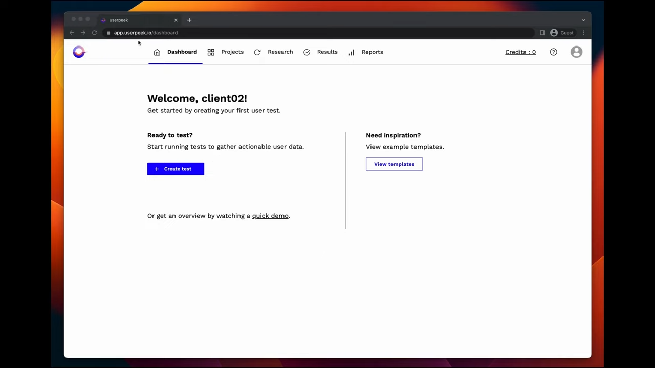
Userpeek is a remote usability testing solution that allows you to assess user experience with your website and optimize specific areas for better satisfaction. With its help, you can get real user video feedback (watch videos from real people using and commenting on your site’s usability and product), use tagging and annotations, and get speech-to-text transcriptions. The platform helps designers collect actionable user data, test designs, functionality, and user flows.
Below, you can see the process of creating user testing in Userpeek.
Pricing: Hotjar does not offer a free plan, but you can access its benefits by purchasing a paid plan priced at $211 per month when billed annually. This plan includes 5 monthly testers, credit rollover, unlimited projects, advanced test templates, annotation & tagging features, and AI speech-to-text transcripts.
Optimize your conversion rates to get more benefits with the same investments. SendPulse will help you do this easily—you can sign up and try a variety of our services, from a subscription form builder to an email campaigns management system.

or