Why do you need to think about the image you’re going to include in your email? The most important thing is revealed in the email subject line and text, and the image is an additional component that can be easily ignored, right?
Well, not exactly.
All of us process visuals 600,000 times faster than text. Considering that we only have a few seconds to capture the attention of a person who opened an email, speed plays an important role. An image immediately immerses users into the topic, sets the mood, and helps to convey the essence of the text.
The right image will help to increase the number of content views and email clicks, and affect the conversion rate. A low-quality photo, obsolete vector, or ill-sorted image can take a toll on the user’s trust in the brand and on the email in particular.
Like clothes make the person, an image does the same for your email. It helps to create the desired impression, build loyalty, and declare your personal style.
In this article, we’ll discuss tips for selecting the right images for your email campaigns, types of photos to avoid, reasons for following trends, and where to find email content.
How to use images in emails effectively
If we describe the proper use of images in newsletters in one sentence, it will look like this:
A perfect image
- is universally beautiful,
- does not distract from the text,
- delivers the essence of the message, and
- fits into the brand’s/company’s style.
Now let’s go a little deeper on each point.
-
Good images do not distract from the message
There is no need to add an image just for the sake of it. If a user opens the email only to confirm their registration, show them the link and don’t distract with excess content. There is also no point to including an image that does not contribute to communicating the email’s message.
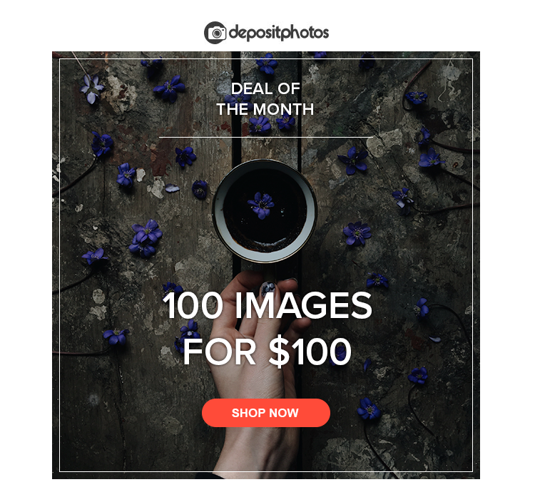
In this case, we solve two problems at once: we show an example of the product (nice images) and set the mood with a trendy shot. The main object is in the center, helping to focus the attention on the text.
-
Well-matched images complement the text and help deliver its message
What is meant by ‘complementing the text’? If you want to inform subscribers about the shoe sale in your newsletter, use a photo of those very shoes. It will be even better if you include a photo of the exact model that is being discounted. Don’t add a shot of a happy lady shopping.
An image should not duplicate the text but should help to set the mood or to literally show the message’s subject.

-
Use quality, aesthetically appealing images
It’s a little weird to talk about it, but some companies keep stealing pictures or using poor-quality images with watermarks in their email campaigns. Don’t take any chances when it comes to licensed images if you don’t want to face the penalties from the contents rights holder and disappoint your users.
Image appeal is a fairly subjective concept. That’s why you need to be familiar with the tastes of your audience. Next, we’ll take a closer look at visual trends.

-
Determine the image style from the get-go
Each image in an email is used to strengthen your brand and communication style. Determine your visual style and topics and choose all images in this framework.
For example, it can be a flat lay photo, emotional and creatively different shots of people, sports topics (that will help to communicate the motivation and achievement), photos with analog filters or duotone effects, or nice vectors with letterings. There are plenty of choices.
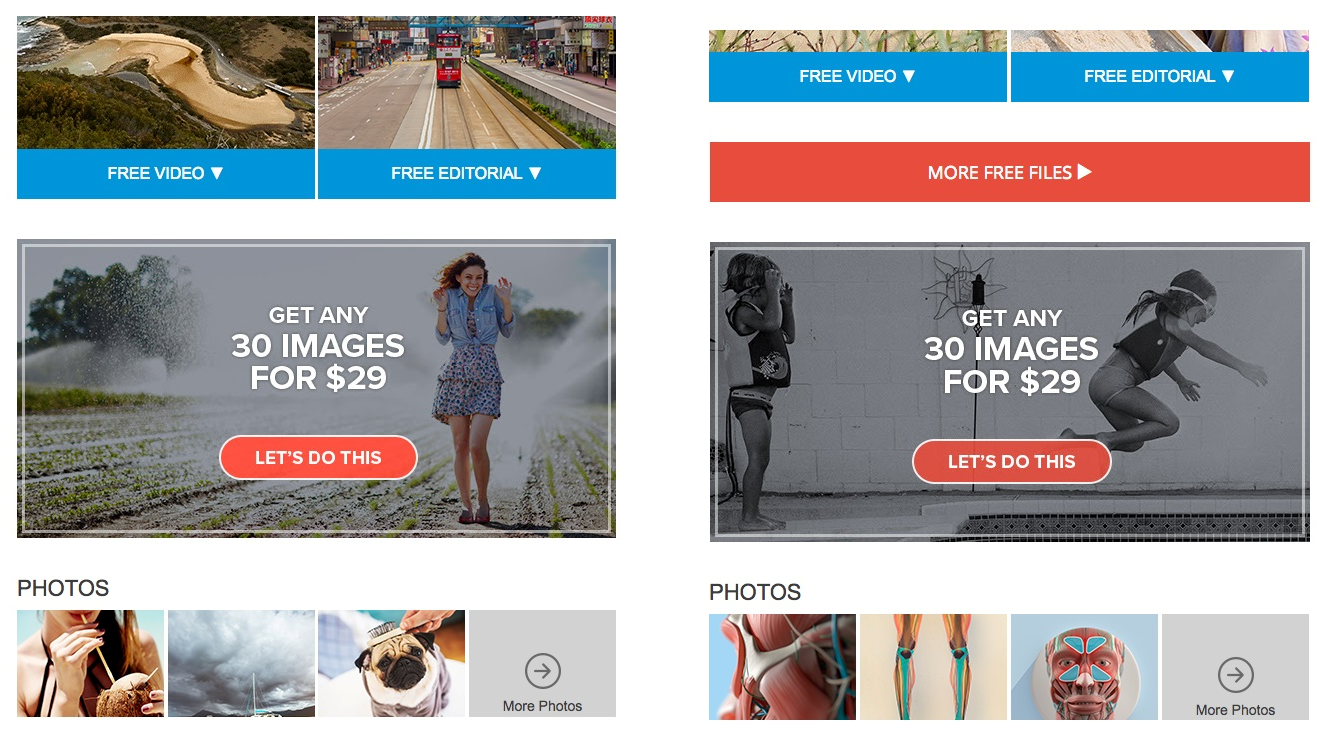
The plan banner in our newsletter changes the images, but it keeps the selected style.
-
If you can show, don’t tell
Since there is little time available for an email to catch a user’s interest, any opportunity to convey meaning with an image or icon should be used. If you want to tell your subscribers about a new feature on the website, take some quality screenshots or, better still, create a GIF that will display the action. If you need to briefly outline the advantages of your new tariff, use icons with text. This will structure the information and facilitate perception.

Here, the images illustrate each point.
What kind of images can hurt your campaign?
-
Too many images
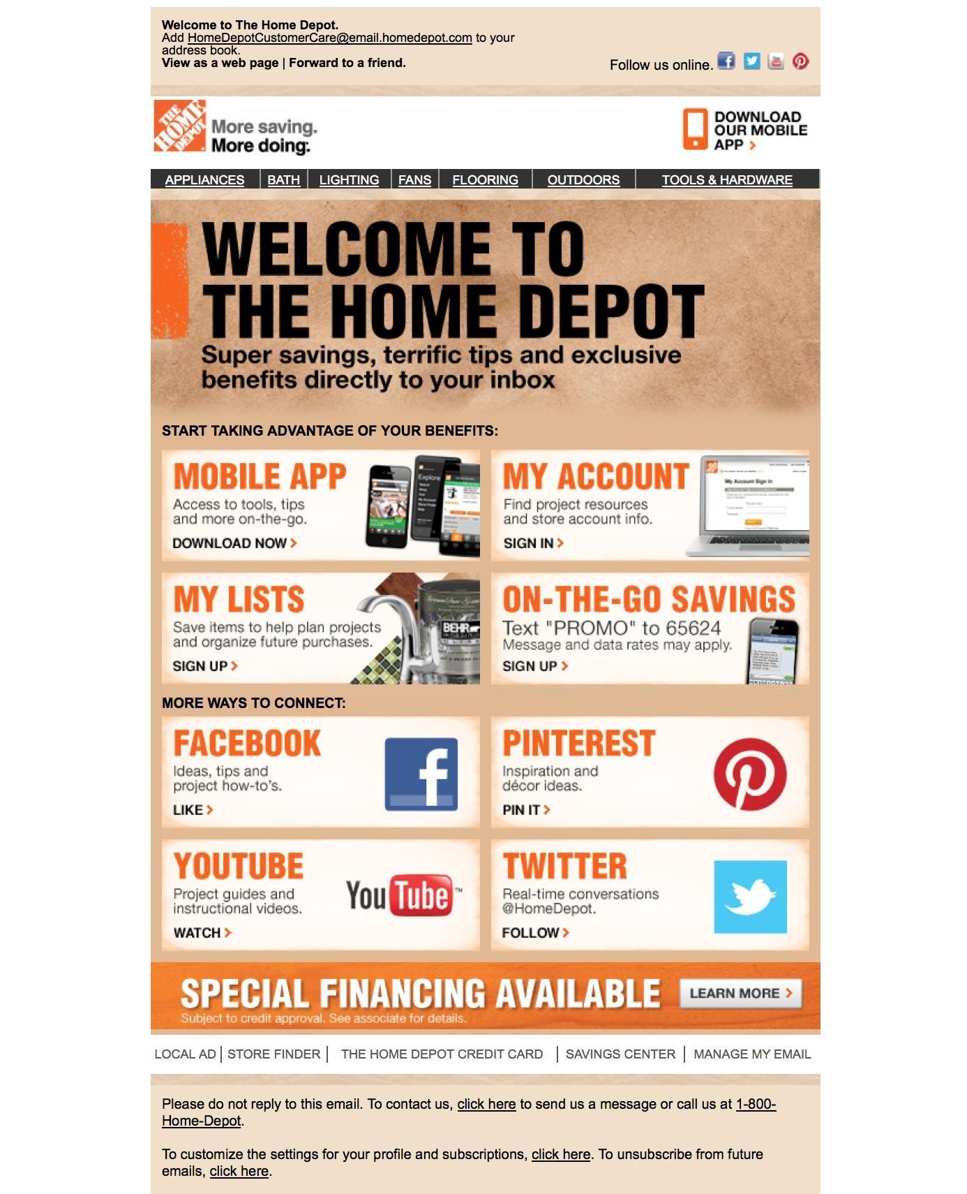
The exact same tip goes both for text and images: do not overdo the quantity. The user does not want to read endless pieces of text to find out the required information, as well as deal with tons of images. It turns into visual noise, making it difficult to put the first things first.
-
Stock clichés
Stock photography clichés have become so boring that we pay them no attention at best. These are images of happy families, businessmen in suits shaking hands, or ladies who are overly happy eating their salads.

When you use these kind of photos in your communications, you show the audience that:
а) you have no taste and imagination, and
b) you simply don’t care – you’ve used the first photo you came across.
Don’t be like that!
What are visual trends and why do you need to be aware of them?
Photography trends come and go quickly. We take dozens of photos and see hundreds of shots of our friends every day. All of these photos change our perception of visuals. Nobody believes the false smiles of models or obviously staged photos.
To gain your audience’s trust and speak one language, you need to understand what images evoke certain emotions, what topics are relevant, and how the latest technologies change our view of life.
Among the 2017 trends that can be useful for email design, the following can be highlighted:
90s aesthetics
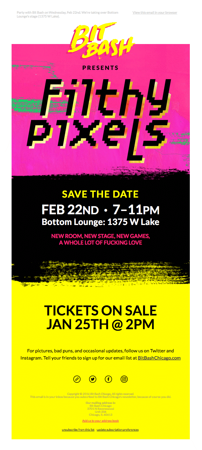
Analog filters, fired photos and Polaroid pictures, denim jackets and chokers, neon colors – many brands are reviving the nostalgic feelings of the 1990s. Do you want to reach out to millennials? If so, employ the symbols of their childhood.
The seamy side of life
Instead of those neat glossy photos from ads, it’s better to use imperfect, emotional, candid photos. Recall a photo from a party with your friends or a picture of a baby taking their first steps looks like – nobody pays attention to composition or lighting. The main thing is to convey emotions and capture the moment.
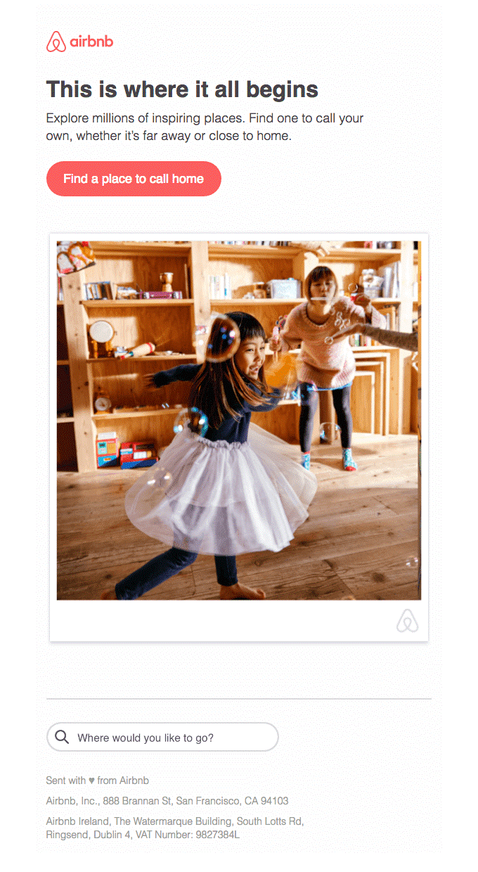
Research demonstrates that the younger your audience is, the more personalized your email content should be. Use fewer stock clichés and more photos that the users could associate themselves with.
Video domination
Video is taking over all other forms of visual content on the Web. If there is an opportunity to use videos or GIFs instead of a photograph, do it.

POV
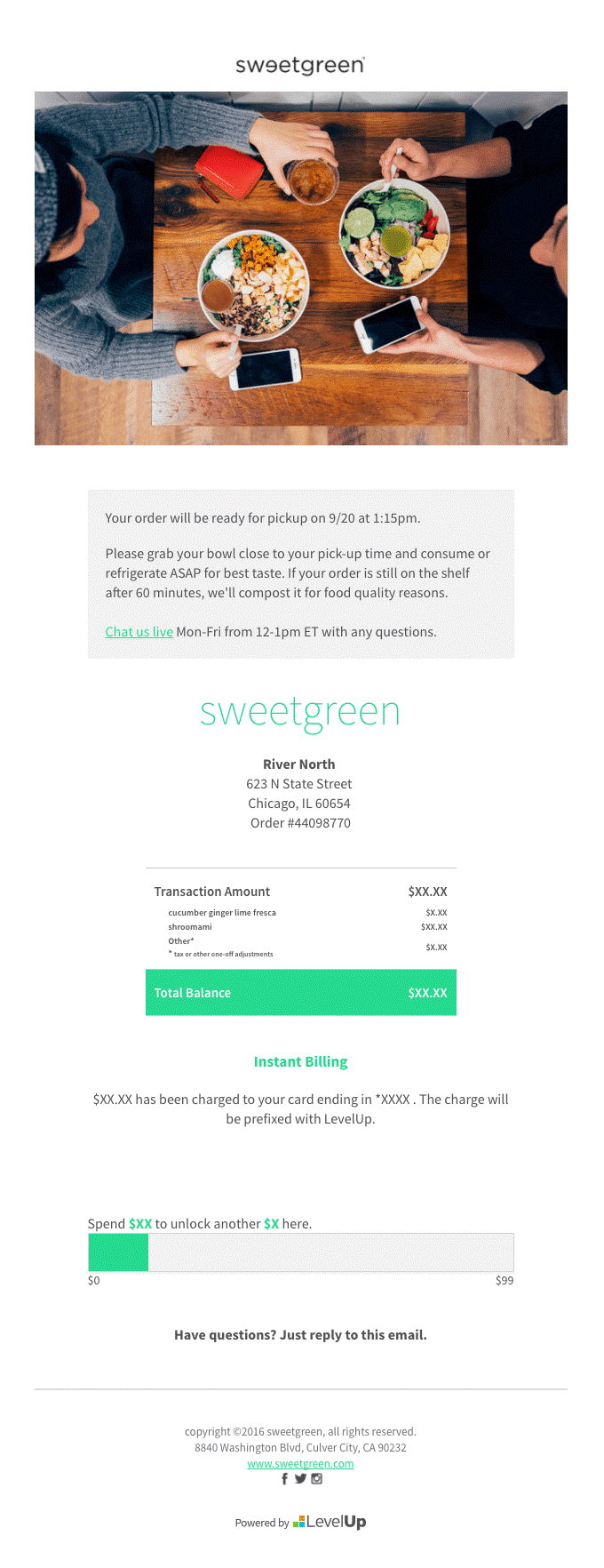
Point of view (POV) in photography refers to shooting from your own point of view or a nonstandard angle. Roughly speaking, it’s not a photo through the eyes of an outside observer, but a picture taken by the process participant. Smartphones provided us with an opportunity to show people the world from our own perspective: how we cook, how we drive, and how we rest on the beach.
Bright minimalism
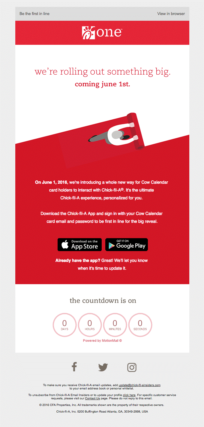
Contrasting main colors and gradient and minimalistic objects go down a treat. It helps to attract attention and get a point by means of brick-and-mortar symbols. It can be either a flat lay photo or a vector and the simple bright background color of the email.
You can read more about this year’s visual trends in our guide.
Where to find images
Free stock photos and image searches in Google are risky variants because there is always a chance of using a stolen image. Always check the license to see if the source cooperates with the author.
The greatest advantage of free stock photos is that they are… free of charge.
The greatest disadvantage is the huge number of people wishing to save money and as a result, a large amount of similar or identical photos.
Big stock platforms like Depositphotos are the fastest and the safest option to find an image. It’s not free. Usually, photographs cost between $5 and $10, but there are alternatives with the price of $1 per file.
Its main advantages are the huge library, distinctive content, and user-friendly search algorithm.
In fact, almost all stock photo sites make a weekly newsletter with free files that can be downloaded.
Use of proper images is a good option in several cases.
If you have good photos of the product, office, or employees, then use them on your website or social media and newsletters when it comes to the company.
It is beneficial to use interface screenshots if you are telling your subscribers about the product’s functions or updates in your email.
If your brand format makes it possible to include user-generated content (photos taken by users or employees), you’re more than welcome to take advantage of it. It enhances the audience’s trust and makes the content personalized.
Online graphics editors will be useful if you need to add text or a logo to a picture but your designer is busy, or if you need a fancy template for an email header but there is no time to do it from the ground up.
There are dozens of free templates in editors like Crello that can be easily customized by modifying the images and text. The style and composition are already elaborated, so you just have to make some small changes and the template is ready for use.

Email header created based on a free Crello template in just three minutes.
You can read more about visual trends and effective use of images in our blog.