In our previous article, we discussed how to start an email properly, in particular, by creating eye-catching headers. Now we will walk you through the most significant block of any email — its body.
Email body
To recap, every email consists of separate and distinct elements — header, body and footer — that all work together. Since the main functions of an email header and footer are to represent, connect and manage, email body stores the most of the content. In other words, it promotes and sells. Moreover, it’s the most variable part of an email as you can always change it depending on the type of message you send.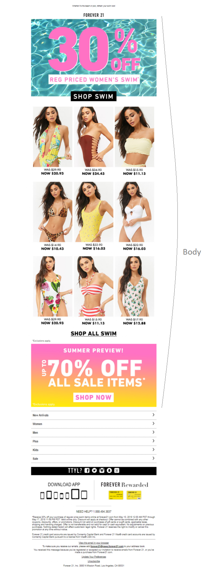 The main goal of the email body is to provide enough information about your offer so that your subscribers will be motivated towards your call-to-action (CTA). Typically, this block contains images of promoted goods, banners, special offers, and CTA buttons.
Best practices
The overall template design should guide your recipients through the email and outline its concept and key message. The content you want to fill your email with defines how busy it looks — the more blocks you include into the body, the more space it requires.Before we proceed to examples, check out these basic tips on how to craft an email body:
- Knit all the information by one topic, use similar colors, fonts and images of the same size.
- Use subheadings, lists and bullets to make the email content scannable for subscribers — remember, they will give your email only a few seconds of their attention.
- Include white spaces: generously spaced elements will increase both visual clarity and readers’ focus.
- Make sure all links are visible and CTA buttons are clickable on all devices and in all browsers.
- Use HTML-coding instead of a single image in the email. Include alternative text for all the images.
Now that we are through with the basic tips, let’s have a look at three ways how to design an eye-candy email body.
Single banner
In case of a single offer, the body of an email focuses on one idea. The message itself takes the central spot, dragging all the attention.For example, New Balance’s email campaign focuses on a single promotion. The email body is centered on one image, offering to choose an item from their collection, and is followed by a clear call to action.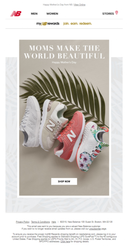 Another example is represented by Dermstore, a skin beauty and e-commerce website. The only content inside their email is a beauty questionnaire and “Take quiz” CTA, which redirects users to the corresponding page with the questions to be answered.
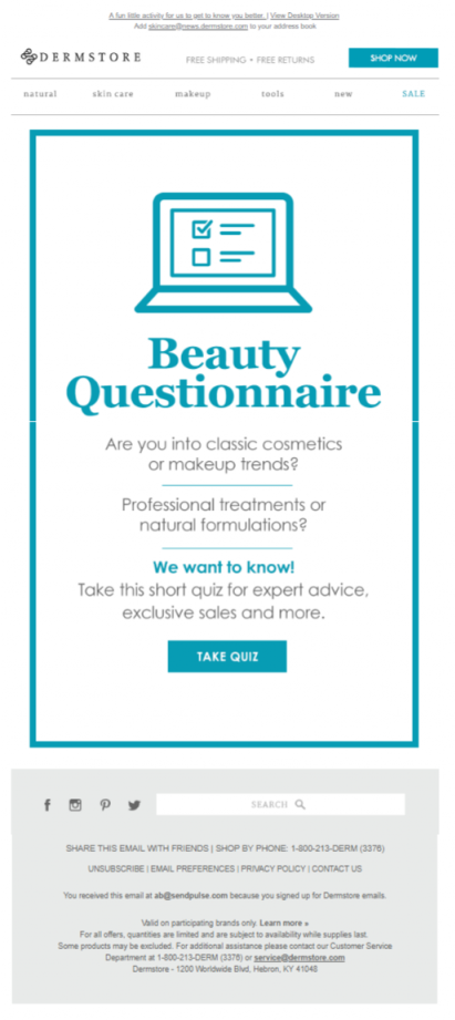
Banner + ad unit
When the email includes more than one offer, the number of blocks in the email body escalates. Use a banner along with an ad unit in case you want to add some details afterwards without distracting the subscribers from the main offer.Lucky Brand sent an email with a special offer, adding an e-gift card alongside. They left the second part of the email body less standing out to outline the Mother’s Day sale — the ‘hero’ call to action.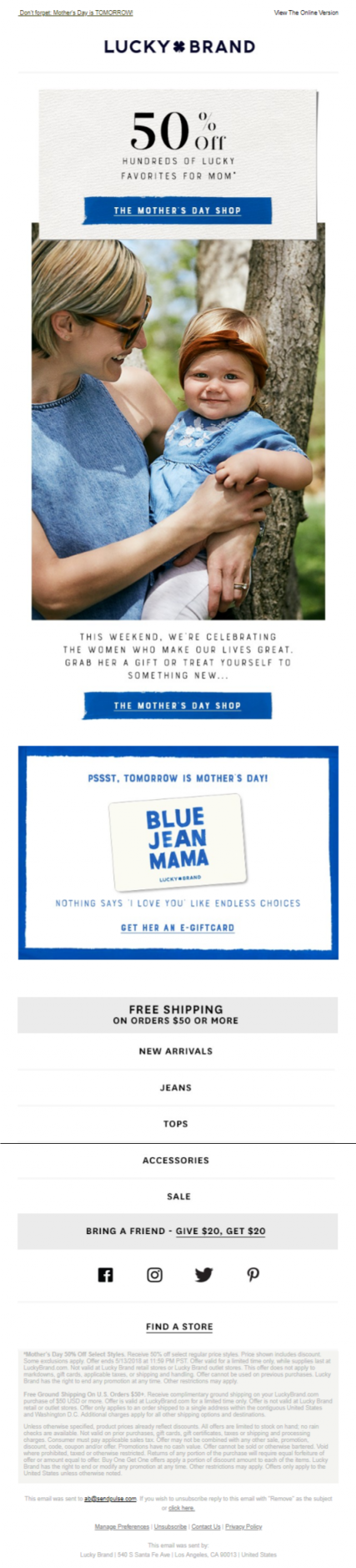 Chanel, for their part, in one of their emails not only promoted the cosmetics they had used in their fashion shows, but also added a video tutorial on how to apply these products as an ad unit.
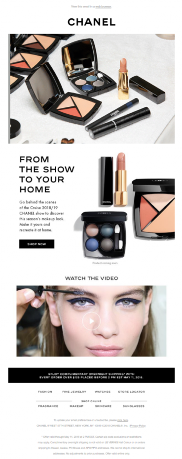
Product grid
In this case, the email body can combine a core offer, an ad unit, and a grid of promoted goods. Along with the blocks included in the email, you should also consider the format in which you present your content. In other words, you can present the information in a single column, or break it up into two or more columns.Single-column emailIf your email is focused on one offer, promotion, product, event or CTA, use a single-column email template. It not only simplifies the scanning of your email content, but, what is more important, this layout is designed to be compatible with any screen size, so it doesn’t have to be restyled much.Below is the example of a single-column template by WP+Standard. The campaign features their new collection, so there are images of the promoted items along with CTA buttons.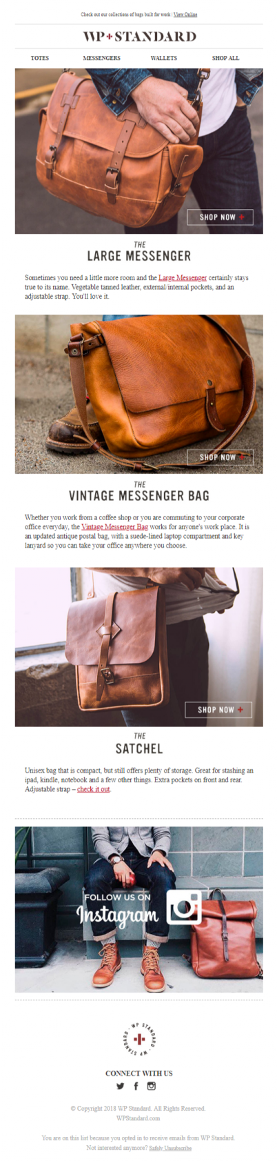 Two-column or multi-column emailThis email format is usually applicable to content-heavy emails as it allows you to present a larger amount of information above the fold for desktop users. In particular, the reasons to use two-column or multi-column templates are the following:
- to showcase numerous items to increase viewing options for users;
- to make an image-based email look shorter and less cluttered;
- to combine different messages or calls to action.
However, on mobile, the columns will stack, making an email template uncomfortable to read and navigate.Check out a desktop view of the three-column promotional email of Touch of Modern: And this is how it is displayed on mobile:
 Now you see that vertical scrolling can be annoying.
Bottom line
So here are the most important takeaways from this part:
- Make your email easy-to-scan and visually clear by using subheadings, white spaces, lists and bullets.
- Use images strategically to make your email well-structured and emphasize the key offer.
- Develop a single-column email template if your email features one offer or CTA. Otherwise, use two-column or multi-column layouts. Nevertheless, always remember about mobile users and template responsiveness.
Next time we’ll put the finishing touch on the email structure and talk about footers, the last block of an email. See you!