Set up a custom pop-up form
You can create a pop-up, select the element type you want to include, collect the information you need, and save it to your variables for further segmentation and personalized interactions.
Let's take a look at how to create and set up a custom pop-up form.
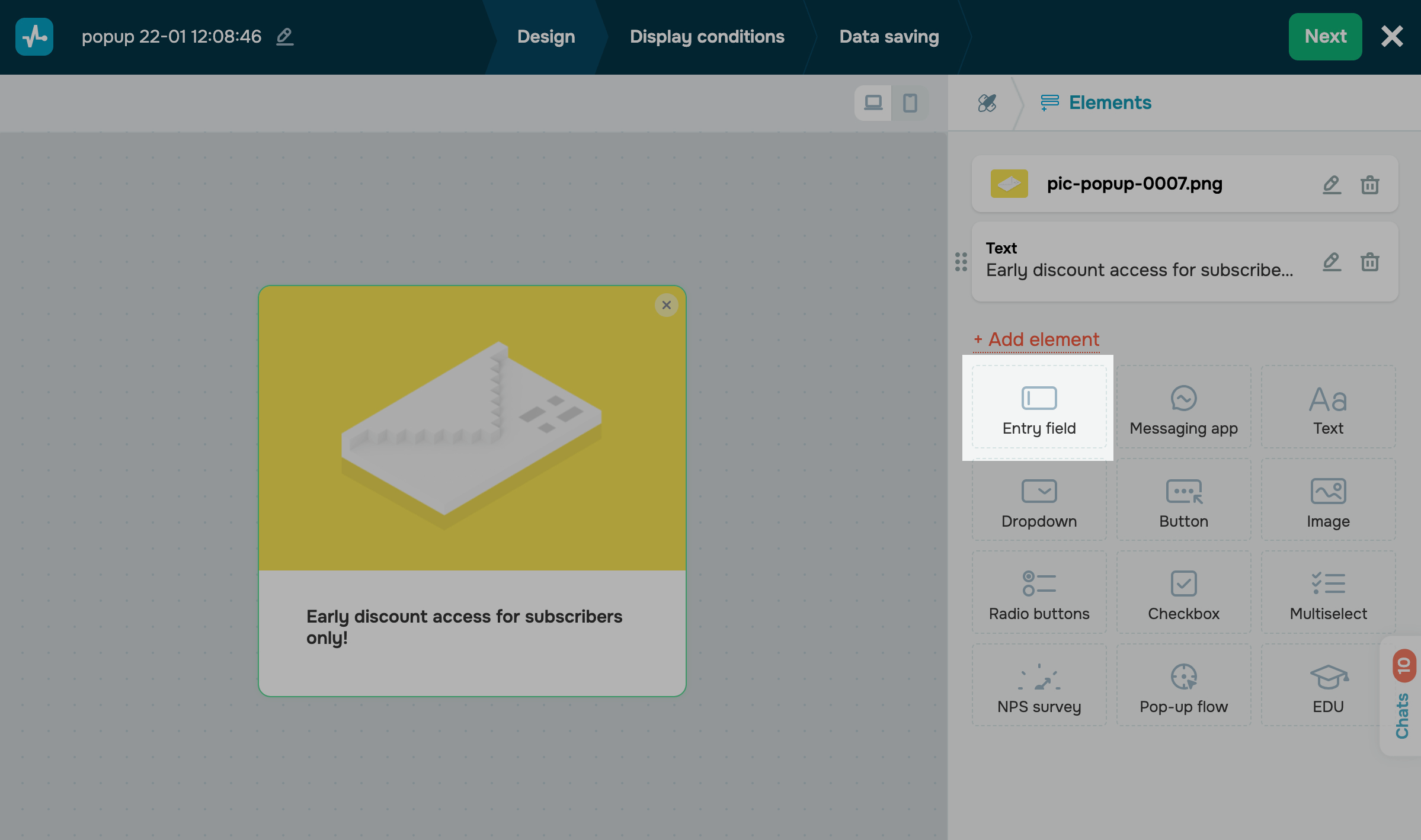
Create a new pop-up, or edit an existing one in the pop-up builder. Add elements to collect data and a button to allow users to submit your pop-up form. You can also add a cover and edit the text.
Learn more: How to create a smart pop-up.
Set up your data collection element
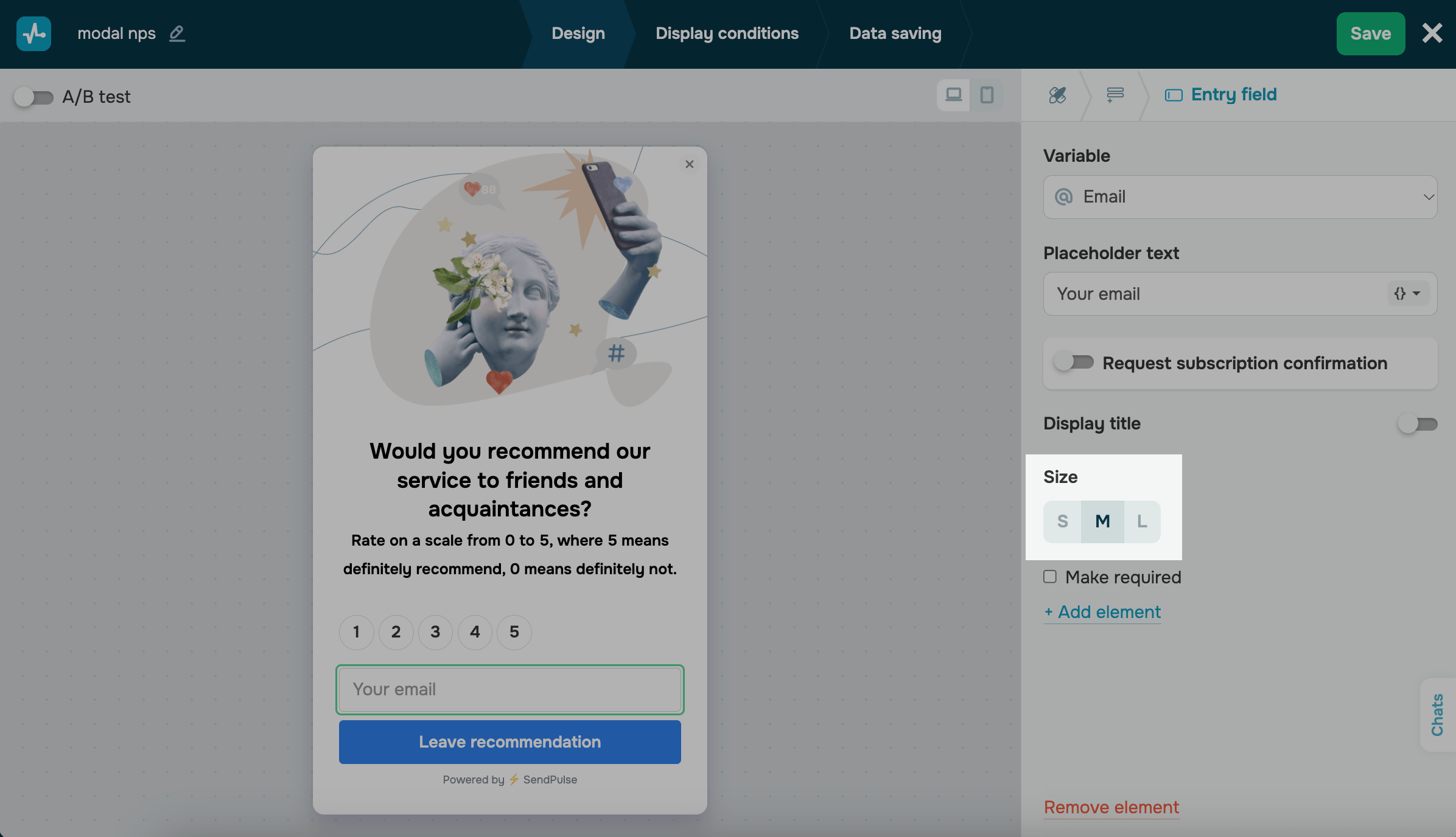
Add the Entry field element
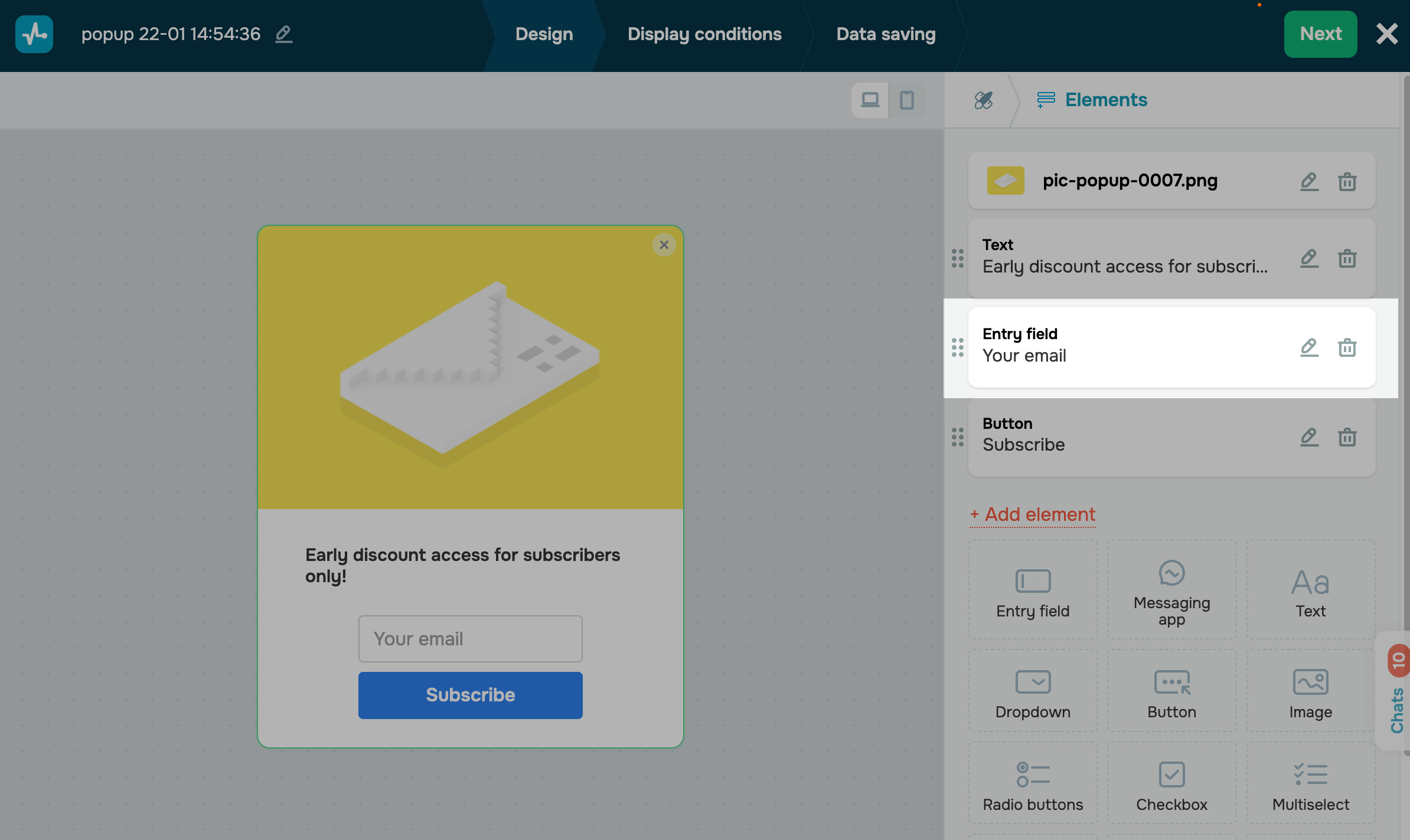
With the Entry field element, you can request user data points and save them to variables.
To identify subscribers and add or update their data collected from elements, add an entry field that requests email addresses. You can also hide this field if you already have these data points and can retrieve them from your system.
In the Elements tab, click + Add element, and select Entry field.
If your pop-up already has an entry field, click it.
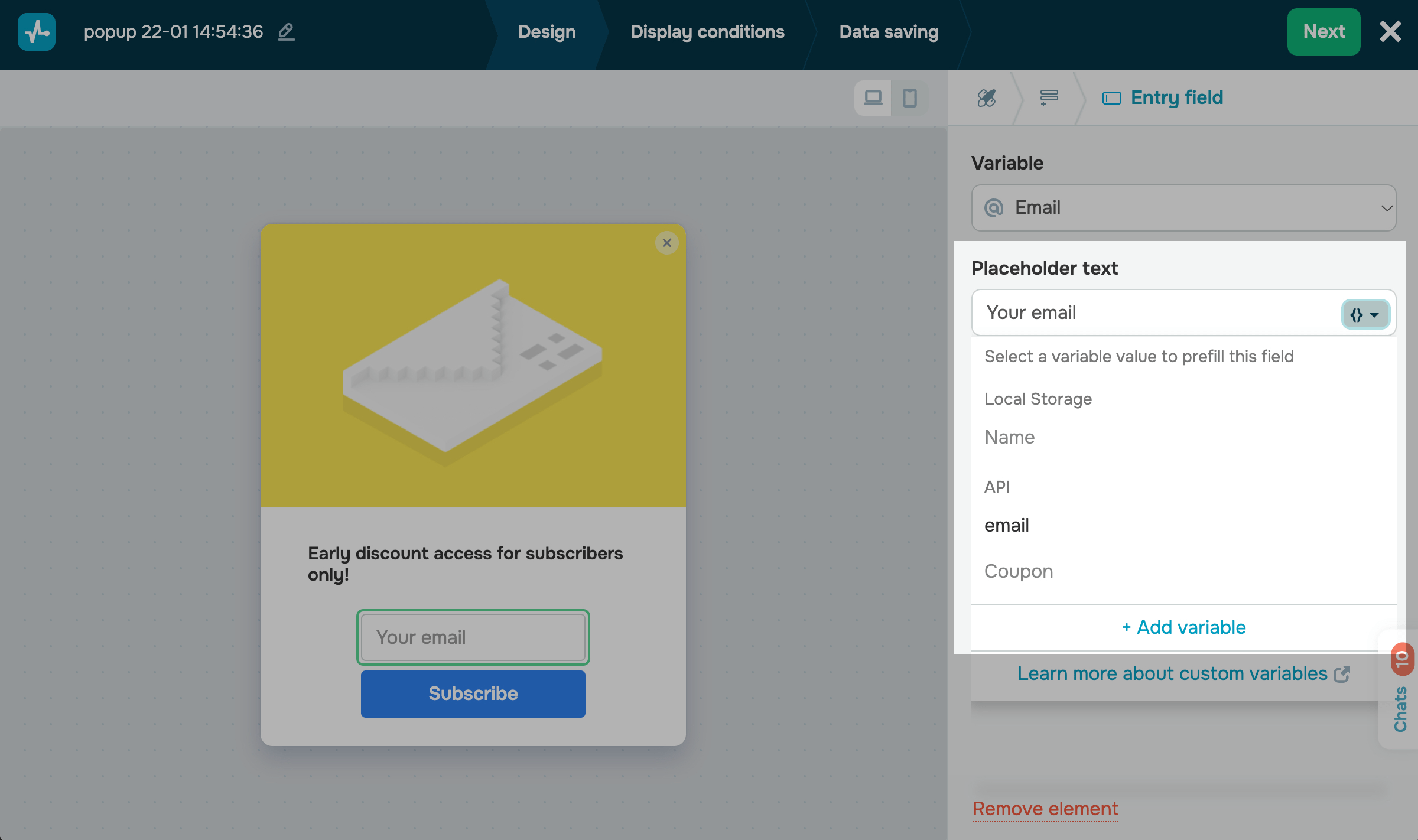
Select a variable
Click the Variable field, and select the variable to which you want to save values. You can select an existing variable or create a new one.
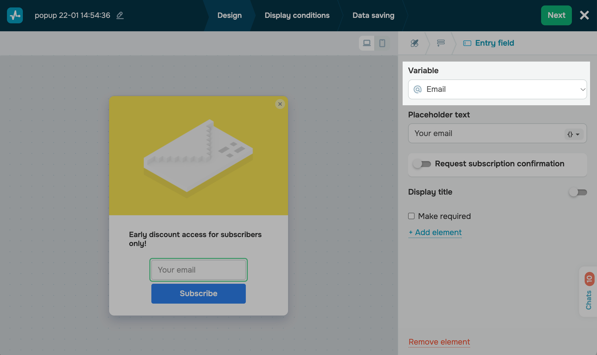
Specify a field name
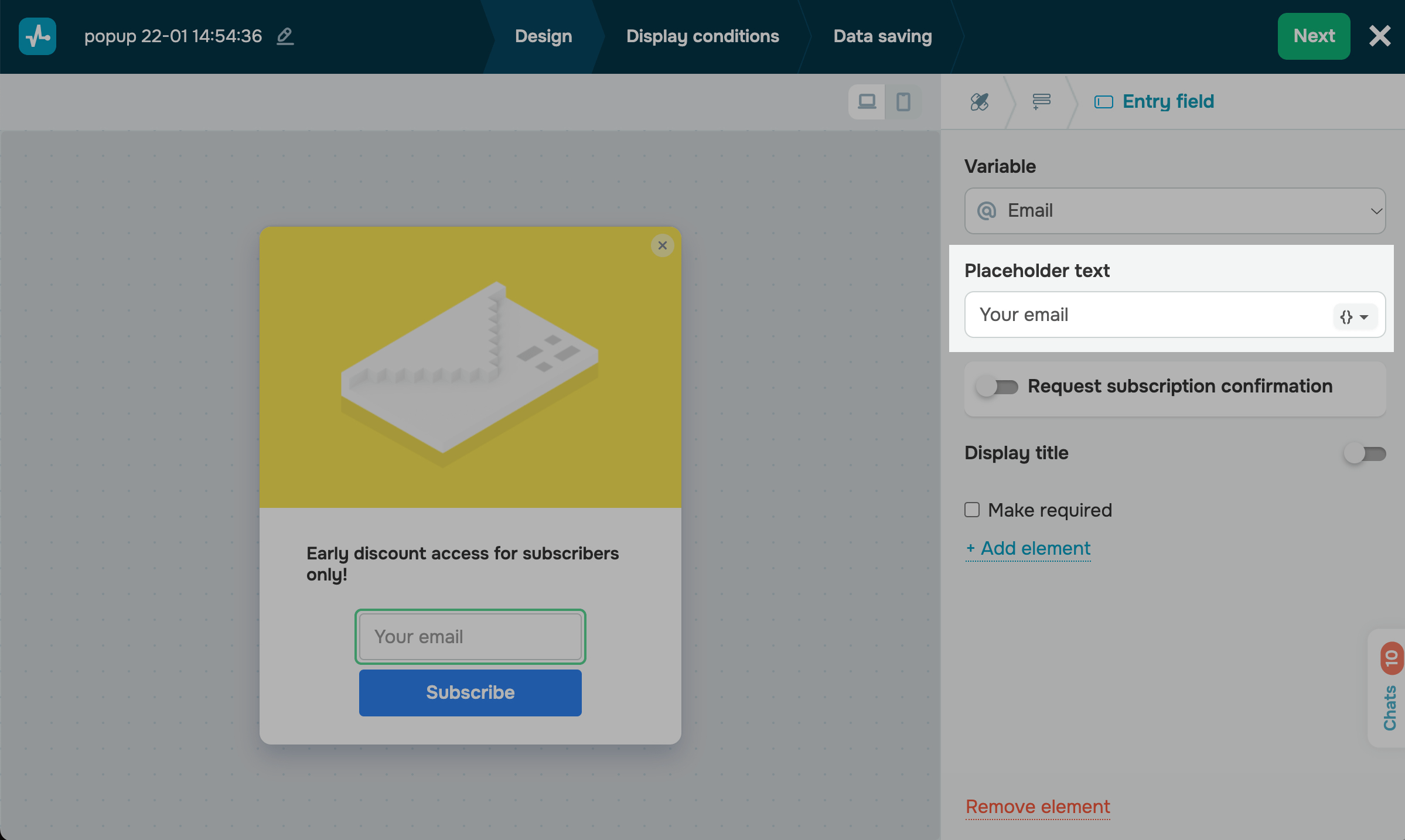
In the Placeholder text field, type in the text that will help users understand what kind of data they should enter. By default, it has a variable name.
You can also add a title that will be displayed above the field. Turn on the Display title toggle, and type in a title.
Configure browser data transfer
Additionally, you can automatically prefill pop-up fields for user convenience. Pop-up data will be added via Local Storage and Cookies (to retrieve data from a user’s local browser storage) or via API (to retrieve data from your system) and saved after a user submits your form.
In the Placeholder text field, click {}, and select a variable you have created in the pop-up settings.
Learn more: How to transfer custom variables.
You can also hide fields if they are prefilled with variable values. For example, if users have already registered on your website, you don’t have to ask them for this information the second time.
By default, if your system or users have available values for a variable, your widget automatically inserts these values into the fields. Users can view and edit them and submit your form afterward.
If you enable the Hide this field if prefilled option, your prefilled fields will not be visible to users, and their values will be saved when they submit your form.
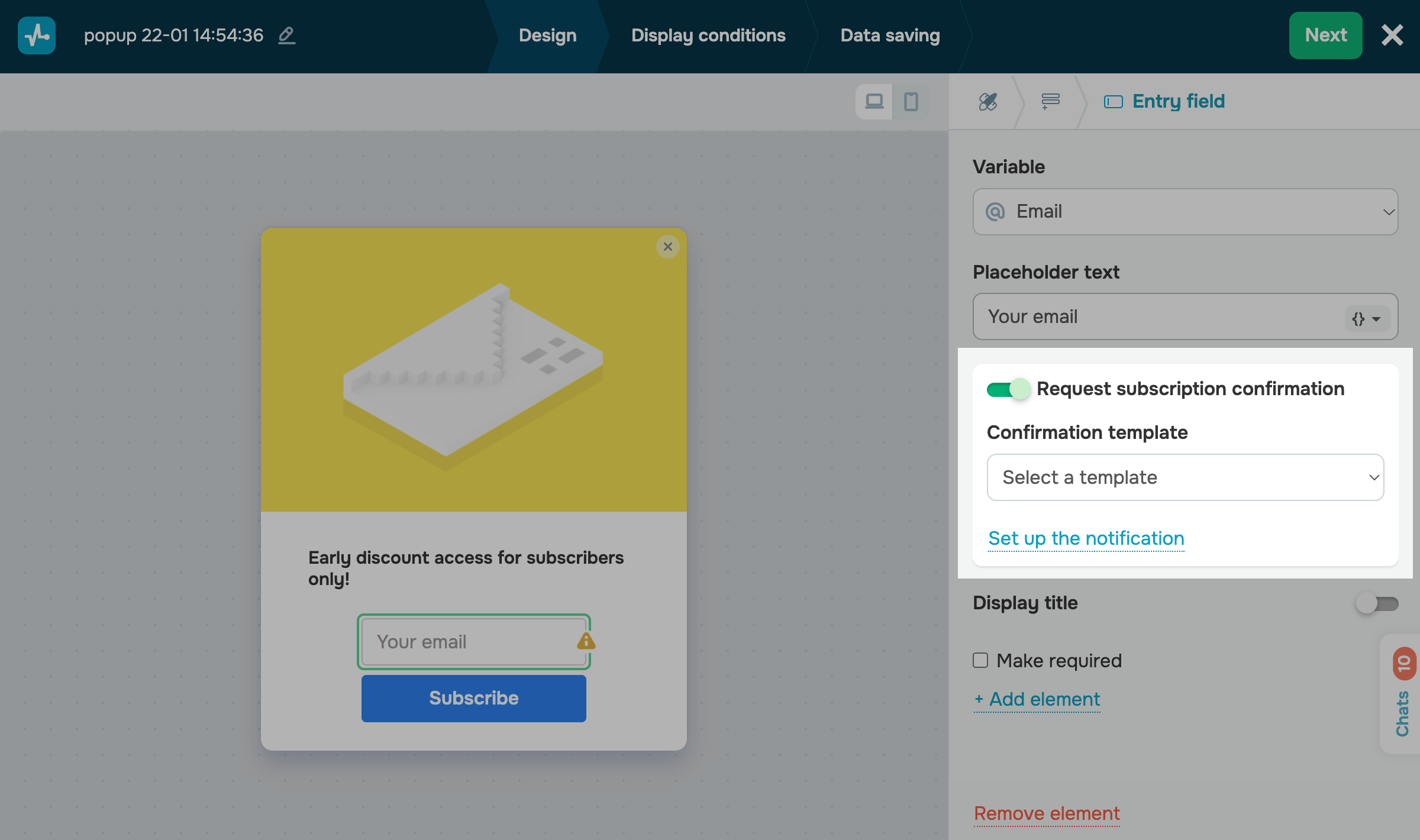
Set up double opt-in
If you enable the Request subscription confirmation option, your subscriber will receive a confirmation email after filling in a field that requests email addresses and submitting your form. Data will be saved only after the user confirms their subscription.
Select an email from the ones you have created in the subscription settings. To add a message that will be displayed once a user submits your form, click Set up the notification.
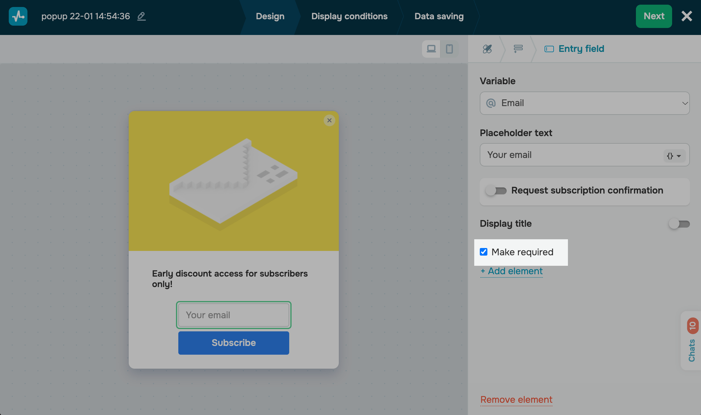
Set your field requirements
If you need users to submit your form only after filling in the field, select Make required.
Your field will be marked with an asterisk (*) to notify users that this field is required.
Add selection controls
You can collect data points by offering users to select an option and save them to the variables they selected.
You can use the following selection controls to collect data:
| Dropdown | This element allows users to select an item from the list, for example, a product category. |
| Radio buttons | This element allows users to select an item from the list using a radio button. |
| Checkbox | This element allows users to select a checkbox, for example, to consent to personal data processing. |
| Multiselect | This element allows users to select options using checkboxes. |
You can configure your selection controls the same way you configured the Entry field element.
You will also need to configure your option fields. In the Option field, enter the value users will see, and in the Value field, enter the value that will be saved to your variable.
When adding several options, you can leave one option blank or mark it to prompt users to select it. For example, you can mark the required fields.
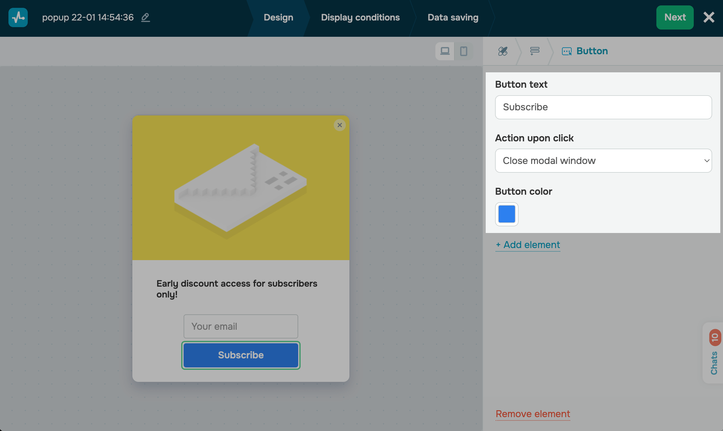
Set up a button
You need to add the Button element to pop-ups that collect user data. Once clicked, this element saves user-entered data from the pop-up fields to the Contact section. It can also save user data to the Email and the CRM services if the corresponding options are configured.
Enter your button text, and select a button action (Close modal window or Open URL). If you have selected the second option, in the next field, enter a URL.
You can also select a button color. By default, the color from the Style tab is applied.
Add other elements
You can also enrich your pop-up form by adding other elements. For example, to grow your chatbot audience, add the Messaging app element, and to add text, use the Text element.
Learn more: How to set up elements.
Arrange your elements
To rearrange your fields or elements, hover over the icon on the left, and drag and drop it to the required place.
Once you finish customizing your pop-up design and elements, click Next.
Customize your pop-up form
You can customize your pop-up element size. In the Size field select one of the following available options: small (S), medium (M), and large (L).
Styles can also be applied to all other elements at once in the Style tab.
Finish up and save your pop-up
Once you’ve configured your pop-up design, click Next.
In the Display conditions tab, select a widget display scenario.
In the Data saving tab, choose where to store subscriber data in other sections.
When you finish configuring your pop-up, click Save and publish or Save and close.
Read more: Set up pop-up display conditions, Configure data saving options, and Publish your pop-up.
Once it's created, you can view your pop-up’s style, track statistics, and edit any settings in the Pop-ups section.
Last Updated: 06.05.2025
or