Online courses are challenging to organize: you have to find worthy information, put together high-quality videos and other materials, and find a perfect platform to host them. However, it isn’t the end of it — you still have to deal with marketing.
A landing page is an essential part of promoting your online course. It can be a hit or miss, either boosting an excellent promotion or destroying all the previous efforts.
Learn more about a landing page, why it matters for an online course, and how exactly to design and write a copy for a perfect course landing page. Also, we’ve collected a list of pages we like so you can implement their tactics into your own online course landing pages.
What is an online course landing page, and why does it matter?
An online course landing page is a single page on your website dedicated to a specific course. It has all the required information about your course and urges visitors to discover more or join it. A well-designed landing page is the best tool to promote your online course.
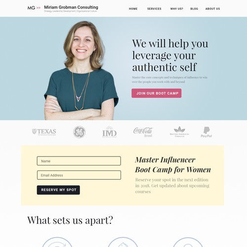 A well-designed landing page for an online course; source: 99designs
Potential learners can land on your course landing page from ads, a newsletter, your social media content, pop-ups on your website, and links added to relevant blog posts. Since all these content types provide limited information, your course landing page can fill in all the gaps.
The landing page has to be both informational and selling enough since it is still a part of your marketing strategy. It has to give the last push to a visitor before they turn into customers. Therefore, it has to have a strong call to action, highlight all the benefits of your course, and address visitors’ pain points.
Building a high-quality online course landing page is as important as choosing the right platform for your course. Visitors will judge your course and its quality based on it and decide whether they need to join it. If the page is old-fashioned, they may think the course will look the same and present obsolete information. The same goes for loading time. Visitors may also drop the idea of joining if they aren’t convinced that you aren’t a scam and if they did not find all the information they need.
Overall, the landing page reflects you and your course; it is seen as a miniature of what the learner will experience during the course. So make it count.
How to build an online course landing page that converts
So how do you make a good first impression with a landing page? We have collected five design and copywriting tips for your online course landing page.
Prepare all the needed information
The more information you provide, the more secure and prepared a learner feels, and the more they know what to expect and, therefore, can make a better judgment.
So here are the main elements you should include in your online course landing page:
- Headline. Make your headline around four to five words and define the best outcome of your course or how it solves a learner’s problem better than others.
- Supporting headline. It usually gives a bit more context to how a learner will achieve a positive outcome; this is something you have to think about before even creating your course. Some turn a supporting headline into a supporting paragraph with one or two sentences.
- Clear call to action. CTA is the main part of any landing page. The button should go right after the supporting headline, specifically above the fold, and come up a couple of times afterward. CTAs can sound like “Enroll Now,” “Learn Whatever Your Course Teaches,” “Try Out a New Career Field,” etc.
- Essential course information. Indicate what the visitor will learn or will be able to do, course start dates and duration, pricing options, etc. When it comes to course outcomes, it can be about life improvement, work-related success, a new skill, or certification acquisition.
- Your bio. A speaker’s persona matters a lot since it helps people understand whether they will get pure theory or field experience backup. Some people may come because of the speaker, especially if they are an important person in the industry. In the bio section, you can tell about the speaker’s experience in the field and explain why they are suited to teach the course.
- Reviews. Social proof is proof that the course is real and was tested by previous students. Testimonials should be around four to five sentences, highlighting how learners liked the course and real-life outcomes.
- FAQ section. This section usually has answers on who can benefit from this course, what payment options there are, whether it is possible to get a refund, what equipment one may need, and whether they can communicate with peers and instructors. You should define questions to include in this block based on what inquiries you actually get the most.
Try to present all the information on your course landing page with short and easy-to-understand sentences. Also, consider using bullet points with icons to remove wordy paragraphs.
Learn more about the perfect structure of a landing page that converts.
Use the power of videos
Videos are the best way to introduce your host and their course. It will fully show what learners should expect and how the speaker explains things and talks overall. It also evokes more trust since it shows the people behind it all.
Read our post on nurturing leads with an effective video marketing strategy.
In your video, you can talk about the course and what it is about, tell the story of its creation from the teacher’s perspective, and add video testimonials from previous learners and proof of their success stories.
Go for smart design
The overall design of your page should correspond to your brand and follow modern design practices. Make sure to use brand colors, seek graphics that demonstrate outcomes of your course, the process of learning, and screenshots from the actual course, and don’t forget to use different colors for different sections to make the reading easier. It is especially important to make your CTA stand out.
Experiment with A/B testing
While creating your page and analyzing the competitors, you may find the formula for success. Yet, it is all theory until it is launched and tested and, therefore, can flop tremendously.
A/B testing is a great way to understand what works on your landing page and what doesn’t. Test one change of element per time and analyze which variant converted better. It works especially well for CTAs, both text and button colors.
Optimize
You need to optimize all the technical nuances to ensure that you provide the visitors with the best possible on-site experience. Here are the points you need to take care of:
There isn’t a worse way to introduce your course than show it off on a slow page with the lack of right-sizing.
Online course landing page examples to get inspired
Here are five good examples of online course landing pages that you can review and draw some inspiration from.
MasterClass
MasterClass is a renowned platform that offers classes from well-known field experts like Christina Aguilera, Aaron Franklin, Gordon Ramsey, and others. Their landing pages are all on brand: it is a minimalistic black, red, and white design, a photo of the instructor on the page, a short description, and a CTA.
Everyone knows them for an appealing video with an instructor talking about their expertise in the topic and motivating viewers to enroll in the course. Instructors talk with a lot of passion about their work, and it ignites a person watching as well.
 The landing page of Joy Harjo’s course on Poetic Thinking
You can find fragments of the course and a short description of each lesson to better understand what you are subscribing to. However, information is hidden behind a button or drop-down menu not to overwhelm people with too much text. They also recommend other courses that you might like and include an FAQ section with a drop-down menu.
Udemy
Udemy has nice landing pages as well: they use videos, have short and long descriptions of their courses, information about who it is suitable for, instructor bio, and clear CTAs right above the fold.
It is a platform where numerous courses with quite similar content and less-known instructors are published and, therefore, they made a good focus point on making it easier for students to decide whose course they would like to choose. You can see the rating and students’ feedback.
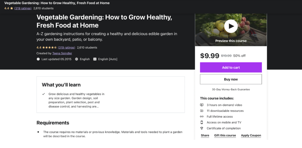 The landing page of the Vegetable Gardening course
However, the description is organized as text only, without any icons and bullet points scattered horizontally, making it difficult to focus on the text.
Le Wagon
Le Wagon helps people learn how to code with intensive training in different cities worldwide and online.
Their landing pages are full of information, with curriculum, admission process, a typical day, and descriptions of activities after the course is over. At the same time, all of it is packed beautifully with icons, widgets, and drop-down menus. They also have a table of contents to make the scanning even easier.
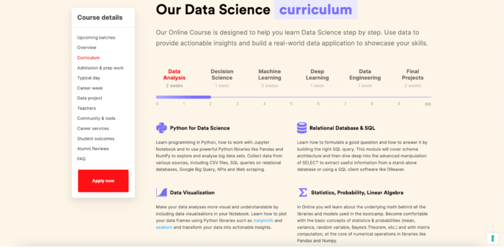 The landing page of Le Wagon’s course
At the same time, the headline could have been more engaging, and the mix of red and violet is a bit rare combination.
Google Digital Unlocked
Google shows off its brand minimalistic design and success stories of those who finished the course. They have more than enough information, but they packed it in drop-down menus and widgets not to clutter the space.
Their video testimonials are impressive, considering that people get promoted to managers and CEOs of big companies, and the visuals are also extremely high-quality. The outcomes of the course are also well-explained.
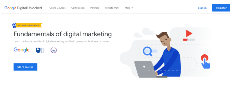 The landing page of Google’s course
We don’t have information about the instructors, though, and some of the courses lack testimonials.
CG Spectrum
Art and design landing pages have other requirements regarding their look and structure, and CG Spectrum seems to have achieved that level.
They clearly state the outcome, organize the information neatly through the navigation menu, show mentors and their works, and show off their students’ work and companies that hire the learners.
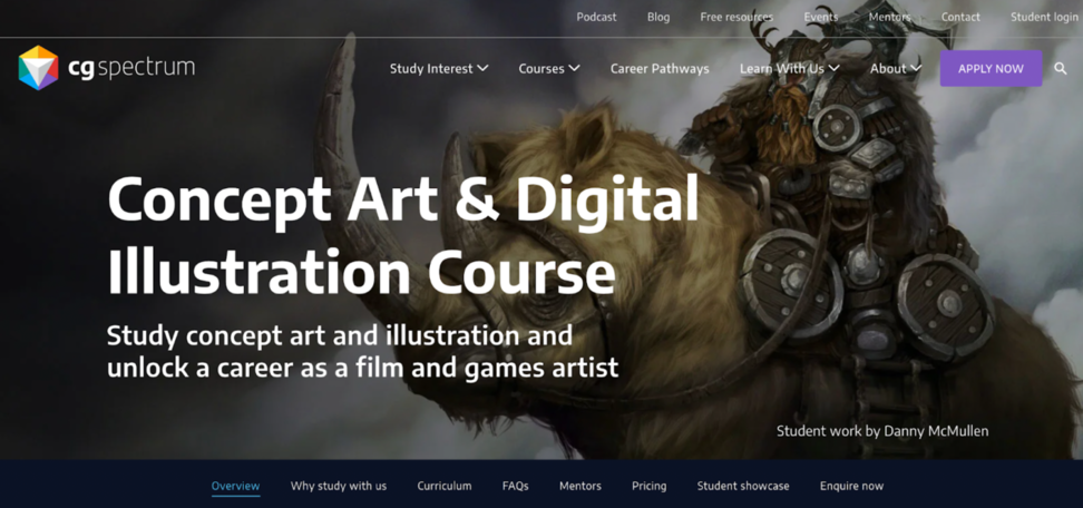 The landing page of CG Spectrum’s course
The only drawback to note is that the application process isn’t well-explained on the landing page itself.
Conclusion
A good online course landing page includes all necessary information but presents it in a clear and easy-to-follow style. One of its primary purposes is to sell, so it is a good idea to tell about course benefits and place some CTAs along with the text.
Do you want to build an online course landing page with no tech sweat, focusing solely on its content? Then try an online course builder by SendPulse and enjoy a quick and high-quality landing page.