Contrary to popular belief, there are no clearly expressed learning styles. We all absorb information through a mix of channels such as visual, audio, and sensory. However, studies show that including visuals in a learning material can help students comprehend and retain information better.
Infographics are the most useful type of visual aid when it comes to eLearning. They can make complex concepts more digestible and even improve student engagement. Also, they allow you to provide additional context and, therefore, make your lessons more complete.
Let’s find out how to create and use them and what kinds of eLearning infographics are the most effective. We’ll show you 10+ educational infographic examples and discuss what makes them work.
Why should you be using educational infographics in your courses?
If you make your online courses more diverse and attractive, your students will be more interested in completing them and actually applying what they’ve learned from you. But there is more to eLearning infographics than meets the eye. In fact, they’re helpful not just for students but also for teachers and online course creators.
- Infographics carry both helpful text and visual information, which means that you can pack and deliver your lessons more effectively.
- They are easy to share or download — you can spread your influence and build authority far beyond your virtual classroom.
- Infographics can improve your SEO if you place them on your online course or webinar landing page or use them as a lead magnet.
- You can use infographics in your online course email campaigns to build up anticipation before the launch or do a quick recap after each lesson.
- Professionally designed images will give your course a more organized, put-together look.
You don’t have to worry about your students copying and sharing some of your materials — there’s a way to prevent sneaky competitors from taking advantage of your efforts.
You can always add a watermark or logo to your eLearning infographics to make sure that your unique content assets won’t be stolen. For the same reason, you should use your iconic brand style and colors when designing them.
If you’re about to launch your first online course, including educational infographics in it is your safest bet. They’re relatively easy to make, especially if you rely on template-based online editors, and your students will be happy to get compelling visuals instead of having to wade through plain, dry text.
8 types of eLearning infographics and how to use them
Let’s address the elephant in the room. You’ve probably encountered boring flowcharts or ugly block schemes and thought, “how’s that supposed to help me?” That’s why you need to make sure that your own infographics don’t fall into the same category.
Here are some educational infographic examples that we find particularly engaging and outstanding — you can use them as inspiration for your own images.
Step-by-step guides and roadmaps
Infographics can help you instantly drive your point across and break down complex ideas into actionable steps. Even if you sell corporate training programs, it doesn’t mean that your visuals have to be dull and uninspiring.
This example shows that virtually any process can be presented as a clear and comprehensive sequence of actions. This type of infographic will help your students understand complex concepts and refresh their knowledge in seconds.
The same can be said about roadmaps. By visualizing complex processes, you ensure that your students get the full picture at a glance.
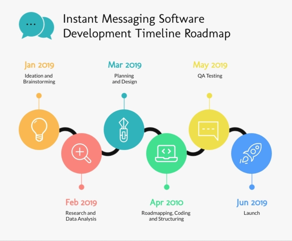 Roadmap infographic example; source: Visme
Roadmaps provide more clarity by helping you demonstrate how to complete a task or project and how much time it should take. This is a fantastic alternative to monotonous, text-heavy lists. Of course, you’ll still need to elaborate on each step during your lesson, but it’ll be much easier to do once you and your students have an intuitive visual aid in front of you.
Explainers
Follow the principle “show, don’t tell” whenever you need to introduce a new term or an idea. So-called explainers can be of great help in that respect, especially if you make them intuitive and even somewhat playful.
This particular infographic is effective because it explains the differences between exchange-traded funds and index funds in the most visual manner possible. Tidy illustrations help drive the message home and make this complex financial topic less confusing and intimidating.
Learn more about creating and choosing effective images for your landing pages.
Informational images will brighten up your slides and allow you to talk less while saying more.
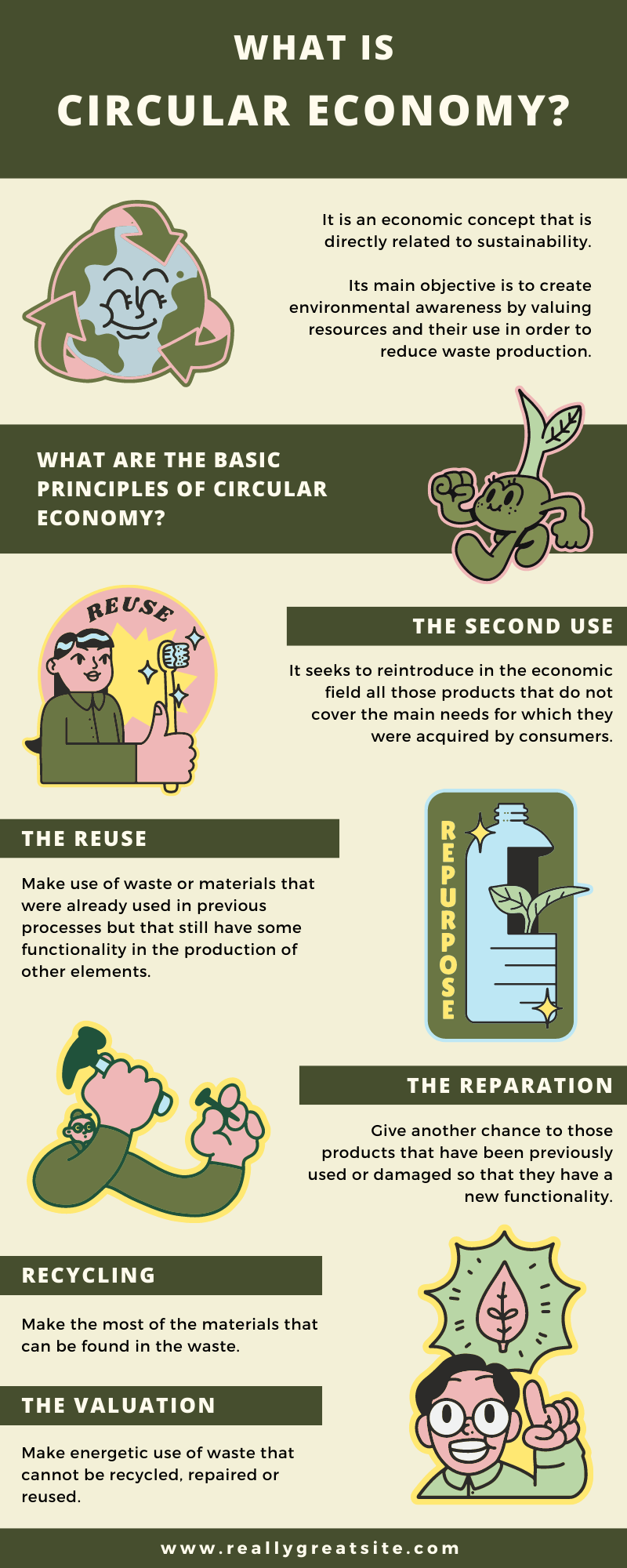 Educational infographic example; source: Canva
Visual explainers allow you to demonstrate the hierarchy and connections between certain topics or objects. Also, they enable you to accentuate the most important points and add another dimension to your online lessons.
Stats and facts
Presenting statistics and figures visually allows you to draw more attention to them and make even somewhat monotonous lessons a bit more exciting. Also, it will make your stats easier to “scan.”
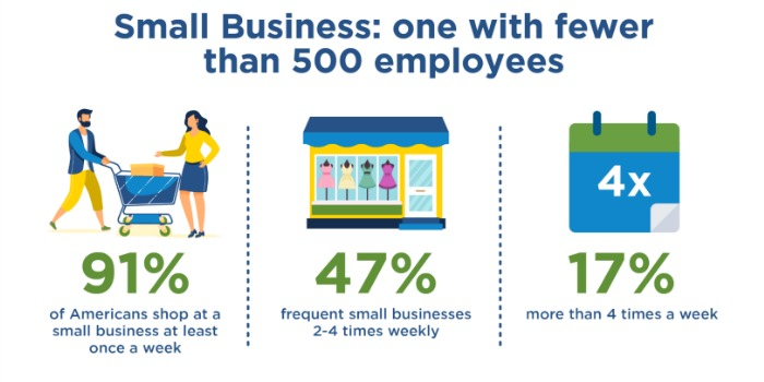 An infographic presenting facts and stats; source: Braden
There’s just one small thing to keep in mind. Don’t forget to tag your sources on your image or below it to provide your students with more context and prove the validity of your information.
Trends
You can use infographics to describe and analyze emerging trends in your field. Turning this type of information into images will make it more comprehensive and compact. In addition, your students will be able to save the chunk of data they’re especially interested in and return to it later.
 An infographic presenting industry trends; source: Capgemini
This educational infographic example perfectly demonstrates that you can make any niche data more convincing and visually appealing by adding relevant images to it.
Lists, tables, and checklists
Let’s be honest, bulleted lists aren’t always enough to awaken students’ interest. If you put a lot of work into composing your unique checklists, why not make them easily downloadable and fun to look at?
 Checklist infographic example; source: Know Your Body Best
This is also a great way to make each of your points more attention-grabbing. Even adding small icons to your list will enormously improve its readability.
You can also use this type of infographic to illustrate the key takeaways or insights from your lesson.
This simple table, for instance, looks more attractive when presented as a clean, colorful infographic. A typical black-and-white spreadsheet design is more likely to bore the reader.
Comparisons
If you describe how two ideas stack up against each other, make sure to sprinkle your slides with some helpful visuals. It will make your explanation clearer and more memorable, and you might even be able to shorten the theoretical part of your lesson.
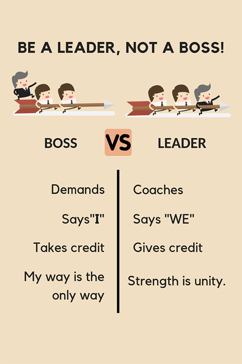 Comparison infographic example; source: Pinterest
In this example, we see two different approaches to leadership being compared. The witty illustrations make the differences between them more obvious so that no lengthy explanation is needed.
Here’s another great comparison infographic example.
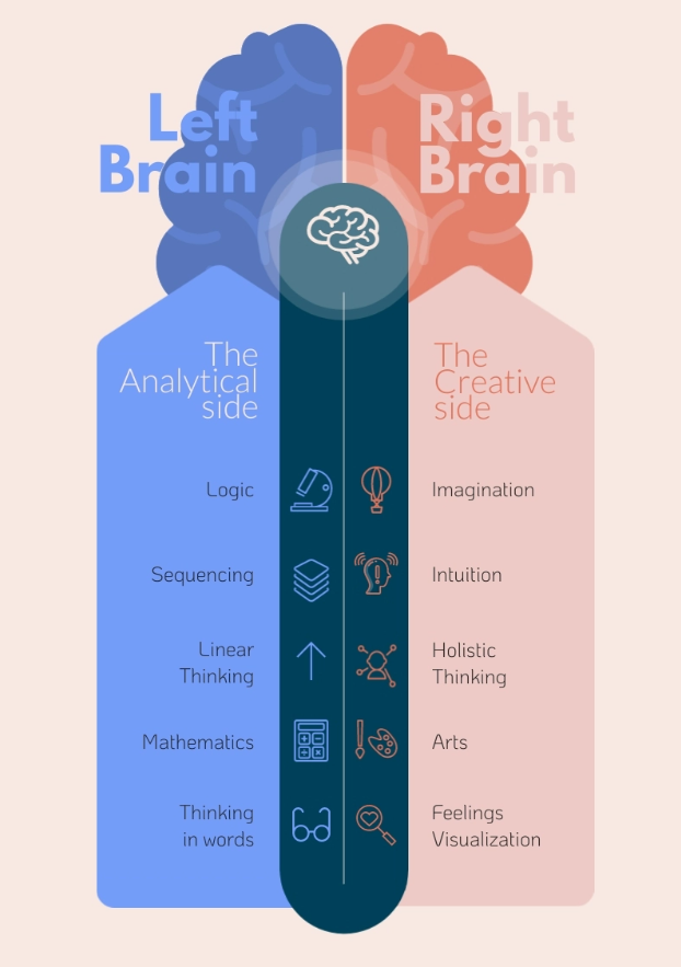 Side-by-side comparison infographic example; source: Visme
This example also demonstrates a visual comparison, but, in this case, the difference between the two sides is further emphasized with two bold, contrasting background colors.
Maps and schemes
Whenever you need to show where certain events take place or where specific things are located, you can fully rely on infographics. They help you simplify your explanation and make it more beginner-friendly.
 Scheme infographic example; source: Lite
This infographic, for example, effectively illustrates how stress affects the whole human body. Delivering the same concept as plain text would result in lower interest and engagement since it clearly calls for some visual representation.
Find hands-on instructions on how to create and sell digital products.
You might also need map infographics more often than you think. For example, they’re extremely useful for the cases when you need to show how popular a specific product or service is.
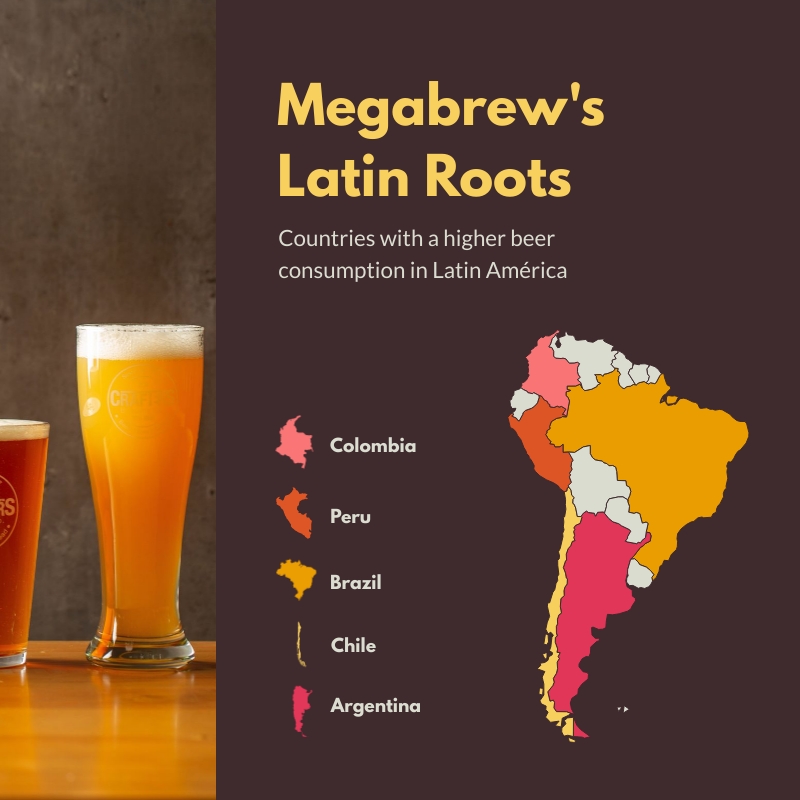 Map infographic example; source: Visme
Maps will immediately make your online lessons look more professional and well-prepared because their usage implies that you’ve done a lot of research before publishing your course.
Discover how to pre-sell your online course in the most successful way.
Cheatsheets
Almost every student uses cheatsheets at some point, even if they excel in their studies. Cheatsheets help us structure information in our head, get back on track when we feel stuck, or grab a fresh idea when we’re exhausted and nothing comes to mind.
 Cheatsheet infographic example; source: JustCall
Cheatsheet infographics can be incredibly helpful if you conduct online employee training and want to teach your new team members how to deal with various problematic situations or react to the most common customer complaints.
You can also create cheatsheets for your students to use outside of your virtual classroom and attach them as downloadables.
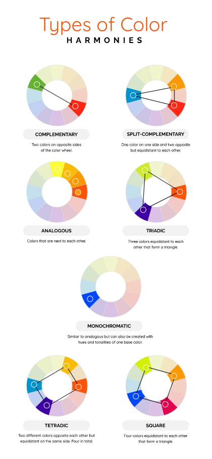 Helpful infographic example; source: Visme
By sharing unique and valuable content assets such as cheatsheets, you’ll boost your students’ trust and prove your expertise.
How to create eLearning infographics in minutes
You don’t need to be a designer to create stunning educational infographics with your branding. You don’t even need to hire one, either.
Instead, head to graphic design platforms that offer customizable templates. Here are the most popular platforms with generous infographic template libraries.
Canva
Canva offers over stunning 2K templates, around 1K of them are free and the rest is available with the Canva Pro plan. You can sort them by style, theme, and price. Under each template, you’ll see a few similar options to choose from.
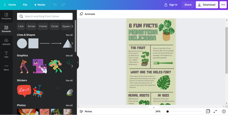 Canva infographic template example
Canva allows you to edit and download graphics on the go as well as collaborate with your team members. The pro plan costs $15 a month and gives you access to more templates, full customization, and a huge stock library.
Visme
Visme has over 1,000 professionally designed infographic templates, and some of them can be used for free. It’s easy to find the one you need with the advanced search filters. You can download your image as a JPEG, PNG, PDF, or HTML5, embed it into your online course landing page, or generate a shareable link.
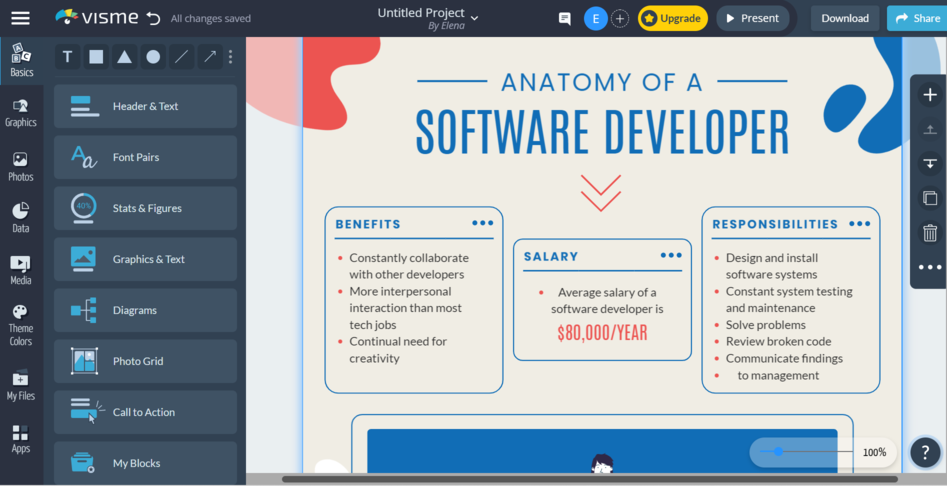 Visme infographic template example
Enjoying premium Visme’s features costs around $29 a month, but the price will be significantly lower if you choose annual billing.
Venngage
Venngage offers hundreds of elegant infographic templates, including free templates. They’re split into categories such as HR or Nonprofit, so you won’t have any troubles finding the layout that suits your needs.
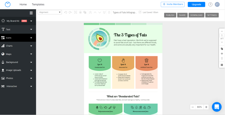 Venngage infographic template example
You can also order custom infographics from the platform by contacting their support. Unlocking Venngage’s premium features such as custom fonts and brand kit will cost you $19 a month.
Check out Venngage’s blog for more information about infographic examples, templates, and design tips.
Piktochart
Piktochart offers around 200 nice-looking infographic templates. You can customize them and download them in a PDF or PNG format. The best part is that you can use them all for free, but you get limited downloads.
 Piktochart infographic template example
To get a premium account, you’ll need to pay around $31 a month, but an annual subscription will be much cheaper.
Create engaging online courses with SendPulse
Still looking for the online course creation platform? Look no further — we’re about to launch our easy online course builder. It’s developed for creators, HRs, coaches, and anyone who wants to share and monetize their expertise online.
You’ll be able to interact with your students, assess their knowledge, and issue certificates of completion. Building courses becomes an intuitive and fun process with our code-free visual editor. We also offer marketing and sales tools such as a CRM and email automation service — they will enable you to centralize all your eLearning-related activities and communications.