Designing a commercial landing page is like walking a tightrope — every tiny move matters. With a one-page offering, you only get one shot, use it wisely. Let’s take a look at some stunning landing page design examples and find out what you can do to turn your landing page into a masterpiece.
The best practices for landing page design
Here are some basic rules you need to consider to create a winning page.
- Control how users read your page. Follow traditional design principles and use an F-pattern or Z-pattern for your layout. These patterns help users read your page naturally — from left to right. Insert prominent focal points to attract users’ attention to your call to action.
- Keep your style recognizable. Your visuals should align with your brand’s identity. Use the same color palette, typeface, and tone of voice to keep that consistency and develop better brand recognition.
- Focus on one specific offer. A landing page describes a specific product or service, and it’s better not to dilute your message with unnecessary content. Remove any distracting links or superfluous buttons from your page to smooth your users’ journeys.
- Create a sense of urgency. The most elegant way to do this is to just show how many people already use your product and highlight the benefits they attribute to it. Another way is to point out that your product comes in limited quantities or is only available for a limited time.
- Use stunning imagery to show off your product. If you sell a physical product, this is a must. It’s also better to demonstrate your product in real life, show how people enjoy using it, and accentuate its unique features. As for digital products, use abstract but memorable imagery or photos conveying emotions your audience is promised to experience.
- Make sure your CTA buttons are impossible to miss. A persuasive call-to-action button can miraculously boost your conversion rate, so you don’t want to skip this step when working on your landing page design. We recommend making CTA buttons contrasting colors and using action-oriented language for the button text. Use active verbs and trigger words such as “Get my free account” or “Book a call now.”
- Don’t bore your users with endless scrolling. Keep your paragraphs short and clear. Sure, if you have a specific tech product and you need to deliver a lot of information to help your leads gain clarity, go for it. However, in the rest of the cases, lengthy pages are totally uncalled for. Think of it as a physical ad. Would you rather meet your potential customers with a convincing brochure or a wordy volume?
The good news is that you don’t need any web design experience to implement these rules. Check out our previous post on the anatomy of a perfect landing page where we also discuss landing page design.
The best landing page design examples
“Fake it till you make it” can be easily applied to designing landing pages. Of course, we don’t encourage you to copy every single feature that you find on your competitor’s page, but we certainly do recommend experimenting more and learning from what other landing page creators do. That said, now, let’s dive in to get some landing page design inspiration.
Lucid Motors
Lucid Motors is a promising American automotive company and, most likely, a future direct rival to Tesla in the electric vehicles market. The star of this brand is still rising, but we already have a chance to appreciate the beauty and elegance of Lucid Air, their first luxurious electric car. It is the first thing you see when you land on their website, and it’s truly breath-taking.
Videos can dramatically boost user engagement
Landing pages need to be stripped of all non-essentials. However, if you sell a high-end product and you have the means to create stunning videos of it, these videos are essential. In our example, Lucid Motors used a video background to create a more immersive experience for their users.
Thrilled about creating killer videos for your brand? Learn how to set up your
video marketing strategy without spending a fortune!
Put yourself in your customer’s shoes. Would you pre-order an expensive car without even seeing it? Probably, not. Mesmerizing visuals go hand in hand with satisfying user experiences in general. They help you attract, explain, and convince. Let your product speak for itself, and you’ll see how much of a difference it makes.
Chicolle
Chicolle a new skincare line, and it’s all about self-love and taking care of your health and body. This landing page can’t go unnoticed with its bold style and bright colors. Their web designers certainly broke a few rules here, but for a good cause.
For example, instead of a CTA button, there is a big clickable banner encouraging users to shop now:
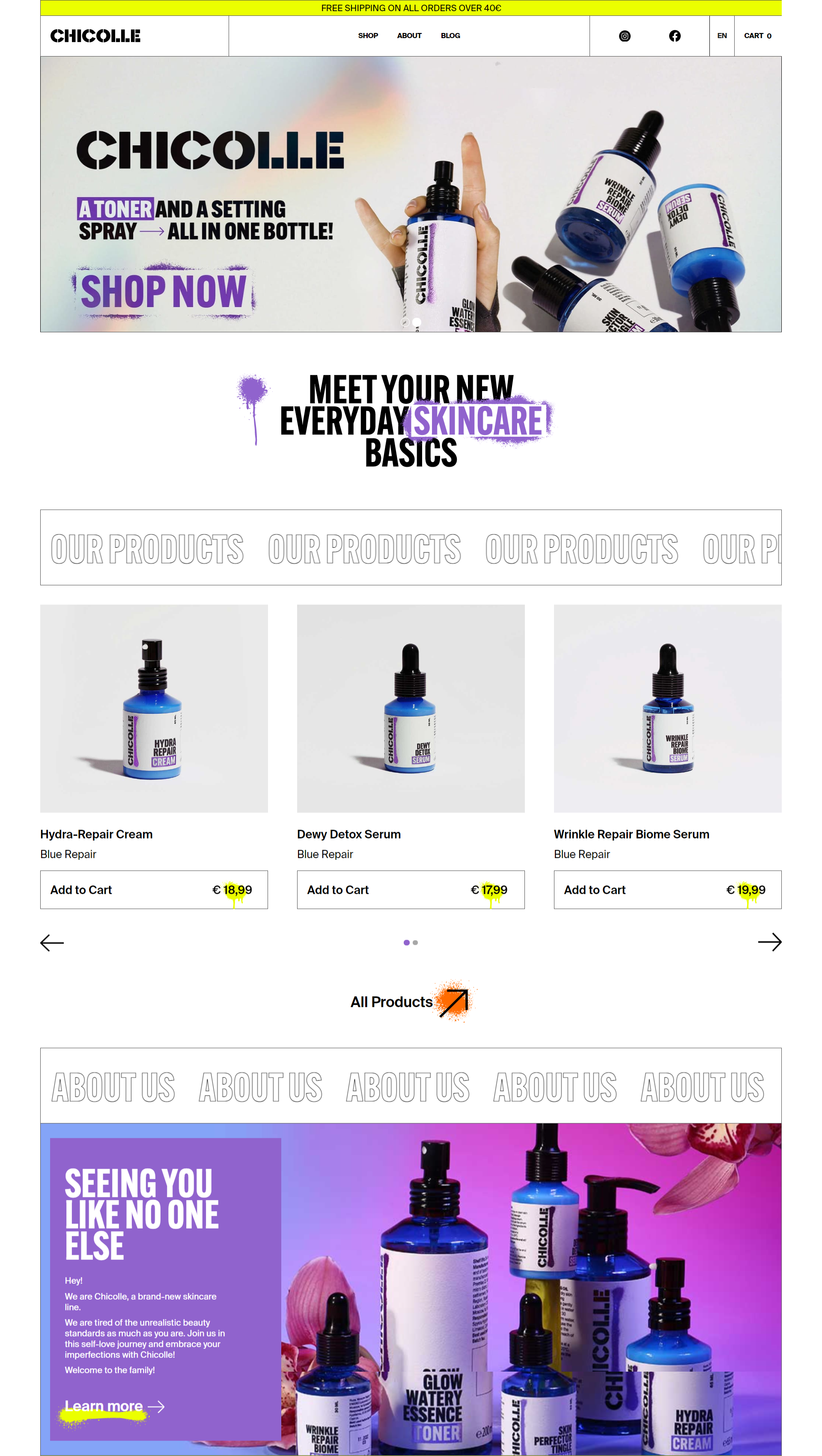 Use bold and recognizable styles to present your beauty products
Another unusual thing on this landing page is the preview of their blog. You can also see their catchy Instagram posts. So, why would they distract users if the whole purpose of that landing page is to sell their products? It’s because they also want to build a community and create long-lasting relationships with their customers.
You can adopt the same approach to design and make your landing pages not only highly-converting but also helpful, engaging, and fun to look at. Just like this one:
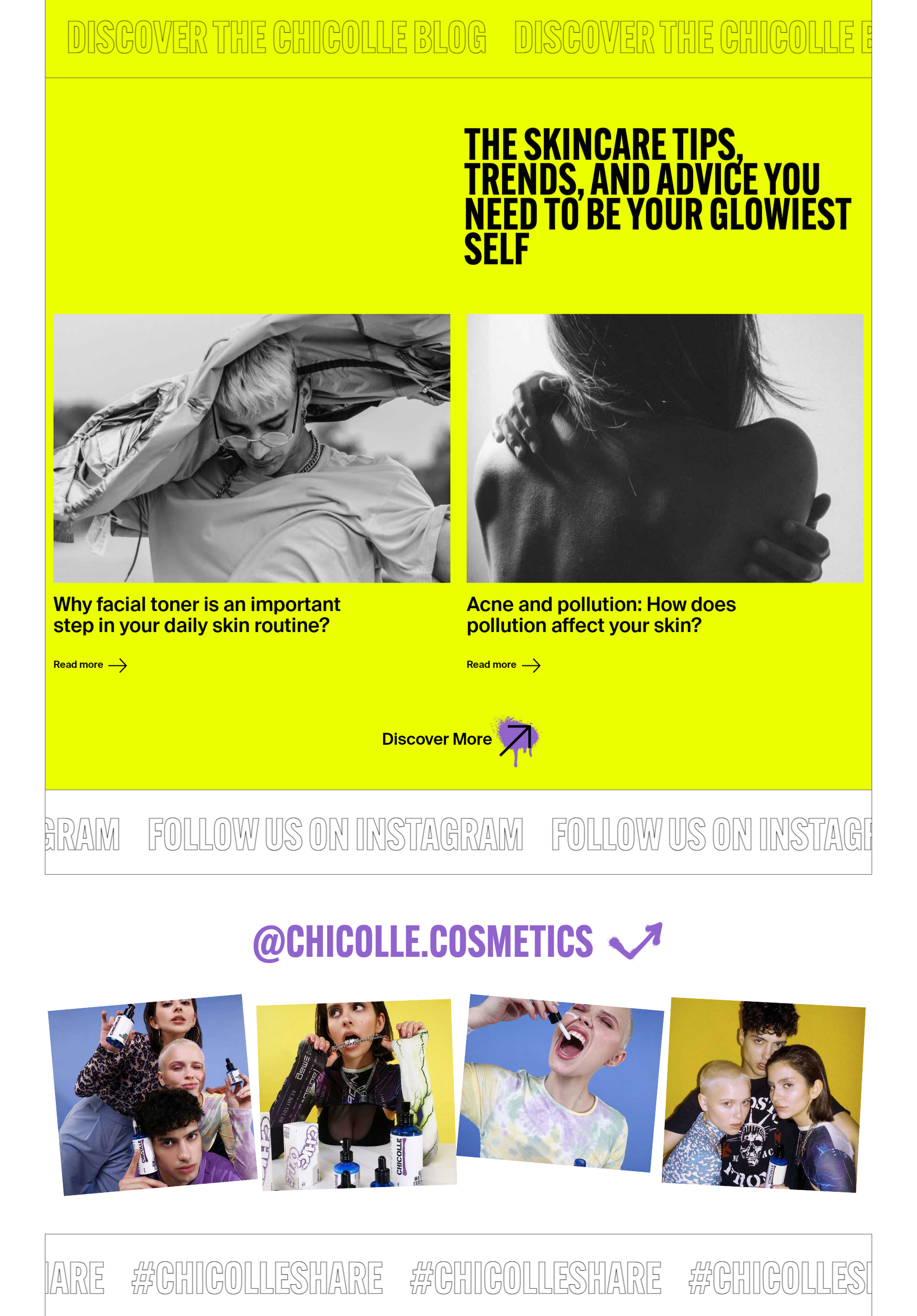 A curated Instagram account can be an additional source of inspiration
Beauty marketing is a unique field where you can experiment with different channels, styles, and approaches, and the example above proves it.
Gusto Wallet
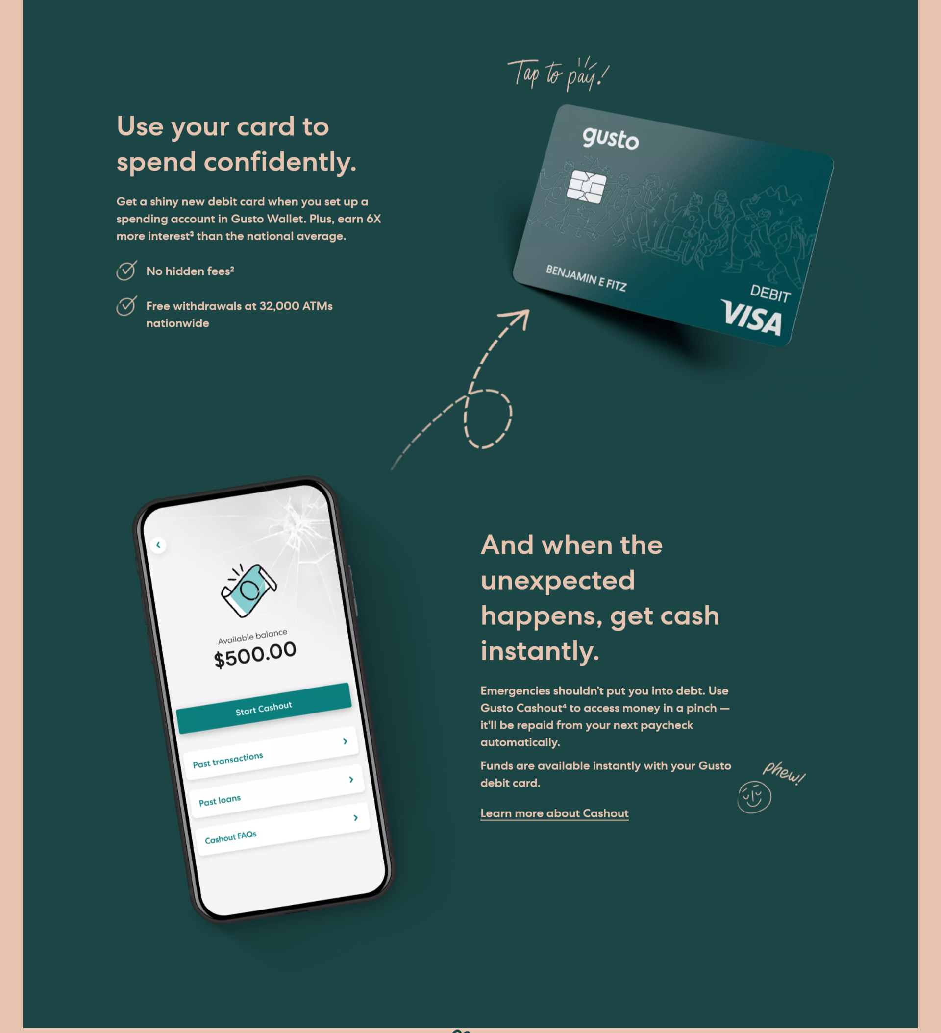
Gusto Wallet is a part of a bigger platform providing all kinds of financial tools for employers and small businesses. You’d expect a fintech product to seem unapproachable, but there is none of that. Instead, you see a simple, almost heart-warming landing page describing how this service changes people’s financial habits for the better.
 It’s always better to use the photos of real people that your audience can identify with
Pay attention to the images they use. You don’t see any generic stock photos with successful men wearing fancy suits. This page shows you real people doing what they love and dreaming about finding a better way to manage their money. Then, you see a simple explanation of how this service actually works:
 Provide a simple description for every elaborate product
It’s still a financial tool, so, obviously, their users have different questions, fears, and concerns regarding the safety and convenience of this solution. And Gusto answers them all:
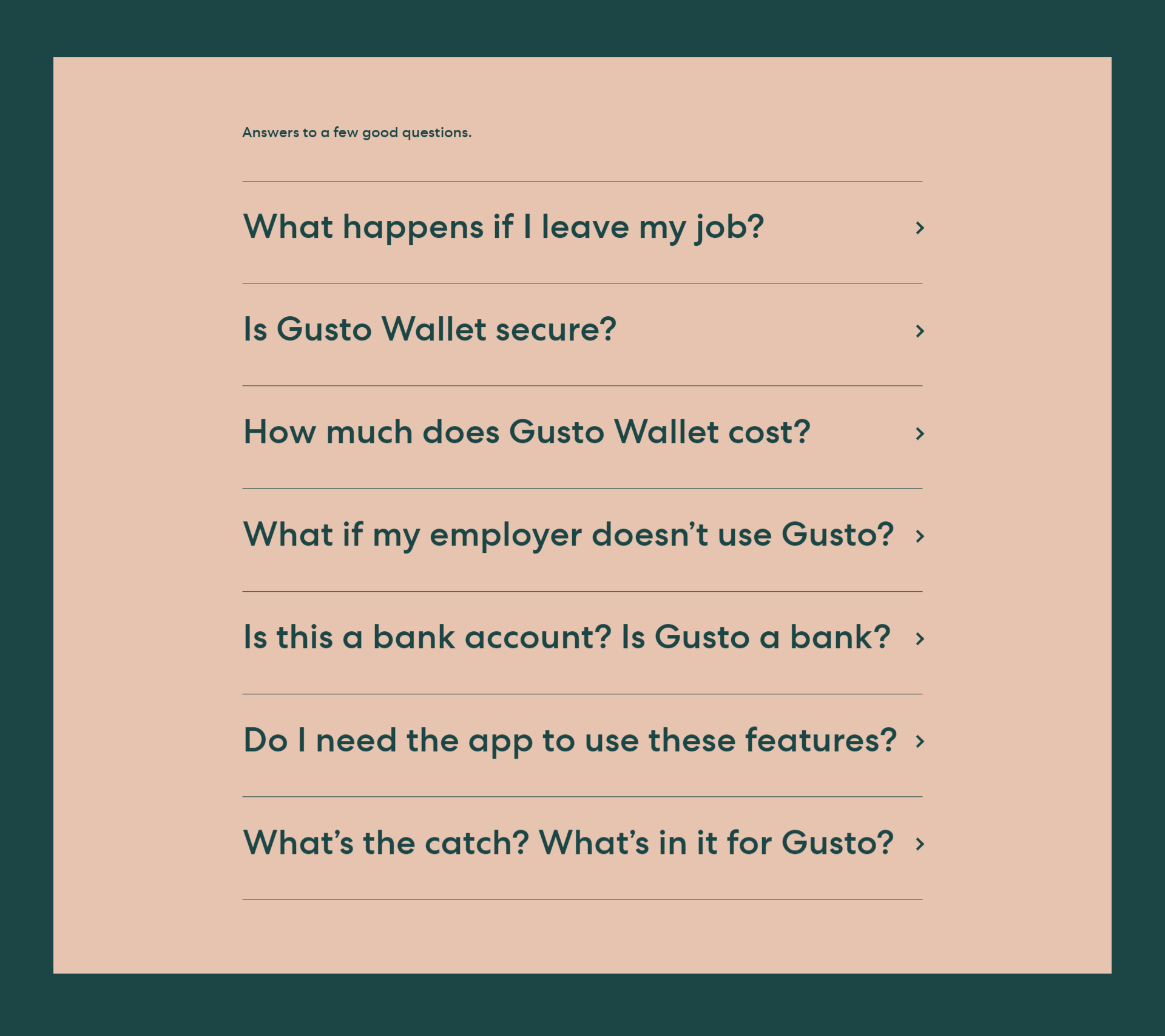 A FAQ section helps users convert faster
The key takeaway here is that answering FAQs on your landing page is always a good idea because you address your customers’ fears and help them convert quicker. So, always include this section in your layout design.
Influenswer
Influenswer is a platform that enables influencers to earn money by simply answering their subscribers’ questions. Indeed, simplicity is the key here. This landing page design proves that you don’t need to overcomplicate things to impress your audience. Just explain your innovative idea in a word and make it easy for your visitors to take the desired action.
Icons make this copy more readable, and video thumbnails demonstrate that popular bloggers already use this platform:
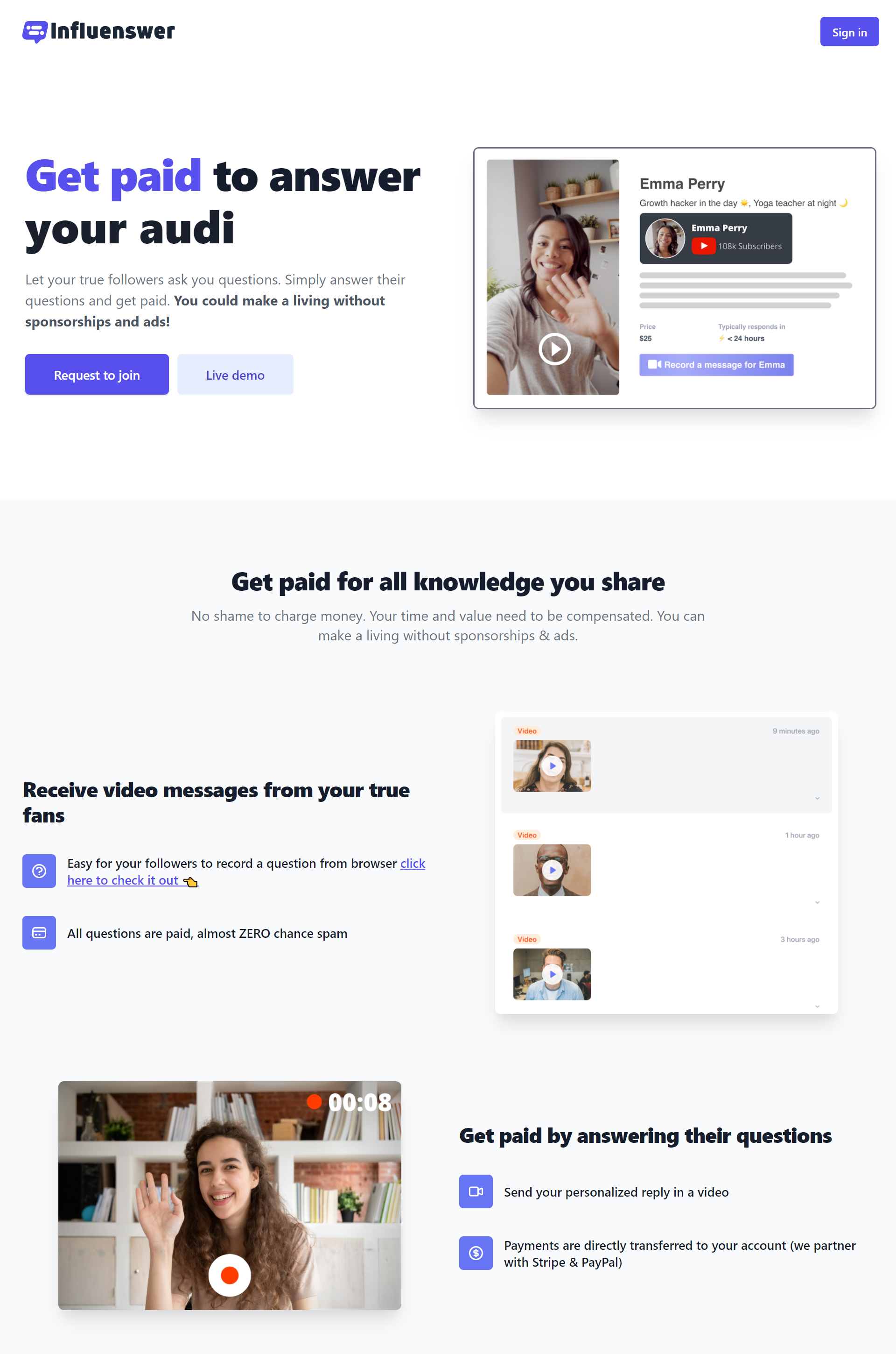 It makes sense to start with a USP and a CTA, then describe all the benefits your offer brings
What’s interesting here is that Influenswer loses no time explaining how convenient it is to start earning money without ads and sponsorships. The landing page copy doesn’t go into detail to describe all the benefits — because the benefits are obvious to anyone who has an online audience.
Lancify
Lancify is an educational platform targeting young talents and turning them into full-fledged freelancers. It’s also a good example of how you can use a stylish dark theme in your landing page design — who said you’re obliged to stick to the same white background for eternity?
The devil is in the details. It’s certainly a smart move to show how many people already use your products:
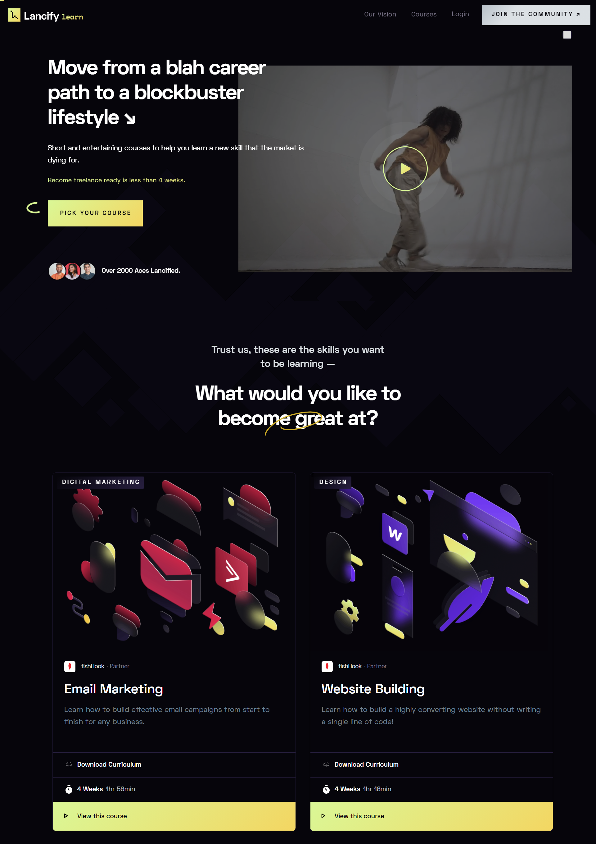 A dark theme is a great stylistic choice for many landing pages
Another cool move is to cross out typical promises your competitors make. Instead, explain what value your product really brings and why it is important. And don’t forget to clear up any doubts your visitors might have by adding a FAQ section to your page:
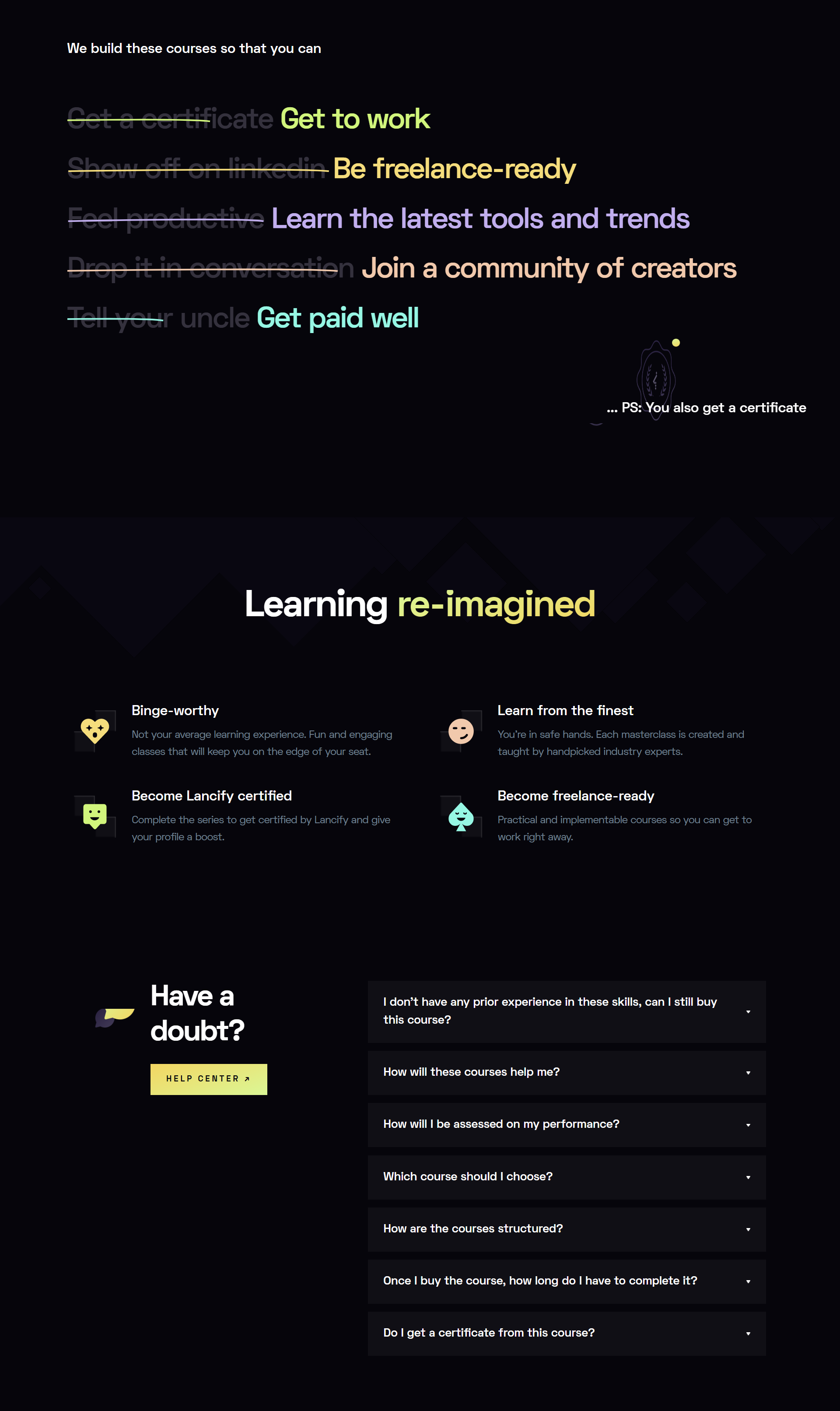 Make sure your offer stands out from your competition
The Essential Supplier Guide
The Essential Supplier Guide is a guide for chefs and kitchen staff to read before considering a new supplier. The first thing you’ll notice on this landing page is a funny emoji animation. It’s a good way to make a lengthy page slightly more entertaining:
Animation makes landing pages more interactive and engaging
Large emoji instead of bullet points also add that necessary human touch to what would otherwise have been a modest, dry page:
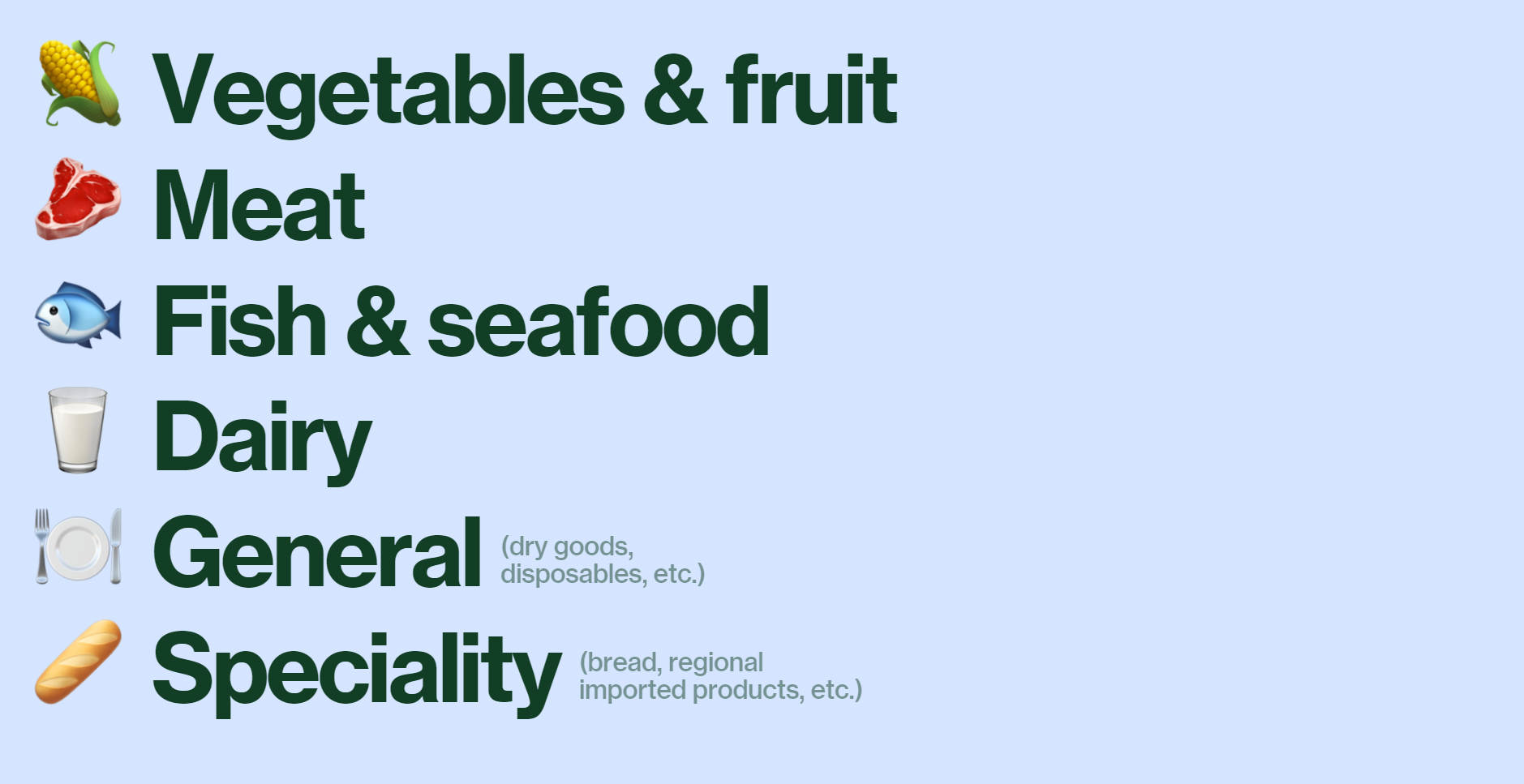 Use playful emoji and icons to inject life into your page
This landing page is also rich in downloadable content, which makes it all the more engaging. It might appear to be a bit too long to read, but keep in mind that this landing page targets a very specific audience that has already shown some interest in the subject. You can definitely use these design solutions for your own landing pages.
Pony studio
Pony studio is a UK-based branding and design agency. On their landing page, they combine amusing illustrations with a minimalistic approach. There are no flourishes here, just a pure description of what this dedicated team does for their clients. What we find worth paying attention to is how they clearly define the standard timeframe and project deliverables:
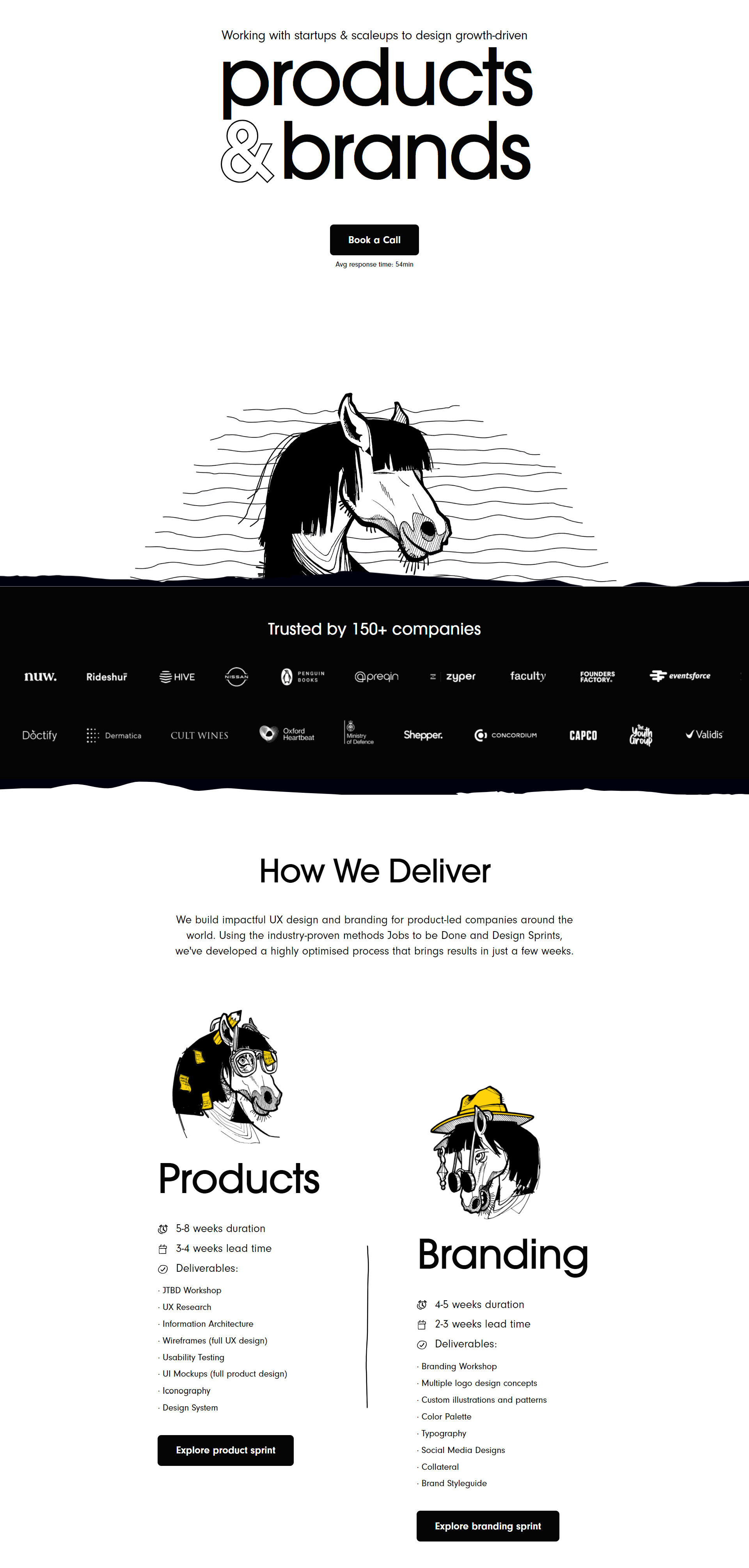 Unique illustrations won’t cost you a fortune but will make your page memorable
Putting your offer on the table is a great way to win your audience’s trust and emphasize your professional approach. If you scroll down a bit, you’ll see tiny bits of animation across the page — another tasteful design solution when you want to entertain, not overwhelm. Also, notice how this landing page design mimics the style of their Instagram account. It’s a good example of brand consistency that we’ve mentioned earlier.
Let’s sum up
Landing page design inspiration may come from different sources — just keep your eyes open. At the end of the day, there is no one-size-fits-all solution — all you need to do is to marry your creativity with practical knowledge to achieve your business goals. Many landing page creators break traditional rules, yet their businesses are thriving.
Chances are you want to use your landing page to capture leads and grow your mailing list. But do you have a lead-nurturing strategy in place to help those leads convert? If not, dive into our knowledge base and try creating your first automated email campaign using SendPulse. We provide 24/7 support in case you get stuck!