User experience is an essential part of any digital product. It can determine whether a user stays on your website for more than a few seconds or leaves immediately because something about it doesn’t feel right to them. If you want people to come back repeatedly, then make sure that every element — from colors down to fonts — guides your audience through the conversion process.
In this post, we’ll discuss how to choose the right font for your landing page so you can instantly enhance your UX. But first, let’s talk about the importance of user experience and how it affects your business overall.
What is user experience (UX)?
User experience (UX) is the user’s overall feeling when interacting with your website or landing page. This includes everything in the design process, such as layout, colors, and fonts.
Check out some stunning landing page design examples to get you inspired!
It’s essential to focus on creating a good UX because it can affect how users interact with your site and whether or not they decide to stick around. And, it is that decision to leave or stay that will directly impact your conversion rates.
Why is user experience important for your landing page?
Websites, splash, and landing pages are not created equal. But what’s the difference between a landing page and a website? One of the biggest differences is that a landing page is focused on one thing: conversion. A website, however, has many pages and serves as a way for people to get information about your business, products, or services.
A website may also include contact information. Contact pages are usually for reference. However, they’re generally not specifically designed to get someone to take action in some form, like filling out an email address field or calling you directly from their mobile device (which we all know happens).
Landing pages are created with one purpose only — converting visitors into leads so they can become paying customers later on down the road. And without a good user experience, you won’t be seeing the high conversion rates you dream of.
But how can you improve your UX?
Well, all the design elements, copy, colors, and load time play a role in how well your landing page will convert. And choosing fonts, in particular, is critical for your landing page design, as it can be the deciding factor in whether or not someone stays on the page long enough to learn about what you’re offering.
How do fonts affect your user experience?
The fonts you choose are vital because they make your landing page content more readable and add to the aesthetic of your website. Font style helps you show off a brand’s personality at first glance.
When you look at a web page, the way that it’s formatted with fonts is one of the first things that grabs your attention and makes an impression on you as a visitor. The wrong typography design choice can be detrimental to your website’s success.
If you use too many different font styles or fancy display fonts, it can have a huge negative impact on your conversion rates and user experience. It’s overwhelming to look at and, quite frankly, amateurish.
When in doubt, it’s best to stick with a couple of tried and true fonts. Our suggestion is to always test out different font combinations and see what works best and how they affect conversion rates. Remember, if your reader has to strain to read the page, they’re going to bail.
If you’re unsure how to change your landing page fonts, contact a professional web developer who can help you make all of the necessary adjustments.
What to take into account when choosing fonts for your landing page
To enhance the UX of your landing pages, you need to make sure you’re selecting the best fonts and typography design. If people can’t easily read what they need to do next on your landing page, then it doesn’t matter if you have a great offer — they won’t be able to take advantage of it.
You need to keep in mind a few things when choosing fonts for your landing page. The first is accessibility. No matter the device your users are accessing your website from, your font should remain clear and legible, no matter the size. You may also want to make sure that you use fonts familiar to your audience so that they only add value rather than detract from it.
You need to consider a few more factors when selecting fonts for your landing page.
Typeface
Typeface refers to the actual design of the lettering. When choosing a typeface, you want something easy to read, looking professional, and still capturing your brand identity.
Serif is a font that will never go out of style and has a strong professional quality due to its sharp lettering. But, go with a Sans Serif typeface and its rounded lettering if you want to be more playful. Go for cursive fonts when trying to achieve a classical, romantical, or established look.
We know choosing a typeface can be complicated, so here are some tips for you:
- always keep the personality of your brand in mind;
- ensure that the visual and tone of the font match;
- make sure the chosen typeface is functional, not just fashionable;
- check out the typeface your competitors use;
- A/B test your chosen typeface.
Size
When it comes to size, you don’t want your text too small or too large. The 12-14pt font is the sweet spot for your default font size.
However, the font size may vary depending on which device your visitors are viewing your landing page on. The mobile version of your landing page should have a larger font so that it is easier to read with thumb taps and swipes.
Find out a few tips and some of the best mobile landing page examples!
Weight
The weight of text refers to how thick or thin the text appears. For example, landing page headlines will usually be in a heavier weight so that your eye is drawn to them first.
This landing page from Row House has good contrast among its headline and body fonts
You will then want to use a lighter weight or medium for body copy, creating a natural shift in attention from the most important downwards. The heavier the font, the more difficult it is for the eyes to read.
Your text should be easy to skim through without being too tedious.
Alignment
Font alignment is when the words on a page are lined up evenly. Aligning text to the left is usually best for large blocks of text.
Justified alignment looks nicer on a page but can be harder to read on smaller screens. It should not be used for small content areas or when only a few lines are involved, as it may cause awkward spaces between words and letters.
Color
Finally, it’s a good idea to use a contrasting color for your headlines or important words or phrases. Such a color selection will make it easier to differentiate your message from the body of the text.
For example, if you have a black body copy, use white on a darker background or blue for your headline colors to increase contrast and readability. This landing page has even gone so far as to make keywords in the text body red to catch the viewers’ attention.
 Always try to keep your font colors consistent with your landing page design
In addition, make sure that the colors you choose for your text are easy on everyone’s eyes by using an accessible contrast ratio.
Contrast
Create contrast between your body copy and headline text using different font families or larger font sizes. Your headlines grab attention so they can be a bit more flashy, while your body copy is where you want to focus on legibility.
For example, use a Serif font for your body copy and a Sans Serif font for your headline text. Or, try using a larger font size for your body copy, so it’s easily readable against a busy background. You can also create contrast with styles. Try using an authentic handwriting font as an accent font against a very simple and clean Sans Serif.
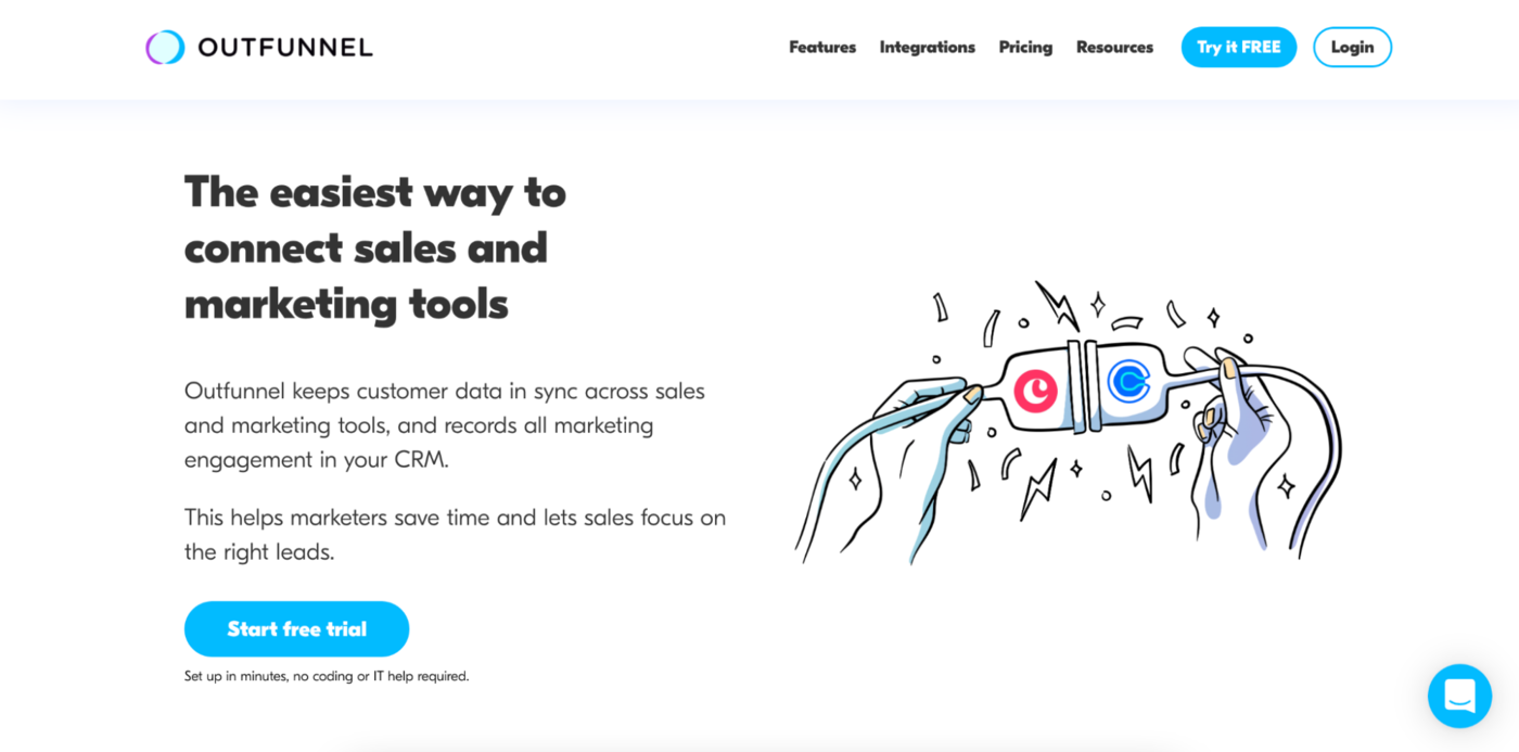 Make the important parts stand out using different font sizes, weights, colors, forms, etc.
This landing page is a great example of contrast. The black text contrasts against the white background, and the headline text is bigger than the body text. They have even used a different font for the headline and body text, making the headline bold and eye-catching.
If you want some inspiration for what landing page fonts to use, listed below are some of the latest font trends for 2022.
Font trends for 2022
Two great resources for finding what fonts are trending for the upcoming year are Typewolf and 99 Designs. They are both websites that showcase the latest and greatest font trends.
Rounded Sans Serif fonts
Rounded Sans Serif fonts are elegantly understated; however, they still stand out from the regular fonts you see daily. These fonts suit someone who wants their landing page to stand out but not invoke too much indifference.
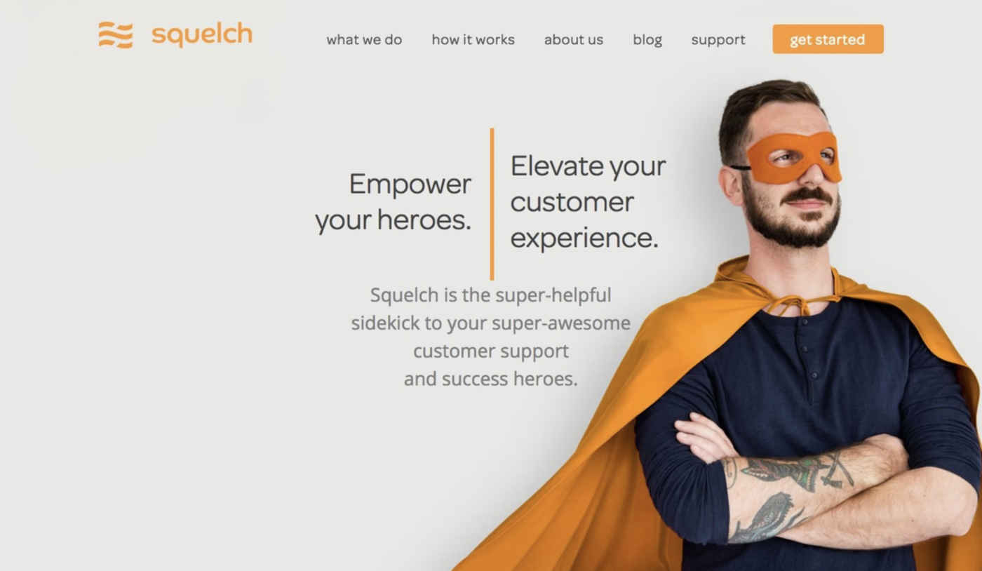 Rounded Open Sans fonts can give a refreshing appeal to your pages
These rounded fonts look clean, simple, and easy to read. This style is great for a landing page centered on child products or a page targeted to children because it has a playful and young feel.
Super thick strokes
Choose fonts with thick strokes for your landing page when you want to grab users’ attention and make a big impact. These bold fonts make an equally bold statement and bring a solid eye-catching element to any landing page.
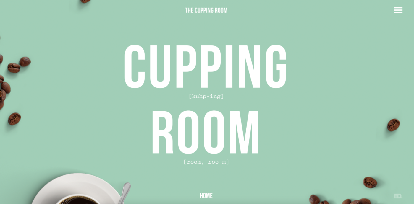 Cupping Room using a bold font called Bebas Neue on their landing page
If your landing page has an image in the background or you are using a dark color scheme, using a font like this will help your words stand out against it, therefore emphasizing the message you are trying to convey.
Strong and simple Sans
Simple will always be trendy. Just look at this Roboto font used below. It has thin spaces between the letters; however, it remains uncluttered and readable thanks to its thinly weighted letters.
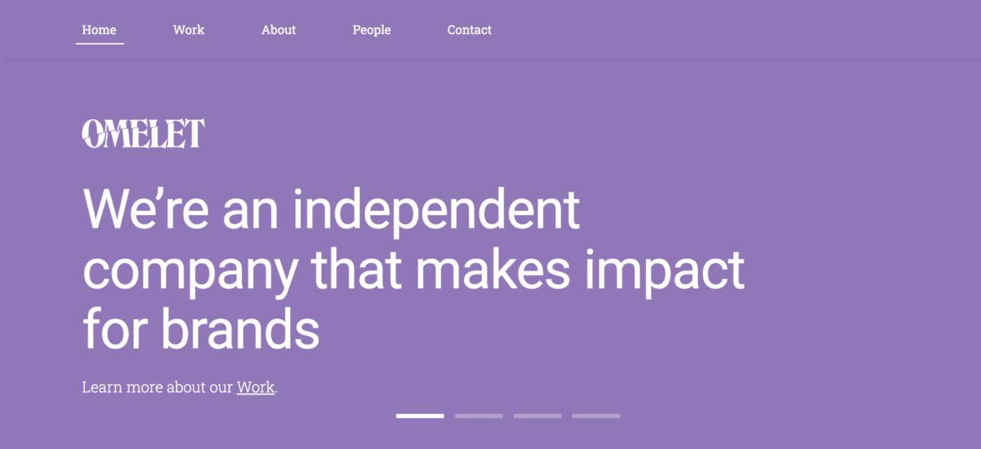 Simplicity is also among today’s font trends
These fonts are timeless, and they always look great. Just remember, simple doesn’t have to mean boring.
Authentic handwriting fonts
Authentic handwriting fonts give off a handmade vibe. Because they appear as though they were written by hand rather than using a computer, they are more relatable.
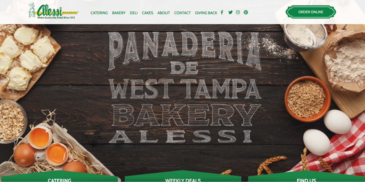 Fonts that mimic handwriting can help brands connect with their audience
They work exceptionally well for those landing pages that are trying to sell a product or service that is homemade. These organic-looking fonts add an extra layer of trust and authenticity to your page.
Decorative fonts
While simple fonts are always trendy, decorative fonts are always in style because they add personality and character to any page.
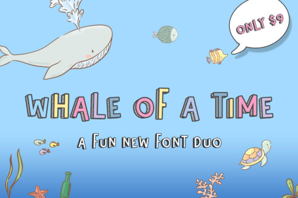 Whale of a time font duo with a filled and stripey version; source: Creative Fabrica
There are so many decorative fonts that you can easily find one that perfectly suits your brand’s personality and character.
Just make sure that you use them sparingly — too much decoration can detract from your message. We suggest using decorative fonts to draw attention to one key element of your landing page rather than using it all over the place.
Tactile realism fonts
Incorporating real objects into words adds another level of creativity and depth to a message. The tactile realism font trend is not new, but it has been picking up steam lately.
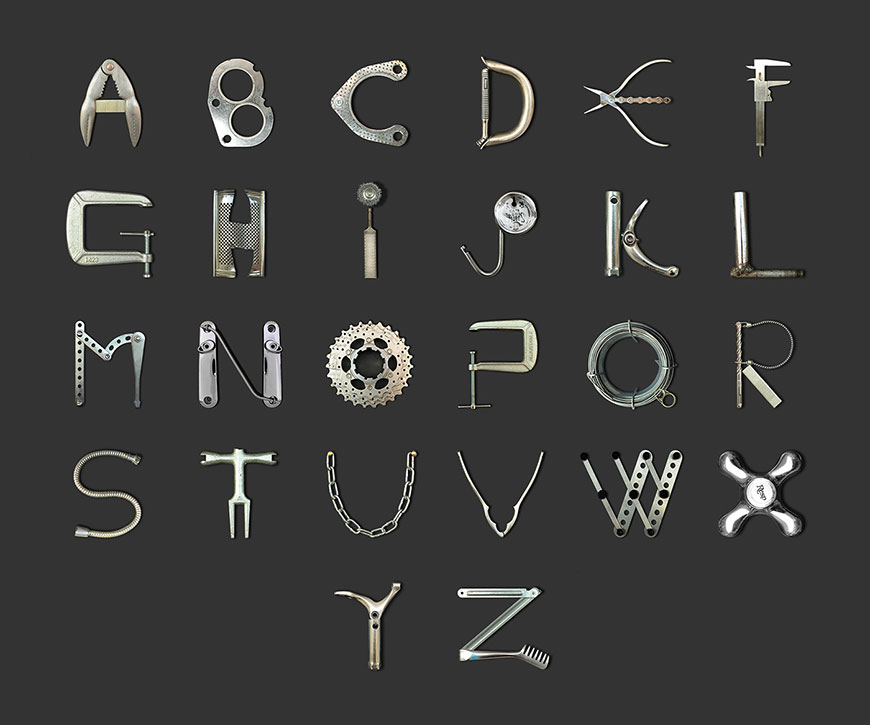 The found-object font made from images of real-life objects; source: Creative Cloud
Creative designers have found novel ways to incorporate real items into words and phrases. From a coffee cup being used as an “o” in the word “coffee” to a candy cane forming the letter “s” in the phrase “happy holidays.” This design technique can be both fun and functional, especially if your business sells products that you use in the font itself.
The best part? You don’t even need Photoshop skills. All you need is some creativity and imagination to design something truly unique for your page visitors.
Retro style fonts
Retro is making a huge comeback. Whether you like curvy retro fonts or chubby retro fonts, retro fonts are hot right now.
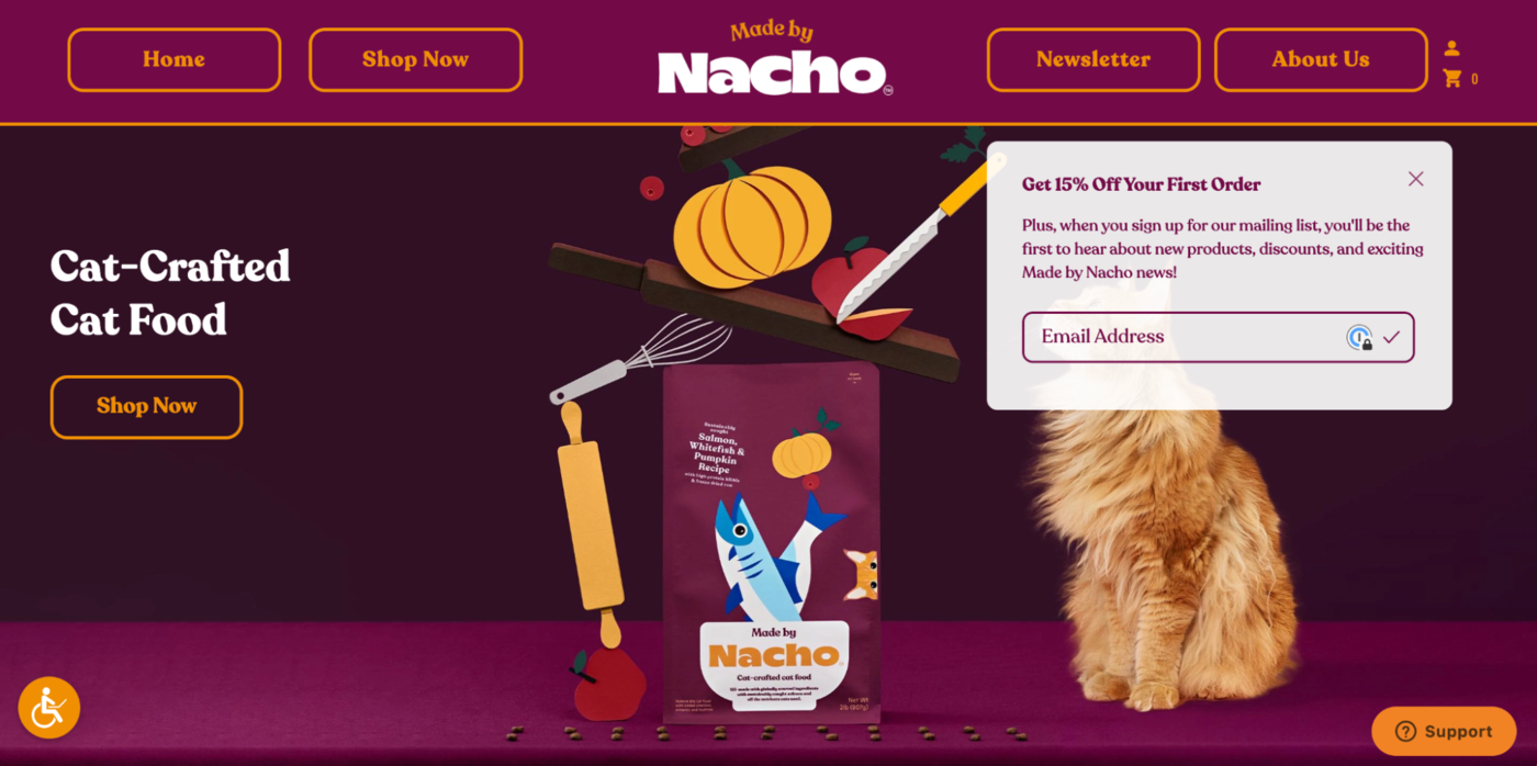 The Made by Nacho website features groovy retro fonts
Retro fonts suit best for landing pages that are designed for fun and games. For example, maybe you have a landing page where users can go and play old-time games like pinball or Pacman. Or, perhaps you have an informational site about the history of video games in general. Either way, these fonts will catch users’ attention.
Rustic Serif fonts
Rustic has a unique vintage style that can bring a new life to your website.
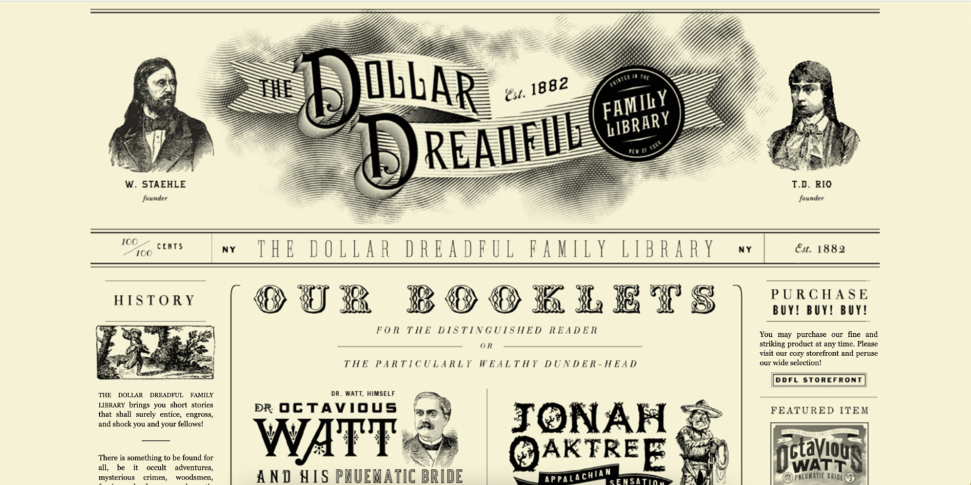 A landing page with a variety of different rustic fonts
There are several types of rustic fonts, such as Serif and slab. They look old-fashioned but still have that modern feel, so you’ll be able to combine them with other elements on your landing page. You can use these typefaces in any way you want — just make sure it fits into the design or theme of your project before committing too much time trying out different variations.
Animated fonts
Animated fonts are not just for kids and cartoons anymore! They can bring movement into static text, making them fun and interesting.
Animated font on your landing page can become more engaging than ever
In general, you should use animated fonts sparingly not to slow your page’s loading times. Slow loading times are a sure way to annoy users and turn them off your page.
However, when done correctly, they can enhance any project’s look and help you convey emotion through motion.
Experimental type fonts
Who said that letters should come one after another or that words must be displayed in the proper order or using actual letters? Sure, order and clarity are a priority, but experimental designs are now pushing the boundaries.
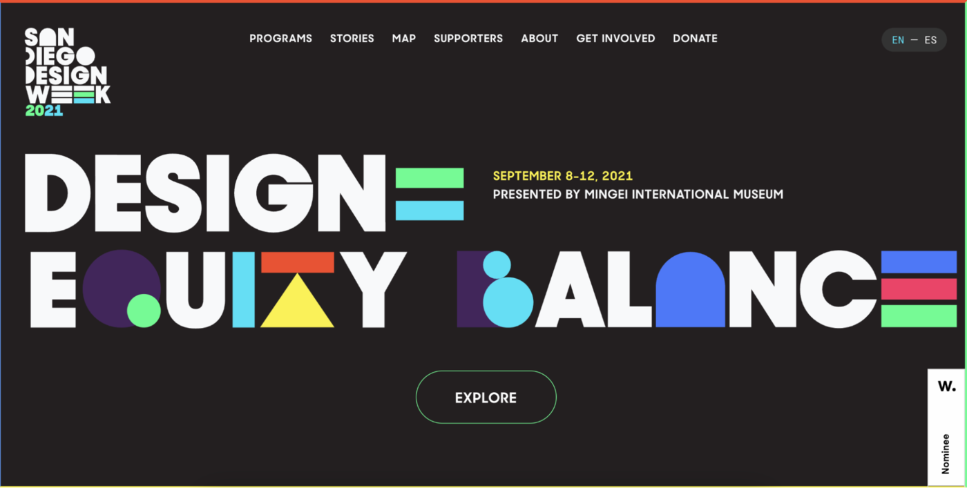 Adding textures, patterns, and different colors to your fonts can make your landing page design way more exciting
Experimental fonts are unique and can be used in many different ways to make your designs speak for your brand. Just keep an open mind about using them for the best results.
Simple script font
Script fonts should be used tentatively, but enough so that they add elegance and a personal touch to your designs.
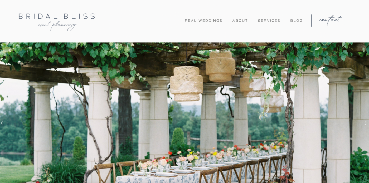 Script font is used minimally on the Bridal Bliss landing page
When used correctly, script fonts can enhance your user experience. Misused, they can be challenging to read and look messy. Scripts are typically display fonts, so they are great for embellishing your landing page design.
Quietly quirky fonts
If you’re looking for a different-looking font but find decorative fonts tacky, look into the quietly quirky font trend.
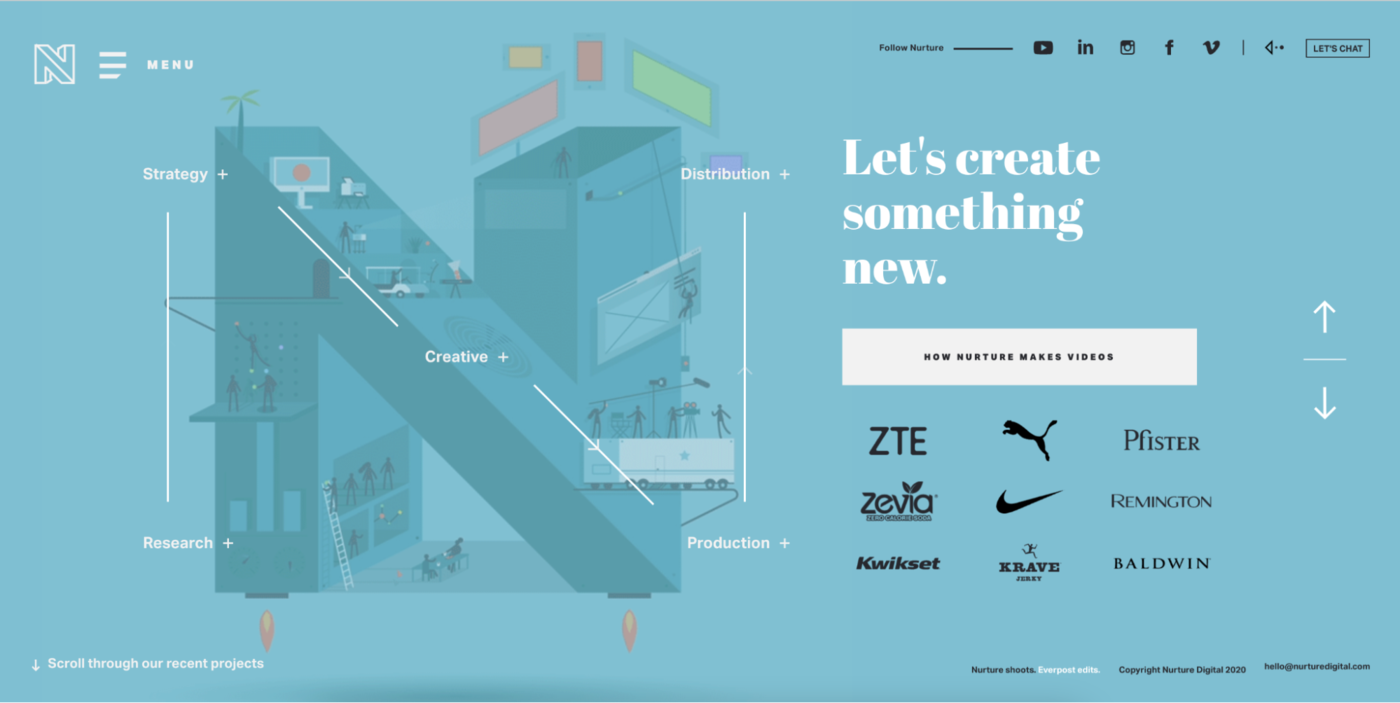 Abril Fatface is a quirky font used on on the Nurture Digital landing page
These fonts are a bit quirky, but not in an overt way. They have unique details that make them stand out without being over the top. Some of our favorites include Brandon Grotesque, Lato, and Open Sans.
These fonts can be used for headlines and body text, making them versatile options for your landing page design.
Conclusion
Fonts are an essential part of any landing page design, yet they are often overlooked. Many people think that all fonts are created equal, but this isn’t always the case.
When choosing a font for your landing page, it’s important to keep the functionality in mind to pick a style that makes the most sense for your audience. You can’t choose a perfect font for every landing page, but you should always choose fonts that are easy to read and contrast with the background.