Rome wasn’t built in a day, but a solid architecture website may very well be — that is, if you know exactly what to focus on. Considering that your website is often the first impression potential clients, collaborators, and industry peers will have of your work, you need to make it count.
Whether you’re an established firm looking to refresh your online presence or an emerging architect building your digital portfolio from scratch, this post will help you design an architecture website that leaves a lasting impact. We’ll show you how to structure a website for an architecture firm, highlight your best work, and connect with future clients — all with real examples of the best architecture websites.
The benefits of having a well-designed architecture website
A common mistake is to treat an architecture website as a basic portfolio website. Surely, showcasing your projects is one of its goals. But, more importantly, it has to communicate your firm’s vision, design philosophy, and expertise.
Here’s what you get by investing time and effort into the website design for your architecture firm:
- Making a strong first impression. A blank or overly simple website doesn’t help communicate your firm’s unique approach, whereas a curated site allows you to present your best work, reinforce your brand’s aesthetics, and make an immediate impact on visitors.
- Ensuring better client engagement. An architecture website should invite exploration and drive inquiries. Through intuitive navigation, high-quality visuals, and strategic CTAs, a curated website makes it easier for potential clients to understand your niche and scope of expertise.
- Revealing stories behind each project. Architecture is about more than just buildings — it’s about ideas, processes, and experiences. A well-curated website allows you to tell compelling project stories through case studies, videos, blog content, and behind-the-scenes insights, helping to positively differentiate your firm.
- Establishing industry authority. A polished website signals professionalism and credibility, making you stand out from competitors with generic, bland, or outdated online presences. It becomes a green flag for anyone interested in working with you and effortlessly brings them up to date with your latest work.
- Becoming more discoverable. A big part of creating a professional architecture firm website is SEO — optimizing for search engines and, potentially, AI models like ChatGPT makes you more visible online and increases the chances of your target audience stumbling upon your resource.
- Highlighting your awareness of current design trends. With the help of interactive 3D models, virtual walkthroughs, panoramas, and dynamic portfolios, you get to present your work in immersive and engaging ways, which can create the desired wow effect for your potential clients.
- Attracting the right audience. A curated website helps filter and attract ideal clients by clearly communicating your firm’s style, values, and expertise. This prevents wasted time on mismatched inquiries and ensures you get projects aligned with your strengths.
- Making a solid foundation for your brand to grow. A well-maintained website becomes a powerful marketing tool over time, generating leads, showcasing testimonials, and keeping your audience engaged through blog posts, newsletters, and project updates.
In short, a professional architecture website design is a worthy investment in your firm’s success, helping you build trust, gain exposure, and ultimately win more projects. However, to achieve that result, you’ll need to load each website section with high-value content.
Architecture website design best practices
When you design an architecture website, the goal is to combine aesthetics, functionality, and user experience to engage visitors, tell a compelling story, and convert interest into action. With that in mind, let us go through the key steps of ensuring your resource is inviting and fully representative of your expertise.
Ensure seamless navigation and intuitive design
Just like a building can’t stand on its own without having strong bones, an architecture firm website won’t be able to make a strong impression if it doesn’t have a clear, logical hierarchy. This is a chance for you to demonstrate your professionalism, strategic thinking, and ability to put yourself in your client’s shoes.
 An intuitive architecture website navigation example
For architecture websites, intuitive navigation often means a hamburger menu or an accordion allowing access to the following key sections:
- Home
- Projects/Portfolio
- About
- Mission
- News/Blog
- Contact
The hamburger button allows you to keep your navigation neatly tucked away as your visitors soak in the visuals first. Once they’re ready to explore beyond the homepage, they won’t have any difficulty doing so.
If you have dozens of projects and blog articles on your site, you may want to consider adding the search feature, like in the example above. This will enable potential clients or peers to quickly uncover the most relevant content and understand whether you’re a good match for them.
Using clear, descriptive labels both enhances user experience and supports SEO efforts by making content easily accessible. If you have any additional links or social buttons, you can place them in the footer to keep the main menu clutter-free.
Divide and categorize your projects to clarify your niche
If you have a wide array of projects, you want to make sure your potential clients grasp the full scope of your expertise without being overwhelmed. The best way to achieve that is by dividing them into logical groups, for example:
- by purpose — industrial design, private housing, academic, offices, etc.;
- by material — stone, timber, paper tube structures, etc.;
- by type — shelters, exhibition stands, protective structures, etc.
 Architecture website design with different project categories
Proper systematization makes it easy for visitors to get an overview of what your architecture firm does. If you want to highlight some of your best-of works, you are free to do so in a swipeable gallery, but it’s not recommended to visually dump all of your projects together at once without giving any context.
You may consider implementing filters or a searchable portfolio so users can easily find the kinds of projects they’re most interested in. Also, when publishing your architecture projects, be clear about their implementation stage — realistic renders can be quite misleading.
Consider adding a map with your projects from different regions
For international freelance professionals and firms, it is advantageous to be able to work across different climate zones, cultures, and regulatory environments. An architecture website can — and should — highlight this adaptability. By showcasing a diverse range of projects from various regions, you signal to potential clients that your design approach is both flexible and globally savvy.
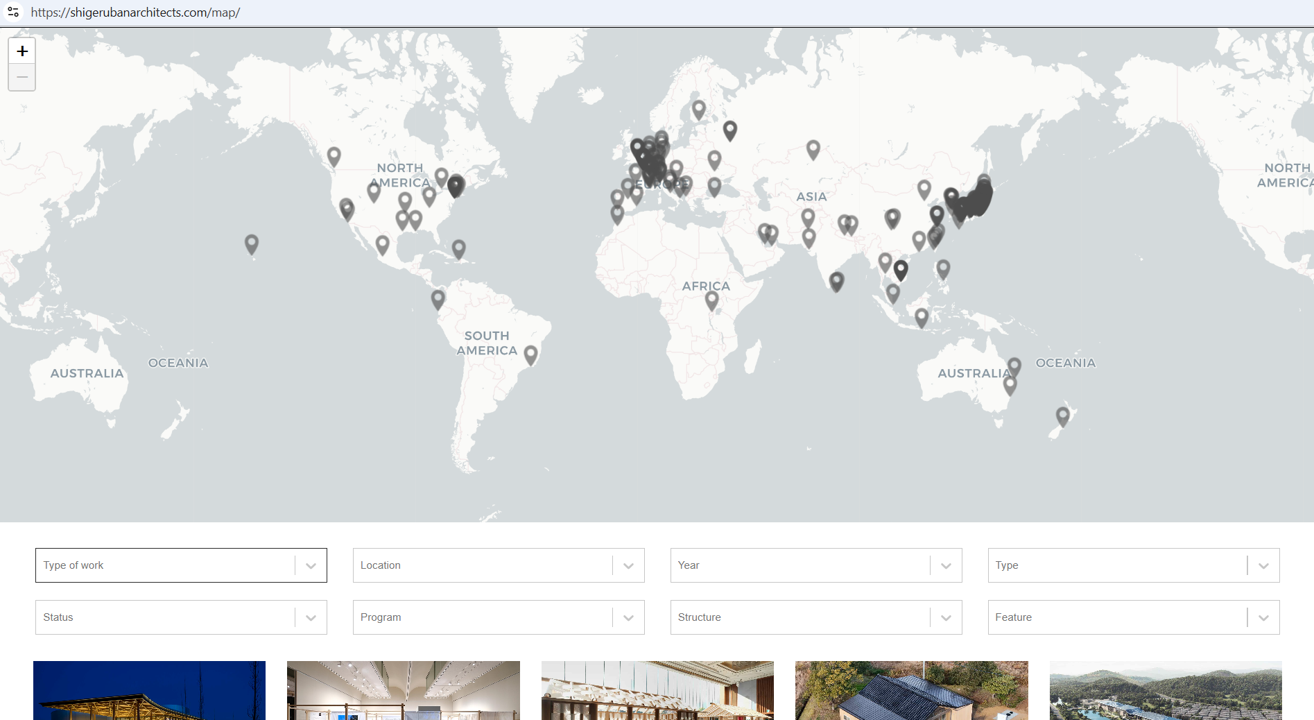 Website design for an architecture firm that showcases an interactive map
Cultural sensitivity, environmental responsiveness, and knowledge of local building codes are all highly sought-after assets in international practice. The presence of an interactive project map on your site unambiguously communicates that you possess the said qualities and provides living proof of them.
Keep things lightweight and mobile-friendly
Mobile accounts for approximately 60% of web traffic worldwide, so there’s no point in investing time and money in fancy animations if half of your visitors won’t be able to see them. Accounting for smartphones means using large, tappable buttons and links, swipe-friendly image galleries, and versatile video players that adapt to different breakpoints.
An example of a mobile-friendly architecture website
This example demonstrates what a good responsive design looks like — it’s aesthetically pleasing but not clunky, and the site still has a clean flow to it. Every bit of information is within reach, and the user has the opportunity to convert at any point of their browsing journey. At the same time, no essential pieces of content were sacrificed — this mobile-first website for architects feels just as informative and complete as its desktop counterparts.
Our visual website builder allows you to create responsive websites just like in our example, without any coding knowledge. You can customize one of our ready-made templates to save time while ensuring your site stays unique and true to your brand.
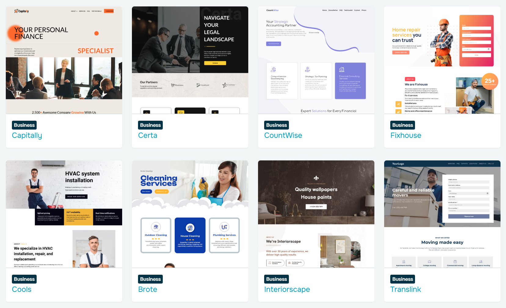 SendPulse’s website template library
The integrated analytics and SEO tools are there to help you get the most out of your online presence. The builder is available even with our free plan — so you can explore it in a risk-free manner.
Embrace and celebrate minimalist aesthetics
The best architecture firm websites often resemble modern art galleries with their clean elegance and almost cinematic presentation. You can achieve a similar aesthetic by following minimalist design principles, such as incorporating ample white space, which naturally directs focus to key content areas.
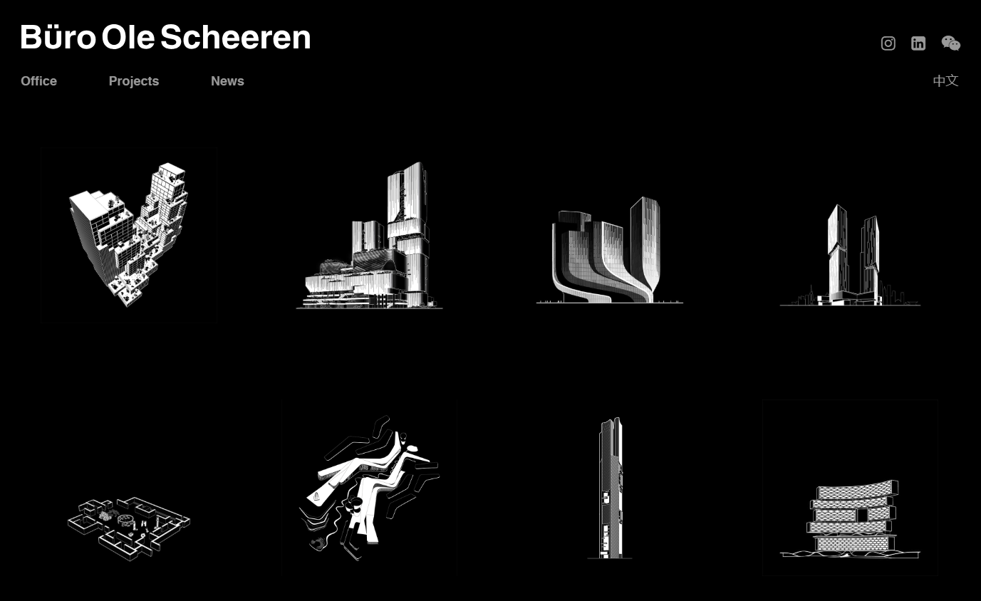 An example of a minimalist monochromatic website design for an architecture firm
Having a clean, uncluttered website layout will let your curated visuals and typography truly shine, creating that desired high-end look. The white space doesn’t have to be white per se — your design can even be all-black as long as each element has enough space to breathe.
Let your high-quality visuals be the start of the show
For your architecture firm website homepage, it makes sense to prioritize images and videos over wordy descriptions. Think gorgeous 3D renders, interior photos, 360° panoramas, video walkthroughs, sketches, or even drone footage taking over the whole screen, accompanied by gentle, lightweight fonts. This will create the needed contrast, set the mood, and make the user eager to learn more.
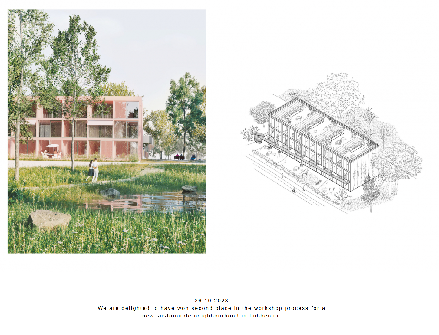 Architecture website design pairing tender typography with large-scale visuals
However, having brief but meaningful descriptions of each project, including location, scope, materials used, and design intent, is still important as it tells a more multifaceted story than visuals alone.
Consider integrating a conversational bot
AI-powered tools like conversational chatbots can dramatically enhance client interactions, processing every single inquiry even outside your business hours. The 24/7 availability contributes to the premium experience and allows you to take a proactive approach, reaching out to new visitors.
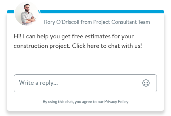 A live chat widget example from an architecture firm website
With SendPulse, you can easily set up and deploy a live chat widget on your website and integrate it with OpenAI to have it seamlessly interact with your website visitors in your tone of voice.
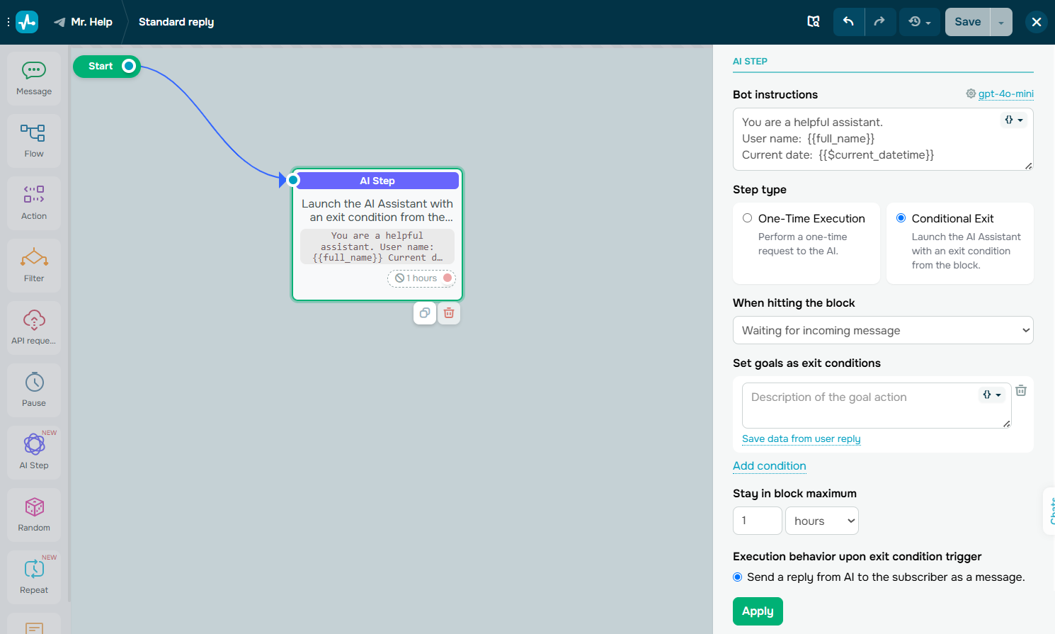 Incorporate AI into your chatbot flows
The live chat feature also enables your team to monitor and take over any nuanced conversations down the pipeline at any moment. It’s possible to create deals right in the live chat and save and manage them in the built-in CRM system, too. You can explore the basic features of our chat builder even on our free-forever plan — more advanced plans start at $8 a month, billed annually.
Emphasize sustainable design practices
Green design has gone from being a niche trend to a central pillar of contemporary architecture. Clients, stakeholders, and even regulatory bodies are prioritizing environmentally responsible practices, and your architecture website is the perfect place to reflect how your firm meets that standard.
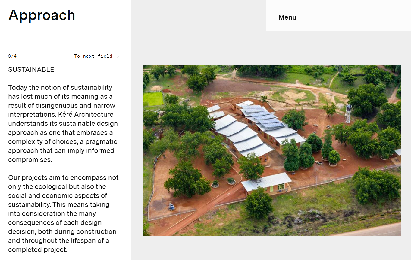 Describing a sustainable design approach in architecture
A dedicated section on sustainable design can showcase your ongoing commitment to ecological responsibility, be it the use of recycled materials, incorporating passive design principles, achieving certifications like LEED or BREEAM, or designing for net-zero energy consumption.
Turn your projects into captivating stories
Instead of introducing your architecture projects as is, you can engage visitors by sharing the narratives behind them, including faced design challenges and unconventional solutions. This storytelling approach will add depth to your portfolio and resonate with potential clients on a more personal level.
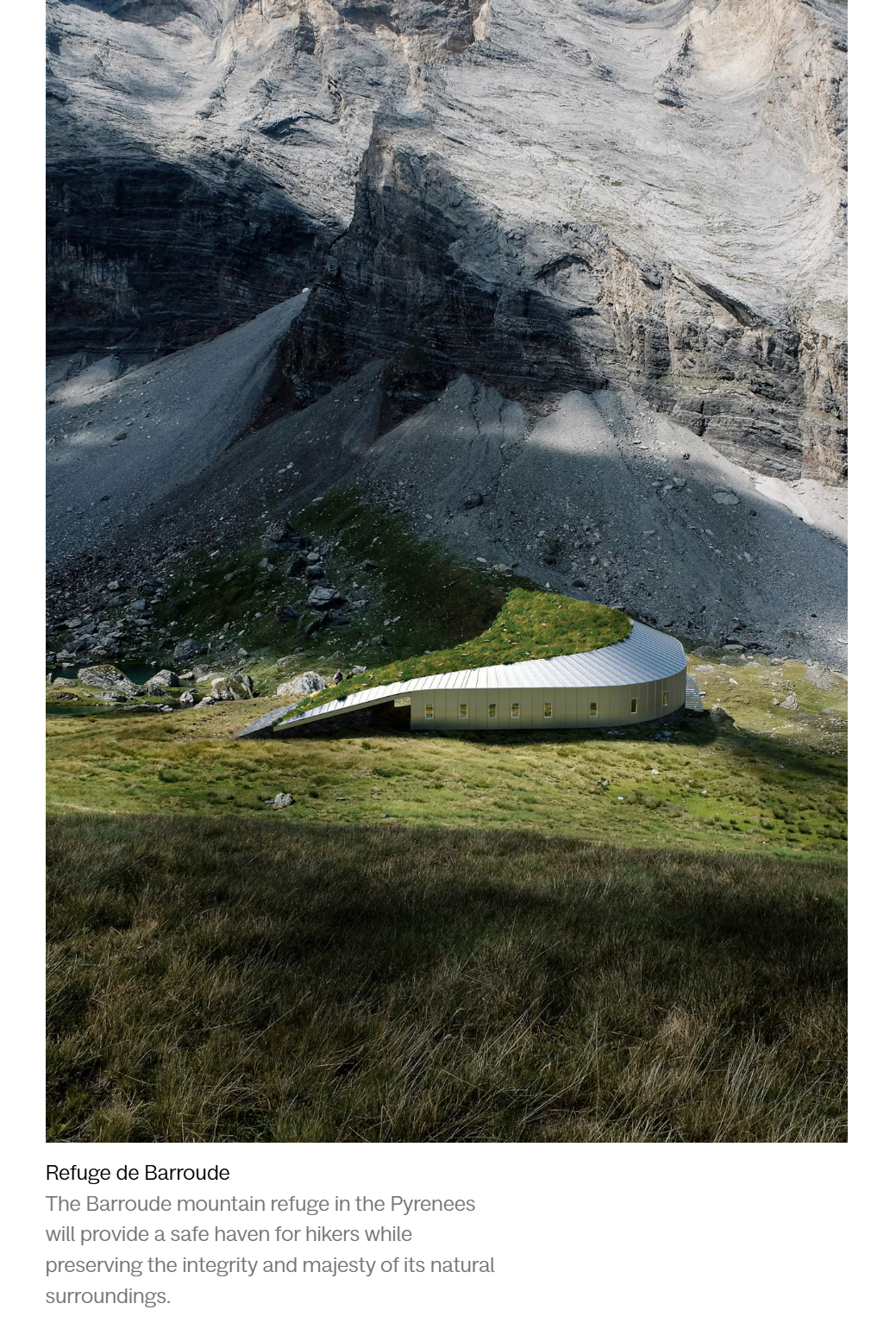 Cinematic visuals from an architectural design project
Combined with dreamy, cinematic visuals, your project descriptions will give your audience a glimpse of your creative process as well as the thinking behind it. This architecture website example demonstrates just that — here, we see how a more personal and passionate description immediately makes the project spring to life.
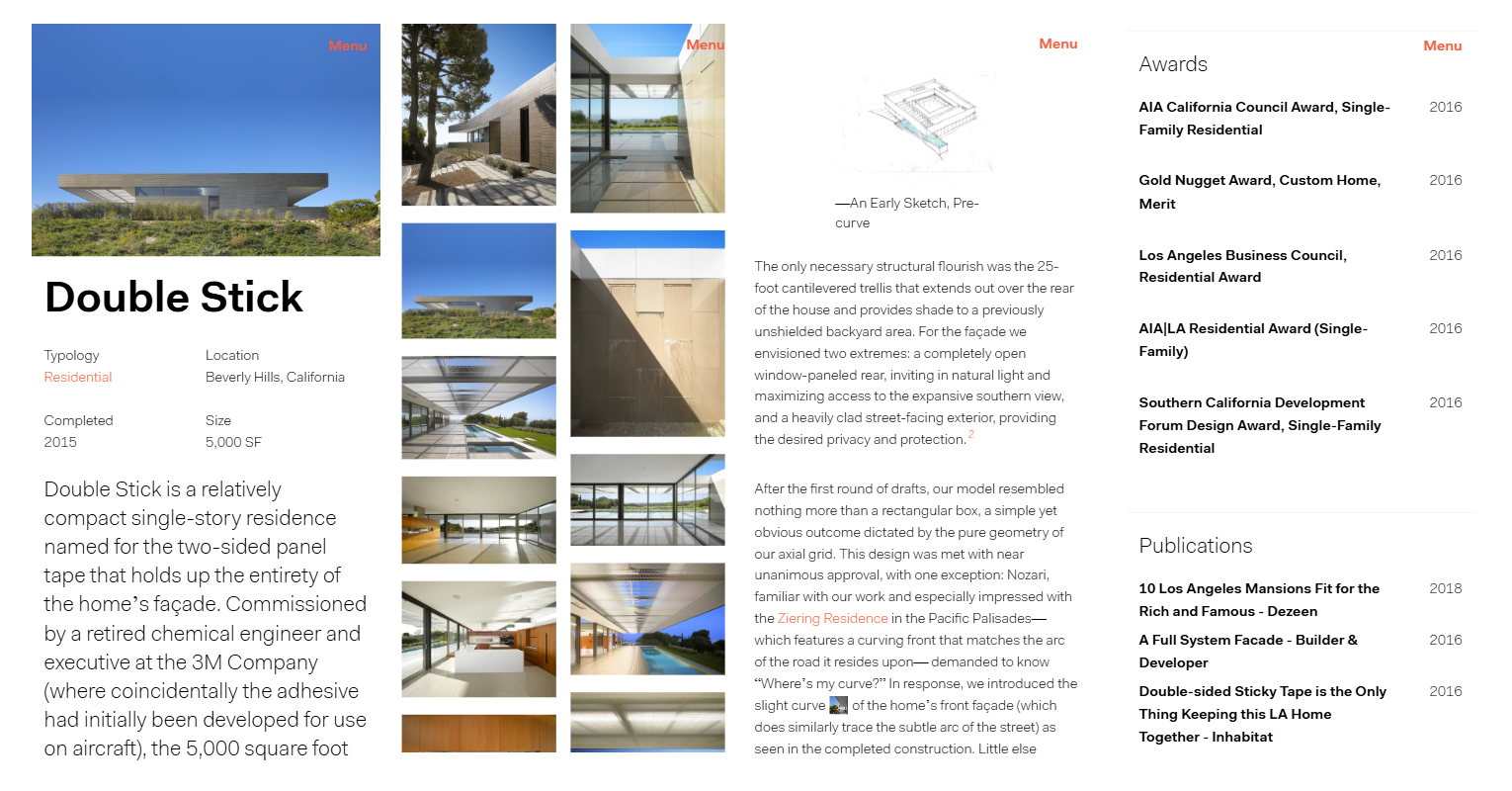 Storytelling in architectural project descriptions
The quotes from the designers add more realism to the description, making us visualize how the team overcomes the challenges in real-time. Finally, the footnotes give the reader yet another chance to dive deeper into your work.
Introduce your team
Some architecture firm websites tend to feel quite sterile and even drab because too much emphasis is put on lifeless structures and not enough on the people who conceptualize them. To offset this uncanny effect, you need to make sure your team gets its own spotlight.
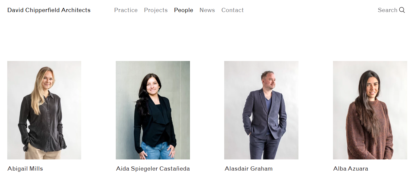 Introducing an architecture firm team
You can either briefly introduce yourself and your firm on a dedicated About Us page or go into more detail on an Our Team page, depending on your goals. Including short bios, portraits, and even quotes or design philosophies from each team member humanizes your practice and helps clients connect with the people behind the work.
Add a news section to liven up your online presence
Nothing reflects your involvement in the industry like freshly updated content that highlights your latest projects, awards, press features, speaking engagements, or participation in exhibitions and design competitions.
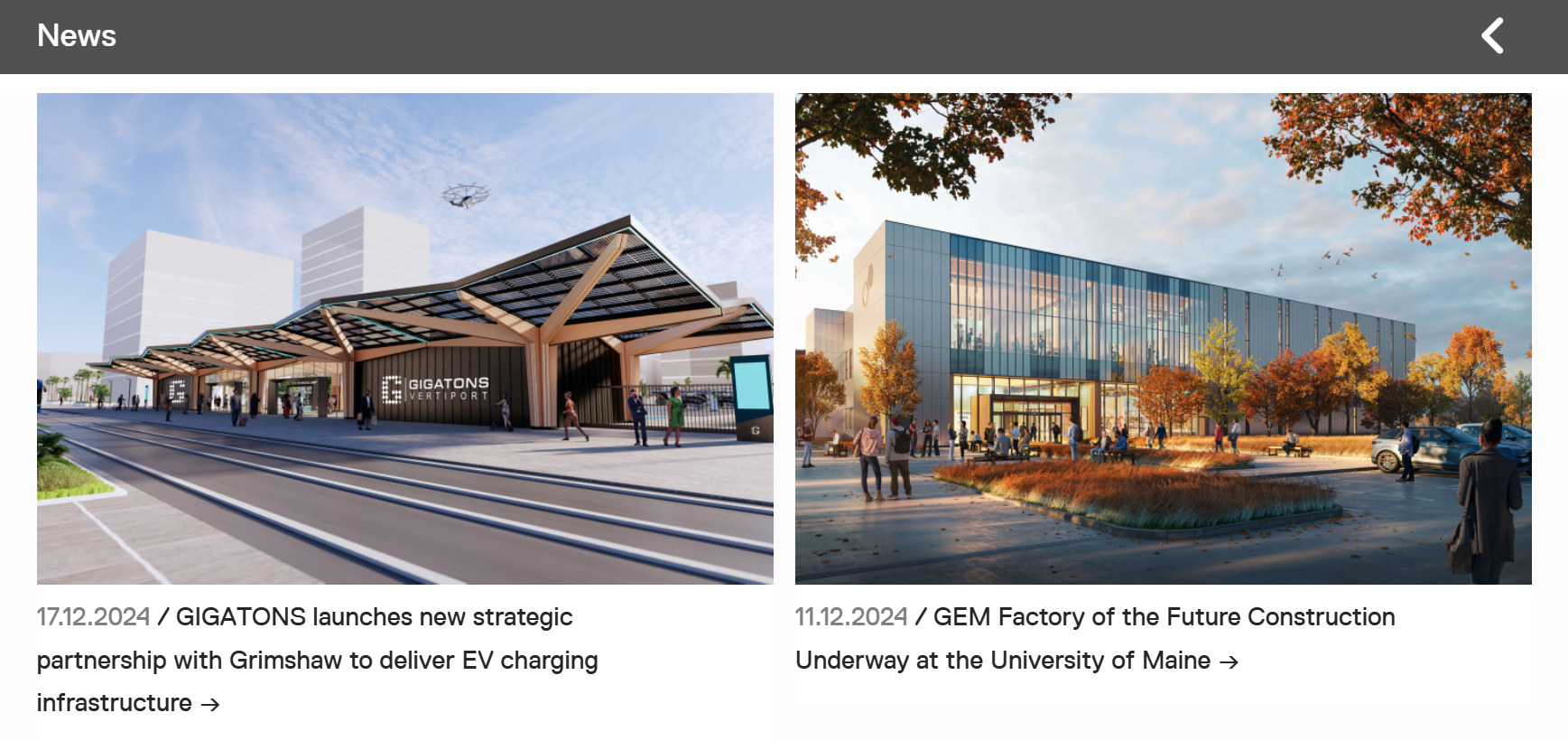 A news section from an architecture firm website
There’s no need to be verbose — even a short update, like a project breaking ground, a feature in an architectural magazine, or your team attending an international design fair, will help maintain your relevance online.
Make it easy to connect with you
Whether a visitor is a potential client, collaborator, or media contact, they should never have to dig around to figure out how to reach you, especially after you’ve provided them with convincing examples of your expertise. That’s why you need a proper contact form or a Contact Us page to seamlessly connect with your audience.
For Contact Us pages, it’s recommended to specify what each communication channel is for to prevent confusion and missed opportunities.
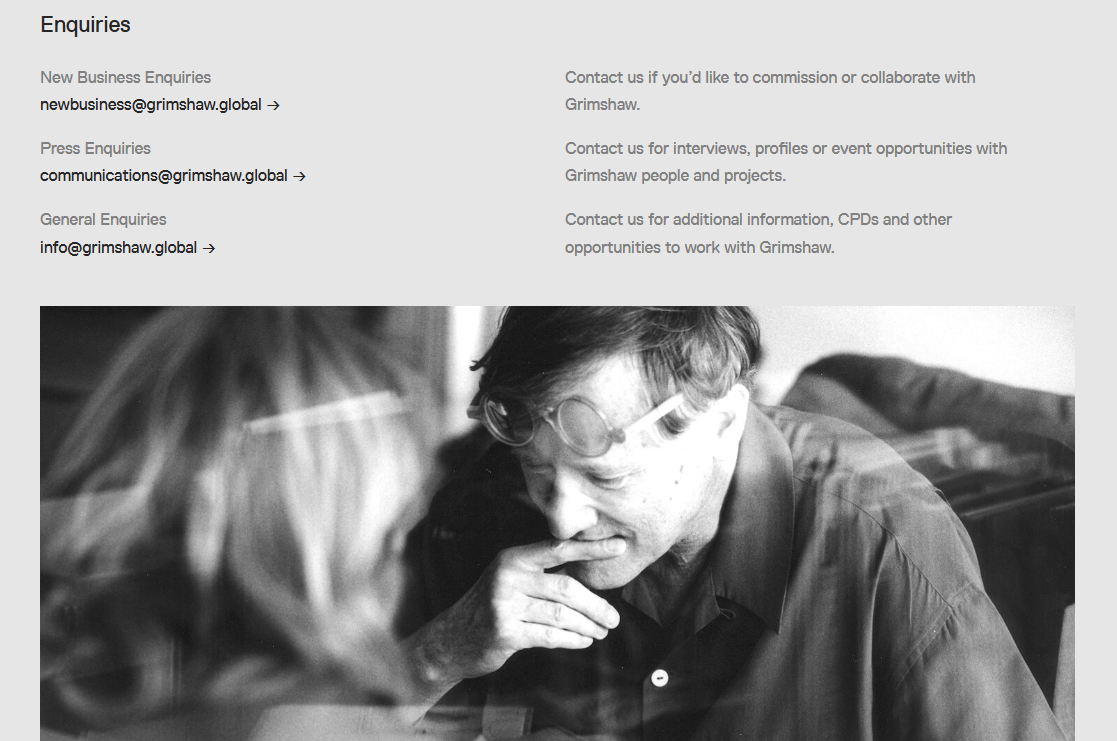 A Contact Us page example on the architecture website
If using a contact form, keep it simple — ask only for essential details like name, email address, message, and, perhaps, the nature of the inquiry. Including a dropdown for inquiry type, like quote request, press, or partnerships, can help streamline communication on your end.
With the help of our platform, you can create smart pop-up contact forms that not only capture user data but also qualify leads for future communications. Intricate display scenarios allow you to ensure your pop-up is displayed when your users are ripe and ready for interaction. The customization feature makes it easy to align the pop-up design with the rest of your website.
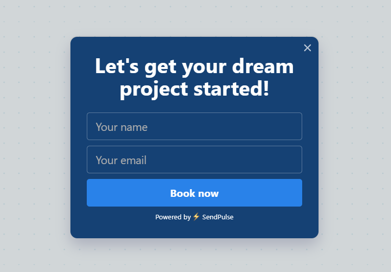 Creating a contact form for an architecture firm website with SendPulse
You can give our pop-up builder a try with a free account or choose one of the pricing plans starting at $9 a month, billed annually.
Bring in the good words from your past clients
Testimonials are often overlooked, but they can be one of the most persuasive elements on your architecture website. While beautiful visuals and sharp copy show what you do, testimonials show how you work — what it’s like to collaborate with you, how you navigate challenges, and how clients feel about the final result.
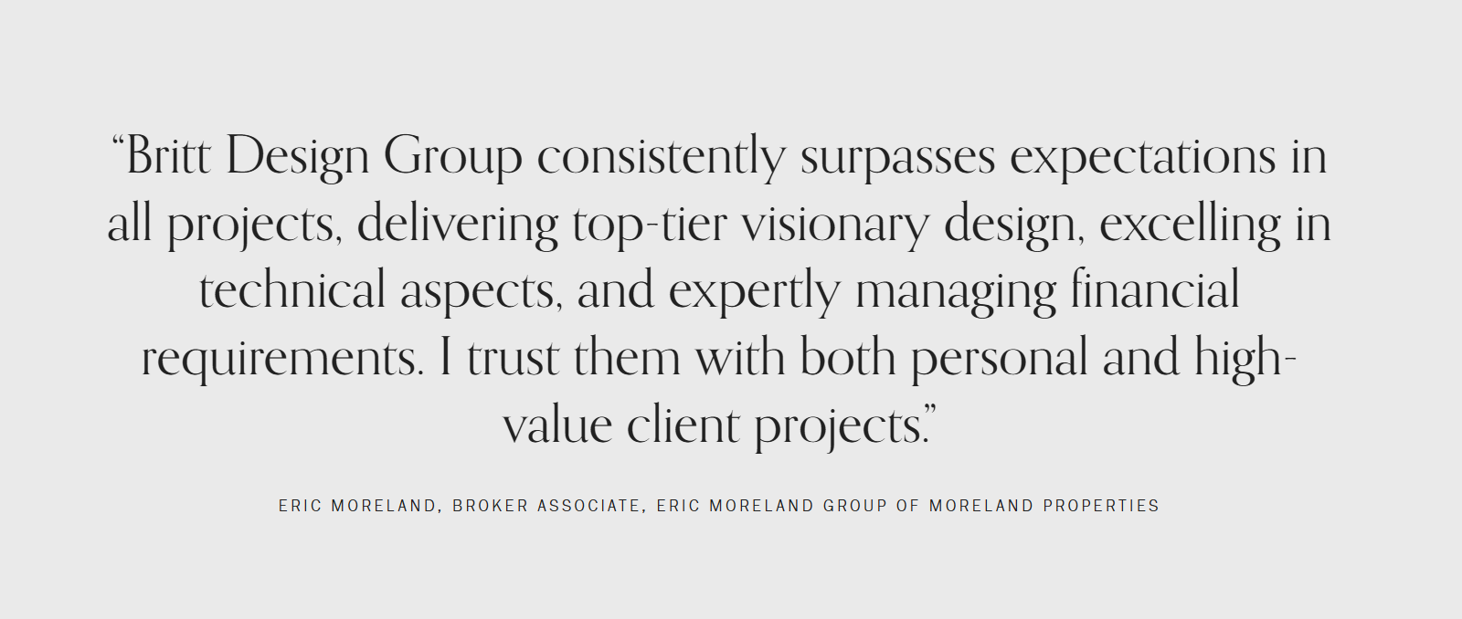 A client testimonial incorporated into website design for an architecture firm
A few strategically placed quotes from satisfied clients can build trust and credibility instantly. These don’t have to be long — in fact, concise and honest feedback often resonates best. By pairing testimonials with project images or featuring them alongside related case studies, you’ll create a clear narrative. If you want to go one step further, include the client’s name, company name, or even a photo or short video testimonial.
Best architecture websites that get it right
Let’s look at some of the best architecture firm website designs out there — the ones that tick all the boxes from our list above but also aren’t afraid to bend the rules when necessary.
OTJ Architects
This example is on our list of the best architecture websites because it captivates visitors from the get-go with its stunning hero section slideshow, immersing them in the firm’s best projects. The website copy gets straight to the point, briefly introducing the company and describing its scope of work, key values, and geographic reach.
OTJ Architects’ website design
The website has a beautiful flow — the homepage answers possible questions before they even appear, and the subtle navigation bar always stays within reach.
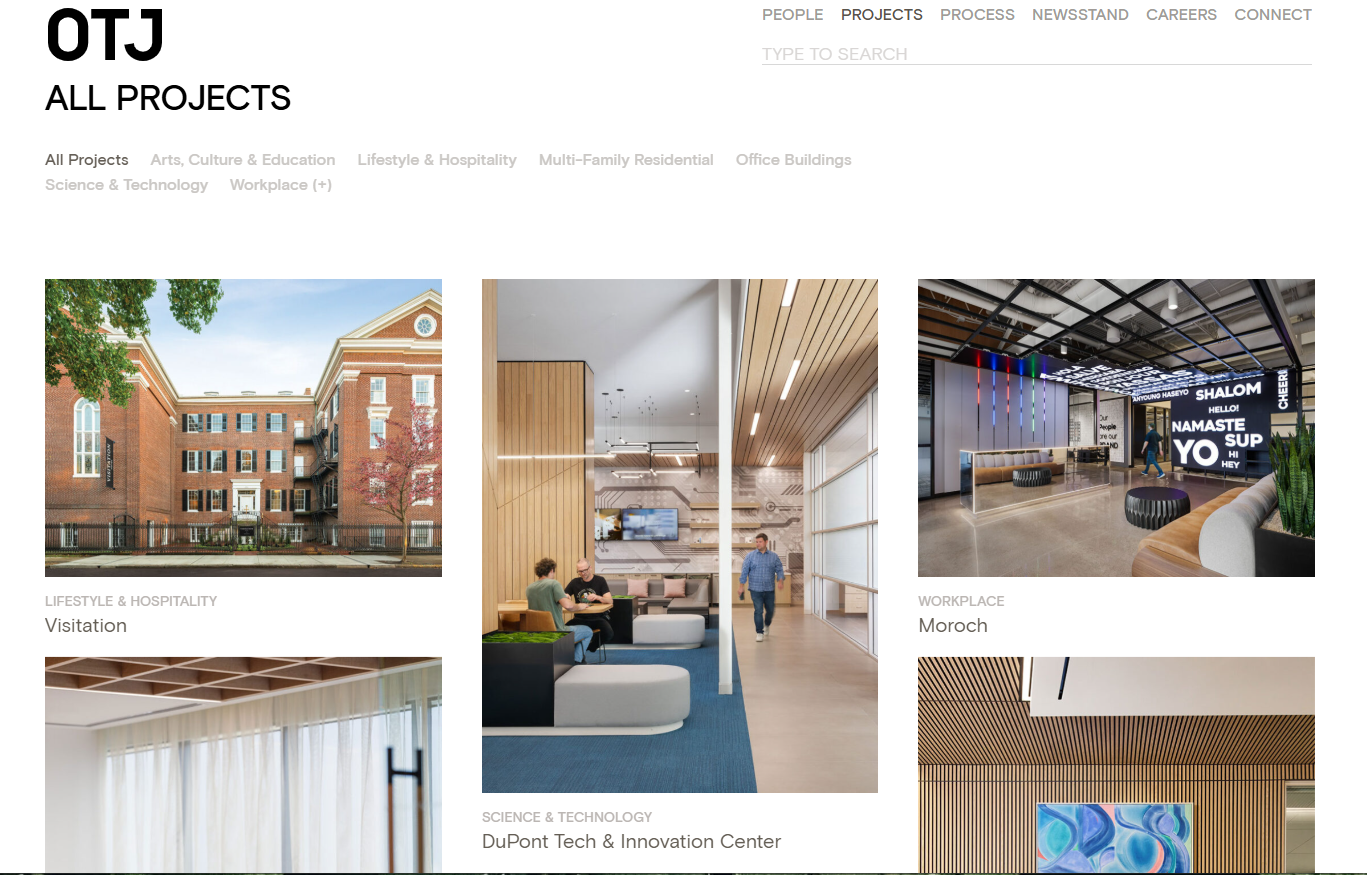 An architectural project portfolio example
The projects are intuitively organized, and each of them comes with a thought-provoking description, inviting the reader to dive deeper into the cultural context of the development. The chunkier parts of text are collapsible and hidden by default to make the pages look lighter.
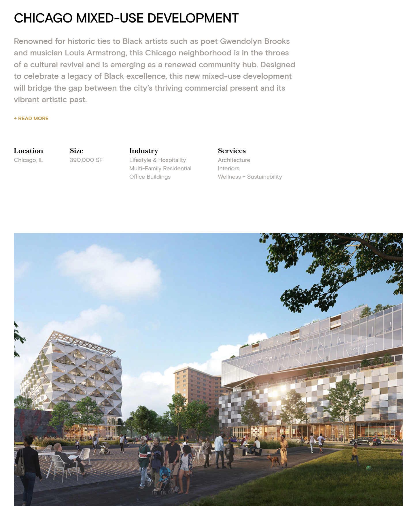 An informative architectural project description example
The company prefers to present facts instead of vague statements, which contributes to the perceived credibility of this architecture firm website. This approach is more likely to appeal to demanding clients who trust data over hearsay.
 Stats from the OTJ Architects website
The clearly defined values make it easy for potential customers to understand if the firm is a good fit for them. Each statement is illustrated by a selected project or award proving the company’s commitment to the described standards.
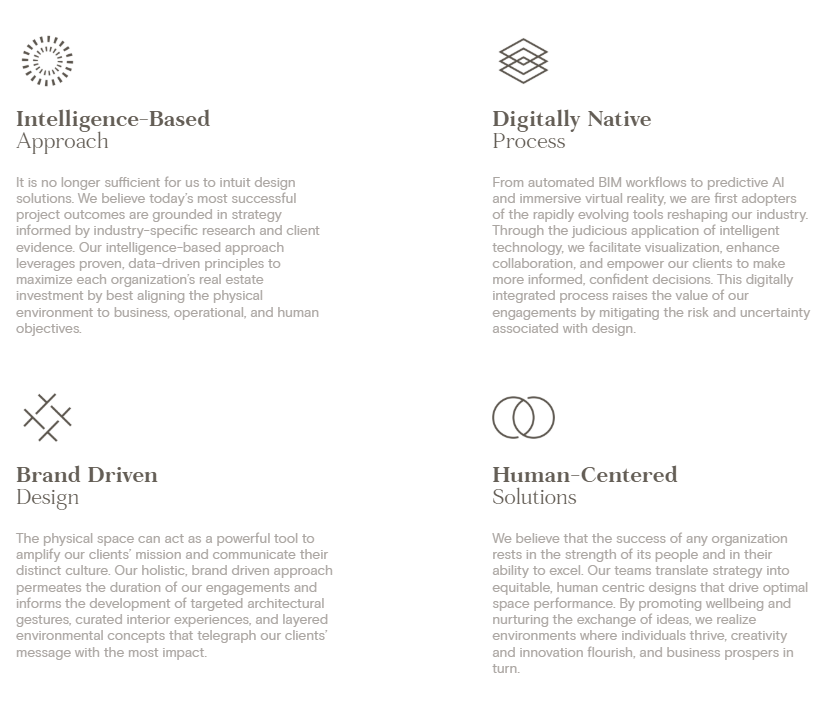 OTJ Architects’ value statement
OTJ Architects’ data-driven approach is reflected in every piece of content they publish. Even the Careers page is enhanced with positive testimonials and diversity and inclusion stats that speak for themselves.
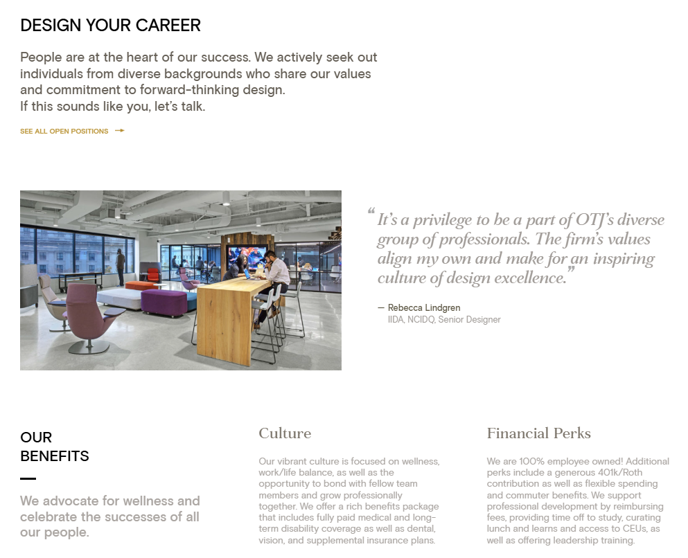 OTJ Architects’ career page
This is a perfect example of a resource that respects its audience’s time and anticipates their needs at every step, resulting in a highly professional yet memorable online presence.
Perkins&Will
Our next example demonstrates how ultimate transparency and the human element can transform an architecture website, making visiting it a multidimensional learning experience. On the homepage, the main focus is put on the today of the firm, including its recent milestones, insights, and partnerships.
Perkins&Will’s architecture website design
Instead of boring the user with plain project descriptions, Perkins&Will chooses to shed more light on its team members and their unique expertise, making the narrative more personal and nuanced. It instantly becomes clear that the company isn’t just aware of the current trends but is actively engaging with them — and, in some cases, even helping to shape them.
The broad spectrum of topics tackled in the firm’s blog signals a deep curiosity and thought leadership that extends far beyond bricks and mortar. From reflections on climate resilience to behind-the-scenes process breakdowns, this blog serves as a window into the firm’s intellectual landscape.
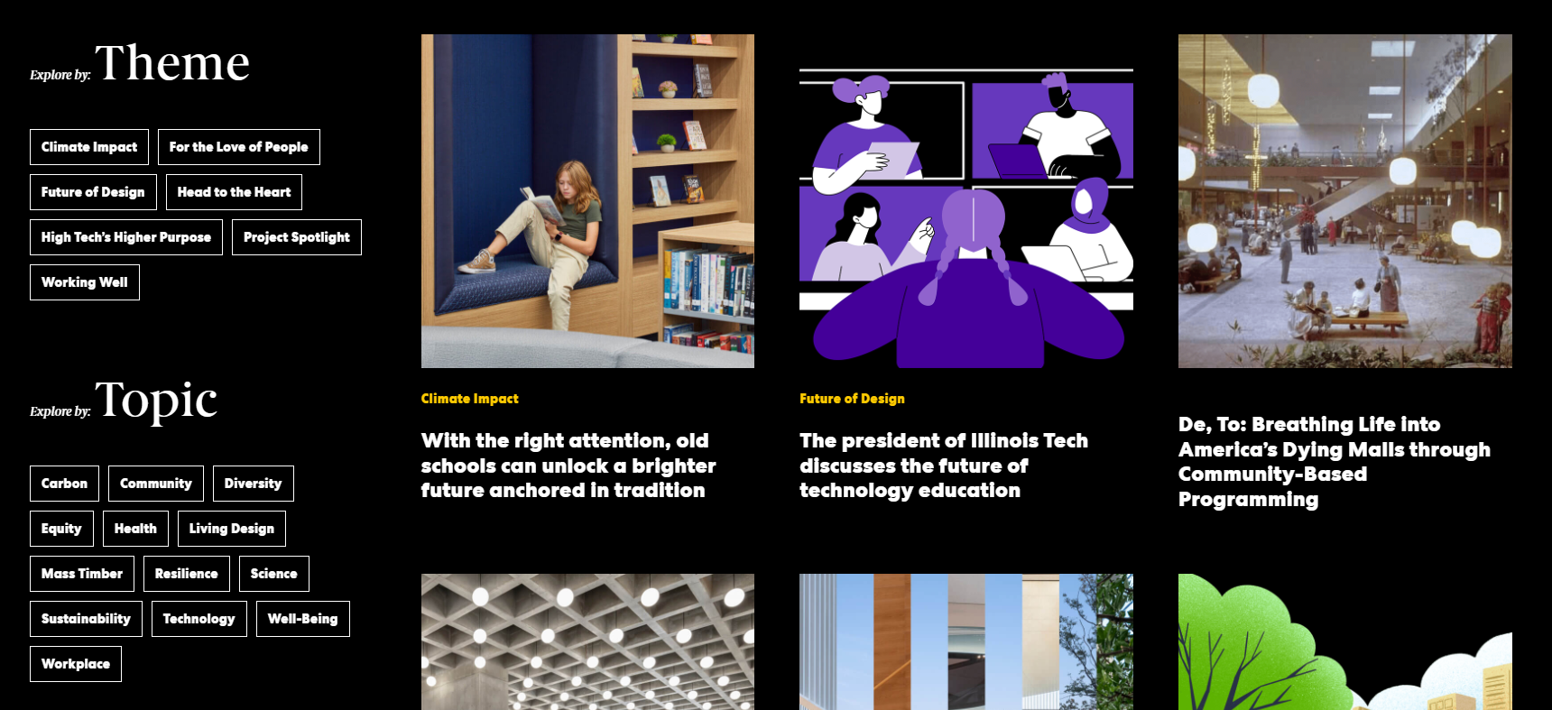 Perkins&Will’s blog
The Team page offers a similar level of transparency, thanks to the embedded footage depicting the Perkins&Will team in action. Rather than simply listing team members and generic company values, the page paints a vivid picture of the firm’s day-to-day culture. Viewers can see real interactions, collaborative sessions, and even shared fun moments.
Perkins&Will’s team introduction
Visitors immediately get a feel for who they’d be working with, how the team approaches challenges, and what kind of relationships they build with clients. This unmatched level of openness helps demystify the design process and builds trust from the very first click.
Studio Red Architects
Our final example on the list of the best architecture websites is slightly more minimalistic and visual-heavy, but no less informative. As we land on the website, we’re greeted with a cinematic video introducing the best gems from the studio’s project portfolio. The drone videos help us grasp the scale of the buildings, while the close-ups enable us to appreciate textures, materials, and small details.
Studio Red Architects’ website design
The impact of the video is enhanced by the profound company mission statement. Then, we get a glimpse of the versatility of the Studio Red Architects’ work spanning community projects as well as commercial buildings and more.
All studio’s accomplished projects come with real-life photos instead of sterile, overly polished renders, which makes them more tangible and comprehensive. We see how people interact with the environment the studio has created — this gives the projects a new dimension and illustrates how the designs serve their intended purpose.
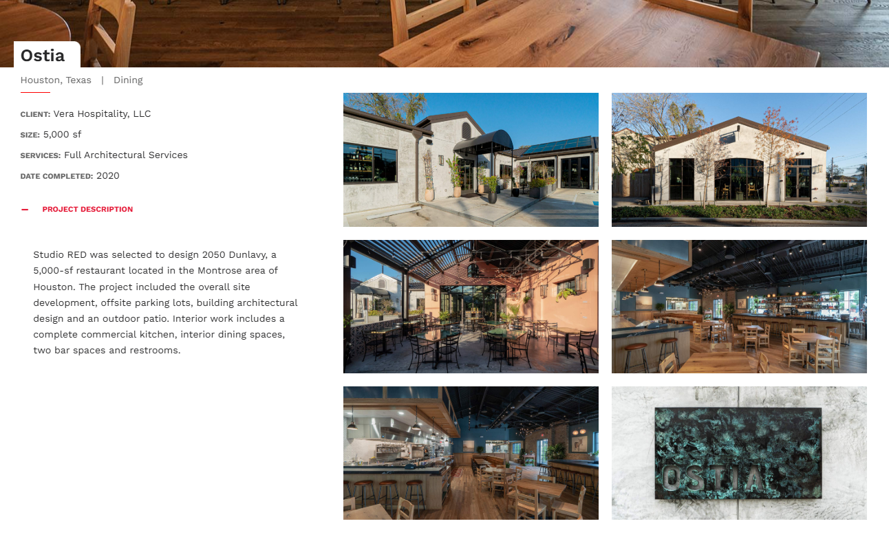 Studio Red Architects’ project descriptions
Just like our previous architecture website examples, this one is free from any typical sales gimmicks — it gives the visitor the option to convert at the footer, but it doesn’t pressure them into doing so at every step, giving them enough mental space to process the presented information first.
Final thoughts
Having looked at some of the best architecture websites, you now have a clearer sense of what works and why. Now it’s your turn. Whether you’re an independent architect or representing a growing firm, you can take these insights and start putting them into practice — with the help of our omnichannel marketing and sales automation platform.
SendPulse empowers you to build converting websites, chatbots, pop-ups, automated email campaigns, SMS campaigns, and even educational products. Moreover, you can manage all of these tools from a single tab, getting a bird’s-eye-view of your projects.
Create your free account now and see what’s possible!