If you’ve ever been to networking events, you know how challenging it is to organize a contact exchange with someone who is of interest to you.
Firstly, you may need to navigate through a busy room and wait for an opportunity to speak. Then, there’s the challenge of starting and maintaining a meaningful conversation while working within limited time frames.
Overcoming the initial hesitation and breaking the ice doesn’t come naturally to everyone. Then, you are also required to make a memorable impression amidst a sea of conversations while staying true to yourself and your interests.
Using website contact forms, also known as pop-ups, isn’t that different from asking someone for their LinkedIn handle. It takes some confidence, authenticity, skill, and a bit of courage, too.
Let’s find out how to create high-impact contact forms for websites and what you need to know before adding one to your platform. We’ll give you some practical tips and creative ideas to help you grab your visitors’ attention.
Contact forms for websites are online forms that allow visitors to easily connect to the website owner or organization by either sending them a direct message or leaving their contact data. These forms serve as a straightforward communication channel, enabling users to skip the extra steps and start communication right away.
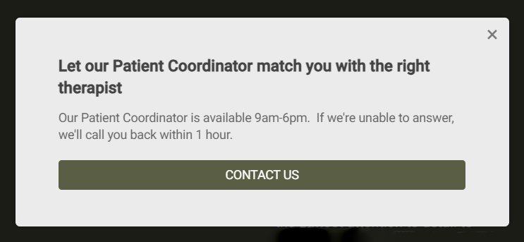 A simple contact form example
Contact forms typically include fields for users to input their name, email address, subject, and message. They may also include additional fields such as phone number, company name, job title, or specific inquiry categories.
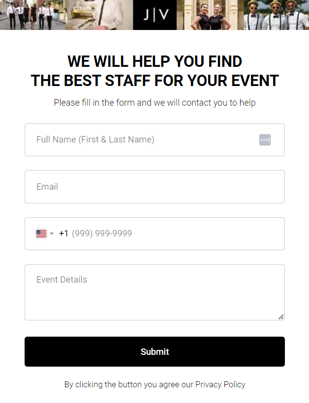 A multiple-field contact form example
Contact forms often match the overall look and feel of the website. They may include recognizable brand fonts, colors, and language to create a cohesive appearance. The design can vary from minimalistic and clean to more elaborate and visually entertaining.
Contact forms often include validation checks to ensure that visitors provide the necessary info in the correct format. If a visitor leaves a required field empty or makes an error, error messages may appear to guide them on how to correct the issue.
In SendPulse, you can create contact forms in various formats:
Depending on your conversion goals, you may gravitate toward one or the other format. Overlays and modal windows help hijack the user’s full attention, while floating pop-ups are typically more gentle. Horizontal bars are perfect for subtle, minimalistic forms with one or two fields. In turn, video pop-ups are great for boosting engagement and exciting the user.
There are several types of contact forms for websites — some of them are best suited for business inquiries while others are more informal and conversational. Let’s take a look at them.
Basic contact form
This is the most common type of contact form that includes essential fields such as name, email address, subject, and message. It allows visitors to send general inquiries, partnership offers, or project proposals to the website owner.
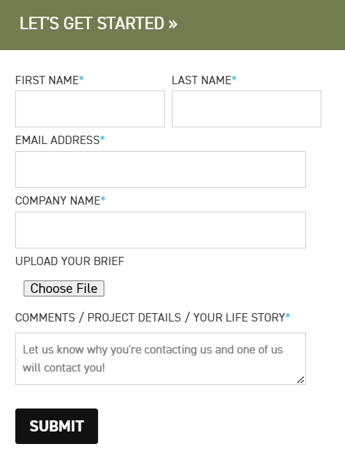 A contact form used by a creative agency
These “Contact Us” forms are meant to be clean and highly specific. They allow potential clients to briefly describe their needs, skip abstract initial calls, and start a factual conversation with the business right away.
Customized contact form
Customized website contact forms offer flexibility in terms of the fields and information you collect. You can add or remove fields based on your specific requirements. For example, you might include fields for customer preferences or a dropdown menu for inquiry categories. You can also add images or even videos to your pop-up, like in this example.
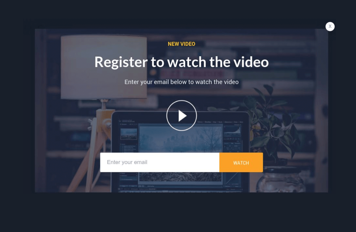 A video contact form example
Enhancing your form can help you catch your visitors’ attention, but it’s important not to overdo it. Contact forms for websites that are loaded with text and images may come across as spammy and overwhelming.
Multi-step contact form
Instead of displaying all the fields on a single page, multi-step contact forms divide the form into multiple sections. This can help simplify the user experience and guide visitors through the form in a more structured manner. Multi-step forms feel more natural and cohesive — they flow like a normal conversation.
Then, there are conditional forms. In these forms, you can use question branching to match your subsequent questions with what your users are typing in. Conditional forms are helpful for reducing the number of fields and keeping questions relevant to the user.
Appointment or booking form
These forms are used when visitors want to schedule an appointment or book a service. They typically include fields for selecting a preferred date and time, service type, and any additional details required for the booking.
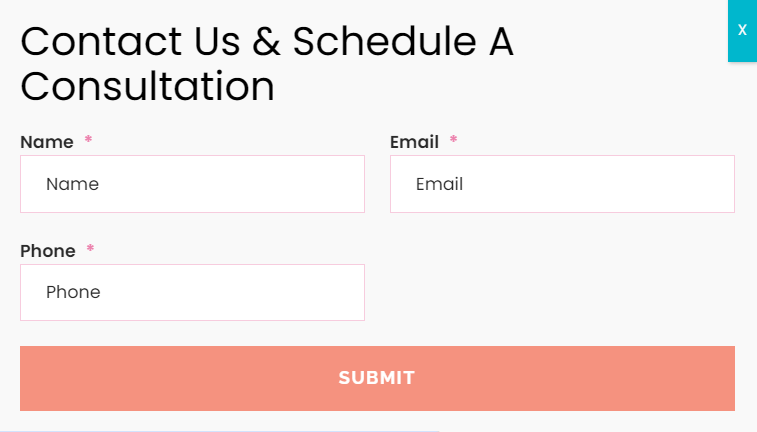 A consultation booking form example
Booking contact forms reduce friction and allow website visitors to spontaneously book sessions, classes, or procedures without jumping through the hoops of creating an account and so on.
Feedback or survey form
Feedback forms allow visitors to provide feedback, suggestions, or opinions about a product, service, or website experience. They may include rating scales, multiple-choice questions, or open-ended fields for users to share their thoughts and impressions.
To increase your response rates, keep your “Contact Us” form friendly and to the point. Ideally, you should also allow your users to attach images or screen recordings to demonstrate any potential issues they may have run into.
Subscription or opt-in form
Subscription forms help collect visitor information for newsletter sign-ups, SMS campaigns, and other marketing purposes. They typically include fields for name and email address and may also allow users to specify their areas of interest to only receive relevant campaigns.
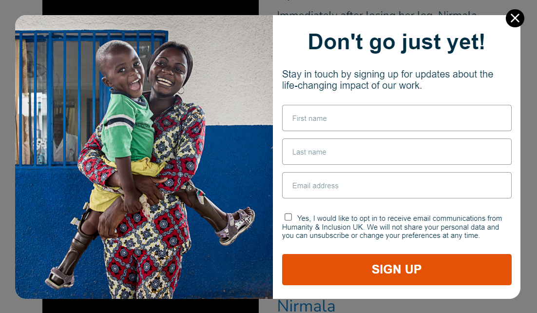 A subscription form example
Subscription forms are also called lead capture forms because they help marketers generate leads and build loyal and active mailing lists. You can then nurture your new subscribers by sending them tailored content and personalized offers.
Giveaway form
Giveaway forms are helpful for promoting giveaways or other special offers and giving new visitors a chance to partake in them. They usually contain fields such as name and email address.
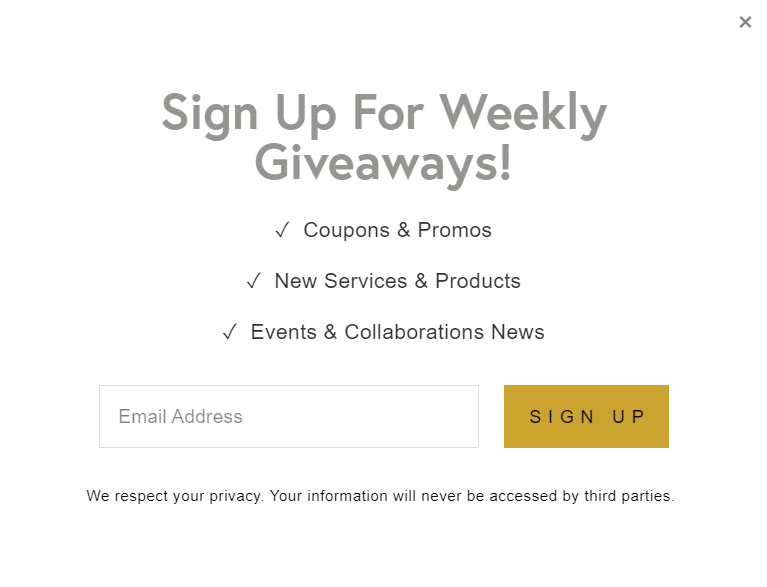 A giveaway pop-up
Giveaway contact forms can feature sweepstakes along with special offers, exclusive sales, etc. They allow you to redirect the user’s attention and familiarize them with your contest without cluttering your website pages.
Surely, your visitors can always open your “Contacts” page and find your email address to reach out to you. But will they? By using contact forms, you’ll enable them to overcome those hurdles and initiate contact with you in a seamless way.
Here’s how businesses can benefit from website contact forms:
- Increased visibility. Contact form pop-ups are inviting, dynamic, and hard to miss — they appear prominently on the screen. Visitors are more likely to notice and engage with them.
- Improved conversion rates. By strategically timing the pop-up to appear when visitors are most engaged or about to leave the site, you can optimize the chances of capturing their contact information.
- Lead generation and data collection. Without “Contact Us” forms, it’s challenging for businesses to steadily generate leads and grow their mailing lists. Pop-ups are irreplaceable for building an active audience of potential customers, whom you can then gradually nurture.
- Granular targeting. Contact form pop-ups can be targeted based on specific criteria, such as user behavior, referral source, or browser information This way, your contact forms will match the interests or needs of individual visitors, increasing the chances of conversion.
- Time-sensitive promotions. Contact form pop-ups are perfect for showcasing limited-time offers. They motivate visitors to take action while also keeping the main website pages visually tidy.
To achieve these results and noticeably enhance your visitors’ experience, you need to follow some ground rules of contact form copywriting and design.
Avoid blindly copying someone else’s forms and using default display settings. More personalized pop-ups lead to higher chances of success. So, make sure to pay attention to the following aspects of contact form creation.
Timing
Pop-up timing is everything, especially if you’re intended to ask your visitors for their personal data. Displaying a contact form too soon can be intrusive, while displaying it too late may miss the window of opportunity.
Depending on your goals, you may want to trigger it when your visitor:
- scrolls more than 50% of the page;
- accesses your page using a mobile device;
- browses your website from a specific region;
- lands on your website after having clicked on a specific ad campaign;
- spends enough time on your website in general;
- spends enough time studying one specific page;
- intends to exit and moves their cursor away from the page;
- has completed a particular action.
When it comes to pop-up timing, there’s no right and wrong — you can pick either scenario depending on the desired user journey.
Clear and concise messaging
Use straightforward, unambiguous messaging in the pop-up to communicate the value proposition or benefit of filling out the form. Highlight any incentives, such as free consultation or downloadable content, to motivate visitors to provide their contact information.
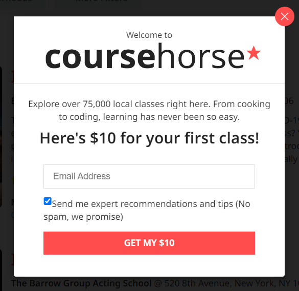 A contact form with an incentive
Keep it as short as possible — a good contact form shouldn’t take more than a second to skim. Use simple, motivating sentences with active verbs like “subscribe,” “explore,” and “get your bonus.”
Simple and user-friendly design
Keep the design of the pop-up clean, visually appealing, and consistent with your website’s branding. Ensure that the form fields are easy to read and fill out. Ruthlessly remove any unnecessary fields, lines, or words, like in the example below.
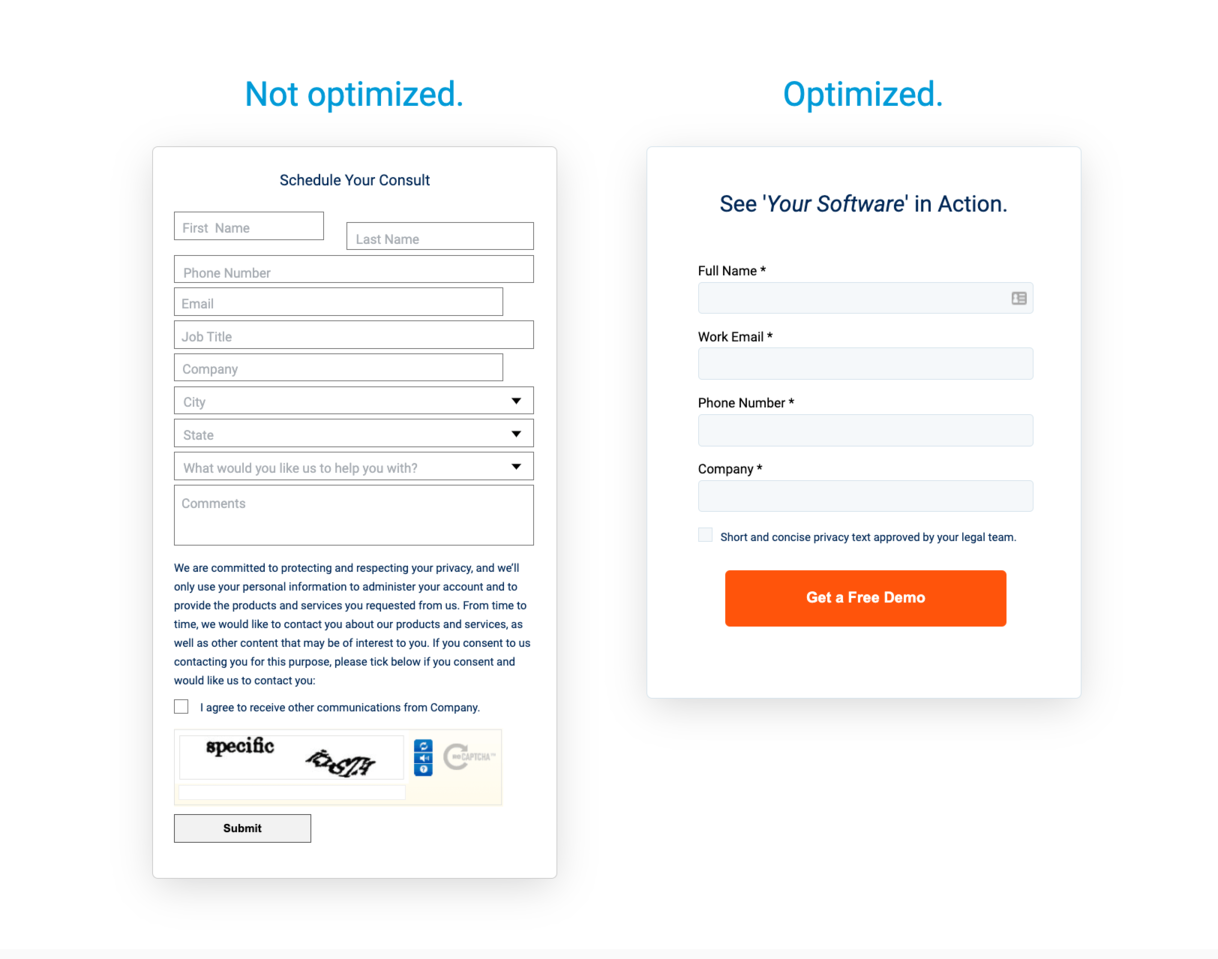 An optimized contact form example; source: Gartner
Bulky, text-heavy forms are more likely to be ignored as users often don’t have the time or desire to read them through. If you want informative responses from your visitors, a compact pop-up is your best bet.
Mobile responsiveness
Make sure your contact form pop-up looks great on mobile devices. The pop-up should be responsive, properly scaled, and user-friendly on smaller screens because your visitors may be scrolling your website on the go.
To reduce effort, use template-based pop-up builders like SendPulse. Our platform has over 30+ mobile-friendly contact form templates that look appealing on any screen.
Minimal form fields
Keep the contact form fields to a minimum to reduce friction and make it easier for visitors to fill out the form. Request only the essential information you need, such as name and email address. Additional fields can be included based on the specific purpose of the form.
 A horizontal bar pop-up
In some cases, you can collapse a voluminous form to a horizontal bar, like in this example. Should your user express interest in it, they’ll be shown a more detailed form or taken to a dedicated registration or contact page.
Trust indicators
Incorporate credentials, such as security badges, testimonials, or privacy statements, to reassure visitors that their information is safe and will be handled responsibly. This can help alleviate concerns about data privacy and increase the likelihood of form submissions.
 A contact form with trust indicators
In this contact form example, the website owner mentions the size of their subscriber base to incentivize new visitors to join their community.
Make your CTA the main focal point
Whichever approach to design you choose, let your CTA button be the brightest star. Ideally, it should attract more attention than the headline itself. Use contrasting colors that align with your overall brand aesthetic. You can enhance your call to action by placing a trust indicator right next to it.
A/B testing and optimization
Conduct split tests with different variations of your pop-up design, messaging, or triggers. Try out different elements to identify the winning combination for maximizing conversions. Continuously monitor and optimize your pop-up based on data and user feedback.
Test one element at a time because otherwise, it’d be impossible to tell what works and what requires improvement. In SendPulse, you can create two versions of the same pop-up and test them side-by-side to see which contact form template performs better.
Frequency capping
Set limits on how frequently the pop-up appears to prevent annoyance and ensure a positive user experience. If you blast the same contact form to them over and over again, your users will go the extra mile to avoid filling it out.
Easy exit option
Provide a clear and easily accessible option for visitors to close or dismiss the pop-up if they choose not to engage with it. Respect their decision and avoid intrusive, in-your-face pop-ups with a barely visible or hidden close button.
To create a contact form for your website using SendPulse, you can follow these steps.
First, sign up for a new account or log in to your existing account. Once you’re logged in, open the “Pop-ups” tab. Even with our free plan, you can thoroughly explore pop-up builder functionality.
There, you need to create a project, an individual space for organizing and managing your pop-up campaigns. For simplicity, you can create a separate project for each of your websites.
Connect your pop-up project to an external or SendPulse-hosted website. Having done that, open your project and click “Create pop-up.”
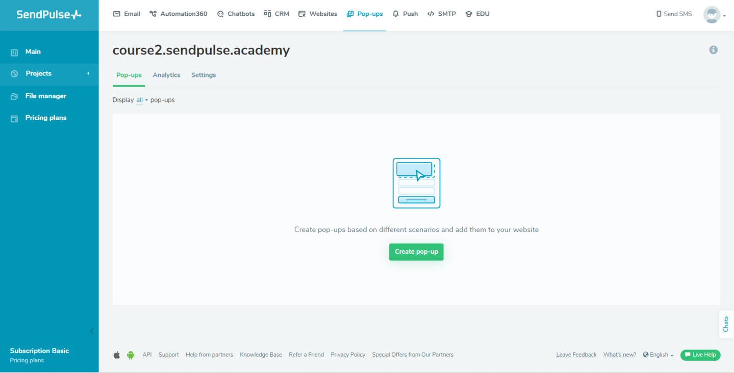 Creating a workspace in the pop-up-builder
SendPulse offers various pre-designed contact form templates to choose from. You can either select a template that closely matches your requirements or start with a blank canvas for a completely custom form.
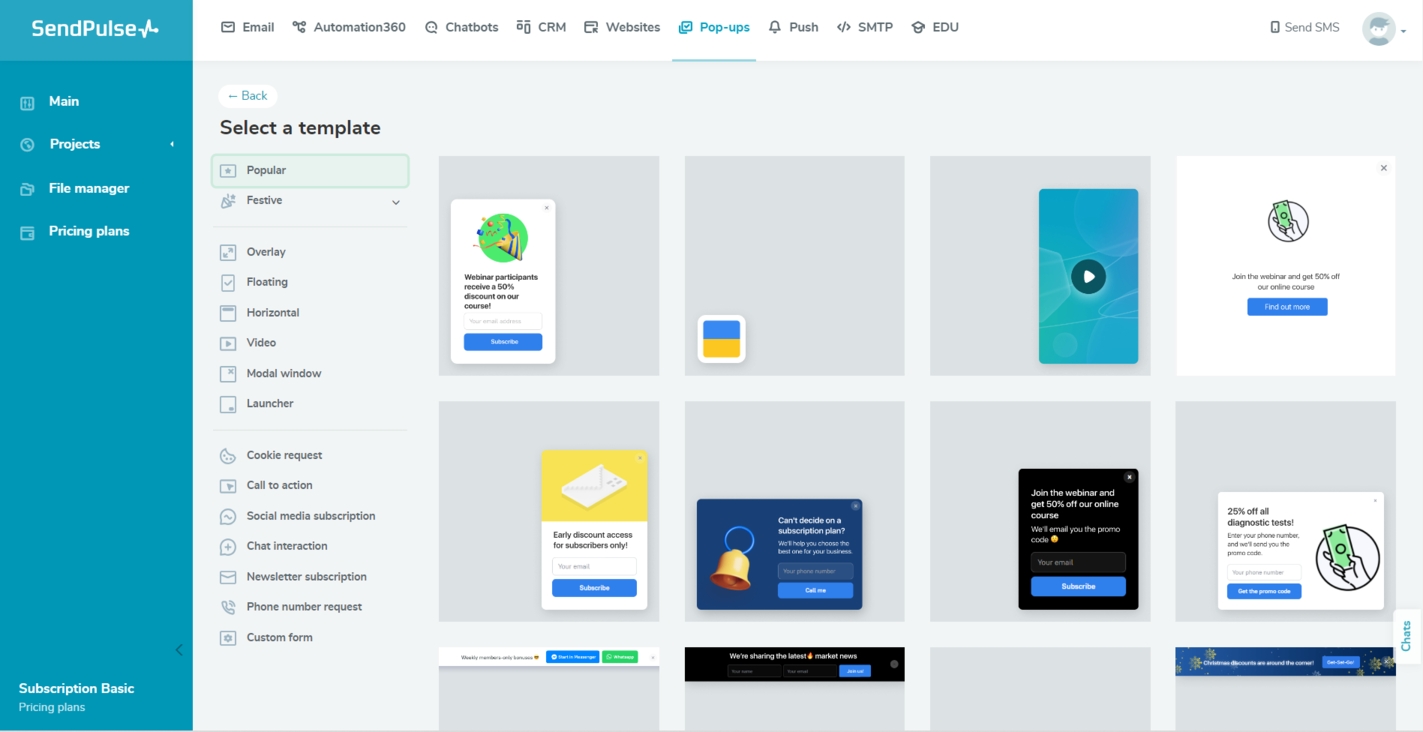 A pop-up template gallery in SendPulse
Customize the contact form to fit your needs. You can edit the copy, set a target action, add your logo, and modify other design elements to align the form with your website’s branding.
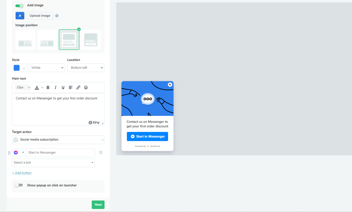 Customizing a pop-up created in SendPulse
At this point, you can also decide if you want to automatically create deals in your CRM every time a visitor submits your form. This is optional, but it’d help you start the dialog with the new subscribers right away.
Customize the form settings according to your preferences. You can specify the form title and configure display conditions. Once you’re satisfied with the form design and settings, you can save and preview it by using a quick link.
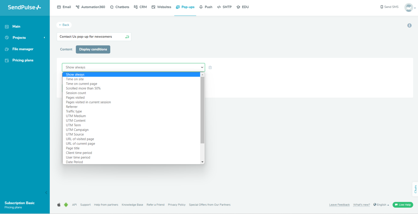 Configuring pop-up display conditions
Fill out the form and submit it to see if the responses are captured accurately. You can also create an alternative version of the same form to A/B test both of them.
Monitor your pop-up campaign performance using built-in statistics tools or through an integration with Google Analytics.
You can find detailed step-by-step guides on how to get notifications about new leads and connect your pop-up to Google Analytics in our knowledge base.
SendPulse is an all-in-one sales and marketing automation platform that can replace 10+ marketing tools. It’s created with small business owners in mind, providing diverse functionality at an attractive price.
With SendPulse, you can create automated email campaigns, build chatbots, design landing pages, track sales, monetize your content, run SMS campaigns, send push notifications, and create pop-ups — all from a single tab.
In addition, we offer generous free plans, which allow you to explore the product before purchasing a paid plan. Should you run into problems, you can always contact our 24/7 support with real human agents. Create your free account now and give it a go!