Judging a book by its cover is a frowned-upon tactic, but we do it nevertheless, and here’s a logical explanation for that. According to Albert Mehrabian, a psychology professor at the University of California, visual communication makes up an overwhelming 55% of our first impressions, whereas actual words are only responsible for 7%.
So, it’s reasonable to expect your customers to judge your business by its online storefront design. Thankfully, it’s in your power to make that first impression an unforgettable one.
In this post, we’ll be discussing homepages for websites and what they’re made of. You’ll learn which elements belong to a powerful homepage and which will only clutter it. We’ll also show you some fantastic homepage examples and dissect them to find out why they work so well.
Why is website homepage design important?
The homepage of a website is crucial because it serves as the virtual storefront or entrance to an online business. It is often the first impression that visitors have of a company. Homepage design shapes their perception and experience, influencing whether visitors stay and explore further or leave immediately.
Homepage design is important for multiple reasons:
- Establishing trust. A visually appealing and well-designed homepage can convey professionalism, credibility, and trustworthiness, increasing the chances of visitor engagement.
- User experience. A well-designed homepage ensures that visitors can quickly find the information they seek and navigate the website effortlessly.
- Brand representation. A homepage is an opportunity to showcase your brand identity and establish a consistent visual representation. A cohesive and well-executed design strengthens brand recognition and fosters brand loyalty.
- Call to action (CTA). A homepage is an excellent place for prominent CTAs that guide users toward desired actions, such as making a purchase, signing up for a newsletter, or contacting the business.
- Search engine optimization (SEO). The design and structure of your homepage can impact search engine rankings. Search engines consider factors like page load speed, mobile-friendliness, and user engagement when determining search result rankings.
Now, let’s talk about what may happen if you don’t pay enough attention to your homepage design.
Firstly, your visitors may need help navigating the website, finding relevant information, or understanding your offerings. This can lead to frustration, confusion, and, ultimately, visitors leaving without taking any desired actions, which reduces the chances of converting visitors into customers or leads.
Then, a poorly designed homepage is likely to convey a lack of professionalism or attention to detail, which can erode trust and credibility. Your users may question the legitimacy of your business or worry about the security of their personal information, resulting in a negative perception.
In addition, a homepage that fails to effectively guide users towards desired actions can lead to missed conversion opportunities. You may lose out on potential sales, subscriptions, or other valuable user interactions.
Lastly, if your business neglects its homepage design while your competitors invest in creating compelling, user-friendly experiences, you risk being left behind. Users are more likely to engage with attractive and intuitive websites — they won’t waste their time trying to find a way around some bulky, outdated homepage.
10 elements of a successful homepage design
The specific elements and sections of a homepage may vary depending on the nature of the business or website. With that in mind, here are some common elements that we often see on some of the best website homepages, one of them being the homepage of N26, one of the biggest European online banks. Let’s take a closer look at it.
Header
The header typically includes the business logo, the main navigation menu, and sometimes additional elements like a search bar or language settings. It allows users to easily access different parts of the website and provides a consistent point of reference throughout their browsing experience.
 A homepage header example
In this example, the header also contains a CTA inviting users to open a free bank account right away. You certainly don’t have to follow this exact layout as there are many schools of thought on menu design — dropdown, hamburger, mega, etc. But you can’t go wrong with a clean, minimalistic horizontal menu.
Hero section
This is the large, prominently placed section at the top of the homepage that immediately grabs the attention of visitors. It often contains a compelling headline, a captivating image or video, and a concise message that communicates the unique value proposition or key offerings of the business.
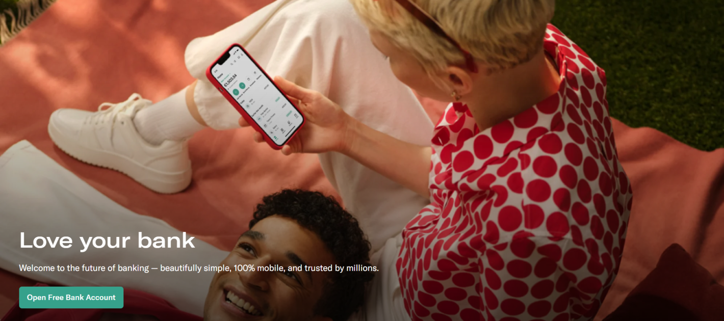 A homepage hero section
The hero section aims to quickly engage visitors and encourage them to explore further. It also captures the spirit of the brand, allowing newcomers to get the feel of it before they scroll any further. This section typically contains photos of real human faces, with whom visitors can easily identify.
About us or introduction
This section provides a brief overview of the business, including its mission, values, and key competitive advantages. It helps users understand the purpose and background of the business, fostering trust and connection. It may also include a call to action, like in our example, or a link to learn more about the company.
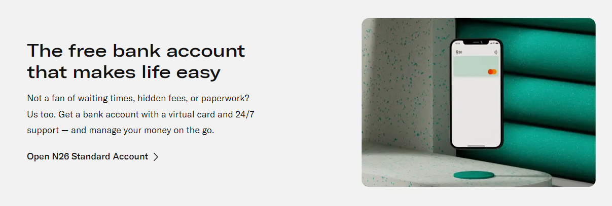 A homepage introduction section
As you can see, the introductory section of your homepage doesn’t have to be overly complicated. In fact, it’s even better if you can encapsulate the purpose of your company in a few sentences.
Features or services
This section highlights the main features, services, or products offered by the business. It provides a summary or a visual representation of what the business provides and how it can benefit users. It helps visitors quickly grasp the core offerings and may link to more detailed pages for each feature or service, as shown below.
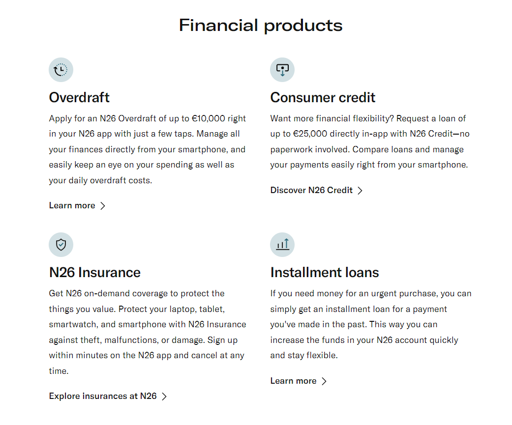 A feature list example
Here, we see a concise, skimmable product list that gives users a quick overview of the financial products without going into detail. This section is usually text-heavy and doesn’t require major visuals.
Testimonials or social proof
Including testimonials, reviews, or social proof on the homepage can enhance credibility and build trust. This section showcases positive feedback from customers, peers, partners, or industry thought leaders, demonstrating the value and legitimacy of the business.
 A testimonial section example
In this example, N26 only briefly mentions its verifiable 5-star reviews and other achievements without cluttering the homepage. Alternatively, you can pick three rave reviews from your customers and feature them on your homepage in their entirety.
Call to action (CTA)
CTAs are strategically placed buttons, links, or forms that prompt visitors to take specific actions, such as making a purchase, subscribing to a newsletter, or contacting the business. CTAs should be visually distinct, clear, and compelling, guiding users toward desired conversions.
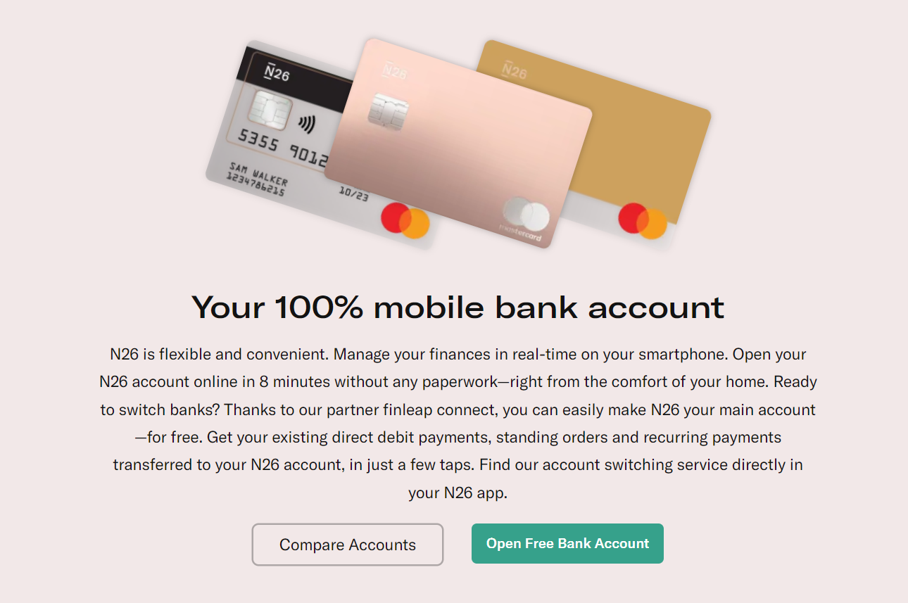 A homepage CTA example
Here’s how N26 works relevant CTAs in its various homepage sections. Primary CTA buttons are highlighted in green, while secondary CTAs are left transparent. The calls to action are repeated throughout the page to give users multiple chances to convert.
Featured content or promotions
This section can showcase featured blog posts, articles, products, or any other content that the business wants to highlight. This is also a proper place to feature user-generated content pulled from Instagram or other social media.
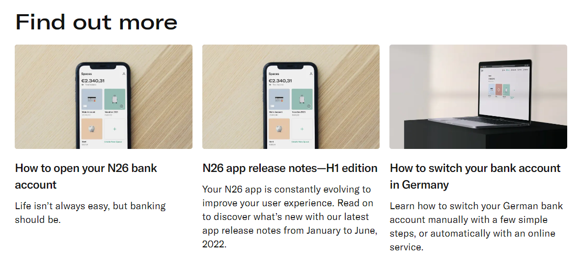 A featured content section example
The featured content section helps draw users’ attention to more in-depth, educational, and inspiring content from the brand and learn more about its offerings. Typically, businesses place their three latest or most-read articles in this section.
FAQ
The FAQ section allows the business to address frequently asked questions or concerns and helps first-time visitors overcome their doubts regarding the offer.
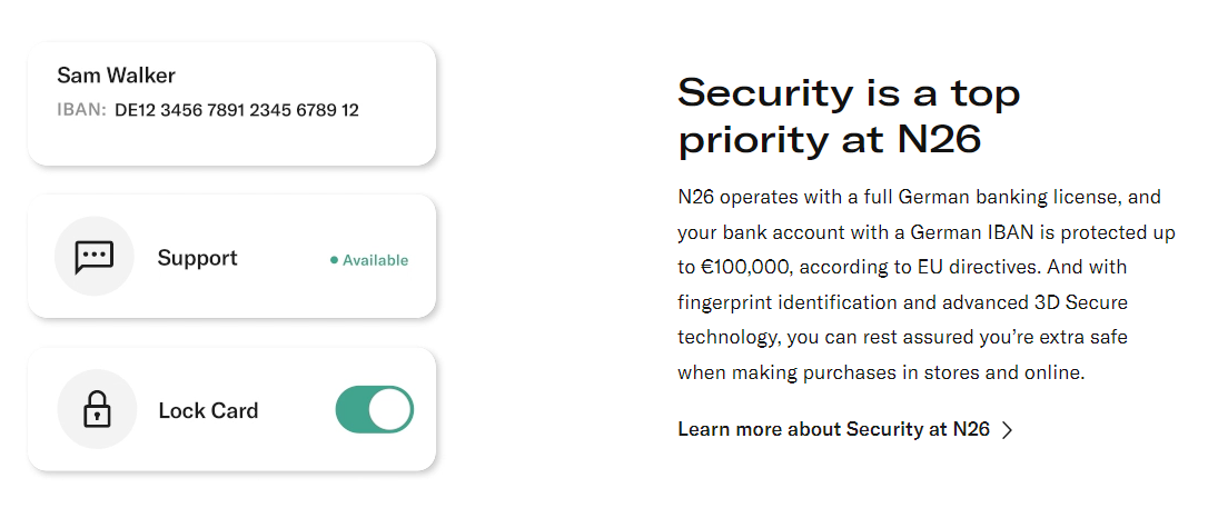 Addressing customer concerns on a homepage
Technically, it’s not necessary to use a dedicated section for that. You can follow the N26 example and answer common questions, like “Will my money be safe in your bank?”, throughout your homepage.
Contact information
Providing clear and easily accessible contact information, such as a phone number, email address, or contact form, is essential for visitors who want to get in touch with the business. You can also include a map or directions, if applicable.
 A contact information section example
In this case, N26 does a great job by including links to the App Store and Google Play, where its users can download the online banking app and appreciate its convenience and user-friendliness.
Footer
The footer appears at the bottom of the homepage and often includes secondary navigation links, additional information about the business or website, privacy policies, terms of service, copyright notices, and sometimes social media links. It provides a consistent structure and helps users navigate to important legal pages.
 A homepage footer example
Obscuring or intentionally hiding “boring” data policy pages and cookie settings is a bad idea, as your visitors have the right to access and review them. Instead, you can neatly organize them in your homepage footer.
5 show-stopping homepage examples and what we can learn from them
We’ve gathered a few website homepage design sources to give you some fresh ideas for your virtual storefront.
Nissan
This gorgeous, dynamic homepage design proves that a video is worth a thousand words. Instead of creating an overly informative, text-heavy page, Nissan has chosen to highlight its bestsellers in a powerful sequence of high-quality visuals.
Nissan’s homepage design
At the same time, this choice doesn’t harm the page’s usability. Here, we can see an intuitive menu, clear CTAs, an easy-to-navigate product gallery, and a more detailed version of the same menu in the footer.
Heinz
This is one of those creative homepage examples that are meant to be enjoyed both as a source of information and entertainment. The page instantly captures the user’s attention with its witty video ad placed above the fold.
Heinz’s homepage design
Then, we’re offered to explore the Heinz universe and learn more about the brand’s initiatives, special offers, and new arrivals. Bold, amplified visuals reinforce Heinz’s iconic branding, while the featured content section invites visitors to follow the brand on social media.
Huggies
Huggies’ homepage is surprisingly attractive and educational, and goes well beyond promoting diapers and wipes. For starters, we get to learn more about babies’ anatomy and why Huggies’ diapers fit so well, compared to the alternatives. Then, we’re invited to discover Huggies’ tools and educational resources for soon-to-be moms.
Huggies’ homepage design
The overall look of the page is rather on the minimalistic side, but we see Huggies’ signature colors consistently used throughout the whole website, nicely accentuating CTA buttons, headlines, and individual sections.
Pringles
One more vibrant and colorful website homepage design — this time, from the iconic chips brand. It starts off with a goofy yet relatable video ad and continues with a featured TikTok trend. Then, we see a comprehensive gallery of Pringles products, from classics to spicy blends.
 Pringles’ homepage design
Then, the page proceeds to show us where to buy the beloved snack across the world. It contains pretty much everything a Pringles fan would like to know, and then some. We also can’t ignore how much this homepage itself resembles a bright can of Pringles, with its popping colors and bold lettering.
Impossible Foods
Plant-based meat producers have to fight hard to win consumers’ attention, so it’s no surprise that Impossible Foods, as well as similar brands, have created outstanding homepages for their websites.
Impossible Foods’ homepage design
First, we’re met with a compelling video describing the story and purpose of the brand. Then, we jump straight to the fact-based benefits of the product, along with the sources. Powerful typography helps the visitor navigate through the page and increases brand recognition.
Another highlight of the homepage is its featured recipe section, which is a fantastic way to promote an innovative product. Mouth-watering images help solidify the impression of the brand, and the interactive map allows customers to quickly locate the Impossible Foods product near them.
Create pixel-perfect websites and marketing campaigns with SendPulse
Did you know that SendPulse offers a user-friendly website builder designed specifically for busy marketers and small business owners? Our builder allows you to effortlessly create visually stunning homepages for websites, online stores, link pages, and everything in between in just a matter of minutes. But that’s not all.
SendPulse is an all-encompassing solution that empowers you to create and automate email campaigns, design pop-ups, build chatbots, sell education products, and execute SMS campaigns with ease. No coding experience is required.
Unleash the power of SendPulse to effortlessly track your sales, grow your brand, and maintain effective communications with your customers. Take advantage of our step-by-step guides and 24/7 support, provided by real humans. Sign up for a free account and see what the platform is capable of!