This is a tough one because we all know that it’s the nose that usually leads customers to a bakery. While it is not yet possible to convey the smell of freshly baked butter croissants over text, there are still ways to entice your potential customers and make them crave your pastries after just looking at your website.
Let’s discuss what makes an appealing bakery website and how to make it not just mouth-watering but also informative and sales-oriented. We’ll list the elements needed to help your customers navigate your products, understand your niche, and successfully place an order for a custom cake or catering for their event. Also, you won’t leave without enjoying aesthetic bakery website examples, along with tips on how to recreate their magic on your own platform.
What should a bakery website contain?
A bakery website serves as a digital storefront and marketing tool for the business producing bread, cakes, or other pastries. It allows customers to discover, learn about, and interact with the bakery digitally.
Having a bakery website enables you to provide your existing and potential customers, partners, and suppliers with all the necessary information they may need about your establishment:
- History and philosophy — the background of your bakery, its founders, and what makes it unique (e.g., family-owned, organic-only, or gluten-free).
- Mission and values — the bakery’s purpose as well as the commitment to quality, local ingredients, or sustainability.
- Product list — a detailed menu of items such as breads, cakes, scones, and other baked goods, along with photos, descriptions, and prices.
- Specialties — highlight of signature items, seasonal products, or limited-time offers.
- Dietary information and alternative options — information on gluten-free, vegan, or allergen-friendly options as well as possible ingredient swaps.
- Ordering functionality — option for customers to place orders for pickup or delivery online, without having to call or visit the shop in person.
- Guide on ordering a custom product — information on how to order custom cakes, cupcakes, or other personalized baked goods for events like weddings or birthdays.
- Catering — services for special events, with details on bulk ordering, delivery, and setup options.
- Locations, hours, and holidays — a list of bakery locations with addresses, phone numbers, operating hours, and a map for easy navigation.
- Themed events — announcements and information on baking classes, tasting events, or collaborations.
- Special offers — all of your ongoing promotions, discounts, or loyalty programs.
- Contact form — a widget allowing users to ask questions or make inquiries.
- Social media buttons — links to your bakery’s Instagram, Facebook, or other social media accounts.
This is just a quick overview of what an informative bakery website usually features. Now, let’s talk about the advantages it can bring.
The benefits of having a bakery website
Creating and maintaining a strong online presence is a fantastic way to expand and connect with your customer base. Here are some key reasons why your bakery deserves its own website:
- Get discovered by a larger audience. A website allows your bakery to be found by customers beyond just local foot traffic. With a well-optimized website, your business can appear in local search results, helping potential customers find you easily when searching for baked goods online.
- Make it easier for customers to understand your assortment and services. Offering online ordering and payment systems simplifies the process for customers, who can browse the menu, customize their order, and have it ready for pickup or delivery.
- Keep the key information about your bakery available 24/7. A website is accessible any time of day, giving customers the convenience to explore your products, pricing, and services outside of normal business hours.
- Make users crave your products even before they visit the bakery. High-quality images of colorful cupcakes, crispy pastries, and artisanal breads are guaranteed to get your website users excited about your offerings.
- Convey the soul of your bakery through images and text. Having a website empowers you to share your bakery’s story, mission, and values, which helps in creating a personal connection with customers.
- Highlight your time-sensitive offers, activities, and events. With the help of a website, your bakery can easily advertise special promotions, discounts, or events like baking classes, making them more popular and well-attended.
- Collect orders in a hands-off manner. By offering website forms for customers to submit inquiries or place custom orders for cakes or catering services, you streamline the whole process and save time on repetitive phone calls and in-person assistance.
- Stand out from the crowd of old-fashioned businesses. Many bakeries still have little to no online presence, and you can positively stand out in that market by presenting your audience with a modern, user-friendly website.
By consolidating the information about your bakery on a single online resource, you simplify your customers’ journey and help them get their basic questions answered without having to pick up the phone. But that is only possible if you’re being strategic about what kind of content and how you present on your site.
Bakery website design ideas
What works for an eCommerce shop doesn’t necessarily work for a bakery website. These types of brick-and-mortar businesses require designs that appeal to users’ all five senses without being overly salesy. Our well-designed bakery website examples will serve as illustrations here.
Let your baked goods steal the show
Any bakery website should include high-quality photos of baked goods to entice visitors and tickle their cravings. Photos should be vibrant, sharp, and almost tactile, demonstrating the exquisite crispness, freshness, and creaminess of your treats.
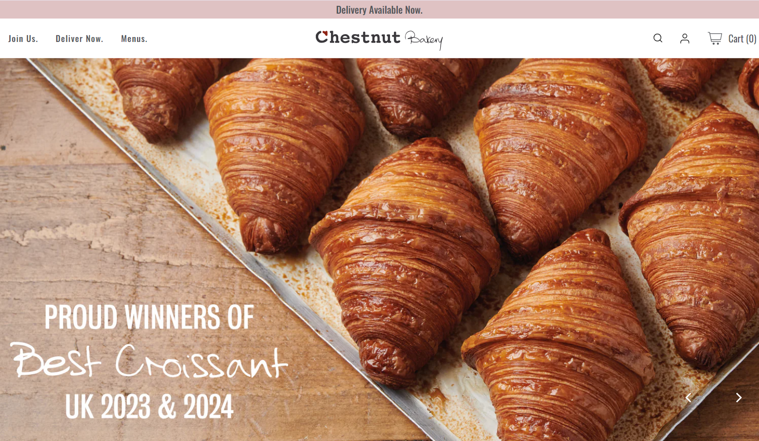 An example of an image-heavy bakery homepage
It’s a good idea to use image sliders or galleries to showcase different categories like breads, cakes, pastries, and seasonal items without visually overwhelming the users. To make the site feel more personal and add some context, you can also feature images of the baking process, your team at work, or the bakery’s interior. This will also help potential visitors understand the atmosphere of your establishment and what it’s like to sit inside, enjoying a slice of cheesecake and a hot cup of coffee.
Keep things simple and intuitive
Bakeries are inherently inclusive — all demographics have a sweet tooth, and getting a fresh loaf of bread for breakfast is a tradition that crosses borders and generations. It’s important to design your website with that knowledge in mind. Teens and elderly people alike should be able to quickly navigate it, even if they’re not native speakers.
Having clear, accessible menus is paramount as it helps direct customers to essential sections like the item list, contact information, FAQ, and online ordering.
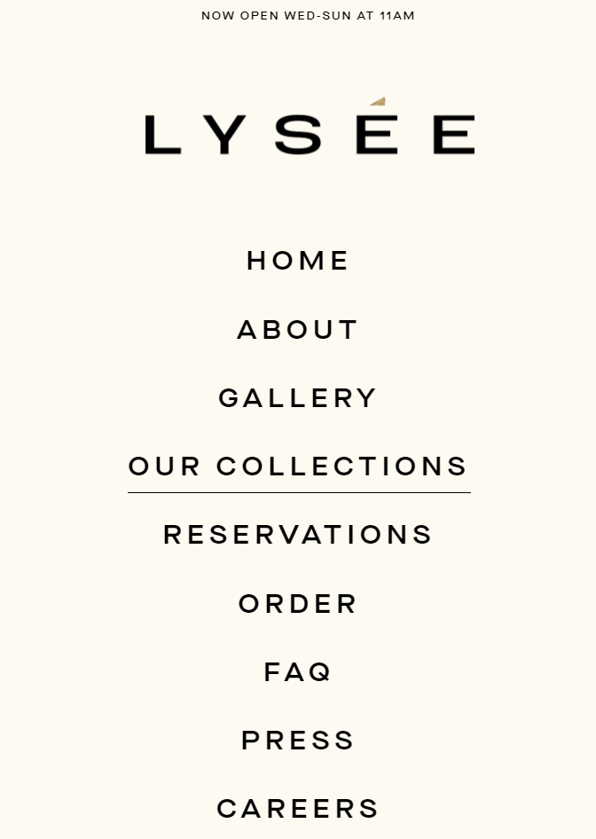 An example of an intuitive bakery website navigation system
Instead of confusing your visitors with lengthy cards describing every possible item you have, let them navigate through categories. Group items by type (e.g., cakes, pastries, bread) to make browsing more straightforward.
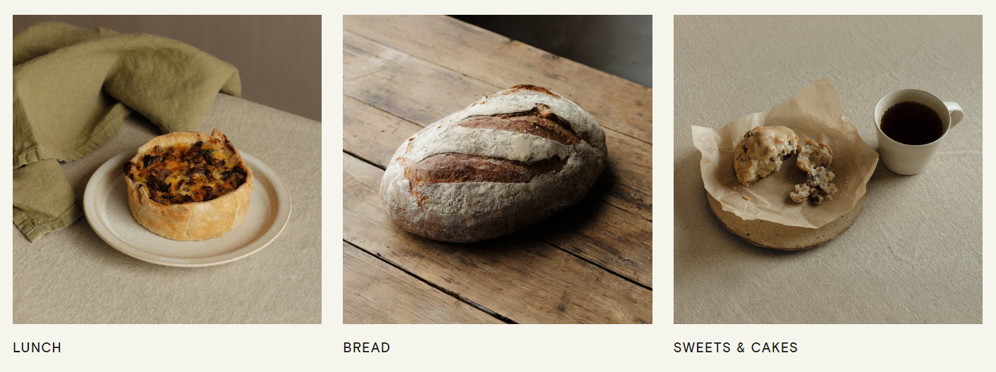 A bakery’s item list split into categories
Apply the same principle to your other services like catering or on-demand baking workshops. This will help your visitors instantly understand the scope of your offerings without having to make an inquiry.
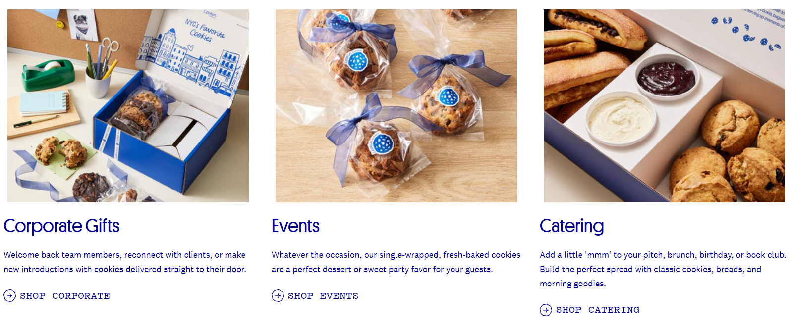 A bakery’s service descriptions
Using images is highly recommended here, as it allows users to browse smoothly without having to read every single line of text.
Take a mobile-first approach
Creating an inclusive design also means designing for smartphones and tablets, as about three-quarters of US adults use them daily to shop for everyday items, which include sweets.
When it comes to cakes in particular, people often order them in a hurry, while organizing some family event or at-work gathering, and they don’t always have the opportunity to do it from their PC.
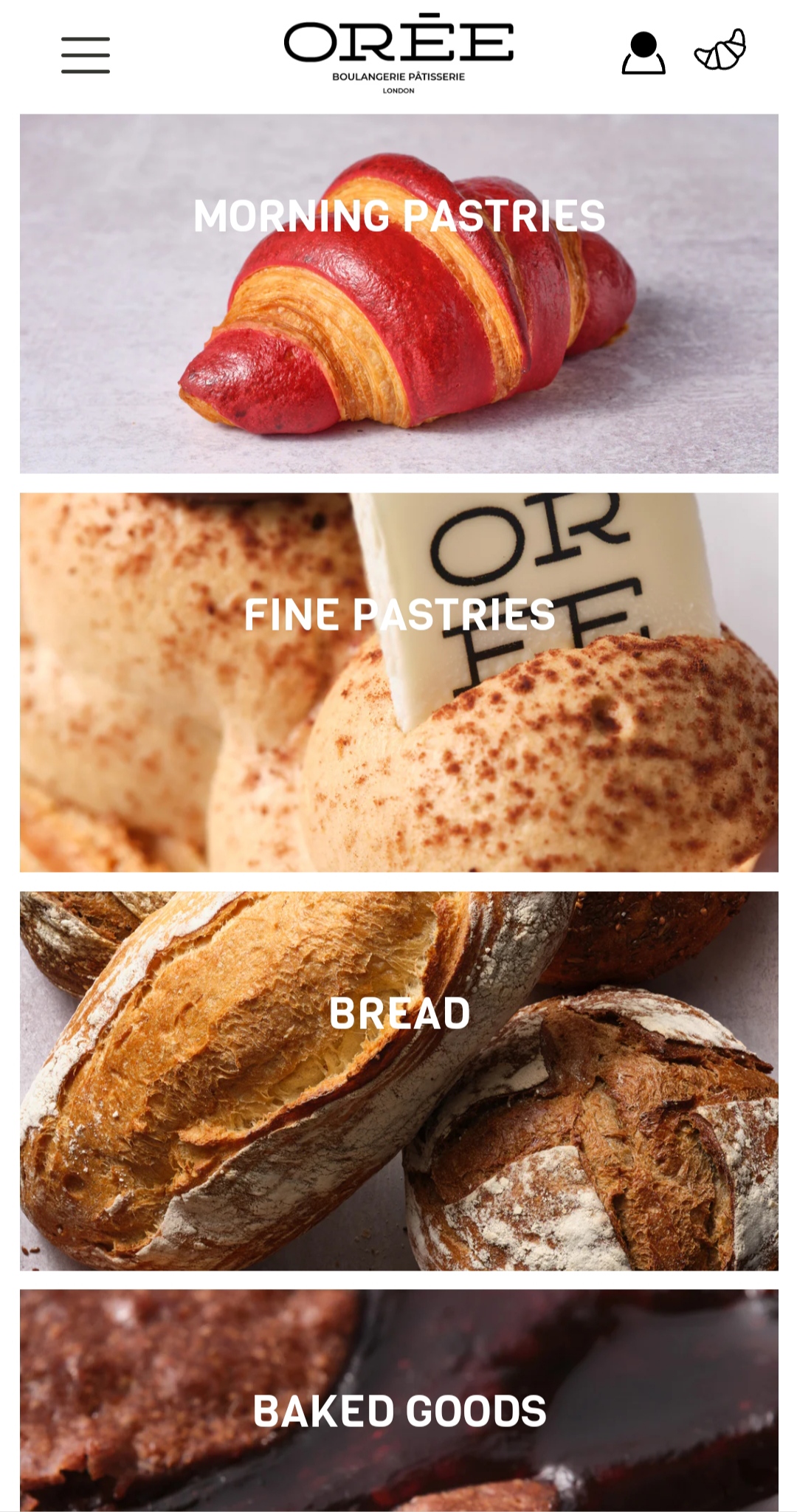 A mobile-friendly bakery website example
To make a site mobile-friendly, you’ll need to introduce responsive design, intuitive navigation, big and easily tappable buttons, clear and legible text, lack of clutter, enough white space, and prominent CTA buttons.
Make your order form impossible to miss
If you offer online ordering, make sure the process is frictionless — you don’t want users to get lost in the hierarchy of your website and leave. Offer clear options for pickup, delivery, and payments and highlight them visually, placing them above the fold.
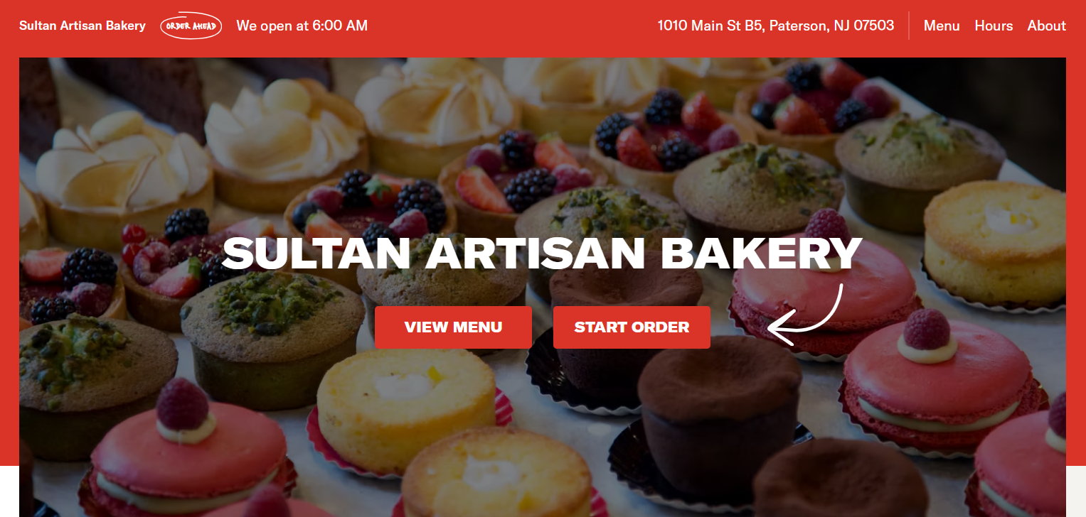 A bakery website example with clear CTA buttons
Prominent, well-placed buttons like “Order Now,” “Find Your Cake,” or “View Menu” should be visible and stand out to drive conversions. The form itself also needs to be streamlined yet detailed enough to ensure the correctness of each order.
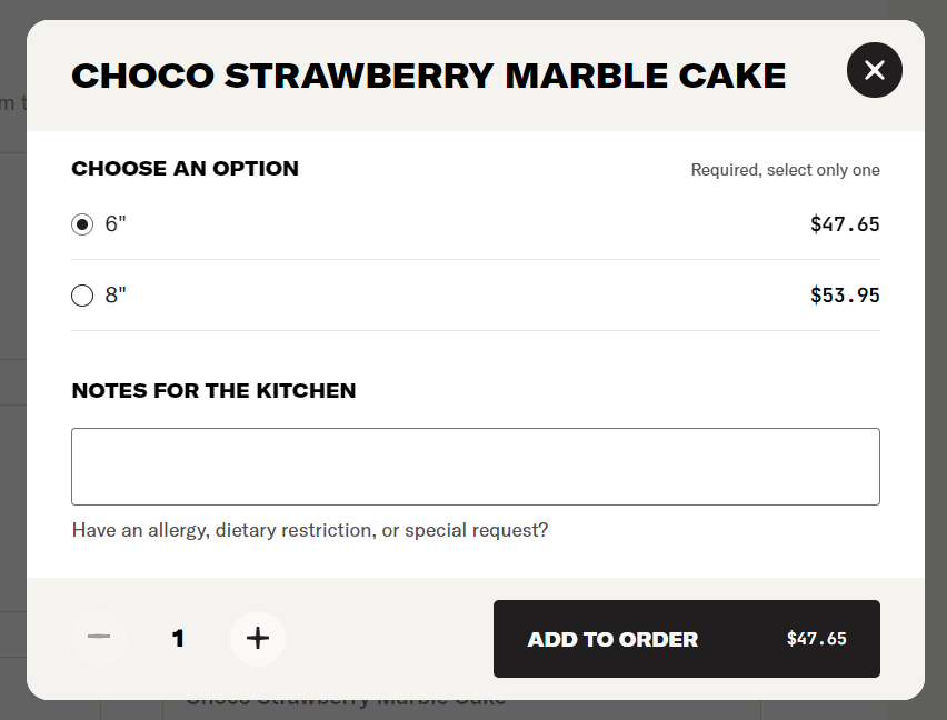 An example of an intuitive bakery website order form
By letting customers express their wishes in a dedicated form field, you increase your chances of fully understanding and exceeding their expectations.
Introduce and maintain a recognizable aesthetic
Your pastry website is your customers’ first impression of your bakery. To make it impactful, you need to implement a recognizable color scheme, logo, fonts, and tone consistently across the website.
Choose easy-to-read fonts that match your bakery’s vibe — a hip scone place may do well with trendy neon sign lettering, while a cozy traditional pâtisserie calls for a more vintage script font. When in doubt, opt for clean, minimalistic fonts that pair well with any imagery.
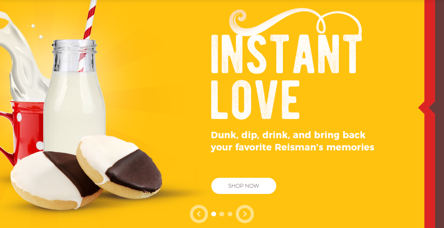 A traditional American bakery using a vintage sign font
For instance, this aesthetic bakery uses an old-school signage font, which perfectly matches the bakery’s iconic and nostalgic desserts. The texture of the letters mimics hand painting, instantly transporting the user back to simpler times.
Use colors intentionally and in moderation
Baked goods often evoke sentimental memories in people because we tend to indulge in fresh pastries with our loved ones or use them to celebrate significant milestones in our lives. You can tap into your customers’ emotions by skillfully using colors throughout your bakery website. A cozy, artisanal bakery may go for warm, earthy tones, while a modern pastry shop might opt for sleek pastels or bold colors.
Warm colors like soft yellows, earthy browns, and creamy oranges evoke feelings of comfort, coziness, and nostalgia. These tones are known to stimulate appetite and increase cravings. Soft backgrounds and warm accents can also help your food photos stand out, drawing the viewer’s eye to the richness of the baked goods.
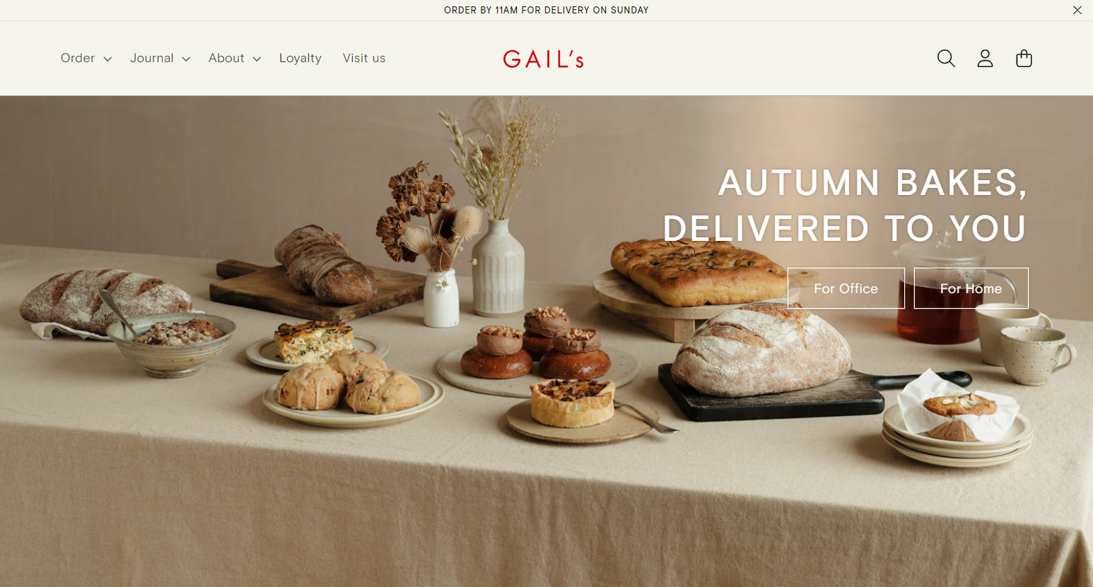 A bakery website example with an earthy color palette
Finally, cozy colors create a sense of care and thoughtfulness, giving the impression that the bakery is more than just a business — it’s a place where people matter and where food is hand-crafted with love.
In turn, chic and less traditional bakeries may opt for more daring or sleek designs with cooler tones like grays or blues to stand out. The key is to carefully combine those fresh colors with more gentle and natural backgrounds, like in this aesthetic bakery website example.
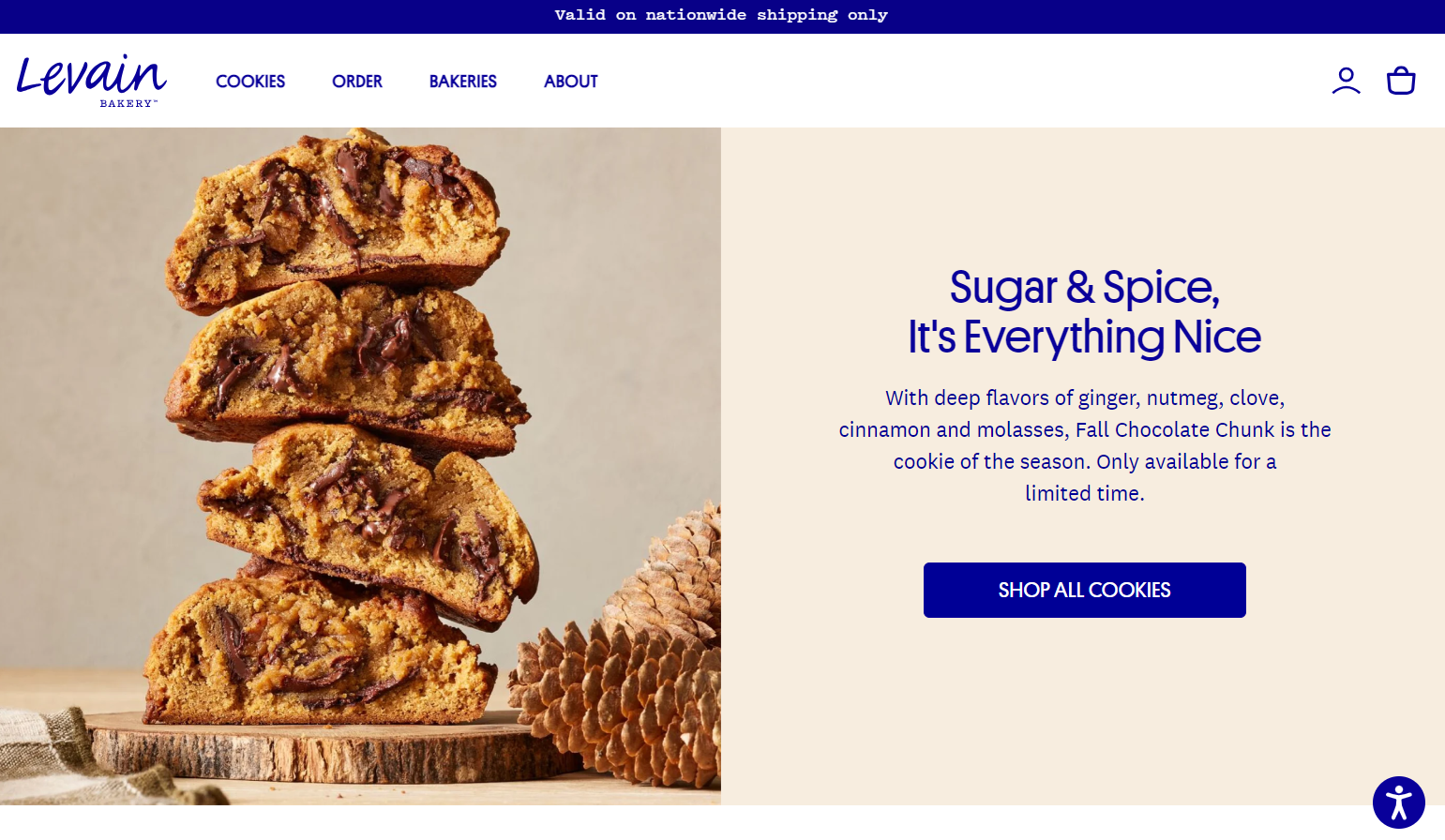 A bakery website demonstrating an appealing color pairing
Muted greens paired with warm wooden textures will also be a good choice as they evoke a sense of natural, wholesome ingredients, which is exactly what customers want to see on a home bakery website.
Keep your calls to action calm and gentle yet prominent
As we’ve already established, bakeries are associated with comfort, community, and warmth. Hard-selling CTAs can feel too aggressive and may clash with the inviting and cozy atmosphere that you’re trying to create. Gentle CTAs, on the other hand, feel more like an invitation rather than a push.
Friendly CTAs, like “Explore Our Menu” or “Treat Yourself Today” align with the down-to-earth, relaxed vibe of a bakery and will softly guide the customer toward action without making them feel pressured.
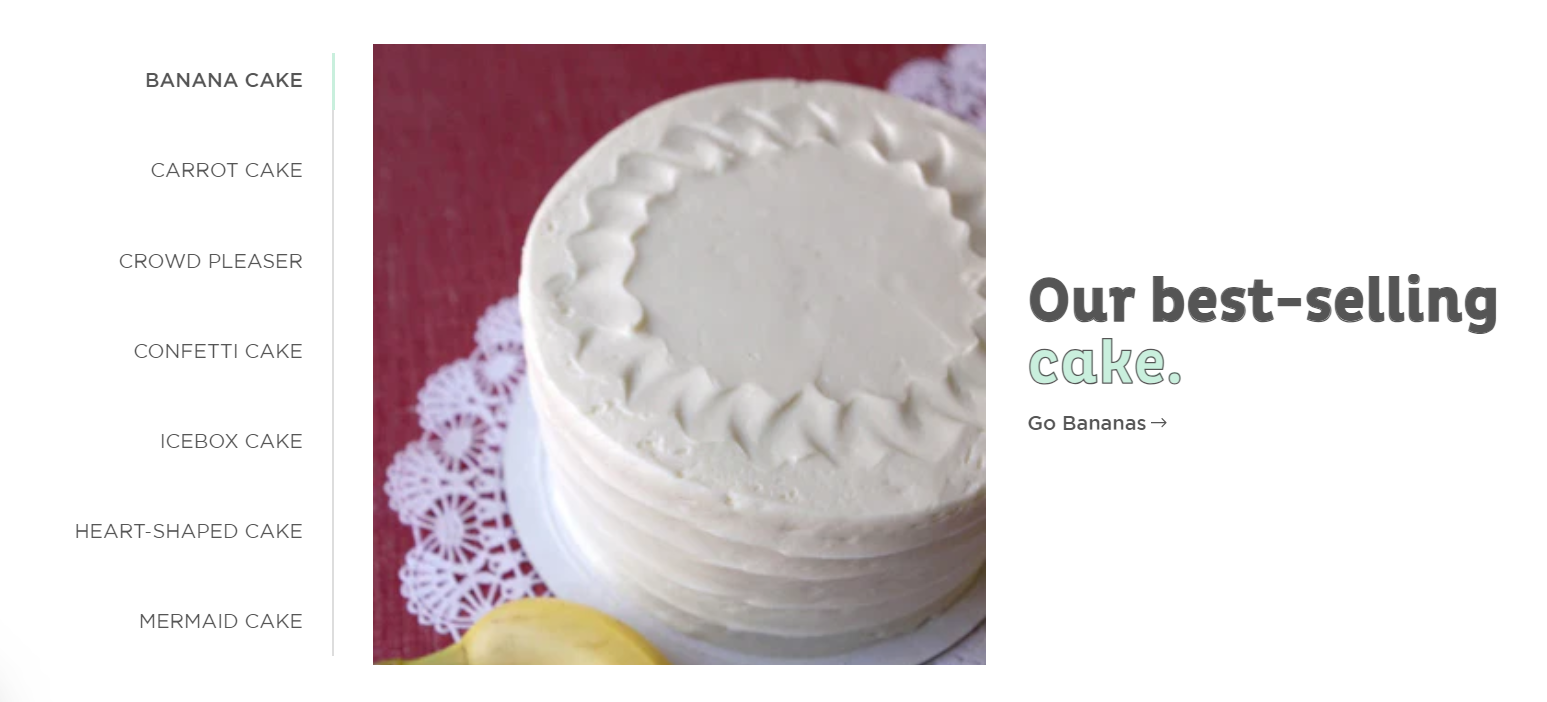 An example of an unconventional CTA on a bakery website
Consumers are more likely to respond positively to a CTA that feels like a natural suggestion rather than a command. For example, “Satisfy Your Donut Cravings” is more engaging than “Order Right Now or Regret Later!” The same goes for colors that you use — bulky and aggressively bright red buttons may conflict with your overall aesthetic. That said, your CTA buttons should still be easy to locate on the page.
Use widgets for better interactivity
You don’t want your website to be a static, lifeless source of information, like a newspaper article. It’s much more efficient to turn it into a medium for connecting with your customers through various channels like chat, newsletters, SMS, and more.
One way to do that is by offering an option for visitors to sign up for your bakery’s newsletter to receive updates on new products, special offers, and events. An email capture form helps grow your customer base by collecting contact information for future marketing campaigns.
If you offer custom cakes, it makes sense to employ a chatbot to answer customers’ questions about the assortment, ingredients, and delivery and help them address common problems in an automated yet conversational manner.
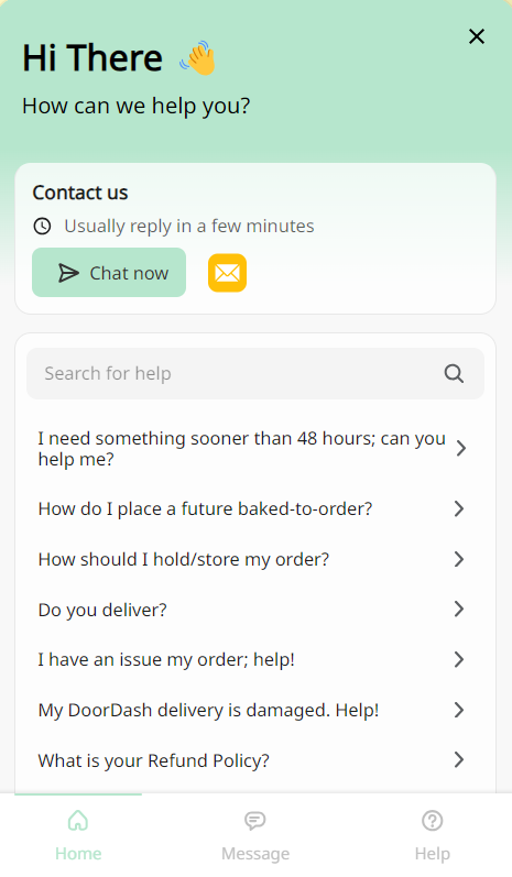 A bakery website chatbot
Bakery website copywriting ideas
Effective copywriting for a bakery website helps convey the brand’s personality, attract customers, and drive conversions like orders or store visits. Let’s find out how to make your bakery website not only look but also sound appetizing.
Awaken your customers’ taste buds by using descriptive language
By using vivid, sensory-rich descriptions, you can make the reader imagine the smell, taste, and texture of your baked goods. For instance, “Our flaky, buttery croissants are baked fresh daily, with countless layers that melt in your mouth and a golden, crispy exterior.”
Alternatively, you can shift focus to rare, high-quality ingredients or special baking techniques. For example, “Our sourdough is made with ancient Einkorn flour, which is naturally low in gluten. It is fermented for 48 hours, giving it a recognizable tangy flavor.”
Combine friendliness with expertise
You can’t go wrong with writing in a conversational, warm tone that reflects the welcoming nature of your bakery. As a rule of thumb, engage customers as though you’re speaking to them in person.
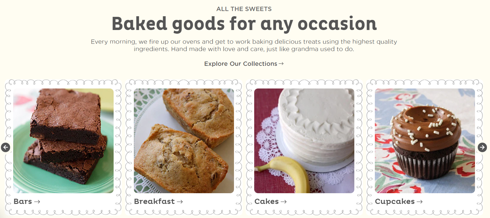 A bakery’s warm tone of voice
This website for a bakery, for instance, uses a cordial, family-like voice that perfectly matches the bakery’s comforting grandma-style desserts.
Tell your bakery’s personal and inspiring story
Chances are, your bakery has at least one competitor just around the block. To help customers differentiate yours from the others, you need to communicate what makes your bakery special, such as its history, values, or the inspiration behind your products.
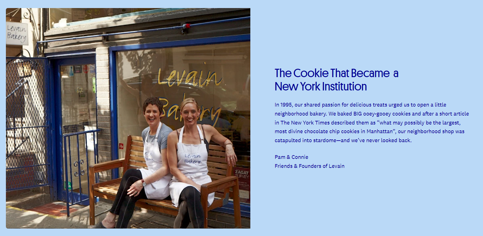 The personal story behind Levain Bakery
To make your message even more resonant, add a photo of the bakery’s founders or entire team. This will help website visitors relate to your story and develop interest in your brand.
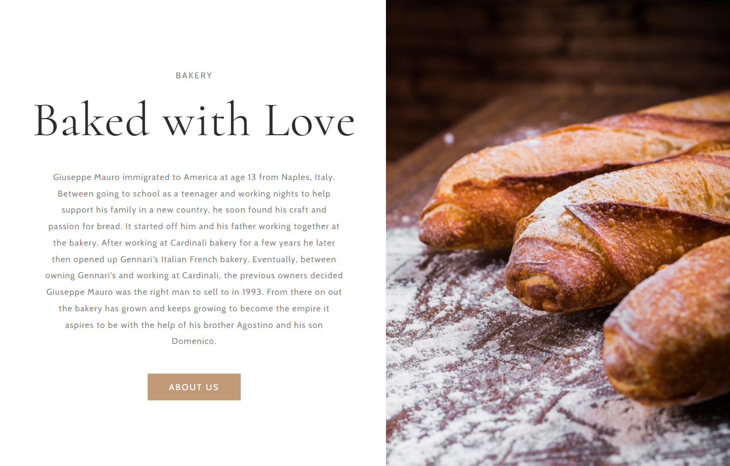 An example of a bakery’s origin story
Sharing quirky facts or traditions that make your bakery unique will also positively distance you from the multitude of faceless bakery chains.
Be specific and address your customers’ unique preferences
In your bakery website copy, focus on what matters to your target audience, such as dietary preferences, delivery options, or customization services. “Looking for a dairy-free option? We’ve got you covered with our delicious almond milk lattes and eggless pastries.”
It’s important to make diverse target groups feel equally seen and to demonstrate that there’s something for everyone in your bakery. At the same time, this approach will help your SEO strategy as it allows you to incorporate more niche, long-tail keywords into your descriptions.
Highlight your commitment to quality
In this day and age, when customers are becoming increasingly health-conscious, food producers are expected to provide a deep insight into the ingredients they use and where they come from.
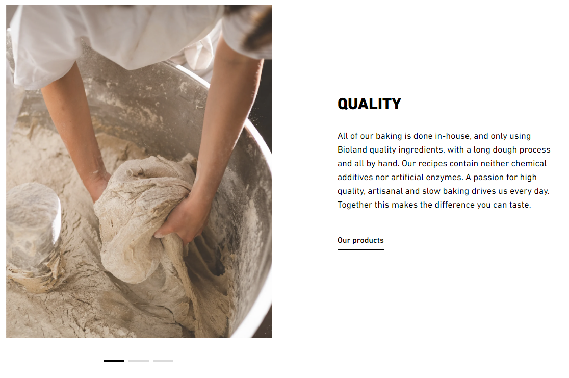 A bakery demonstrating its commitment to quality
Is your flour naturally rich in protein? Does your sourdough contain higher amounts of vitamins and minerals? Make sure to mention these and other nutritional facts in your bakery website copy.
Demonstrate your interest in sustainable practices
Another way to enrich your bakery or cake shop website copy is by mentioning your efforts to source local ingredients and reduce food waste, greenhouse gas emissions, and excessive packaging.
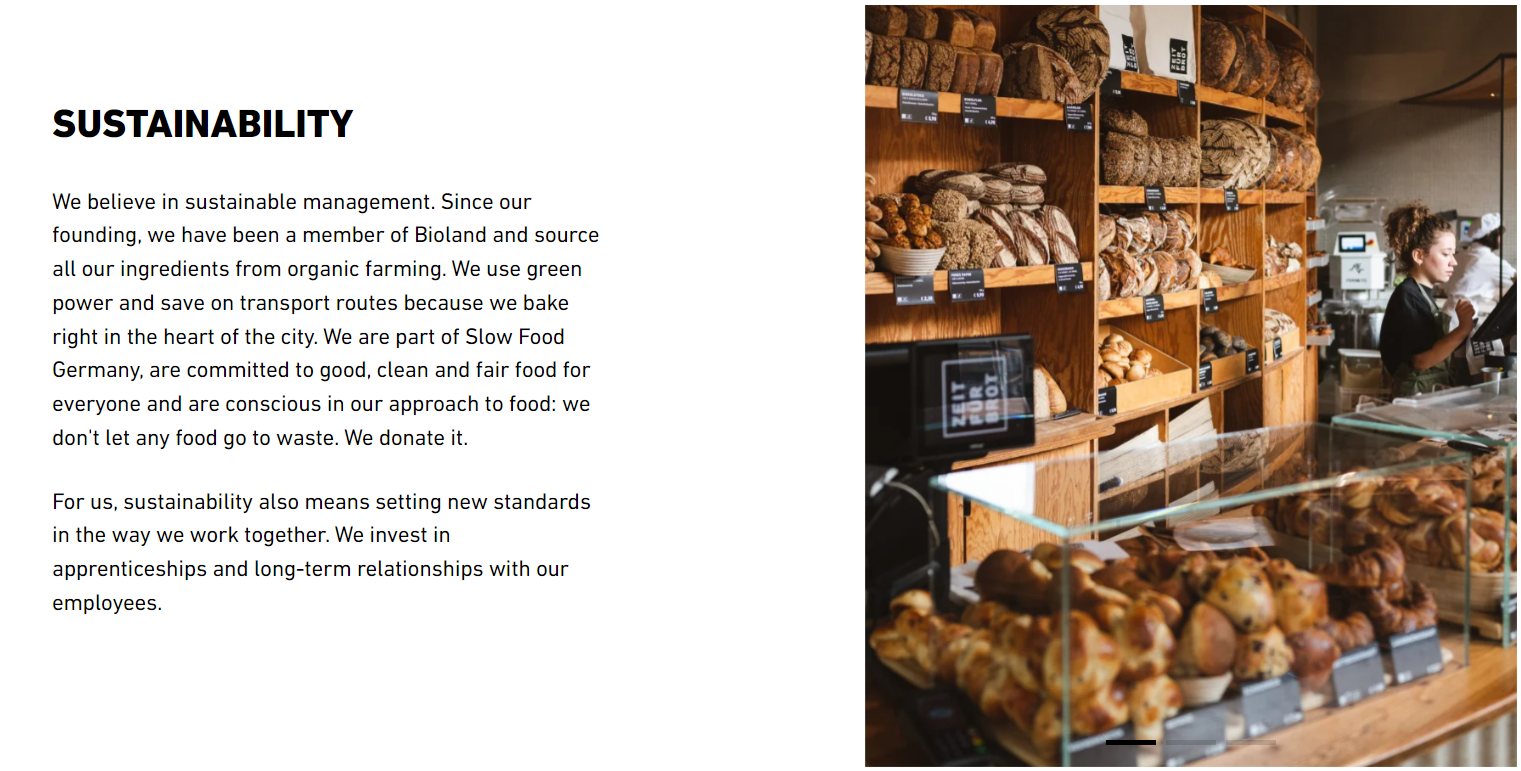 A bakery declaring its dedication to eco-friendly practices
Highlighting these practices can build trust and loyalty, as people feel good about purchasing from businesses that care about the planet. Moreover, it will help your bakery stay competitive in an evolving market where sustainability is no longer just a trend but an expectation.
Answer your customers’ burning questions
Another good practice is to create an FAQ page where you address common questions regarding your assortment, ordering process, and delivery. Some users actually prefer self-service resources to chatbots and phone calls, as it saves time and gives them more freedom.
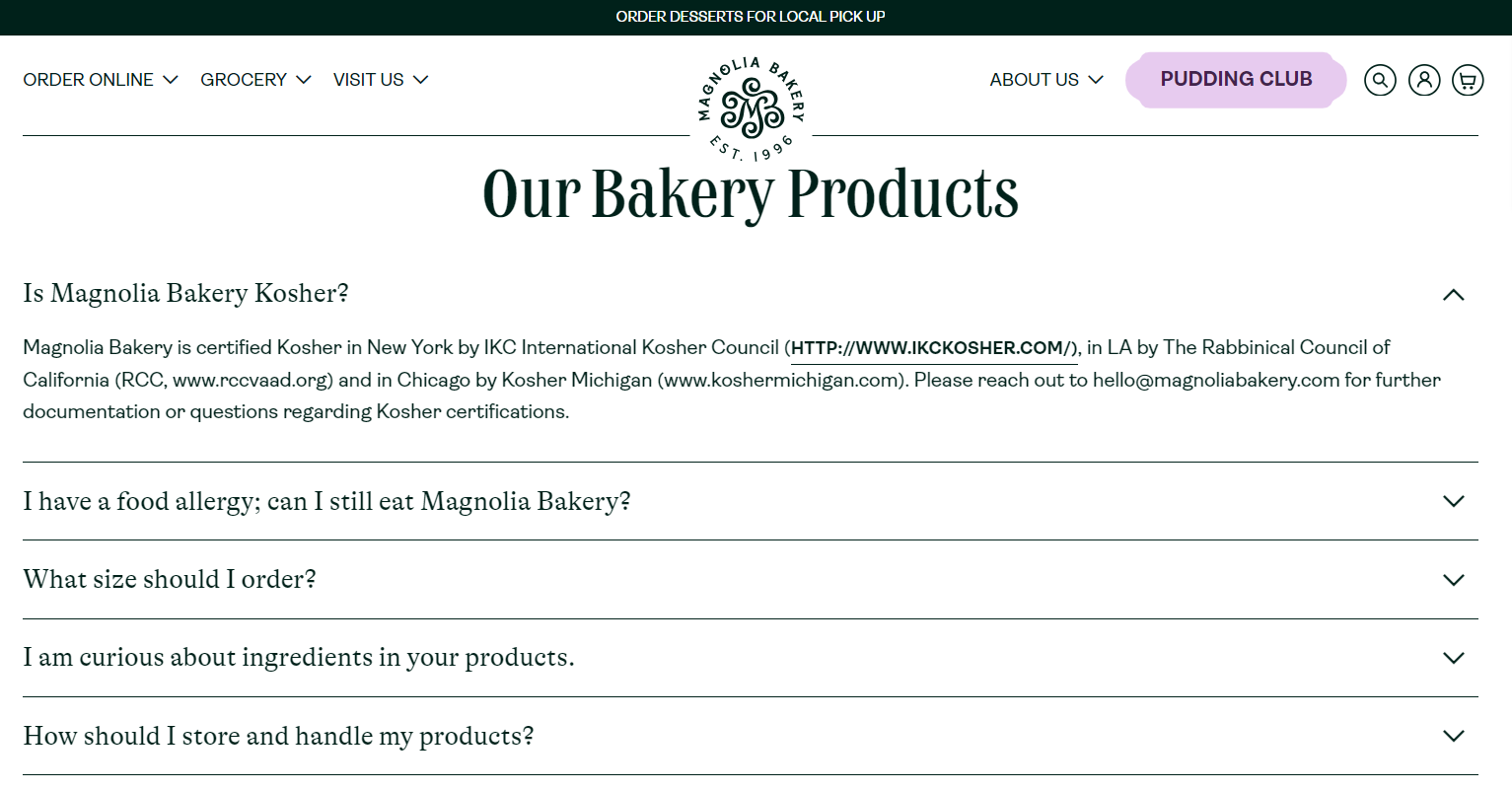 An FAQ section on the bakery website
In addition, the FAQ section is another great chance to insert niche and local keywords, increasing your bakery website’s visibility in the search results.
Mention how others can benefit from working with you
It’s not just customers who will visit your website — your platform may also attract potential partners, suppliers, collaborators, or guest chefs. To avoid letting those opportunities go to waste, you can address the interested businesses on a dedicated page.
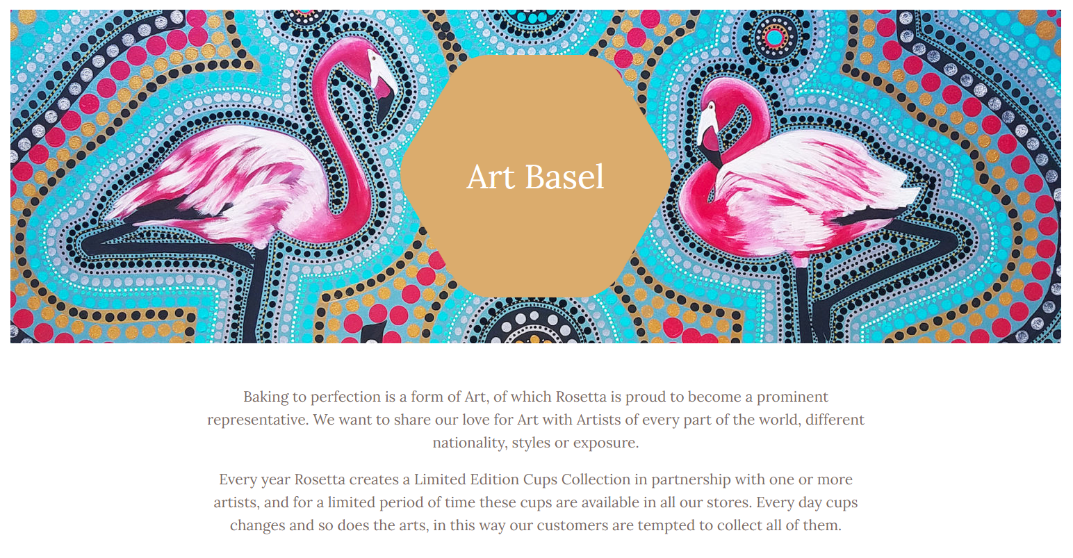 A bakery looking for artists for a themed event
Connecting with other businesses and creators is a guaranteed way to get some positive word of mouth and make your brand well-known in the local arena.
Visualize the popularity of your baked goods
To win over cautious first-time visitors, give them some evidence demonstrating the excellence of your produce in the form of social proof. This can be as simple as a pop-up showing a recent purchase made by another customer.
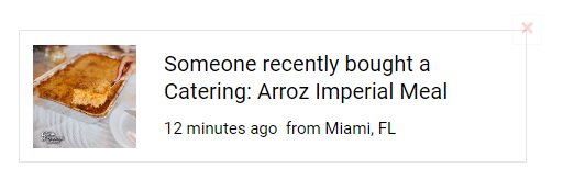 A social proof pop-up on a bakery website
Another option is to place a few testimonials on your homepage, letting the satisfied customers find the right words for describing the taste of your treats.
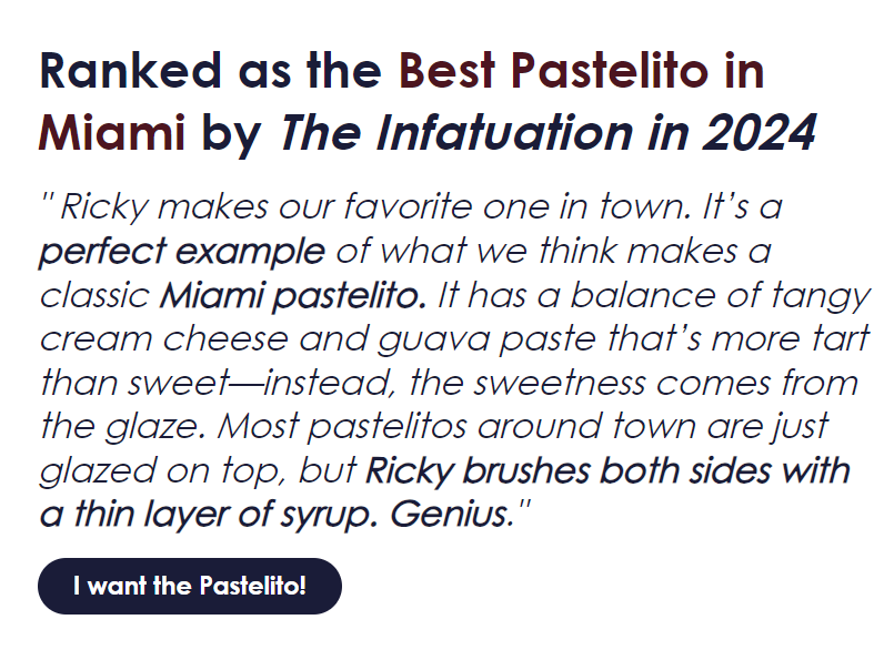 A positive online review from a bakery website
This testimonial perfectly illustrates how one happy customer can leave a review that sums up everything customers need to know about your bakery. To reinforce the positive statement, you can add a dedicated Buy button to it, like in the example above.
Make it easy for customers to visit and contact you
Last but not least, list your locations along with operating hours clearly — or, better yet, show them on the interactive map, like in the following example. Add phone numbers, email addresses, and directions for convenience if needed.
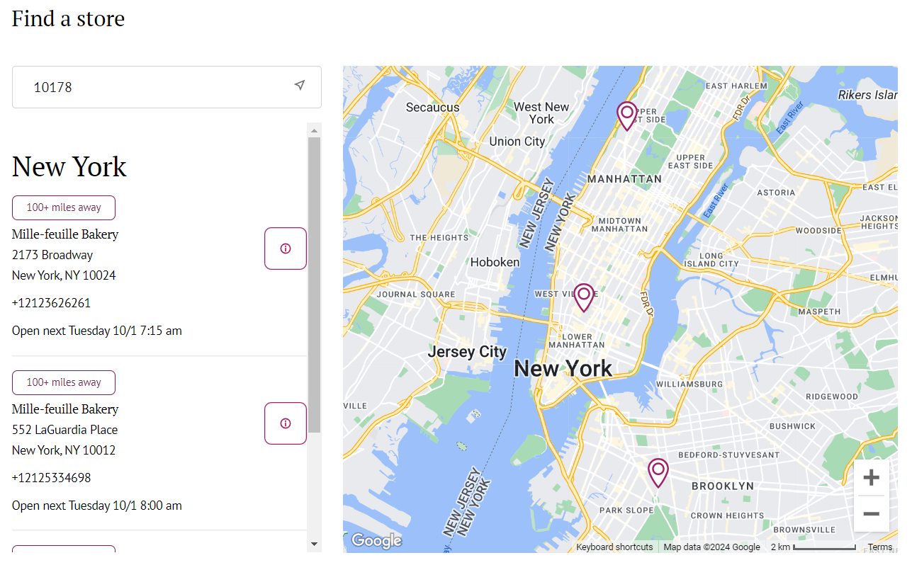 A list of bakery chain locations in New York
Along the same lines, include a contact form that can be used for more complex inquiries and questions that your FAQ page and chatbot do not cover. Specify what the form is for and how long it will take for you to get back to the sender to help them set realistic expectations.
How to create your own home bakery website with SendPulse
Our visual website builder has everything you need to create a single-page or multi-page bakery website and enhance it with features like online payments, email subscription widgets, live chat, and more.
Start by building a new website or selecting from our ready-made templates. Choose a design that reflects your bakery’s style — you can always tweak it in our drag-and-drop editor later.
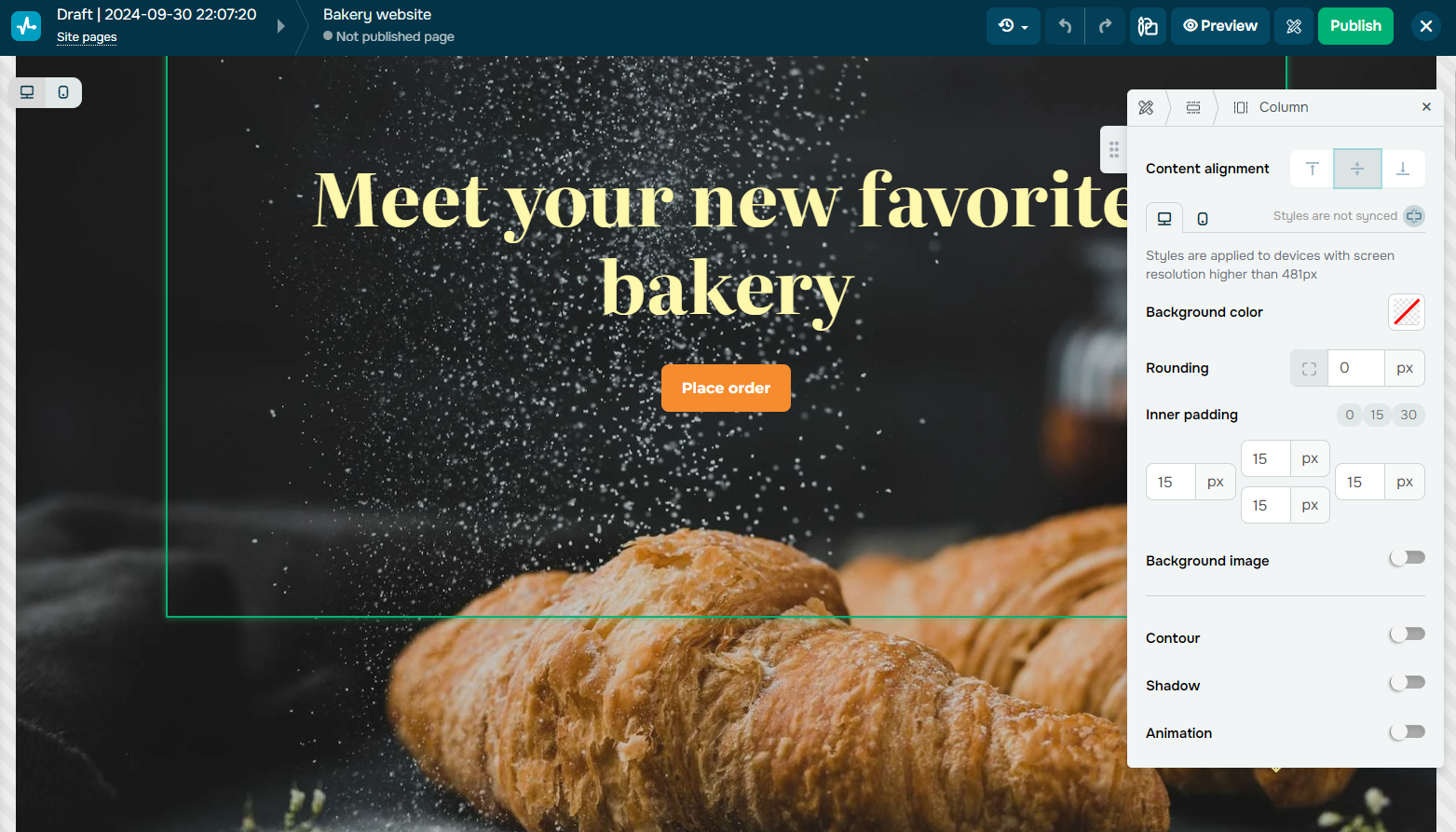 Creating a bakery website in SendPulse
After setting up your site, you can structure it using blocks, sections, and columns. Customize the layout with widgets, navigation menus, buttons, images, and text. With SendPulse, you can personalize fonts, sizes, line heights, and even generate or localize website copy using the built-in AI assistance.
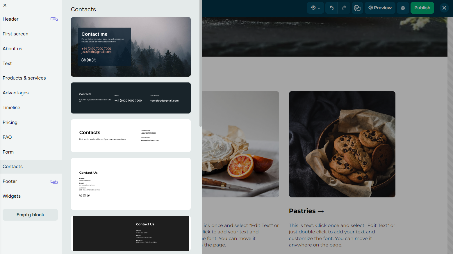 Editing a bakery website
You can also embed images or videos to showcase your bakery’s products in a more dynamic and appetizing way. For advanced customization, you can add extra elements using custom code.
Before publishing, preview your website to ensure everything looks and functions smoothly. Don’t forget to add metadata for better SEO visibility. Once satisfied, you can publish your website and monitor its performance directly from your SendPulse account.
Eager to implement the bakery website ideas you’ve just collected? With SendPulse, you can create a stunning page for your business and equip it with interactive widgets, engaging contact forms, surveys, and more. Our comprehensive help center will help you get up to speed in no time — no coding knowledge is required.
Take advantage of our free plan and give our platform a try!