When it comes to building a successful website, great content is only part of the equation. The way your content is presented can be just as important. A clean, user-friendly website layout helps visitors quickly find what they need and complete target actions like signing up for newsletters or purchasing.
In this post, we’ll discuss the key elements of effective website layout design and show you how to create a stunning layout with our website builder.
What is a design layout for a website?
A website layout is the way visual elements are organized on a webpage to guide users through content and help them find what they need. Effective website layout design can significantly enhance your website’s visual appeal, improve user experience, and support your website’s primary goals.
The best website layout design usually depends on its type and purpose. For instance, when designing a landing page, it’s important to focus on simple navigation and clear calls to action so visitors can easily take the next step, like placing an order. On the other hand, a blog layout should prioritize readability and a straightforward text structure to keep readers interested and engaged.
Why is a website layout important?
Website layout plays a crucial role for multiple reasons. Let’s explore some of them.
- Better user experience. A well-designed layout makes it easy for visitors to navigate your website. When information is organized clearly, users can quickly find what they need, which helps avoid their frustration and reduces bounce rates.
- Visual appeal. Website layout design greatly affects how aesthetically pleasing your webpage appears. An attractive and balanced design tends to grab more attention and create positive first impressions.
- Branding. Using consistent colors, typography, and imagery can help you establish a strong brand identity and build trust with your audience.
- Content prioritization. A thoughtful website design layout helps highlight key content to guide users to the most important information first.
- Device responsiveness. Good layout design ensures your website looks and works well on various devices and screen sizes, making it accessible to everyone.
- SEO benefits. Well-structured content makes it easier for search engines to crawl and index your website, which can improve your visibility in search results.
- Higher conversion rates. An effective design layout for a website can lead to higher conversion rates. By strategically placing CTAs and using engaging visuals, businesses can encourage users to take desired actions, such as signing up or purchasing.
As you can see, a well-thought-out website layout design is essential for engaging users and creating a positive first impression. It can significantly enhance your website’s visual appeal, effectively communicate your brand’s identity, and guide visitors toward taking action.
10 types of website layout design
With the almost endless technical possibilities available today, there are many types of website layouts to choose from, and new styles are constantly being developed. In this section, we’ll review some common layout types and what makes them unique.
Single-column layout
As the name suggests, a single-column design arranges all content in one vertical line. This simple, focused design typically has a narrower width and makes it easy for users to read and follow the content without distractions. It’s a popular choice for blogs and mobile-responsive websites where smooth content flow is essential.
Below is a single-column website layout from Penguin Random House.
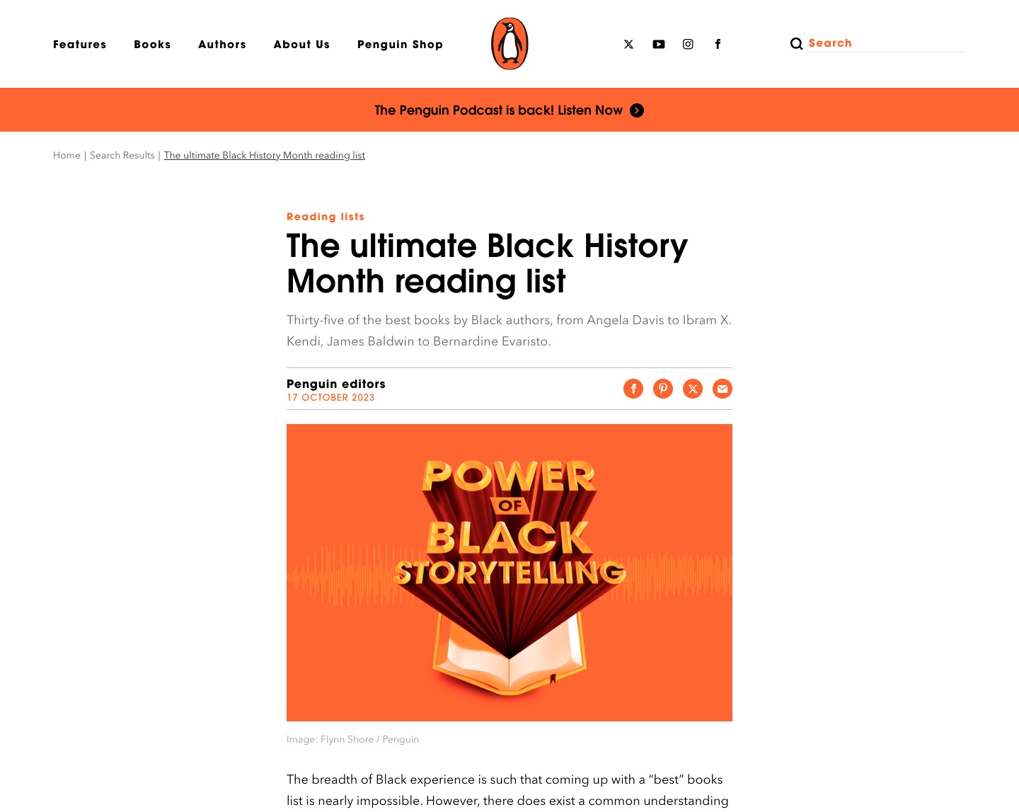 A single-column website layout idea
Split-screen layout
A split-screen layout divides a webpage into two side-by-side sections. One side might feature images, while the other shows text, creating a balanced look. This layout works well for highlighting two related pieces of content or providing visual and text-based information together.
Here’s a split-screen website layout from RedLight.
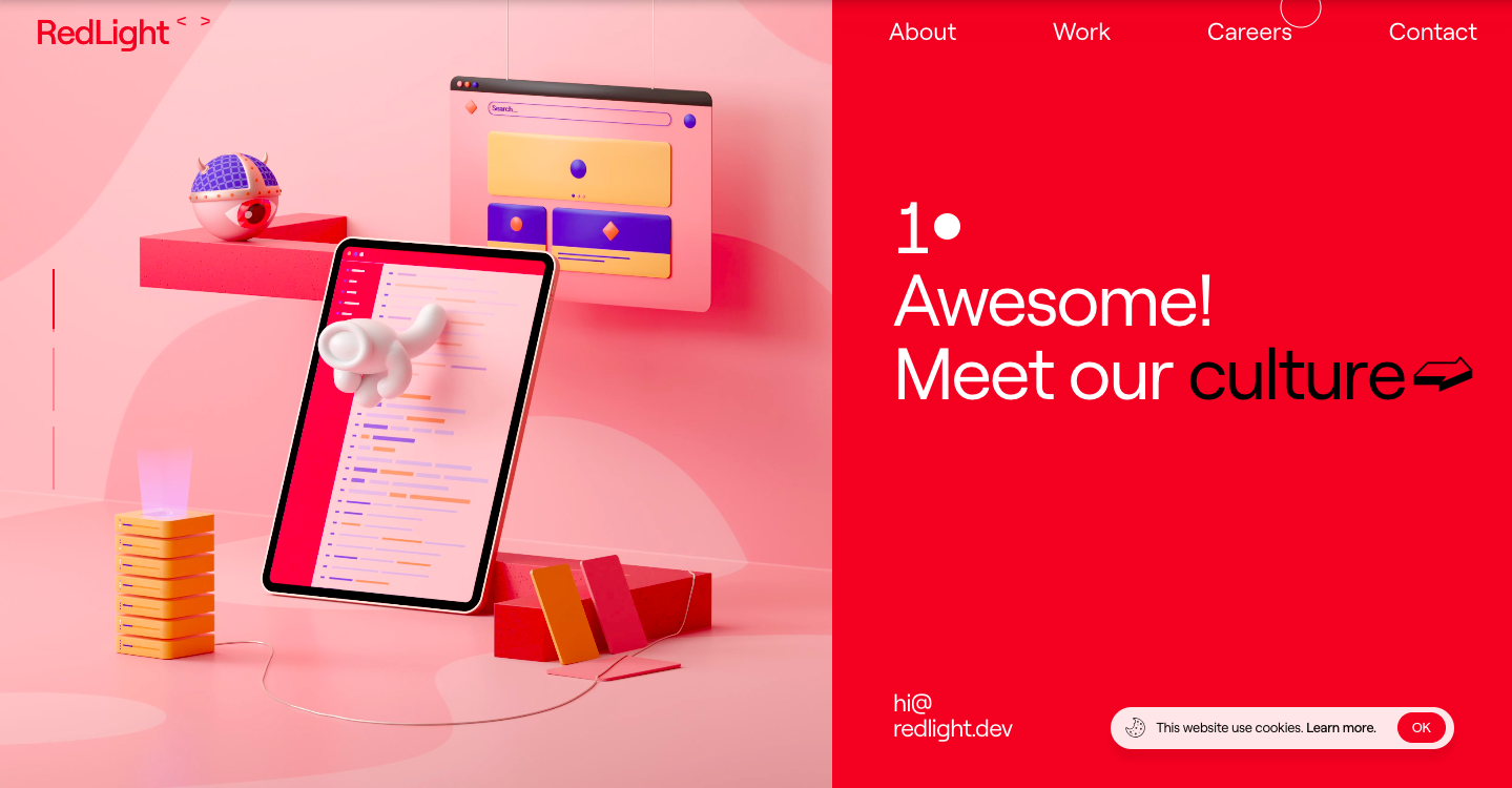 A split-screen website layout idea
F-shaped layout
This type of website layout design matches the natural way people read, following the shape of an “F.” Users scan the top horizontally, move down slightly, scan again, and then continue down the left side. This layout is ideal for text-heavy pages like blogs and news sites, as it helps keep important information in the most viewed areas.
The Boston Globe website below uses an F-layout.
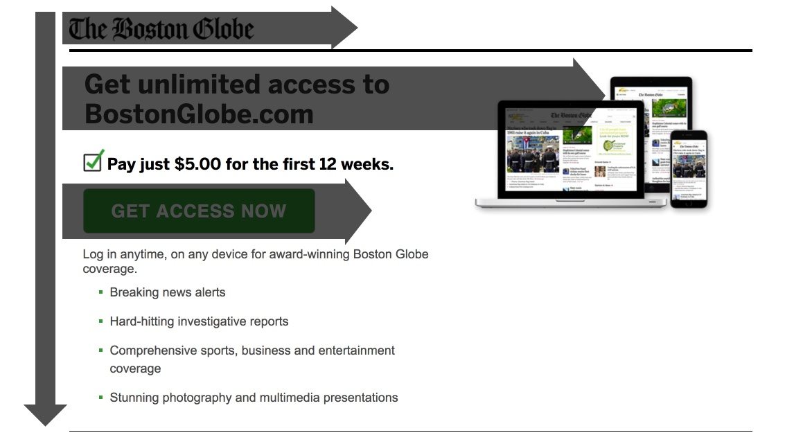 An example of an F-shaped website layout design; source: Instapage
Zig-zag layout
The zig-zag layout also follows a natural reading pattern and is ideal for pages with less content. Such a layout guides the users’ eye from the top left to the top right, then diagonally down to the bottom left, and finally to the bottom right. It’s a great choice for landing pages and websites with strong calls to action because it effectively directs viewers’ attention to key areas.
The Artykul website example below shows a zig-zag layout.
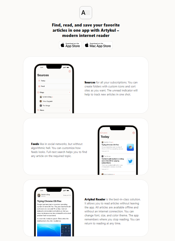 A zig-zag website design layout idea
Grid layout
A grid layout arranges content in rows and columns for a clean, organized look that’s easy to navigate. There are different types of grids, so the exact website layout designs can vary. For instance, grids can have uniform columns and spacing, or they can use cells of different sizes to highlight specific content. This layout is especially popular for portfolio websites and eCommerce platforms because it neatly balances images and text.
Check out the grid layout from iHeart below.
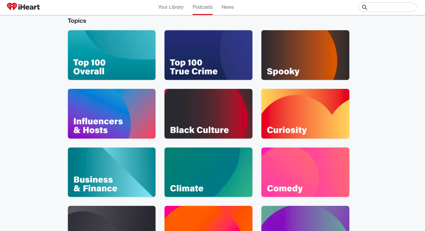 A grid website design layout idea
Card layout
A card layout displays content in individual boxes or cards, making it easy to scan and visually appealing. It’s a popular choice for online stores and portfolio websites, as it lets users browse multiple items or pieces of content at once
Right below, you can see the card layout on the Paula’s Choice website.
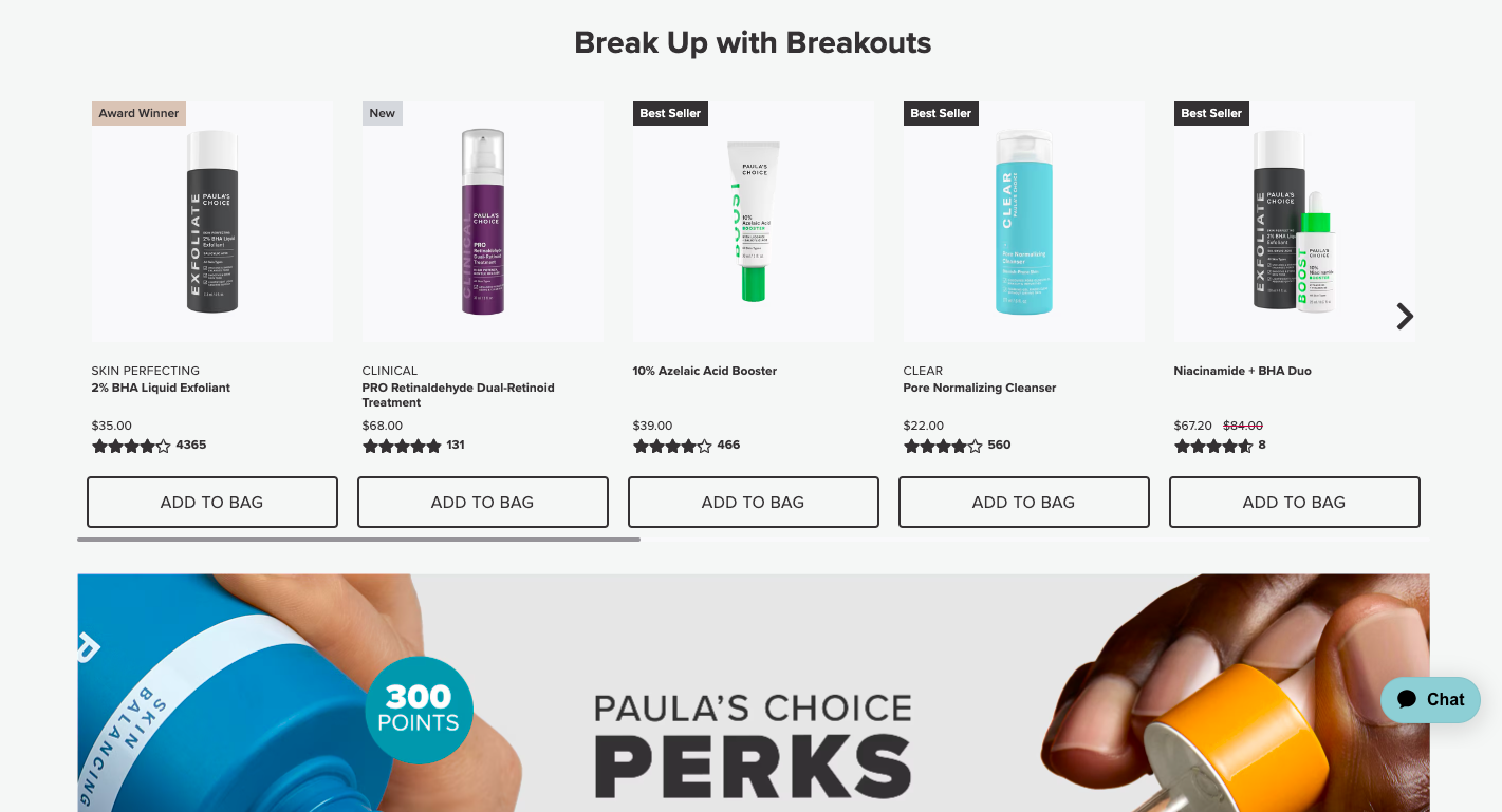 A card website layout idea
Hero layout
The hero layout, commonly used by SaaS companies and on landing pages, typically includes a full-screen image of a featured product or service. Surrounding text is often arranged in a simple pattern, like a zig-zag. To avoid overwhelming the viewer, the large image is often balanced with ample negative space, creating a cleaner and more visually appealing website layout design.
Below, you’ll find a hero website layout by Tesla.
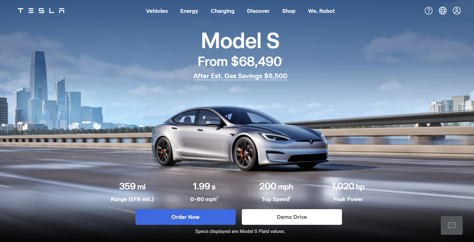 A hero website layout idea
Asymmetrical layout
The asymmetrical layout breaks away from traditional symmetry to create a more dynamic, modern look. This style is popular with creative agencies and fashion websites where the focus is on uniqueness and originality.
Take a look at the asymmetrical layout from Home Société.
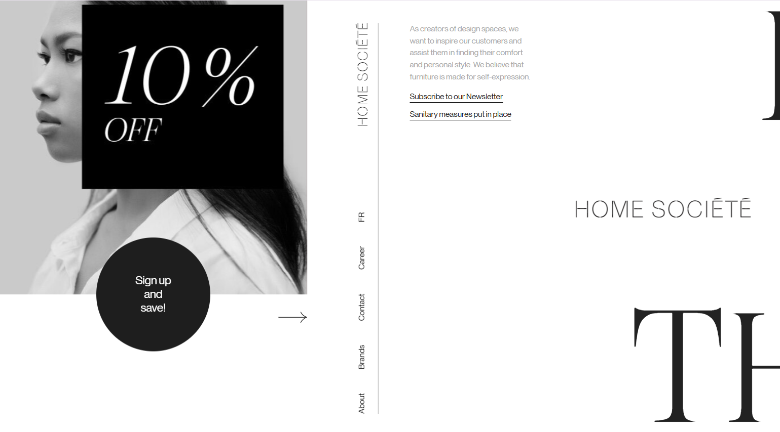 An example of an asymmetrical website layout design
Magazine layout
Inspired by print magazines, the magazine layout uses multiple columns, images, and various content types. It’s ideal for news websites or lifestyle blogs that offer a wide range of articles and media.
The following is a magazine layout from The Washington Post.
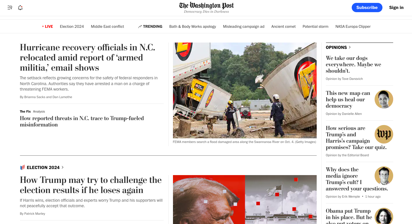 A magazine website design layout idea
Full-screen image layout
The full-screen image layout features a large visual that covers the entire screen, with minimal text or other elements. It may include some text or overlay elements, but the image remains the primary focus.
Here’s an interactive full-screen image layout from Species in Pieces.
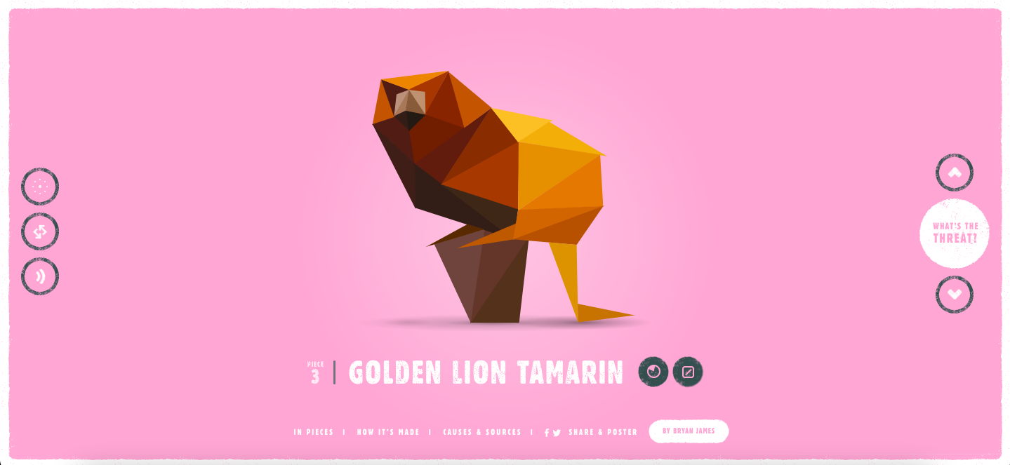 A full-screen image website layout idea
Tips on how to design a website layout
Now that you have settled on a website layout type, let’s go through some best practices for actually designing an attractive website layout that is both functional and user-friendly.
Choose a style
If you already have a business or an online presence on social media, chances are you’ve established some branding elements like fonts, logos, color schemes, and button styles. If not, now is the perfect time to pick a specific style for your website to make it look professional and cohesive.
Choosing colors that complement each other can greatly enhance your website’s visual appeal. A helpful approach is to use a color wheel to find complementary colors. You can also experiment with different shades of the same color or create harmonious color schemes, such as warm or cool tones.
This website design layout idea from DiME uses a pastel color palette. When users hover over product boxes, the background color changes, adding an interactive touch that engages their audience.
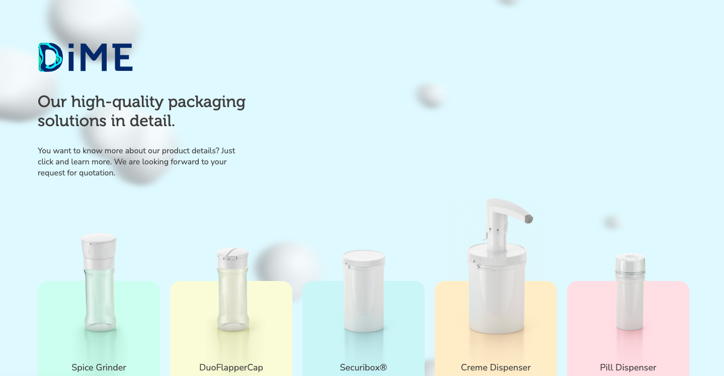 A website layout style from DiME
With SendPulse, you can set a template style before building your website layout so that your color scheme and text style will automatically apply to all the elements you add. This can help you save time and create a consistent look without manually adjusting every website element.
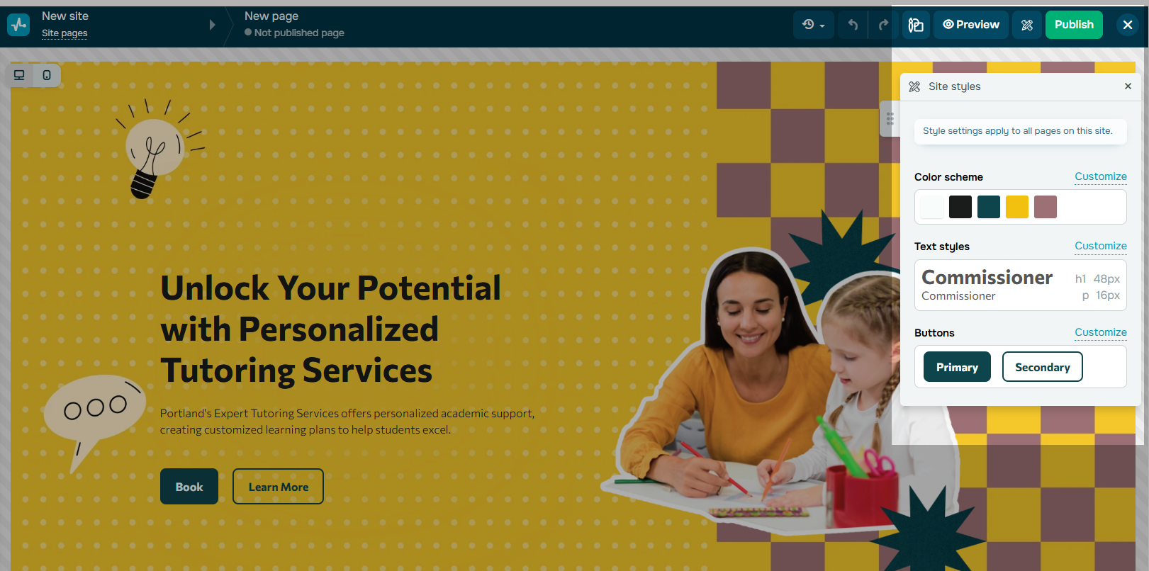 Setting a style of a new project in SendPulse
Use grids and columns
Selecting a specific website layout design type is a great way to make your website visually balanced and cohesive. Consistent layouts guide users smoothly through your content and make navigation feel intuitive. While grids and columns are great for this, an asymmetrical layout can also be a good choice if you want to showcase creativity and highlight your brand’s personality. Just make sure the design you choose aligns with your brand’s goals and speaks to your target audience.
In the example below, Apple organizes information with grids and boxes, separating key focus areas visually. This approach makes navigation easier by helping users quickly find what they’re looking for.
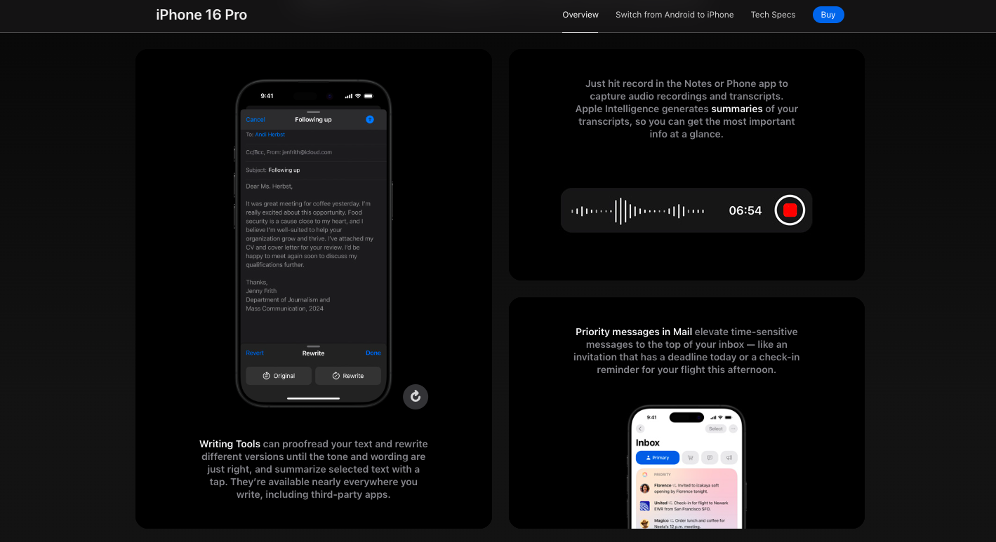 Website layout design from Apple
With SendPulse, you can easily structure your website using blocks, sections, and columns. Leaving some blocks empty can create negative space to keep your layout clean and uncluttered. Additionally, SendPulse offers pre-designed blocks for common elements like FAQs, footers, and contact information, making it even easier to build your website from scratch.
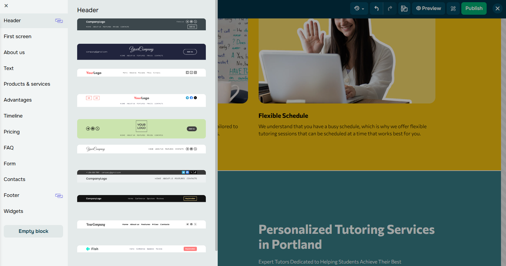 Browsing pre-made blocks to design a website layout
Create clear navigation
An effective website layout design should have a clear navigation menu that allows visitors to find information effortlessly. Use simple, descriptive labels for each menu item, and add drop-down menus for subcategories so users can quickly locate the correct section without getting lost.
On the Bershka website, users can easily explore different sections with a drop-down menu organized by men’s and women’s fashion. There’s also a section with pre-made looks that users can access directly by clicking one of the boxes on the right.
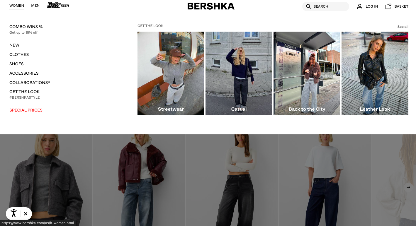 A navigation system on the Bershka website
In a visual website builder like SendPulse you can add a Menu widget to the top of your website. This widget is easy to customize and allows you to link to different blocks.
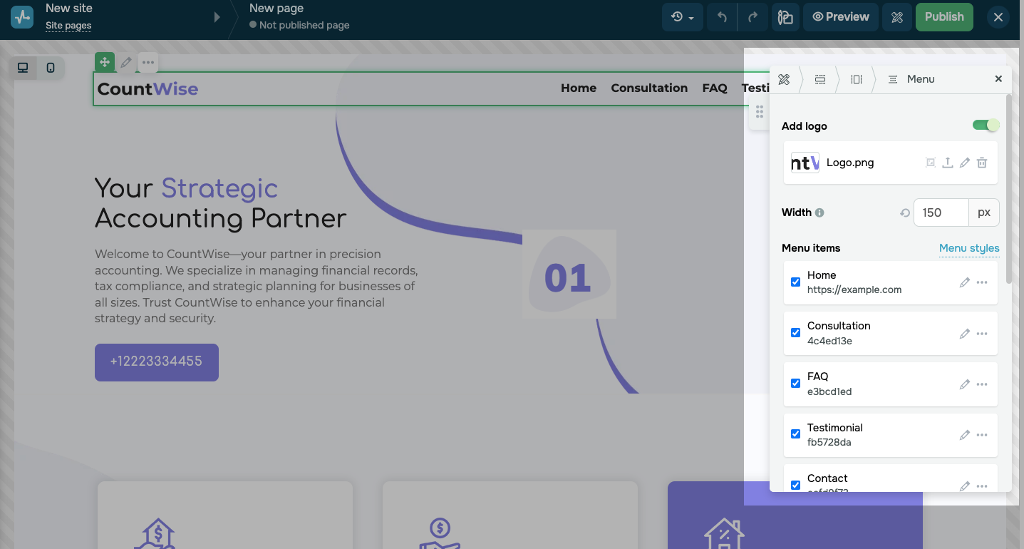 Customizing a website menu
Focus on typography
Start by picking fonts that are easy to read and keep a consistent style across your site. You can use font size, weight, and color to create a visual hierarchy, making it clear which information is most important.
It’s also helpful to choose fonts that work well together. Here are some combinations that usually look good:
- serif and sans serif, like Georgia and Helvetica;
- modern and classic, like Futura and Baskerville;
- bold and light, like Montserrat Bold and Open Sans Light.
Limit your design to just 2 or 3 fonts to keep your layout cohesive. Using too many styles can make your design look cluttered. Also, avoid overly decorative fonts for large text blocks, as they can make reading difficult.
Below is a website layout idea from Pink Chili, a Gen-Z-focused agency that uses bold fonts and catchy slogans to showcase their unique style.
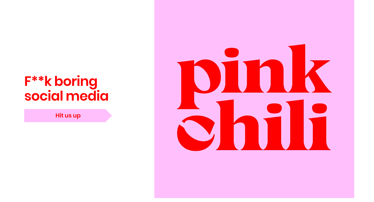 A typography example on the Pink Chili website
SendPulse lets you customize your fonts by adjusting the size and line height. Plus, with its seamless ChatGPT integration, you can create website copy more efficiently.
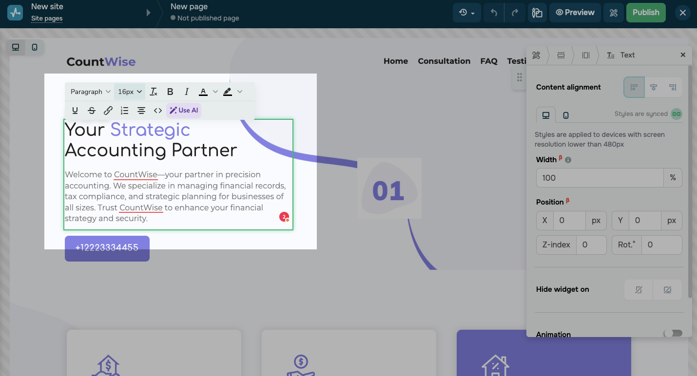 A text editor in SendPulse
Incorporate visuals
Visuals play a key role in website layout design because they grab attention and communicate information quickly. High-quality images, videos, and graphics break up text and improve the user experience. If you don’t have your own visuals, stock libraries are a great option.
For example, Arctic Adventures uses large visuals in a carousel to showcase different tours and inspire bookings. This layout approach lets users preview a variety of trips.
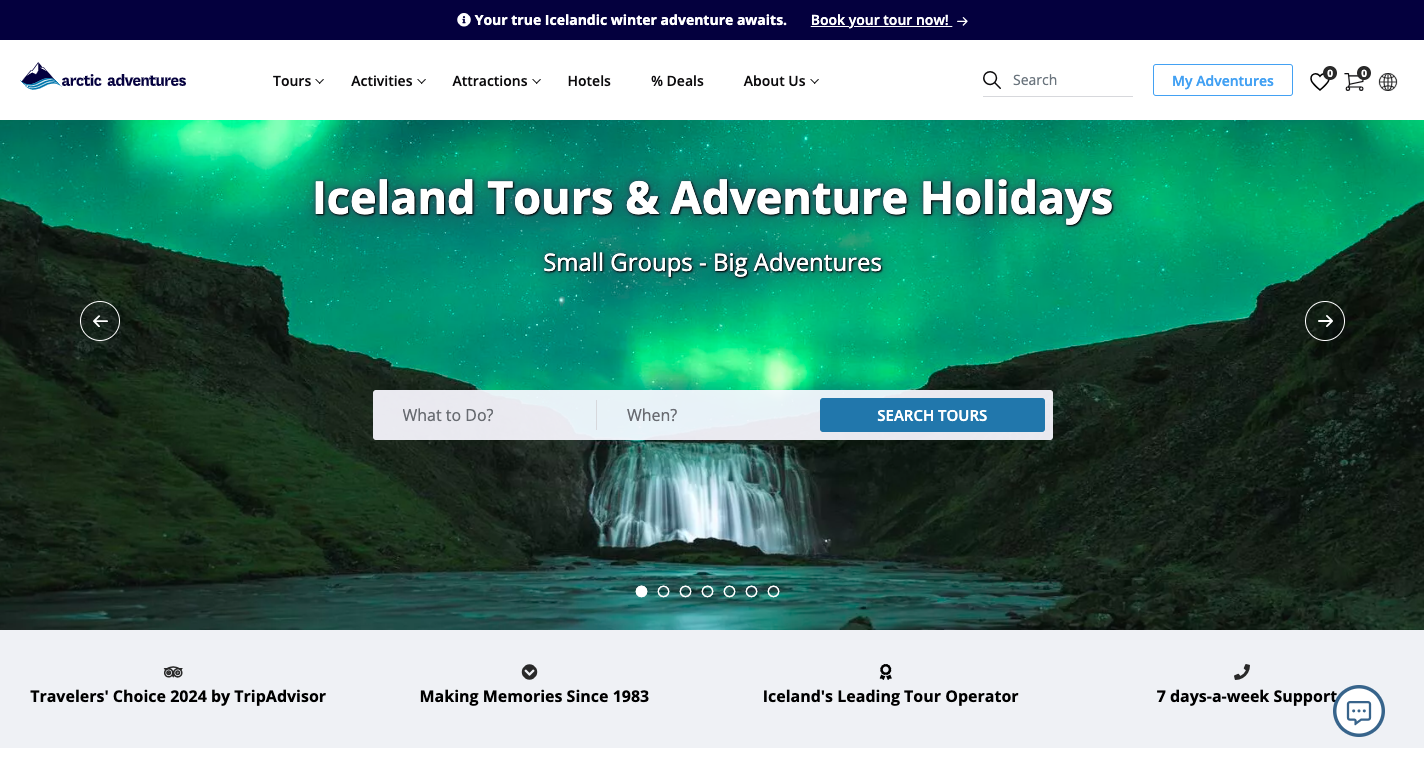 Incorporating visuals in the website layout design
SendPulse’s image editor allows you to enhance your visuals easily. You can crop, rotate, flip images, add shapes and stickers, draw lines, and apply filters. With the gallery feature, you can arrange images in a carousel, grid, or collage to create a cohesive look.
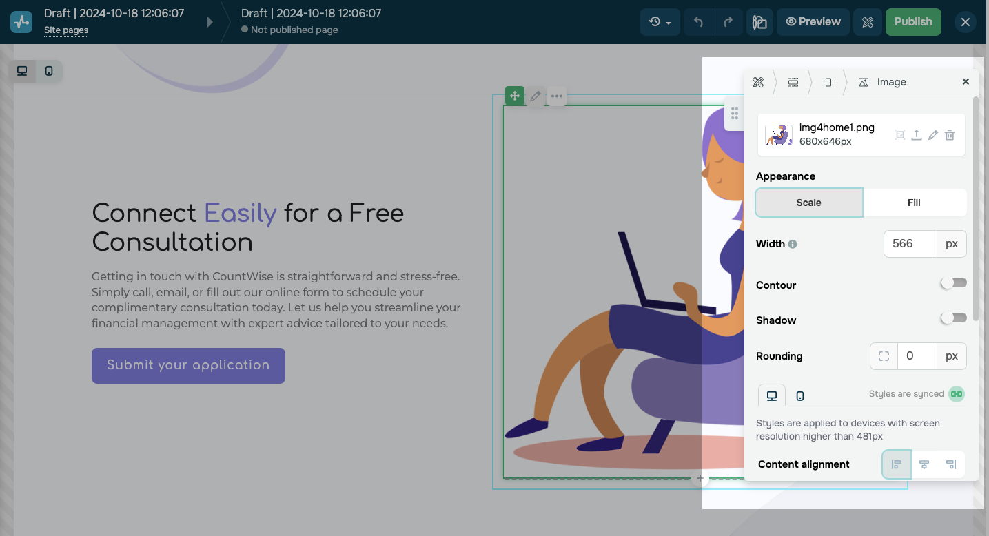 Adjusting an image in SendPulse image editor
SendPulse also lets you embed videos via URLs. Just select the platform where your video is hosted, and you can customize the preview to match your website’s style.
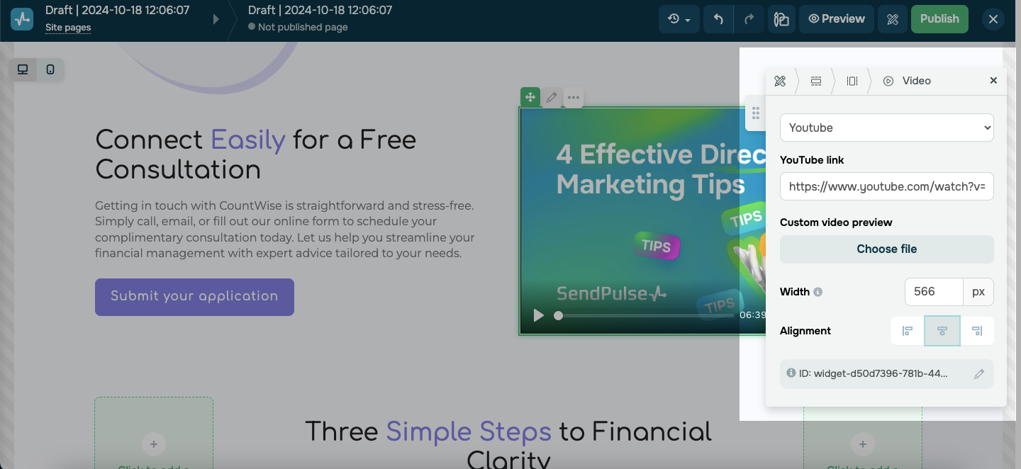 Embedding a video from YouTube on the website
Ensure mobile responsiveness
As of late 2023, mobile devices made up 53.42% of global website traffic, according to Statista. With so many users visiting sites on their phones, mobile-friendly design is essential. Make sure your website layout design adapts to different screen sizes and loads quickly, especially if it includes multimedia or heavy design elements.
For example, the Rains website has a clear navigation structure, with menu items on the top left and search and cart icons on the right, plus a chatbot widget at the bottom.
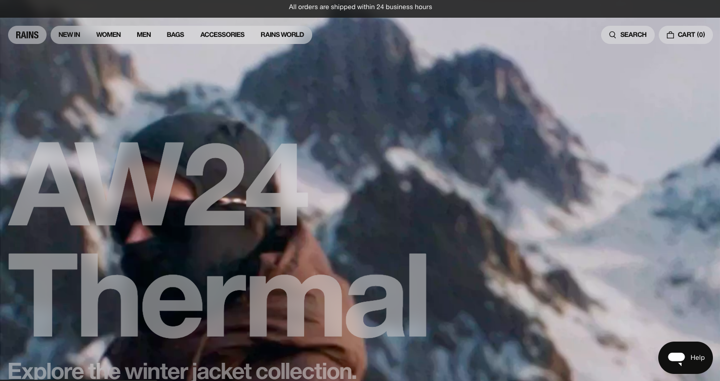 A desktop website layout design from Rains
On the mobile version, the navigation becomes more compact — menu items are unified, descriptions are removed, and only the search and cart icons remain.
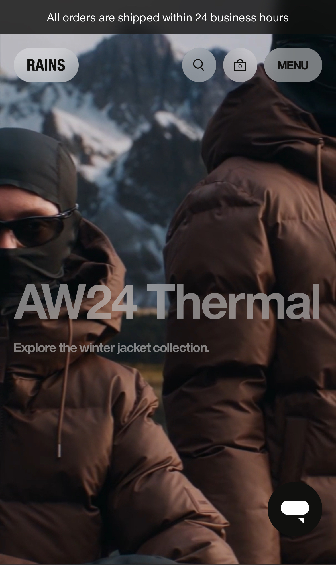 A mobile website layout design from Rains
SendPulse templates are fully responsive, so they look great on any device. By clicking “Preview,” you can check how your website will appear on different screens. You can also adjust the mobile version manually, including editing elements, font settings, and hiding specific blocks if needed.
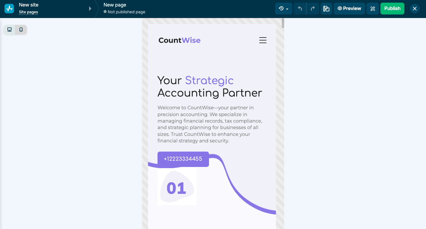 Previewing a mobile website version
Add animation
While not essential, animation can make your website more lively and engaging. Subtle animations like transitions, hover effects, and background movements capture users’ attention and make the experience more interactive. Animation can also guide users through your website layout design, drawing their focus to key elements like “Sign up” or “Add to Cart” buttons. This helps visitors navigate your website more intuitively.
For instance, Instagram created a website to showcase their custom font, Instagram Sans. The website uses animated blocks and elements to make the browsing experience more interactive.
Instagram Sans website animation
With SendPulse, you can add animations to various website elements, including text, buttons, images, and columns. You can choose from several animation types, such as fade, scale, slide, or scrolling ticker, right in the settings.
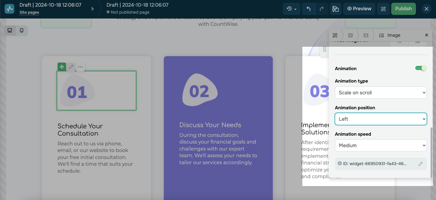 Adding animation to a website image
The bottom line
When it comes to questions about how to design a website layout, there are plenty of options to explore. By following the tips in this post, you can choose a layout style that fits your needs and make the most of it.
If you’re ready to start designing your website layout, SendPulse offers an intuitive website builder that makes it as easy and intuitive as it gets. You can create a fully custom website from scratch or customize one of many high-quality pre-made templates and tailor it to your needs. Plus, SendPulse lets you add smart features like chatbots and pop-ups all in one platform.