A landing page is an enormously effective tool to attract customers, subscribers, and leads. After spending hours making a page and pouring money into PPC ads and email campaigns, you may get tons of visitors, but next to nothing in clientele growth.
There are two ways to deal with it: shrug your shoulders and say “it happens” or attempt to boost the landing page conversion rate. If you decided to strive for a better rate, it’s time to revise the website design, take another look at the copywriting, or add some psychological hooks for consumers.
Design tips to boost landing page conversion
Never underestimate the significance of the website’s visual appeal, you only have around 50 milliseconds to impress a new visitor. In contrast, improvements made in landing page design can multiply your conversion rate. And the best way to implement useful changes is to start from the very beginning.
Create a landing page structure
Let’s start with some good news — you don’t have to be a genius to create a great landing page. The most important thing is to use a structure for the page, which has proven its effectiveness.
Here are some of the pivotal elements every landing page should include:
- An attention-grabbing headline
- Relevant images
- A compelling and prominent call to action
- A simple subscription form to collect all the essential information
Putting all these parts into the right places might seem confusing. However, anyone can make a great landing page with the help of website builders that offer free templates. Check out our comparison of popular website builders to save some time and effort.
Use color psychology
It only takes 90 seconds to make a subconscious judgment about a product. Interestingly upwards of 90% of this assessment is based on color alone. Choosing the proper color of your page is crucial to increase landing page conversion rates.
It is a good idea to use hues that reflect the design of your company’s main website — this trick helps visitors link your landing page with your brand, which increases their trust in the page.
Think about your product and the association you want your leads to have with it. For instance, people unknowingly connect orange with fun, black with luxury, and blue with security. See how TransferWise accentuates their reliability by using dark blue for their landing page.
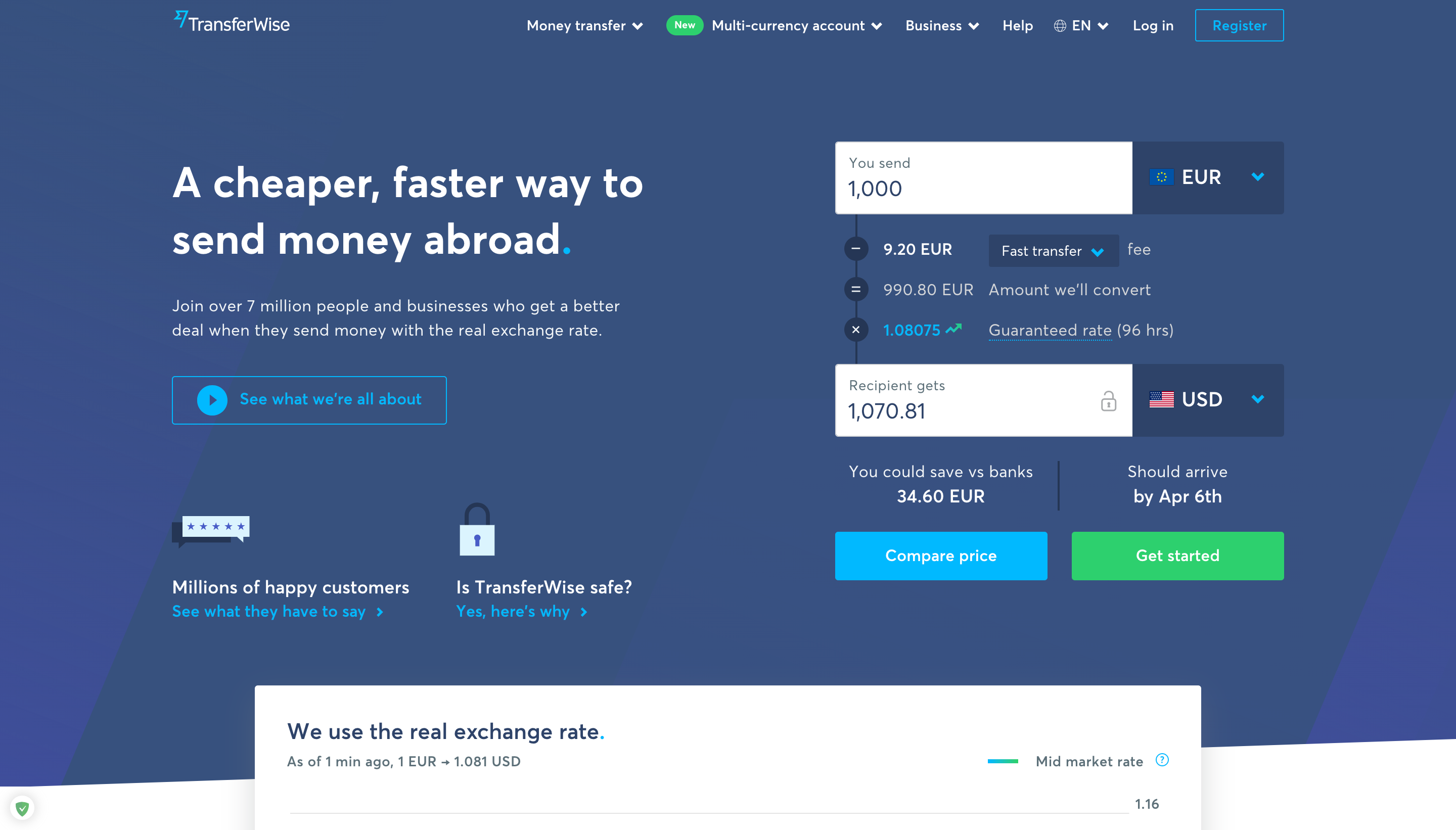 A fragment of the TransferWise landing page
Add pictures effectively
As most people perceive information mainly through visual elements, images are more likely to improve a landing page conversion rate. Just be sure to use them effectively. But what does that mean?
Well, images on your landing page should match these criteria:
- High-quality
- Attention-grabbing
- Relevant
And if it is more or less clear with the first two points, the relevancy question might need some more explanation. Should we only use product shots or images of people using our product? A relevant image is any image that emphasizes and reinforces the statement it illustrates.
HelloFresh used well-produced, eye-catching, and relevant shots. Notice how the image below supports their message about simplicity, health, and having fun while cooking.
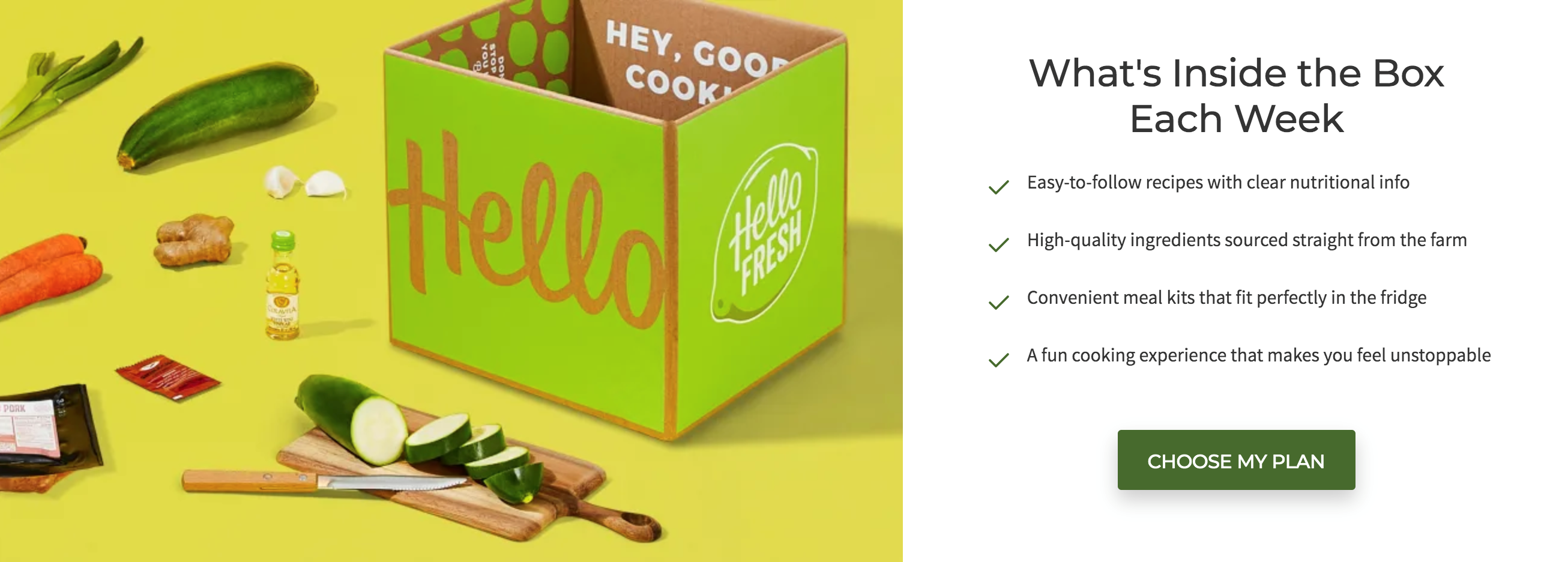 A fragment of the HelloFresh landing page
Speaking of catching one’s eye, it is worthwhile to use unique photos, sketches, or other kinds of illustrations rather than photo stocks or basic product shots when possible. However, if you can’t avoid using stock photos, at least try to find good ones that are rarely used.
Use custom infographics
On average, conversion rates for companies using custom visual content is seven times higher than those without. And infographics can improve website traffic by 12%. So, using infographics not only helps boost the landing page conversion but also attracts new customers without increasing your budget.
Luckily, you can represent almost any type of information with infographics: arrays of data, ratings, processes, you name it. Here is an example from HubSpot showing how to use the platform to illustrate social proof.
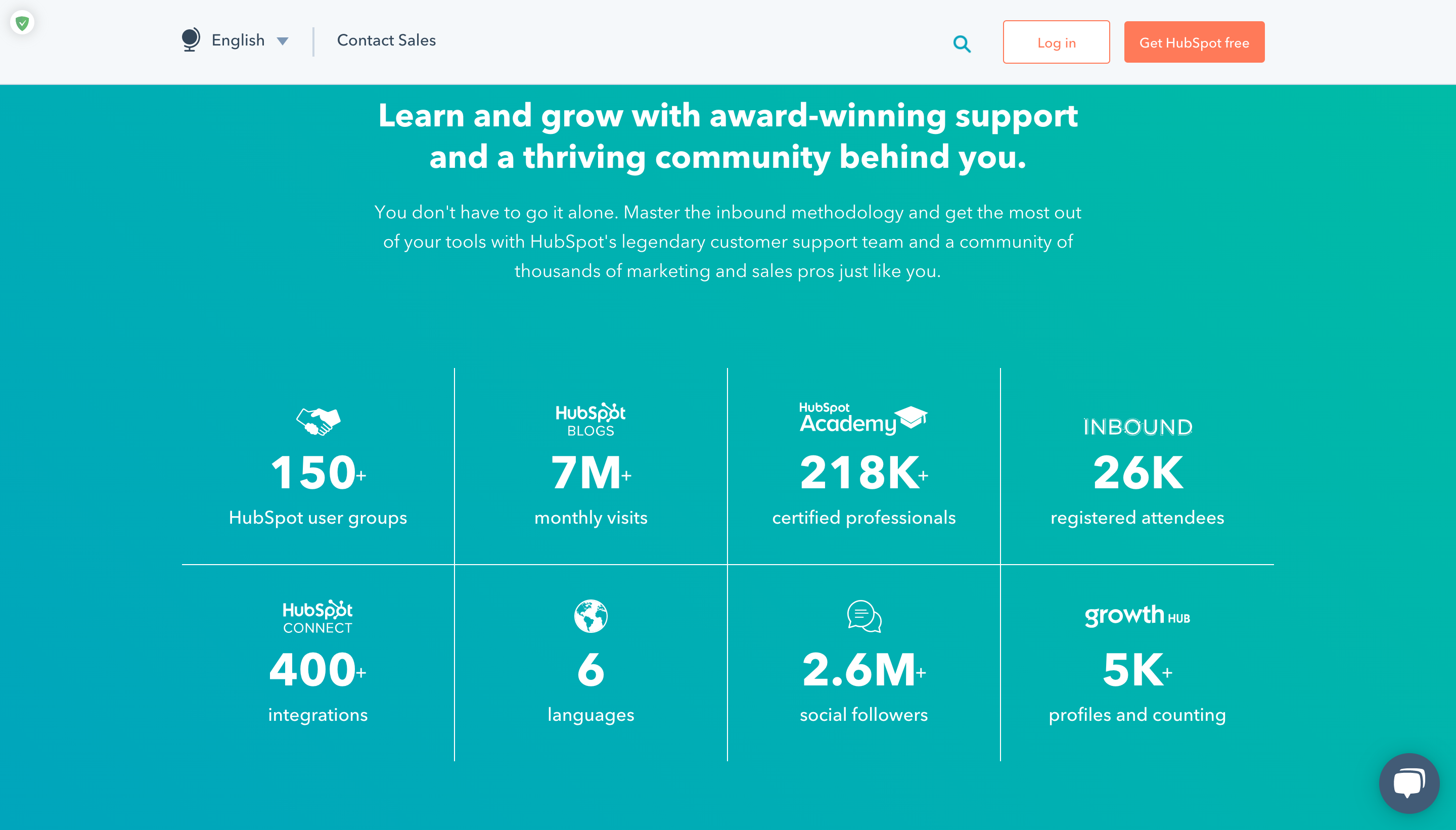 The infographics on HubSpot’s landing page
Another advantage of infographics is that you don’t need to hire a designer to make them. There are tons of tools to help anyone produce custom images. Check our guide on how to create great infographics from scratch.
Employ good video content
Video is considered to be among the most engaging types of content. While visitors hardly ever read all of the text on a webpage, 52% of viewers watch a video all the way to the end. But more importantly, videos are profitable: 80% of video marketers claim that this type of content has helped them increase sales.
However, there are some rules you should follow to enhance your landing page conversion rate with the help of the video. First of all, keep it short — if a video is more than 20 minutes, only 25% of viewers will watch it to the end. Vidyard, an online platform for helping businesses create promotion via video content, recommends limiting a landing page video to between 30 and 60 seconds.
Make sure the video is adapted for different screen resolutions — for this purpose, you’ll probably have to experiment with sizes. To avoid distortion, keep a standard aspect ratio like 16:9. A convenient way to find the right video size is to use an aspect ratio calculator. This one also contains a cheat sheet with typical proportions for various devices.
And finally, be careful with auto-play — there are few things more annoying than a video that started playing out of the blue. The video on the SharpSpring landing page begins to play after a click, lasts less than two minutes, keeps the viewer engaged, and provides a detailed overview of the product.
The video on the SharpSpring landing page
A CTA button is an essential part of any landing page; that’s why you should do your best to make it eye-catching, relevant, and precise. We’ve already published the ultimate guide on how to optimize your call to action.
Let’s just sum up the main points about the visual side:
- use a vibrant and contrasting color for your CTA button;
- make the button big enough to be easily noticed;
- leave some space around the button, do not overwhelm visitors with text or visual elements;
- choose the right location following the user’s eye-sight movement.
WordStream nailed it with their CTA button — it’s bright orange and situated at the top of the page right after the headline and offer. Besides, the company repeats the flashy CTA button near the bottom of the page and uses muted colors for additional buttons and links.
CTA buttons on the WordStream landing page
Copywriting hacks for high landing page conversion
Although the web page’s visitors commonly pay less attention to the text than to visual elements, a good copy is still vital for increasing landing page conversion. In the end, writing is the only way to make a proposal to the client. And the first goal is to make a strong impression with your page’s headline.
Compose an attention-grabbing headline
A prominent headline draws immediate attention when a person visits your webpage. Marketers offer different formulas, such as using numbers or the phrase “How to,” but each of them should be tested — there is no one size fits all approach to creating a headline.
However, there are some rules worth following to create a good headline for your landing page, it should:
- inform visitors about the product that you are offering;
- be straightforward;
- be relevant to the offer you’re about to make them;
- reflect your customers’ pain points and offer a solution.
Instapage got it right with their headline, which addresses the consumer’s pain points and shows the value of their solution, reflects the product and stays clear and concise.
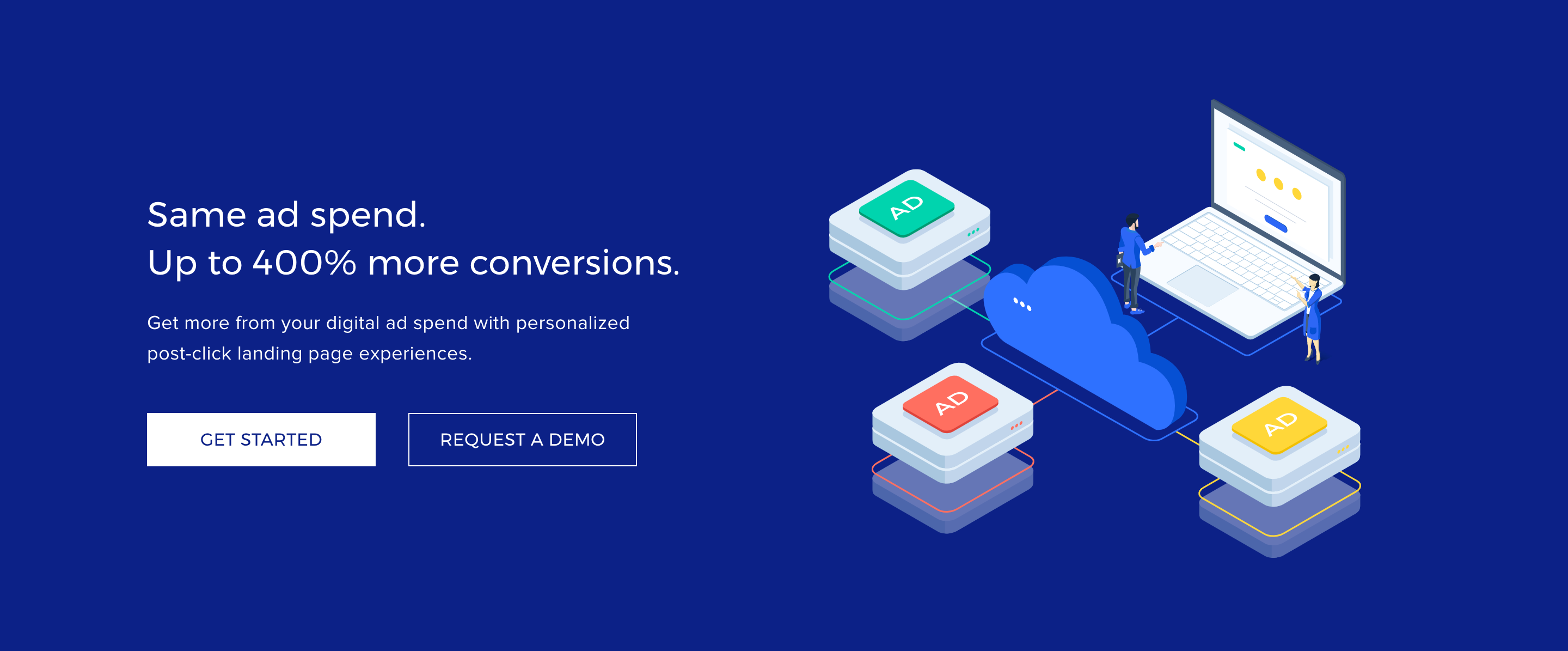 A headline on the Instapage landing page
Get to know your audience
Targeting the right audience is the key to better conversions. However, a lot of businesses don’t have precise information about their target audience and limit themselves with vague characteristics, like “30-year-old women” or “SaaS companies.”
This approach to customer personas leads to a lack of trust in your proposal; if you don’t understand your clients, you can’t address their pain and don’t speak their language. To fix it, try to spot your clientele — our guide on how to create a customer profile will help you. Then figure out what your customers should know about your product, and what feelings you want to provoke with your landing page.
Edupath targeted adolescents’ parents with one of their landing pages. The company covered the main points: the need to prepare children for college, desire to stay in control of the learning process, and fear of losing good relationships with teens.
Edupath landing page
Only make one clear offer
Keep in mind that limiting yourself to one offer per landing page will increase your conversion rates. Pages with only one call to action have an average conversion rate of 13.5% while conversion for pages with five or more links is 10.5%.
If your landing page contains two or more unique CTAs, it is better to focus on the most important one or establish more landing pages to keep things simple on each one. Uber uses different pages for their drivers and customers, targeting to employ the first group and attract the second.
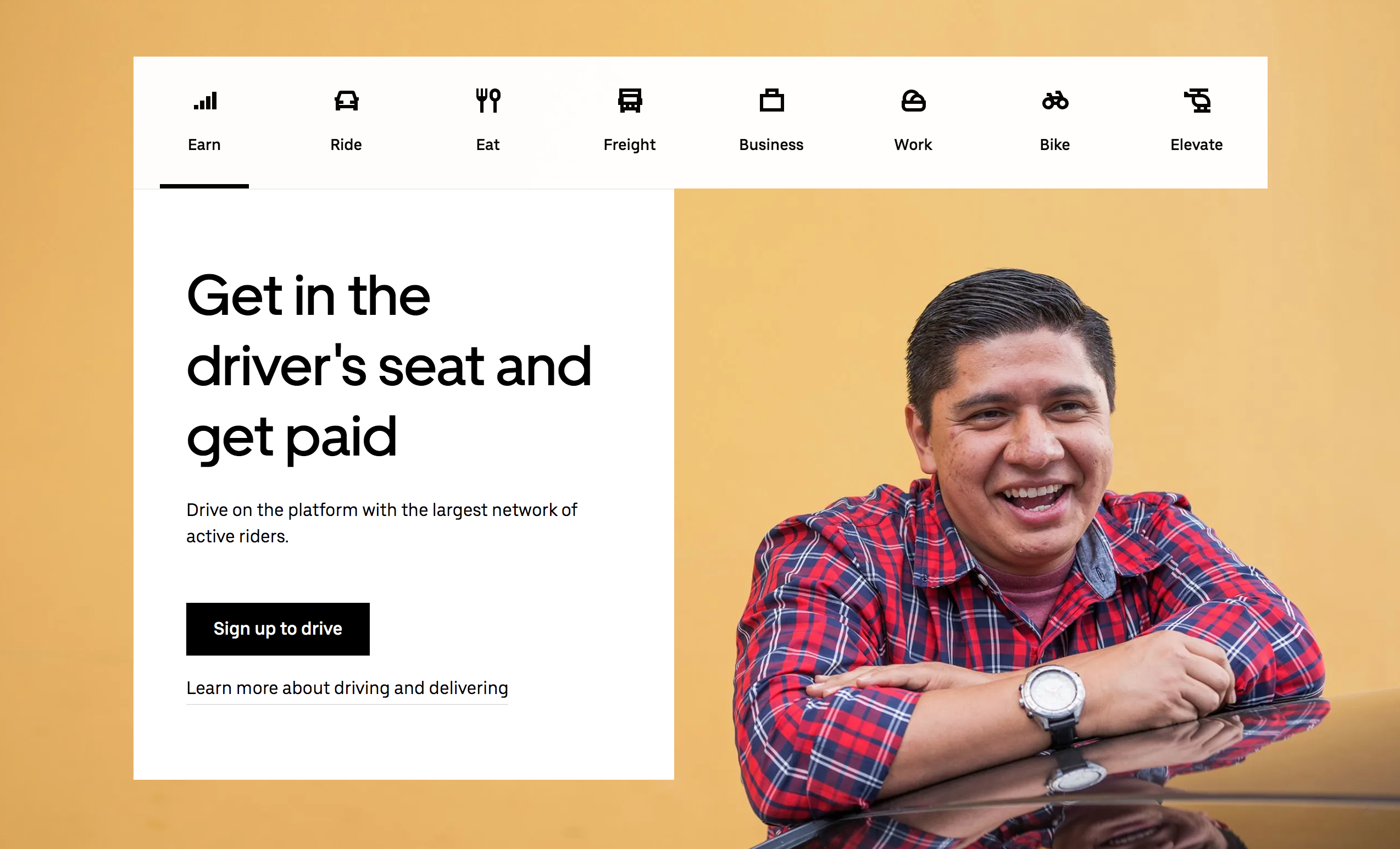 Uber landing page for drivers
Although the pages are different, Uber makes a clear offer on both of them straight away. Everyone can understand what this page is about and what the company is proposing to them.
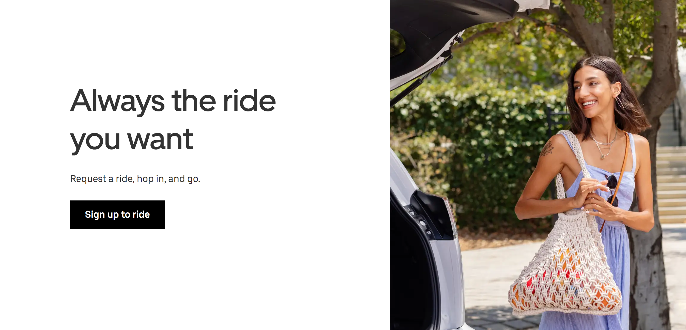 Uber landing page for customers
Use your body copy to skyrocket landing page conversions
Besides a killer headline and a clear offer, the landing page copy should cover other crucial points: the pain of your potential customer, the solution to combat it, the main features of your product, and the benefits of using it.
Knowing and mentioning the pain of your customers is the best way to quickly build trust and rapport. It shows that you know them, sympathize with them, and care about them. To make it more clear, you should phrase your offer as the solution to their problem and accentuate the interconnection between their problem and your solution.
Speaking of features, give more precise information about the product you offer. How does it work, what does it consist of? Give all the information a consumer needs to react to your call to action. Show visitors how their situation will improve and what value your product can bring to them. For instance, Square emphasizes its product’s swiftness, data collection, and cross-platform approach.
Square landing page copy
Make your text logical and easy to skim
It might be tempting to make your landing page a long read, but this usually has diminishing returns. Again, visitors likely won’t read every word on the website. Moreover, huge blocks of text can even scare them off and lead to a drop in your conversion rate. According to Unbounce, landing pages with 100 or fewer words convert better than pages with more than 800 words.
Number of words on a page versus conversion rate
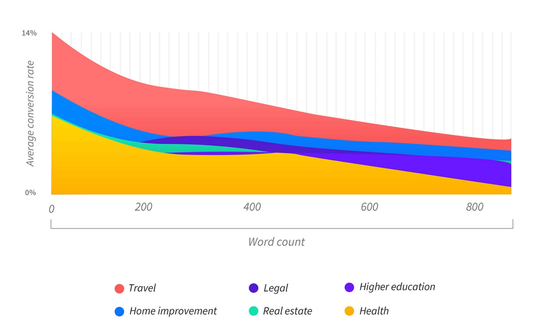
However, users need to get all the information to make a decision, so think about how to deliver it while being concise. Use headlines and bullet points, so visitors can quickly look through the text and still understand your message.
Make sure your copy is readable and easy to comprehend — split complex sentences into short and simple ones, replace difficult words with simple substitutions, get rid of any extra information that visitors do not need.
Keep your copy short and sweet like Crazy Egg did on their landing page. They only use a headline, subheading, and CTA while still showing all the necessary information about their product’s benefits after a user clicks “Learn more.”
Crazy Egg’s brief landing page
Psychological tricks to increase your landing page conversion rate
Even with a flawless design and precisely targeted copy, it is not a crime to use some techniques that play on human psychology. They will help you work with each person’s attention span to make your offer more persuasive.
Consumers often have a lot of doubts about paying for services, especially if they are just learning about the brand providing it. The more complex the product is, the more people tend to hesitate. To diminish this uncertainty, add extra value to your CTA.
Here are some examples of added value that can stimulate a visitor to click on a CTA button:
- money-back guarantee;
- free trial;
- additional services;
- price slashing.
Look how Credit Repair reinforces their CTA by adding extra value in the form of a free 10-minute credit analysis. On the one hand, this measure assures a customer that they have nothing to lose. But on the other, after getting free service consumers may feel an obligation to pay for the full product.
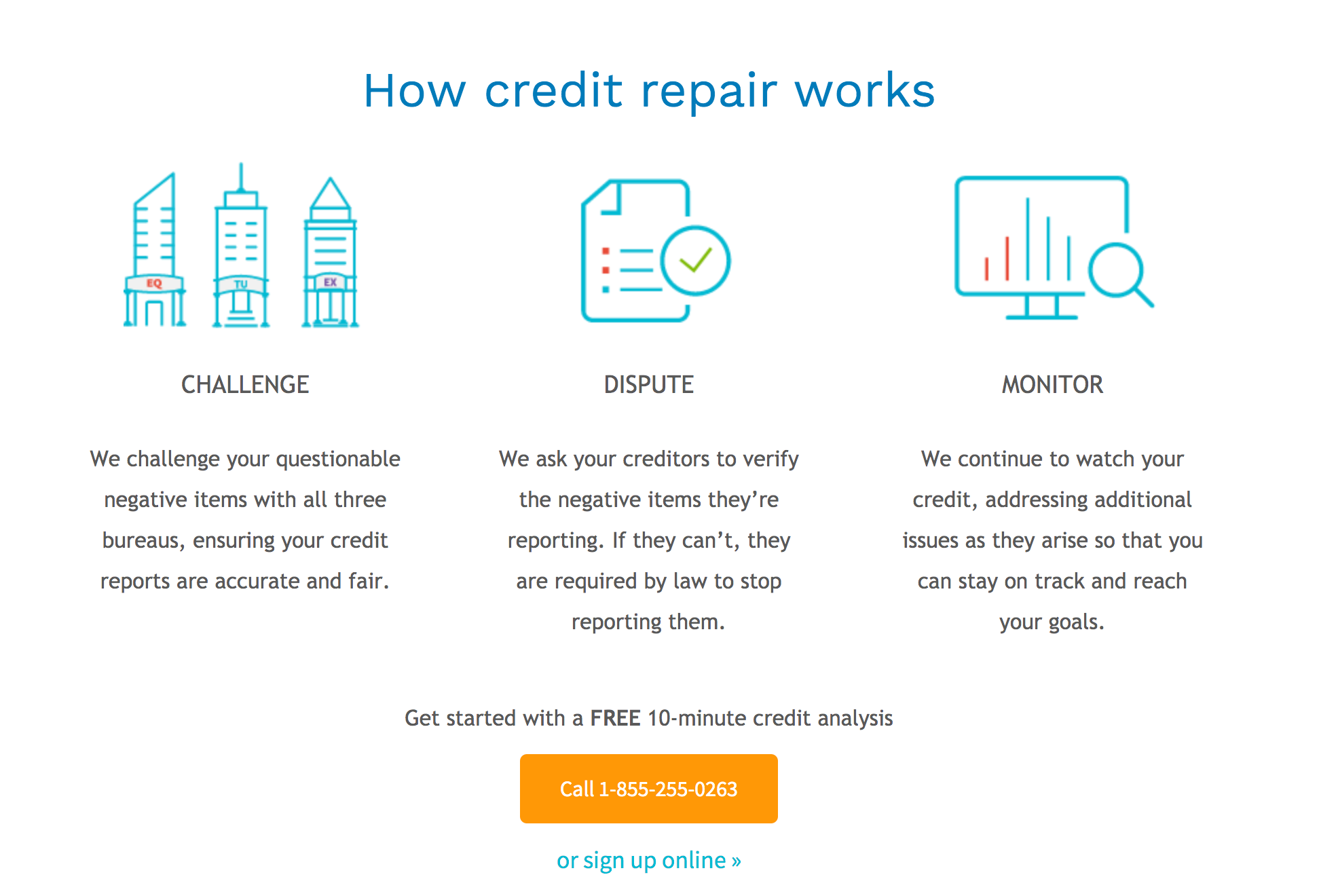 Additional services offered on the Credit Repair landing page
Create scarcity to improve your click rate
Things that are harder to get turn out to be more desirable. It is a basic trait of human psychology you can easily use to boost your landing page conversion rate. There are plenty of ways to create scarcity without producing a limited version of your product. Here are the easiest tricks:
- make a limited special offer for the first ten customers;
- add a timer that counts down to the end of the offer;
- inform visitors that only a small quantity of product is available.
Udemy uses scarcity with their promotions all the time. Pay attention to the way they emphasize the limited-time nature of their offer on their main page.
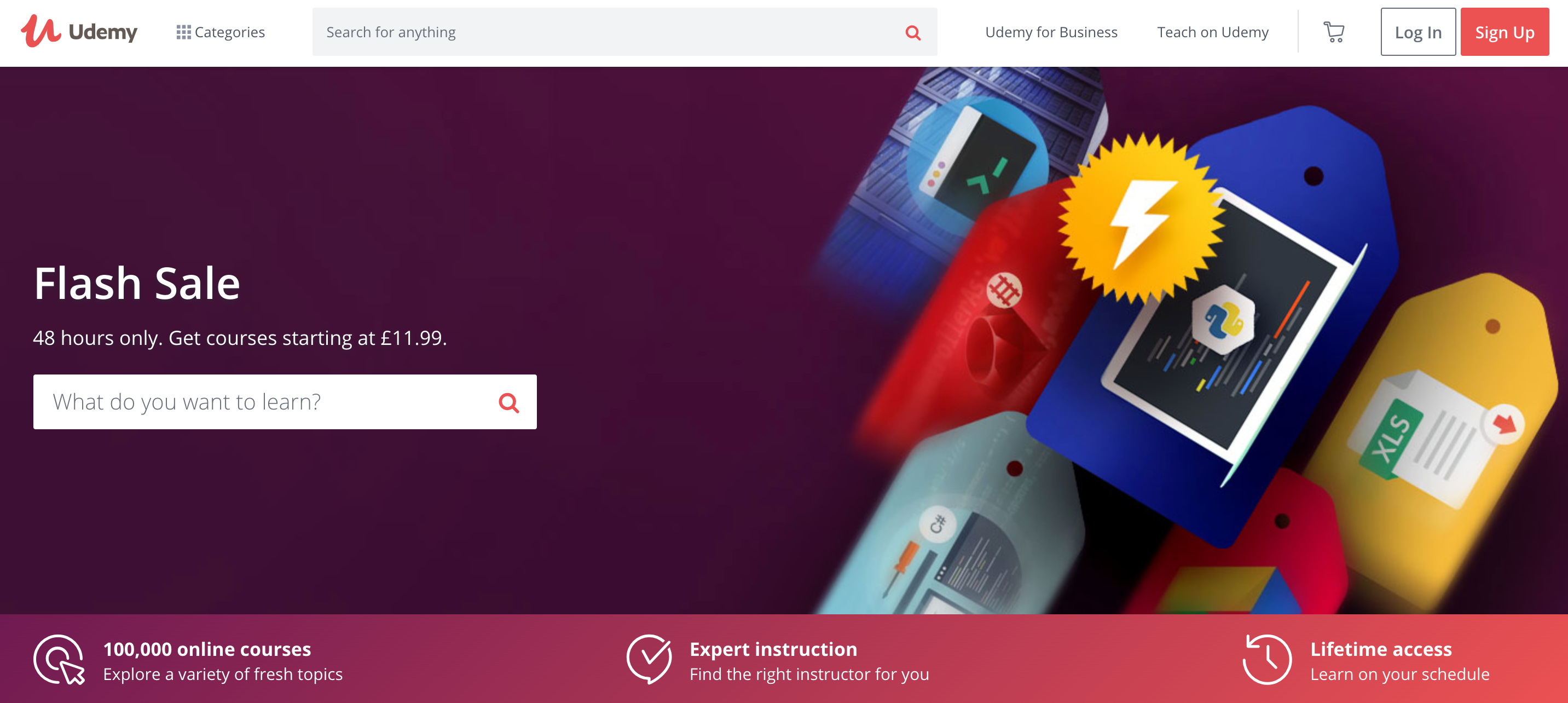 Udemy creates scarcity on their landing page
Boost landing page conversion with social proof
Humans are social beings, whether we like or not, and businesses can benefit from this by using social proof. With testimonials, ratings, or other types of social proof, the average landing page conversion rate is about 12.5%, while without them, it’s only 11.4%.
Social proof can take different forms, such as reviews, customer ratings, likes on social media, testimonials from influencers, and even case studies. Zendesk has found a way to implement social on their landing page — after showing some of their clients’ logos, it offers visitors to see more and redirects the visitor to a page with a case study collection about brands using their product.
Social proof on Zendesk landing page
Remove distractions
We all have a limited attention span. So, it’s crucial to make sure visitors won’t be distracted on unnecessary things and to use their attention resources for things that drive conversions.
Many landing pages often contain too many elements, such as navigation bars, unnecessary links, banners, and enormous subscription forms. In most cases, all these things grab the visitor’s attention but do not lead to them clicking on the CTA button. As a result, the conversion rate drops.
To spot distractions, try to use heat maps on Google Analytics or other tools to analyze your page’s effectiveness. And then cut any extra elements, or at least make them less visible as Flickr did.
They reduced the number of options on the main page to three — sign in, sign up, and search. Flickr didn’t manage to remove the navigation bar but has hidden it at the bottom of the page.
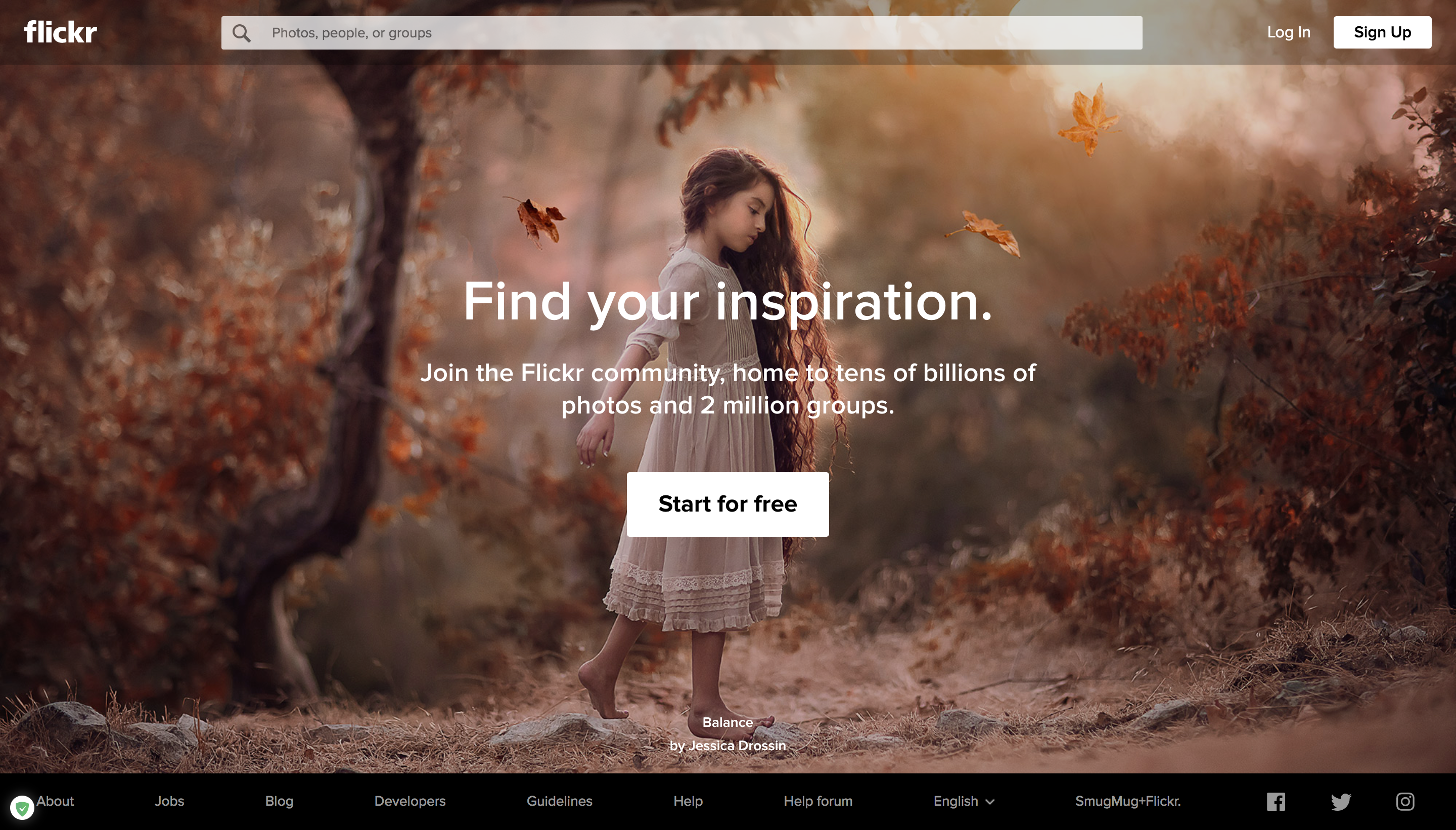 Flickr landing page
To sum it up
You can improve your landing page conversions by changing your design, adding copywriting hacks, and using psychological tricks.
- To improve the design of your landing page, revise its structure and use color psychology. Apply well-produced visual content like custom images, infographics, and videos to boost conversions. Make your CTA button stand out with vibrant color, big size, and proper location.
- To increase conversions with your copy, begin with getting to know your target audience. Text on your landing page should be concise and well-structured, but still provide all the information a customer needs to click on the CTA button. Pay special attention to the headline and your offer — you need them to be attention-grabbing and clear to the visitor.
- To make a conversion rate better, employ a psychological trick: add more value, create scarcity, apply social proof, or get rid of the distractions.
After increasing your landing page conversion rate, take care of nurturing your leads and enhance sales — register to SendPulse and send your offers via email campaigns, SMS, web push notifications, and chatbots for Telegram and Facebook Messenger.