So, you have a new business up and running, congratulations! Or maybe you’re getting ready to open a business, also, congratulations! But now, you need a website to promote your business and inform people about your brand. Fortunately, now is an excellent time to launch a site because there are more tools and resources than ever before. In this post, we’ll bring you up to speed on everything that you need to know to launch a website for your company.
We are going to try to avoid being too technical in this rundown because the days of sitting down at a terminal to code your own site are a thing of the past. Modern services allow you to create and launch a website using intuitive tools and take out a lot of the guesswork. That being said, there are still quite a few things to think about when launching a website, so let’s dive in.
What to consider before launching a website
This might seem basic, but let’s take a minute to remember why you should have a website in the first place. Having a good foundation of fundamentals and goals will help you help your brand and customers as your business grows. Your site should be:
- A central location for information. A well-designed website is a one-stop-shop for everything you need from a brand for every stage of the buyer’s journey. You need to cater to people in each stage of the journey from awareness to the decision stage, and beyond. While this sounds a little overwhelming at first, it is easier than you may think. Having a diverse range of content will allow you to meet the needs of everyone that interacts with your brand.
- User-friendly. We have all tried to use a website that has problems, and it is a sure way to lose out on traffic. Making your site navigation straightforward and adaptive for different devices and display resolutions is a must in modern times. Make sure that your website builder makes pages that are optimized for both desktop and mobile users. Fortunately, most website builders offer dynamic page templates by default, meaning that your site will look great on any device.
- Worth visiting. It is easy to take this point for granted. Having a user-friendly site that holds tons of information is very important, but if your site lacks style or interesting content, it is less likely to bring in traffic. Adding some fun images or text is a great way to make your site more attractive. You can also use gamification to give your site more value for visitors.
Let’s look a little at the steps of launching a website to get your new site up and running without breaking a sweat.
Four easy steps to launching a website
We’re going to assume that you already have a domain and website builder ready to build your site. If you don’t, check out our guide to the best website builders to get an idea of what you will need to get up and running.
Website launching step 1: Pre-launch site
This step is optional but is useful in helping you get your foot in the door and start promoting your new site before it is even finished. A pre-launch site is typically a single landing page that appears on your soon-to-be homepage. Not only does this page give you a chance to let users know that you are going to have a full-featured site coming soon, but it can also be used to gather new subscribers before you even launch your site. Use this page to create some interest in what is to come in the near future.
Below is a pre-launch page from Harry’s. You can see that this page is simple, but includes branding and a subscription box. This site lets people know that there is more to come from the brand and tells them that they can be the first to know by subscribing. This approach also helps brands gather interested audiences for their future email campaigns. Building a little hype and using exclusivity is a great way to create a buzz around your new website and brand in general.
 Harry’s prelaunch site
Website launching step 2: Planning
Now you are ready to sketch out a layout and navigation map for your site. Here it’s best to think about the pages that you will need and how you want visitors to move through your site. There are lots of sitemap tools that can help you get an idea of what pages you will use and the logic of your site.
Slickplan and GlooMaps have free tools to help you map out your site layout. Using a sitemap planning tool will help you organize all of the pages that you need and make it easier to notice any holes or redundancies in your pages.
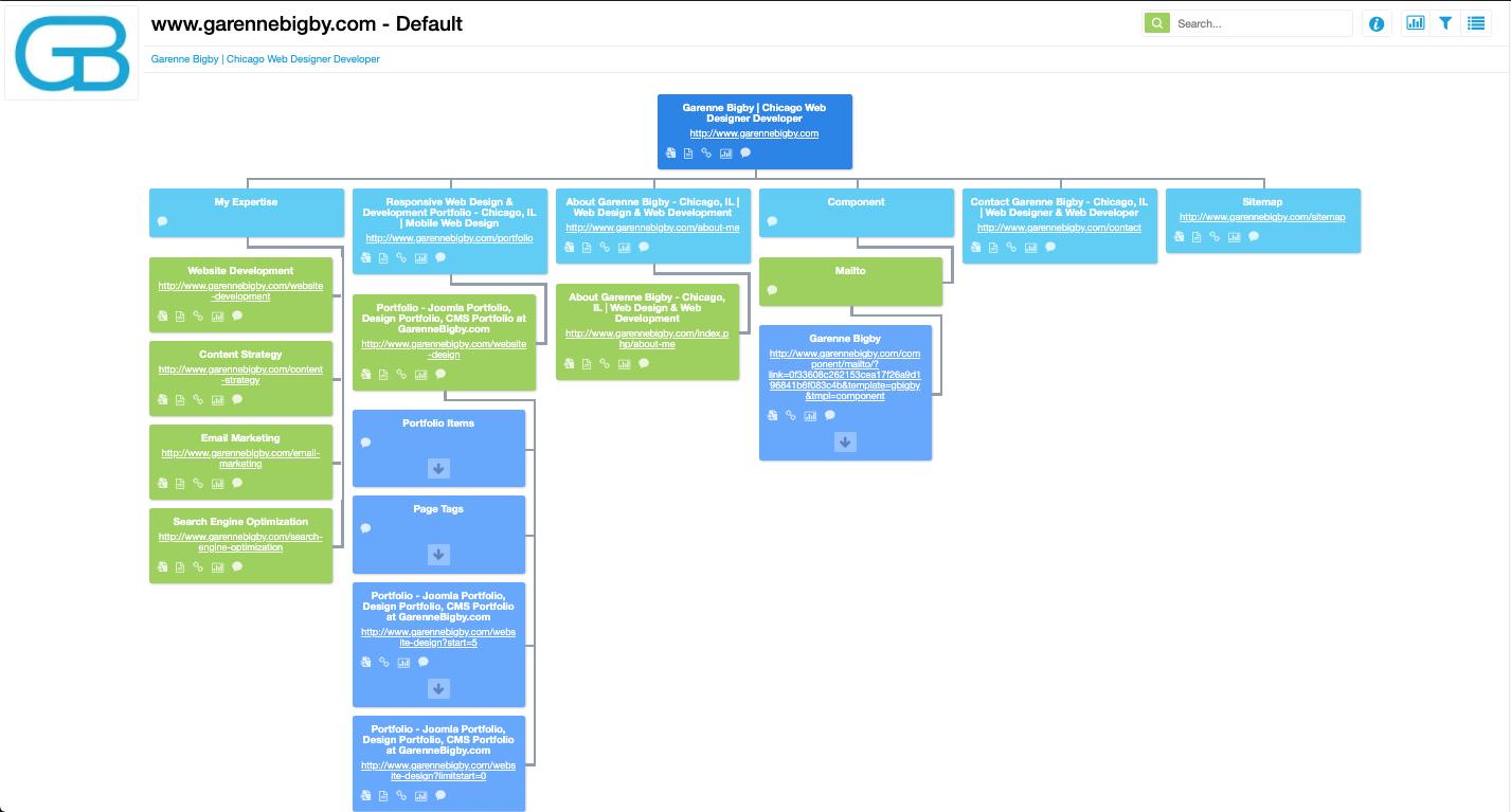 Visual Sitemap example using Dyno Mapper
Website launching step 3: Design
Now it’s time to think about how your site is going to look. Assuming that you already have some branding, like a logo, you probably have an idea of what colors you want to use on your site. Now you want to think about what styles you are going to employ. It is best to pick a page design style and apply it to all of the pages on your site to create a cohesive user experience.
There are also tools to create website design mockups. Both of the sitemap tools we talked about before have this feature. However, your website builder should also have the option to let you design a page without publishing it.
Pro tip: Work on your design in the website builder to avoid doing the work twice.
Now, you’re ready to roll up your sleeves and design your site. Here are a few things to keep in mind:
- White space is your friend. Don’t flood pages with walls of content. It is better to let your website “breathe” a little. Your site is there to share information, but make sure that you present that information in the most user-friendly way.
- Landing pages reduce clutter. Just like including too much content can make your site feel a little cramped, it can also reduce visitor interest. It’s better to break the sire up into several smaller chunks of information. Using landing pages for this is a great way to break up the information on your site.
- A cohesive design goes a long way. You have probably visited sites where each page feels like a visit to another planet, it is your job to avoid this. Make sure that every page has the same header and footer, branding, and overall appearance. Little things like this can do a lot for your brand authority.
- Simple site navigation is crucial. Keep menu items to a reasonable number, the fewer the better. This doesn’t mean that your site can’t have lots of pages, but rather than getting to a specific page shouldn’t be overwhelming. Keep your menu items down and add links and buttons to pages to allow users to visit other parts of your site without using an overwhelming menu.
- Visual content is king. Sharing information in the form of pictures and videos will allow you to give your site some brevity without sacrificing its quality. Make use of visual content to break up text blocks, show off your product or service, and entice visitors to make a purchase.
Here is an example of a well-designed site layout and style from Dropbox. You can see that the site opens with just little text and a signup form above the fold. This keeps things simple, without losing any of the necessary functionality for new users. Likewise, I was able to navigate from page to page without using any menus, and the site has tons of white space without a lack of content.
Dropbox’s excellent site layout
Before you’re ready to launch your site, make sure that you test its functionality several times. You may want to hire a quality assurance specialist to help you make sure that everything is working properly. There is nothing worse than rolling out a dud website.
Website launching step 4: The launch
Now, you have all of the elements of your new website laid out. You have been collecting subscribers using your pre-launch page, have excellent site logic from your planning stage, your site is looking great, now it’s time to make it public. Publish your site and wait for the traffic to roll in. Sounds easy right?
Unfortunately, simply hitting the publish button does not bring thousands of visitors to your site. Now you need to promote your new website. This is where you can take to your marketing channels and let people know about your new site. Email and social media are two great channels to begin promoting your new site and bring in traffic from different sources.
The email below isn’t exactly a website launching email, but it has all of the qualities of a good one, so let’s take a look. A while ago, Apple revamped it’s App Store and sent users an email about its new and improved app store. The email demonstrates the value of the new store and shows off some of its features. This is exactly what you should do in your website launch messages. Show the value of your site straight away.
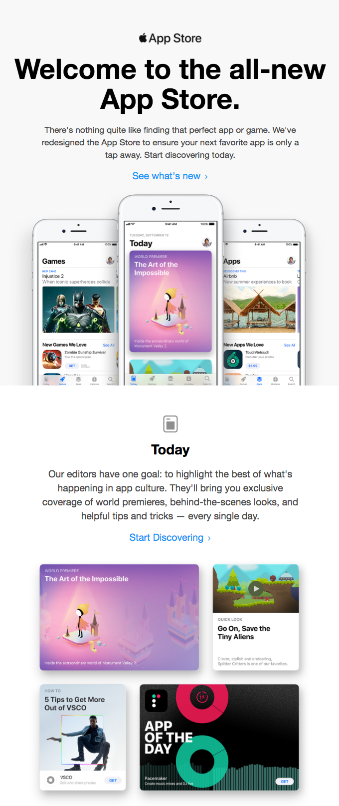 New App Store launch email from Apple; Souce: Really Good Emails
Post-launch considerations
So your site is live and you are watching traffic come in, again, congratulations! Now let’s look at a few things you can do to improve your site’s conversion performance, get more traffic, and keep customers coming back for more after launching a website.
Analytics and SEO
It’s important to keep tabs on your site’s performance so you know what you’re doing well and what could use a little improvement. Google Analytics is a great free resource for checking out how individual pages and your site as a whole is performing. You can add the code to your site, or many website builders offer plugins to add the code for you. Below is an example of a Google Analytics report for a website, you can see a ton of detailed information and there is much more available in other menus as well.
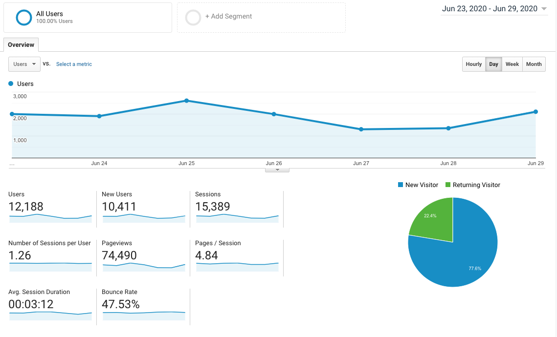 Example of Google Analytics dashboard
The next thing that you will want to consider is implementing an SEO strategy to bring your site higher on search engine results pages. This will bring you more traffic, leads, and overall brand authority. SEO is a big topic, but here are a few things you can do to improve your site’s search engine performance:
- On-page SEO. This is only one of three parts of an overall SEO strategy, but it is easy to implement without having technical skills. The short version is that you want to include any keywords that you want your site to rank for in the content of your site. This means including the keywords or phrases organically in your titles and the body of the content on your site. Using a blog is a great way to improve your SEO organically.
- Performance. Keep an eye on your SEO results and work on more difficult keywords as your site’s authority grows. When you’re just getting started look for keywords that you can rank for and don’t be afraid to use some long-tail keywords, since they will be easier to rank for even with a brand new site.
- Keyword search. Searching for keywords that you can rank for and keywords that are trending will help you improve your on-page SEO. You will know what to focus on and how to improve your performance.
Below is an example of keyword search using the SEO tool Ahrefs. This tool can help you with everything SEO.
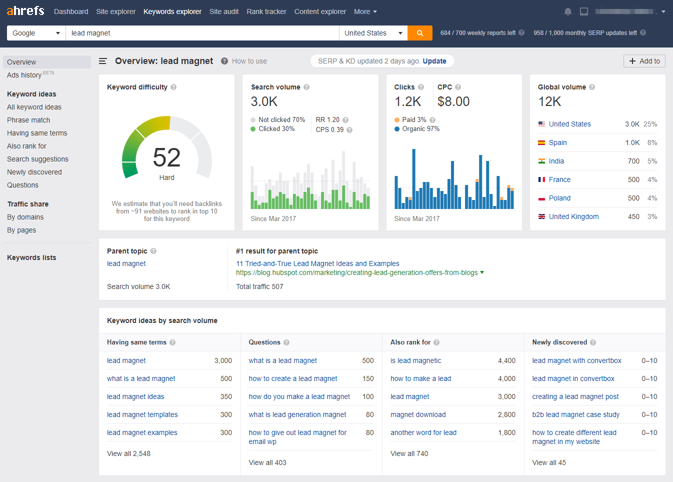 Ahrefs keyword search results for the keyword “lead magnet”
You can use subscription forms on your site to help get customers in the awareness stage engaged with your brand. Subscription forms are easy to use and allow you to transfer new leads right to your mailing list for future marketing campaigns.
Here is an example of a subscription form from Nike. You can use SendPulse subscription forms for free and start getting new subscribers today.
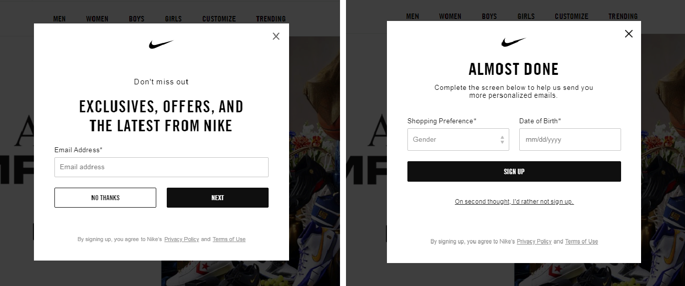 Nike subscription form with two steps
Check out our guide to create a subscription form in minutes.
Constant improvement
After launching a website and optimizing things a little, it’s important to check in with your performance regularly. Things can change quickly, and visitor behavior is hard to predict. Checking your analytics regularly will show you trends that you can take advantage of to improve your site and make more sales. Remember, Google Analytics is your friend.
Website launching recap
We have talked about the process of launching and maintaining your site, but let’s go over some tips to get you started on the right foot. Here are the steps to launching a website:
- Set up a pre-launch site. This will allow you to collect subscriber information and build hype around your upcoming launch. Just create a simple landing page and let people know that the full site is coming.
- Plan your site layout. Use site mapping tools or good old paper and pencil to layout the various web pages that you plan to create. Seeing this information visually will help you understand what you are missing and give you an idea of how the navigation will work.
- Design the site. Time to give your brand a face. Use a mockup tool or simply design pages in your website builder without publishing them. Check to make sure that everything looks good and has a cohesive style. Then, make sure that the site’s navigation works well. Test, test, test.
- Launch your site. Everything is ready, push the publish button. Now it’s your job to market your site and bring in some traffic. It’s a good idea to promote your site using SMM and email marketing. Don’t forget to make use of subscription forms to get contact information from your leads.
Well, you made it to the end and now you know how to launch a website. Don’t forget that you can use SendPulse to send email campaigns and get your site kitted out with great looking subscription forms for free.