An opt-in page is a page designed to convert users into subscribers with the help of a lead magnet. Marketers use this technique to encourage more people to share personal data with them. Insights gained from that data allow brands to communicate quality and personalized email campaigns to their audience.
Opt-in Page vs. Landing Page
These two types of pages are similar as they share the same goal: collect as many marketing leads as possible. However, there are some differences between them.
An opt-in page uses a lead magnet — a practical gift that users want to get for free. Also, all the necessary information and the fields to fill in with personal info are usually placed above the fold on opt-in pages. While landing pages can be much longer, containing lots of details, images, several CTAs, and, what’s more important, are designed to sell products. Lastly, an opt-in page converts users into leads, while landing page belongs to a lead-to-customer conversion type.
Let’s move on and find out what makes an efficient opt-in page.
How to Build an Opt-in Page
- Create a value proposition
- Add a lead form
- Include a clear CTA
Opt-in pages differ from industry to industry and brand to brand. Every company offers a different kind of value, requires various types of data in exchange for that value, and uses different communication styles. To create high-converting opt-in pages, you should optimize them for your business goals and include three essential elements to all of your opt-in pages:
- Create a value proposition. Tell your future subscribers what they will get in exchange for joining your community. A professional and attractive opt-in page must include a lead magnet that offers something helpful, like a free ebook, ticket to an event, free trial to your service, etc. Make sure your value proposition is relevant.
- Add a lead form. A lead form contains fields for providing personal info in exchange for your value proposition. Find the right balance between the amount of value you share with people and the number of fields they need to fill. The more value you offer the more specific details you can ask for, like location, phone number, name of the company users employer, the position they hold in that company, etc.
- Include a clear CTA. A call to action should clarify the next step for users. For example, “Download a free guide” or “Grab my ebook.”
Let’s see how marketers bring these simple ideas to life with a few examples.
3 Opt-in Page Examples
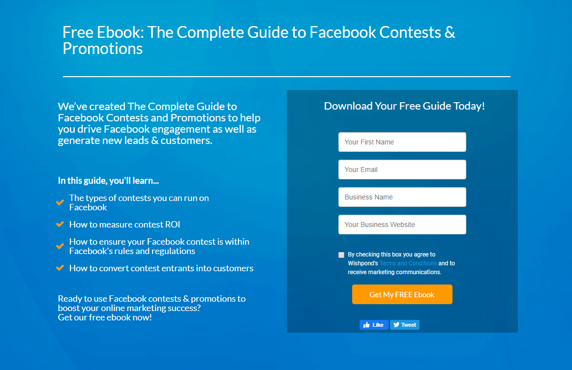
The first example is Wishpond’s opt-in page. It has a simple design, but it’s well-structured, all the elements are readable and get to the point.

What makes this opt-in page effective?
- The title clarifies what the guide is about;
- It explains the goal of creating this guide — to help drive Facebook engagement;
- It lists what users will learn with it;
- The lead form only asks for essential information, and targets to the specific and interested audience by asking for their website’s URL;
- The CTA is encouraging, and it contrasts with the background color.
- It allows users to share this page on Facebook and Twitter.
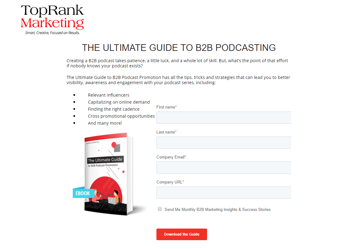
The next example is from TopMarketing. This opt-in page has a lot of white space, which makes it easy-to-digest. However, the lead form fields are a little lost in this background.

What makes this opt-in page effective?
- The title clarifies what the ebook is about;
- It shows an appealing image of the book to create demand;
- It provides a list of what users will learn;
- A checkbox asks for permission to allow sending monthly emails, which means the company tries to start communication right away.
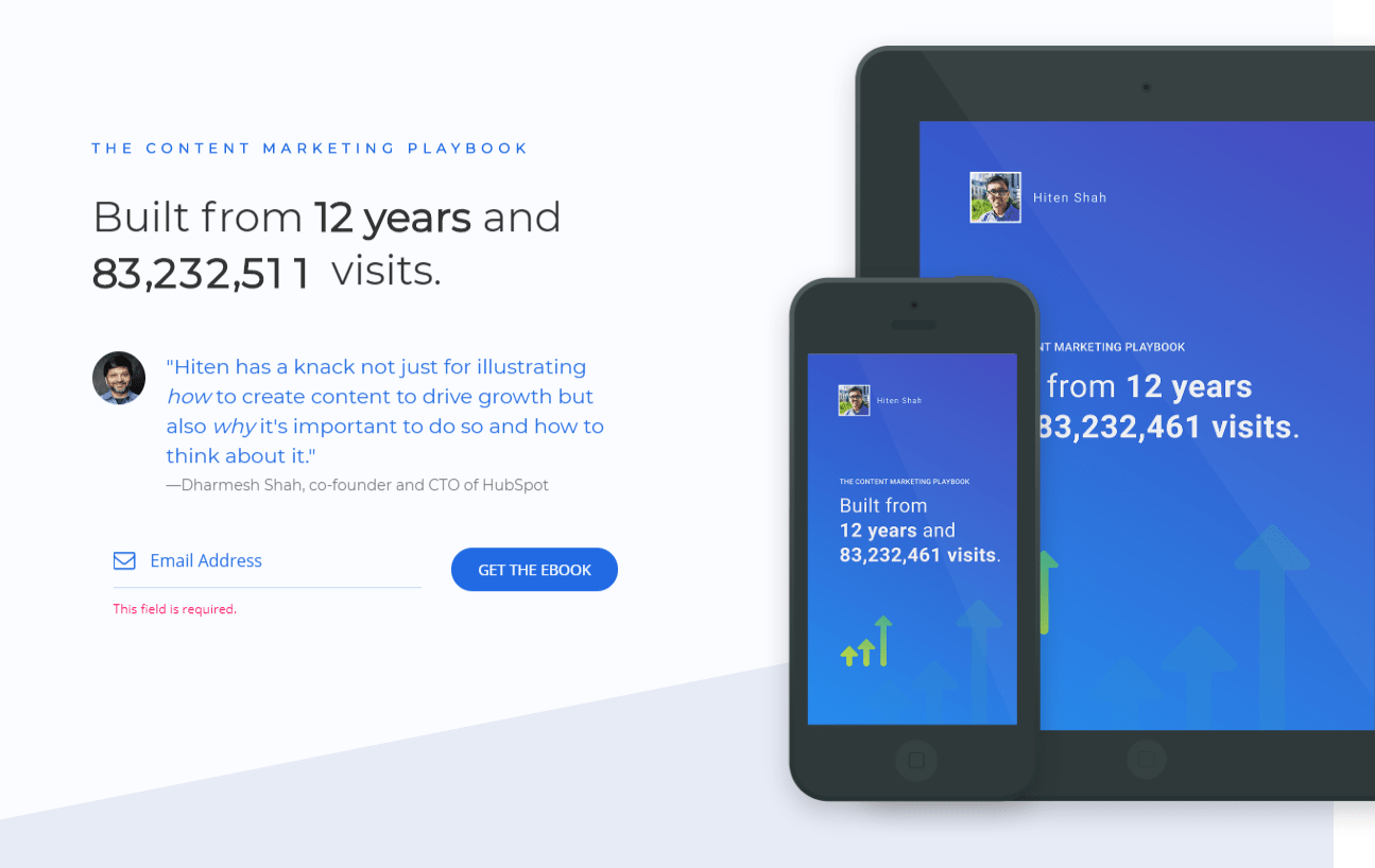
The last opt-in page example is from Hitenism. It focuses user attention on their experience in the field using by social proof to the company’s advantage.

What makes this opt-in page effective?
- The number of visits changes in real-time, which creates FOMO;
- The value proposition is executed as a quote from a well-known expert;
- The image of the phone and tablet hints that this ebook is optimized for mobile devices.
Now that you’re acquainted with opt-in page examples let’s finish this guide with some best practices.
5 Best Practices for Creating Effective Opt-in Pages
- Avoid long opt-in pages
- Make sure your CTA button contrasts with the background color
- Use directional cues, like arrows
- Get creative
- Qualify and segment leads using an opt-in page
We’ve collected a list of best practices that will help you generate more subscribers from your opt-in pages.
- Avoid long opt-in pages. The longer your opt-in page is, the more users will bounce without reading it to the end. If possible, place all the necessary information above the fold.
- Create multichannel subscription forms. They will help you collect subscribers' email addresses and let them contact your brand via chatbots in Facebook Messenger and Telegram. All you need is to add a link to the necessary chatbot.
- Make sure your CTA button contrasts with the background color. Your CTA should attract user attention, so make sure that it is eye-catching.
- Use directional cues, like arrows. A little arrow, as if it was written with a permanent marker, will show users where to look. It’s an easy way to focus their attention on the lead form that works subconsciously.
- Get creative. Opt-in pages usually have a standard structure. Try to stand out from the crowd of competitors by adding interactive elements to your opt-in page, including GIFs, animated CTA buttons, or a carousel with all the necessary details.
- Qualify and segment leads using an opt-in page. Think about what data you should ask users to share with you. The more information you have, the more relevant and personalized offers you can provide in the future.
Congratulations, now you know what an opt-in page is and how to create an efficient one to bring leads for your business.

or