Wait, aren’t all commercial landing pages just lead capture pages? Well, most of them are, but there is more to it than meets the eye. You won’t find two identical leaves, and the same can be said about landing pages. However, there are tendencies and similarities that you need to be aware of. We’ll go over them and help you understand which types of landing pages will work best for your goals.
Product landing page
This is where you shouldn’t let shyness hold you back — speak proudly about your product and its benefits. Use customer-centric language and describe how your product’s features change people’s lives for the better. Don’t overwhelm your users with lengthy descriptions, though — go for bulleted lists and catchy highlights.
High-quality photography is a must. Visuals are responsible for making a great first impression — a convincing copy comes second. Your product page is exactly how your product is going to be remembered, so aim for the wow factor.
Here comes an example of a minimalistic but effective HNST product landing page describing their sustainable denim:
You can feature a few similar products on one page
It sparks the users’ interest and describes the most outstanding features all of their products have in common. They don’t go into detail and describe every inch of every pair of jeans they’ve ever made. A user can find all the necessary information by opening related pages and collections and continue shopping from there.
Service landing page
When you offer some sort of service, you’re ready to serve your audience by providing them with the best solution possible. What’s left is to prove that fact to your audience. That’s the approach you need to take to create a converting landing page.
BetterHelp does exactly that, and their landing page is a fantastic example:
When you promote a service, make sure you establish trust first
They eliminate any doubt by explaining why online counseling is actually better than expensive in-person meetings. They also list the exact problems people can receive help with. Finally, they seal the deal by demonstrating how they’ve helped thousands of people across the globe and how easy it is to find the right counselor through their service.
Educational landing page
These are lengthy, information-laden pages whose purpose is to explain how something works. They don’t sell anything, at least not obviously. Despite that, you can use this type of landing page to unfold an industry-specific or universal problem that your product is solving or just teach your users how to take care of something, plants, for example.
This type of landing pages can include downloadable assets
This educational format allows you to bring value to your potential customers without pressing them to buy anything. It takes time and effort to create an engaging educational page, but once you’ve done that, it will steadily get more and more social shares and views.
Landing page design matters — your educational page shouldn’t be purely text-based. Add unique illustrations and animated objects to make the user’s journey through the page more exciting.
Click-through landing page
These are hybrids between educational and lead capture pages. Click-through landing pages are usually voluminous and have links to other pages. This is the way to go if there is an interesting history, idea, or philosophy behind your product.
Long landing pages help you deliver more information about your offer or brand
Click-through pages are also a proven way to simplify matters if you offer something innovative and many people aren’t familiar with your technology or method at all. Just make sure you diversify your content by including videos, infographics, and animation. Otherwise, your users won’t make it through the whole page.
Squeeze landing page
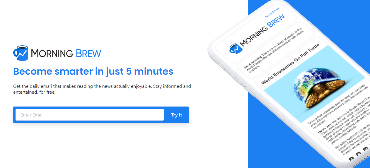
Squeeze landing pages are tightly packed and serve one specific purpose — getting the user’s email address. This type of landing page usually contains lead capture forms or lead magnets and has no more than two or three lines of text.
 Use this type of landing page for lead capture forms
You may want to add a little sneak peek to help your visitors understand what they will receive after sharing their email address. It’s also a good idea to mention how often you’ll send them emails.
Event landing page
You need to say a lot about your event to capture your audience’s interest, and the best way to do that is to dedicate a stand-alone landing page to your event. Webinars and other online events fall into the same category — don’t promote them with a humble banner, try full-sized landing pages.
Promote your online and in-person events with landing pages
There are many things you need to mention and describe on your event landing page to make your users save the date:
- the main theme of the event;
- the main topics;
- speakers;
- star guests;
- the location;
- opportunities for networking;
- attendees’ impressions from your previous events;
- prices.
You will also need to create an automated email flow to warm your users up before the event and follow up with them after.
Interactive landing page
This type of landing page is solely entertaining and experiential, with little commercial incentive. Of course, they boost virality and create buzz around a certain brand, but they don’t feature nor describe any specific product or solution in a typical salesy way. Usually, interactive pages contain VR experiences or games.
Products may be featured as parts of the experience though. For example, Gucci created an interactive landing page with a game called “Mascara hunt.”
Let your users interact with your brand in a playful way
Pricing landing page
Just telling them the price isn’t enough — you need to negotiate in advance, remove doubts, and explain why your offer is worth it. Why not do all of that on the same landing page?
Explain the difference between your pricing plans and make the choice easier
Dropbox’s pricing page has it all. They not only compare their pricing plans but also answer FAQs, show reviews, and add a CTA button at the end of the page. The last one helps users convert right after they finish reading.
“Thank you” landing page
You need to use every opportunity to inject a bit of personality into your brand’s voice — it will help you stand out and be remembered. Your “Thank you” landing page is exactly the right place to do so. Of course, you can just thank your users for subscribing and call it a day, but there’s another way.
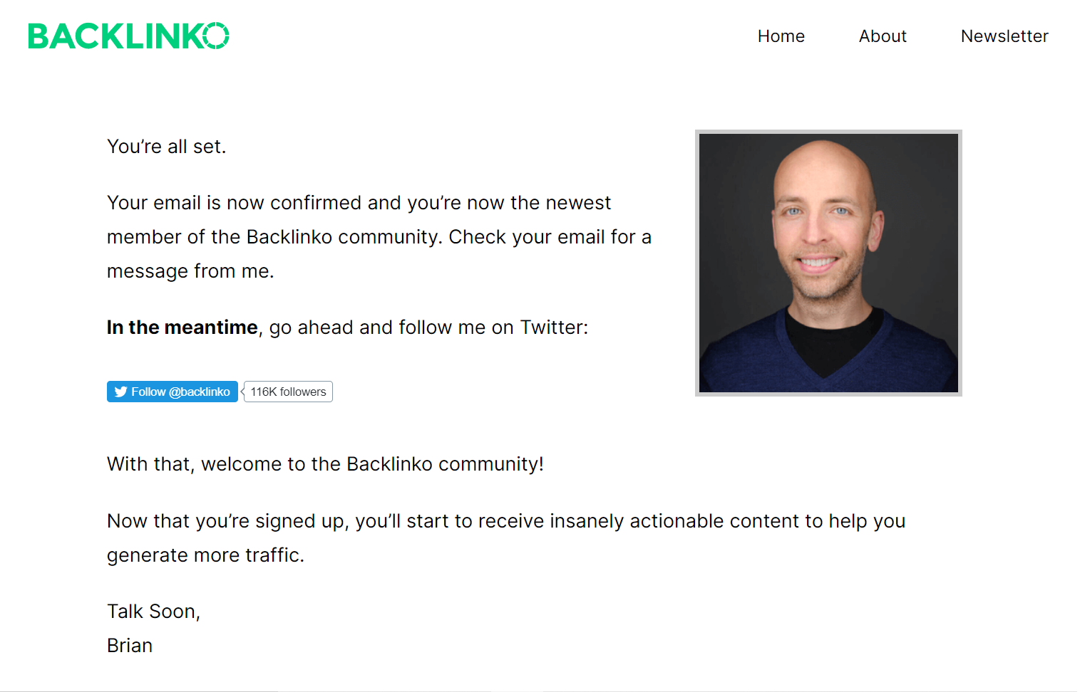
Take a look at Backlinko’s personalized landing page:
 Thank your subscribers in a non-trivial way
It sounds surprisingly friendly, natural, and positive. Brian from Backlinko invites users to follow him on social media and become active members of their community. You can do the same by adding a few nice words and offering your subscribers new ways to stay connected.
404 landing page
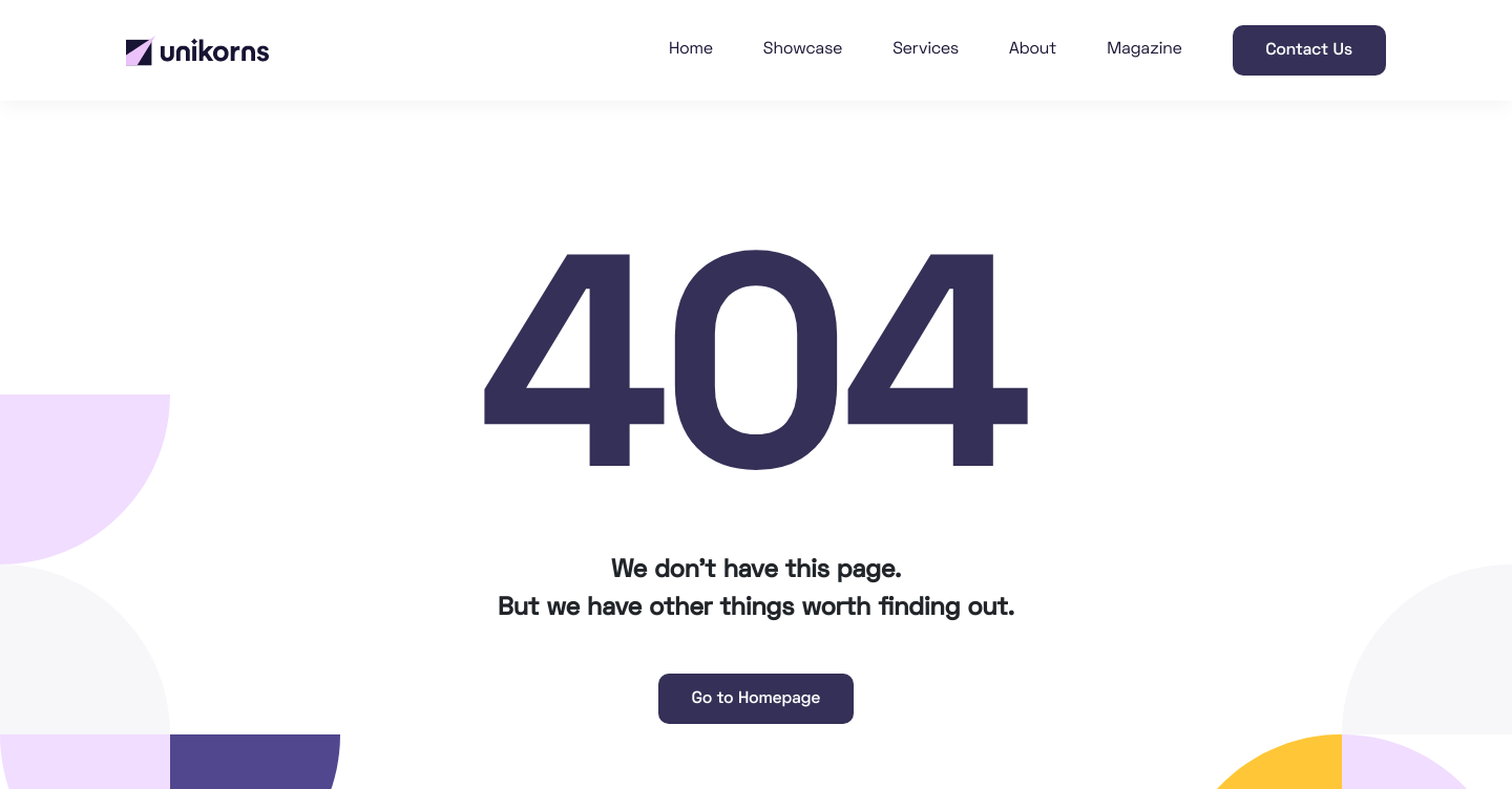
Yep, this is also a landing page and another chance to connect with your users. Try to approach it creatively and add a unique message from your brand in addition to apologizing for the missing page. Don’t oversaturate it though — the main message should remain clear. Also, don’t forget to link to your homepage. Here is how Unikorns, a web design studio, approach it:
 Turn your blank 404 error page into a unique message
Personal brand landing page
There should always be a stark focus on your personality and unique skill set — consider this type of landing page your virtual business card. It’s not a portfolio, although you certainly need to show some of your work, nor is it a personal multi-page website. It’s something in between — clean, simple, but effective.
Use landing pages to present yourself and your work
This type of landing page is a great fit for freelancers, bloggers, and influencers. Also, nothing limits your creativity when you work on your personal page — tell your story in the way you find the most captivating.
“About us” landing page
This is where you tell your brand’s biography, present your team, and reveal your goals and values. Use the “About us” section to show your customers who is behind your brand and what your principles and ethics are.
Storytelling will help you build trust and explain why you do what you do:
Share that personal story behind your brand
Let’s get started
We hope you’ve discovered new types of landing pages and feel inspired enough to create the highly-converting and memorable pages of your own.
If you don’t have any experience, start small — try our landing page builder and create simple landing pages for your social media in minutes. Ready to go further? Then, develop your lead nurturing campaign and send emails to your leads automatically with the help of our platform. You can try all of this and more, even with a free account!