A confirmation link is added to a confirmation email. A click on it automatically adds the user to a mailing list, ensuring that the subscriber’s email address is active.
Let’s learn a bit about the subscription first since the confirmation link is an integral part of this process.
The CAN-SPAM Act and other anti-spam regulations require brands to opt-in users. To ensure a new subscriber’s email address is valid, and enable further communication via emails, marketers use a double opt-in approach.
It works as follows: a user fills in an email address in a subscription form, then gets a confirmation email to that address, opens it, and clicks the confirmation link.
Yes, double opt-in takes a little more time for people to subscribe, but if they want to be in touch with your brand, they will finish the subscription. Besides, such an approach makes your mailing list healthier with no invalid emails. It results in a better sender reputation.
How to add a confirmation link with SendPulse?
It’s not a big deal. With SendPulse, a confirmation link integrates with a confirmation email and is included in the subscription form creation. So, here’s a complete instruction on how to create a subscription form.
Let’s briefly review the main steps now.
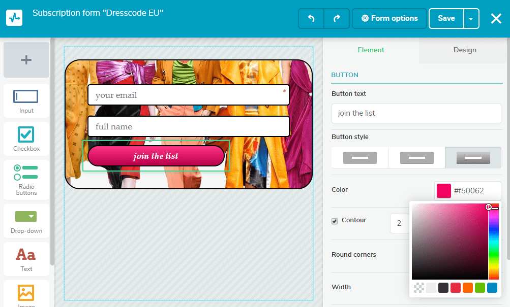
Find the “Subscription forms” tab in your SendPulse account and choose a layout for your subscription form. Drag and drop necessary elements and customize them to your liking. Below is the screenshot from the SendPulse subscription form builder.
After that, go to “Form options.” Here you can select the mailing list(s) where the newcomers will be added to, edit subscription notification, and customize confirmation email text. You can change the text, its font, and size. A confirmation link is connected to a button like on the screenshot below.
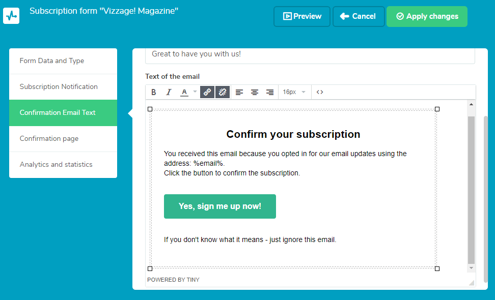
As you can see, adding a confirmation link is a piece of cake. Let’s view more examples to get a better understanding.
Confirmation Link Examples
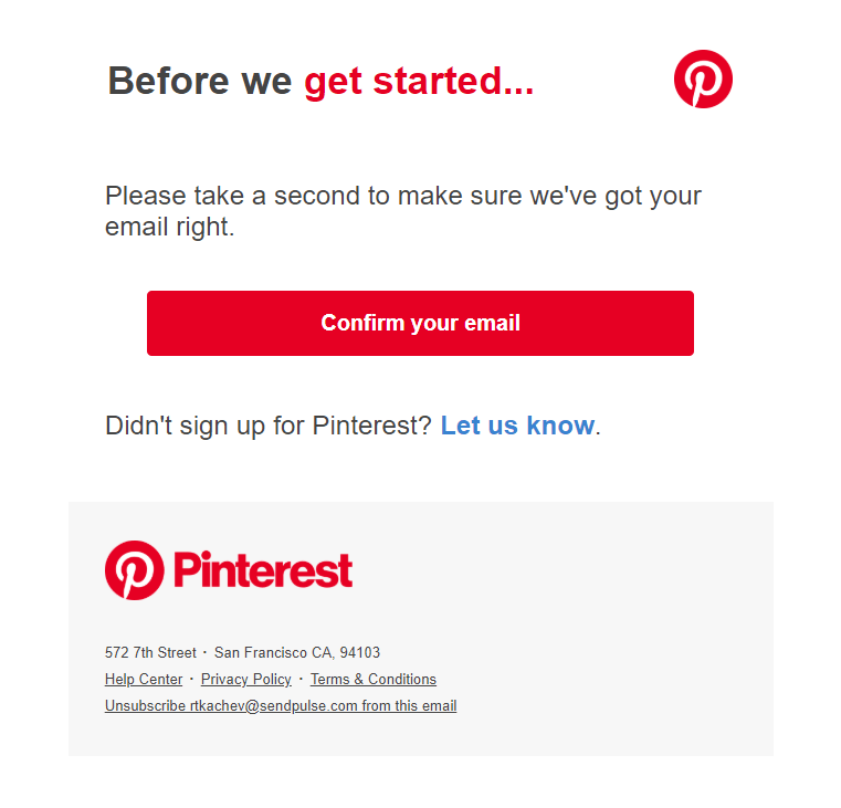
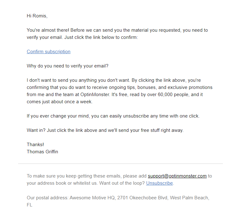
There are two types of confirmation links in email marketing: a link connected to a button and a link as classic hyperlinked text.
Pinterest. It is an example of the confirmation link connected to a button.
Optinmonster. It is plain-text email, so the link is also added as text to match the style.
Wendy’s. Here’s another example of a button with a confirmation link.
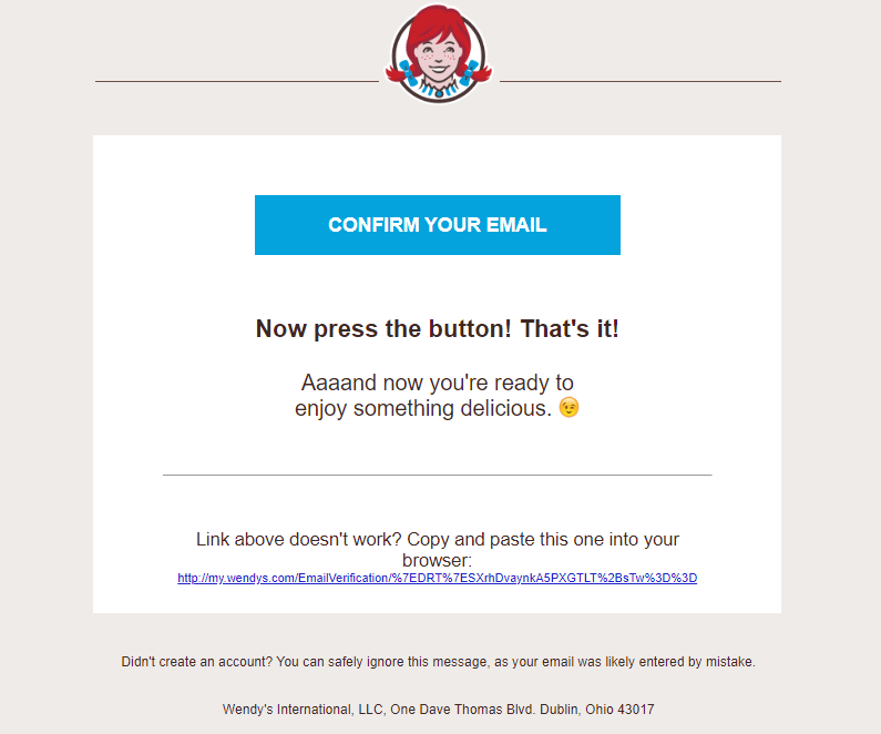
They even offered a plan B in case the link doesn’t work. You need to copy and paste another link into a browser.
To learn more about email marketing, read our blog, and subscribe to email newsletters.

or