Here’s a thought: are you sure your homepage alone is good enough for you? Maybe it will do for some time, but what if… you don’t think it will… stop converting? But how can you be sure that landing pages for eCommerce can fill that void with their big logos and fancy visuals? Believe us, they can.
If you have been having doubts about developing an eCommerce landing page and waiting for the stars to align — here’s your sign to create one! In this post, we will talk about how to turn your eCommerce landing page into a show-stopper, explain how to benefit from it, and review some excellent examples.
What is an eCommerce landing page?
An eCommerce landing page is a straightforward web page with a sole purpose: to persuade a visitor to take a certain action.
The essence of landing pages for eCommerce boils down to this: they focus on a single offer and motivate a visitor to act on it by highlighting a company’s value proposition, keeping it brief and sharp, and implementing an easy-to-skim layout.
Usually, landing pages for eCommerce include the following elements:
However, when a user visits your website, it is not an eCommerce landing page that they see first — it is your product landing page. How are they different, and which one is more effective? Let’s dive a little deeper and learn more about both of their peculiarities.
| Product landing page |
eCommerce landing page |
| Multiple purposes that are not always clear |
A single and clear purpose |
| Generalized content for a wide audience |
Personalized content and offers |
| Multiple CTAs and links |
A single CTA and minimal or no other links |
| Invites a user to navigate to other pages for more info |
Contains all the necessary info on a single page |
| Acts as a general website intro |
Encourages visitors to act on a particular offer |
| Motivates a user to explore more info about a brand |
Motivates a user to convert or purchase |
| Attracts organic traffic |
Attracts new customers |
Optimized for SEO
|
Optimized for marketing campaigns |
As you see, product landing pages offer a more generalized approach to attract all of your audience segments, trying to satisfy their curiosity and build trust. Meanwhile, landing pages for eCommerce target a specific audience and provide more customer-centric content.
Is one of them more efficient than the other? It depends on what your goals are. If your potential clients are not ready to buy yet, then an information-laden product landing page will definitely strike the right chord. It educates website visitors about your brand and the products or services you offer without pushing them to make a purchase.
Here you can find out more about the types of landing pages.
However, if your goal is to move your leads and prospects down the sales funnel and keep them engaged in the long run — a resolute eCommerce landing page will do the job.
Five reasons to create an eCommerce landing page
Now, it’s clear that landing pages for eCommerce are essential for your sales funnel — they are a driving force that enables you to convert more potential clients. But is that all they can do? Of course not. Read on to learn more about the perks of creating an eCommerce landing page.
Increased ROI
Landing pages for eCommerce are targeted at particular audience segments, which requires a meticulous analysis of their needs and preferences. This way, you know that your unmarried or child-free customers probably don’t want to buy family packs of socks. Similarly, your artistic customers would appreciate a creative pair of socks, for example, with famous paintings printed on them. You know exactly what they need and can provide them with relevant and personalized offers.
Still, your visitors know what they want even better. If you disperse their attention by leading them to your website homepage with lots of other products and not to your eCommerce landing page, your bounce rates can skyrocket in the blink of an eye. Your customers will not feel satisfied or fulfilled since they did not find what they came here for, meaning that they are not likely to revisit your website. Your investments, time, and effort not paying off would be the last straw.
However, if you lead them to your eCommerce landing page, their shopping process instantly becomes shorter because you offer exactly what they want on a silver platter. Therefore, they are far more likely to make a purchase and have an excellent experience with your brand, which, in turn, increases your ROI.
More generated leads
Even if your visitors don’t make a purchase, you will still have more leads whom you can nurture along the way. This is where you also play the personalized content card. By implementing tailored offers on your landing pages for eCommerce, you can lure visitors into staying on your site.
Learn more about lead capture landing pages from our post!
Homepages do not show the same results here as your visitors have to look for the necessary info themselves. This effect can be lessened if you introduce intuitive and clear-cut navigation, but you should not expect your potential clients to do all the work and then pay you for that — which is why you should let your eCommerce landing page do the heavy lifting. You will be rewarded with enhanced lead conversion rates and lots of satisfied customers.
Extra A/B testing opportunities
To optimize your eCommerce landing page for your marketing campaign goals, the best you can do is conduct split testing. Power up your conversion and lead rates by trying more options in action and choosing what works best.
Don’t forget to give some extra attention to testing your CTA. Pay close attention to its size, phrasing, and placement since it’s one of the most essential eCommerce landing page elements. This way, you can ensure that it’s captivating enough to reflect the benefit of your offer and perform. You can also evaluate your eCommerce landing page design and monitor if you have potential distractions to eliminate them right away and maximize your click rates.
Increased customer response and engagement
Having tested your eCommerce landing page, you can start enjoying and benefiting from increased customer engagement and improved click rates. Once again, personalized content and offers should be your signature move here.
If your tailored eCommerce landing page design, communication style, responsive CTA, and offers appeal to your particular audience segment, then it’s an extra incentive for them to stay on your website and convert. Consequently, visitors feel more comfortable being active on your eCommerce landing page if it’s a two-way deal. Namely, it’s not just them who want to purchase your products but also you who care about your visitors, demonstrate that you notice their preferences, and take them into account to provide the best content.
More marketing insights
All of your experience in developing an eCommerce landing page can be valuable for your future marketing campaigns because, by that time, you will have learned a lot more about your business and clients. Moreover, it is an excellent chance to explore the value you provide from new, never-before-seen angles and perhaps reevaluate or even redefine it.
Make the most out of assessing what works best for your campaign in terms of calls to action, performance metrics, and testing different versions. This way, you can build yourself a solid background for your future landing pages for eCommerce, and there’s a good chance that you will need more than just one.
Tips on developing landing pages for eCommerce
As you see, landing pages for eCommerce can level up your marketing campaigns and strategies you incorporate. We have prepared a few excellent practices to help you avoid some bumps along the road and maximize your eCommerce landing page’s performance.
Keep it simple
Your eCommerce landing page is not the place for long texts, tons of details, or irrelevant links. It only takes seconds for a visitor to decide whether your page is worth their attention or not, so make sure it does not come with lots of bells and whistles.
Here is what you might want to do when developing your eCommerce landing page:
- exclude site navigation;
- adjust your CTA’s placement and size so that it’s responsive and visible;
- work on some compelling and short headlines;
- keep your value proposition clear;
- remove any unnecessary elements in your copy, design, and structure.
Be consistent
Before starting to incorporate specific ideas and strategies to create your eCommerce landing page, make sure that they align with the rest of your campaign. Use clear audience-oriented messaging to avoid disparities between your goals and end results. Consider coming up with a consistent eCommerce landing page design for your campaign to enable customers to identify your brand on the spot.
Moreover, remember to use the same tone of voice you have on your website, emails, or messengers to interact with your audience. For example, if your communication style is more formal, standard, and to the point, transforming it into conversational and slangy to appeal to your younger audience will bring more confusion than positive results.
Define your intent
Analyze which sales funnels stage your customers are at to modify your eCommerce landing page and choose only suitable ideas. For example, emphasizing your brand value and providing social proof will do the job for those who are at the top of your funnel. Alternatively, customer referral offers or sneak peeks of your new products will be relevant for those who have already purchased something from you. This way, you won’t waste your time and resources creating content for people to whom it doesn’t bring anything new, or worse, scares them away with excessive details.
Analyze your CTA
Ah, one of the most crucial elements of landing pages for eCommerce. Your CTA should evoke enthusiasm since it’s the last piece separating visitors from exploring your landing page and actually taking action. Although you should have only one call to action, you can include multiple buttons so that potential customers will definitely notice it.
Apart from that, when creating your CTA, remember to:
- evoke a sense of urgency;
- use active voice;
- place your CTA above the fold;
- test it, then test again, and find the best solution;
- make the benefit you offer loud and clear.
Tailor your product description
Leave those generalized descriptions on your homepage. Don’t forget that your eCommerce landing page targets a particular audience segment and promotes a specific product. Describe the features that appeal to these visitors and solve their unique problems. Besides, you will have yourself a good ol’ double kill: your lead rates will increase while your potential customers will get to know more about your product and why it’s perfect for them.
Maintain logical hierarchy
Apart from being simple, your eCommerce landing page design should be immaculately structured. Since visitors won’t spend much time looking for the necessary information on your page themselves, you need to make it easy to read, comprehend, and skim through.
Grab some inspiration from our landing page design examples!
Here is what you can do to make your eCommerce landing page look well-structured:
- implement headings and subheadings;
- organize your info using bullet points;
- incorporate page dividers;
- use different colors and sizes.
Optimize for mobile
Statistics show that 79% of customers make purchases online using their phones, so that’s definitely not something you want to overlook and miss out on sales. Your visitors should not have a hard time finding solutions to their problems because of some poorly planned eCommerce landing page design.
Explore more: Mobile Landing Page Examples to Learn From
You can optimize your eCommerce landing page design for mobile by:
- formatting your forms vertically;
- taking into account users’ phone specs while creating images and videos;
- minimizing your copy;
- incorporating tappable buttons;
- optimizing your page load speed.
Include high-quality images or videos
How can you appeal to a visitor and inspire them to stay on your eCommerce landing page if your hands are tied when it comes to copy? With visuals! A strong and enticing eCommerce landing page design relies heavily on high-quality imagery since it can increase your credibility and express some ideas for which words might not be good enough. It can build powerful associations with your brand, expand its recognition, and intensify your company’s value.
Here is where you can include powerful visuals to enhance your eCommerce landing page design:
- background images or videos;
- aesthetic product pictures;
- your media presence;
- videos of customers enjoying your products;
- pictures of influencers you collaborated with.
Excellent eCommerce landing page examples
Let’s take a look at some real-life eCommerce landing page examples to understand how to implement all of these tips and ideas.
Promo
Promo, a video ad platform, is on our list of excellent eCommerce landing page examples. It has multiple CTA buttons and only one call to action to ensure that visitors will see them and click through.
The eCommerce landing page design here is also worth mentioning: it maintains a logical hierarchy by implementing different colors and sizes, enabling a visitor to single out the essential info and decide whether this offer suits them.
Remember to structure your landing pages for eCommerce and use a single CTA for multiple buttons
Dedupely
Dedupely’s offer is one of the best eCommerce landing page examples you can get inspired by. This platform finds duplicate client contact entries so that they can merge them later, and here they offer to remove duplicate Hubspot contacts. Just like Promo, it includes a few CTA buttons that lead to the same page, meaning that there is only one call to action.
Another aspect that can serve as an example is the eCommerce landing page’s consistency. The overall style and layout resemble Hubspot’s usual choice of colors and fonts, which is crucial here since the offer involves that specific brand.
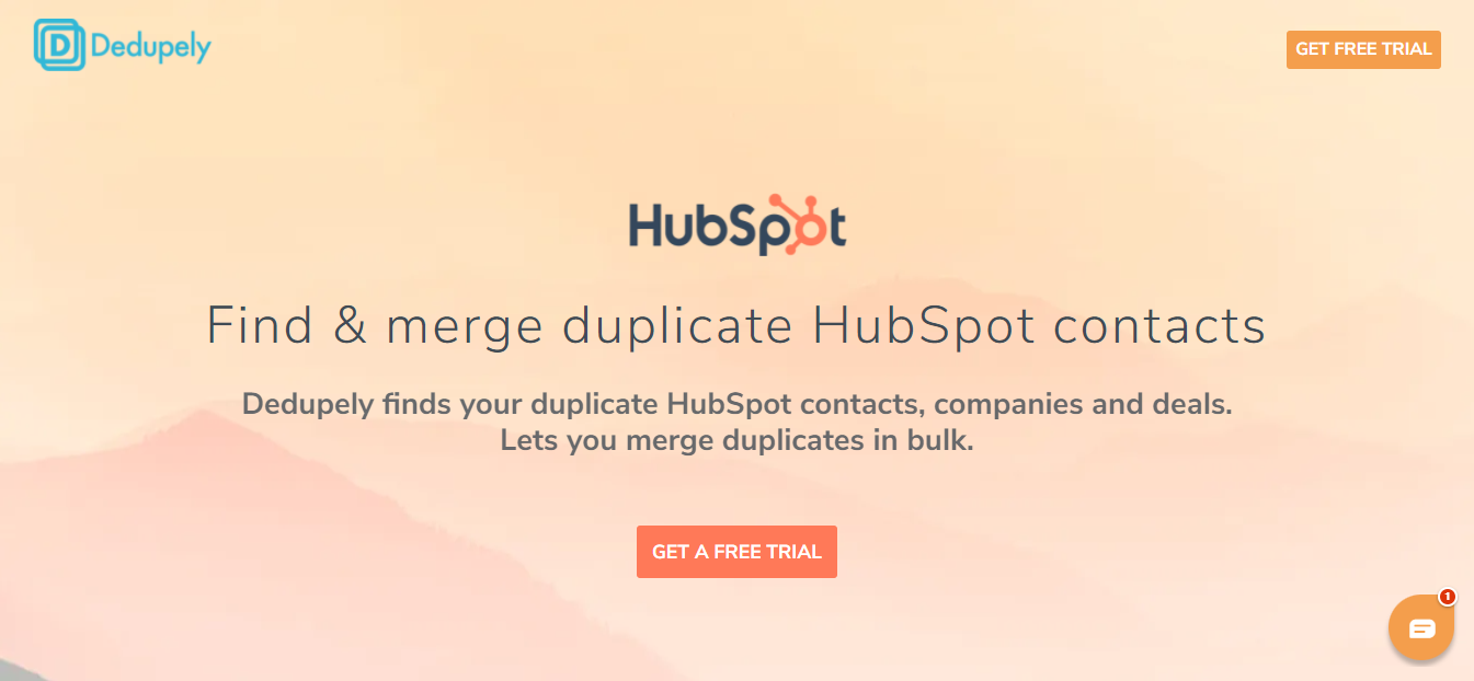 Maintain consistency throughout your marketing campaign
Yelo
Another one on our list of excellent eCommerce landing page examples is Yelo. What is great about this page is that it provides a visitor with all the information needed to lure them in. The cherry on top of this page’s UVP is the 14 day free trial offer.
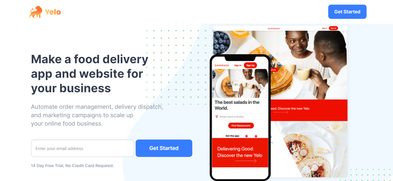 Make your value proposition and benefits clear
Apart from its brief and informative copy, the simplicity of this page is what makes it one of the best eCommerce landing page examples. It does not feature any unnecessary elements that would disperse visitors’ attention.
Roomie
Roomie is a company that sells and rents affordable mattresses to college students and graduates. Let’s take a look at one of their landing pages for eCommerce.
Ensure the high-quality of your background videos and other visuals
Okay, these monkeys are super cute, but that’s not the only reason Roomie should be one of the best eCommerce landing page examples to get inspired by. The company uses a creative and high-quality product demonstration video as a background, evoking positive associations. What we also like about this page is that it has a single CTA and no other distractions. Only you, the CTA button, and the monkeys.
Anne Weeks
This personal brand serves as one of the greatest eCommerce landing page examples with its modern and to-the-point design. Clearly, not every layout needs to be colorful and flashy. And what is a better background color choice for a virtual home organizing brand than elegant white?
However, it’s also essential to optimize it for mobile to make sure that all users are able to enjoy your eCommerce landing page design. Anne Weeks does just that by implementing vertical formatting and including a tappable button.
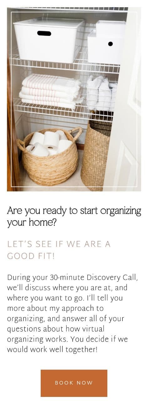 Consider optimizing your eCommerce landing page for mobile devices
Wix
Wix is one of the best eCommerce landing page examples. Its copy is minimalistic yet powerful since it clearly outlines the offer, focuses on the UVP, and is logically structured thanks to bullet points.
 Keep your copy simple and concise for the best results
One more reason why Wix makes it into the list of great eCommerce landing page examples is its call to action. The “Create Your Store” CTA contrasts the page’s background and is placed above the digital fold, making it visible. What’s also great about this CTA is that it does not just say “Join Now” or “Get Started” but highlights the benefits visitors will get and reminds them why they’re here.
Shopify
Shopify presents an excellent example of an eCommerce landing page with its subtle design and social proof.
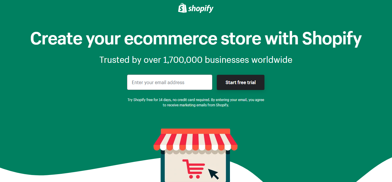 Think about including an element of social approval to your landing pages for eCommerce
Shopify includes evidence that its audience loves and trusts the brand — its number of clients speaks for itself. What also makes it one of the best eCommerce landing page examples is Shopify’s visible CTA, meaning that it’s clear and visible thanks to the color choice and above-the-fold placement.
Now what?
Whew! That’s some great work you have to accomplish. A/B testing, creating and minimizing your copy, developing and optimizing your design, and double or even triple checking your CTA should be your priorities.
So you have all this knowledge, tips, and examples, but how do you make it all come together? Landing page builders to the rescue! You can build your eCommerce landing page from scratch in just a few minutes without any coding or programming knowledge. Customize, promote, analyze the performance of your landing page, and most of all — try it all for free.