Building a website for your new commercial endeavor can be a thrilling experience. After all, you get to decide what kind of impression your business creates on online customers. The thing is, creative freedom comes with responsibility — a single poorly thought-out element can ruin it for your audience.
This post will help you understand how to craft a user-friendly, informative, and visually appealing platform that not only represents your brand but also converts visitors into customers.
Whether you’re starting from scratch or looking to revamp your existing resource, give it a read — you’re guaranteed to get inspired by our pixel-perfect small business website examples.
The benefits of having a small business website
Say, you already have a smoothly running brick-and-mortar shop, or your appointment calendar is always full thanks to the word of mouth from your previous clients. In that case, why would you even bother creating something more complex than a business profile on Google Maps?
Here’s what you can achieve by strengthening your commercial presence with an informative and modern small business website:
- Make your USP easily discoverable and reach a broader audience way beyond your local area.
- Use it as a chance to show that you are serious about your business and are invested in building a solid reputation, both in person and online.
- Allow potential customers to study your offers, learn more about your brand, and make inquiries before visiting you in person.
- Showcase your brand’s mission, values, and unique approach to make it clear why customers should choose you over your competitors.
- Accept orders or bookings directly from your website in an automated way instead of answering endless emails or calls.
- Add marketing and analytics tools to your toolkit to target specific demographics that are more likely to appreciate your offers.
- Engage with your customers by sharing helpful information on your website blog, newsletters, and social media.
- Collect customer data using tracking software and contact forms to better understand who you’re targeting and how they interact with your resources.
In short, having a website allows your business to expand its presence and visibility and pursue long-term growth goals. Now, let’s talk about the essential components of a great small business website.
What elements should an effective small business website contain?
Whether you’re browsing through pre-designed templates or preparing to build something from scratch, there are a few things you have to keep in mind when making your small business website. Including the following elements will help you create a memorable, intuitive, and inviting platform:
- Clear branding. Ensure your business’s name, logo, and tagline (if you have one) are prominently displayed at the top of the homepage. You want your brand to be recognized early on.
- Contact information. Display your contact details, including a phone number, email address, and physical address, prominently on your website, even if it’s just a coming soon page.
- About us page. Share your company’s story, mission, and values. Humanize your brand by including photos and bios of key team members.
- Products or services. Describe what you offer in clear, concise terms. Include high-quality images and detailed descriptions. If applicable, offer pricing information.
- Testimonials and reviews. Showcase positive customer reviews to prove your business is legit and in demand.
- Call to action (CTA). Include clear and compelling CTAs throughout your site to help your potential customers connect with your business.
- Blog or news section. Share your expertise and what your small business lives and breathes to establish authority and engage your audience.
- FAQ section. Anticipate common questions and provide answers on an FAQ page to reduce customer inquiries.
- Contact form. Include a user-friendly contact form that visitors can fill out to get in touch with you. This will signify your readiness to connect with potential customers, partners, or vendors.
- Newsletter signup. Encourage visitors to subscribe to your newsletter for updates, promotions, or valuable content. Building a mailing list will help you stay in touch with your audience and nurture leads.
- Social media links. Link to your social media profiles to demonstrate that your business is active and keeps up with the times.
- Privacy policy and terms of use. Ensure legal compliance by providing clear privacy and terms of use policies.
- Search functionality. For eCommerce websites, include a search bar to help visitors find specific items quickly.
The key takeaway here is that your small business website should bring actual value to your potential and existing customers. Populate it with information they may need to make a purchase or place a reservation confidently, even if you offer just a handful of products.
Best practices for your small business website design
So, you’re ready to create a new website or revamp your existing one. There are a few steps you need to take to make your platform more attractive and fun to use — let’s discuss each of them.
Define your goals
Clearly define your website’s purpose and objectives. Are you looking to generate leads, sell products, provide information, or offer customer support? Your goals will shape your website’s design and content.
Ask yourself the following questions:
- Who’s my website for?
- How do they prefer to interact with businesses like mine?
- What can I do to help them understand my offers better?
- What kind of action do I want my website visitors to take?
- Do I have the incentives, infrastructure, and resources in place to make sure they can perform that action frictionlessly?
Answering these questions alone will help you tremendously in eliminating clutter and making your resource easy to navigate.
Make your design vivid
Use high-resolution images and graphics that are relevant to your business. Visual content can leave a lasting impression on visitors. Avoid stock images at all costs, as your website is your only chance to demonstrate the legitimacy of your business, and there’s nothing more suspicious than a company that’s hiding its own team and operation conditions.
Focus on user comfort and safety
Ensure your website is secure by using HTTPS (SSL certificate) to protect user data and gain trust. Regularly update software and plugins to prevent vulnerabilities. If your existing website is running on HTTP, move to HTTPS — WordPress and many other popular website builders allow and even encourage that.
Take care of the SEO essentials
Optimize your website for search engines by using relevant keywords, meta tags, and creating a sitemap. This helps improve your visibility on search engine results pages (SERPs). Most popular code-free builders come with website optimization tools, allowing you to do that basic SEO work in a few clicks.
Keep your site up-to-date
If the link on your business card leads to a lifeless, outdated website, your potential clients will naturally assume that your company went out of business. To avoid that, keep your website content up to date, including product listings, news, and blog posts, even if you don’t do sales or accept orders online yet.
Make your site available for a diverse public
Ensure your website is accessible to people with disabilities by following web content accessibility guidelines (WCAG) to make your content usable by a wider audience. The guidelines include:
- providing text alternatives for non-text content like images and multimedia;
- ensuring all functionality is operable through a keyboard interface;
- providing users with enough time to read and interact with content;
- avoiding stroboscopic videos and animations that could cause seizures or physical discomfort;
- helping users avoid and correct errors during input, such as form submissions.
Adhering to WCAG guidelines makes your web content accessible to a broader audience, including individuals with visual, auditory, motor, and cognitive impairments.
Stick to local regulations
Include necessary legal pages such as a privacy policy, terms of service, and a cookie policy to comply with local regulations and demonstrate that you treat your customer data with care. There are GDPR-compliant privacy policy generators and other similar tools available online, so you won’t have to struggle with legalese yourself.
Keep your finger on the pulse
Having a beautifully designed website that is always down or dysfunctional is pointless. Continuously monitor your website’s performance and user feedback to identify areas for improvement.
Invest in finding a reliable hosting provider that offers 99.9% uptime and takes care of the technical side of things for you. Many hosting providers offer free migration, so you can easily abandon a clunky, outdated platform and move to a speedy one. A premium hosting service will help you reduce load times and identify and troubleshoot performance issues in one click.
Rely on templates
Don’t reinvent the wheel unless you’re absolutely confident in your coding and design skills. There are countless stunning and eCommerce-friendly website templates out there — and most website builders give you plenty of customization options, too.
In the following sections, we’ll show you how to use SendPulse to create a unique small business website in minutes using our flexible templates and visual editor.
3 steal-worthy small business website examples
When it comes to expressing the essence of your business, you shouldn’t let outside influences dictate what it should look like. However, sometimes, it helps to look around and pick a creative idea or two. Here are three small business website design examples that will likely inspire you.
Outdo
This small business offers guided bike trips across the European mountains. The website perfectly captures the company’s mission — to attract courageous and active individuals and embark on an adventure in one of the most picturesque corners of the world.
A small business website example from Outdo
The website features an engaging video showcasing their previous trips. We see a route overview and a clear day-by-day breakdown of the upcoming trip, followed by the introduction of the Outdo team. Moreover, there’s a FAQ section, positive testimonials, and a gorgeous gallery depicting their past adventures.
This resource ticks all the boxes — it has a clear CTA, lots of useful and verifiable information, and a nice personal touch. This small business website design isn’t overly complex, but there are many beautiful details, from gentle animations to stylish typography.
24th Pizza and Meatballs
This crazy pizza joint website is one of a kind. Firstly, you get to scroll through the mouth-watering variety of carb goodness that the place offers. Then, you’re met with a stylized call to action followed by a heartwarming background story of the restaurant.
A small business website example from 24th Pizza and Meatballs
The vibrant color scheme of the website evokes memories of old-school candy machines and cozy motels. We especially love that this business has a full-sized menu on its homepage, leaving no questions unanswered.
Eastside Paddle Club
This pickleball club website has a lovely mascot along with a tasteful color palette and concise descriptions capturing the upscale atmosphere of the community. The website copy makes it crystal clear why this club is like no other.
A small business website example from Eastside Paddle Club
The vintage-style photos and typography reinforce the overall impression — the club feels classy and sophisticated while simultaneously being fresh and hip. This small business website example definitely proves that sometimes less is more.
How to build a small business website using SendPulse
No prior coding experience? No worries. With SendPulse, crafting polished small business websites is ridiculously easy, regardless of your skill level. Our website builder relies on templates, but you get lots of customization choices to make any of them your own.
To kickstart your journey, simply log in to your existing SendPulse account or create a new one if you haven’t already. Once logged in, navigate to the “Websites” section. Here, you can create, edit, and oversee both single-page landing pages and multi-page websites.
Click on “Create website.” This will lead you to our collection of over 20 customizable designs. You can conveniently sort them by theme and language, depending on your needs.
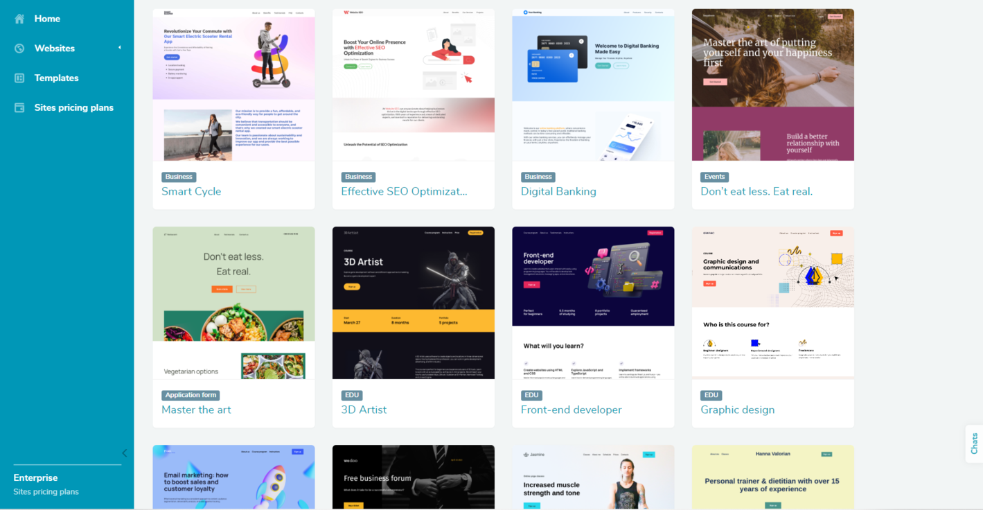 A website template collection in the SendPulse builder
Explore the array of templates at your disposal and choose the one that aligns with your vision. Get a sneak peek of the templates by simply clicking on them. To switch to editing mode, just click on the template’s name.
Our builder allows you to adjust and personalize the template to reflect your brand identity and the type of content you want to present. You can play around with the website’s structure, text, color palette, fonts, and visuals. If you want to customize any element, click on it, and a panel with editing tools will appear.
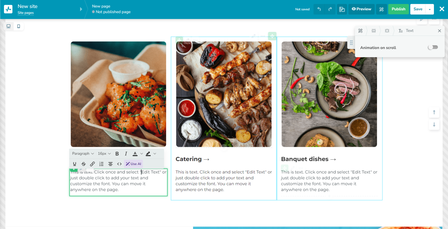 Customizing a small business website template in SendPulse
Our visual-first templates allow you to put your products or services front and center, presenting them in a professional and appealing way. It’s also easy to accentuate your business’ strong sides using bullet points with icons.
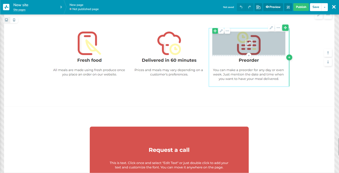 Adding unique selling points
For a small business, having a contact form is a must if your goal is to attract new customers. SendPulse enables you to integrate an attractive lead capture form and save and process incoming inquiries in your CRM.
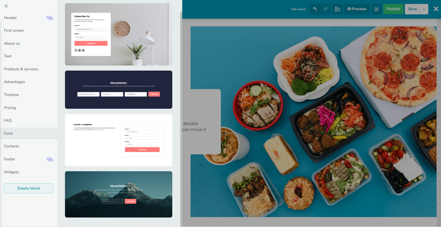 Adding a lead capture form in SendPulse
Make sure to save the changes before you leave. Clicking on the “Preview” button in the top-right corner allows you to see what your small business website looks like before it goes live. Once you’re satisfied with the results, click “Publish.”
Go back to the “Websites” and click on the three-dot icon on your website preview to take care of the SEO part. Add your desired page URL and title. In this case, you may want your URL to be your brand name. Input SEO metadata, mention your target keywords, and add a preview image for your resource if necessary.
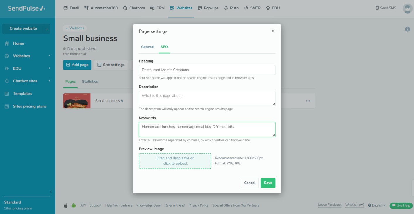 Adding SEO data to a website created with SendPulse
The same tab will help you stay informed about how your website is performing. It enables you to track visits, clicks, subscriptions, and payments. For a more granular view, head to our knowledge base to learn how to track your site’s performance with Google Analytics and Facebook Pixel.
Our website builder is created specifically with small business owners in mind, as it allows you to quickly create impressive-looking single pages, commercial websites, link pages, and more. But there’s even more to our platform.
SendPulse can become your one-stop shop for all things sales and marketing. Create promotional newsletters, pop-ups, chatbots, educational products, and SMS campaigns like a pro — and don’t let these processes distract you from the main thing, which is running your business.
Our toolkit empowers you to test and track your marketing campaigns and manage your deals in a straightforward CRM. Sign up for a free account now and check it out!