Say all you want about door-to-door salesmen, but there’s one thing they did right. Their in-person presentation allowed them to address common objections on the spot, leaving no room for doubt. Whichever question you may have, they’d answer it right away to prevent you from second-guessing their offer — and it worked.
With eCommerce, the situation is quite different. Surely, online shopping can be tempting, and no one is immune to impulsive purchases, but think about how many times you’ve decided against ordering something just because the return policy or delivery terms were unclear.
Now, imagine how many potential customers you lose by not being able to answer their burning questions in the moment. What if you could stop them from walking away? With proper FAQ pages in place, you can kill the seeds of doubt in your first-time visitors and increase the likelihood of spontaneous purchases. Let’s break it down.
What is an FAQ page?
An FAQ (Frequently Asked Questions) page is a section or stand-alone help page on a website that compiles and addresses common questions, concerns, and queries that users or customers often have. It’s a go-to resource designed to help visitors find quick answers without having to talk to anyone or make unnecessary clicks.
An ideal FAQ page would include:
- Q&As. Questions are typically presented in a list format, with concise answers below each question.
- Hierarchy. A complex FAQ page should be organized in a way that makes it easy for users to find relevant information. Questions may be categorized by topic or theme.
- Search functionality. Some FAQ pages include a search bar, allowing users to type in specific keywords and quickly locate relevant questions and answers.
- Extreme user-friendliness. Answers are usually written with the POV of a first-time visitor in mind.
- Relevancy. The FAQ page should always be up-to-date, reflecting the latest changes in products, services, policies, or customer needs.
However, not every FAQ page needs to be that complex. In the following sections, we’ll talk about the cases when less is more.
Here are some topics that are typically covered on an FAQ page:
- Product information — details about products, features, specifications, and usage guidelines.
- Ordering and shipping — information related to the ordering process, shipping options, delivery times, and tracking.
- Account and billing — details about account creation, billing procedures, payment methods, and subscription information.
- Technical support — troubleshooting tips, common technical issues, and instructions for resolving problems.
- Returns and refunds — policies and procedures for returning products and obtaining refunds.
- Privacy and security — information about data protection, privacy policies, and website security certificates.
Depending on your niche and target audience, you may choose more specific topics to cover in your FAQ section. We’ll discuss them in a bit, but first, let’s focus on the reasoning behind creating an FAQ page.
Why do FAQ pages matter?
An FAQ page is one of those website elements that are tempting to ignore or fill with generic information and hide in the darkest corner. But, having a well-organized, easy-to-find, and comprehensive FAQ page is crucial for multiple reasons:
- Give your customer support team a break. An FAQ page provides a convenient way for users to find answers to common questions without having to contact support. This will reduce the sheer number of messages or calls your team receives daily, allowing them to focus on more complex or unique inquiries.
- Show your customers that they truly matter to you. An informative FAQ page can build trust with your audience. It shows that you anticipate their questions and are transparent about your products, services, or policies.
- Boost your SEO efforts. FAQ pages are genuinely good for search engine optimization. When structured well with relevant keywords and content, an FAQ page can improve your website’s visibility in SERP, attracting more organic traffic.
- Save money on fancy explainer videos. An FAQ page is a budget-friendly opportunity to quickly educate your audience about your products or services. You can use it to explain features, provide usage tips, or clarify any misconceptions.
- Demonstrate your thought leadership. Use FAQ pages to showcase your expertise in your industry by sharing in-depth knowledge, insights, and practical tips your customers won’t find elsewhere.
- Turn the buyer journey into a smooth ride. By addressing potential concerns or objections, you can contribute to higher conversion rates. Your first-time customers will simply have fewer fears and hesitations if you provide them with all the necessary details upfront.
- Meet customer expectations. Many users expect to find an FAQ page on an eCommerce website. Its absence may make your website seem less transparent or thought-through compared to competitors that do provide this resource.
In short, a single FAQ page can enhance your user experience, reduce customer complaints, and even fuel spontaneous first-time purchases. It’s a must-have tool for transparency, customer support, and efficient communication.
Steps to creating a relevant FAQ page
Starting anew is always intimidating. This blueprint will help you craft a help page that resonates with your audience and makes your business sound reliable and approachable.
Identify your frequently asked questions
Compile a list of the most common questions your customers have had in the past, anticipating their future needs based on historical data. Take the time to document and answer them in a beginner-friendly manner. Remember, most users reading your FAQ page will be people who don’t know much about your company or your offers yet.
These questions could be about your shipping policy, refunds, payment options, materials, safety standards, or sustainability practices. Their content depends on your niche, price segment, region, and even audience demographics. For example, Gen Z is more likely to care about sustainability of products, while older generations may be more interested in how it will pair with their existing items.
Draw from customer service interactions, including phone calls, emails, and social media comments, to gather valuable insights. Also, feel free to explore your competitors’ FAQs for inspiration.
Finally, try People Also Ask (PPA), a Google SERP feature that provides users with additional information they may be interested in based on their initial query. PAA will help you uncover questions that can also be used as high-demand, low-competition keywords.
Make sure your FAQs are brief and aligned with your tone of voice
Your brand has a distinct voice, and your FAQ page’s tone should match it. You may want your answers to be consistent with your brand identity but not too quirky. When in doubt, opt for the most neutral tone possible. The main goal of any help page is to provide value and guidance, so keep your sentences short and to the point.
Avoid using industry jargon that might intimidate newcomers. An FAQ section is intended to help an already confused user make sense of the offer in front of them — niche terms and software-specific abbreviations may confuse them even more.
Structure your FAQ page for better readability
Are there more than five questions in your FAQ list? Then, you may want to divide it into categories to avoid creating a visual mess. You can organize that wealth of information into topics and subtopics.
The easiest way to do that is to sort the questions based on the stage of the customer journey they’re related to, like “Delivery” or “Maintenance.” This ensures visitors can easily browse, find their answers quickly, and discover relevant questions they might not have considered.
While you’re structuring your page, take a moment to make sure it’s not the exact copy of your more in-depth articles. Keep the content unique to avoid issues with duplicated content, a factor search engines frown upon.
Make it lean and easy to navigate
When it comes to your FAQ page design, prioritize simplicity, but make sure to use your standard fonts, colors, and text sizes to maintain the visual identity of your brand. Use images and icons scarcely — they can easily clutter the page. Instead, employ headings, subheadings, and bullet points to break up the content. Collapsible answers will also help make your help page leaner and more minimalistic.
Include links to relevant resources, such as product guides, video tutorials, or customer support channels. This helps users get more in-depth information if needed. End the FAQ page with a clear call to action, encouraging users to reach out to customer support if their question isn’t answered or if they need further assistance.
Keep your FAQ page up-to-date
Regularly update your FAQ page to reflect changes in your business. Ensure that crucial details such as delivery areas, working hours, and product categories are always right. Add new questions that arise over time as you collect more customer feedback. If you neglect your FAQ page, some customers will eventually end up misled and frustrated by that.
Learn how to create an
FAQ chatbot to assist your customers.
The dos and don’ts of FAQ page design and copy
Here are the dos for your FAQ page design — the best practices you absolutely want to follow:
- Ensure that it’s written with inexperienced customers in mind. Your first-timers may not know specific names, qualities, or terms that your products have — educate them in a light-hearted manner. Seasoned customers are less likely to read your FAQs.
- Keep the details for later. Provide answers that are concise, straightforward, and directly address the user’s query. Avoid unnecessary information that could overwhelm the reader at the discovery stage.
- Include visuals if they serve a purpose. Schemes, infographics, or videos can enhance understanding and engagement, especially if your FAQ page is fairly complex.
- Design your FAQ page to be mobile-first. Mobile eCommerce sales now make up 60% of all online sales around the world — you surely want to grab a piece of that pie.
- Embrace white space in your design. A clean layout with ample white space makes the content more readable. Nothing should distract the reader; otherwise, they may get confused and leave.
- Add or remove questions if needed. It’s hard to get it right the first time. As you learn more about customer needs and frictions on their buying journey, you will be able to optimize your question list.
- Have real users test your FAQ page. Test the usability of your page with actual users who could give you feedback and help identify any issues with navigation or comprehension.
As for the don’ts of an FAQ page design, here are a few common offenses:
- Don’t use generic FAQs. Abstract, superficial answers or definitions won’t help your audience make an informed purchasing decision. If anything, they might make them start questioning your authority.
- Don’t assume what’s on your visitors’ minds. If you don’t have enough data, survey your repeat customers to find out what they struggled with during their first purchase and use that knowledge to phrase better questions.
- Don’t use excessively wordy answers. Save the rest for your knowledge base.
- Don’t ignore SEO best practices. Optimize your FAQ page with relevant keywords, questions pulled from SERP, internal and external links to improve search engine visibility.
Knowing all that, you can safely start composing your own help page.
3 FAQ page examples that hit the spot
Let’s see how everything we’ve just described works in practice — and how to break the aforementioned design rules creatively.
Carbonmade
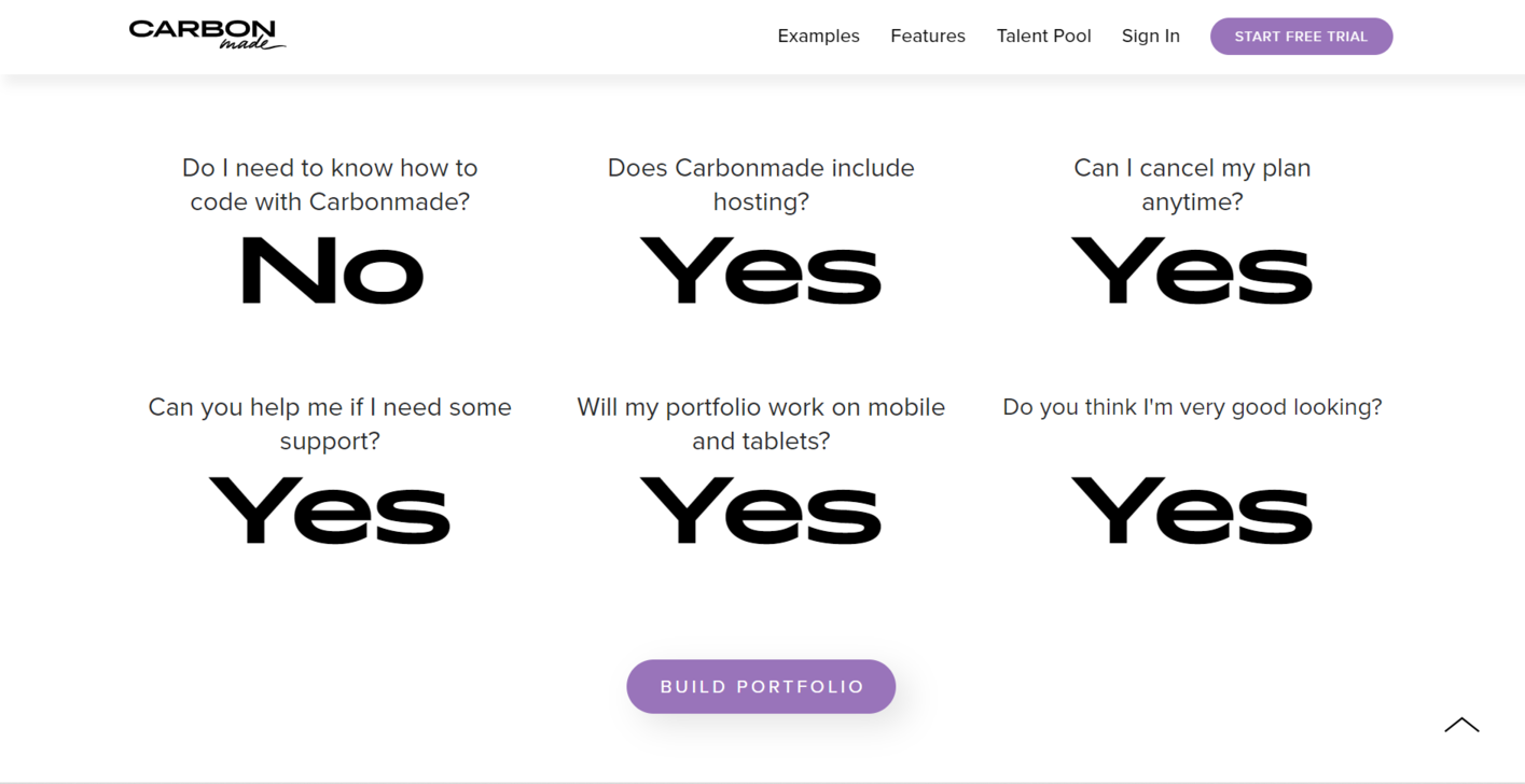
This FAQ page example is quite rebellious. It’s unusually simple, consisting purely of yes–no questions. And surprisingly, it works. Carbonmade offers an intuitive portfolio website builder, and these FAQs nicely highlight its main advantages, from flexible plans to responsive design.
 An FAQ page example from Carbonmade
The bold typography makes the whole FAQ section pop and steal the reader’s attention. Having received some reassurance, the user can immediately proceed to create their portfolio, thanks to the conveniently placed CTA button.
Root
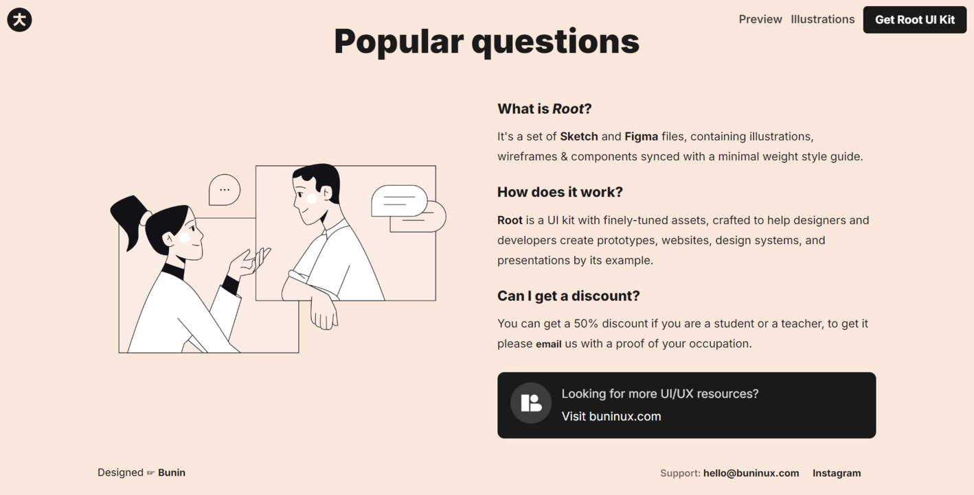
Our next example doesn’t break any design rules — instead, it follows them vigorously, which results in a pixel-perfect FAQ page. Root uses bold text to emphasize certain keywords, namely the platforms its kit is compatible with. This is an excellent way to guide the user through your page.
 An FAQ page example from Root
This example contains an illustration that definitely serves a purpose — it shows us an actual dialogue between a user and a support agent, which helps users differentiate the FAQ section from the rest of the website. Finally, Root links to a vast knowledge base, enabling its users to learn more about UI/UX before they sign up.
Nike Swoosh
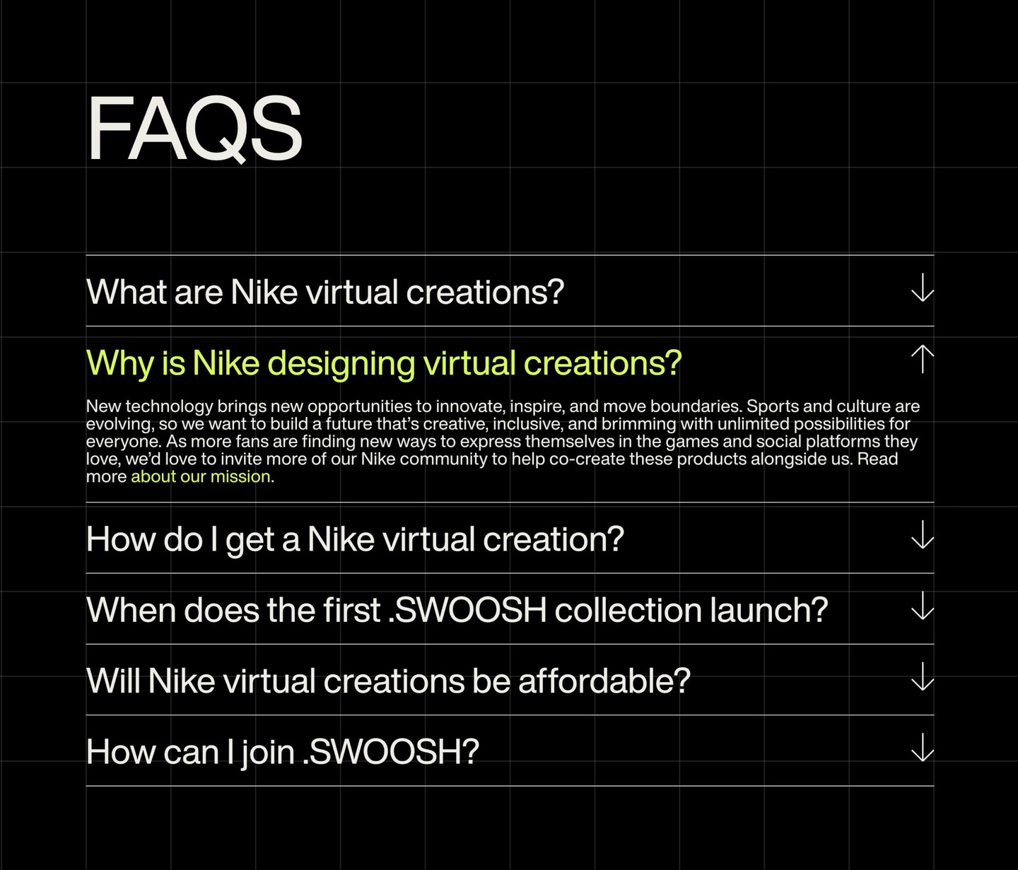
Our final FAQ page example is from Nike. The common notion is that dark mode makes everything look better, and it certainly applies here. At the same time, the subtle grid on the background adds some extra dimension.
 An FAQ page example from Nike
Nike uses dialed-down neon green as the only accent color, which creates a fresh, somewhat futuristic look. The same color is used to highlight external links. The questions are formatted as headlines, which makes them easy to scan.
How to build an FAQ page without knowing how to code
SendPulse offers a no-code website builder for creating stunning online stores, portfolios, link pages, personal pages, and more. Whatever it is that you sell or promote, you can rely on our platform to create a professional website and equip it with a comprehensive FAQ page.
Simply follow these steps:
- Create your SendPulse account — it’s free of charge, and you won’t need to enter your credit card details.
- Open the “Websites” tab and click “Create website.”
- Pick any template you like and click “Edit.” All templates can be customized to your liking.
- Click on the elements to edit or move them. Add your text, images, and other content.
- Once you’re done customizing the existing elements, add new ones by clicking on the green plus sign that appears in between the page blocks.
- You’ll see a block gallery on the left. In this case, you’ll need to choose the FAQ form template.
- You can change the background color, text formatting, and more. Add more questions if needed.
- Preview your website and save changes.
Here’s how to add an FAQ widget to your page:
Adding an FAQ section in SendPulse
SendPulse gives you control over your website’s SEO settings — you can decide which keywords to target and how your page should appear in SERP. You’ll find more on that and other aspects of website building in our knowledge base.
Besides the website builder, SendPulse offers email marketing features, CRM, a chatbot builder, an LMS, an SMS marketing platform, push notifications, and more. It can replace up to 10 regular marketing and sales tools for a fraction of the cost.
Get your free account now and give it a try!