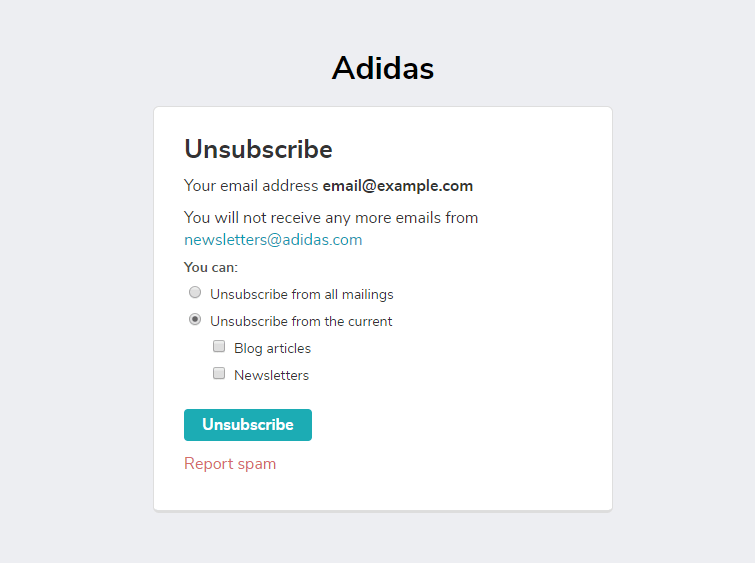
An unsubscribe page is a web page that appears when a user clicks on the unsubscribe link in the email footer. It aims to confirm the opt-out, and it is the last chance to keep a subscriber from leaving your mailing list.
Check out this video on how to create an unsubscribe page with SendPulse.
Why is an unsubscribe page important?
Unsubscribing is a serious issue, as it influences the way email service providers like Gmail, Yahoo, and Outlook judge your sender reputation. A certain number of unsubscribes — over 0.05% from emails delivered — may harm the deliverability of your emails.
Most often, people opt-out because of a high email sending volume, irrelevancy of content, or because they feel overwhelmed with the overall number of emails in the inbox. Sometimes users even can’t recollect they have once subscribed. Keeping the unsubscribe rate within a norm is a challenge, and the unsubscribe page is the last chance to re-engage users or, at least, find out why they want to get no more emails from you.
An unsubscribe page is also a way to confirm the user’s intention to leave your mailing list. With AMP emails, unsubscribing directly in the email became possible, but not many brands use this technology so far.
How to create a custom unsubscribe page?
It takes just a few minutes to create an unsubscribe page with SendPulse. The service provides a default unsubscribe page for confirming the opt-out.
You can create a custom one, change the background color, create a survey with the questions that will help you find out the reasons why users unsubscribe. If a person has once opted-in to receive different flows of emails like weekly newsletters and blog digests, suggest unsubscribing from one flow of emails, staying on another.
Here’s an instruction on how to create an unsubscribe page in few steps. Check the example below.

Unsubscribe Page Tips
- Suggest updating email preferences
- Encourage unsubscribes to follow you on socials
- Make a survey optional
- Don’t require signing in to unsubscribe
- Leave a positive trace
- Suggest updating email preferences. Since the most common reason for breaking up with a brand is the wrong email sending frequency, ask your audience to change their email preferences. Even one email a month can turn out into some revenue in the future.
- Encourage unsubscribes to follow you on socials. Some of your subscribers may want to clear out some private space because they feel overwhelmed with the number of emails in their inbox. Offer to continue communication on Facebook, Instagram, or Twitter. Does it matter where exactly is your engaged audience, even if it’s not in the email inbox?
- Make a survey optional. Don’t make an obligatory poll about what was wrong and how you could improve your job. Such an approach may result in moving your email to a spam folder, too. It’s OK to ask subscribers why they unsubscribe, but let them decide whether they want to answer any questions.
- Don’t require signing in to unsubscribe. When the user wants to unsubscribe, that’s for a reason. Allow them to do so in the easiest way possible. Signing in to unsubscribe pushes them to mark your email as spam, which harms your sender reputation even worse than unsubscribing. After all, when uninterested users leave, it makes your mailing list healthier.
- Leave a positive trace. Yes, it is not easy to say goodbye after all you’ve been through together, but if there are no other options, make it memorable in the right way! Say that you'll wait for them to become subscribers again. A great example is HubSpot’s unsubscribe video. Some comment on YouTube says: “I want to sign up so that I can unsubscribe!” This is a kind of reaction you should try to achieve.
Unsubscribe Page Examples
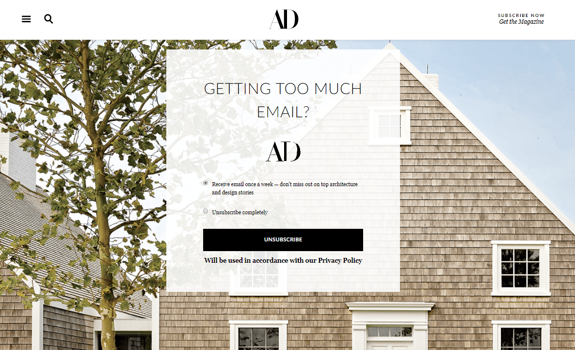
Architectural Digest. On this unsubscribe page, AD suggests changing the email sending frequency. This is an excellent strategical move since this brand kind of bombards its subscribers with daily emails from the very start.

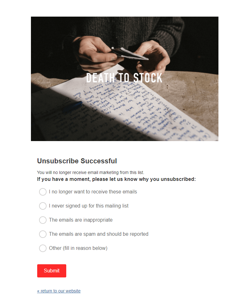
Death to Stock. There is a small optional survey on this unsubscribe page, that would help improve the brand’s email marketing. The only thing that's not quite right here is Death to Stock unsubscribe a user right away after they click on the unsubscribe link. In case the users will change their mind, it would be too late: they would have to go back to the website and subscribe once again, which they would probably not do.

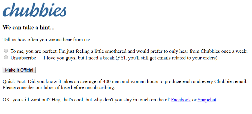
Chubbies. As always, any sort of communication with these guys is humorous and friendly. They use every single chance to keep users from unsubscribing: suggest changing preferences, hilariously plead for sympathy, and offer to continue communication on socials.

Check this helpful blog article for more examples of unsubscribe pages.
References
- The article “9 Effective Email Unsubscribe Pages” by HubSpot discovers wonderful examples that you can consider for your inspiration.
- The article “How to Build Highly Effective Unsubscribe Page” by MailerLite gives the best practices and examples of unsubscribe pages with explanations.

or