An exit-intent popup is a message that appears in front of users when they move their cursor towards closing the tab. Marketers create these popups to keep users from leaving a site and convert them into subscribers, leads, or customers.
Why should I set up an exit-intent popup?
Exit-intent popups are crucial because they allow you to recover up to 53% of visitors that want to leave your website. As a result, you can continue building your relationships with the audience.
The most popular type of exit-intent popup is a subscription popup with a lead magnet. These messages ask users to share their email address in exchange for something valuable, like helpful or entertaining content, discounts, free e-books with hacks, etc.
Let’s explore some brilliant examples of using this technique.
8 Exit-Intent Popup Examples
We’ve collected eight examples based on different goals exit-intent popups help marketers achieve. You will see that many brands use similar design tricks, including contrasting CTAs, eye-catching images, text that stresses out the benefits, etc.
1. A Popup with a Discount
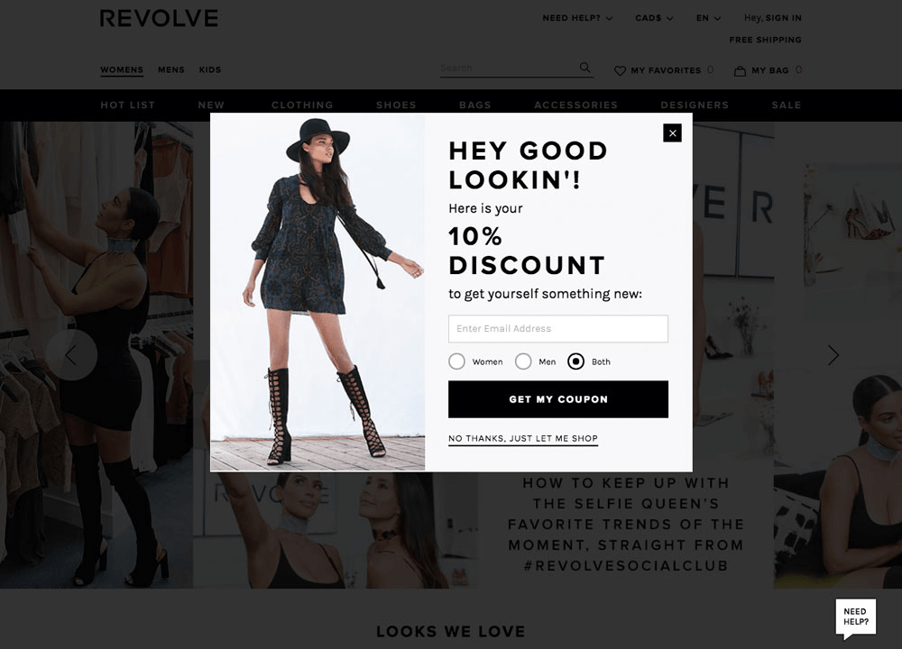
If you sell products, some users may leave your website because they are not satisfied with the price. If your strategy and budget allow you to give discounts, it’s a great idea to provide one with an exit-intent popup. A coupon can add value to communication with your shop so that some part of visitors can join your brand and quickly turn into customers.
Below, an online shop asks users to share their email addresses and gender information to make them more relevant offers to them in the future.
2. A Popup with a Free Shipping Offer
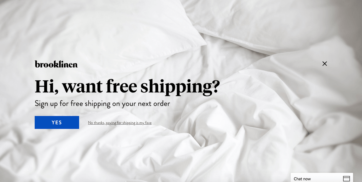
Providing free shipping is similar to giving a discount. For people from some distant regions shipping costs may seem to be high, so free shipping is a great incentive to convert them into paying customers.
The example below offers free shipping without asking for users' email address.
3. A Popup with Social Proof
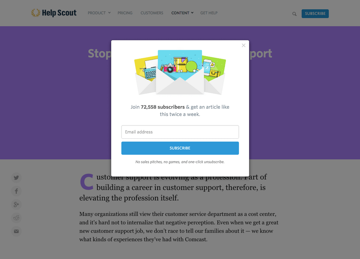
Some users may lack social proof on the landing page where you promote your products and services. Tell them how many people pay for your services or subscribe to your newsletters in an exit-intent popup. This may affect human emotions and convince them you’re a trustworthy brand.
The popup below says there are more than 72 thousand subscribers already on board.
4. A Personalized Popup
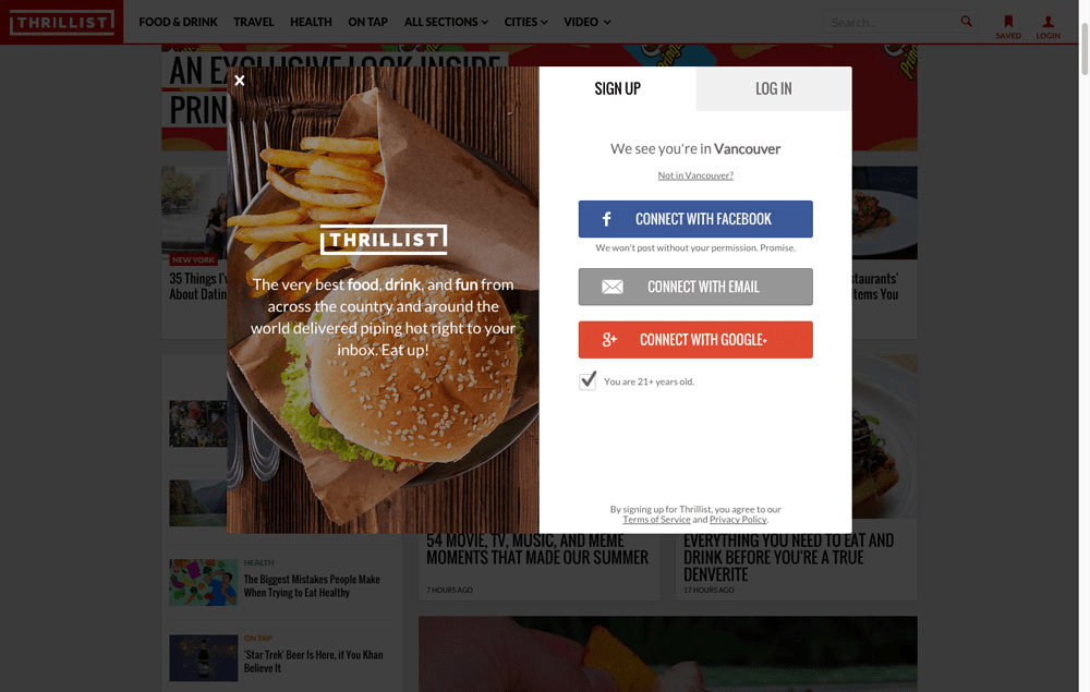
Here’s another excellent approach to hook people’s attention. Personalized messages may provoke pleasant emotions.
In the example below, the brand utilizes user location data when it says “We see you’re from Vancouver” and offers specific food recommendations.
5. A Popup that Appeals to Emotion
It’s crucial to appeal to people’s emotions since such popup messages have very little time to persuade visitors. Brands strive to find the right tone of the message and they base their decision on the target audience.
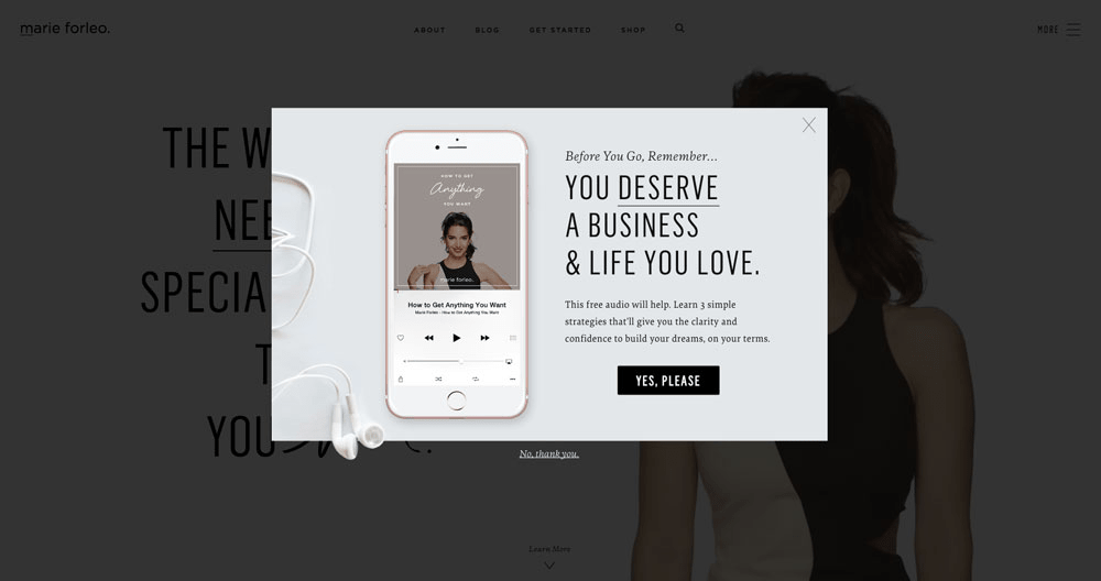
This popup is targeted at women. To ensure the brand will help, it uses the title “You deserve a business and life you love” with the stress on “deserve.”
6. A Popup for Entry-Level Entrepreneurs
It’s a great idea to create popups that resonate with your target audience. Companies invest a lot in analyzing their audience’s interests and behavior to create their buyer personas and better tailor their communication.
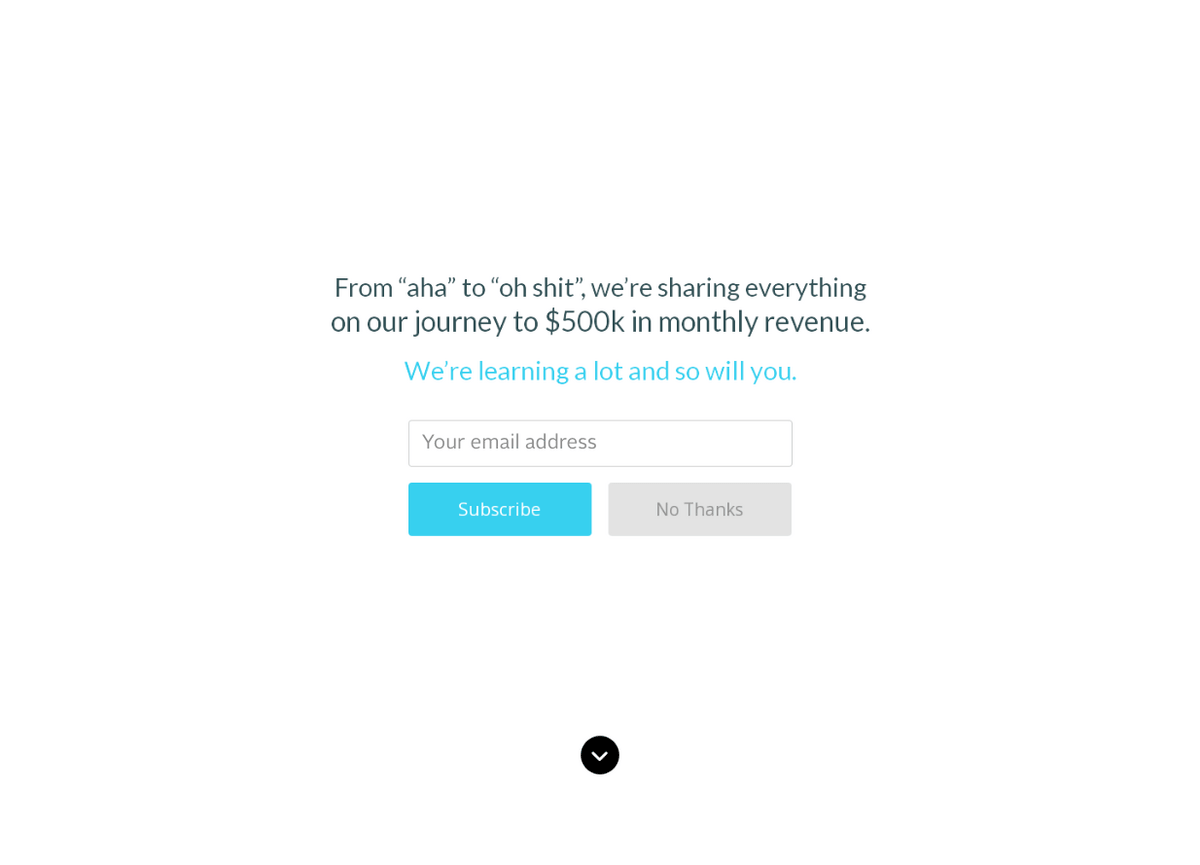
“From “a-ha” to “oh shit” are the first words in this example. The message is addressed to a specific audience, probably young people and entry-level entrepreneurs. The phrase “We’re learning a lot and so will you” highlights that the brand is trying to look like an ally for their users. Besides, this exit-intent popup only asks for an email address, so chances are, a lot of people will convert with this message.
7. A Popup that Redirects Users to Relevant Content
Sometimes, users intend to leave a website because they failed to find the content they expected to find. If your website or blog specializes in multiple topics, you can provide users with more options.
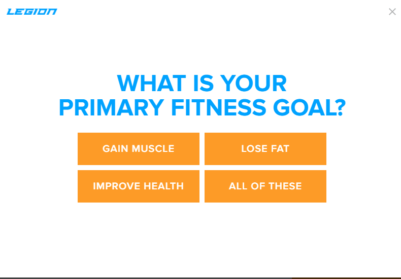
This type of popup keeps users from leaving by allowing them to choose the type of content they want to see. If a user was introduced to content about weight loss, but interested in health improvement in general, this message may address that person to more relevant content. At the same time, it allows the brand to collect some data for further personalization.
8. A Popup with FOMO
The fear of missing out, or FOMO, is a useful technique that can make people change their minds in a flash. Warm leads are most likely to bite this hook.
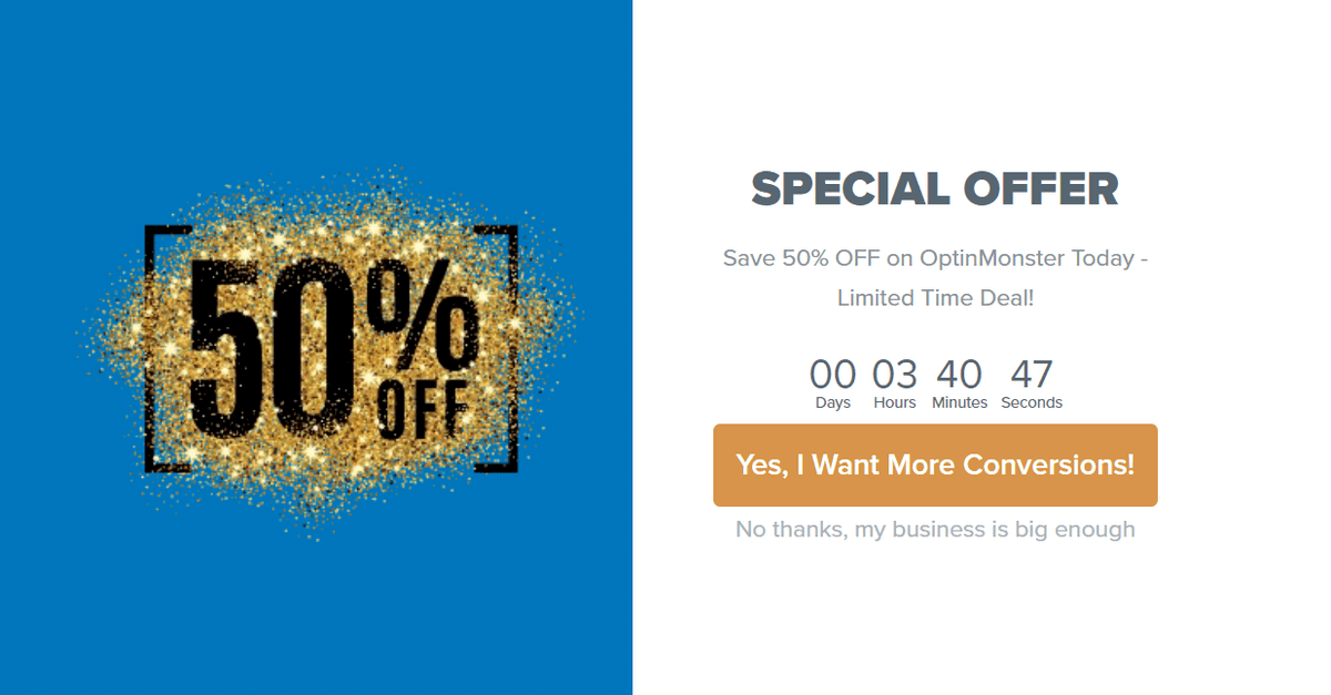
This popup creates FOMO by showing a timer that tells users about a special 50% offer that expires soon.
The bottom line for the exit-intent popups is that you need to address your message to users’ emotions because it’s the most efficient way to convert them from visitors into leads and, potentially, clients. Let’s finish this guide with some useful tips.
5 Best Practices to Create Killer Exit-Intent Popups
- Make it mobile-friendly
- Use A/B testing
- Track conversions
- Provide a simple way to close the popup and say no
- Keep your message simple
We’ve collected five actionable tips that will enrich your strategy. Here they are:
- Make it mobile-friendly. This is necessary because about 40% of users browse websites from mobile devices. If your popup is not mobile-optimized, it will be displayed incorrectly, resulting in a poor user experience.
- Use A/B testing. This technique allows you to find out what kind of copy, images, and CTAs work best for your exit-intent popup.
- Track conversions. This will allow you to understand on which pages exit-intent popups bring you desired results. Note that your popups need to have reasonable goals, like “convert 25% users that intend to exit your website into subscribers,” otherwise tracking conversions won’t help you very much.
- Provide a simple way to close the popup and say no. These messages are somewhat annoying in nature, so it’s best to provide users with a well-visible X to quickly close the popup. Don’t try to hide or camouflage the “no” reply by making it too tiny.
- Keep your message simple. Don’t overwhelm visitors with a wall of text — they are too busy for that. Instead, it’s best to tell them what you can give and what they need to do to take that from you right away.
Congratulations, you’ve learned how to create effective exit-intent popups. We hope that this tool will help you keep a lot of potential customers from leaving your site.

or