A study by Microsoft showed that our attention span has dropped to just 8 seconds. That is more than 33% drop from a relatively longer span of 12 seconds in the year 2000. This study was carried out a couple of years ago. The actual attention span might be even smaller than that on mobile phones.
People do not read content. They scan through your emails and stop only if there’s something that catches their interest.
This scanning doesn’t take place in a typical left to right pattern. Users have specific patterns and understanding these patterns can help you create a layout that places the main message and call to action at the right place.
In this post, we will talk about these patterns and some other findings from eye-tracking research that you can use in your emails.
Know the reading patterns
A study titled “How people Read on the Web: The Eye Tracking Evidence” by Nielsen Norman presents the following patterns.
The “F” Shaped Pattern
The “F” pattern is the most commonly discussed pattern when it comes to web design and layouts. In this pattern, users start by looking at the title and first couple of lines. Then, scroll down a little bit and read some text from the middle, and then scroll down further to the bottom of the page while going through the contents in a vertical pattern.
When we look at the heat map, the pattern looks like letter “F”.
![]()
Source: Nielson Norman
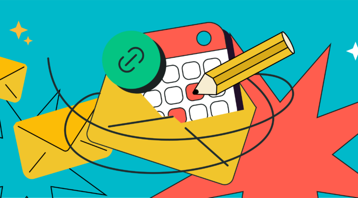
Companies can optimize emails for this pattern by placing the key message in the headline and first few lines of the email, and placing the main call to action on left after the first paragraph.
Here is an example from our template library.
![]()
Layer Cake Pattern
In this pattern, users scan the page in layers, quickly going through the headings and then stopping at the layer/section that interests them.
Lots of new websites use this pattern in their parallax scrolling designs. The design works equally well for mobile users because they can scroll down from one layer to another and stop when there’s something they want to see.
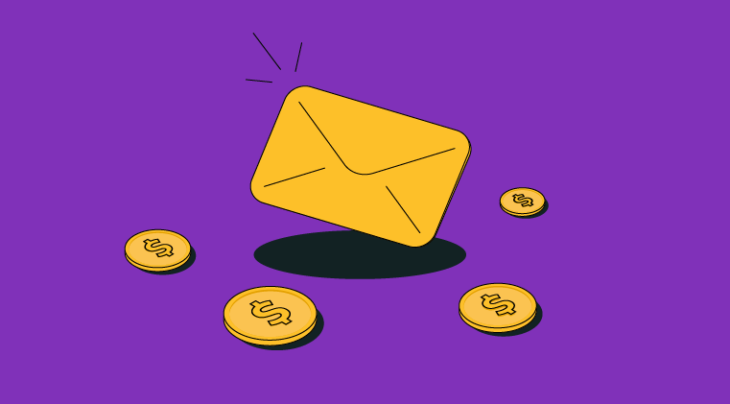
Email templates can also be designed to accommodate this pattern.
Here’s an example from our templates. Different products are presented in layers, with each layer having its own heading, description, and call to action.
![]()
Bypassing Pattern
The bypassing pattern is more of a skipping pattern than a reading pattern. It was observed when readers were going through lists, especially when the first few words in the lists are the same.
It established the fact that readers will easily skip or ignore content if it’s getting repetitive.
Marketers need to avoid repetitious emails. Just say what you want to say. Don’t rephrase the same message again and again.
The same study by Nielsen Norman also mentions instances when readers skip the text because it seems unimportant.
Online users are becoming smarter. Researchers at Facebook found that the younger generation is quite fast at scrolling and finding useful information. They take seconds to decide if it’s worth reading or not. You can read our post about copywriting mistakes and learn how to avoid using clichés, long text, or pointless headers.
Marketers can also use some eye-catching visuals to grab their attention.
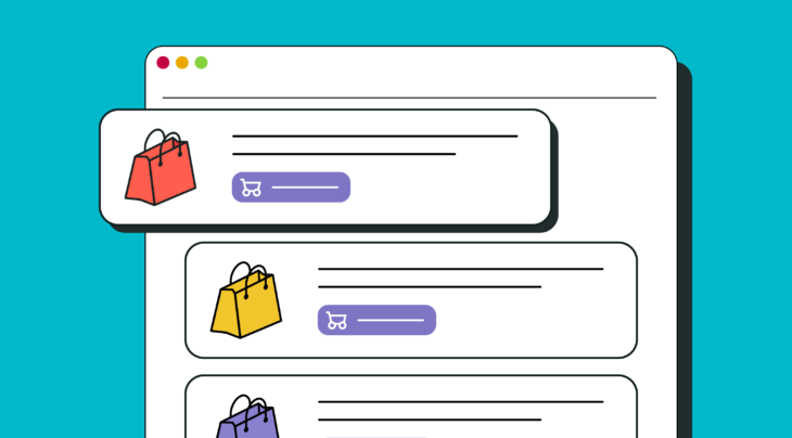
Take a look at the following templates as an example:
![]()
Spotted Pattern
The spotted pattern was observed when users quickly scanned through the text. They quickly moved their gaze while sampling text and deciding if there’s something worth giving a read. This is something we do quite often while browsing.
Email marketers can use bold words, headings, underlines, lists, bullet points, or different text colors to grab their attention.
Commitment Pattern
Commitment pattern is followed once the users have found the information that they were looking for. This pattern highlights the commitment to read the entire text.
![]()
Source: Neilson Norman
This pattern is usually preceded by another pattern like “spotted” or “F-shaped pattern” because users are scanning the page. Once they find something of interest, they will stop and give it a detailed read.
Ideally, you want to see commitment pattern around your call to action. The best way to do that is to highlight what’s in it for them.
The “Z” Pattern
There’s another pattern that is not discussed in this study and it is known as the “Z” pattern. This reading pattern starts and ends with two horizontal lines like the F-shaped pattern. The only difference is that the user moves down in a pattern that resembles Z.
Here’s an example with a template that places a call to action at the finishing point of this pattern.
![]()
Remember that these patterns are not carved in stone. Readers can start from a specific pattern and change to another while going through the emails. Businesses also need to keep the mobile effect in mind. Some reading patterns that are quite common on desktops might be rare on mobile phones.
Still, keeping these patterns in mind will help you create a template that has the best chances of conveying your message.
You can also use our Drag and Drop Email builder to create a layout according to different patterns and see which one gets the most clicks or conversions.
Eye tracking for emails
Another study by Nielsen Norman looked into the reading patterns for emails.
The study found that users read just 19% of the newsletters and almost 67% skipped the introduction or pretext altogether.
![]()
Source: Nielsen Norman
As the research concludes, users are flooded with emails and promotional messages and they have become more choosy and impatience.
All eyes should be on the call to action
Techwyse used heat maps to analyze and optimize the following landing page.
![]()
You can see that the header is getting all attention and users are totally ignoring the main message and call to action button.
Using unnecessary images or visuals in the email can be counterproductive. An interesting thing observed in another eye tracking study by Nielsen Norman was that users can ignore the big, decorative images, but they will pay attention to real photos and product images.
It is not advisable to use bold colors, fonts, or visuals that will take the attention away from the main call to action. The call to action must not be hidden under the lengthy text.
See the following template from our collection:
![]()
Directional elements can also be used to draw their attention towards the main content or call to action. An easy way to do that is using arrows or a real person’s image that is looking towards or pointing at the main content.
See this example:
![]()
Color contrasts and white space is used for the same purpose.
The only thing that stands out should be the call to action or key points.