SendPulse logo guidelines
Whenever possible, use horizontal format of the logo or the symbol. The vertical logo in the middle can be used in rare cases.
It’s available in PNG, SVG, EPS formats.


How to use SendPulse logo
White space
There should be sufficient clear space around the logo. The minimum white space is measured by the width of the first letter.
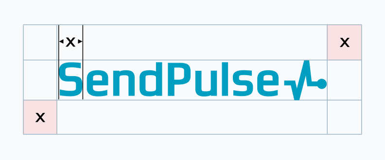 |
The minimum clear space is defined as X. |
Minimum size
The word ‘SendPulse’ should be easily visible.
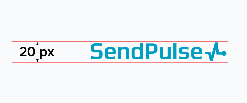 |
The logo height should be not less than 20 px on screen. |
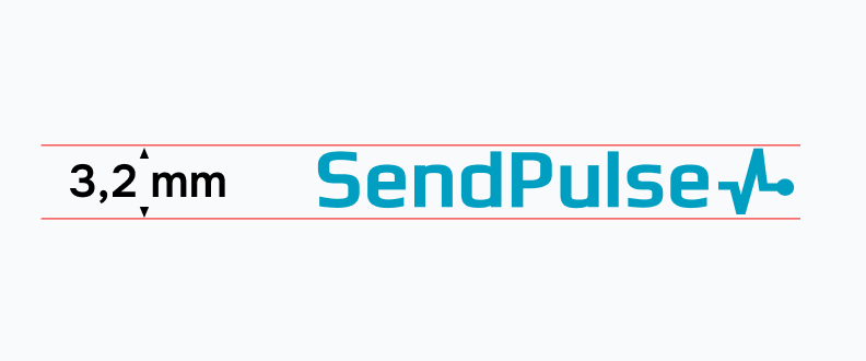 |
The logo height should be not less than 3.2 mm in print. |
Logo color
Do not change the brand color of the logo.
Use CMYK and PANTONE color models for print copies and RGB for websites.
 |
#009FC1 |
Background colors
Below are examples of a proper combination of colors when using the logo on a solid background.
 |
Use white logo if the background color is darker than 50-percent gray. |
 |
Use blue logo if the background color is lighter than 40-percent gray. |
Improper logo usage
SendPulse logo is a recognizable symbol that cannot be modified in any way.
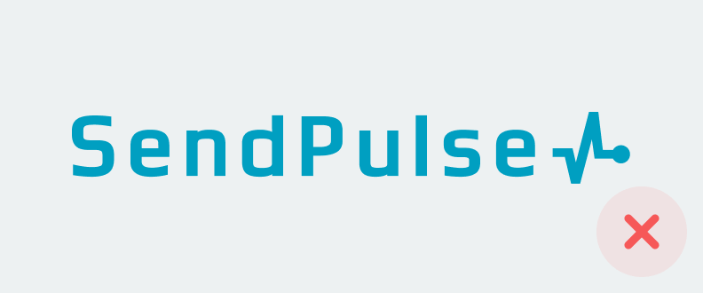 |
Do not change letter spacing, alignment and location of the logo elements. |
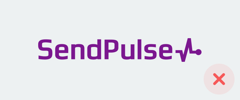 |
Do not change the brand color in logo. If, however, the usage of brand colors is impossible, you can apply your own color. |
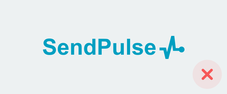 |
Do not change the font of the word ‘SendPulse.’ |
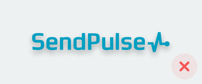 |
Do not add effects like shadows or gradients. |
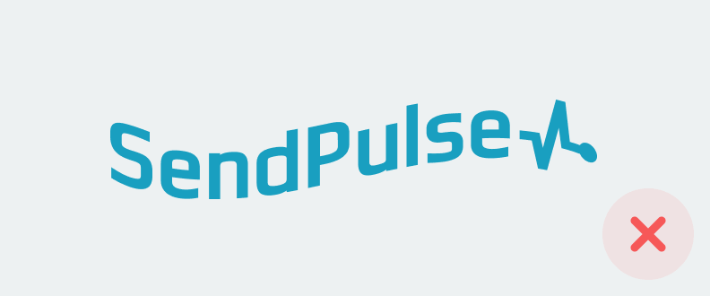 |
Do not modify the form of the logo. |
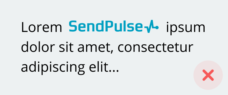 |
Do not paste the logo in the sentence or phrase. |
or