Whoever told you that the first impression is the last impression definitely did not have to craft a welcome email. Not only is it the start of your sales narrative but also the first stone that builds an indestructible and long-lasting relationship with customers. And you need to make sure that it’s a fortress, not a Jenga tower.
Luckily, there are already quite a few strategies on how to strike the right chord with a customer, and all of these techniques have already been tested. We will review some of the best welcome email examples that will empower you to jump-start your relationship with new subscribers on the right note.
What is a welcome email?
A welcome email is the first message a customer receives after subscribing to your mailing list or purchasing something from you. It is your way of saying “hi” and laying the first stone on the way to seamless communication with subscribers.
Sending welcome emails to customers enables you to bolster your customer onboarding process and tailor your future email campaigns to them. Whether you offer your subscribers a discount, send some useful materials, ask them to log in, or showcase your products — it all will go a lot smoother with a properly designed welcome email.
Find out about 14 types of emails you may need to employ to jazz up your promotional efforts!
The design and copy of your welcome email depend entirely on your tone of voice, brand type, industry, and products or services you create. Even so, the best welcome emails are always minimalistic, information-rich, and engaging. Read on to explore more tips on creating well-performing welcome emails that are actually welcoming.
Tips on creating and designing the best welcome emails
Welcome emails shape customers’ first impression of you, so you need to make it matter. You already have potential clients’ attention at this stage, and you just need to firm it up.
Here are some tips that can help you write the best welcome emails and eliminate any roadblocks along the way:
- keep your copy concise and value-loaded — no rigmaroles;
- don’t be afraid to get creative with your design;
- tailor your content to your subscribers’ preferences;
- offer freebies or discounts to move your subscribers towards a purchase;
- showcase only relevant products or services;
- optimize your design for mobile devices;
- include your social media links;
- tell more about your company’s story and how it all started;
- automate your welcome emails;
- always (and this applies not only to welcome emails) add an unsubscribe link;
- craft a catchy and compelling subject line;
- test your CTA to ensure that it’s clickable and tappable;
- keep your welcome email well-structured to avoid shoehorning your copy and images.
However, there is only one rule all of the strategies above derive from: thou shalt focus on thy customer. Welcome emails to customers are just the beginning of your story, and the best way to go here is to allow your subscribers to control how it unfolds. Provide them with an option to choose how often they want to hear from you and what kind of content they want to receive, and live up to their expectations.
You can also send a welcome email series to smooth out your subscribers’ onboarding process!
Killer welcome email examples
Now it’s time to get to practice. We have gathered a load of welcome email examples, so let’s analyze what we like about them and how they can help you beef up your own welcome emails.
Welcome email example #1 Sundae School
You might not guess it from the name, but Sundae School is a Korean-inspired clothing brand. Their welcome email accentuates this impression, jokingly calling their subscribers “students.” This email design is an excellent example of using white space and large pictures organically.
 Incorporate white space and quality visuals to make your welcome email design more elegant
The brand comes in strong with their welcome emails to customers: they offer a 10% personal discount while showcasing the most relevant and high-demand product since 2020 — face masks. This tactic encourages subscribers to hit the visible CTA button and make use of their discounts right away.
Employ the latest email design trends to make your email campaigns look sharp and fresh!
Why this email makes it to our list of the best welcome email examples:
- a large, high-quality, and brand-colored image;
- a compelling discount offer that pairs perfectly with the products showcased;
- a creative and concise copy;
- minimalistic and elegant design that implements white space successfully;
- a visible, contrastive, and only one CTA button.
Welcome email example #2 Armadillo
Armadillo is a brand that produces luxurious handcrafted rugs and advocates sustainability. The company’s welcome email is designed using the same pastel color palette as its website and social media profiles, which boosts brand recognition.
 Be consistent with your brand colors so that customers can identify your email on the spot
This welcome email example gives a sneak peek of the brand’s history and values and includes a picture of Armadillo’s co-founders, which just oozes transparency and openness. The layout and block structure can be your inspiration to go the other way instead of just placing your images and text sequentially.
Why this email makes it to our list of the best welcome email examples:
- a friendly and inviting tone of voice aimed to depict the brand’s transparency;
- an imaginative layout without unnecessary distractions;
- consistent design;
- succinct yet information-rich info about the company.
Welcome email example #3 Plus
“Because we love you” is the subject line of this welcome email from Plus. It immediately creates a hint that something lucrative comes your way if you open this email. And if your subject line is alluring enough like this one, it means that it works.
 Take some extra time to come up with a captivating welcome email subject line
Plus illustrates its products’ key benefits, gradually moving subscribers towards a purchase. This welcome email design captures the essence of the brand and leads to the company’s Instagram and TikTok accounts, keeping in mind that these could be their subscribers’ preferable communication channels.
Discover our email subject line tips to increase your open rate and boost customer engagement!
Why this email makes it to our list of the best welcome email examples:
- a captivating and creative subject line;
- a responsive and hard-to-miss CTA that aligns with the email’s design;
- focusing on the brand’s product value and benefits;
- a bold and vivid color choice that reflects the brand’s essence.
Welcome email example #4 Snow Peak
Full disclosure: the sight of these people in the picture having the time of their lives and talking near the fire makes you want to drop everything and go on a lake trip. That’s how powerful this welcome email image is — that’s how powerful your visuals should be as well.
 Use compelling visuals to amplify the message expressed in your welcome email copy
Other remarkable aspects of this welcome email example are its crystal clear aesthetics and design, encouraging but not intrusive headlines, and high-quality visuals that capture the experience Snow Peak’s products provide.
Why this email makes it to our list of the best welcome email examples:
- sophisticated and to-the-point design;
- powerful and stimulating visuals that encapsulate the experience the brand provides;
- links to the physical shops;
- a copy that emphasizes the content value subscribers receive.
Welcome email example #5 Baboon
There is a secret key that can grant you more inspiration for your welcome email design and copy, and this key is your brand name. Baboon to the Moon plays out their space-related brand name in every way possible, and it’s beautiful.
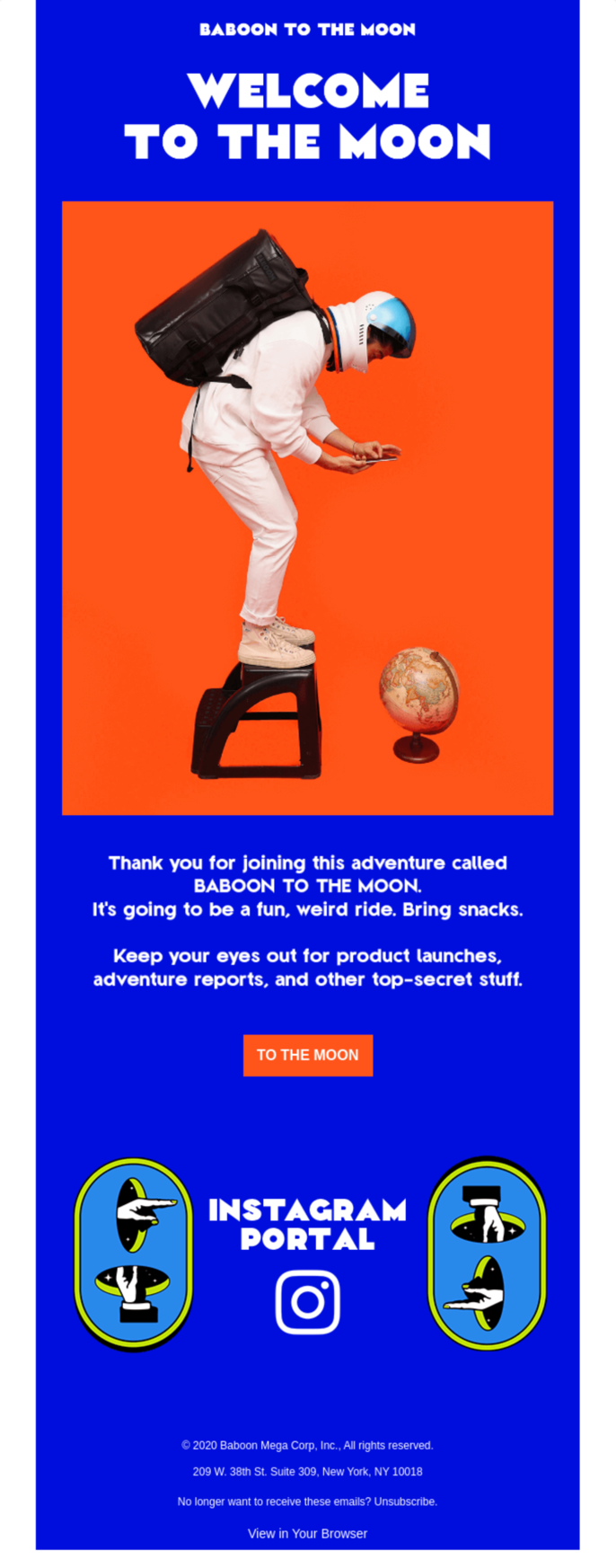 Being creative with your email copy and design will make your welcome email stand out
What we like about this welcome email example is its creative CTA. There is nothing wrong with “Shop Now” or “Get Started,” but crafting a unique and brand-specific call to action will definitely help your emails stand out even among the best welcome emails. The color choice of this email deserves a special mention: it epitomizes the brand’s fun, adventurous, and lively personality while also aligning with the colors of its products.
Why this email makes it to our list of the best welcome email examples:
- a color choice that reflects the brand’s personality;
- a unique and brand-tailored CTA;
- a creative and snappy email copy;
- an experimental and fun way to include the brand’s social media links.
Welcome email example #6 Radavist
A surefire way to start a solid and long-term relationship with your subscribers is to thank them for joining you and outlining what it is you offer. Radavist here promises to send an email digest once a week and invites subscribers to visit their shop, read some reviews on their products, and catch up with the latest news. You can use a similar strategy to help your potential customers get started and clue them in everything your brand does.
 Use your welcome email to guide your subscribers and enhance their onboarding
Why this email makes it to our list of the best welcome email examples:
- thanking the subscribers for joining the family;
- offering a quick rundown on the brand’s products and activities;
- establishing an email sending frequency right away;
- showcasing relevant products.
Welcome email example #7 Faculty
Your “minimalistic yet well-performing welcome email” starter pack should include your brand logo, visible CTA, and succinct copy. That’s how Faculty does it, and that’s what makes this welcome email example so stunning.
 Keep your welcome email informative and straightforward for excellent results
You don’t necessarily need to stimulate subscribers to purchase something; you can just offer them to check out your website. After all, the primary purpose of welcome emails to customers is to boost their onboarding process. Follow one of the Faculty’s best welcome email examples, and create a minimalist email with a compelling email copy that reflects your fundamental brand values and a high-quality image to illustrate your point.
Why this email makes it to our list of the best welcome email examples:
- a contrastive and responsive CTA;
- including a visible brand logo, helping to increase brand recognition;
- a stunning and top-notch image that aligns with the email’s layout;
- a bold, heartfelt, and concise copy representing the brand’s values.
Welcome email example #8 Artsy
If your welcome email’s goal is to zero in on a certain action you want your subscribers to perform after joining you, then adding a single CTA is the way to go. You can adapt some of the ideas that Artsy’s team uses in this welcome email example since their goal is similar.
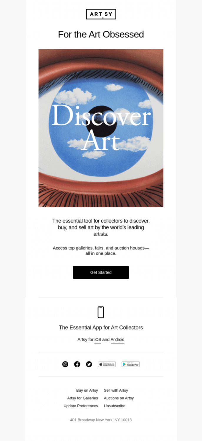 Tailor your CTAs to be oriented on a single welcome email goal
Why this email makes it to our list of the best welcome email examples:
- excellent use of white space that helps draw attention to the famous painting;
- encouraging headlines and copy;
- a hard-to-miss black CTA button;
- an elegant design style that reflects the brand’s purpose and principles.
Welcome email example #9 Fits
Simple, well-designed, and actually welcoming — this is how you can describe Fits’ email. Sometimes the best welcome emails are designed just to say “hi,” and this one can be your inspiration. Choose a color palette that matches your brand colors, and remember to keep your tone of voice consistent to increase brand loyalty.
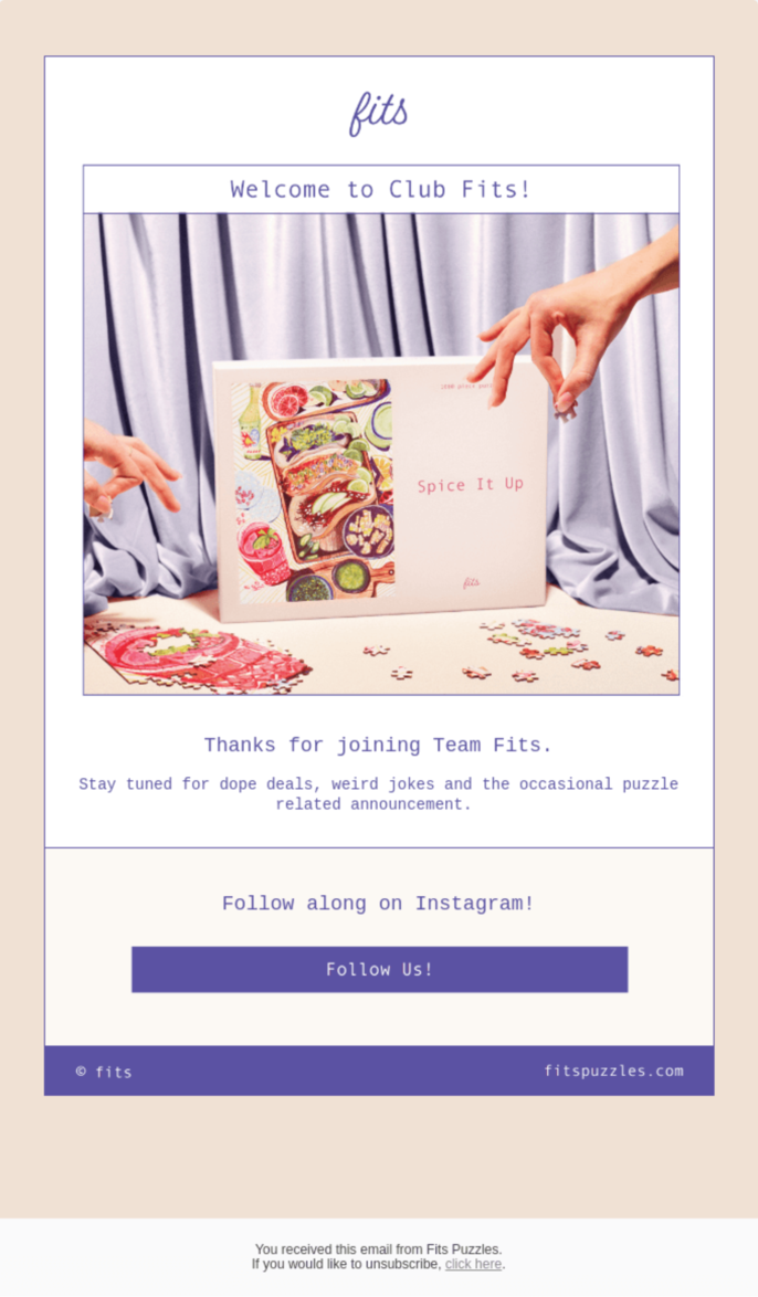 Making subscribers feel welcomed should always come first, and moving them towards a purchase — second
Why this email makes it to our list of the best welcome email examples:
- an aesthetic color palette matching the brand colors;
- maintaining the brand’s informal and casual tone of voice;
- a high-quality product image aligned with the color palette;
- a short and straightforward copy that will not overwhelm the reader but will still get the point across.
Welcome email example #10 Otherland
Still not convinced that you can just greet your new subscribers without moving them down your sales narrative and still end up with the best welcome emails? Here’s an example from Otherland that does not have a single CTA, and it will change your mind.
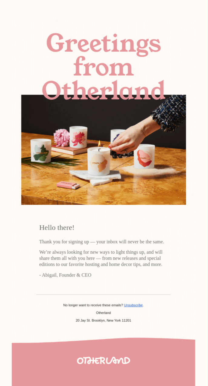 Promise your subscribers to provide more value with every email
The brand’s team focuses on a seamless customer onboarding process and guarantees the value and advantages their emails bring — you can never go wrong with this strategy.
Developing onboarding email campaigns can help you retain the progress you achieve with your welcome emails!
Why this email makes it to our list of the best welcome email examples:
- a clean and simple design without any distractions;
- clever use of the brand’s name in the headline;
- a creative and genuine copy that increases customer trust;
- a visible unsubscribe button.
Welcome email example #11 Adobe Lightroom
“This is how your portfolio or gallery could look like,” says Adobe Lightroom’s welcome email without actually saying it. And it once again proves that captivating visuals often do a big part of the job. Encouraging and inspiring headlines and high-quality amplify each other’s effect, creating an impeccable first impression.
 Your visuals and copy go hand in hand and intensify each other’s impact
Why this email makes it to our list of the best welcome email examples:
- well-structured design and copy that maintain the email’s hierarchy;
- subtle but contrastive CTAs that don’t seem intrusive;
- compelling and high-quality visuals;
- motivating and invigorating headlines.
Welcome email example #12 Italic
This example shows how the best welcome emails get the job done with two things: mouth-watering visuals and demonstrating that their membership costs significantly less than their competitors’.
 Don’t be shy to show off your competitive advantage to convert more subscribers
Italic’s team also abides by the rule of a seamless customer engagement: one CTA, multiple buttons. This way, the buttons don’t meddle with the email flow but still motivate subscribers to join the brand.
Check out our post with some excellent tips on how to optimize your CTAs!
Why this email makes it to our list of the best welcome email examples:
- aesthetic design that perfectly fits the company’s products;
- one CTA, multiple buttons;
- clear brand benefits and value;
- a simple and straightforward copy.
Welcome email example #13 Lazy Oaf
Lazy Oaf knocks on new subscribers’ doors with a solid intention to move them towards their first purchase. Offering your potential customer a discount on their first purchase is a strategy you might want to adopt if you have a similar goal.
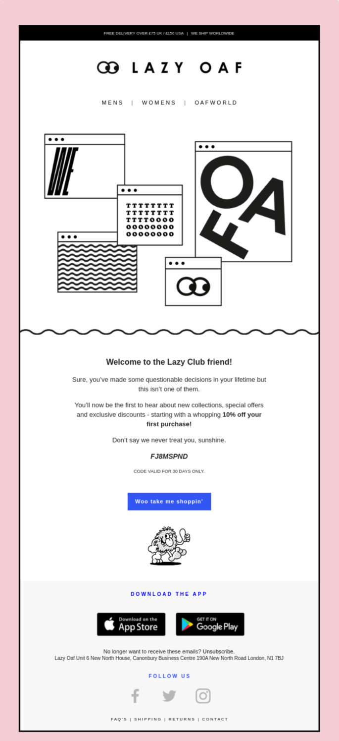 Offering your new subscribers a discount can increase your number of clients
Another element of this email that makes it so stunning is a customized CTA button. Since the brand’s overall tone of voice is conversational and casual, tailoring an original call to action instead of a classy “Shop Now” seems finely tuned.
Why this email makes it to our list of the best welcome email examples:
- an imaginative and unique CTA;
- a discount offer that motivates subscribers to make their first purchase;
- a crisp and funny copy;
- structured and clear-cut design and email hierarchy.
Welcome email example #14 YouTube
It’s never a bad idea to remind your subscribers about the benefits your products bring forth. YouTube does just that right after you join their premium membership. You can employ this method by going into detail about the value you can bring and the problems your products can eliminate.
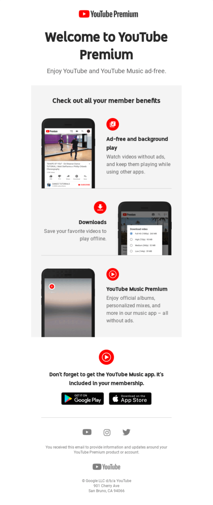 Focus on the pros and value your brand provides to customers
Why this email makes it to our list of the best welcome email examples:
- a clean and easy-to-navigate block structure;
- no unnecessary elements or information;
- an information-rich copy that reflects the value the company brings;
- a quick visual representation of how to use the company’s premium services.
Welcome email example #15 Mojo
Welcome emails to customers are also a great chance to educate new subscribers about your product and debunk some myths or misconceptions that surround it. Mojo’s team starts the sales narrative by providing general information about the brand’s products so that potential customers feel more competent and comfortable discovering more.
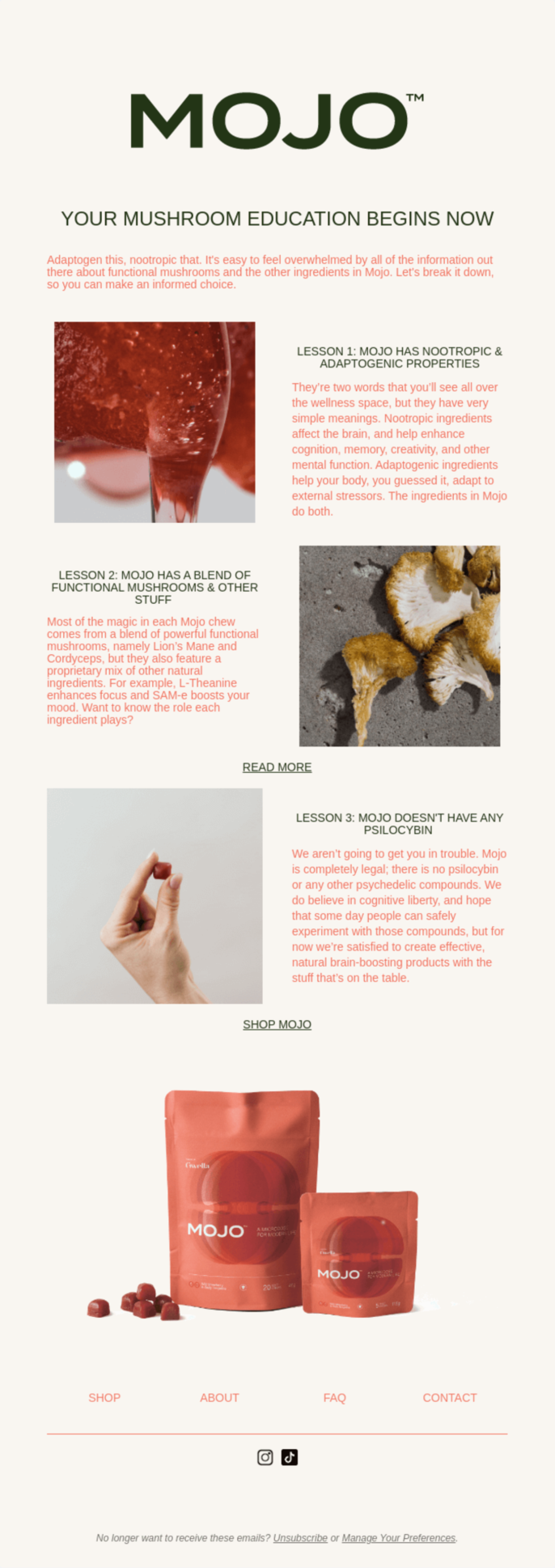 Ensure that your subscribers know enough about your product to be able to convert
Why this email makes it to our list of the best welcome email examples:
- a font choice that matches the product’s packaging and brand colors;
- subtle but responsive and visible CTAs;
- a preferences center;
- all the necessary links included (e.g., FAQ, contacts, etc.).
Welcome email example #16 Oda
A creative and artistic product requires artistic solutions. Oda’s email design reminds a telegram printed on a piece of old paper, and the hand-drawn picture and different social media icons add a nice touch: someone really cared to write this welcome email.
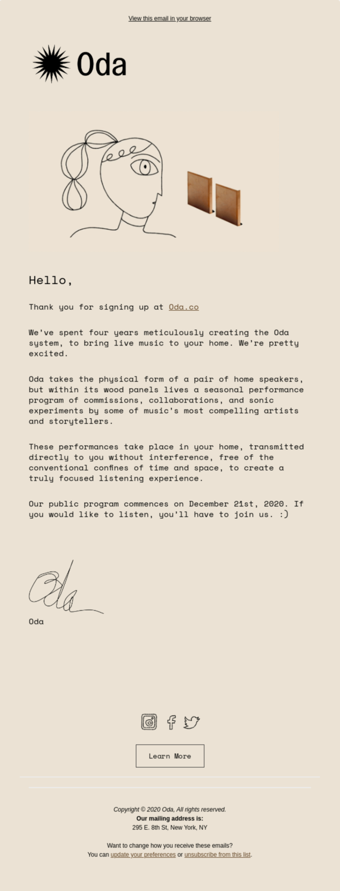 Use your welcome email to illustrate how much you care about your subscribers
This welcome email example can teach you how to briefly explain the purpose and essence of your product and charm your new subscribers. Tell more about your brand story, how you came up with the idea, and how long the development process lasted to emphasize your product’s value.
Why this email makes it to our list of the best welcome email examples:
- design and color palette that suit the brand’s essence perfectly;
- a description of the customer experience the company provides;
- a visible and contrastive CTA;
- a creative way to match different social media icons with the general design style.
Welcome email example #17 Fi
Fi’s email can teach you an all-purpose killer welcome email combination: a well-put brand statement + a discount + a product benefit description. Add to that some brand colors for more recognition and a friendly tone of voice, and you will have the blueprint to successful welcome emails to customers.
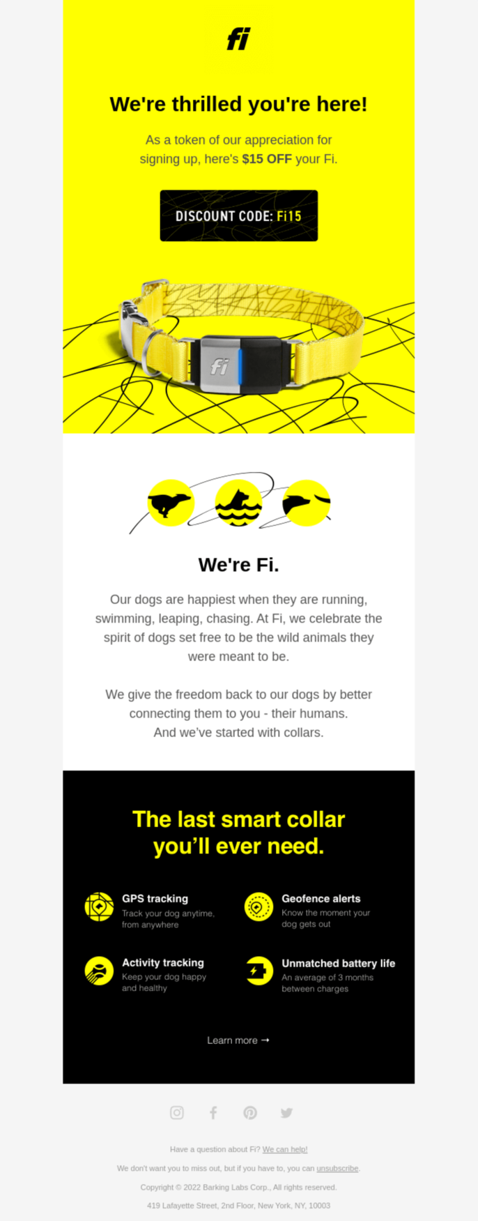 Include your brand statement in your welcome email to earn subscribers’ trust
Why this email makes it to our list of the best welcome email examples:
- a straightforward email copy that captures the brand statement successfully;
- an unclouded product value and purpose;
- a high-quality and large product image;
- using the brand and product colors to boost recognition.
Welcome email example #18 Harry’s
Who said that if you put a giant tree image into your welcome emails to customers, you can’t pull it off? Not that we recommend you do the same, but getting creative to make your welcome email stand out and boost brand awareness is a great idea.
 Implement all the instruments available to help subscribers remember your brand
The visuals are supposed to reinforce the power of your copy, even if they both have a humorous effect. Always make sure to include only high-resolution and relevant images that align with the rest of your design.
Why this email makes it to our list of the best welcome email examples:
- a consistent casual tone of voice that creates a light-hearted atmosphere;
- two CTAs that don’t interrupt the navigation flow;
- a large picture that acts as the main character in the email;
- no unnecessary distractions in the copy or design.
Welcome email example #19 Plum
Plum, an insurance company, accentuates that they value their customers’ time and want them to fully understand the milestones their partnership runs on. This is yet another example that your welcome email is just the place to educate your new subscribers on your products or services and emphasize why your products outrank their alternatives.
 Concentrate on how your products’ unique features make them better than competitors’ alternatives
Why this email makes it to our list of the best welcome email examples:
- a copy that clearly outlines the brand’s advantage over its competitors;
- using design and copy hierarchy to make the email easy-to-navigate;
- a vivid and responsive CTA button;
- showing compassion and understanding of customers’ problems.
Welcome email example #20 ROUT
Once again — you can’t go wrong with minimizing and strengthening your copy and tweaking your design to resemble your products’ color or shape. Topping off your first-purchase discount with a free delivery offer will definitely lure in more subscribers to convert. And don’t forget to remind them how happy you are to have them!
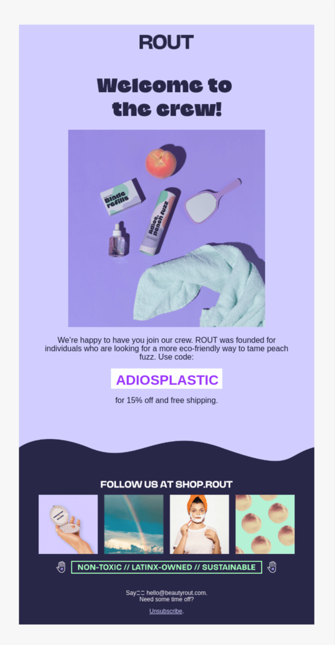 An amiable and encouraging tone of voice is the best welcome email idea
Why this email makes it to our list of the best welcome email examples:
- a consistent and aesthetic choice of colors and fonts;
- a tempting discount and free shipping offer;
- a concise yet effective copy;
- a warm and inviting tone of voice.
Welcome email example #21 Tre’dish
Take a look at this welcome email example from Tre’dish and jot down: your brand logo, slogan, and mission statement together can amp up your customer awareness and exposure. Make sure that subscribers remember your brand colors and are able to identify you from tons of other brands. So why hold this off if you can start right from your welcome email?
 Add your brand logo and slogan to help subscribers identify and remember you
Why this email makes it to our list of the best welcome email examples:
- a contrastive CTA that stands out but matches the color palette;
- clear product benefits and brand value;
- an excitable and encouraging copy;
- a clear-cut structure that significantly improves navigation.
We know something you don’t
That’s not everything there is to well-performing welcome emails. What if we told you that you can automate the whole process and still welcome your new subscribers like the friendly host you are?
You don’t need any HTML skills to create your own stunning email template or use a ready-made one. Personalize your emails, use tags to organize your mailing list, and analyze your email performance. And here’s a little something extra: you can try it all for free with SendPulse!