If your business sells products online or relies on customers signing up for a service, you’ll need an effective website conversion funnel to take them from your landing page to the checkout or sign-up page. All websites that sell products or services have a conversion funnel, so you don’t need to worry about creating one from scratch. But you do need to optimize the funnel to maximize conversions.
With an optimized website conversion funnel, you’ll sell more products by preventing customers from dropping off due to weak points. For example, if your landing page and calls to action are excellent but your checkout process is complicated and untrustworthy, many customers will abandon the process at the checkout.
Tips to help you optimize your website conversion funnel
A website conversion funnel refers to a customer’s journey from landing on your site to making a purchase. If one stage in your conversion funnel is weak, it will affect the whole process and lead to lost conversion opportunities.
Learn some tips to boost your landing page conversions.
Read on to find out how to perform conversion rate optimization at each stage of your website conversion funnel.
Analyze your trust elements
Customers often have trouble distinguishing trusted websites from scams and unreliable online retailers, unlike traditional retail. So, you need to assure your customers that they can trust your website to convert.
The first trust element you should analyze is your customer opinions. Customers often make purchases based on social proof, so ensuring your customer reviews and testimonials instill trust in the company is essential. We’ll look at social proof in more detail in the next section.
Product tests from trusted sources also help assure customers of the legitimacy of your website. Using trust badges like Norton Secured, McAfee Secure, and Rainforest Alliance seal assures customers of the security and legitimacy of your website as the seal’s brand is well recognized.
If you don’t already have a relevant trust badge for your industry, consider getting one for your website — different trust seals require different types of certification.
Customers are wary about submitting their payment details to sites they don’t trust. You can increase customer trust in your payment system by displaying your payment processors’ logos.
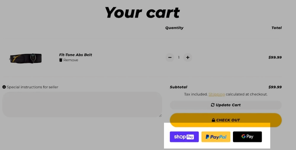 Displaying trust badges to boost customer trust
Mastercard, Visa, Apple Pay, and Google Pay seals go a long way in building trust in your checkout process. Using updated facts and figures about your products and overall company can also help increase user trust.
Check out our post for tips to optimize your checkout page!
Use social proof
If you want to convert, your customers need to be assured they will get a good product for a reasonable price. Customers may be heavily influenced by emotion, so backing emotion up with social proof is essential.
Social proof includes positive testimonials and customer reviews. You need to make sure potential customers see these at the right stage in the conversion funnel. Your sales, pillar pages, and landing pages are the best places for your positive testimonials and customer reviews. That’s a trick used by major brands like Shopify.
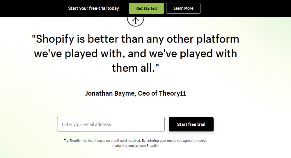 Shopify uses testimonials as social proof on its landing page
You can also include your social proof in promotional emails. The most effective way to do this is to send recurring emails. Using reviews from trusted sources like Trustpilot is a good idea, but in-house reviews can also be very effective.
Consider the quality of your social proof as well. Do the testimonials and customer reviews reflect the desired image of your product or service? If not, you’ll have to curate social proof that does reflect your brand image. You can offer incentives via email to encourage customers to leave reviews and offer testimonials.
Set clear Google Analytics goals
Analyzing Google Analytics is the best way to monitor the effectiveness of your conversion funnel. But you need to set clear Google Analytics goals to ensure you are making the desired progress. So the first step is to analyze your current Google Analytics and see where you are at.
To set clear Google Analytics goals, you need to sign in to your Google Analytics account and click Admin. Once on the Admin page, you need to navigate to your desired view. Next, click “Goals” and either add a new goal or update an existing one.
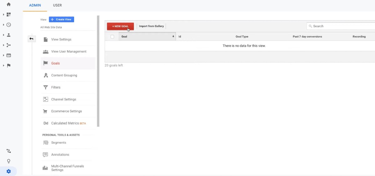 Setting goals in Google Analytics; source: YouTube
There are three options for creating goals:
- goal template used to set actionable goals for standardized business objectives;
- custom goal that allows you to set your parameters for the goal;
- smart goals that allow you to measure explicit conversions to optimize your bid, ads, website, and Google Ads performance;
You will need to verify your goal, regardless of your goal type. Verifying your goal will calculate a conversion rate for the goal based on your recent data from the past seven days. Once the goal is created and verified, it will start recording data.
Identify your drop-off zones
Drop-off zones are the points where potential customers abandon the conversion process. Fixing these drop-off zones increases your conversions, so it’s vital they are identified and remedied.
The best way to identify your drop-off zones is by simply looking at your Google Analytics to see where traffic drops during the conversion process. If your landing page has lots of traffic, but your product pages have little traffic, the link between the landing page and the product page might be the problem.
Check out our post to understand which types of landing pages will work best for your goals.
You can also use screen recordings of customer behavior to identify drop-off zones. Watching screen records can be tedious, but seeing where and why customers drop off during your checkout process will be easier. For example, the product page link might be placed awkwardly, or there may be too many steps to get to the payment page.
Also, ensure that your design is flexible, responsive, and appealing to your audience. Your design might be causing your customers to leave the conversion process. You’ll need to learn about the best practices of website design for B2B and B2C businesses to prevent this from happening.
Have fewer steps
We have all heard that simplicity is vital, which also applies to website conversion funnels. If a customer is forced to go through many steps to get to the product they want, they are more likely to abandon the conversion process. So, a thorough analysis of how many steps a customer must take to get through the conversion funnel is essential.
How do you do that?
First, identify each step. Next, identify the purpose of each step. Ask yourself, is each step necessary? Could several steps be combined into one?
Once you have performed this analysis, you can streamline the process to decrease the number of drop-off zones.
Offer a loyalty program
Customers love to feel valued, and they love rewards. When customers feel valued and receive rewards from you, they are more likely to follow your website conversion funnel and make purchases. That’s where loyalty programs can help you. Loyalty programs are best announced via email, but there are other options.
Here is an example of a loyalty scheme from Old Navy:
 Old Navy uses email to promote their loyalty program; source: Drip
The loyalty scheme shows the perks of staying loyal to the store. Showing the benefits of the loyalty scheme is more likely to get customer engagement.
You can offer different rewards through your loyalty scheme, including discounts. But you need to link the loyalty program back to your conversion funnel. A discount delivered via email, for example, will bring your customer straight to the sales page stage of your conversion funnel.
You are far more likely to convert if your loyalty program circumvents stages and brings the customer directly to the product. So, offering loyalty programs is vital for optimizing your website conversion funnel.
Best practices for a successful website conversion funnel
Now that you know the six tips to help you optimize your website conversion funnel, let’s look at some best practices.
Optimize your landing pages
The purpose of your landing page is to provide as much information as possible in a clear, concise manner. It should have a well-placed call to action to funnel your customers towards the conversion. Your call to action should be above the fold of your landing page as unnecessary scrolling will cost you conversions.
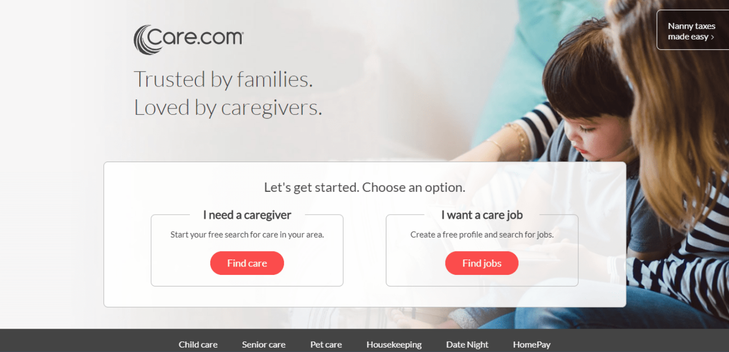 Care.com uses an optimized call to action for it’s landing page; source: The Daily Egg
In the example above, the copy tells the customer all they need to know about the service. You won’t miss the CTA button because it stands out from the rest of the page. In fact, it’s probably one of the first things the customer sees.
You should include more detailed information about the service lower down the page to provide for customers who want more information before clicking the call to action. The aim of the information should be to convince the customer to click the call to action and bring them to the next stage of the conversion process.
Add strong calls to action
A solid call to action starts with a command. The command, however, should be enticing, clear, and unambiguous. A generic “find out more” isn’t as convincing or exciting as “find jobs,” leaving the user confused about what will happen next. A good call to action explicitly clarifies where the call to action button will bring the visitor.
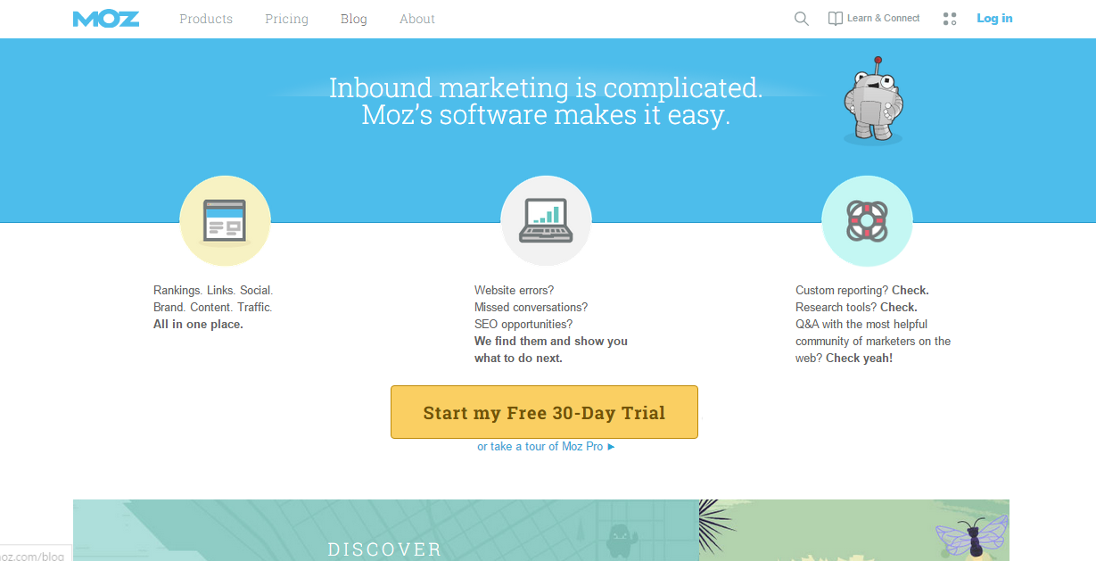 Moz uses actionable words to create compelling call to action buttons
The call to action above begins with a command (“Start”) and clearly states where it will bring the customer. Customers are more likely to click because the call to action stands out on the page with its yellow color contrasting with the white background. There is also no confusion, and the value of the call to action is stated.
Highlight customer reviews
As stated earlier, the best places for your customer reviews are on your sales pages, landing pages, and promotional emails, among others. The placement of your customer reviews on the landing and sales pages should be before the fold but not the central element; you want the customer reviews to support the main content.
The images you should use should be of the person giving the review. Ideally, you should also have supporting information like an email address, LinkedIn account, and website. The idea is to give credibility to the reviews, as customers are less likely to trust reviews from a single first name.
Here is an example of a review for WordPress.
 Using customer reviews to optimize your website conversion funnel; source: Right Central
The review is credible as it has an image of the reviewer, the full name, and a link to a website. Customers are far more likely to trust this review than a review with no image and website by “Mr. Smith.”
Now here is an example of good customer review placement on a landing page:
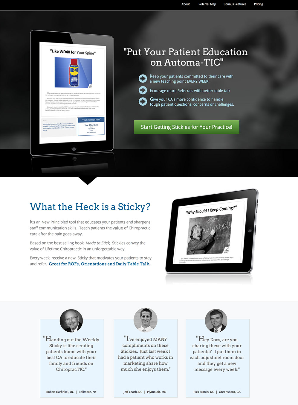 Highlighting expert testimonials to optimize landing pages; source: Unbounce
The customer testimonials are placed just above the fold and right below the “What the Heck is a Sticky?” section. This location is strategic as a website visitor will want to see customer reviews before committing to a purchase. By placing the testimonials on the same page as the CTA, the user will stay on the page instead of looking elsewhere for reviews.
Collect and analyze user data
Collecting and analyzing user data allows you to see how your users navigate your website. You can use this information to improve your website conversion funnel and avoid customers dropping off your funnel.
You need to start by mapping out your customer journey to do this. Once you know the journey your customers take to reach the end of your funnel, you can analyze their user data.
You can start at the endpoint by analyzing your shopping cart analysis. Look into the data to see if it’s the shipping cost stage of the shopping cart stage that’s putting off customers. If many users abandon your funnel at this stage, it might be a good idea to reduce or remove your shipping costs.
Look at your landing page as well. Are users dropping off before they follow the call to action? If so, you may want to improve your call to action. Another critical stage to analyze is your product pages. If users follow the funnel up to the product page and then drop off, there may be issues with the product page. Maybe your product pages look outdated, or there isn’t enough information about the product.
Poor quality images may be the issue, too.
Simplify the checkout process
As we have already touched upon, the checkout process is a crucial stage that needs to be right for you to convert. Customers expect a quick and easy checkout. Customers also want to be assured that the checkout is secure and they know exactly what they are paying for.
You can simplify the checkout process by following this simple formula:
- checkout;
- delivery details;
- payment details;
- confirmation.
Also, it’s a good idea to avoid overburdening shoppers with special offers at the checkout: keep it simple. Customers also expect options like Apple and Google Pay, so incorporating these systems will help simplify the checkout process.
Asos is an excellent example of a website with a simplified checkout process. If you want to buy something, the first step is to sign in or create an account if you don’t already have one. Asos simplify even that last step because if you don’t want to create an account, you can just sign in through any of your social media accounts:
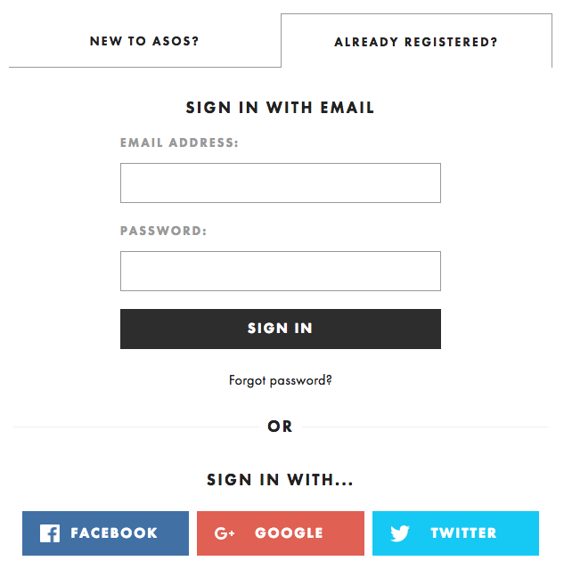 Asos uses social media sign-in options to enhance its checkout process
Once logged in, all you need to do is select the delivery country and promo codes, if any. Then just add your payment details.
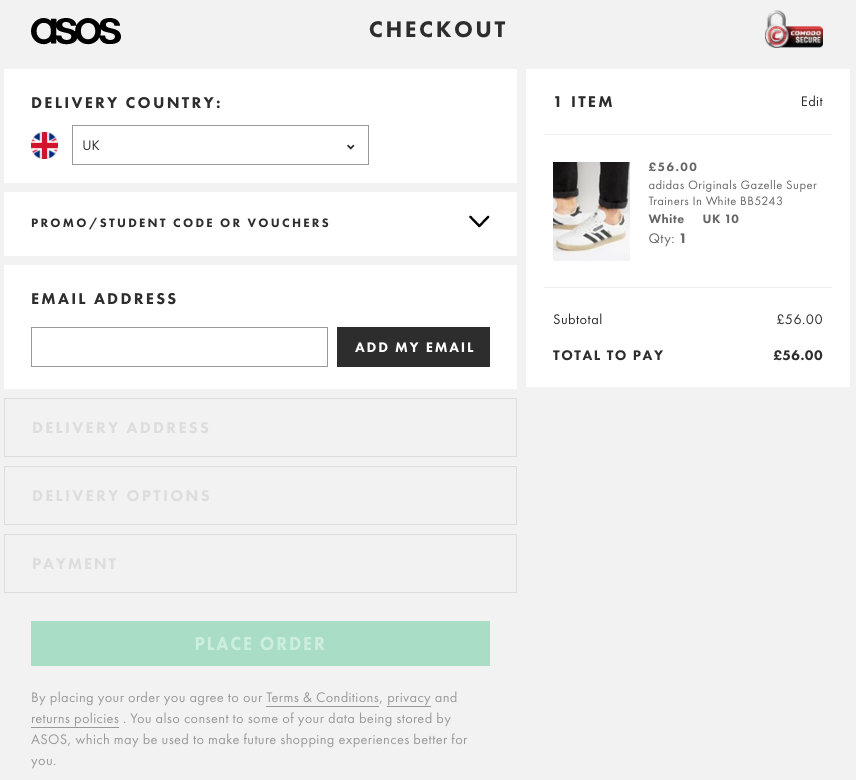 Asos uses a simplified checkout process to enhance its site’s conversion funnel
The process is simple and only contains the necessary information. The payment details have all the necessary trust elements. The user can also see what they are ordering on the right-hand side.
Conclusion
Optimizing your website conversion funnel ensures all the steps work well and work together. When the conversion funnel is fully optimized, your customers will have an effortless journey from landing page to checkout.
Start by analyzing your trust elements like your trust seals and social media integration so your customers trust your website. Use your social proof like reviews and testimonials to ensure your customers trust the product. You also need to set clear Google analytics goals to track progress and minimize the steps taken for usability. Identifying and fixing drop-off zones is crucial too.
There are best practices you should follow, as well.
Optimize your landing pages as this is the first thing the customer sees. Having strong calls to action will then funnel them to the next step. Customer reviews help with the process by instilling trust in both the product and your business. Also, a simplified checkout process is critical; your customers expect an easy checkout. But make sure you collect and analyze your user data to understand how your customers are using your conversion funnel.
But don’t just optimize your conversion funnel once and call it a day. What makes an effective conversion funnel is constantly changing. That means you need to monitor your conversion funnel to optimize it. Good luck!