If you’re starting a new business, you have a lot on your mind. And you might be wondering where to start.
A website in this digital age is a must. According to PixoLabo, 70-80% of potential customers could be lost to businesses without a website. So, it is safe to say that creating a website is a crucial first step in your new venture to connect with customers.
How do you make sure that the people who use your site are excited and engaged? If you want to keep people on your site, ensure that it’s well designed, functional, and easy to navigate. Otherwise, traffic will bounce from your website immediately and go elsewhere.
There are many important things to consider when building a website, from layout and design to fonts, colors, and image use. By knowing what matters most, you can create a website that accurately represents your brand.
When creating a website for your business, it can sometimes be tough to know where to start. Here are ten important website design considerations for a new business.
Define your goals
Before you jump into designing your business website, take a moment to consider these questions:
- What is the purpose of your website?
- What do you want people to do when they come to your site?
- How much are you willing to invest in a website?
- Will you be using a content management system (CMS)?
- What type of content will you be sharing on the site?
- Who is your audience?
These questions are important because different types of businesses will need specific design and function elements on their website. For example, there are some significant differences between a SaaS website and an eCommerce website in terms of information architecture.
Check out some stunning eCommerce landing page examples to get inspired by.
A SaaS website will typically have lots of text content describing features and benefits. In the example below, Wordable, a SaaS that helps you instantly import and publish content on popular CMS platforms, explains the process with text and simple screenshots.
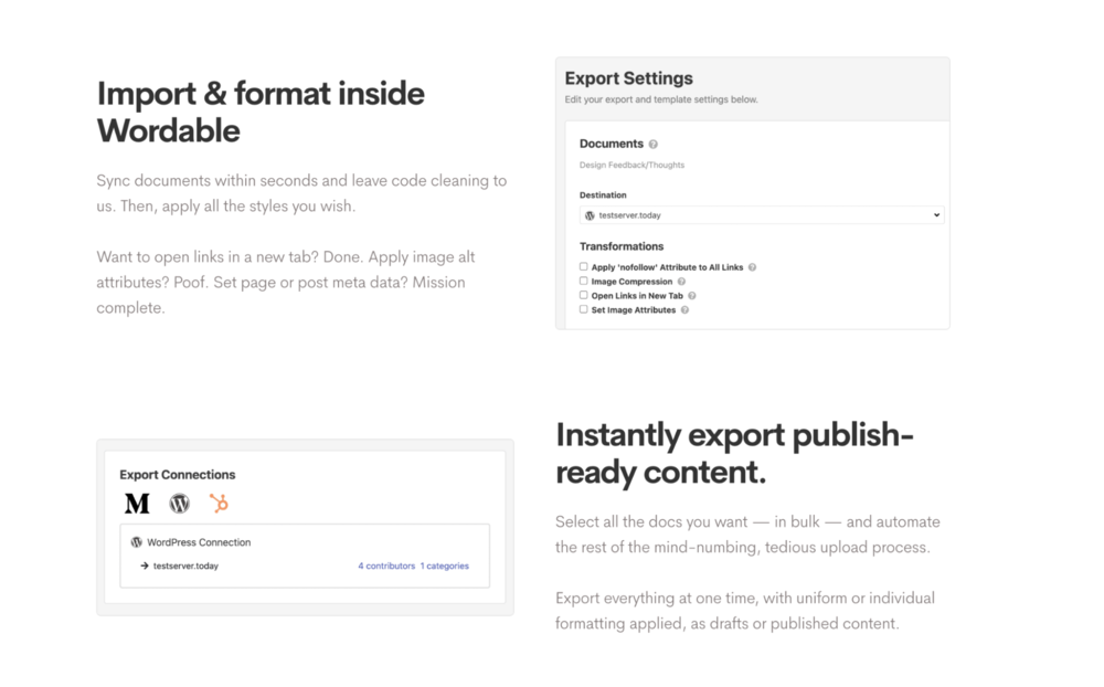 Wordable explains their SaaS product using concise text
On the other hand, an eCommerce store will have more images than text because it needs to sell products visually before explaining anything else about them in detail. Take Olipop, for example, where they use very little text and instead focus on vibrant, eye-catching pictures of the product.
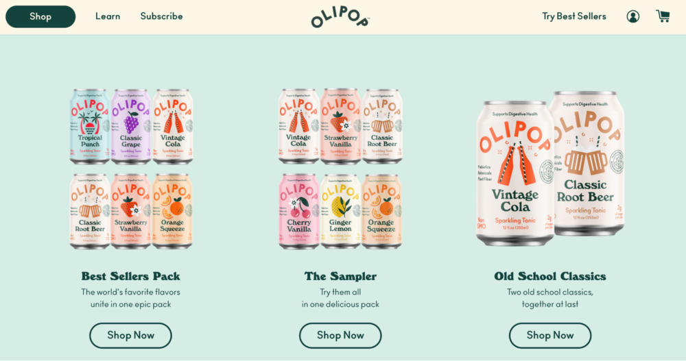 Olipop uses images to drive drink sales
The type of business you run will help dictate the website design and get the wheels turning in the design process. It will also dictate how to manage your visual elements and if you need to use a photo editor to create a consistent feel around your images.
Try out the free photo editor to create and share your images, graphics, or animated visuals.
Consider your competition and how they are using the web
Another thing to consider when building a website is your competition. When starting, it is good to understand what they are doing well and where they can improve. This way, you have an excellent place to start by building on their strengths and improving their weaknesses.
Find out cool competitor-analysis tools that will conduct the whole process for you and provide detailed reports.
Additionally, if you know what other businesses in your industry are already doing with their website, you can create something different and unique to stand out from the crowd. Take these two sushi restaurants in San Francisco, for example. Fenikkusu has a very dull website that lacks pictures and does not indicate what type of food they serve.
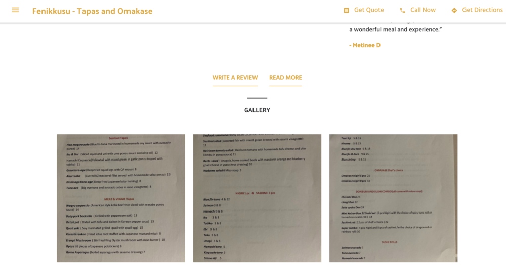 Fennikkusu lacks serious website style points
Meanwhile, Kusakabe goes above and beyond to include multiple pages and pictures to showcase their fresh, delectable sushi.
 Kusakabe stands out from the competition
Identify your target audience
Your website should tailor to your target audience, so before creating the site, take some time to identify your audience. This can be done by asking yourself questions: What kind of people will be interested in my product or service? Are they primarily male or female? How old are they? Where do they live? What are their interests and hobbies?
You’ll also want to research your customers to better understand who they are. You can do this by using Google Analytics to find out more about your customers and user personas to create a detailed profile of customers who are most likely to use your business. Store this information in an online database to help keep you organized. Understanding your target audience will help you determine the colors, font, layout, and images that would resonate best with your potential consumers.
For example, Squishmallows fill kids’ hearts with love and affection. They leverage bright colors and adorable pictures on their website to sell plush toys.
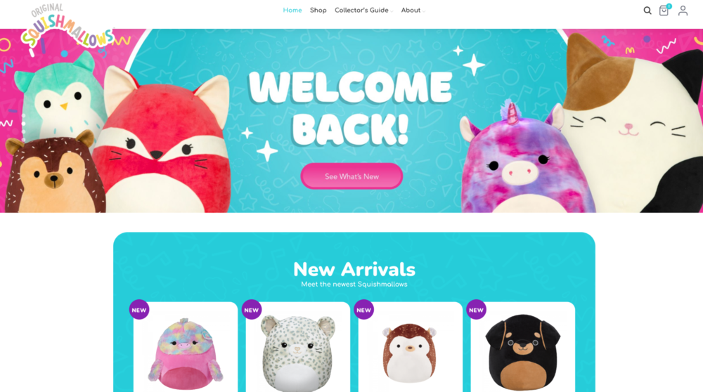 Squishmallows targets kids with neon colors and cute stuffed animals
Since Squishmallows targets young children, it is wise to enhance security and block pop-ups or ads that could be harmful if viewed by kids or teens. If an inappropriate advertisement randomly shows up, it could immediately cause an overall bad interaction with their website.
Security should be another thing to consider when building your website. Certain types of malicious software can run graphic pop-ups from websites if not set up correctly. Unsolicited content can be detrimental to any brand. It is better to be safe than sorry and protect your consumers.
Choose a suitable color scheme
Color is a powerful tool. You can use it to influence your users’ emotions and perceptions of your brand. A well-designed website uses color to create visual interest, contrast, and harmony.
A palette is a combination of colors used to design a website. Designers pick palettes by researching the psychology behind different colors and how viewers perceive them, then choosing colors that convey the message they want their site visitors and readers to receive.
For example, the color blue has long been associated with stability, calmness, and harmony. Blue is the most common brand color worldwide. It symbolizes dependability and trustworthiness. And while not all blue logos depict these characteristics, when you see a blue logo, you can be sure that the company using it believes in doing things right.
uSERP, a well-respected link building agency, uses the color blue on their website to convey to their consumers that you can count on them to help grow organic traffic with ease.
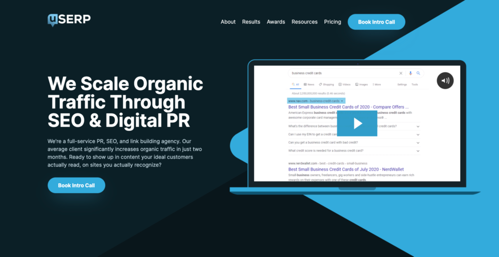 uSERP creates a trustworthy vibe with the power of blue
When designing your website, don’t try to do all the manual work yourself. Plenty of tools and existing resources are available to lessen your workload and ease the building process. Enlist the aid of a landing page software, pick a design and colors you like, and you can have a custom-built website in no time.
Balance content and design thoughtfully
Is the design or content more critical when it comes to your website?
In most cases, content is usually more important than design — if you have great content that ranks well on the search engine results page (SERP), it will drive more people to your website. But if they find that the design on your website is lacking or unintuitive, this may discourage them from returning.
Home & Jet, a digital magazine for the modern era, provides a good blend between content and design to keep traffic coming in and allows for easy navigation once they arrive.
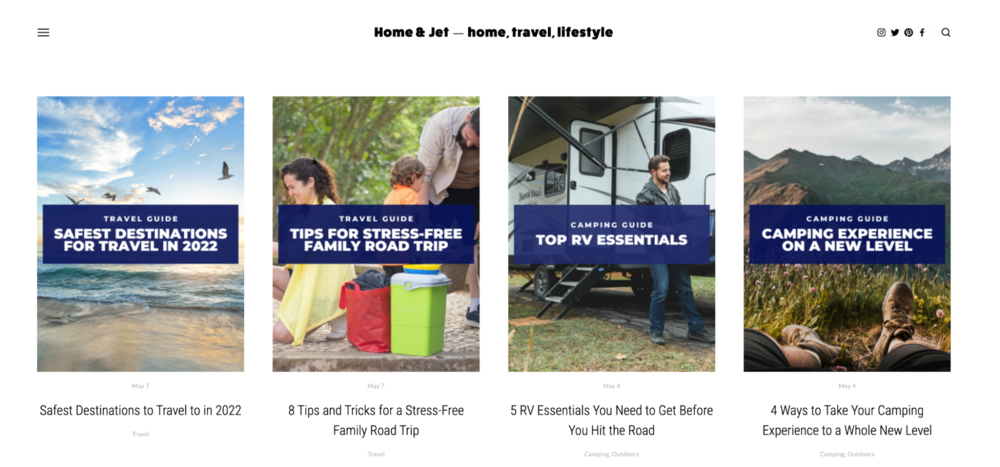 Home & Jet combines design and content as a focal point
This doesn’t mean that a good web design isn’t necessary — because it can be a significant factor in attracting people to your site. Still, if the content of your website doesn’t meet expectations, visitors may leave and never return.
There is no exact science to correct the blend of design and content. It is ideal for focusing equal amounts of time and effort on website design and content for best practice. The goal is to provide a seamless, engaging, and valuable experience for your consumers through your website.
Think about how people will be accessing your website
Your potential customers could be browsing your website on a mobile device or tablet at any given moment. In fact, in the fourth quarter of 2021, mobile devices (excluding tablets) generated more than half of global website traffic.
How the layout will change for each scenario should be one of your website design considerations. When starting, it is helpful to create or view mockups that will display how your site works on each device, whether a desktop computer, tablet, or mobile device.
Ideally, you want to provide a consistent experience across devices: the same colors and branding should appear everywhere. All information should be easy to access, no matter what kind of device the customer uses.
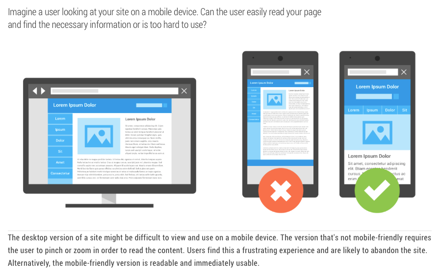 Don’t underestimate the power of a mobile-optimized website
Craft consistent brand messaging
A good website design should immediately send a message to potential customers about what you are trying to sell and what your business is all about. First impressions are critical. Think of your website as a salesperson representing you and your business 24/7. Of course, you want that person to be a good representation of you, your company, and what you are selling.
If someone visits your website for information or to purchase a product or service, they need to know who you are, what kind of products or services you offer, how much they cost, and why someone should buy from you instead of from one of your competitors.
Sunski does an excellent job with the messaging on their website. They mention that they are not another pair of cheap sunglasses, but instead, they are quality sunglasses made from recycled materials. This message remains consistent across their website in their design, copy, and testimonials.
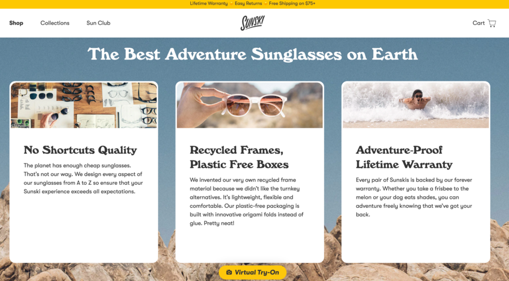 Sunski provides clear messaging about their sustainable sunglasses
Your website needs to communicate information about what differentiates you from your competitors.
Share your brand’s personality
You should also include a little personality in your website design. Why not show off the people behind the business? This doesn’t have to be limited to an “About Us” page. You can inject a little personality into the other areas of your site.
For example, use humor when it’s appropriate and keep content conversational. Chamberlain Coffee blends the conversational tone and adds a touch of humor to keep things light and engaging on its eCommerce website.
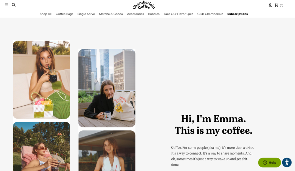 Emma Chamberlain adds personalization to the coffee brand
Also, using an avatar or mascot on your site is a great way to add some flair and make it feel more personal. Chamberlain Coffee utilizes a cute little owl mascot and other small animals to keep the website design fun and colorful.
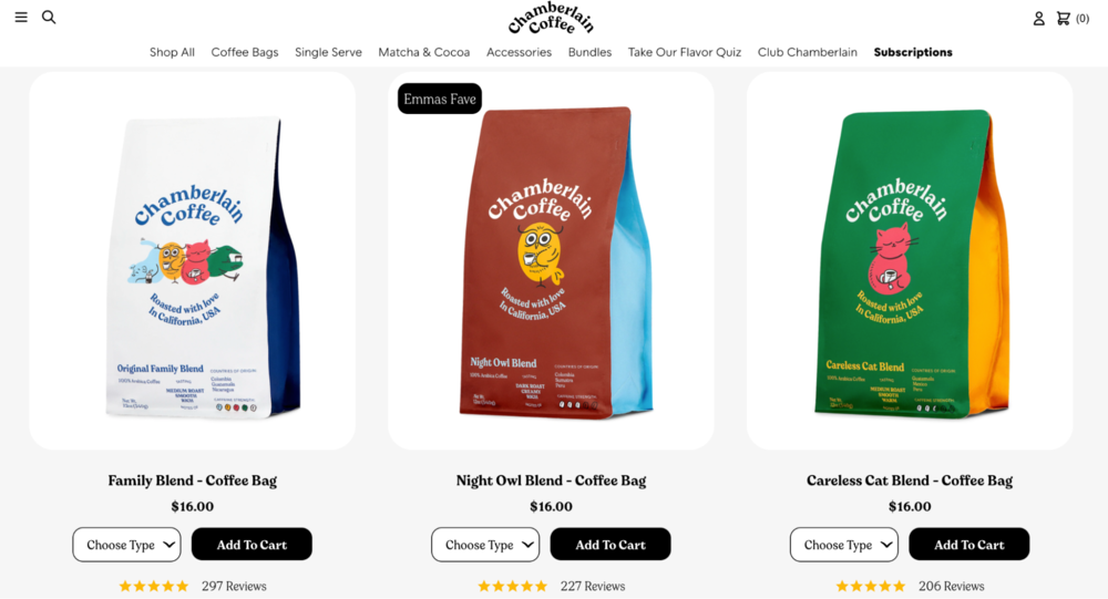 Chamberlain Coffee leverages a mascot for a personal touch
Remember, being overly corporate and using business jargon isn’t always the best way to go on a website for a new business. Keeping things light and fun will help engage users when they land on your website, making them more likely to stay around for more extended periods.
Choose a layout that is easy to use and simple to navigate through
The layout is another significant website design consideration. The format is more than just aesthetics; it’s about the functionality of your website and how the user will experience your site.
A good layout provides a seamless, easy transition from one content area to another. The best structures keep the user in mind or have a focal point to draw the user’s attention. Tesla provides a balanced website layout that promotes symmetry. The design seems to suggest stability, and the aesthetic value is pleasing to the eye.
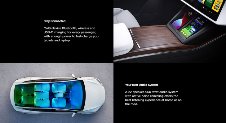 Tesla uses a symmetrical layout for a design appealing to the eye
You want to make things easy for visitors when they reach your site. A customer doesn’t want to spend ten minutes searching for information on your website. Also, a great aesthetically pleasing layout can help you stand out from the crowd.
There are a few different ways to optimize your website for search engines, but it’s essential to start with the basics. This includes having unique and quality content, good keyword use, optimized SEO meta descriptions, and sustainable links.
Learn how to make your website user-friendly and easy-to-find with our list of website optimization tools and tips.
Make sure that your content is readable and engaging for humans, not just search engines. It will go a long way in helping you achieve better search rankings and attract valuable customers.
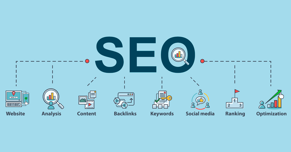 Status Labs breaks down the components of SEO; source: Status Labs
The same goes for social media optimization; focus on quality over quantity, be consistent in your engagement with users, and take advantage of all the tools available to you, like hashtags or social commerce posts if you are starting an eCommerce site.
Wrapping up
The goal of a business website is for users to get to know about their products and services and purchase them if they like what they see.
As a business owner, you want to make sure your website is user-friendly and optimized for mobile devices. A clean, easy-to-use website will make visitors feel comfortable and engaged with your content.
A well-designed website is the first step toward long-term business success. Take some time to consider the overall design of your website before getting started. Have a plan, map it out, and leverage existing resources.