Website carousels have always been known as a proven way to improve web design and increase profits. If implemented wisely, they can become a powerful tool for increasing user engagement and reducing bounce rates of any website across multiple industries.
Today, website carousels are widely used by the world’s largest corporations from various sectors, such as Toyota, Netflix, Spotify, Amazon, and millions of small and mid-size businesses online. Overall, they’re often employed to enhance web design and user experience, catch users’ attention, promote products or services, support the main content, and so on.
This post will discuss the basics of implementing carousels on websites, including their types, examples, and best practices to maximize content performance for your business regardless of the industry. Let’s get it started!
What is a website carousel?
Website carousels, also known as carousel sliders, refer to a slideshow of photo or video content on a website. Dynamic carousels display various content of the same type or topic at a certain motion, speed, and time while static carousels are navigated manually with side buttons or arrows.
Web designers commonly use carousel sliders as a space-saving, attractive option to present content with a higher degree of interactivity. Additionally, they work great to keep visitors interested in page content and encourage them to explore the topic or learn more about the products.
What is the difference between carousels and sliders?
Both terms identify the same meaning in context, as they display images, videos, or other content as an automatic or manual slideshow. However, sliders can display one slide at a time, whereas carousels allow users to see multiple slides at once.
 Using sliders, you can see only one slide, but with carousels, you can show more slides next to each other; source: Youcanwp
Though both options are slightly different in design, they can provide maximum efficiency to your website performance if implemented properly. Let’s investigate the major dos and don’ts for using website carousels.
Dos and don’ts for website carousels
Before we discover the basic types of carousels and analyze some excellent website carousel examples, let’s discuss the best practices for creating and adding an engaging, functional, and effective carousel to your website.
The wrong way to use carousels on your website
Website carousels can significantly enhance user experience, page functionality, and content efficiency. However, there are some common aspects where a carousel on a website might not be the best solution.
Here are some cases when it’s better to omit website carousels:
- In articles and blog pages. When a page is content-focused, website carousels can become a distraction instead of adding more value to its performance.
- When it’s for a business, not users. Implement carousels with your end users in mind, not just to improve the internal metrics.
- When it’s added everywhere across a website. Because of their highly engaging nature, carousels should be used extremely carefully to provide the maximum output and attract more clicks from visitors. Otherwise, no one remembers its content at best; in some cases, annoyed customers can simply leave.
These are some cases when it’s better to avoid website carousels. Still, there are plenty of dos for a carousel on your website.
The right way to use carousels on your website
Carousels allow multiple pieces of content to occupy a single, coveted space, and that’s one of their best advantages. Feel free to use carousels on your website in the following cases:
- When users expect it. In other words, if presenting content as slideshows, galleries, timelines, or presentations benefits its perception, engagement, and user experience.
- When it saves time and clicks. Website carousels also add to the page’s functionality by helping users get the information they need easier and save time clicking around the site.
- When you need to emphasize key messages or items. Carousels can help you highlight a certain type of content to increase its visibility and engagement.
- When the content is visual and easier to display. Carousels can be a suitable alternative to the “wall of text,” helping make your content more engaging and EATable.
- When you need to make a comparison. Carousels can help users compare different items and their characteristics during shopping. This is a popular eCommerce tactic.
- When it saves space on your page. Instead of saying hundreds of words, explain your message with informative and engaging carousels. It will be more appealing and save up lots of space for providing identical or even higher value to your website visitors.
Regardless of your industry and audience specifics, web carousels can be a true lifesaver for your business. However, among the various designs applied today, it becomes somewhat challenging to define the most efficient one for your business. To help you make the right choice, let’s review the most popular types of website carousels with real-case examples across different industries.
The types and examples of website carousel design
Having discovered the functionality of a website carousel, let’s now review what design types are currently trending. This will help you define the most efficient and attractive option that better fits your website and ideally works for your audience in particular.
Gallery carousel
This website carousel design type refers to a swipeable gallery for multiple images or videos. For better user engagement, videos often feature autoplay, similar to static pictures that automatically change at a specific interval.
Minimalistic but appealing, this gallery carousel example is professionally integrated into the site design. This homepage carousel introduces the most recent projects delivered in a catchy and aesthetic way.
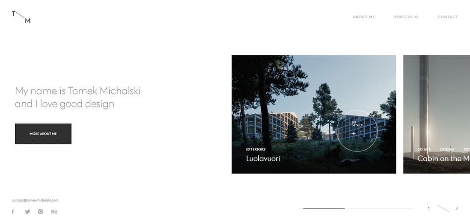 A gallery carousel by Tomek Michalski
Full-screen carousel
This type implies using the whole page as a full-screen carousel that snaps between sections. Images smoothly come into view, creating a memorable user experience. With each section showing different content packages, it is also highly efficient from the marketing point of view.
Dreamworks uses an interactive full-screen carousel on its landing page to promote released and upcoming movies.
 A full-screen carousel by Dreamworks
Hero image sliders
This carousel design can work perfectly for eCommerce platforms of different sizes, regardless of the products or services they offer. Basically, it drives people’s attention thanks to the structure’s simplicity: a website carousel, in this case, features high-quality product hero images, clear headings, and laconic descriptions.
User-friendly side buttons direct viewers to information about add-on products, and, in some cases, micro-animations are used to highlight key elements of a landing page, such as CTA or headings.
Simple, modern, and effective, hero image sliders on the Mercedes website are used to show off its cars. In addition, the visual layout of this carousel is comparatively easy to implement across a diverse number of websites, which makes it a versatile option for any page’s design.
 Hero image sliders by Mercedes Benz
Multiple horizontal carousels
A horizontal carousel provides a better way to navigate a website’s content easily and fast. From the developer’s standpoint, this website carousel design allows displaying more information on the same page, which benefits engagement rates, brings more high-quality leads and conversions.
With multiple horizontal carousels, Netflix designers managed to save space but still allow visitors to view a diverse number of personalized movie recommendations within a single page.
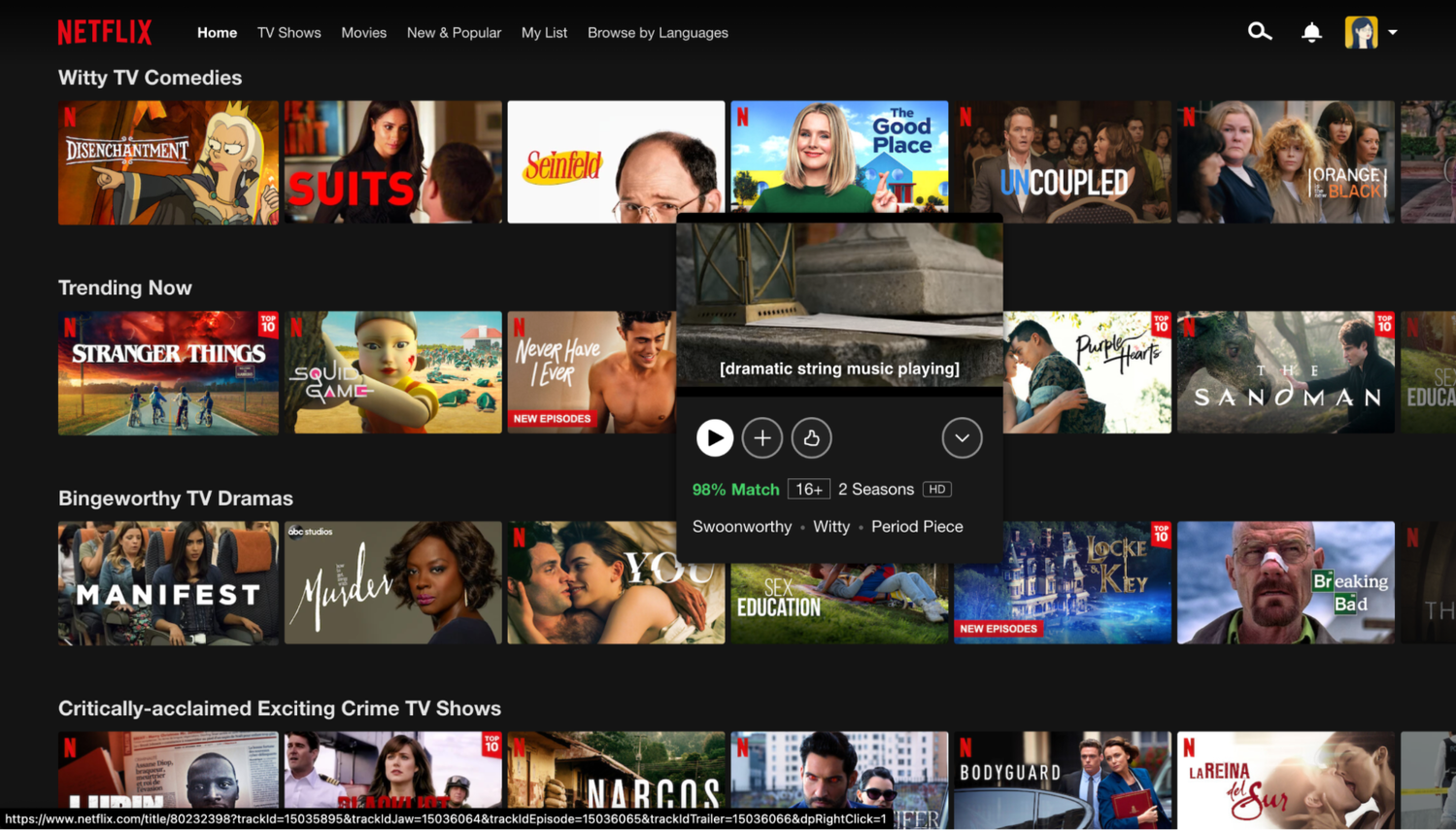 Multiple horizontal carousels by Netflix
Tutorial sliders
A website carousel can also be introduced as a step-by-step tutorial. Usually, this carousel type has a simple and interesting content structure that drives users to click through it to learn new guidelines, discover product features, and many more.
Tea Round’s website introduces the functions of its app with a home page tutorial slider. Combined with stylish design touches like handwritten notes, artistic images, and convenient navigation, the carousel can easily attract users’ attention and showcase the value of the promoted product.
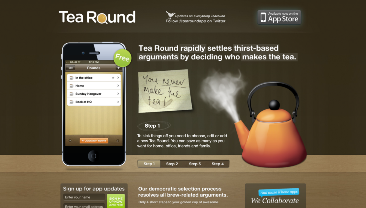 Tutorial sliders by Tea Round
Best practices for your website carousel design
Now it’s time to discover the key points and guidelines to consider when implementing a carousel on your website.
Ditch autoplay
It’s common for carousels to flip through the content automatically, but the major disadvantage of this approach is that it hits user engagement and causes them to bounce.
Moreover, regardless of the static or dynamic carousel model, the first slide always dominates, receiving 40% of all clicks. This means you should give end users better control of the carousel’s speed and pace for a more comfortable user experience.
Include three to five slides
The more sliders you have, the less likely users will watch the entire carousel content. Basically, the first three slides receive the most clicks, which means creating five+ slides will be simply a waste of time and resources.
Use high-resolution content
Whatever content you want to display, keep it the best quality to attract, not distract your visitors. Otherwise, it can easily turn a first-class, professional website into a low-grade one.
Optimize for SEO
As any other content, the text you use for your website carousel is also displayed in the page’s HTML code. Therefore, using SEO best practices for headers, image alt-text, and other code lines of your carousel can benefit your page ranking position on a SERP.
Check our post on
SEO trends that you can leverage to rank higher on SEPRs.
Keep your text short and simple
To make the carousel really engaging, don’t turn its content into a blog article. Instead, make it EATable, easy to perceive, and with a clear message for the best efficiency.
Create a powerful CTA
CTA is the key component of any website that allows users to clearly understand what to do after they learn the page’s content. So, each slide in your carousel should contain the proper user intention and target a specific goal to deliver maximum efficiency. Examples of CTAs are “Get Your (product) Today,” “Find More About the (service),” or “Request a Consultation.”
Optimize for different devices
Today, people browse websites from different devices: laptops, tablets, wearables, and smartphones. This tendency has made device optimization one of the major priorities in web design. Adjusting website carousels won’t be an exception here, as it helps increase their engagement and functionality.
Include control buttons
Side and volume buttons and navigation indicators can give users better control over the content they browse, which is essential for delivering first-class UX.
Don’t overuse the carousel feature
Depending on the type and functionality, it’s recommended to only use one or two carousels per page. Otherwise, it won’t deliver the desired outcomes and will turn out useless for visitors and website owners.
These are only a few common practices for website carousel design, but stay sure that all those implemented can significantly upgrade your page’s performance.
How to add carousels to a site created with SendPulse
With our website builder, you can add a gallery to display several images as a carousel, grid, or collage.
First, add the “Gallery” widget to the required part of your website.
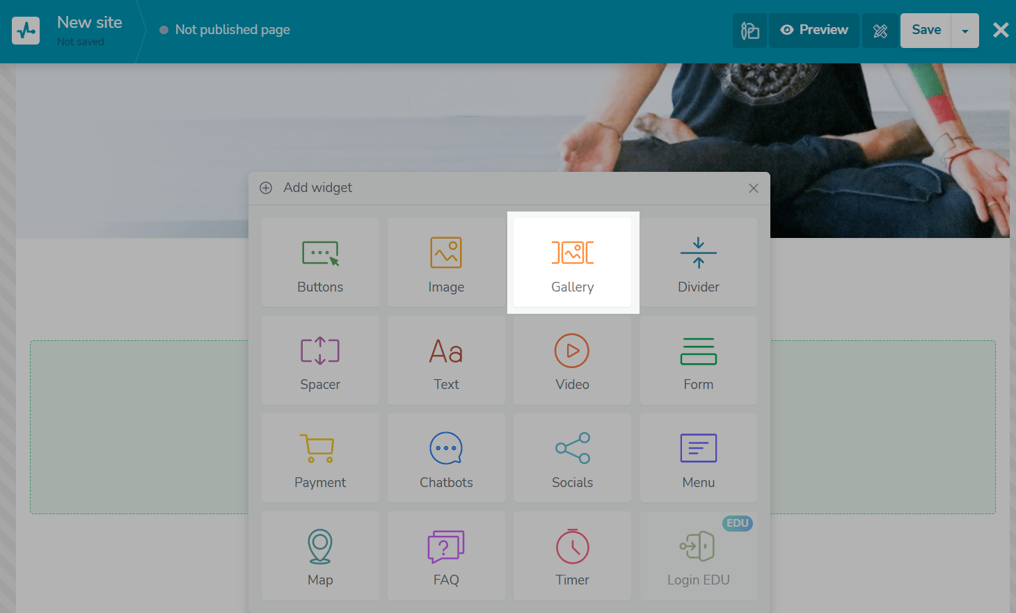 Adding the “Gallery” widget
Then select the gallery type you want to create — carousel, grid, or collage — and upload the images you want to use for your website carousel.
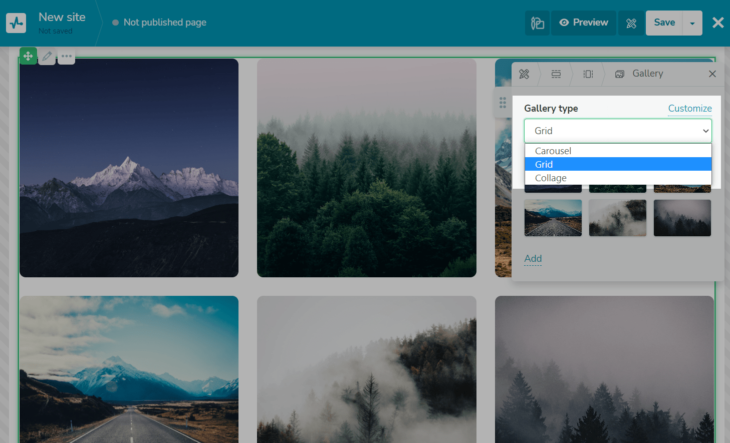 Choosing the type of gallery to be used
Now proceed to your widget customization. Choose how many images you want to add to the row and set up its appearance, indicate the spacing between images, round your image corners, and select your slider buttons’ color.
Customizing the website carousel in SendPulse
You can also enable or disable image opening after a click and automate slide transitions.
Final thoughts
Using visuals on a website is one of the most effective tricks to increase engagement and reduce bounce rates. When organizing a bulk of media content on a page, nothing works better than adding a carousel slider.
To maximize the efficiency of your website carousel, make sure its copy is short and simple. Also, we suggest using the highest quality content to catch visitors’ attention and drive more interest.
We hope this guide has shed some light on creating an effective website carousel. If you need help maximizing your website’s efficiency with the most modern marketing approaches, feel free to leverage the power of a wide variety of SendPulse tools!