Squeeze landing pages, lead capture pages, sales landing pages… Don’t we have enough already? Well, splash pages are in their own category and can be very helpful for guiding or segmenting a new audience. Besides, they are easy to create — you don’t have to map out their structure or spend eternity designing individual blocks.
Let’s take a closer look at some top splash page examples and find out what they are made of and why your business may need a page like that.
What is a splash page?
If you haven’t heard of splash pages before, that’s because they are not nearly as widespread as other types of commercial pages. A splash page is simply an introductory page that opens before a homepage. For example, here’s the splash page you’ve probably seen many times:
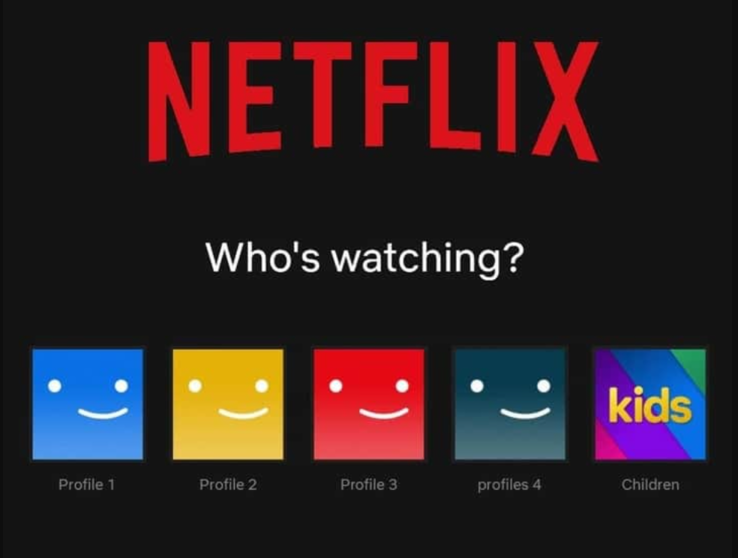 An example of the Netflix splash page
This is not a landing page, even though the user technically lands on it. This is a “before you go any further” type of page — it ensures that the website visitor gets access to the most relevant content. Effective splash pages are very action-centered and do not contain a single distracting element — think concise disclaimers or recommendations.
You can benefit from having a splash page if:
- there’s something your visitors need to know before entering your website;
- your website has multiple localized versions for specific regions;
- your resource promotes goods or services available only to those older than 18 or 21;
- you want to attract attention to a limited-time offer.
These are the most common use cases, but you don’t have to limit yourself to them.
Splash page vs. landing page — what’s the difference?
Unlike a landing page, a splash page shouldn’t describe your entire offer or contain paragraphs of text. It is a lightweight page — users should be able to scan it instantly and take the action it requires. Ideally, a splash page doesn’t divert any attention from the following landing page but only enhances it.
By their nature, splash pages are closer to pop-ups than to full-sized landing pages. If you omit them altogether, it won’t harm your website. However, a well-crafted splash page can save your users’ time, help you send them to a more relevant website version, or notify them about something they may otherwise miss. A pop-up serves a similar purpose but has a small downside — it might make your landing page look cluttered.
Are splash pages beneficial for any business?
Splash pages are extremely useful for international retail companies and businesses selling a wide variety of goods or services, for example:
- fashion;
- cosmetics;
- furniture;
- tech;
- gear and equipment;
- automotive industry.
Interactive or gamified websites are also usually packed-full of content and often require a splash page to prepare visitors for what’s to come or warn them that the page might take a while to load.
The elements of an effective splash page
Creating a killer splash page is easy — include only essential elements and fight the desire to make it prettier. The more attention your visitors pay to your splash page, the less concentrated they will be when scrolling through your key landing page, so don’t overdo it.
By essential elements, we mean the following:
Sometimes, you won’t need any copy at all. Here is an example of a splash page seen on the Pull&Bear international website:
 A minimalistic splash page from the Pull&Bear website
There are no chunky buttons or unnecessary blocks — just two harmonious clickable images working together perfectly. This page shortens the user journey by allowing website visitors to immediately jump to the most relevant product section and start shopping.
Good to know before creating a splash page
Until recently, many commercial and entertaining websites had splash pages showing a running progress bar while the homepage was loading. Since they are not very functional or interesting to look at, more and more online businesses decide against them. For a commercial website, a splash page like that can create an unnecessary interruption affecting the user experience.
But some businesses still prefer to keep them to add some intrigue and encourage the user to stay while the page is loading.
 A splash page from Ibanez showing a loading progress bar
If you thought about choosing this type of splash page, make sure it’s visually appealing and helps create some suspense. A progress bar page is a better choice for entertaining websites since their visitors are not in a hurry and don’t have a strong purchasing intent.
If you are adding a splash page with a data entry form, you need to specify why you need that information and how you will store it.
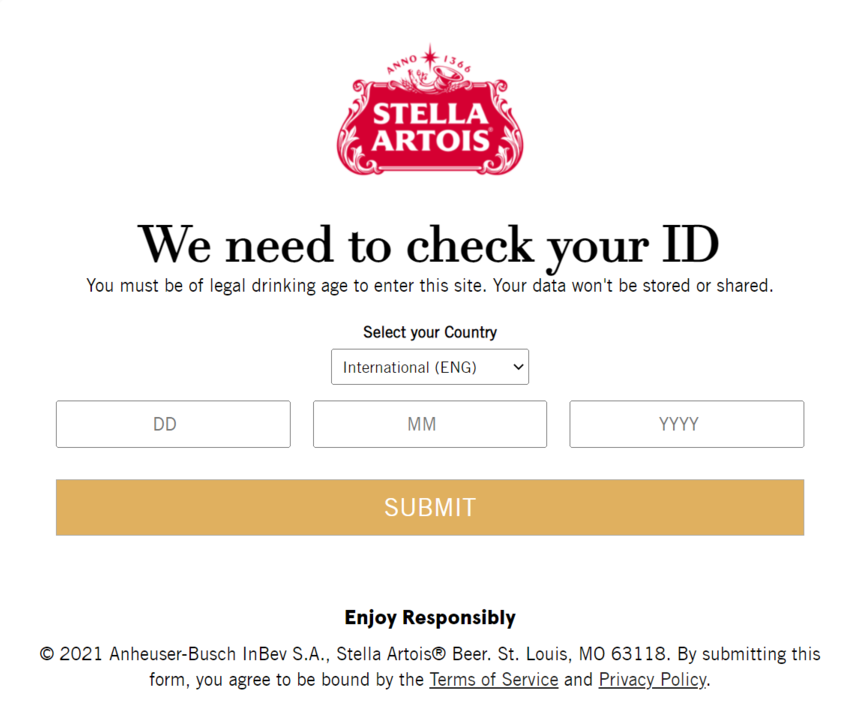 A splash page for age verification
If you, for example, promote alcoholic beverages or run an online adult store, your local regulations may require you to place a similar form on your website. Then, your task is to make that splash page as non-intrusive and informative as possible to keep the user experience smooth.
Five more splash page examples and why we like them
Details matter. Let’s find out what exactly makes certain splash pages appealing and click-worthy — and how to apply those insights to your own pages.
Whole Foods
Take a look at this mouth-watering splash page example we’ve discovered on the Whole Foods website — it’s clean, intuitive, and nondisruptive. And it serves an important purpose — it redirects buyers to their local Whole Foods website and helps them avoid frustration caused by the inability to purchase a specific product that isn’t available in their region.
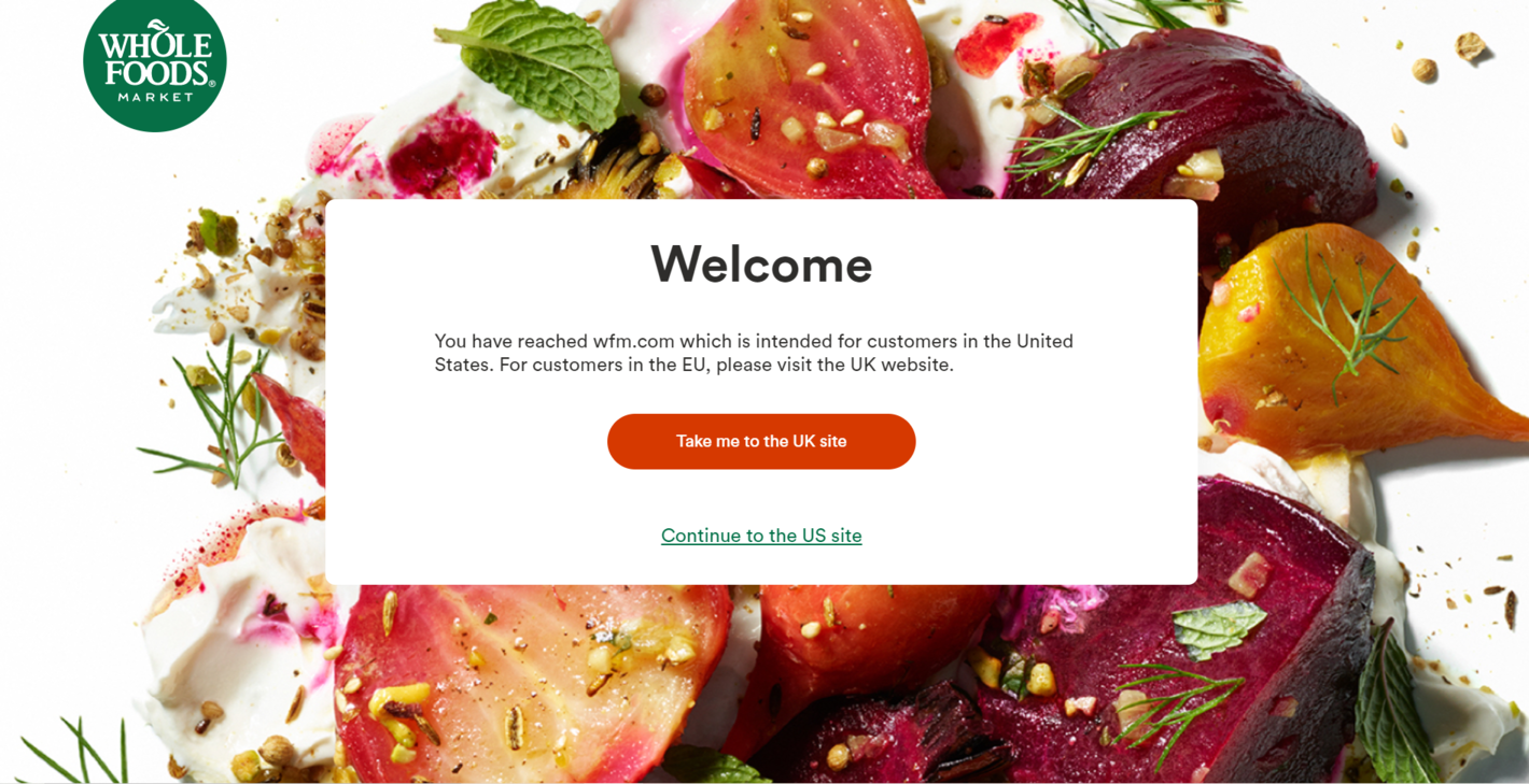 An appetite-provoking splash page from Whole Foods
We recommend using high-quality, bright, and tasteful background images for landing pages and splash pages to make them more enticing. Just make sure that there is enough contrast between your images and copy and that text legibility isn’t sacrificed.
Neil Patel
If you are into content marketing, we bet you’ve already come across this captivating splash page from Neil Patel’s website. It has multiple subpages, a data entry form, and a lot of text, but it’s still intuitive and appealing enough.
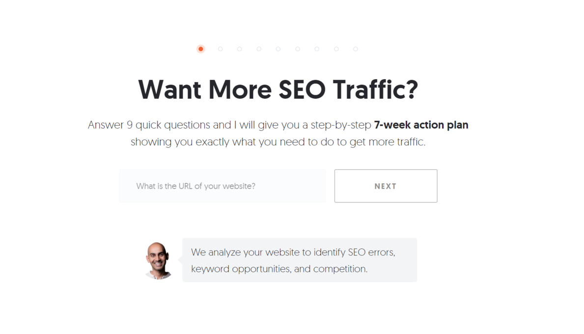 A splash page containing a lead capture form
Even though this splash page contains a lead capture form, it is still an introductory page a user can always skip. Because it takes over the whole screen, it is more convincing and harder to miss.
Stradivarius
This splash page has it all — on-brand visuals, easy-to-read copy, and a contrasting CTA button. The simplicity of this splash page allows website visitors to find their local version of the Stradivarius online shop within seconds.
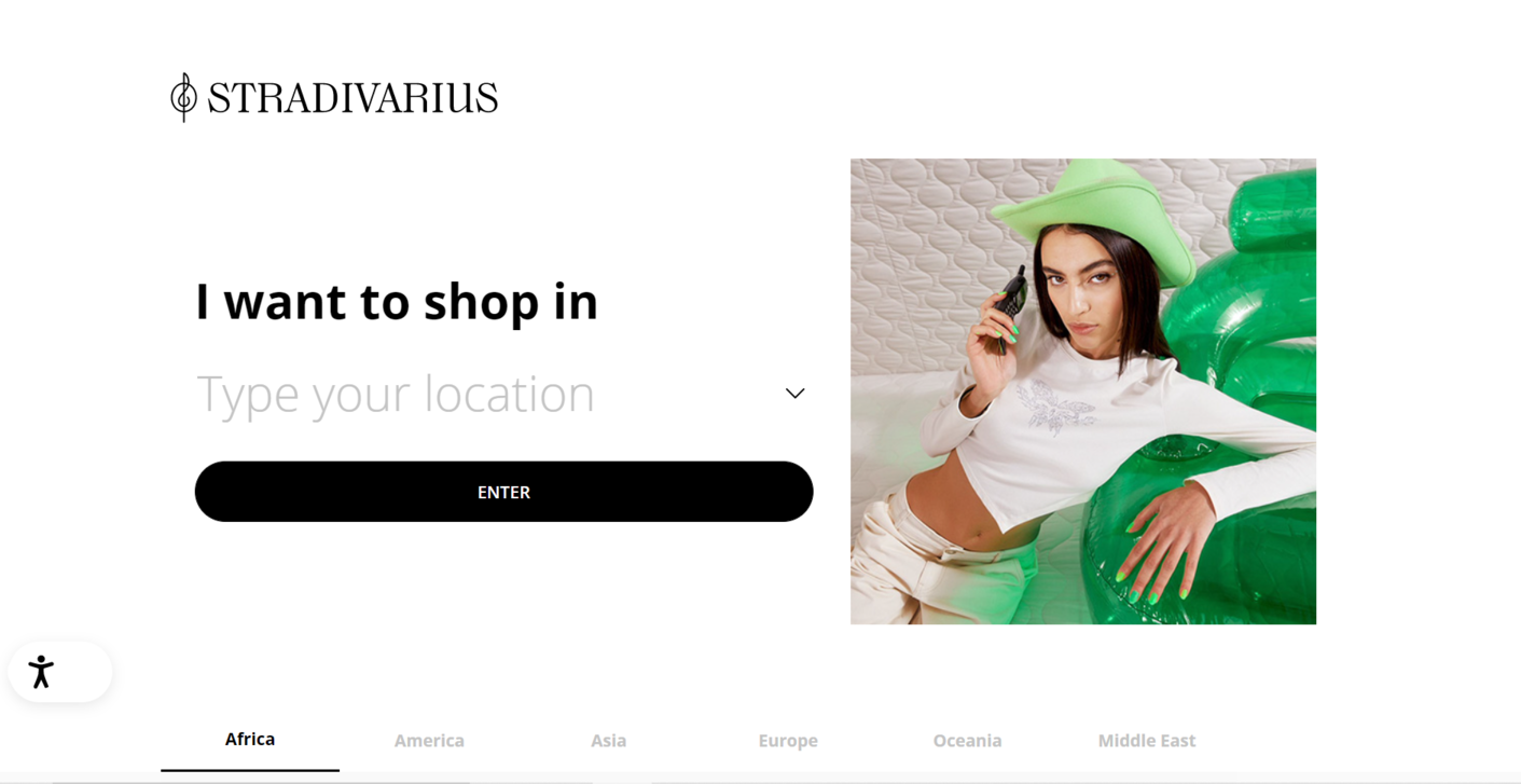 A clean, nice-looking splash page from Stradivarius
To specify their location, the user can choose a country from a drop-down menu or type in the name manually. It’s a sure way of helping consumers find exactly what they are looking for.
Jeep
You can take the best from both worlds by designing your splash page so that it would resemble a pop-up notification. In this splash page example, the background is transparent and allows the user to see the home page, but the form itself can’t be skipped or closed.
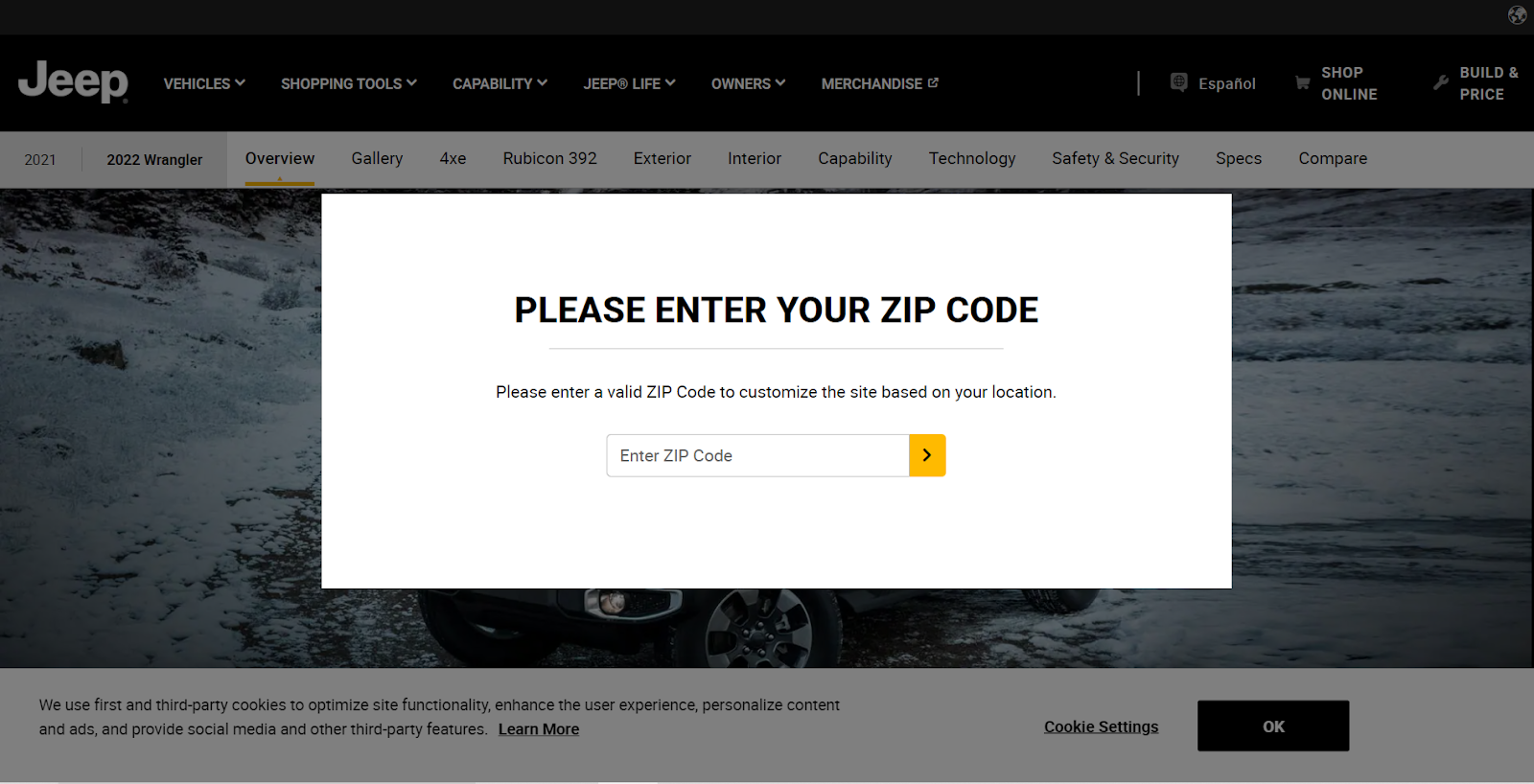 A splash page from the Jeep website
This design makes the splash page significantly lighter and less intrusive — a great move for when you don’t want to cause your first-time visitors any annoyance. By giving a glimpse of your main landing page, you increase the chances of your users taking the action required to get there.
Lefties
Another example showing how bold visuals can amplify your splash page and make it truly attention-grabbing. In this case, photos also demonstrate Lefties’ products in action, which is another advantage.
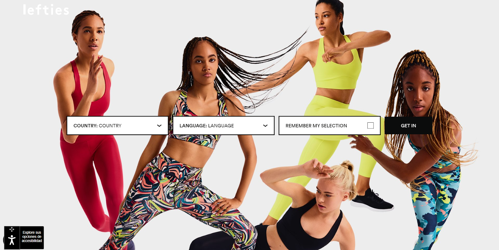 An example of an attention-grabbing splash page with a bold background photo
There are three fields on this page, but they are elegantly centered and do not make the page look crowded. A contrasting CTA button is hard to miss, yet it’s not too bright to conflict with the background photo.
Summing up
A splash page is a non-essential but helpful element that can improve your website conversion, so make sure to give it a try. And if you are looking for the tools to create stunning landing pages, check out our landing page builder — it has a drag-and-drop editor, dozens of customizable templates, and marketing tools for boosting your traffic and more. Build your landing page in just 15 minutes or less!