According to the study, 81% of small and medium-sized businesses rely on email marketing for customer acquisition and 80% of them use email for customer retention. But what truly matters is that email marketing is an affordable way for a small business to achieve both of these goals.
In this guide, we’ll talk about small business email marketing and, namely, show how to get new subscribers, build and design an engaging email, and check your progress and spend your budget wisely. Let’s get started!
Step 1. Create a quality mailing list
To start paving your way towards effective email marketing for small business, you should build a mailing list. In fact, there are proven methods and tips for small business owners to get people sign up for their emails.
First things first, let’s speak about types of subscription forms and ways to use them.
There are four types of forms:
- pop-up, which appears in the middle of a web page and covers up the rest of the content;
- embedded and fixed, which are usually placed in footers, sidebars, and at the bottom of the screen, surrounded by content;
- floating, which, as follows from the name, floats at a certain part of a website until a user takes an action.
Subscription forms can include the following elements:
- title, which explains why a user should join your mailing list;
- short description (optional), which provides a little more information about the email subscription, for example, email frequency, topics, number of existing subscribers, and so on;
- image — another optional element used for dragging attention to the subscription form;
- fields where a potential subscriber should insert their email address or any other data such as their name;
- optional checkboxes to let users choose a few different options such as types of emails they would like to receive;
- optional radio buttons that are used if there’s a need to pick only one out of several options, for example, gender;
- sign-up button, which is a final call-to-action.
Here is an example of an embedded subscription form from Vox. As you see, it contains only necessary elements and nothing extra.
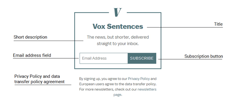 A minimalistic subscription form from Vox
An example of a pop-up form from Nike includes more fields, but that’s a reasonable choice for a clothing brand which usually sends out more personalized emails with different content for the male and female audience as well as birthday gifts and discounts.
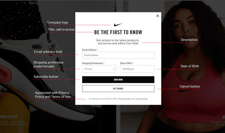 A pop-up subscription form from Nike
For your own small business email marketing campaigns, define the number of fields within the subscription form based on what information about your subscribers you would like to have.
Pop-up forms usually bring the highest number of conversions as they tend to catch the full attention of a website visitor. However, for business in general and small business email marketing in particular, we recommend using several types of forms at once. For example, you could place a fixed subscription form in the footer of your website and set up a timer for a pop-up window, which would appear, say, after a minute spent on your website.
Keep in mind that the exact location and timer settings should always be tested as users’ preferences differ from one person to another. For instance, set up the timer for a pop-up form to appear after 30 seconds and 60 seconds and hold an A/B test to find out which option generates more subscriptions.
Here are some options for you to place your subscription form:
- website homepage;
- product page or landing page;
- company blog — inside, before, or after the article;
- purchase confirmation page;
- user sign-up page, and so on.
To create an effective subscription form, make sure:
- it doesn’t have too many fields and is not too complicated as people may feel worried about giving out too much personal information during the sign-up stage;
- your copy clearly explains what users should expect from your emails;
- there is only one sign-up button, so the process isn’t confusing;
- the design and copy of the subscription form look appealing and are in line with your overall brand identity;
- your pop-up forms don’t appear too early after a user lands on your website.
Choose between single or double opt-in
Single opt-in and double opt-in are sign-up methods used to collect new email addresses. Both of them have pros and cons, so we’ve prepared a comparison table for you to decide which option to choose for your small business email marketing.
|
Single opt-in |
Double opt-in |
| How does a user become a subscriber? |
A user enters their email address and clicks a sign-up button. |
A user fills in their email address and clicks “Sign up.” Then, they receive a confirmation email with a link which they have to follow in order to join a mailing list. |
| How fast does the mailing list grow? |
Quicker than with double opt-in as users opt-in the mailing in one click. |
Slower than with single opt-in as there are more steps users need to take to sign up. Moreover, sometimes users simply forget to open a subscription confirmation email. |
| What about the deliverability rate? |
It is lower than with double opt-in. Inactive or invalid email addresses as well as spam traps may get on a mailing list, and if their number gets too high, email service providers (ESP) can block your emails. Moreover, these emails may cause delivery errors and lead to lower sender reputation. |
It is higher than with single opt-in. The subscription confirmation process guarantees that only existing and valid email addresses get on a mailing list.
If an email lands into the spam folder, it’s easier for a sender to prove to the customer service of the ESP that the mailing list consists only of those who have deliberately joined it. |
Magnetize your leads
One popular and effective solution for attracting new subscribers is to use lead magnets. A lead magnet is a piece of content or other valuable item or service which you offer for free in return for the subscription.
Lead magnets in email marketing are basically subscription forms which can offer eBooks, guides, lists, online webinars, courses, and any other freebies. Here’s an example of a lead magnet from Just Creative with their branding course and logo inspiration eBook they offer in exchange for an email address.
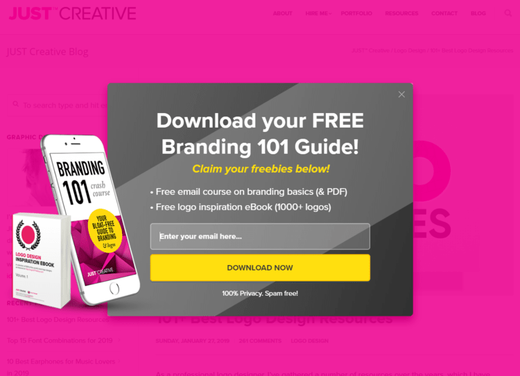 A lead magnet from Just Creative
When a user enters their email address, they see a confirmation pop-up with the request to check their email as well as Just Creative Facebook page.
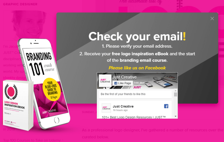 A lead magnet confirmation from Just Creative
Finally, users receive their first email from Just Creative with the eBook as well as the description of the upcoming branding course.
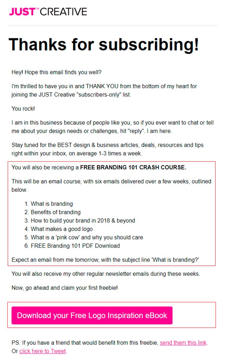 An email from Just Creative with freebies promised in the lead magnet
Use Facebook to get subscribers
To combine your marketing channels and efforts, place an email subscription form on your Facebook page using Woobox. It will allow you to integrate your email opt-in with your Facebook page, adjust its design, and write a unique copy. When a user signs up, their email address will be automatically added to your mailing list.
That’s how a form looks like on the Facebook page of Just Creative. To see the form, you can click the action button “Sign up” or the “Email Signup” button on the left-side menu. Both of these buttons lead to the same page below.
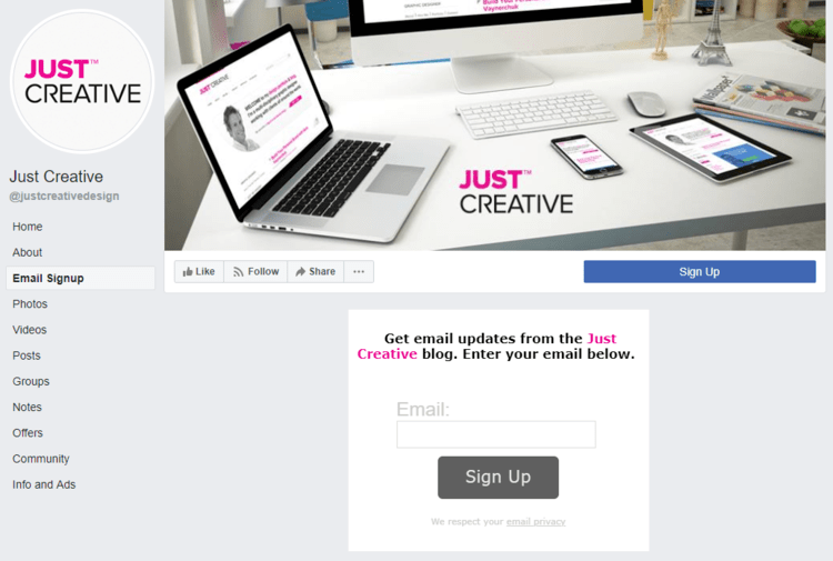 An email opt-in on the Just Creative Facebook page
Checklist on building a mailing list
Here is a list of email marketing tips for small business owners to build a quality mailing list:
- Combine different types of subscription forms — pop-up, embedded, fixed, or floating — on different pages of your website. Add a subscription form to your Facebook page to reach more people at various stages of their journey. Make sure the form doesn’t include too many fields that may scare off prospect subscribers.
- Choose a suitable sign-up method: single opt-in if you want your subscriber base to grow fast or double opt-in if you want to make sure that no invalid addresses appear on your list.
- Offer lead magnets, valuable pieces of content relevant to the needs and interests of your audience in exchange for their email addresses.
Step 2. Understand the anatomy of an email
Let’s move on to the email itself. It usually consists of the following parts:
We’ll walk you through all the elements, explain what role they play, and what content to use for each of them.
Sender name
The element identifies who the email is coming from. It can be in the following forms:
- a brand name;
- an employee name + a brand name;
- a manager name;
- a company name + a company type, and so on.
Choose the option based on how popular your brand is, how well your audience knows your managers and employees, and what tone of voice your company usually uses for communication with the audience. For instance, companies focused on young people who are interested in street fashion would most likely use some slang words, nicknames, or first names of their team members both in their sender name and in the rest of the email.
Here is an example from Downshiftology. It’s an email series by Lisa Bryan, who owns a YouTube channel and a blog. She used her ‘name + the name of her blog’ as a sender name because her personal name is well recognized by her audience.
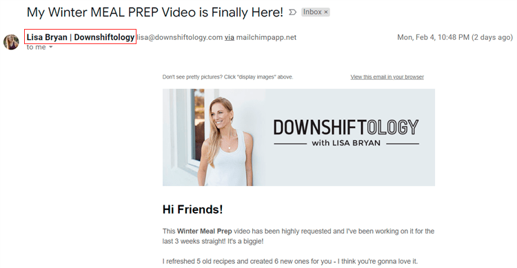 A sender name used in the Downshiftology email series
On the contrary, Uniqlo’s sender name field is limited only to their brand name because people know the company well and have come for it specifically.
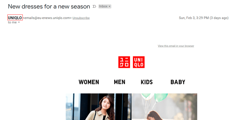 A sender name used in the Uniqlo emails
Subject line
This element shows the main idea behind each particular email you send. A compelling subject line should hit right on target, be bold and clear.
To craft a perfect subject line, try to:
- avoid all-capital letters, too many exclamation marks or questions, and click-baits;
- respect your reader and provide a valuable summary of your email in a way that would be engaging for your audience;
- make it fit 40 symbols so that it will be displayed correctly on any device.
Below are some subject line ideas that will make subscribers want to open your emails.
Announce new collaborations, especially when they are the reimagination of well-known classic characters.
 Uniqlo announcing the Sesame Street collaboration in their email subject line
Incorporate numbers in your subject lines to narrow the content of your email to its key points (and people do love numbers).
 Shopbop using numbers in their subject line
Ask questions in email subject lines as they provoke curiosity, especially if they are relevant to your subscribers.
 NOMAD asking a question in their email subject line
State a deadline for your offer or mention the limited availability of the product in your subject line to create a sense of urgency.
 And Comfort setting the time limit in their email subject line
Preheader is a logical extension of the subject line as it provides some more details about the email content. It may include a subscriber’s name or their location, discount amount, or even a call-to-action.
For your inspiration, take a look at these three examples of preheaders from different brands. Bruegger’s Bagels set the time limit for their “Free Brownies” promo; Lisa Bryan mentioned the number of ingredients needed for her new recipe; and Timberland explained the meaning of their mysterious subject line.
 Examples of email preheaders from Bruegger’s Bagels, Lisa Bryan, and Timberland
Header is the first thing users see when they open your emails. It may include a logo, menu or headline of an email as well as social media links, contact details like a phone number, working time, and other information.
Shopbop, for example, begin their emails with a logo and a minimalistic menu on a white background with everything a customer might need.
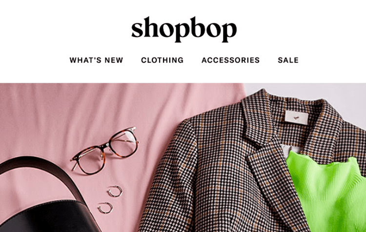 A minimalistic header of the email from Shopbop
Meanwhile, Krave Beauty placed a visible preheader at the top and then decided to promote a gift for orders over $50 right away, even before showing their logo.
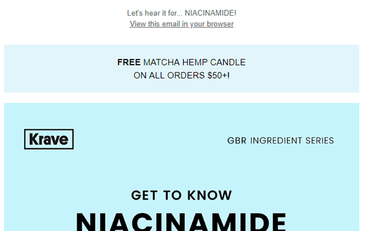 A header of the email from Krave Beauty
Bruegger’s Bagels composed their email header of the logo, menu, and the number of loyalty points a user has. Not only is it comfortable for users but can also bring new sales as those who realize that they have a lot of loyalty points will be likely to part with them.
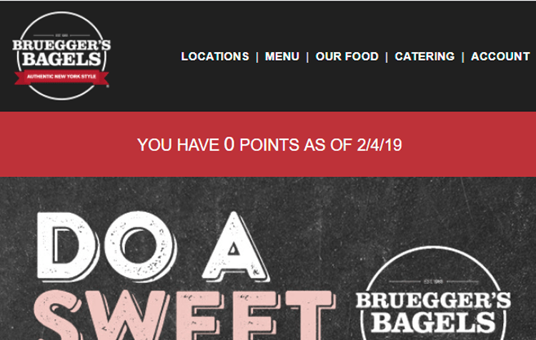 A header of the email from Bruegger’s Bagels
Email body
This is the most informative part of any email. Its size and content fully depend on a company and its conversion goal. We recommend beginning with an introduction or a welcome line, then communicate your main message, and finish up with a clear call-to-action button. In small business email marketing, you can use images, GIFs, text, buttons, videos, and hyperlinks to present your content in the most user-friendly way.
Take a look at an example from The Sill. The header in their email is very short ― it’s simply their logo ― so they get to the email body right away. The latter begins with a large image and promotional text. Then goes the CTA button leading to their website. After that, they promote three of their favorite picks providing a CTA button for each of them.
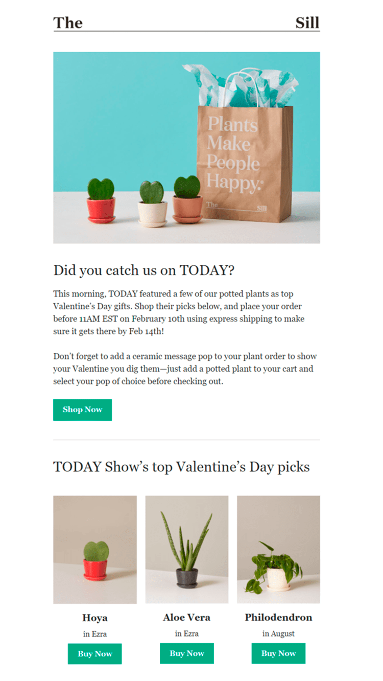 An email body from The Sill email
Footer is the closure of your email. It usually stores the elements that repeat from one email to another:
- social media links;
- website menu;
- contact details;
- unsubscribe link or button;
- legal information, and so on.
For example, the footer of the Timberland email mostly consists of legal information: shipping details, the company’s address, the unsubscribe link, along with the link for a sender to update their email address. The company complements their footer with four large CTA buttons: new arrivals, best sellers, refer a friend, and find a store.
 A footer of the Timberland email
You can do the same by checking what pages of your website are the most popular with your visitors and putting those in your email footer.
Checklist on understanding the email anatomy
Here’s what you should know and do about the email anatomy when your goal is the best email marketing for small business:
- Introduce yourself in the sender name in such a way that people understand right away who the email is coming from.
- Experiment with your subject line to make it compelling enough for a recipient to open your email. You can ask questions, use numbers, mention well-known characters or brands, and leverage the sense of urgency or scarcity. Remember to complement it with an insightful preheader.
- Divide your emails into three main parts: the header with the company’s logo, menu, contacts, or other useful external links; the body that sells, which should include images, copy, and CTA related to the main offer; the footer that stores legal information like offer details and company’s address, unsubscribe link, and possibility for a subscriber to update their personal information.
Step 3. Care about your email design
The visual part of an email is an important aspect as it influences the recipient’s first impressions about you and your product as well as their buying decision. That’s why you should pay special attention to the way you design your emails.
Structure and visual guidelines
A clear and transparent structure is the key. All elements of an email should help readers to quickly scan it and understand its message. Consider these elements:
- headings;
- small paragraphs;
- bullet lists;
- citations;
- font formatting;
- highlighted words and sentences, and so on.
You should also make sure that the important parts of your email are visually highlighted and are placed at the first scroll, while the rest can be placed closer to the footer. The main rule is that visual elements should guide readers through the content of your email.
Call-to-action buttons take special place in design as the success of it is on them that an email campaign depends on. Thus, while designing your emails, following these tips:
- make your buttons well-visible and bold;
- choose the same presentation style for them, so it’s easy to recognize them while scrolling through your emails;
- place the main CTA button above the fold, closer to the header, and repeat it again at the end of your email;
- surround buttons with a good amount of white space to make them stand out;
- use strong verbs for the copy of your CTA buttons.
Look at the example from ShopBop. The images and the position of the text help the recipient move from the header to the footer and easily perceive the information, which is presented in the logical order. The CTA buttons are large, bright, their copy containing action verbs.
 A well-structured email from ShopBop
Layout and responsivity
Emails are usually built using one, two or three columns. In case of a single-column layout, an email will look good on any device. For other options, you should use responsive templates; otherwise, your email may fall apart on mobile, even if it is displayed correctly on desktop.
The recommended width of an email is 600 px, where you should put no more than three columns of content. If you are going to have more columns or a wider email, the text and images may shrink down to a small size not visible on mobile.
You should also take care of responsivity of your email, so it’s displayed correctly on a desktop, tablet, and mobile. As a rule, email service providers can automatically make your email responsive if you use the templates they offer. That’s why it’s important to spend some time on choosing the most comfortable email marketing service for small business success.
Here’s an example from HelpScout. It’s a single-column email divided into three blocks structured in a similar way. There is no visual clutter thanks to a good amount of negative space, equal line spacing, the main focus of the email going to custom illustrations.
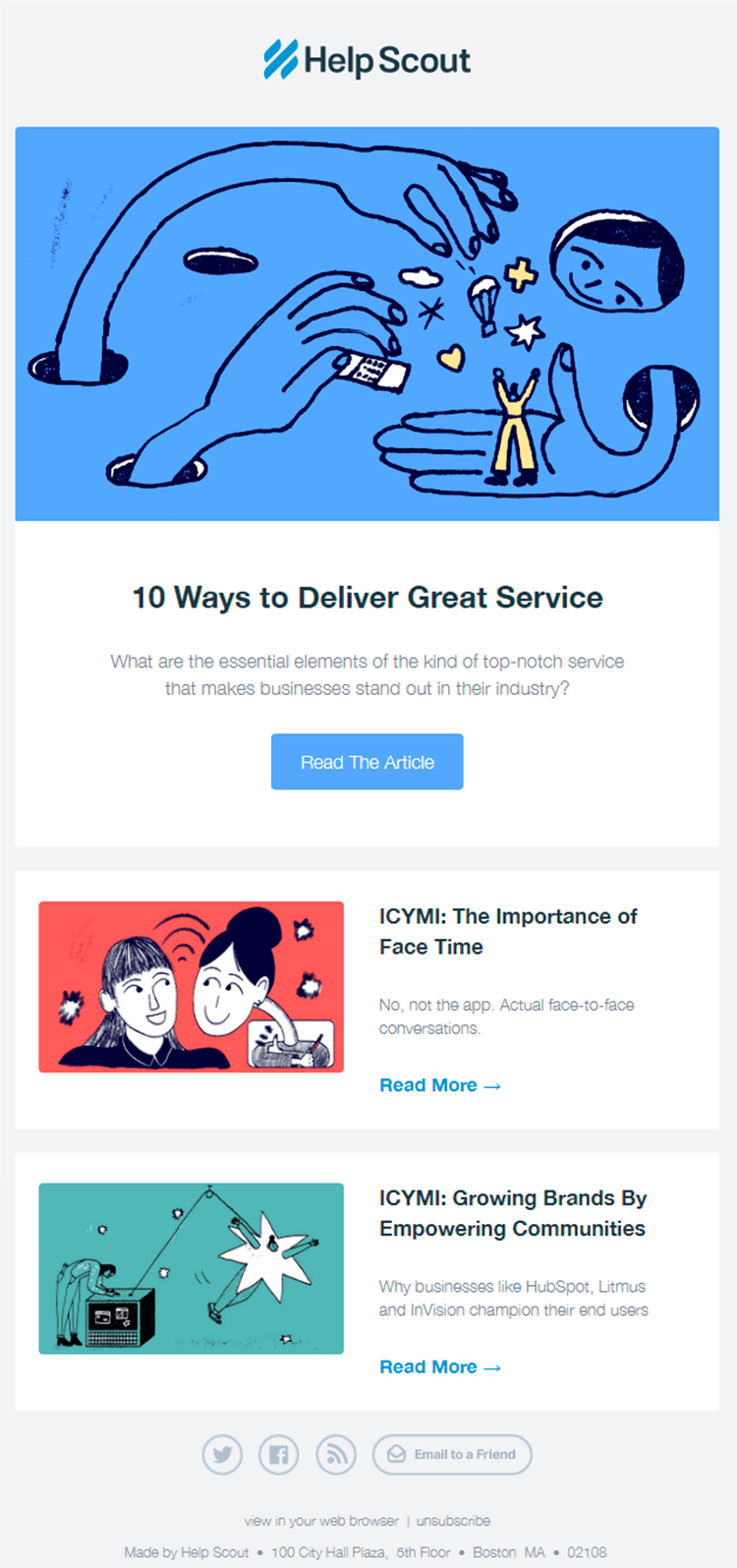 A single-column email from HelpScout
Consistency
The design solutions should be consistent throughout all of your email campaigns. By consistency we mean similar colors, fonts, layouts or grids, and design elements, which create a sense of a holistic approach and make your emails easily recognizable.
For convenience, you can keep a library of visual assets that you’ll be able to reach out to every time you need to create a new email. Such library may include:
- headers;
- footers;
- buttons;
- layouts;
- primary and secondary fonts;
- illustrations made in one style, and so on.
When it comes to using images in your emails, stick to a simple rule: use images as a visual extension of your text. Images should represent the main message you are trying to communicate and correlate with the copy of your email.
Below you can see four different emails from Uniqlo that are designed in the same style. All of them have the same header, desaturated square images, centered text, headlines in bold fonts and descriptions in thin, followed by “ghost” CTA buttons.
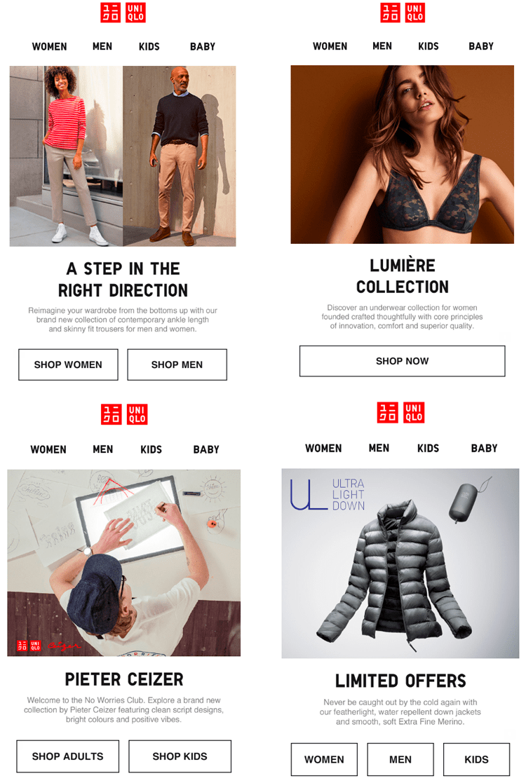 Consistent email design from Uniqlo
Checklist on the email design
When it comes to design, there are simple but important rules you should follow:
- Make sure that your email is responsive ― correctly displayed on both the desktop and mobile.
- Create a library of branding assets and ready-made elements that you can simply drag and drop into the email template.
- Build images around the text and not otherwise, which means that you should think of your content first and then support it with images.
- Make your CTA buttons stand out against the email background and content.
- Build your email design so that users can scan fast through the content and still understand the main message behind your email.
Step 4. Keep track of your small business email marketing results
The main goal of small business email marketing is to bring conversions that can be measured either as sales, clicks, views, or any other metric you set up.
To start tracking your results, you need to choose what you want to measure and set up a realistic timeframe to achieve these targets. Such way of target setting will help you in planning what exactly you should do in the nearest future. For example, you may plan to increase open rates by 7% in the next three months. To make it happen, you can hold A/B tests with different subject lines, find those which get more opens, and write your upcoming subject lines in a similar manner.
Now, let’s consider the most important email marketing metrics you should keep track of.
Bounce rate
Bounce rate = (Emails returned / Emails sent) * 100
Bounce rate shows how many of your emails haven’t been delivered. There are two types of bounces with different reasons behind them:
- Hard bounces happen when the email is sent to a non-existent email address.
- Soft bounces can be caused by temporary problems, like DNS failure or not enough free space in the inbox of a particular subscriber.
When you see hard bounces, the only cure is to delete these email addresses from your mailing list as they can’t be fixed or recovered. For soft bounces, you should leave some time for the problem to get resolved, and if you see that some email addresses have been getting soft bounces for a long period of time, it’s better to delete them too.
Unsubscribe rate
Unsubscribe rate = (Users unsubscribed / Emails sent) * 100
This metric shows how many of the users you sent emails to unsubscribed. Unsubscription is not always a bad thing as it helps you keep your mailing list free from the audience which is not interested in your content. However, if this rate is too high, you need to find out the reason why. These reasons can be as follows:
- Irrelevant content. In this case, you should go through every piece of content you are sending and make sure it brings value to your audience. Check out what your typical subscribers like to google on your topic via Google Trends, see who they follow, like, and comment on social media and what they write in those comments; or hold some surveys to find out which content would be most relevant in your case.
- Too frequent emails. See how often you send out your emails and for what reason. While transactional emails can be sent as many times as they get triggered by subscribers actions such as a purchase, promotional or entertaining emails shouldn’t be sent too often: one-two times a week is more than enough. If you send a variety of emails, you should always give subscribers an easy way to change their preferences and choose which emails they want to receive and how often.
- Mailing list with users who didn’t subscribe for emails. If people receive emails from a sender they didn’t subscribe to, they might unsubscribe in bulk. To avoid that, try to get new subscribers only via opt-in forms or some other ways which let you receive an explicit consent from every user.
You should also place the unsubscribe link in a visible place because sometimes users mark emails as spam if they can’t find a way to unsubscribe.
Spam complaint rate
Spam complaint rate = (Emails marked as spam / Emails sent) * 100
This metric demonstrates the number of users who marked your emails as spam. It directly influences your sender reputation, which means that if your spam complaint rate is too high, your emails will automatically get to the spam folders.
The acceptable spam complaint rate is considered to be 0.1% or 1 complaint per 1000 emails. If you notice that the spam complaint rate is getting higher, make sure to do the following:
- Ensure that your mailing list consists of users who gave their explicit consent for receiving emails from you.
- Regularly check the engagement of your subscribers measured in open and click rates to find inactive users. Try to re-engage inactive subscribers ― those who haven’t been interacting with your emails for six months or longer.
- Use double opt-in to prevent invalid email addresses or spam traps from landing into your mailing list.
- Make sure you don’t buy ready mailing lists as people may react negatively to receiving emails from unknown senders and send them to spam.
- Send out welcome emails to every new subscriber, so they get to know you better right away and recognize you in their inboxes.
Click-through rate
CTR = (Emails clicked / Emails delivered) * 100
Click-through rate is a metric that shows how many of the subscribers who opened your emails actually clicked on the links inside them.
Here is what you can do to improve your CTR:
- Make sure the content you are sending is relevant to your audience. You can hold tests and surveys to request some feedback from your subscribers. Their comments will help you find new ideas for your emails.
- Analyze your emails and see if they have a good structure and are easy to scan through.
- Make sure that your emails do not contain only one CTA button somewhere in the bottom. If possible, add several CTA buttons logically connected with the email content, check if they are well-visible, and if the text on these buttons motivates users to click.
Conversion rate
Conversion rate = (Number of users who completed an action / Emails delivered) * 100
The conversion rate is directly connected with the goals you set up in the very beginning of your campaign. To analyze this metric, you will need Google Analytics. It will enable you to track actions of users who came to your website form an email.
This rate is the one you should pay most of your attention to if you don’t want to waste budget on an ineffective campaign.
Checklist on five metrics of email marketing for small business owners
To make sure you are in line with your KPIs, remember to:
- Get rid of hard-bounced email addresses; delete those that have been bringing back soft bounces for a long time.
- Keep track of the unsubscribes as they may be a sign of irrelevant content, too frequent emails, or presence on your mailing list of the users who didn’t subscribe to your emails.
- Make sure that your spam complaint rate stays as low as possible because this metric influences your sender reputation.
- Make sure your emails are easy to scan and have bold CTA buttons, so people understand where to click, and your click-through rate doesn’t drop.
- Track your conversions to see how well you are doing with your small business email marketing campaigns and avoid losing budgets for no results.
Takeaways from the guide on email marketing for small business
Small business email marketing may bring you great results for little money if you are ready to invest your time and serious efforts in it. Here is the list of the most important email marketing tips for small business:
- Take care of your mailing list. To do that, place different types of subscription forms on your website, use lead magnets, and attract subscribers from Facebook.
- Choose between single and double opt-in sign-up methods to enrich your mailing list. We recommend using the former if your aim is quantity and the latter if it is quality.
- Make sure your email has a proper structure, which includes the sender name, subject line, preheader and header, body, and footer. Pay attention to the role of each element and the overall design of your template — use visual accents to make it easier on eyes and help recipients to scroll it through still keeping in mind the point of the message.
- Set clear goals and timeframe for their implementation. To understand how successful your email marketing efforts are and improve your strategy, track the number of bounced emails, see how many users unsubscribed from your emails and marked them as spam, measure your click-through and conversion rates.
Ready to launch your first campaign? Try out SendPulse email marketing service that offers a free plan for less than 2,500 subscribers, 100+ free ready-made templates, analytical reports, and other helpful tools to cater for the best email marketing for small business.