Your website is one of your most powerful marketing assets. However, businesses need to leverage them correctly to unlock their true power. You can have the flashiest site with custom graphics and all the content in the world, but it’s all for nothing if it doesn’t convert visitors.
Marketers are always looking for the special formula that can reduce bounce rates and increase conversions. While there isn’t a one-size-fits-all approach, there are a handful of tips you can leverage to maximize your website’s performance.
In this post, we’ll examine ten of those strategies, so you can reduce high bounce rates and boost your conversions. Before we dive in, let’s take a look at what exactly a bounce rate is and why should you care.
What is a bounce rate, and why should you care?
A bounce rate is the percentage of users that visit a single page of a company’s site and immediately end their session. This is an important metric for marketers to determine if their site keeps potential customers engaged and provides valuable information.
To calculate your bounce rate, take the number of singular page visits divided by the total website visits.
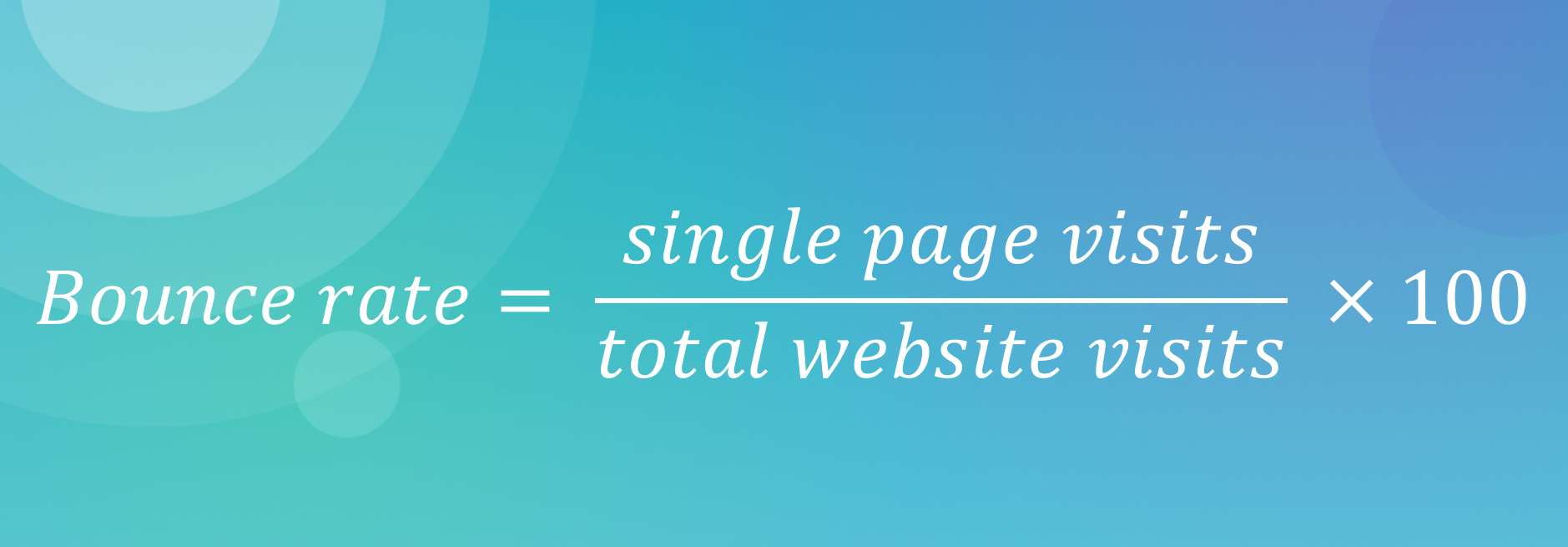 Bounce rate formula
Businesses are constantly trying to lower their bounce rate, which begs the question, what is a good bounce rate?
What is a good bounce rate?
Average bounce rate varies by industry. For example, complex SaaS companies may have a lower bounce rate than a small brick and mortar business that don’t have a complex website. It’s not uncommon for someone to bounce from a page if it addressed the searcher’s intent. They searched for an answer and may have immediately found it.
To understand what is considered a good bounce rate, take a look at this:
Bounce rate by industry
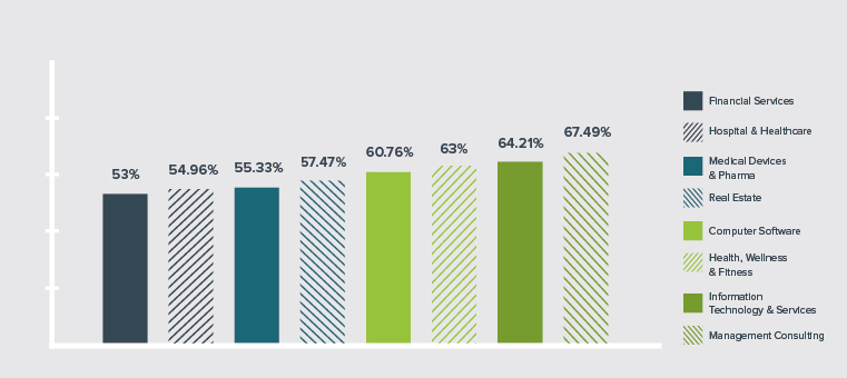 The computer software industry has an average bounce rate of 60.76%; source: Brafton Content Marketing Benchmark Report
The average bounce rate for a SaaS company is 60.56%. This is in the middle of a range of bounce rates spanning from 53% (Financial Services) to 67.49% (Management Consulting). By understanding where you stand, you can make adjustments to stay competitive.
10 ways to reduce bounce rates and boost your conversions
Let’s take a look at some of the tactics you can use to optimize your site for conversions. You might find one strategy works better than another. The key is continued optimization across all individual pages. By iterating, you will improve your bounce rate across the site.
A/B test landing pages
If people are bouncing immediately, try multiple landing pages for a campaign. A/B testing is the act of changing one variable across two assets to see which performs better. Businesses can A/B test their headline, slider photo, call to action, and navigation. To accomplish this, they can show their homepage to half their audience and a variant to the other half.
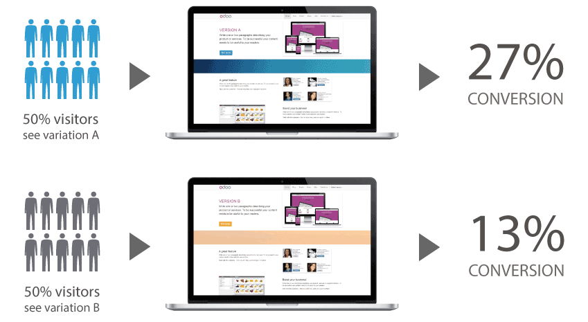 A/B testing is an effective way to optimize your site for conversion; source: Learning Hub
A/B tests are simple to conduct with the help of various software solutions. VWO, Optimizely, and Crazy Egg are three popular A/B testing software options. Each will let you input a variant to test and help you monitor the results.
Make sure you don’t change too much, though. You only want to test one variant at a time, so you can measure its effect. By performing multiple A/B tests, you can continuously optimize your page to ensure that your target consumers are spending more time on it.
Optimize your call to action
Is your page designed to ensure that the leads only have to do one thing? Sometimes landing pages are cluttered with ancillary content, resulting in a higher bounce rate. Simplify your landing page and optimize your calls to action. Focus on writing copy with the inverted communication style in mind.
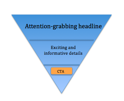 By leveraging an inverted communication style in your messaging, you can guide the reader to the desired action; source: Campaign Monitor
Start with an attention-grabbing headline and move onto your product’s value proposition. End with a clear call to action that ties everything together. Be as simple as you can be. Shopify’s landing page follows this same structure.
 Shopify’s call to action is prominently featured on their landing page
The company doesn’t have mixed messages or multiple calls to action. Instead, they offer a simple, straight-forward landing page with a simple request for the customer. This page is optimized for their “Start Your Free Trial” call to action and clearly guides the visitor to convert.
Utilize social proof on landing pages
Sometimes, prospective customers need a little nudge. Social proof is validation that a product or company is reputable. It helps buyers make their decision to purchase easier by offering credibility to the company as a whole.
Commonly, it appears as certification badges on the company’s site or logos from credible clients or media organizations. For example, Proof, a website personalization tool, features prominent clients on their homepage.
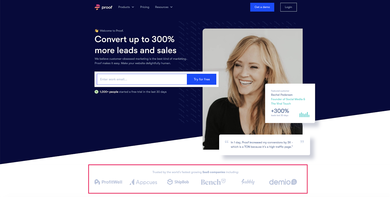 Adding customer logos to your site is a popular form of social proof
A customer who is casually browsing the site might see that ProfitWell trusts Proof and think, “Why shouldn’t I?” With social proof, your website will attract new customers and keep them on your site longer.
Make your site mobile-friendly
In 2020, all sites should be mobile-friendly. The vast majority of your web traffic will be done on a mobile device, and Google prioritizes sites in their search engine that are mobile-first. Sites that aren’t optimized for mobile use can be hard to use. The text will run off the screen or be too small to read, and call to action buttons may be difficult to press.
Take a look at these two variations of websites below:
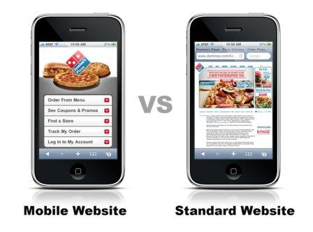 Mobile websites are easier to use and decrease bounce rates; source: Xzito
On the left, you can see the easy-to-use mobile website. On the right, you can see the standard website shrunk to fit a mobile screen. Companies should prioritize the development of mobile-first websites to accommodate those who will browse and shop from their phones.
Speed up your site loading time
Site loading time is one of the leading reasons prospective customers bounce from a site. If a page takes too long to load, the customer will find another company. Customers are 32% more likely to bounce as page load times increase from 1-3 seconds. This can be detrimental to your business.
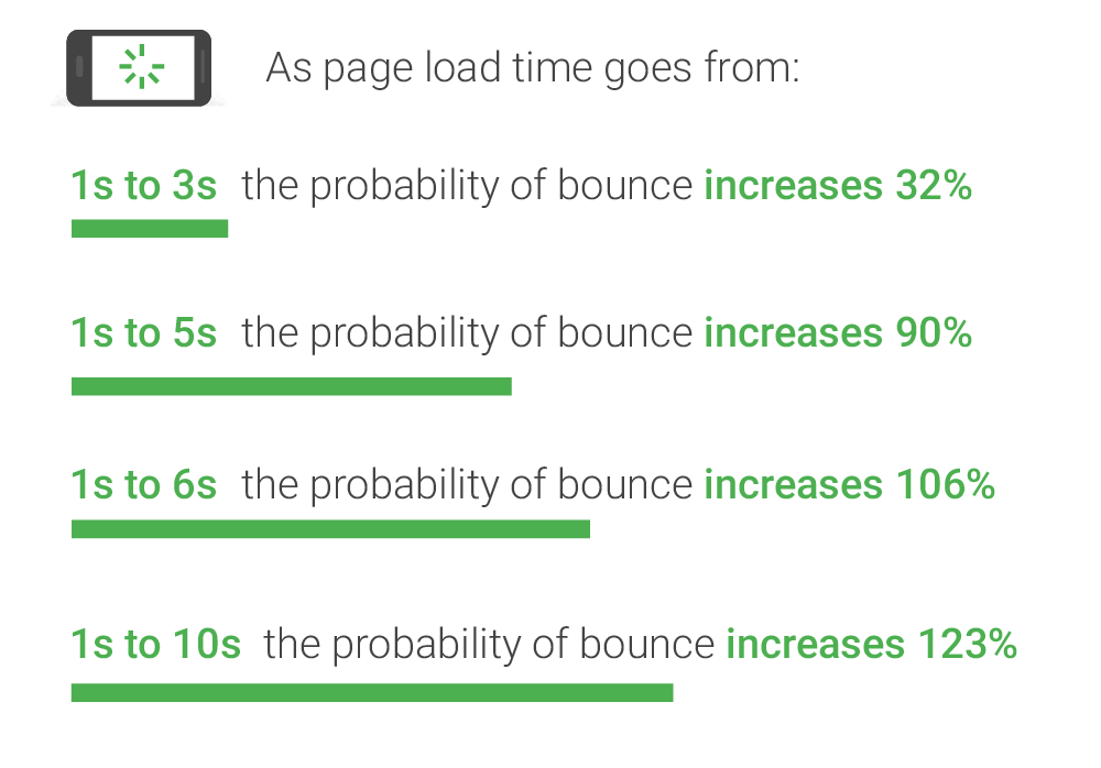 Site load time will have a drastic image on your bounce rate; source: Think with Google
In today’s competitive online landscape, even a few extra seconds of loading time can mean the difference between gaining a new customer or losing them to a faster competitor. By optimizing your site’s speed, you create a smoother user experience that encourages visitors to stay longer and take action.
Refine the user experience in your customer journey
You might think your user experience is optimized, but there may be hidden obstacles. Test your buying process with focus groups. In addition, go through the customer journey from start to finish. View your website from a consumer’s perspective. Consider the following:
- How easy is it to access your site?
- Are consumers overwhelmed with content when they view your homepage?
- Is your information architecture designed to guide the user where they need to go?
- Where is there friction within the customer journey?
Take a look at Hubspot’s landing page. Hubspot realized that prospective buyers might need assistance in understanding which product is right for them. They added a chat widget to the page to make the customer experience seamless. They even personalized the widget to relate to the customers with the opening message, “Too many choices?”
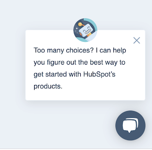 Hubspot improved their customer journey with the introduction of a chat widget
This provides a personalized approach to the customer journey and eliminates friction along the way. By auditing your customer journey, you can improve the customer experience on your site.
Attract the right visitors using the targeted keywords
One reason why visitors bounce from a site is that it doesn’t provide what they are looking for. You need to ensure you are targeting the right visitors to your site. If someone clicks onto your site and isn’t a relevant prospect, they will leave.This will increase your bounce rate and decrease your conversion rate.
To eliminate this issue, ensure you are targeting the right keywords with your on-page SEO. For example, social media scheduling platforms, Sprout Social and Buffer, both compete for the keyword “social media scheduling.”
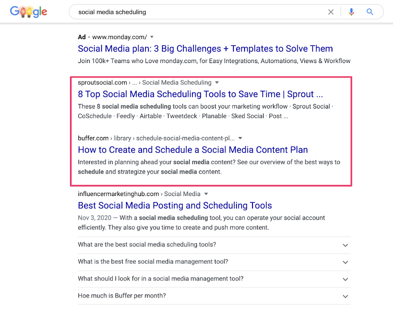 Sprout Social and Buffer target “social media schedule” keyword on Google
Both produced an engaging blog post that is optimized for search engines. Use an SEO tool like Ahrefs or Clearscope to ensure that your page is optimized for search. This will make sure you have the right keywords in place to drive traffic and conversions.
Optimize for content relevance
What are people searching for certain keywords actually looking for? The key to successful content is focusing on user intent. If you write content that actually provides value, the searcher will stay on your site longer, and your offer will be relevant.
Run a Google search for your keyword. Take a look at the related search terms. For example, if I searched “beauty email marketing,” I would see this:
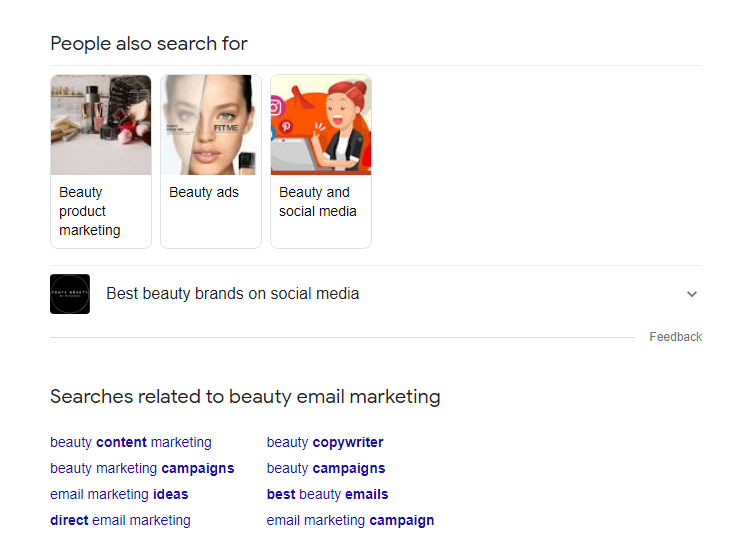 Run a Google search to see what related topic ideas you can include in the piece you’re creating
This data helps you understand what people are really looking for. If I were to develop content about beauty email marketing, it would make sense to include beauty marketing campaigns, ideas, and examples as well.
Improve your content readability
Make your web pages easy on your consumers’ eyes. Break up blocks of texts with high-quality images to engage the reader more fully. Ensure that your text color contrasts with your background. Don’t overwhelm the reader with pop-ups and unnecessary messages. Keep them engaged with only the most critical information and graphics needed to nudge them toward conversion.
Look how Buffer leaves dead space to ensure that their headline and imagery pops.
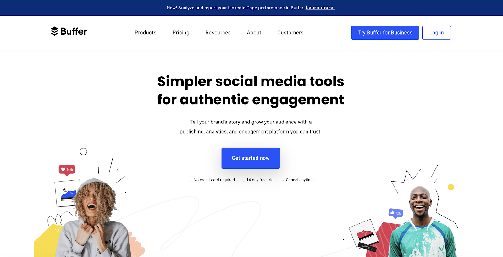 Buffer uses dead space on their homepage to make their content shine
The call to action is centrally located with a glowing blue box. This is one of the first things that the consumer will notice, which likely impacts their conversion rate. Keep your website simple, and use images and visual depictions to make sense of the text.
Use exit-intent pop-ups sparingly
Don’t annoy consumers. This sounds easy, but many websites fail at it. One of the most common ways to annoy users is with an exit-intent pop-up.
An exit-intent pop-up is a box that will appear as a user moves their cursor to the corner of the page to close their browser. Leesa deploys one sparingly to capture users’ emails before they leave.
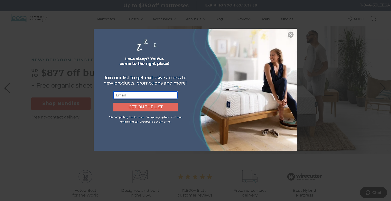 With a clear call to action, an exit-intent pop-up can capture powerful user data
While this is a great example of an exit intent pop-up, some businesses deploy this on every page. You should only deploy it once per user and ensure that it doesn’t pop up every time someone leaves your page. Businesses should use this tactic sparingly so their website doesn’t feel overloaded with pop-ups.
Conclusion
Reducing high bounce rates and increasing conversions is a constant battle for marketers. Businesses need to find the right mix of copy and creativity while ensuring an optimal user experience to drive conversions and decrease their bounce rate. With these tips, you can begin to iterate and discover what works best for your business.