Web push is a relatively new, but fast-growing tool to deliver messages right to users’ desktops and mobile phones. While in email marketing, you always depend on subscribers opening their inbox, with web push notifications, you can reach out to your audience immediately, and the only requirement is an opened web browser.
In this short guide, we will show how web push notifications work in practice and talk about push notification best practices. If you need a little more background information, refer to the basics of web push notifications before you continue reading this article.
Master opt-ins
In web push marketing, just like in email, the main goal is to convert website visitors into subscribers using opt-in forms. The latter may be a “soft-ask” or “hard-ask.”
A “hard-ask” opt-in appears at the top left corner of the browser window and usually consists of a title, text, and two buttons “Allow” and “Don’t allow.” It’s a single-step opt-in, so the only thing a user has to do to subscribe is click “Allow” once.
 An example of a “hard-ask” web push opt-in form
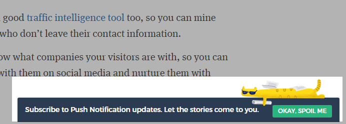
“Soft-ask” opt-in forms may look differently: they can be a lightbox, Safari-like, topline, or floating. Their content may be different as well based on the goal. As a rule, “soft ask” opt-in forms are aimed at explaining the value of web push subscriptions. This subscription method takes two steps: a website visitor first allows web push notifications within a “soft-ask” form. The call to action button itself usually contains a specific text, not simply ”Allow.”
 An example of a floating “soft-ask” opt-in from PushCrew
After that, they have to click “Allow” once more in a standard “hard-ask” form.
Using “soft-ask” opt-in is preferable because there is more context for website visitors to decide whether or not they need to receive push notifications. With a “hard-ask,” however, a user cannot always understand why they are asked to opt-in.
There are two factors that truly matter when it comes to creating a successful web push subscription form: time and user behavior.
Opt-ins based on time
Sending a web push right after a person opened your website is not the best option because people need some time to understand who you are and what you offer before making any “commitments.”
What’s more, the amount of time a user spends on a website demonstrates their level of interest in your content or products. Set up a timer to show the web push only to users who have spent the optimal amount of time on your website. To find out what the optimal time is, test a few variations and see which one brings more subscribers.
Another option is to apply a page scroll timer and show the opt-in forms after a user has scrolled enough through your page. You can choose which part of your website a user should reach for the opt-in to appear.
Opt-ins based on customer actions
Consider customer behavior as it can tell you what your website visitors are most interested in and help you understand what content you should offer them.
Every user comes to your website with their own goal, so you can place web push opt-ins on different website pages to address each concern. For instance, if a user has read an article on your blog, offer them a chance to sign up for weekly new blog posts notifications, or encourage those who have been scrolling through product pages to sign up to learn more about upcoming sales.
Try to make users feel that your web push didn’t just come out of the blue, but was sent to offer valuable content right at the time when a user needed it.
What about opt-outs?
Don’t be afraid, opt-outs actually help you get a better understanding about whether you are on the right path with your web push marketing strategy. According to the GDPR regulations, marketers should make sure users can easily access their data and revoke their consent whenever they want. That’s why it is important to provide not only an easy opt-in but also an easy opt-out.
Adjust to the best frequency and timing for push notifications
Using the right timing and frequency are two push notification best practices for creating messages that are never too overwhelming and are always relevant.
A recent report explains why it’s important:
- 45% of users feel like they are being spammed when web push notifications are sent at the wrong time;
- over 74% of customers consider that getting more than five web push notifications a day is too much.
To set up the perfect time to send push notifications, take into account the following factors:
- time zones;
- periods of the highest user activity;
- user engagement;
- possible the lifestyle habits of a user.
For the frequency, you should check how often users click on web pushes, how much time they dedicate to your website, and when they stop clicking and lose their interest in your messages.
Besides, consider the overall trends like the number of opt-outs to understand when you send too many web push notifications.
Segment your subscribers for better results
Marketers use segmentation throughout all digital channels, and web push is no exception. Today’s users demand more relevant and personalized content, so it is no surprise that sending web push notifications to a segmented audience can increase the CTR by up to 218%.
Let’s delve deeper into the topic and see what data you should consider to segment and personalize web push notifications:
- Browser language. Segment the audience by language as there’s probably no point in sending an English web push to a non-English-speaking user. This may not be necessary if you notice that the majority of your audience speaks the same language.
- Region. Location is usually defined automatically when a user opts-in for web push notifications. You can segment your audience by countries and cities to offer relevant information about shipping, offline stores around the world, pop-up stores, events in different locations, and so on.
- Subscription page. This is a page where your subscriber agreed to opt-in for web push. This information will be help you understand the reasons why each particular subscriber agreed to receive your messages and to divide your web pushes by topics.
- Type of browser. The type of browser matters if you want to send out web pushes that will be displayed correctly on every device.
Use the full power of a copy and images for creative push notifications
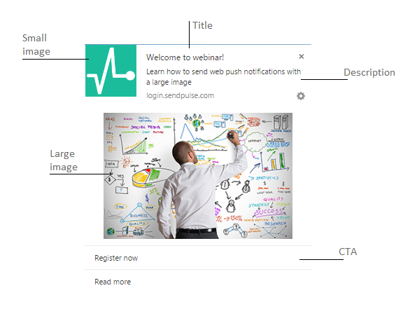
Web push notifications typically consist of three text elements — a title, a description, and a call to action — and two images: the small one is usually a logo, and the large one is an optional picture which supports the copy.
 The anatomy of a web push notification
95% of purchase decisions happen unconsciously, according to Harvard Business School professor Gerald Zaltman. Appealing to human emotions is vital to keep users interested and motivate them to click on web pushes. That’s why the text and images you use play such a big role in the success of your overall web push notification strategy.
How to use images for push notifications
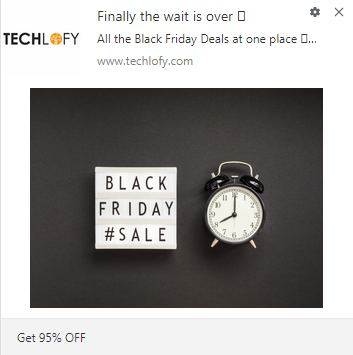
Make your customers happy and accompany web pushes with images that support the main message. It will make your notification larger compared to the regular ones, thus drawing more attention. You can also use space in an image to place additional text like it’s been done in the example below.
 A web push notification with a large image from Techlofy
How to write push notifications
To motivate users to click, call them to action with the title like CNET did in their web push.
 Calling to action in the web push title
This way, users can understand right away what exactly you are offering and what they should do to learn more. Moreover, it helps you save some of the limited space in notification, by getting to the point from the very first word of the push notification.
If you want to arouse interest, place numbers in the title of a web push. Numbers make users feel that they will receive measurable value, which will motivate them to click. Take a look at the example from WPBeginner:
 Numbers in the web push title
Make your subscribers feel special and provide some “secret” or insider information and deals. For example, GamePlan A sent out a web push promoting their new insider guide on how to become a part of their company. They used their title to introduce themselves and a description box to announce the name of an article.
 A web push notification from GamePlan A
In general, always try to be clear and concise. Since push notifications don’t offer much space for text, do your best to put everything you need to say in a couple of short sentences.
Bottom line
If used correctly, web push notifications can help you reach more people, enlarge your audience, and raise sales. Here’s a list of push notification best practices to keep in mind:
- Begin with an engaging “soft-ask” opt-in based on how much time a website visitor spent on a page or what actions they performed.
- Remember to provide your subscribers with an easy option to opt-out.
- Test the sending frequency and timing to find the right settings, which won’t overwhelm your audience.
- Segment your web push subscribers based on their region, language, the type of their browser, and subscription page to send valuable and engaging offers.
- Use large images that complement the main message of your web push as well as an effective copy to motivate users to click.
Try out SendPulse web push notifications that work on Google Chrome, Mozilla Firefox, and Opera browsers, both on desktop and smartphones.