When you enter a new store, chances are, you don’t immediately rush to the cash register. At first, you take some time to stroll through the aisles and see what the store is about. Then, you pick up an item or two to get a closer look. Finally, after you’re done looking, you may be ready to talk to a shop assistant.
Exploring a new website isn’t that different. Your new visitors want to get a general idea of what your resource has to offer before committing to anything. In a way, it’s your obligation to give them that precious time to look around and process what they see. This will allow them to develop some interest in your brand and make more mindful decisions.
In this post, we’re going to be talking about the importance of pop-up timing. When should you display your pop-ups? How much should you wait? What can happen if you break those unwritten rules? We’ll answer these and other questions and share some tips on how to develop a perfect formula for your pop-up marketing.
5 common problems bad pop-up timing brings
Bad pop-up timing can have a detrimental impact on your conversion rates, let alone on users’ opinions of your website and brand as a whole.
Here are some examples of bad pop-up timing and its negative effects:
- Immediate pop-ups are guaranteed to disrupt the user experience. When a pop-up appears immediately upon landing on a website, it can be disruptive and annoying for your visitors. It interrupts their browsing experience before they even have a chance to explore your content. This can lead to frustration and a higher likelihood of visitors leaving the site without taking any desired actions, resulting in lower conversion rates.
- Poorly timed pop-ups confuse and obstruct users. Pop-ups that appear at inappropriate times during the user journey can also be off-putting. For example, if a pop-up interrupts visitors while they are reading an article or browsing a product page, it can be seen as intrusive and negatively impact their experience. This can lead to visitors abandoning your site or avoiding engaging with the pop-up.
- Overlapping pop-ups tend to hide important page content and feel overwhelming. When multiple pop-ups appear simultaneously or in quick succession, it can create a cluttered and overwhelming experience for visitors. This can be confusing and make it difficult for users to focus on the desired action or message. Consequently, your visitors may choose to angrily close the pop-ups without engaging or leave the site altogether.
- Repeated pop-ups often irritate users and make them leave. Displaying the same pop-up over and over during a single visit or across multiple visits can be irritating for users. It can give the impression that the website is overly manipulative or desperate, which will negatively affect the perception of your brand. Visitors may develop banner blindness or block your pop-ups, ruining all your efforts.
- Random pop-up timing can disrupt the user’s flow and cause frustration. Pop-ups that appear at critical moments or during important user interactions can disrupt the user’s flow and cause frustration. For example, if a pop-up appears right when a visitor is about to make a purchase or submit a form, it can create annoyance and distractions. This can lead to abandoned conversions as visitors may lose interest or feel compelled to leave the site due to the interruption.
There’s an exception to every rule. For instance, you can and should use immediate pop-ups for urgent announcements or warnings. Repeated pop-ups can be useful when you suspect that your user landed on the wrong website version and can’t find their way back.
If you haven’t given much thought to your pop-up timing, you are not alone. On average, email capture pop-ups convert just 3.8% of website visitors. Could that number be higher? Certainly.
But not that many marketers question the status quo when it comes to pop-up timing and other details. Because of that negligence, pop-ups earned the title of the “most hated advertisement technique on desktop,” according to a popular study by the Nielsen Norman Group.
But, businesses shouldn’t be punished for the sins of a few bad actors. It’s possible to display pop-ups in a way that enhances the user’s flow instead of disrupting it.
What’s the best time to display pop-ups?
A recent study by Drip stated that pop-ups that are shown after eight seconds convert better than pop-ups shown before or after. So, eight seconds is a great number to use as a baseline. However, the real answer isn’t as cut and dry as one might think.
Determining the best time to display pop-ups can vary depending on the specifics of your website content, your target audience, and your conversion goals. At different times, you may need to use different pop-up types and strategies. Let’s explore some of them.
Time-delay pop-ups
Instead of displaying pop-ups immediately upon landing on a website, you can introduce a time delay before the pop-up appears. This delay can allow visitors to engage with the content and get a sense of your website’s value before being presented with an offer or call to action. You can adjust the delay duration based on factors like page type, user behavior, or audience characteristics.
Most pop-up builders, including ours, allow you to add a delay in the settings.
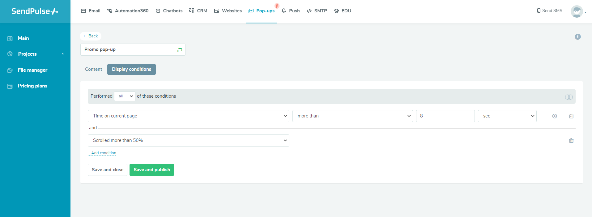 Adding a time delay to a pop-up in SendPulse
You can introduce a delay based on:
- time spent on your site in general;
- time spent on a particular website page.
According to the aforementioned study from Drip, eight seconds may be an optimal delay, but you should test different versions to see if that holds true for your audience. After all, experimenting with pop-up content, settings, and design can help achieve up to 25% higher conversion rates.
Based on the Wisepops research, pop-up campaigns shown with a four-second delay deliver high conversion rates, but this only holds true for welcome pop-ups with incentives for first-time visitors. The second best-timed delay was over 30 seconds, which proves that “the longer users stay on a page, the less likely they are to bounce.”
These pop-ups are triggered when a visitor scrolls down a certain percentage of the webpage, typically, more than 50%. By waiting for user engagement through scrolling, marketers can ensure that the pop-up appears when visitors have shown some level of interest in the content. This pop-up timing strategy can help you capture attention and engage visitors who are actively exploring the page and are open for more.
Inactivity-based pop-ups
If a visitor remains inactive on a page for a specific period, you can trigger pop-ups to re-engage them. This can be particularly useful for online stores, where an inactivity-based pop-up can remind visitors of items in their shopping cart or offer personalized recommendations based on their shopping preferences.
Post-purchase or post-conversion pop-ups
After a visitor completes a purchase or conversion, marketers can display pop-ups that provide relevant information, such as personalized discounts, upsell opportunities, or even freebies. This pop-up timing strategy enables you to leverage the momentum of a successful conversion to encourage additional actions or foster customer loyalty. Also, according to Wisepops, pop-ups with discounts are the most converting, attracting 4.87% of visitors on average.
Exit intent pop-ups
Exit intent pop-ups appear when a visitor demonstrates an intent to leave the website, such as moving the cursor toward the browser’s close button or the back button.
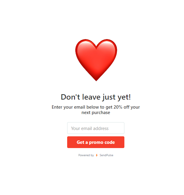 An exit intent pop-up example
By detecting this behavior, exit intent pop-ups can provide a last-ditch effort to capture the visitor’s attention and offer an enticing incentive to encourage them to stay or even subscribe to a newsletter.
Limited-time period pop-ups
These pop-ups are usually tied to a specific limited-time offer and are only displayed when the said offer is active. This approach is less specific than the previous ones, but it allows you to draw customers’ attention toward a time-sensitive offer. This is a great strategy for promoting events, exclusive sales, competitions, challenges, and seasonal offers.
Behavior-based pop-ups
By tracking user behavior, such as the pages they visit, products they view, or actions they take on the website, marketers can deliver targeted pop-ups at specific moments. For example, if a user visits more than five pages in a single session, you can hit them with a pop-up offering a discount or free consultation, capitalizing on their growing interest. This pop-up type is also considered one of the most converting, bringing in 5.43% of visitors on average.
Track your pop-up statistics such as conversion rates and bounce rates to determine which timing strategies are most successful in driving leads.
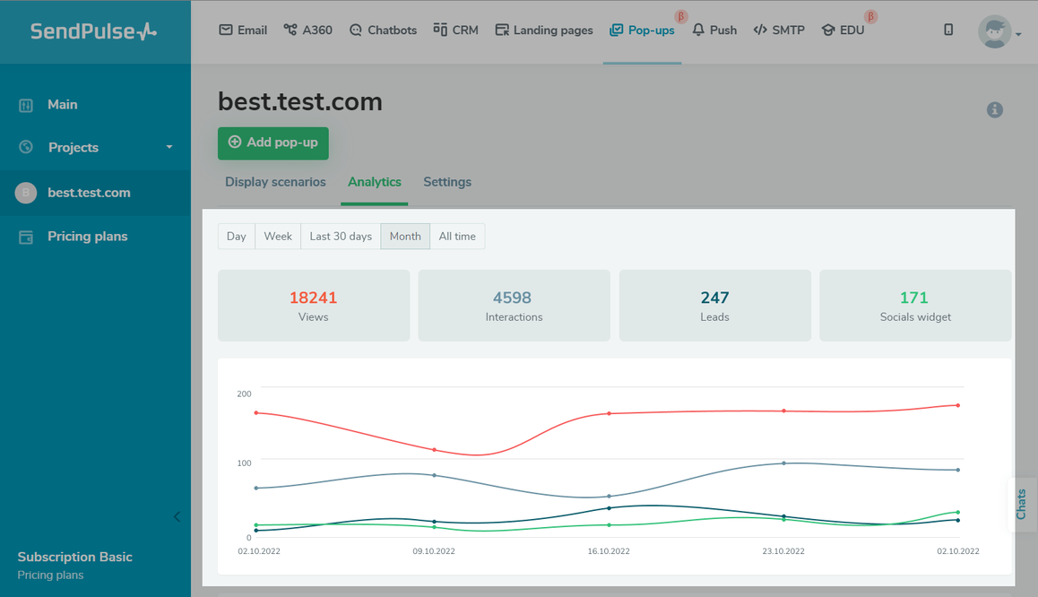 Viewing pop-up statistics in SendPulse
In SendPulse, you can do that by using built-in analytics tools as well as through integration with Google Analytics. This allows you to see how many people viewed or interacted with your pop-up and more.
How to set up time-triggered pop-ups in SendPulse
Our platform offers an intuitive pop-up builder for creating smart pop-ups. It enables you to deliver relevant, personalized messages to your website visitors and turn them into leads with ease.
To create a smart pop-up with a delay, sign up or log into your SendPulse account. You can create one for free, no credit card is needed.
Open the “Pop-ups” tab. This is where you will be able to create, view, edit, and track your projects and campaigns. You can create up to three projects and have up to 10,000 unique visitors with the Basic plan for free.
Click “Create project” to create a new space for your campaigns. You can assign each project to one of your websites. A single project can also be used for several websites. This doesn’t affect how your pop-ups are displayed.
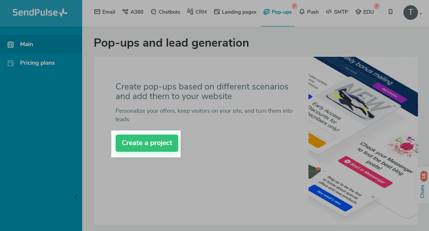 Creating a project in SendPulse
Open your project by clicking on it. Then, click on “Create pop-up” to set up your first campaign. Select a template from our collection. All templates are customizable. You can sort them by theme, CTA, or placement on the web page. Once you’ve picked the template, click on it to jump to editing mode. Start customizing the look and content of your pop-up. Add your images, text, and target action.
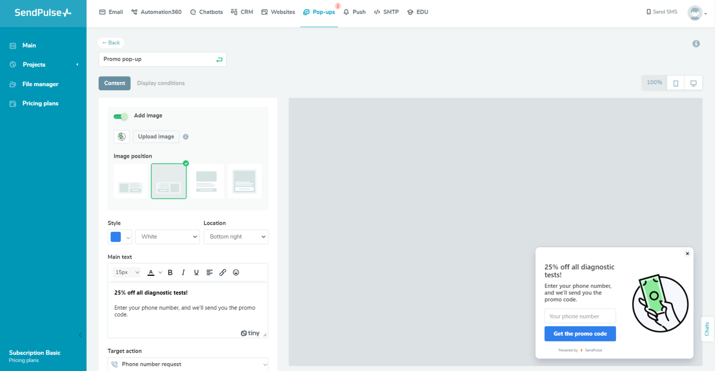 Editing a pop-up in SendPulse
At this stage, you can also set up automated CRM deal creation. You’ll be able to access your deals in the “CRM” tab. Toggle the “Save to a mailing list” button on if your goal is to capture leads.
Save your edits and click on “Display conditions.” This is where you can manage your pop-up timing. For adding a delay, choose “Time on site” or “Time on current page.” To choose a time period during which your campaign should be displayed, use “Client time period” or “User time period.” You can add multiple conditions and apply all or at least one of them.
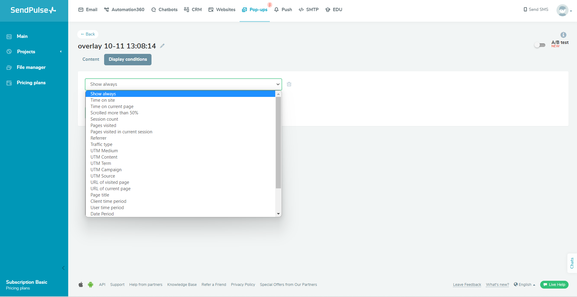 Setting up pop-up scenarios in SendPulse
After that, save and publish your campaign. You’ll be able to preview it and make changes at any time. Test the timing, triggers, and form submission functionality to ensure everything works smoothly.
Monitor your campaign’s performance using native SendPulse tools and Google Analytics, track conversion rates, and make adjustments as needed.
Use SendPulse for creating highly-converting campaigns
Pop-up marketing is just one piece of the puzzle. Check out our whole sales and marketing automation toolkit for planning and managing omnichannel campaigns. Our CRM, website builder, chatbot builder, email automation service, and other tools will help you communicate with customers and track deals in a stress-free manner.
Our free plan allows you to test-drive multiple tools before you buy anything. Create your account today and see for yourself!