The art of saying more by saying less is a timeless one, and it’s definitely applicable to online communication and marketing. Most digital content formats nowadays are visual-first. There’s rarely enough space or need for bulky text paragraphs, so one has to be extremely wise and cautious with words.
Take pop-ups, for example. These elements usually contain no more than three sentences — and yet they can drive website conversions up 4% or more. Other sources report that pop-ups, on average, show a conversion rate of 11%. Even for seasoned marketers, this is nothing to sneeze at.
So, how do you make sure your pop-ups always do the trick? Trial and error is an inevitable part of the process, but you can also speed up your learning journey by following someone else’s examples and building upon them. This post will help you with that. Read on to discover tried-and-true pop-up message recipes, ideas, and best practices.
What is a pop-up message?
A pop-up message, often called a lead capture form, is a type of notification or alert that appears on a website user’s screen. Usually, it has the form of a small window or a dialog box. These messages “pop up” to grab the user’s attention and tell them something important or time-sensitive.
Pop-ups can contain:
- warnings;
- updates;
- language and country selectors;
- cookie consent requests;
- error messages;
- announcements;
- special offers;
- gated content;
- security alerts;
- confirmation prompts.
Marketers commonly use pop-up elements to capture leads. The pop-up format makes it easy to demonstrate a valuable piece of content or a promo code and ask the user for their email address in return. But pop-ups also often convey technical, legal, or entertaining messages.
What should a pop-up message include?
There are a few crucial elements of an effective pop-up message. Let’s take a closer look at each of them.
Pop-up message element #1. Headline
Almost every pop-up typically has an eye-catching headline conveying the key message. It can be neutral, formal, provocative, cheeky, or witty, depending on your target audience. The headline should set the right tone and prepare the user for what’s about to come.
Pop-up message element #2. Button
Pop-up windows often include buttons or options that allow users to respond to the message. This could involve confirming an action, dismissing an alert, entering information, or navigating to a specific page or feature. Without these buttons, your pop-up will be powerless as it needs converting functionality.
Pop-up message element #3. Visual hooks
One thing is certain for all pop-up messages: their main goal is to hijack the user’s attention by appearing prominently on the screen. This makes a lot of sense when you need to convey critical information that requires immediate awareness.
This should be reflected in your pop-up design. There’s no shame in going a little crazy with the typography and colors while keeping it coherent with the rest of the page. Including a bold image or stylized font will help your pop-up message stand out.
Pop-up message element #4. Body text
The pop-up body text gives the element more context and clarifies the message. It should be brief and to the point, clearly articulating the information you want to convey. Two or three sentences usually suffice. The most important thing is to use language that resonates with your target audience and aligns with your brand voice.
Pop-up message element #5. Call to action
To make your pop-up message stronger and more convincing, you need to state the action you expect your users to take. Use actionable language in your CTA button, such as “Get Started,” “Subscribe Now,” or “Grab This Offer.” Making the CTA button stand out with a contrasting color is always a good idea.
Pop-up message element #6. Value proposition
To prevent users from instantly closing your pop-up, you need to give them a good reason to stay. Highlight, verbally or visually, the benefits of your message and show the user what they will gain by taking the desired action.
Pop-up message element #7. Contact form fields
Form fields invite users to provide their contact details, such as name and email address, in exchange for a resource, newsletter subscription, or special offer. This is key to growing an engaged mailing list. To evoke trust, specify how that information will be used, and if possible, include checkboxes for consent to privacy policies or newsletter subscriptions.
Best practices for your pop-up message
Too many pop-ups, especially if they’re perceived as intrusive or irrelevant, can lead to user annoyance. To avoid that, you need to polish your pop-up message, making sure that it enriches users’ browsing experience. It’s also important to choose appropriate display settings to make sure your messages are shown at the right moment.
Here are some tips that can help you with that:
- Prioritize readability over fancy design. Maintain a good contrast between text and background, and make sure your pop-up can be skimmed in a matter of milliseconds. The message should not turn into an obstacle on the way to the main content. For multi-step pop-ups, ensure each step is equally easy to read and quick to scan, so users don’t feel overwhelmed.
- Tailor the content of your pop-up message to specific user needs. Customize pop-up content based on the user’s referral source, geolocation, demographics, behavior, or past interactions. Create different pop-up versions for each audience segment.
- Avoid misleading your visitors. Be transparent about the purpose of your pop-up. Clearly convey what users can expect by engaging with it, and don’t lure them in with false promises.
- Respect the user’s time. Don’t beat around the bush — use short, snappy sentences with active verbs for your pop-up text and headline. Frame your copy in a way that emphasizes the user. Use “you” and “your” to make the message more relatable.
- Keep your branding consistent and recognizable. Your pop-up should not conflict with the overall look and feel of your website, or it’s likely to become an eyesore. Use the same color scheme, fonts, and style as the rest of your resources.
- Always add a close button. A close button provides users with a clear and easy way to dismiss the pop-up if they are not interested in it or find it disruptive. This gives users more control over what they’re shown and helps avoid frustration.
- Make sure the pop-up timing is aligned with the user journey. Pop-ups may appear in response to a specific user action or to prevent them from leaving the page. They can be triggered by scrolls or clicks. Alternatively, you can set an appropriate time delay to let your visitors get acquainted with your resource.
- Go easy with your pop-up display frequency. Avoid showing your visitors two or more pop-ups one after another — it’s a guaranteed way to annoy them. Keep your messages spaced far enough in time, especially if one of them is a non-negotiable legal pop-up that most users skip automatically. If you absolutely must show more than one pop-up, place them in different parts of the screen.
Remember, the key here is to create a pop-up message that not only captures attention but also guides users toward the desired action. By following these best practices, you can enhance the effectiveness of your pop-up and garner more attention.
5 pop-up message examples to learn from
Now, we’ll show a few inspiring pop-up message examples from big brands and discuss what sets them apart. Moreover, you’ll see the pages on which these pop-ups are displayed — this will give you some context and clarity on how to align your pop-up text with the rest of your content.
Example #1. Embracing minimalism
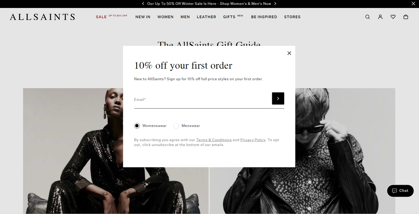
First on the list is this spotless pop-up from AllSaints, a brand known for its strong and recognizable aesthetic. Instead of a salesy “Sign Up Now” button, there’s an elegant arrow. The single toggle button allows users to set their preferences without having to deal with lengthy drop-down lists or manual entry forms.
 A pop-up message example from AllSaints
Another attractive thing about this pop-up example is the fact that it features the company’s privacy policy as well as terms and conditions. This way, users can always learn how their data is being processed and stored.
Example #2. Making it personal
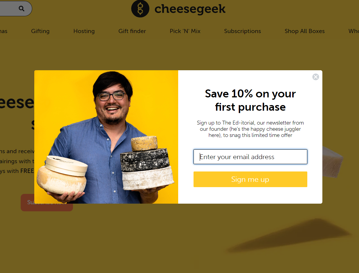
It’s hard not to love this pop-up message example because of how cheerful it is, both in terms of color and content. The message includes a photo of the Cheesegeek founder, which makes it highly relatable and personal.
 A pop-up message example from Cheesegeek
The founder’s love for sophisticated cheeses feels contagious and is meant to inspire users to discover new sorts along with him. No stock image or illustration would have had the same effect here. So, if you run a small business, make sure to take charismatic photos of your team and use them for similar purposes.
Example #3. Daring the user to say no
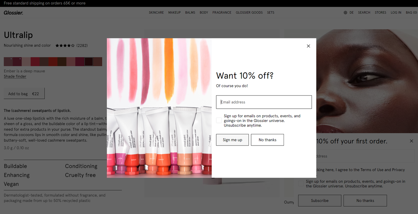
Sometimes, the offer is too good to refuse. This is certainly the case with our next pop-up example from Glossier, a cosmetics brand. Glossier keeps it real when acknowledging that a good discount is something no one would say no to.
 A pop-up message example from Glossier
The pop-up also clearly states what will happen upon signing up and how easy it is to unsubscribe, which is important for building trust with customers. In addition, there is also more than one way to close the pop-up — another good practice to follow.
Example #4. Creating a strong visual hierarchy
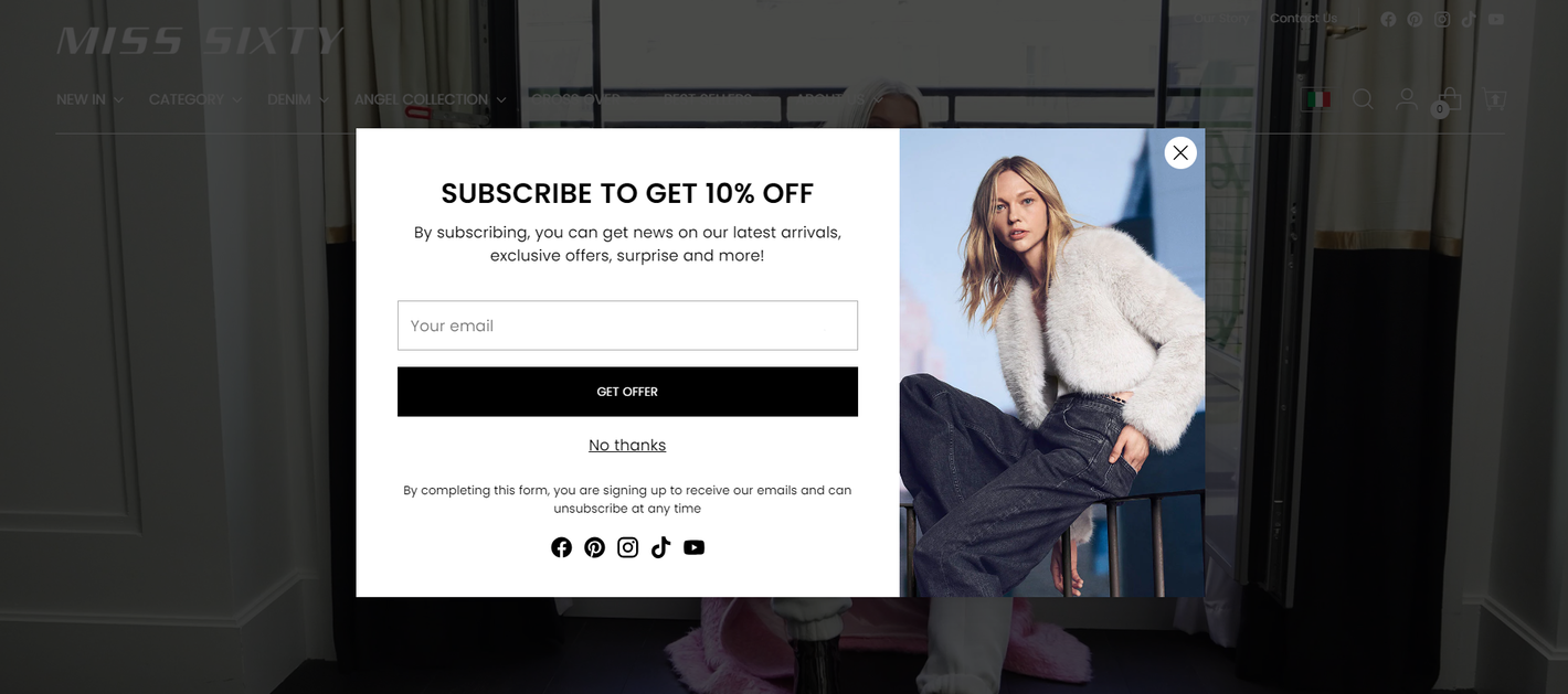
Here’s a textbook example of directing user attention with the help of contrast and typography. This pop-up message formula from Miss Sixty has a perfect hierarchy and image-to-text ratio. The headline is eye-catching but not overpowering. The photo, too, takes up just enough space to be noticed but doesn’t distract from the main text.
 A pop-up message example from Miss Sixty
There’s just one form field, and the CTA button is nicely highlighted in black to stand out. The “No thanks” button is easy to locate but clearly secondary in relation to the primary CTA. Finally, the social media links give the pop-up a bit more context without making it cluttered.
Example #5. Using a big font to offer a big discount
In some cases, you may want your pop-up to be a bit more in-your-face, not holding anything back. For instance, if you offer a generous one-time discount, like Sips by does in this example. Here, using a large font is more than justified as it helps communicate the immense value of the offer.
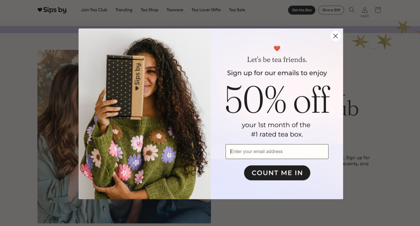 A pop-up message example from Sips by
The tea retailer also uses social proof on their website to emphasize the high demand for its subscriptions. This is a good strategy if you want to tickle one of your customers’ most powerful emotions: fear of missing out.
How to create a pop-up message in SendPulse
When it comes to creating pop-ups, no secret knowledge or skills are required if you do it with SendPulse’s intuitive pop-up builder. Our platform empowers you to create smart, personalized messages that effortlessly convert curious website visitors into leads.
To get started, simply sign up or log in to your free SendPulse account — no credit card info is needed. Once logged in, navigate to the “Pop-ups” tab, where you can seamlessly create, view, edit, and track your campaigns.
First, click “Create project” to establish a dedicated space for your campaigns. You have two options. Either assign each project to a specific website or use a single project for multiple sites — this won’t affect how your pop-ups are displayed.
Open your project, then click “Add pop-up.” Select a template from our collection. You can sort them by theme, CTA, or placement on the page. Use the left panel to customize the template of your choice by adding images, text, and defining the target action.
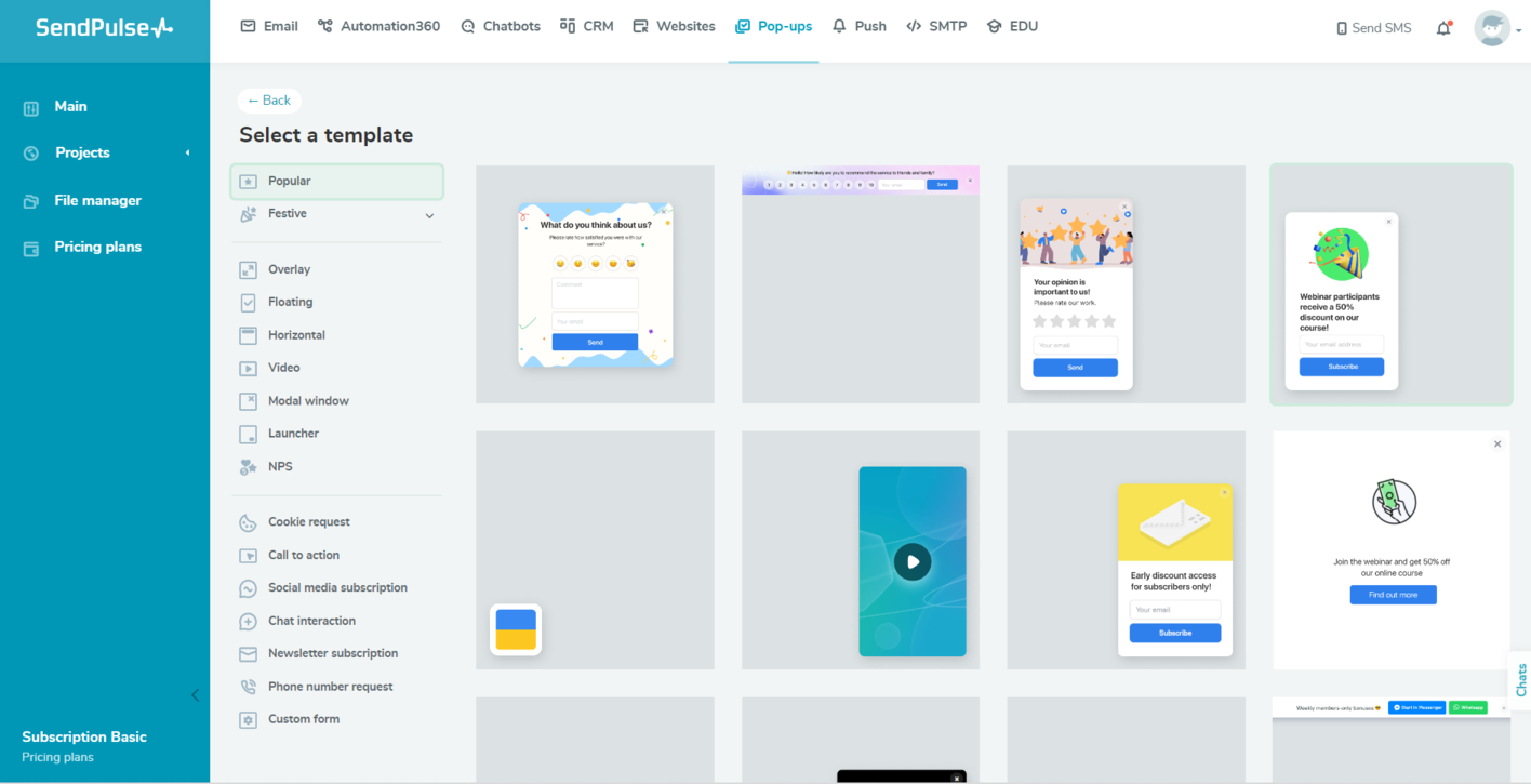 A pop-up template collection in SendPulse
Then, toggle the “Save to a mailing list” option if your goal is lead capture. You can create a new mailing list in SendPulse and use our email service to stay in contact with them.
Set up automated CRM deal creation by toggling the “Create a deal in CRM” option if you want to keep track of your leads and nurture them with SendPulse. Then, you’ll be able to access them from the “CRM” tab.
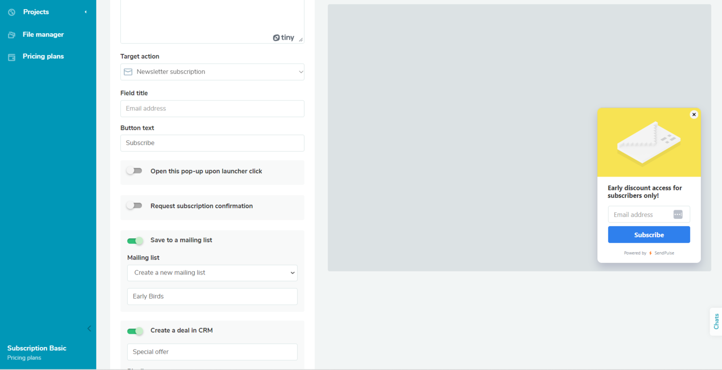 Adjusting settings for a lead capture pop-up in SendPulse
Save your edits and head to “Display conditions” — this is where you set your pop-up timing. Add a delay using options like “Time on site” or “Time on the current page.” Alternatively, you can define the time period during which your campaign should be displayed. Add multiple conditions and choose to apply all or at least one of them.
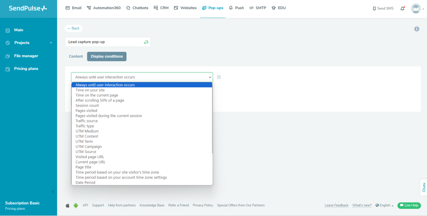 Setting display conditions in the pop-up builder by SendPulse
Save your settings and publish your campaign. Preview and make changes anytime. Test the timing, triggers, and form submission to ensure a seamless user experience. Don’t forget to monitor your campaign’s performance using SendPulse’s built-in tools and Google Analytics. Track conversion rates and make adjustments as needed.
To get step-by-step guides and learn more about creating pop-ups, visit our
knowledge base.
Wrapping up
Pop-up builder is just one tool from SendPulse’s comprehensive sales and marketing automation toolkit. Explore our CRM, website builder, chatbot creator, pipeline automation service, and other tools to streamline communication with customers and manage deals in a hassle-free manner.
Start creating highly-converting campaigns with SendPulse today. Our free plan lets you test multiple tools without any upfront commitment. Sign up and see for yourself just how straightforward it is.