Pop-up overlays can make or break user experiences. To ensure your pop-ups hit the mark, it’s crucial to offer exceptional value. In this post, we will explore effective strategies for creating compelling overlay pop-ups that captivate your audience and look at some real-life examples. Without further ado, let’s delve into it!
What is an overlay pop-up?
Overlay pop-ups are prominent windows on websites that display a certain message by covering a part of the users’ screen. This message can be various, for example, in the form of enticing offers like discounts, exclusive deals, or an invitation to subscribe to a mailing list.
There are several factors that determine when pop-up overlays appear on browsers’ screens, including user behavior, time delay, and scroll-based triggers. By dimming the background and requiring dismissal before continuing browsing, pop-up overlays effectively grab users’ attention and highlight the intended message. These floating windows can be used for a number of purposes, including expanding a mailing list, reducing cart abandonment rates, conveying important information, and collecting user feedback.
Overlay pop-ups offer several advantages for website owners and marketers:
- Increased conversion rates. Overlay pop-ups can significantly boost conversions by guiding website visitors toward a desired action. Whether it’s subscribing to newsletters, making a purchase, or completing a form, pop-ups provide a direct CTA that can motivate leads to take action.
- Enhanced user engagement. Depending on the purpose of your pop-up overlays, some of them can help users stay on the website longer and interact with the pop-up itself.
- Promotional opportunities. Overlay pop-ups offer an effective way to promote special offers, discounts, or exclusive deals. They can create a sense of urgency and scarcity, driving users to take immediate action and purchase or sign up for a limited-time offer.
- Lead generation. Pop-ups are often used to capture email addresses and build an email subscriber list. By offering incentives like freebies, exclusive content, or discounts in exchange for email sign-ups, pop-ups can help grow an already interested subscriber base.
- Communication of important information. Overlay pop-ups are an effective tool for disseminating a message to website visitors. Whether it’s announcing updates or events or highlighting essential announcements, pop-ups prominently display these messages and reach a wide audience.
While overlay pop-ups offer significant advantages, it’s essential to use them judiciously and ensure they provide value to the user experience. Balancing the frequency and relevance of pop-ups is vital to avoid overwhelming visitors.
Tips for creating overlay pop-ups
Now that we’ve mentioned the advantages of overlay pop-ups, it is also important to consider different aspects before bringing them to life. The following are some key tips to keep in mind when creating a pop-up for your brand:
- Identify your core objectives. A clear definition of your business goals will determine what specific actions you want users to take when interacting with a pop-up. Once you have identified your aims, design and implement your overlay pop-up accordingly.
- Be brief with your copy. Keep your pop-up copy concise and to the point. Use persuasive language and compelling headlines that clearly communicate the value proposition. Remember, simplicity and clarity are a priority.
- Don’t ask for too much information. When collecting user data through your overlay pop-ups, be mindful not to ask for an excessive amount of information. Keep the form fields minimal, requesting only essential details necessary for your objectives. Asking for too much information may discourage users from engaging with the widget.
- Create a pop-up that matches your website. Maintain consistency with your website’s overall design aesthetic while creating your pop-up overlay. Make sure that the color scheme, typography, and overall style align with your website’s branding.
- Choose creative images. Incorporate trendy and relevant images into your pop-up design to enhance its visual appeal. Use high-quality visuals that align with your brand and support your message.
- Make your CTA eye-catching and straightforward. The CTA is a crucial element of your pop-up overlay that prompts users to take the desired action. Ensure that it stands out and grabs attention. Use contrasting colors, compelling text, and appropriate placement to make the CTA button visually striking and easily clickable.
- Craft mobile-friendly pop-ups. Optimize your overlay pop-ups for mobile devices. This will ensure that they display properly and function smoothly on different devices.
- Know when to pop up. As already mentioned, there is always a possibility of being intrusive with pop-ups. That’s why it is paramount to display an overlay at the right time. The best practice here would be to A/B test your pop-ups and see which ones perform the best and don’t spoil the user experience.
These are only some general tips that you should remember while creating a pop-up. A user-friendly pop-up that aligns with your website should positively impact your website visitors and bring them to a desired action.
Overlay pop-up examples
Now, let’s explore some real-life examples of pop-up overlays. Examining these examples will allow you to better understand how pop-ups can be used in practical scenarios.
Yfood
The first example is from Yfood, a German company producing protein drinks. The pop-up overlay does not appear automatically. A button on the left entices a user to click on it and obtain a 10-euro voucher. The form itself is rather minimalistic and requires a website visitor to fill out only two fields. Users can check the box below if they want to opt in for newsletters.
The pop-up aims not to expand a mailing list but to spread the word about the company. Typically, a user will obtain their voucher only when a friend has signed up with a special code. This overlay pop-up screams value and serves as a gimmick on the website.
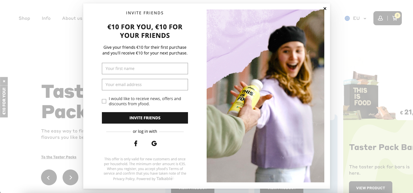 An example of a pop-up overlay on the Yfood website
Kiss My Keto
Here is another pop-up overlay example that lets website visitors communicate their preferences to the company. If a person signs up for newsletters, one would probably want to receive relevant messages that correspond to individual needs and interests.
By checking a certain box, Kiss My Keto will send only relevant emails to its user, providing them with useful information and personalized recommendations. New users also get 15% off the first order, which makes the form even more attractive to fill out.
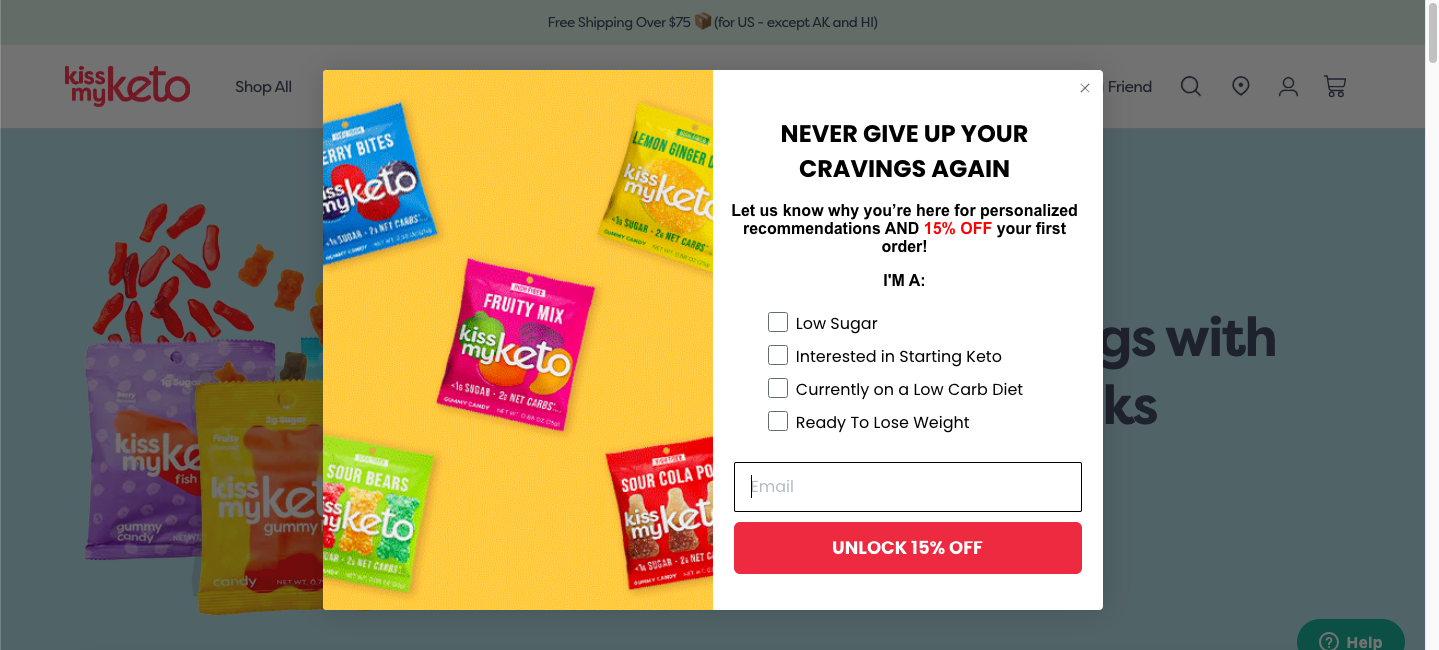 Personalization options in a pop-up overlay
MeUndies
Another pop-up overlay example is from MeUndies. Using a pop-up is an excellent method to warmly welcome and create a favorable initial impression for new visitors. It also serves to direct visitors toward the desired action and subscribe to the mailing list.
In the following instance, the eCommerce website employed a welcome pop-up to present new visitors with a discounted offer and free shipping. The design is pretty appealing and the message is straightforward.
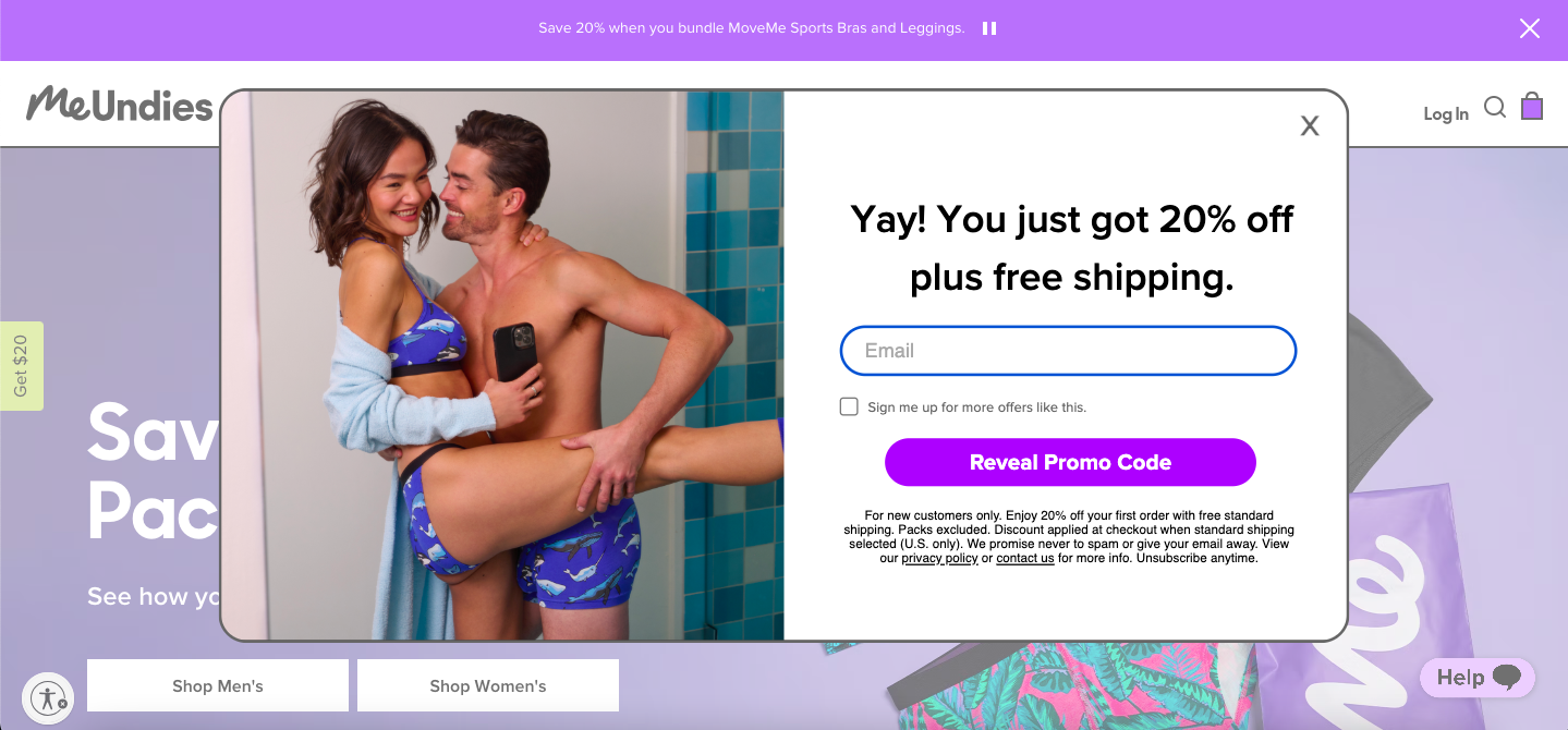 A welcoming pop-up overlay on the MeUndies website
Sephora
Pop-ups can be a great way to cross-sell and upsell your products. By strategically implementing pop-up overlays, businesses can present relevant and enticing offers that complement the customer’s current purchase or align with their interests. These pop-ups usually feature related products, special promotions, bundle deals, or even personalized recommendations based on the customer’s browsing or purchase history.
In this case, Sephora displays a pop-up right after a user adds a product to the basket. The store offers related products to customers ready to place an order.
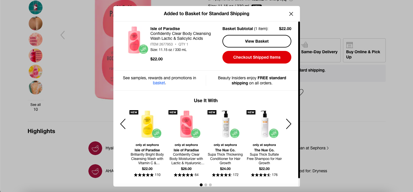 Cross-selling with pop-up overlays on the Sephora website
Calvin Klein
Overlay pop-ups are commonly used to obtain cookie consent from website visitors, ensuring compliance with privacy regulations and respecting user privacy preferences. This type of pop-up typically informs users about the use of cookies on the website and provides options to manage their preferences.
Calvin Klein, for example, went for a crisp and straight-to-the-point pop-up that appears in the middle of the screen. The pop-up overlay may appear quite wordy, but it is essential to provide information about cookie use, including what data is collected and why, and mention if the data can be shared with third parties. Users either consent or adjust one’s preferences by choosing settings.
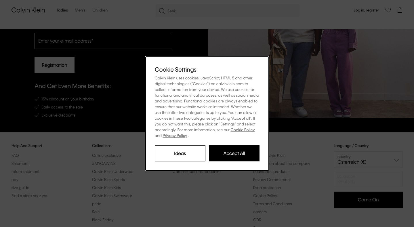 A cookie request pop-up on Calvin Klein’s website
Meow Meow Tweet
Another pop-up overlay example is from Meow Meow Tweet. The company went for a minimalistic window to capture an email address. In return, a user will get skincare tips, insider information, and even cat pics. Additionally, there is a 10% discount code that serves as a gimmick to sign up. The pop-up is not loaded with additional information or multiple fields to fill out. The website’s background is blurred to keep the user’s attention solely on the pop-up overlay.
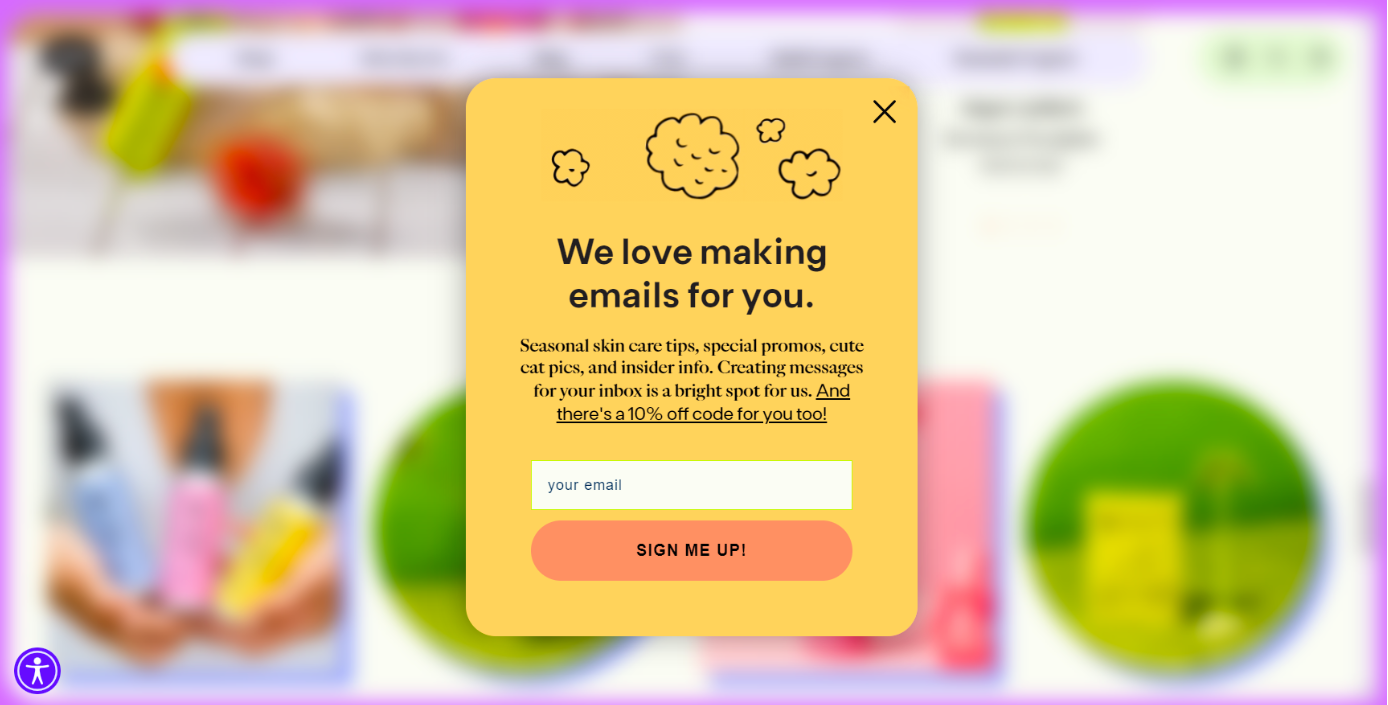 An email request pop-up by Meow Meow Tweet
PixelMe
Welcome-back pop-up overlays have become an effective tool for engaging and welcoming users when they return to a website or application. These overlays serve as a friendly greeting, reminding users of their previous interactions and encouraging them to continue their journey.
Creating a welcome-back pop-up, you can offer exclusive content, promotions, discounts, or just ask a user to sign up as PixelMe does. With its eye-catching design and witty wording, this pop-up overlay captures attention without being intrusive or annoying.
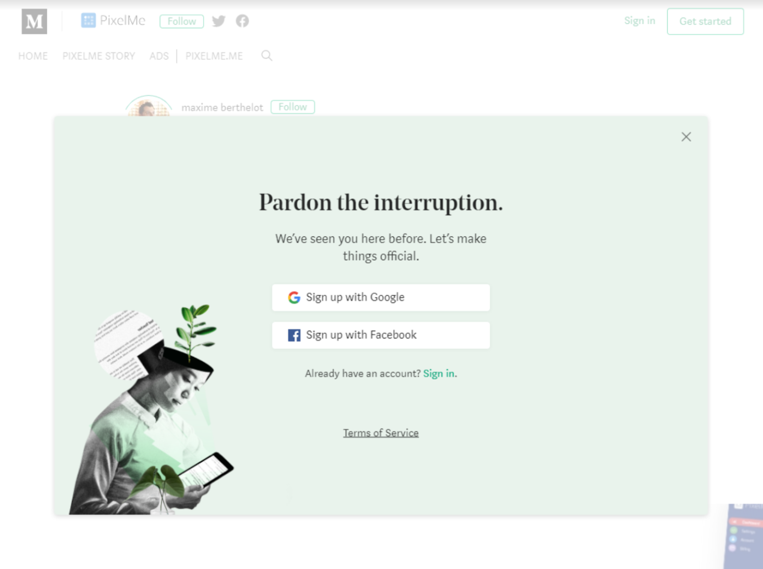 A welcome-back pop-up overlay from PixelMe; source: Littledata
As you can see, pop-up overplays can be employed for different purposes and with varying objectives in mind. Utilizing smart widgets on your website can help you craft a distinctive impression of your business. The above examples of pop-up overlays can serve as inspiration for your own website, allowing you to create captivating interactions with your users.
How to create a pop-up overlay with SendPulse
Now that you’ve seen some pop-up overlay examples with different approaches, let’s discuss creating your own using our pop-up builder. With our Basic plan, you can create pop-ups absolutely for free.
Create your project
To start, log in to your SendPulse account and navigate to the “Pop-ups” tab. Click on “Create project” to manage your website.
If you have a SendPulse-hosted site, you can simply paste the URL, and it will be automatically connected. For an external website, you need to generate an installation code and add it to your site. After that, verify the installation to ensure everything is set up correctly.
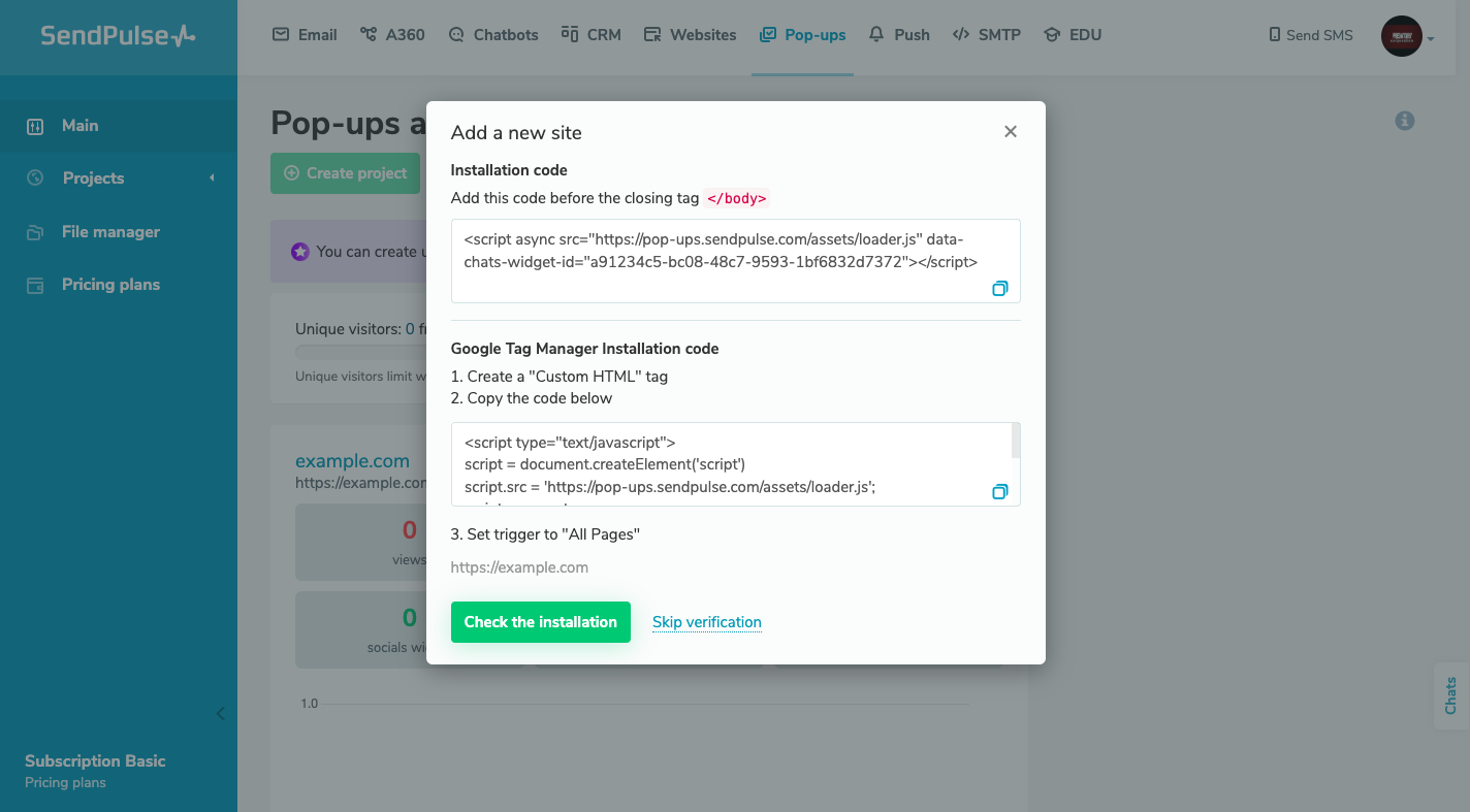 Adding a new site in the pop-up builder
Choose a template and customize it
Once your project is set up, open it and click on “Create pop-up.” You’ll find a template library with many options, all of which can be customized. In this case, select an overlay pop-up template that suits your needs. Start editing it by adjusting its appearance, placement, and copy. You can also replace the image if necessary.
It is also possible to connect any social media button to your pop-up if your goal is a social media subscription. You can also request a phone number or email address or even leave your pop-up overlay without any action.
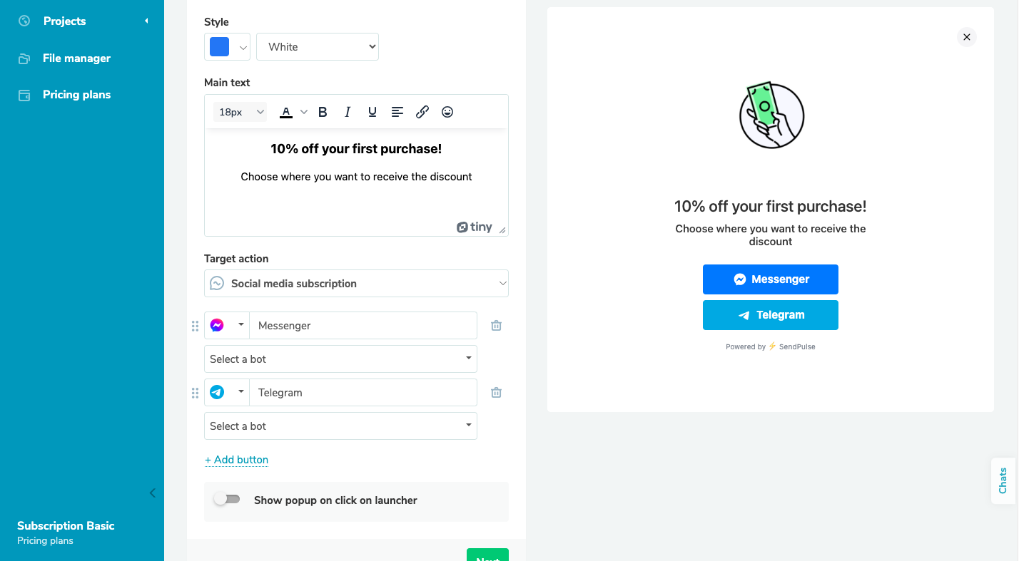 Creating a pop-up overlay in SendPulse
Set display conditions
After customizing your pop-up, click “Next” to set the display conditions for your widget. You can combine multiple conditions and choose to show the pop-up when any or all of them are met. If you wish to display your pop-up overlay all the time, you can select “Show always.”
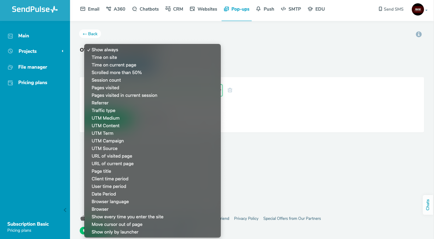 Setting conditions for a pop-up overlay
If you prefer not to show the pop-up overlay to repeat visitors, you can specify the required session count. Finally, you can publish your pop-up or save it as a draft for later.
These steps gave you a brief outline of how to create a pop-up with SendPulse. For more detailed guidelines, you can always check our
knowledge base.
Wrapping up
Pop-up overlays are a fantastic way to add engagement to your web page with minimum effort. Take inspiration from the remarkable examples of pop-up overlays mentioned above and infuse your own website with creativity.
If you’re eager to implement overlay pop-ups on your site, SendPulse is the ultimate tool for the job. With a number of pre-designed pop-up templates at your disposal, you can swiftly launch incredible campaigns that will leave a lasting impression on your audience. Get started with SendPulse today and witness the remarkable impact of pop-up overlays on your website engagement.