So, you’ve settled on the topics you’d like to teach your audience and crafted an amazing script that’s jam-packed with valuable knowledge. As an expert in your field, these two are probably an absolute breeze for you.
But, how do you deliver this content in a compelling and engaging way? That’s the stage most educators find overwhelming and struggle with.
The truth is, it’s not as complicated or time-consuming as it may appear. With the right tools and a set of best practices, you can learn to craft captivating presentations that produce the desired results every time.
In this post, we’ll walk you through everything you need to know about creating presentations for online courses, so you can instantly take your learning materials to the next level!
Best practices for creating online course presentations
While you don’t need fancy effects to convey your message effectively, you still need to spend a considerable amount of time preparing and producing your online course presentation. Even the most compelling insights can get lost if your course materials are inaccessible or look sloppy.
Here are some best practices to implement to take your presentation from bland to brilliant:
- Use the right layout. You need to adjust your online course presentation to the video format you’ll be shooting in. For instance, YouTube, Udemy, and FutureLearn use a 16:9 aspect ratio. This detail can easily be overlooked but can have great implications. If you create slides in a different format, you risk getting information cut off.
- Use colors that are in line with your branding. If you already have a brand, every piece of content you produce is an extension of it. So, using colors and fonts from your brand book makes your presentation instantly recognizable to your audience.
- Avoid walls of text. As our attention spans are constantly narrowing, creating text-heavy slides is a surefire way to lose your audience halfway through. We’ve all had our fair share of lecturers flatly reading information off .PPT slides — and I can’t be the only one who never learned anything that way, right? Instead, be concise and straight to the point. Your students will appreciate it!
- Combine text and visuals. A great way to break up walls of text is by using visuals to get your point across. Instead of overloading your audience with hard data, use data visualization elements to make it more memorable. Or, instead of describing complex processes, create engaging infographics your students can refer back to for easier understanding.
- Enrich your presentation with videos. According to an analysis of 100,000+ sales and marketing presentations, videos are a critical component in presentations, as presentations with any video embedded had a 37% longer average reading time.
- Use interactive slides instead of static. PowerPoint was created 30 years ago and hasn’t changed much since then. Static slides are a relic of the past, while interactive slides bring real results. By giving your audience something to play around with, you’re ensuring 41% more people will get to the end of your presentation and will read it 21% longer.
- Weave storytelling into your presentation. The best method to create active engagement is using storytelling techniques to deliver your message. Even if it’s just a simple anecdote, our brains absorb stories much more effectively. This way, the audience will feel like the main characters in your story and not just passive listeners. Meaning, they’ll treat the contents of your presentation personally and remember them better.
Now let’s move on to some peculiarities of choosing the right presentation tool.
How to pick the right software for your course presentation
The process of choosing the right software to craft your online course presentation needs a personal approach. What worked for someone else might not necessarily work for you.
Therefore, it’s very important to answer the following set of questions before signing up and parting with your hard-earned money:
- How easy is this presentation software to use?
- Is it within your budget? What are the different pricing options?
- Who is this presentation software aimed at? Is it mainly for individuals, educators, or businesses?
- How extensive is the template and graphic asset library?
- What are the import/export options?
- How easily can you share your presentation with other collaborators?
- Is the tool cloud-based or desktop only?
- Can you add audio and videos?
- Can you add animations?
- Can this presentation software be used on any device?
- Is there an option to pull colors from your brand kit?
- Is there an analytics panel to check the performance of your presentation?
You can also divide these questions into non-negotiables (criteria that your ideal tool must meet) and optional (good for a potential tool to have, but not necessary), or assign priorities to specific features. This will save you plenty of time in the long run, as you will be able to eliminate tools that don’t meet your requirements straight away and compare those that do based on the priority order you set earlier.
The best presentation software to use for your online course
Now that we’ve got the basics out of the way, it’s time to actually pick the best presentation software for you. As hundreds of different options are currently available, it can be challenging to keep track of all the launches and features. That’s why we tried and tested numerous solutions on the market to create a carefully curated list of tools that will amplify your presentation efforts.
Storydoc
Storydoc is a next-generation presentation maker, and as such, it’s a true powerhouse. Every last presentation template by Storydoc is interactive and sure to impress and engage your audience. The premise of Storydoc is to ditch the old, static-based presentations and switch to a modern-day solution that will help you tell your story the right way.
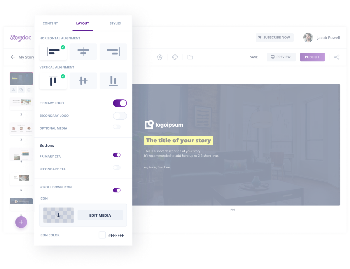 Storydoc is a presentation maker that will help you impress your audience
With a wide range of pre-made templates for different use cases, crafting your online course presentation will take a few clicks. You can begin by uploading your old deck, and the editor will take care of the rest for you — starting with extracting your key visual assets to ensure your presentation is fully on-brand.
You can then harness the power of storytelling with the help of various interactive components, including tiered or narrator slides. Thanks to numerous product integrations, you can go way beyond what standard presentation makers can do.
Storydoc not only allows you to embed third-party content but also integrate your calendar or subscription form straight into your presentation so that your students can, for example, book 1-on-1 sessions at an additional cost. Or, you can collect feedback to improve the existing course without making your audience click through to a new tab.
If you need deeper insight into the performance of your presentation, there’s also an extensive analytics panel where you can check who opened your presentation, how long they viewed it for, when they stopped reading it, or which components they interacted with the most, and adjust your deck accordingly.
Pricing. You can sign up for a free 14-day trial to try out this presentation maker. After this period, the Starter plan costs $40 per user per month, while the pricing for the Pro and Business plans is available upon request. Storydoc is 100% free for verified .edu addresses.
Canva
There’s a good reason Canva has quickly become a firm favorite among bloggers, freelancers, and small businesses. This software lets anyone feel like a graphic designer and create professional-looking visual aids in a matter of minutes.
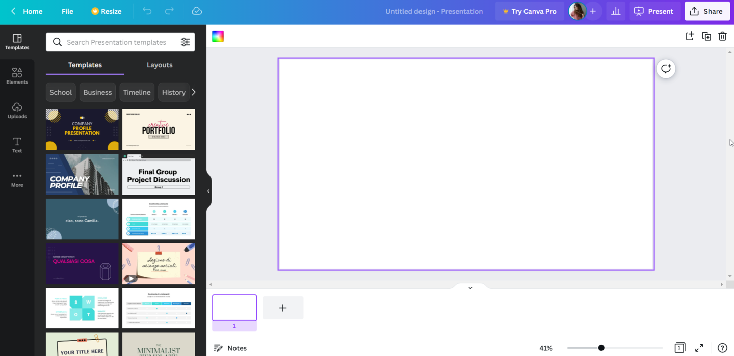 Canva is a tool for non-designers wanting to create visuals on a budget
Canva has one of the most robust free plans out of all the tools available on the market. You can design virtually anything, from social media graphics and logos to presentations and print banners. The built-in template library is overwhelmingly extensive, including templates designed specifically with educators in mind, and you can tweak any design to meet your needs. There’s also a graphic asset library where you can choose from various shapes, stickers, frames, and icons.
Discover the seven principles of conversion-centered design you need to consider when creating a layout.
Canva comes with an extremely user-friendly interface, allowing people to craft beautiful presentations even with no design skills. You just drag and drop different elements and arrange the contents of your slides. There’s also an option to import audio, video, or embed third-party content thanks to a wide range of integrations, including YouTube, Vimeo, or Pinterest, to name a few.
The presentations designed in Canva can be shared with other team members for collaboration, and they can be viewed and edited across various devices. The main disadvantage is that there is no analytics panel, so there is no way to measure the performance of your presentations.
Pricing. The free version of Canva comes with extensive features. If you’d like access to premium resources and additional options, paid plans start at $119.99 per year. It’s free for primary and secondary school teachers along with their students.
Visme
If you’re looking for a versatile presentation tool, you should definitely look into Visme. Aside from creating visually appealing presentations, you can also design infographics, social media graphics, or charts.
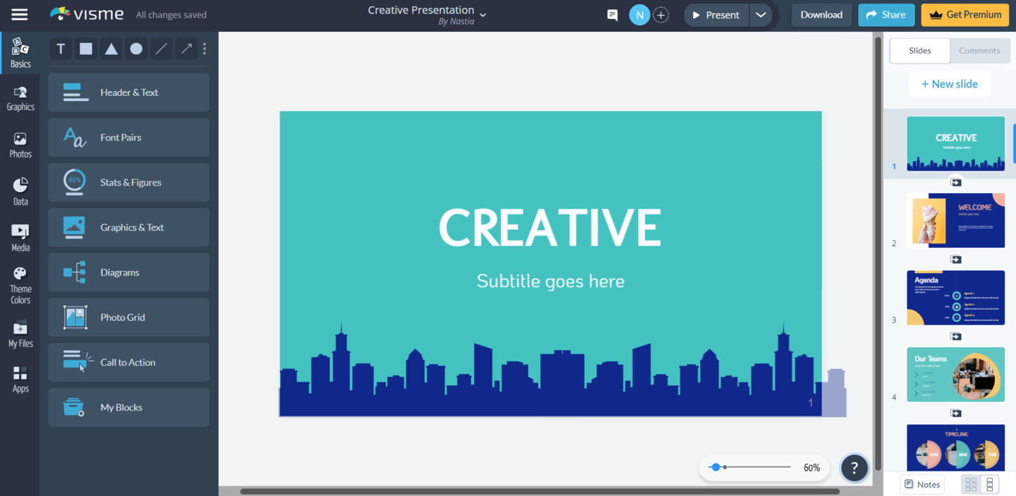 Visme is an all-round presentation tool with a user-friendly interface
It comes with a very intuitive UI, so it shouldn’t take new users long to find the desired editing or customization options. There’s also an extensive knowledge base to fall back on when you’re struggling with the design process, including video tutorials and graphic design videos, among others.
There are numerous pre-made presentation templates to choose from, tailor-made for different industries or topics. If you prefer, you can also design from scratch, add new slides to existing presentations, or create custom slides for later use. Inside the graphic asset library, you’ll find hundreds of stock photos, dataviz elements, graphics, or audio and video clips that you can add to your slides and customize to match your brand colors or presentation theme. You can also easily embed third-party content in your presentation, such as polls or quizzes.
All designs can be edited across different devices, while complete presentations can also be viewed offline in different formats. Only the premium plan, however, has the option to collaborate on projects with other teammates. Once you share a presentation using a live link, you can also track how many times it’s been viewed and how long for.
Pricing. If you’d like to test Visme out, you can start with a free account that allows you to create up to three projects. For more capabilities, there are three upgrade options available, starting at $15 per month for a personal plan.
Slidebean
If you’d like to create beautiful-looking presentations but are pressed for time or ideas, then Slidebean might just be the tool for you. It utilizes the power of AI to convert your materials into a finished presentation, using the most suitable slide layouts and configurations based on your content.
While it’s mostly aimed at startup founders, it can be used to create other types of presentations, too. (Or, if your online course is about how to pitch to investors, you can kill two birds with one stone!)
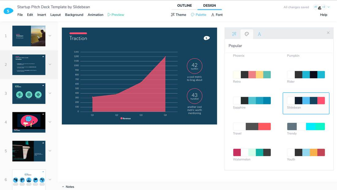 Slidebean will turn your course materials into a finished presentation
Should you wish to create your presentation yourself, there’s also an option to toggle the AI option on and off and customize all content blocks. There’s a wide variety of templates, color palettes, fonts, icons, and images to choose from. There are no shapes, however, so if you need to add any to your presentations, you’ll have to use icons instead.
An interesting thing about the template gallery is that it includes presentations by household brands, such as Airbnb or Snapchat, to draw inspiration from.
Slidebean is a cloud-based presentation tool and can be used on any device. Though, many of the more advanced features, such as collaboration, sharing to social media platforms, or analytics, are only available on the paid plans.
Pricing. The Basic version is free, while the All-Access plan costs $29 per month.
Beautiful.ai
Another presentation software for creating AI-powered presentations is Beautiful.ai. It takes all the hassle out of the design process and allows your presentation to look professional and engaging every single time, even if graphic design isn’t your strong suit.
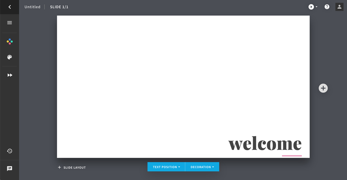 Beautiful.ai allows you to create professional AI-powered presentations
Beautiful.ai strikes the right balance between automated and customizable design. There are several slide themes and dozens of fully-designed templates to choose from. Once you decide on a layout, the tool will automatically adjust it to match the rest of your presentation. You can then play around with various elements to create slides that are tailored to your topic and needs.
You can also include different stock photos or icons in your presentation, but the graphic assets library is rather limited. There’s also no option to embed third-party content into your slideshow.
Unfortunately, Beautiful.ai can only be used on desktop computers, and there’s no Brand Kit option available. The Analytics feature is only available in the paid plans, but if you’re only looking for the basic features, it should work well enough.
Pricing. There’s a 14-day free trial if you want to take it for a spin. After that period, there are two paid plans starting at $12 per month, as well as a custom Enterprise plan.
Genially
Genially is a presentation software specializing in creating interactive content. Aside from creating online presentations, you can also use it to design infographics or work on other interactive projects.
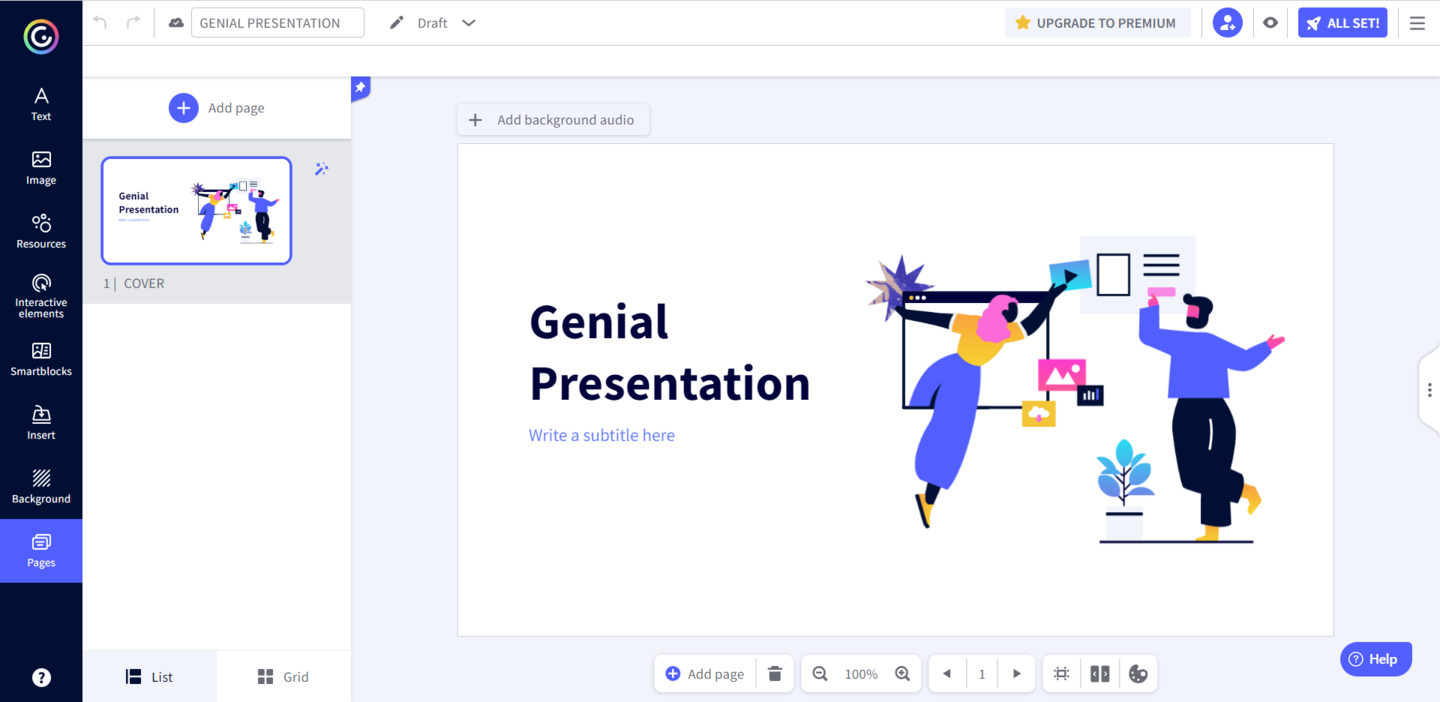 Genially specializes in interactive presentation designs for different industries
It comes with a variety of interactive buttons and animated templates to create modern presentations. For instance, you can add extra content that appears on hover, jump links to any section of your presentation, or external links. The so-called Smart blocks can also be used to include image galleries or dataviz elements. Moreover, any change you make can be applied to all slides with just one click, saving you plenty of time in the process.
Check out some tips to make your online course interactive and engaging.
The tool itself is straightforward to learn, but there are third-party tutorials and design tips on the blog to help you create stunning designs. Thanks to numerous integrations, you can easily add stock images, audio and video files, or other third-party content to your slides. All elements can also be animated, with lots of different animation effects to choose from.
Unfortunately, Genially presentations can only be edited on desktop computers, but they can be viewed on any device. The software comes with collaboration and sharing capabilities, while premium plans also include Analytics and Brand Kit features.
Pricing. On the free plan, you can create unlimited designs, but the resources are limited. There are two types of paid plans: for education and business. The education plans start at $1.25 per month when billed annually, while the business plans start at $7.49 per month when billed annually. If that’s not enough, there’s also an option to get a custom plan.
Pitch
If your main priority is real-time collaboration, then Pitch is a safe bet. It has all the capabilities of other presentation-making tools — pre-made templates, an intuitive interface, and customization options. But, once you add your team members, that’s when it truly stands out!
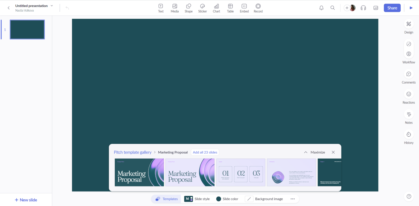 Pitch is the go-to presentation tool for real-time collaboration
In the right-hand sidebar, you’ll find all of the project management and collaboration features that will allow you to design and edit your slides as quickly and easily as possible. For instance, you can track progress, assign entire decks or individual slides to particular teammates, or leave notes and comments. And if that wasn’t enough, any design can be saved as a custom template to make the future design process even quicker.
Thanks to the “Go live” option, you can also start a video call to collaborate on a presentation in real time. You can easily embed third-party content or import data straight into your deck to create powerful presentations in no time. Non-designers will appreciate the ease of use, while designers will value the ability to control every deck element.
Unfortunately, you need to pay to be able to access additional workspace features and analytics, but it’s a great option for individuals and growing business teams.
Pricing. The free plan enables you to create unlimited presentations and comes with custom templates and the live video collaboration feature. Paid plans start at $8 per user per month, with an option to get a custom enterprise plan for larger organizations.
Powtoon
Finally, we have a tool that combines the power of modern design with animation to deliver engaging video presentations. Powtoon is a leading animation presentation tool that aims to move away from static, slide-based presentations.
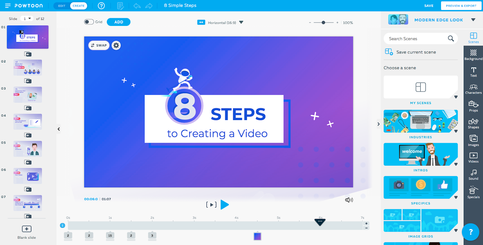 Powtoon will turn your slides into professional-looking videos with a click of a button
My favorite thing about this software has to be the intuitiveness and ease of use. The entire design process feels like playing around in any other presentation editor, except you end up with a professional-looking video instead.
Aren’t you using video on your website? Discover five innovative ways to get started!
You start by editing your slides as you normally would, and once you hit “Play,” your deck comes to life. The editor takes care of the more technical aspects for you and adjusts the timing to the contents of each slide. If you’d rather present your deck as a slideshow, you can easily do so with a single toggle of a button.
On the free plan, you get up to 100 MB of storage and can create videos up to three minutes long with the Powtoon branding. If you’d like to get access to the more advanced features, such as more storage, longer videos, white-labeling, or 24/7 support, you need to upgrade to one of the paid plans.
Pricing. There’s a limited free plan ideal for personal use. Paid plans start at $20 per month when billed annually. There are also special business plans with custom quotes available upon request and educational plans starting at $4 per month for students and $8 per month for teachers.
Takeaways
When it comes to creating presentations for online courses, preparation is key. For the contents to be truly compelling and memorable, you need to implement some best practices:
- always use the proper presentation layout;
- treat your presentations as an extension of your brand;
- don’t overload your prospects with too much text;
- avoid static slides and always break up text with images and videos;
- utilize the power of storytelling.
Bearing all these tips in mind, you should answer several basic questions that will help you establish your main criteria for picking the right presentation software. All of the mentioned tools are battle-tested and will help you deliver the right results. Regardless of your niche or requirements, we’re sure you’ll find the perfect one on this list.
Good luck designing your next presentation!